10,000 search results
(0.03 seconds)
- Silvia Norlin by Maulana Creative,
$14.00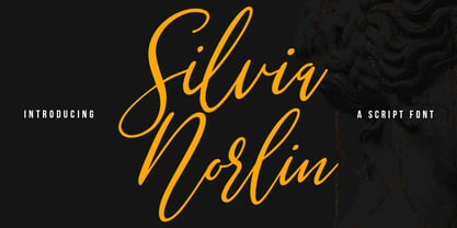 Silvia Norlin is a beauty signature script font. With thin contrast stroke, slanted and fun character with a bit of ligatures. To give you an extra creative work. Silvia Norlin font support multilingual more than 100+ language. This font is good for logo design, Social media, Movie Titles, Books Titles, a short text even a long text letter and good for your secondary text font with sans or serif. Make a stunning work with Silvia Norlin font. Cheers, MaulanaCreative
 - Tiffanka by Maulana Creative,
$11.00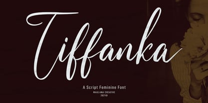 Tiffanka is a Modern Script font. With thin contrast stroke, fun character with a bit of ligatures and lowercase alternate. To give you an extra creative work. Tiffanka font support multilingual more than 100+ language. This font is good for logo design, Social media, Movie Titles, Books Titles, a short text even a long text letter and good for your secondary text font with sans or serif. Make a stunning work with Tiffanka font. Cheers, MaulanaCreative
 - Zapatos by Maulana Creative,
$11.00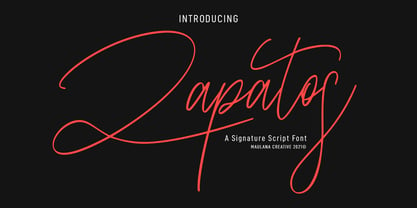 Zapatos is a fancy feminine script font. With thin stroke, super slanted and Unique Upper and lower character with a bit of ligatures. To give you an extra creative work. Zapatos font support multilingual more than 100+ language. This font is good for logo design, Social media, Movie Titles, Books Titles, a short text even a long text letter and good for your secondary text font with sans or serif. Make a stunning work with Zapatos font. Cheers, MaulanaCreative
 - Mandalay - Unknown license

- Gloriz Vintage by Mans Greback,
$59.00 Gloriz Vintage is the bold and distinctive retro serif font that adds a touch of rustic charm to any project. Designed by Mans Greback in 2023, this font features rounded edges and a heavy, printed appearance that will give your work a vintage look. Perfect for headlines and logotypes, Gloriz Vintage is the perfect choice for designers looking to add a touch of personality to their work. Don’t miss out on this one-of-a-kind family! The Gloriz Vintage family consists of six high-quality fonts: The three weights Regular, Light and Bold, are each provided as both Upright and Italic styles. The font is built with advanced OpenType functionality and has a guaranteed top-notch quality, containing stylistic and contextual alternates, ligatures and more features; all to give you full control and customizability. It has extensive language support, covering all Latin-based languages, from Northern Europe to South Africa, from America to South-East Asia. It contains all characters and symbols you’ll ever need, including all punctuation and numbers.
 - Queenica by Artisticandunique,
$55.00 Queenica - Sans serif font family - Multilingual supports, 12 Style If you're looking for a stylized sans serif font, Queenica might be the font you're looking for with its unique structure. Queenica is a distinctive modern sans serif font. It offers rich solutions to your creative projects with its alternative versions. You can easily use the sans serif font feature in many areas. You can create your text with normal characters and highlight bold characters and titles. This font offers a wide variety of styles to help you discover the best mood for your projects, from body text to large headlines, from classic to modern and bold styles. Well suited for books and magazines, magazine covers, editorials, headlines, websites, logos, invitations, branding, advertising and more. CHARACTER RANGES : Basic Latin, Latin-1 Supplement, Latin Extended-A, Latin Extended-B, General Punctuation, Currency Symbols, CJK Symbols And Punctuation, Private Use Area (plane 0), Alphabetic Presentation Forms -Uppercase typeface -Lowercase typeface -Numbers -Symbols With this font you can create your unique designs. If you have a question, please contact me. Have a good time.
 - Swift by Linotype,
$30.99 Gerard Unger developed this newspaper font between 1984 and 1987 for Dr.-Ing. Rudolf Hell GmbH, Kiel. He was mainly influenced by William A. Dwiggins (1880-1956), the typographic consultant of Mergenthaler Linotype, who started to develop more legible, alternative fonts for newspaper printing as early as 1930. Swift was named after the fast flying bird. Austere and concise, firm and original, Swift is suited for almost any purpose. Swift has been specially developed to sustain a maximum of quality and readability when used in unfavorable print and display processes, e.g. newspapers, laser printing and low resolution screens. Its robust, yet elegant serifs and its large x-height provide an undeniable distinction to the typeface, making it suitable for corporate ID and advertising purposes as well. Swift 2.0 family was designed in 1995. It's an improved version with technical and aesthetic enhancements and new family members. The Cyrillic version was developed for ParaType in 2003 by Tagir Safayev. Please note that this family includes only basic latin characters; it does not include accented characters required for western and central Europe.
 - Arthur Cabinet by SIAS,
$49.90 The Arthur Cabinet font family offers a most particular range of seven fancy ornamental fonts in the spirit of the Art Deco era. These fonts celebrate the age of elegance, stylishness and refinement to its very best. They give you a unique tool for exquisite designs. The fonts of this family are derivatives from the Arthur Sans series, which you may also want to have a look at. Use this unique typefaces for distinctive personal stationary, outstanding headlines, captivating brochures and invitations; for marvellous logotypes, wonderful menus, hotel leaflets, exciting ads … for brillant designs. Each Arthur Cabinet font features the same comprehensive Euro-Latin encoding for full language support. Additionally, every font includes a small supplementary set of fine ornaments. – For an even more comprehensive range of Arthur embellishments check out the font Arthur Sans Regular or Arthur Ornaments! Have also a look at the sister fonts of the gorgeous Arthur Sans Family, which will offer you yet another wonderful scope of fascinating typographic possibilities. ________________________________________________________________________________ Tip: Set Sample text (see below) manually to [ABCDE…] to view effectively the fonts most relevant parts! ________________________________________________________________________________
 - Corporative Soft by Latinotype,
$26.00 Corporative Soft is the slightly rounded-edged version of Corporative. This font has a marked personality and distinctive traits, which makes it suitable to be used at large text sizes. At the same time, the smooth transition from straight to curved lines gives the font a more friendly feel. This display typeface is the perfect choice for logos, posters, signs, branding, packaging and so on! Corporative Soft comes with Latinotype’s standard set of 350 characters, making it possible to use the font in 128 different languages. Corporative Soft provides users with a wide range of characters, weights and widths for every project. By combining different variants, designers can achieve the best results. The family consists of 64 fonts: a basic family that includes 8 weights plus italics, an alternative family of 8 weights with matching italics and 2 condensed families, one regular and one alternative, both with italics. Corporative Soft was created by LatinotypeTeam and developed by Javier Quintana, Eli Hernández and Rodrigo Fuenzalida, under the supervision of Luciano Vergara and Daniel Hernández.
 - Dal Baati by Gunjan,
$69.00 "Indulge in the Delectable Delight of 'Dal Baati' Brushy Typeface - A Feast for the Eyes! Discover the artistry of 'Dal Baati,' an exquisite brushy typeface that serves up a delightful blend of elegance and rustic charm. Inspired by the flavors of Rajasthan, this typeface brings a touch of authenticity to your designs, evoking the rich cultural heritage of the region. With every stroke, 'Dal Baati' exudes a handcrafted allure, making it perfect for logos, branding, posters, packaging, and so much more. Its unique character and versatile nature add a pinch of spice to your projects, leaving a lasting impression on your audience. Captivate your viewers' senses with the flavorful aesthetics of 'Dal Baati.' Whether you're designing for a restaurant, food-related business, or any creative endeavor, this typeface elevates your work to new culinary heights. Embrace the distinct personality and mouthwatering appeal of 'Dal Baati' in your designs. Enhance your visual storytelling and give your projects the delectable touch they deserve. Take your creations on a flavourful journey today with 'Dal Baati' brushy typeface!"
 - Organica Pro by Sudtipos,
$39.00 Just as most buildings are based on a structure of vertical columns, horizontal floors, square angles and the occasional arch, most Latin typefaces are designed within a largely uniform, static, alphabetic structure that provides a framework for playing with the style of the terminals —serif, sans-serif, slab-serif, flared, Tuscan— without significantly modifying the deep anatomy of the letters. Orgánica Pro, by contrast, proposes a different structure: curvilinear, subtle and sophisticated, beyond the typical «sticks and balls» model. Organic anatomy, in one word; deliberately dynamic and asymmetrical. Over this radically distinct structure, terminals play a characteristic, expressive role that challenges easy classifications: Is this a serif or a sans font? A semi-serif? A semi-sans? For text or display? Modern or ultra-modern? Joke or serious? All answers are valid. Anyway, its six stylistic variants allow for multiple, diverse uses in text setting, headings and logotypes. In spite of —or perhaps thanks to— its innovative, uncommon structure, Orgánica’s personality is sweet to the eyes, wittily elegant and surprisingly legible.
 - Snobbish by Create Big Supply,
$15.00 Designed with an organic brush style, this font adds a touch of uniqueness to your projects. Although Snobbish is an all-uppercase font, its distinctive character sets it apart, allowing you to explore endless possibilities. With Snobbish, you have access to both uppercase and lowercase letters, numbers, and punctuations, providing flexibility in your designs. Express yourself in various languages, as Snobbish offers multilingual support, enabling you to reach a global audience. This purchase includes TTF, OTF, and WOFF font files, ensuring compatibility across different platforms and software. The font is PUA encoded, allowing easy access to all its features and ensuring a seamless design experience. Character Sets: Snobbish encompasses a wide range of characters, including symbols, accents, and special characters. Let your imagination run wild and create visually stunning compositions that leave a lasting impression. Unleash your creativity with Snobbish and elevate your designs to new heights. Whether you're working on branding, logos, invitations, or any other artistic project, Snobbish is the perfect choice for adding a touch of organic charm.
 - Mavitya by Dora Typefoundry,
$19.00 Mavitya is a serif font with a classic but modern style with smooth curves and beautiful binding, consisting of regular and condensed versions with four types. allowing for a very sophisticated and contemporary approach to typography and the unique look of the font it also features ligatures and multi-language support. This font is made perfect for application especially on logos, and many other formal forms Mavitya provides a distinct, creative and expressive message for your branding, advertising, packaging, headlines, magazines, websites and other large projects. Feature: - 4 Font Weights — Regular, Condensed - Numbers & Symbols - Supported Languages - Alternatives and Ligatures - PUA coded What's included: - Mavitya Regular + Oblique - Mavitya Condensed + Oblique We strongly recommend using programs that support OpenType features and Glyphs panels such as Adobe and Corel Draw applications, so you can view and access all Glyph variations. Families like this have become a true labor of love, making it as easy and enjoyable as possible. I really hope you enjoy it! Thank you Enjoy the font and be creative :)
 - Segment B Type by Kobuzan,
$19.99 Segment B is a powerful display type family with 18 styles inspired by condensed European grotesques of 19th-century with a reference to the first grotesques, which differ in the contrast of strokes, but with clear geometric proportions. In Black weights, the letterforms are inspired by the aggressive industrial graphic design of the 1960s and 70s. Both have 3 axes and are adjustable in weight, width and 10? italic. It is a typeface with narrow proportions, distinctive character, high-quality outline and lots of details. Characters have oblique cuts, sharp tails and highly visible ink traps. All this makes the font more aggressive and edgy. The huge x-height with short ascenders and descenders allows this typeface to be used in blocks with minimal line spacing. Features: – Total glyph set: 631 glyphs; – 18 styles (3 weights x 3 widths + italic); – Support 210+ languages; – Latin Extended; – Cyrillic Basic + Bulgarian letters; OpenType features: – Proportional numerals, tabular numerals, superiors, fractions; – Punctuations and symbols; – Arrows; – Stylistic alternates (ss01-ss05); – Ligatures; – Case-sensitive forms.
 - Metrock by Ditatype,
$29.00 Meet Metrock, a bold and distinctive brush sans-serif font that exudes strength, modernity, and artistic edge. Crafted with large letters, Metrock is the epitome of impactful design with a touch of rugged elegance. The characters in Metrock are deliberately bold, featuring boxy shapes that command attention. The thick weight adds a sense of solidity and substance, while the sharp corners and brush details introduce an element of raw creativity. This unique combination makes Metrock a font that stands out in any display setting. In addition, enjoy the features here. Features: Multilingual Supports PUA Encoded Numerals and Punctuations Metrock fits in headlines, logos, posters, flyers, branding materials, greeting cards, print media, editorial layouts, and many more designs. Find out more ways to use this font by taking a look at the font preview. Thanks for purchasing our fonts. Hopefully, you have a great time using our font. Feel free to contact us anytime for further information or when you have trouble with the font. Thanks a lot and happy designing.
 - Adoreles by Nathatype,
$29.00 Adoreles is a distinctive sans-serif display font that stands out with its elegance and unconventional charm. Crafted with a delicate touch, this font creates a visual experience that is both refined and uniquely artistic. With Adoreles, you have a sans-serif display font that redefines the expected. The characters in Adoreles are presented in uppercase, each possessing a subtle sophistication. By eschewing boldness, the font embraces a refined simplicity. The true magic of Adoreles lies in its inlines—irregular, yet meticulously designed to add a touch of unpredictability and individuality to each letter. Enjoy the features here. Features: Multilingual Supports PUA Encoded Numerals and Punctuations Adoreles fits in headlines, logos, posters, flyers, branding materials, greeting cards, print media, editorial layouts, and many more designs. Find out more ways to use this font by taking a look at the font preview. Thanks for purchasing our fonts. Hopefully, you have a great time using our font. Feel free to contact us anytime for further information or when you have trouble with the font. Thanks a lot and happy designing.
 - Beautinus by Fikryal,
$25.00 Beautinus Handwritten Script Font is a beautiful and exclusive typeface, designed specifically to add an elegant and feminine touch to your graphic designs. With its soft and classy handwritten appearance, this font exudes a romantic and artistic atmosphere. With its smooth-flowing characters, Beautinus Handwritten Script Font is perfect for various design projects such as logos, branding, greeting cards, wedding invitations, digital products, and more. Its uniqueness and elegance make it ideal for conveying messages of gentleness, beauty, and warmth in every design work. When you use Beautinus Handwritten Script Font, you will feel a personal and unique touch in every word and sentence you write. With the ability to adjust letter size and style, this font provides perfect flexibility to customize your designs according to your needs. Enhance your creativity with Beautinus Handwritten Script Font and let every word become a beautiful painting that portrays uniqueness, gentleness, and distinctive personality. If you have any questions please don’t hesitate to contact me. Features : Thank you best regards, Fikryal Studio
 - Cralic coob by Popskraft,
$12.00 The Cralic Coob font is an excellent selection when you want to infuse your designs with a playful and whimsical charm. This adorable and quirky display font adds a delightful and lighthearted element to any creative endeavor. It offers a wide range of applications, making it a versatile choice for various projects. Whether you're working on branding projects, crafting unique logos, designing wedding materials, creating eye-catching social media posts, producing captivating advertisements, or even developing product packaging and labels, the Cralic Coob font is your ideal companion. This font's handwritten style adds a personal and charming touch to photography projects, while it also elevates the elegance of invitations and stationery. With its ability to convey a sense of childlike wonder and cheerfulness, the Cralic Coob font is your go-to choice for infusing character and whimsy into your creative work. Its versatility and distinctive aesthetic make it a valuable asset for designers seeking to add that extra touch of playfulness and individuality to their projects. See other fonts from Cralic family https://www.myfonts.com/collections/cralic-font-popskraft
 - Swift 2.0 Cyrillic by ParaType,
$100.00 Gerard Unger developed this newspaper font between 1984 and 1987 for Dr.-Ing. Rudolf Hell GmbH, Kiel. He was mainly influenced by William A. Dwiggins (1880-1956), the typographic consultant of Mergenthaler Linotype, who started to develop more legible, alternative fonts for newspaper printing as early as 1930. Swift was named after the fast flying bird. Austere and concise, firm and original, Swift is suited for almost any purpose. Swift has been specially developed to sustain a maximum of quality and readability when used in unfavorable print and display processes, e.g. newspapers, laser printing and low resolution screens. Its robust, yet elegant serifs and its large x-height provide an undeniable distinction to the typeface, making it suitable for corporate ID and advertising purposes as well. Swift 2.0 family was designed in 1995. It's an improved version with technical and aesthetic enhancements and new family members. The Cyrillic version was developed for ParaType in 2003 by Tagir Safayev. Please note that this family includes only basic latin characters; it does not include accented characters required for western and central Europe.
 - Haboro Sans by insigne,
$- Quit trudging through the thick with encumbering fonts, and spring to the front of the pack with the cutting edge sans serif, Haboro Sans. With nothing to clutter up your work, your editorial designs, websites, and software will be sharp and clear. While this hyperfamily is simple in character, it (like Haboro Slab and Haboro as well) provides you with plenty of options. Haboro Sans features simple geometric shapes to help you achieve that perfect effect wherever you use it. Enjoy the comforting reassurance that this multi-tool of a typeface family can work on most anything, including packaging, branding, web copy, and more. Take the simplicity of Haboro Sans a step farther with OpenType features, too. Haboro Sans contains special glyphs like Titling, Small Caps and Oldstyle figures that give your work just enough of a distinct touch. For even more options, use the entire Haboro hyperfamily to expand your capabilities. Put some simple class into your projects with the traditional look of Haboro Sans. Your layouts, websites, iPhone apps, advertising, and newspapers (to name just a few) will thank you.
 - Bs Monofaked by Feliciano,
$37.92Monospaced become very popular among graphic designers. Nevertheless, I’ve noticed that in most cases that designers use monospaced typefaces is not because of their particular features caused by the strict rules of design — all characters share the same advanced width — rather because of it’s ‘electronic derived’ appearance. So, I decided to create a typeface that keeps the characteristics that, in my opinion attract designers to this particular sort of types, but deliberately break the main rule: characters do not share the same width — but they they look like they do! Characters are better balanced compared to truly monospaced types, giving more even typographic color while used in text setting. One weight might enough to please electronic type lovers. Designed in 2000. - Lucifer Sans by Daniel Brokstad,
$29.00 Lucifer Sans is a modern sans serif font rooted in Scandinavian geometry and minimalism, mixed with a healthy dose of black metal and irreverent attitude. Harsh vertical cuts and angles throughout the font creates a very strict and hard look, that can either be amplified or loosened up through its stylistic sets. Lucifer Sans family contains 162 font, 9 different weights and width, plus italics. In addition there are 3 different stylistic sets. This creates substantially diverse set of characters for contrasting against another and makes it a versatile font for different formats. Style 01 takes on an almost hand drawn style, while Style 02 enhances the geometric aspects of the font further. Style 03 uses only the rounded letter 01 without the hand drawn variations.
 - Brick Stone by Alit Design,
$22.00 Introducing the "Brick and Stone Victorian Typeface" – a timeless and elegant font that beautifully captures the essence of the Victorian era. This exquisite typeface is a masterful blend of intricate craftsmanship, vintage charm, and artistic flair, making it the perfect choice for designers, typographers, and creatives seeking to evoke a sense of classic refinement and sophistication in their projects. The Brick and Stone Victorian Typeface boasts a rich repertoire of design elements that truly set it apart. With meticulously crafted ornaments, graceful swashes, captivating ligatures, and versatile alternates, this font provides an extensive toolkit to elevate any typographic endeavor. Whether you're working on invitations, branding, packaging, signage, or any other creative pursuit, this typeface lends an air of prestige and distinction to your work. Each character of this Victorian typeface has been thoughtfully created to reflect the ornate and elegant aesthetics of the 19th century. The font captures the essence of engraved stone and brickwork, giving your text an authentic vintage touch. The ornamental details add an extra layer of opulence, making every word feel like a work of art. Whether you're designing for weddings, formal events, historical projects, or simply seeking to add a touch of classic sophistication to your work, the Brick and Stone Victorian Typeface will exceed your expectations. Embrace the elegance of the past and unlock a world of creative potential with this remarkable font.
 - Mirantz by insigne,
$32.00 Y’all ready for this? Now starting for Insigne: the new serif Mirantz. This rookie all-star plays a precise game every game, cutting at all the right angles to leave your reader impressed and ready to see more. You can always count on Mirantz to lead with solid mechanics and a clean style, but don’t be surprised when the face keeps it real with a little individual flare and creativity. This personal touch is nothing short of elegance in every appearance. So what makes us love this rookie above the other great players in the field? Contrast, for one. Mirantz brings more contrast to the game than most serifs out there. The serifs on this face have a crisp, sharp wedge that naturally draws the reader’s eye. You can’t help but fall in love with its clean, natural style. Mirantz also features a tall x-height and regular proportions that can play a number of positions on the page and still stay strong through the last half of the copy or even the final period. Mirantz is a solid powerhouse player, containing a complete set of small capitals and nine weights from thin to bold. It can play well both down low and up top with its subscripts and superscripts and can move your reader’s eye easily across the copy with its titling capitals, condensed and extended variants, and open style figures. With its options covering more than 72 Latin-based languages, look for this newcomer to have international success in the near future. It you haven’t set your draft picks for this next round of projects, think hard before passing up Mirantz. A capable serif like this one is a guaranteed asset to any team of fonts. Production assistance from Lucas Azevedo.
 - TXT Modern Mom by Illustration Ink,
$3.00Find style and flair in this downloadable font. Its thin lines and handwritten look are perfect for scrapbook journaling, cards, and more. - Geli by Volcano Type,
$46.00 It’s a mixture of digital exactness and analog freedom. With over 130 Opentype features, the font can change its look from strict to charming twirly. GELI offers many different ways to highlight words, which gives the font a personal character. It is a powerfull corporate font with a wide range to play with. Tobias Gutmann designed the Font in 2009/10 in the Typoclub which is part of the Hochschule der Künste Bern.
 - Gravita by TipoType,
$29.00 Gravita is a typeface family that conveys security and respect by combining the solidity of its classic proportions with the strict precision of its modern profile drawing. Ideal for modern corporate communication where you need customers to perceive confidence and transparency. It has 9 weight variables, 2 predefined sets (GEO and HUM) with their respective italics. Its design is inspired by the geometric precision of modernist imprint typefaces reinterpreted under a 21st century humanist sensitivity
 - Felicity by Fenotype,
$35.00 Felicity is a tightly cut heavyweight display serif. Felicity has strict kerning and it creates strong looking words just by typing - but if you need even more try any of Felicity’s many OpenType features: Discretionary Ligatures, Stylistic, Titling or Swash Alternates. Felicity has also a small selection of ornaments you can from the Character Window. Felicity is also equipped with Contextual Alternates and Standard Ligatures that prevents letters from colliding. Both features are automatically on.
 - Conifer by Ryan Keightley,
$15.00 Conifer is a blocky geometric sans serif font that adheres to strict grid rules in order to define its corner angles. Its seemingly rigid form is tempered by the soft, rounded corners, and fine notched details present at acute angles in the glyphs. Available in a clean solid and a varied, textured rough. The result is a rugged, retro, typeface that is at home in fashion lookbooks and wood-carved park signage alike.
 - Edison by HiH,
$12.00 Edison, is it Victorian or is it Art Nouveau? While this typeface may be found in Petzendorfer’s Treasury of Art Nouveau Alphabets, I believe the decorative spirals are more Victorian than “New Art.” To me, they looked tacked on, rather than organic -- with the industrial mechanics of a coiled spring, rather than the tendrils of a growing plant as the philosophical wellspring. Originally released by ATF in 1894 as Houghton, this typeface was re-released shortly thereafter by Bauer and Berthold in Germany as EDISON. Please do not make the mistake of thinking the font we offer here is no better than freeware fonts in cheap rip-off collections. This font has a set 218 characters and represents many hours manipulating the bezier curves to produce acceptable results. Available freeware fonts are often little more than raw scans with little accuracy of letterform. The muddy line intersections are a dead give-away. Frequently all you get is the alphabet itself. No numbers, no punctuation and don't even think about diacriticals. The font we offer represents a tremendous value. Considering the hours of work involved, I have no business charging so little. I could make better money cooking hamburgers or bagging groceries. But we want very much to encourage you to purchase and enjoy these fascinating historical typefaces and are making it as easy as possible for you to do so. So please encourage us and order Edison today.
 - Shoganai by Hanoded,
$15.00 I really like the Japanese language, as it has words that describe a whole world of meaning. Like Shoganai. It literally means: ‘It cannot be helped’. That’s life, get used to it. Shoganai sums up a lot of the Japanese culture and way of thinking: if things cannot be helped, then accept it and move on. Shoganai is a set of Brush fonts: a thinner, script font and a heavy display font. Use if for book covers, product packaging and more. If you can’t use it, then, well, Shoganai.
 - Torus Pro by Monotype,
$40.00 Torus Pro is a rounded monoline typeface. As its name suggests, this is a more professional version of my original Torus family released in 2017. Each glyph has been scrutinised and redrawn where necessary. In addition, there are now italics, small caps, old style figures, and numerous other improvements. Torus Pro includes many new decorative alternates and ligatures that will add distinctive flourishes to your typographic compositions. With up to nine alternates for some glyphs, these additional styles include stencilled, simple dots, looped and smooth swashes, plus a more aggressive angled option for those looking for something a little different. When used subtly, these alternates and glyph combinations will add flair and personality to your own creations. Perfect for titling and branding, Torus Pro also packs a punch without these features activated, as well as being a comfortable read in long runs of text. There are 12 fonts altogether, ranging from Thin to Heavy weights in both roman and italic. The variable font versions of the family allow you to define the weight exactly to your liking. Torus Pro has an extensive character set that covers all Latin European languages. Key features: 6 weights in both roman and italic Variable fonts included with full family 212 Alternates 20 Ligatures Small Caps Full European character set (Latin only) 1450+ glyphs per font.
 - Broaek by Linecreative,
$10.00 Broaek is a display typeface with a modern impression. This font consists of 3 types of styles, namely regular, thin, and outline. This font is perfect for use in headlines, posters, branding, titles, and other graphic designs. What you get dear, you will get : 1. Broaek- A clean San serif font including Upper & Lowercase characters(Regular,thin,Outline) 2. Numbers and Pointing 3. Supports Multi linguage (Latin Western Europe)
 - Action Jackson - Unknown license

- Two Turtle Doves - 100% free

- Hydrogen - Unknown license

- I suck at golf - Unknown license

- Precious Sans Two by G-Type,
$60.00 Precious Sans Two is a complete reworking of the 2002 design which was only ever available in PostScript format. Over a decade later G-Type’s Nick Cooke decided to re-appraise the typeface, scrutinise the old letterforms and overhaul the family. Make no mistake though, Precious Sans Two is no rudimentary re-release; nearly every character has been redrawn, re-proportioned, respaced and improved. Precious Sans Two is now in cross-platform compatible OpenType format with extended Latin language support for Western & Central Europe, the Baltics & Turkey. The original quirkier glyphs (f, g, I) have been retained as an OT style set feature and the typeface now contains small caps and an extensive set of discretionary ligatures as well as both proportional & tabular figures. The character set is further enhanced with the addition of 20 directional single and double arrows in each of the six weights which range from Thin through to Black, all with accompanying italics. Precious Sans Two is a distinctively modern typeface, well equipped for advanced typographic use in print, web and digital publishing environments.
 - Bunaero by Buntype,
$24.50 Buntypes Bunaero™ combines classical and contemporary characteristics to a unique and distinctive font family with extravagant but also harmonious appearance. The characters are clear, open and sometimes bellied. Especially the caps have a very high waistline. The font was manually hinted and contains extensive handcrafted kerning tables to ensure flawless appearance in all media. It supports at least 99 languages incl. Vietnamese and provides ligatures, alternative glyphs, special localized forms and even more enjoyable OpenType® features. Feature Summary*: - 9 weights, 18 styles: Hair, Light, Thin, SemiLight, Regular, SemiBold, Bold, ExtraBold and Heavy and corresponding italics - Supports at least 99 Languages incl. eastern european and vietnamese languages - Overall width: Narrow or Space-Saving - Advanced f- ligature set including fb - Discretionary s- and c- ligatures - Alternative Characters: a, e, f, g, i, k, l, t, v, w, y, J, K, Q, R, and more - Capital German Eszett - Extra characters with Polish Kreska - Catalan Punt Volat - Extra characters with alternate minimalistic Cedille * Some features may only be available in OpenType®-savvy applications
 - Lumberjacky by Tour De Force,
$25.00 In winter when cold time comes, when animals with thin fur play drums, there’s one guy who keeps you warm, his name is Lumberjacky and he’s stronger then storm!


