10,000 search results
(0.264 seconds)
- Mercusuar by Fauzistudio,
$12.00 Mercusuar font FAMILY – an expansion on Mercusuar that includes 16 fonts, regular and italic, from Thin weight to Bold, and still has all the clean lines and trendy minimalist vibes! Mercusuar is a stunningly crisp upper and lowercase typeface that looks incredible in both large settings as a display text. Includes: Mercusuar Thin (Regular & Italic) Mercusuar Extralight (Regular & Italic) Mercusuar Light (Regular & Italic) Mercusuar Regular (Regular & Italic) Mercusuar Medium (Regular & Italic) Mercusuar Semibold (Regular & Italic) Mercusuar Bold (Regular & Italic) Numbers & punctuation Foreign language support Hope you enjoy. Intuisi Creative
 - Enza by Neo Type Foundry,
$25.00 Enza is a display font designed by José José Villamizar. Its design stems from the typographic exploration for the realization of the identity of a company aimed at entrepreneurs in the millennium generation. It’s a family of five weights composed of 455 glyphs. includes Thin, Light, Medium, Bold and Black styles. It also includes stylistic alternates, fractions, and ligatures. Its use is recommended for titles, semicondensed texts or short, and elements of visual communication large phrases. It is also ideal for creating logos, in packaging, signboards and poster design.
 - Revans by Arterfak Project,
$15.00 Revans is a strong serif font with medium contrast. Inspired by the High Octane Rock genre and modern-classic fashion. Carefully designed with a short ascender to give a solid look, also the sharp serif makes the letters look more strong. Revans is a display-type which perfect for a headline, sub-headline, and short body text for a magazine, books, fashion, quotes, hipster t-shirt, signboard, logo, and etc . Available in 5 weights: Light, Normal - Medium - SemiBold and Bold, complete with the slant style. A great choice for a brave concept!
 - FF Oxide Stencil by FontFont,
$59.99 American type designer Christian Schwartz created this display and sans FontFont in 2005. The family contains 3 weights: Light, Regular, and Bold and is ideally suited for advertising and packaging, music and nightlife, poster and billboards, software and gaming as well as sports. FF Oxide Stencil provides advanced typographical support with features such as ligatures, titling alternates, case-sensitive forms, fractions, super- and subscript characters, and stylistic alternates. It comes with tabular lining and proportional lining figures. This FontFont is a member of the FF Oxide super family, which also includes FF Oxide Solid.
 - ALS Lamon by Art. Lebedev Studio,
$63.00 Lamon is a soft-natured display typeface. It looks best when used for short words and succinct phrases. Lamon’s outlined glyphs are made of both uppercase and lowercase letters with the smaller letters hiding inside the bigger ones. The face's smooth lines give street signs, packaging and decorative materials a friendly lightness, while the unexpected contrast involves the viewer in an interesting optical game. Lamon is a perfect typeface for neon signs. In addition to Cyrillic and Latin letters, Lamon includes a set of useful characters and currency signs.
 - Nordique Pro by Leksen Design,
$29.00 Inspired by her Swedish and Norwegian heritage, Andrea Leksen created this modern geometric sans serif reminiscent of Scandinavian design and typography. With its tall x-height, Nordique will be best showcased at large sizes, in headlines and other display uses. The Light, Regular, Semibold and Bold versions each contain over 50 ornaments, swashes, alternates and borders to play with—a modern take on the traditional rosemåling and kurbits painting styles. See some of the creative and beautiful ways Nordique Pro can be used in this YouTube clip! Check out Nordique's cousin Nordeco!
 - NorB Felt Tip by NorFonts,
$32.00 NorB Felt Tip was inspired from the lettering of my grand-brother Med Bahha who taught several kinds of letterings. It is a handwritten text font mimicking a felt pen and can be used with any word processing program for text and display use, print and web projects, apps and ePub, comic books, graphic identities, branding, editorial, advertising, scrapbooking, cards and invitations and any casual lettering purpose… or even just for fun! NorB Felt Tip comes with 6 weights each with their matching italics and in a Light, Normal, Bold and Heavy version.
 - Frederik by The Northern Block,
$26.95 Frederik is a traditional humanist sans with a modern twist. Fresh and neutral in appearance but equally organic and friendly. Frederik features 10 styles ranging from Thin to Black, plus matching italics. Regular and Medium weights work exceptionally well for small body copy, while Light and Heavy styles work best for display purposes — making Frederik a highly versatile type family, suitable for a wide range of uses. Opentype features include inferiors, superiors, fractions, numero sign, circled numbers, stylistic ordinals, ligatures, numerous arrows including extended length, and support for all Latin and Cyrillic languages.
 - NorB Pen by NorFonts,
$28.00 NorB Pen was inspired from Arial Round font, I use this font for my jazz lead-sheets. It's a handwritten text font emulating a round marker permanent pen. You can use this font with any word processing program for text and display use, print and web projects, apps and ePub, comic books, graphic identities, branding, editorial, advertising, scrapbooking, cards and invitations and any casual lettering purpose… or even just for fun! NorB Pen comes with 8 weights, each with their matching italics and in a Light, Normal, Bold and Heavy version.
 - Swingers by AdultHumanMale,
$20.00 Swingers is a curly, fun, cartoonish display font. I wanted it to look light, but loud, so it can yodel from Posters and Headlines. It has over 300 glyphs, several variations on the standard alphabet and all those extra pesky foreign features. OpenType coded, It has various letter pairings that interlock automatically to create a more randomized, bespoke feel to your copy. It also has tons of extra characters and other combinations available directly through your glyphs palette. Play around with it, break it, like it, buy it.
 - Due Credit by Wing's Art Studio,
$6.00 A versatile compressed font for film posters, credit blocks and trailers, Due Credit is a display font specifically designed for the film and television industry. A versatile typeface that’s suitable for bold headline titles and small credit blocks, with an additional horror genre inspired extra style. Watch Due Credit in action in this showreel: https://youtu.be/2XeoqG17wo8 Contents: Due Credit Version One and Two Uppercase Characters Lowercase Capitals Light, Regular, Bold and Extra Bold Weights Additional Cast and Crew Glyphs (simply drop in crew titles in one click) Additional "Horror" genre style with Alternatives
 - Paneuropa 1931 by ROHH,
$19.00 Paneuropa 1931™ is a faithful recreation of XX-century Polish classic, made by Idzikowski foundry in Warsaw, 1931. Original Paneuropa was a renowned and highly popular typeface in XX-century Poland, and was widely used in all kinds of design, editorial use and printed materials for decades. Paneuropa is a geometric, clean and versatile font family inspired by Paul Renner's famous Futura - it is a bit narrower, with different proportions and details in drawing, completely different figures and punctuation shapes than Futura. It is an interesting and refreshing alternative to Futura with its own distinct personality and a subtle authentic vintage flavour. Paneuropa 1931 contains separate styles for display and large sizes as well as styles for small text sizes - differing in spacing and the softness of letterforms. The family features an original Paneuropa Double font - a beautiful inline style for headlines and display use. The whole family is completed with added missing inbetween styles as well as italics. The original subfamily set is available for purchase and it contains solely the original Paneuropa styles (Thin, Regular, Bold, Text Regular, Text Italic, Double). Paneuropa 1931 characteristics: letter shapes and proportions are very faithful to the original, keeping its idiosycrasies and inconsistencies spacing and kerning are carefully adjusted in order to achieve the colour of the original fonts, keeping maximum possible consistency - a compromise between authentic vintage feel and legible consistent text colour (for hardcore users: just turn off the kerning) weights precisely matching the original (Thin, Regular, Bold, Text Regular, Text Italic, Double), inbetween weights were added (Light, Demi Bold, as well as missing italic styles) italic angle faithful to the original (8 degrees) softened corners help achieving the character of old imprecise printed display styles for big sizes are sharper and have tight spacing, text styles have softer shapes (recreating small print imperfect print) and broader spacing for use in paragraph text (spacing in both display and text styles matches the original as well) original style names in Polish for devices with Polish set as their primary language The family is very versatile. The Inline style as well as bold and thin weights are perfect for headlines and display use, other styles works wonderfully as paragraph text. Paneuropa 1931 consists of 18 fonts - 5 display weights with corresponding italics + 3 text weights with corresponding italics + 2 inline styles (for big and small print sizes). It has extended support for latin languages, as well as broad number of OpenType features, such as case sensitive forms, fractions, superscript and subscript, ordinals, currencies and symbols.
 - Archive Modern II by Archive Type,
$19.95An antiquated modern display typeface. - Archive Old Style Condensed by Archive Type,
$19.95Compressed old style display typeface. - Diva Pop by Sylvestre Studios,
$25.00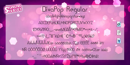 A trendy dance display font.
 - Sainted Medium by Wooden Type Fonts,
$15.00 Slab serif display, medium weight
 - Archive Garfield by Archive Type,
$19.95Inline and shaded display typeface. - Technia by Bogusky 2,
$20.00Modern small caps display font - Pontoon by Phat Phonts,
$20.00Extended sans serif display face. - Benjor by Megami Studios,
$12.50 Named in honor of the great bossa nova artist, Benjor is a fat display meant for headlines, attention-grabbing displays and even Brazilian record covers! Striking and eye pleasing, it's simply que bom!
 - Barbarosa by Gassstype,
$27.00 Introducing our latest display typeface called Barbarosa - Vintage Typeface is Display Vintage Serif can make your logotype become more interesting. Best Vintage font multilingual support. inspired by the decorative arts and architecture movement.
 - Downtown by Aboutype,
$24.99Mono-weight extra condensed display face. Lowercase sits on a floating baseline. Downtown was designed for all media and works best at 24 point and above. Downtown requires subjective display kerning and compensation. - Bookable Sans by Stiggy & Sands,
$24.00 A Sans Serif Family with a few unique relatives Our Bookable Sans Family was inspired by a lettering specimen from “Letters and Lettering” by Carlyle & Oring, but you'll find the inspiration has come a long way, baby. From its original reference of displaying a standard width and weight, to the two words showing a light narrow and a heavy wide, this friendly utilitarian display text face has grown to include three width families, with six weights from light to black each. The outliers of the family are Bookable Mondo: an uber heavyweight wide style exuding all brute power in an all-caps form, and Bookable Noir: a lightweight and narrow style with many unique alternate letterforms and ligatures that spoof film noir titling, but also goes off the rails having fun. Opentype features for the traditional families include: - Full set of Inferiors and Superiors for limitless fractions. - A small collection of f-based Ligatures. - Tabular & Proportional figure sets. - Ordinals. - Approx. 419 characters. Opentype features for Bookable Mondo include: - Full set of Inferiors and Superiors for limitless fractions. - Ordinals. - Approx. 391 characters. Opentype features for Bookable Noir include: - Full set of Inferiors and Superiors for limitless fractions. - Five Stylistic Alternate Sets. - Sixty-six unique ligatures. - Ordinals. - Approx. 701 characters.
 - Big Vesta by Linotype,
$29.99Vesta™ was originally designed as an orientation and information system for the city of Rome, the birthplace of the roman alphabet. The forms are inspired by letterforms found on a frieze in the Vesta temple in Tivoli. Vesta has more contrast than the average sans serif but, like many of other designs of Gerard Unger, let in a lot of light - the letterforms are open, the counters generous. Relatively narrow and hence economical - without feeling too compressed - Vesta is an ideal solution for newspapers and magazines, and numerous other applications, including corporate identity and more. Big Vesta was intended as Vesta's display partner. However, it also performs very well at small sizes - its large x-height and short ascenders and descenders make it particularly economical, making it ideal when space is limited; for example on a mobile display. Vesta and Big Vesta are now available in seven weights - from Light to Black - and include everything necessary for setting extended texts well: italics, small caps, and a range of figures, including old style, lining, and tabular figures. All in addition, Vesta is available as a family of OpenType fonts with a very large Pro character set and supports most Central European and many Eastern European languages. - Avenir Next Thai by Linotype,
$79.00 Avenir Next Pro is a new take on a classic face—it’s the result of a project whose goal was to take a beautifully designed sans and update it so that its technical standards surpass the status quo, leaving us with a truly superior sans family. This family is not only an update though; in fact it is the expansion of the original concept that takes the Avenir Next design to the next level. In addition to the standard styles ranging from ultralight to heavy, this 32-font collection offers condensed faces that rival any other sans on the market in on and off—screen readability at any size alongside heavy weights that would make excellent display faces in their own right and have the ability to pair well with so many contemporary serif body types. Overall, the family’s design is clean, straightforward and works brilliantly for blocks of copy and headlines alike. Akira Kobayashi worked alongside Avenir’s esteemed creator Adrian Frutiger to bring Avenir Next Pro to life. It was Akira’s ability to bring his own finesse and ideas for expansion into the project while remaining true to Frutiger’s original intent, that makes this not just a modern typeface, but one ahead of its time. Avenir Next Variables are font files which are featuring two axis, weight and width. They have a preset instance from UltraLight to Heavy and Condensed to Roman width. The preset instances are: Condensed UltraLight, Condensed UltraLight Italic, Condensed Thin, Condensed Thin Italic, Condensed Light, Condensed Light Italic, Condensed, Condensed Italic, Condensed Demi, Condensed Demi Italic, Condensed Medium, Condensed Medium Italic, Condensed Bold, Condensed Bold Italic, Condensed Heavy, Condensed Heavy Italic, UltraLight, UltraLight Italic, Thin, Thin Italic, Light, Light Italic, Regular, Italic, Demi, Demi Italic, Medium, Medium Italic, Bold, Bold Italic, Heavy, Heavy Italic.
 - Avenir Next Rounded by Linotype,
$42.99Avenir Next Pro is a new take on a classic face—it’s the result of a project whose goal was to take a beautifully designed sans and update it so that its technical standards surpass the status quo, leaving us with a truly superior sans family. This family is not only an update though; in fact it is the expansion of the original concept that takes the Avenir Next design to the next level. In addition to the standard styles ranging from ultralight to heavy, this 32-font collection offers condensed faces that rival any other sans on the market in on and off—screen readability at any size alongside heavy weights that would make excellent display faces in their own right and have the ability to pair well with so many contemporary serif body types. Overall, the family’s design is clean, straightforward and works brilliantly for blocks of copy and headlines alike. Akira Kobayashi worked alongside Avenir’s esteemed creator Adrian Frutiger to bring Avenir Next Pro to life. It was Akira’s ability to bring his own finesse and ideas for expansion into the project while remaining true to Frutiger’s original intent, that makes this not just a modern typeface, but one ahead of its time. Avenir Next Variables are font files which are featuring two axis, weight and width. They have a preset instance from UltraLight to Heavy and Condensed to Roman width. The preset instances are: Condensed UltraLight, Condensed UltraLight Italic, Condensed Thin, Condensed Thin Italic, Condensed Light, Condensed Light Italic, Condensed, Condensed Italic, Condensed Demi, Condensed Demi Italic, Condensed Medium, Condensed Medium Italic, Condensed Bold, Condensed Bold Italic, Condensed Heavy, Condensed Heavy Italic, UltraLight, UltraLight Italic, Thin, Thin Italic, Light, Light Italic, Regular, Italic, Demi, Demi Italic, Medium, Medium Italic, Bold, Bold Italic, Heavy, Heavy Italic. - Monema by ArimaType,
$18.00 Monema is a modern serif font with a unique, high-contrast binding style. The letterform morphology makes this typeface ideal for display purposes such as large bold logos and titles. Also, thanks to its large x-height, it works flawlessly in headlines with tight prefixes. On the other hand, its high contrast and very simple and easily recognizable form makes it very easy to read, so it also works with small and long text.
 - Kessel 105 Remix by Talbot Type,
$19.50 A remixed variation, available in three weights, of the popular Talbot Type geometric sans Kessel 105 . The addition of occasional flourishes at the intersections of strokes, in both upper and lower case, adds character charm, making the font a perfect titling font to accompany Kessel 105, or a display font in its own right. Kessel 105 Remix features a comprehensive glyph set including a number of discretionary ligatures and accented characters for central European languages.
 - Black Crow by Fractal Font Factory,
$12.00 Black Crow is a display sans-serif type family includes eight weights. It is influenced by the geometric-style sans-serif faces that were popular during the 1920s and 30s. The styles are based on geometric forms that have been optically corrected for better legibility. Black Crow has a functional look with a hard touch. It is manually hinted and optimized for screens, so it will be a good choice for Websites, eBooks or Apps.
 - Chairdrobe by XTOPH,
$25.00 Chairdrobe is minimalistic typeface with a contemporary, urban style. It feels pure, raw and a bit dirty. You can use it as display type as well as in longer text. Try to space it up. It looks super tight with a lot of spacing! Chairdrobe is a sans-serif, condensed typeface. Available in 3 different variations – Normal, Rounded and Grunge. It features upper and lowercase letters and up to 7 Weights and Italics.
 - Club - Personal use only

- Outlaw - Personal use only

- ALCATRAZ - Personal use only

- Teatral - Personal use only

- Shanghai - Unknown license

- Gothic Birthday Cake - 100% free

- KG Lego House - Personal use only

- Staubach - 100% free

- 84 Rock! - Personal use only

- Nightmare AOE - Unknown license


