10,000 search results
(0.03 seconds)
- The TaitDemo font, crafted by Daryl Askey, is an exquisite display of typeface design that merges modernity with a slightly vintage aura, creating a versatile font suitable for a wide array of applic...
- TT Marxiana by TypeType,
$59.00 TT Marxiana useful links: Specimen | History of creation | Graphic presentation | Customization options Please note! If you need OTF versions of the fonts, just email us at commercial@typetype.org About TT Marxiana: TT Marxiana is a project to reconstruct a set of pre-revolutionary fonts that were used in the layout of the "Niva" magazine, published by the St. Petersburg publishing house A.F. Marx. In our project, we decided to focus on a specific set of fonts that were used in the preparation and printing of the "Niva" magazine in 1887, namely its Antiqua and Italic, Grotesque and Elzevir. As part of the TT Marxiana project, we sought to adhere to strict historicity and maintain maximum proximity to the paper source. We tried to avoid any “modernization” of fonts, unless of course we consider this to be kerning work, the introduction of OpenType features and creation of manual hinting. As a result, with the TT Marxiana font family, a modern designer gets a full-fledged and functional set of different fonts, which allows using modern methods and using modern software to create, for example, a magazine in a design typical of the late 19th century. The TT Marxiana project started in the late summer of 2018 and from the very beginning went beyond the traditional projects of TypeType because of the importance of preserving the historical identity. Since up to this point, we had never before reconstructed the font from historical paper sources and with such a level of elaboration and attention to detail, it took us two years to implement this project. You can read more about all stages of the project in our blog, and here we will briefly talk about the result. As it turned out, drawing a font following the scanned pages of a century-old magazine is a very difficult task. In fact, such a font reconstruction very much resembles archaeological excavations or solving a complex cipher, and all these efforts are needed only in order to finally understand what steps need to be taken so that the resulting font is not just an antiqua, but the specific and accurate antiqua from "Niva" magazine. In addition, due to the specifics of printing, same characters in the old magazine setting looked completely different, which greatly complicated the task. In one place, there was less ink than needed, and the letter in the reference was not well-printed and thin, in some other place there was more ink and the letter had flooded. An important task was to preserve and convey this feeling of typographic printing, but at the same time it was important to identify the common logic and character of the dot gains so that the font would form a harmonious, single, but at the same time lively picture. Since the "Niva" magazine was historically published in Russian, the magazine had no shortage of references for the reconstruction of Cyrillic characters, but there were not many Latin letters in the magazine at all. In addition, the paper source lacked a part of punctuation, diacritics, there were no currency signs nor ligatures at all—we developed all these characters based on font catalogs of the 19–20 centuries, trying to reflect characteristic details from the main character composition to the max. So, for example, the Germandbls character, which is not in the original "Niva" set, we first found in one of the font catalogs, but still significantly redesigned it. We decided that in such a voluminous project, only graphic similarities with the original source are not enough and we came up with a feature that can be used to exchange modern Russian spelling for pre-revolutionary spelling. When this feature is turned on, yat and yer appear in the necessary places (i, ѣ, b, ѳ and ѵ), the endings of the words change, and so appears a complete sensation of the historical text. This feature works in all fonts of the TT Marxiana font family. TT Marxiana Antiqua is a scotch style serif, the drawing of which carefully preserved some of the artifacts obtained by printing, namely dot gain, a slight deformation of the letters and other visual nuances. TT Marxiana Antiqua has an interesting stylistic set that imitates the old setting and in which some of the signs are made with deliberate sticking or roughness. Using this set will provide an opportunity to further simulate the setting of that great time. TT Marxiana Grotesque is a rather thick and bold old grotesk. Its drawing also maximally preserved the defects obtained during printing and characteristic of its paper reference. In addition to pre-revolutionary spelling, TT Marxiana Grotesque has a decorative set with an inversion. This is a set of uppercase characters, numbers and punctuation, which allows you to type inverse headers, i.e. print white on black. As a result of using this set, you get the text against black bars—this way of displaying was very characteristic for print advertising at the turn of the century. In addition, about 30 decorative indicator stubs were drawn for this set: arrows, hands, clubs, etc. TT Marxiana Elzevir is a title or header font and is a compilation of monastic Elzevir that were actively used in the "Niva" magazine for all its prints. Unlike the antiqua, TT Marxiana Elzevir has sharper forms, and the influence of deformations from typographic printing is not as noticeable in the forms of its signs. This is primarily due to the specifics of its drawing and the fact that it was usually used as a heading font and was printed in large sizes. The height of the lowercase and uppercase characters of Elsevier is the same as the heights of the antiqua, but the font is more contrasting and lighter, it has a lot of white and, unlike the antiqua and the grotesque, there are a lot of sharp corners. An exclusive feature of the TT Marxiana Elzevir is an alternative set of uppercase characters with swash. • TT Marxiana Antiqua consist of 625 glyphs each and and it has 23 OpenType features, such as: aalt, ccmp, locl, subs, sinf, sups, numr, dnom, frac, ordn, lnum, pnum, tnum, onum, salt, calt, liga, ss01, ss02, ss03, ss04, ss05, case. • TT Marxiana Antiqua Italic consist of 586 glyphs each and and it has 22 OpenType features, such as: aalt, ccmp, locl, subs, sinf, sups, numr, dnom, frac, ordn, lnum, pnum, tnum, onum, salt, calt, liga, ss01, ss02, ss03, ss04, case. • TT Marxiana Grotesque consists of 708 glyphs and it has 22 OT features, such as: aalt, ccmp, locl, subs, sinf, sups, numr, dnom, frac, ordn, lnum, pnum, tnum, onum, salt, calt, liga, ss01, ss02, ss03, ss04, case. • TT Marxiana Elzevir consists of 780 glyphs and it has 21 OT features, such as: aalt, ccmp, locl, ordn, frac, tnum, onum, lnum, pnum, calt, ss01, ss02, ss03, ss04, ss05, ss06, salt, c2sc, smcp, case, liga. FOLLOW US: Instagram | Facebook | Website TT Marxiana language support: Acehnese, Afar, Albanian, Alsatian, Aragonese, Asu, Aymara, Banjar, Basque, Belarusian (cyr), Bemba, Bena, Betawi, Bislama, Boholano, Bosnian (cyr), Breton, Bulgarian (cyr), Catalan, Cebuano, Chamorro, Chiga, Cornish, Corsican, Cree, Danish, Dutch, Embu, English, Erzya, Estonian, Faroese, Fijian, Filipino, Finnish, French, Friulian, Gaelic, Galician, German, Gusii, Haitian Creole, Hiri Motu, Hungarian, Icelandic, Ilocano, Indonesian, Interlingua, Irish, Italian, Javanese, Judaeo-Spanish, Kabuverdianu, Kalenjin, Karachay-Balkar (cyr), Kashubian, Khasi, Khvarshi, Kinyarwanda, Kirundi, Kongo, Kumyk, Ladin, Leonese, Luganda, Luo, Luxembourgish, Luyia, Macedonian, Machame, Makhuwa-Meetto, Makonde, Malagasy, Malay, Manx, Mauritian Creole, Minangkabau, Montenegrin (cyr), Mordvin-moksha, Morisyen, Nauruan, Ndebele, Nias, Nogai, Norwegian, Nyankole, Occitan, Oromo, Palauan, Polish, Portuguese, Rheto-Romance, Rohingya, Romansh, Rombo, Rundi, Russian, Rusyn, Rwa, Samburu, Sango, Sangu, Scots, Sena, Serbian (cyr), Seychellois Creole, Shambala, Shona, Soga, Somali, Sotho, Spanish, Sundanese, Swahili, Swazi, Swedish, Swiss German, Tagalog, Taita, Tetum, Tok Pisin, Tsonga, Tswana, Ukrainian, Uyghur, Valencian, Volapük, Võro, Vunjo, Walloon, Xhosa, Zulu.
 - VLNL Bromfiets by VetteLetters,
$30.00 Vette Letters are thrilled to add maverick designer Dirk Uhlenbrock to the family, with the release of VLNL Bromfiets. Bromfiets (the Dutch word for moped) is a ‘holiday child’, the basic idea coming from a stop at a road junction in the Dutch coastal province of Zeeland. The Dutch signage, the black and white rings of traffic light poles, the symbols for brom- and snorfiets have always appealed to Dirk. While on vacation in Zeeland the first scribbles and digital drafts were created, always in mind that the typeface had to be striking, clear and friendly. The end result is more than that, a strong and instantly recognisable font with a matching dingbat weight full of icons and arrows. Stencil fonts have always interested Dirk, the informal character and the possible universal use as a paint- or spray-stencil on a wide variety of surfaces makes this type of font so interesting for me. The technically necessary dissolution of closed font contours always ensures a special aesthetic: What’HAT and HOW MUCH has to be removed or left, in order to make words easy to read and to avoid a fractal impression. Dirk Uhlenbrock has been working as graphic designer and illustrator in his hometown Essen, Germany for over 30 years. Always interested in typedesign he got in contact with Fontographer in 1996 and started to create and distribute loads of free fonts through his online platforms ‘Eyesaw’ and ‘Fontomas’. A bunch of these type experiments have been extented on request to complete fonts. Still located in Essen in 2009 Dirk started his second owner-based business erste liga büro für gestaltung - ersteliga.de
 - Diotima Classic by Linotype,
$29.99Diotima Classic is a total upheaval for the 21st century of Gudrun Zapf von Hesse's mid-20th-century Diotima, one of the most beautiful types ever cast in metal. Its roots lay in a calligraphic sheet written by Gudrun Zapf von Hesse. The text was the Hyperion to Diotima" by Friedrich Hölderlin; Diotima is the name of a Greek priestess in Plato's dialogue about love. In the philosopher's imagination, she should appear slim and beautiful. In 1948, Gudrun Zapf von Hesse finished the typeface's Roman. The Diotima family was released as a metal typeface for hand setting by D. Stempel AG in 1951-53. This original Diotima is a festive design particularly suited to invitations, programs, and poems. The delicate Italic drew attention to text passages that should be emphasized. Linotype's previous digital Diotima only had one weight, which looked great in display sizes, but was too thin for text setting. Diotima Classic has four weights. The new Regular has more robust serifs and thicker hairlines, making it more appropriate for text sizes. The Diotima variation with finer serif remains under the name Light. Gudrun Zapf von Hesse also took the opportunity in 2008 to add an extremely heavy weight to the family. In comparison to the old Diotima, letterforms of the Diotima Classic are more harmonious and balanced. The rhythm of the Italic letters in Diotima Classic is more consistent. The lining figures of the Diotima Classic align with caps, and the letter spacing of the tabular lining figures in Diotima Classic is significantly better. The forms of the figures have been improved as well." - Zawiya by Eyad Al-Samman,
$3.00 The word Zawiya in Arabic language means Angle in English language. "Zawiya" is a Kufic modern square-shaped Arabic typeface. The typeface has only right-angled angles which makes it full of open and closed squares and free from any curves or arches. This font comes in two different weights. I am originally an engineer and I have liked to draw geometric shapes since my early childhood. I decided to design a typeface that embodies both of the technical and artistic human that I have inside me. The main characteristic of "Zawiya" Typeface is in its modern and attractive right-angled and square-shaped styles for its all-Arabic characters. The character "Faa" is one of its most distinguished characters that I myself adore it so much. "Zawiya" Typeface is suitable for books' covers, advertisement light boards, titles in magazines and newspapers, posters, greeting cards, cards, covers, satellite channels, exhibitions' signboards and external or internal walls of malls or metro's exits and entrances, geometric instruments and tools, technical devices, computers and laptops, IT and electric devices and also calculators. It is advisable to use the font in fields related to sciences such as geometry, mathematics, physics, chemistry, astronomy, industry, economy, and other fields. It can also decorate surfaces of calculators, geometric tools, rulers, pens, computers, cars, ships, trucks, and other related electric and electronic devices. It is sharp design qualifies it to be printed in public signs in streets, airports, hospitals, schools, malls, hotels, mosques, and other public places. It can also be used in titles for Arabic news and advertisements appeared in different Arabic and foreign satellite channels.
 - Shilia by Linotype,
$103.99 SHILIA – AN ARABIC FONT THAT LIVES HAND IN HAND WITH LATIN TEXT CHARACTERS A special design principle underlies the Arabic font Shilia created by Mamoun Sakkal: the form of the characters means that they harmonise happily with sans serif Latin fonts, such as Univers. Because of this, Shilia is the ideal choice for any bilingual project and for use in international corporate branding. Shilia™ had its beginnings in the 1970s. Taking one of the oldest variants of Arabic script, the minimalist Kufic, as his inspiration, Mamoun Sakkal fashioned simple stroke shapes that are combined according to a geometric grid. Shilia is at home in both worlds, that of the East and that of the West. And although Shilia has been primarily designed to be used as a display font, it is also ideal for setting shorter texts. Before being published by Linotype, Shilia underwent major adaptation and updating, and is now available in the modern OpenType format. Mamoun Sakkal increased the characters available per individual typeface variant to over 1,800, and his daughter, Aida Sakkal, worked on programming the extensive OpenType features for the font. There are numerous ligatures that can be used to provide suitable variation and avoid repetition within a given context, and many special features such as the dots under the initial and final segments of words being automatically centralised. Shilia not only supports Arabic, but also Persian and Urdu. Special character combinations for setting texts in these languages, particularly Urdu, are provided through OpenType. And there are a total of 19 stylistic sets with additional character variants available to the user. An example of Urdu text Shilia is available in eight weights, from UltraLight to Black. The corresponding condensed versions are in the course of preparation. Along with the Arabic characters, all of the typeface versions include matching Latin alphabet letters of Adrian Frutiger’s Linotype Univers® family, making Shilia intrinsically suitable for setting bilingual texts. A set of ornaments carefully designed to allow for numerous compositions of bands and decorative patterns rounds off the range of characters on offer. With its 21 weights, Shilia is one of the most extensive of Arabic typeface families that is currently on the market. Its clear and well-balanced forms emphasise the linear nature of the font without allowing it to appear sterile or artificial. Shilia not only cuts a good figure as a display font for signage or in artistic projects, thanks to its substantial range of features, the font family can also be used to set texts, such as corporate and administrative documents. In addition, but the full compatibility between the Arabic and Latin characters makes Shilia the perfect choice for international and multilingual design projects.
 - Edge Of Madness, crafted by the whimsically named designer Darrell Flood, is a font that refuses to take itself too seriously. Picture this: the letters are holding a wild party, and sanity was defin...
- Standard Request by Bogstav,
$18.00 Standard Request is 100% handmade, and was inspired by both grafitti and comic book lettering. When viewed at large sizes, the handmade look and feel really stands out - at the same time, Standard Request, is super legible even at really small sizes. I've added 5 slightly different versions of each letter, and they automatically cycle as you type!
 - Ventoux by Wiescher Design,
$39.50 The highest and windiest mountain of Provençe is the Mont Ventoux. That is where I saw a pretty windy signpost in a very windy typeface that inspired me to design Ventoux. I recently added a Small-Caps style to it and overhauled the font a little bit without destroying its shaky appearance. Your not so windy Gert Wiescher
 - Baraquiel by Scriptorium,
$18.00Baraquiel is based on an interesting style of calligraphic script we found in a turn-of-the-century magazine ad. It is much more acutely slanted than most scripts, and has pretty dramatic variations in weight. Nonetheless it has high readability and works well in combination with many of our text fonts, particularly Evadare and Albemarle. - Stangith by Mokatype Studio,
$19.00Hello Introducing, stangith - Ligatures modern Serif is an elegant, unique font that uses ligatures to smoothly link letters. Perfect for adding a unique twist to word-mark logos, monograms or pull quotes. stangith has 45 ligatures and 10 Alternates as well as numbers and punctuation making it super fantastic.Ligature can be turned off if required standard writing needs. - Aldus Nova by Linotype,
$50.99 Hermann Zapf and Akira Kobayashi redeveloped Palatino for the 21st Century, creating Palatino nova. The Palatino nova family also includes revised versions of Aldus (now called Aldus nova). A bold weight is added into the font family. The character set support is similar to Palatino nova, but Greek and Cyrillic are not available in book weight fonts.
 - Taka Sans by FSodic.com,
$15.00 Taka is a font that can be used in all situations, be it Articles, News, Titles and so on. We will be adding variants of the font in the coming weeks which will make this font even more complete. This font is only sold by Monotype and its subsidiaries, make sure you get the original only here!
 - Tulip Algarve by Brenners Template,
$19.00 Tulip Algarve font family showcases elegant and trendy glamour through a bold contrast between horizontal and vertical stems. The basic glyph design was inspired by the beautiful silhouette of a tulip flower, and a classical beauty was added to the typeface system. With a modern display sans serif personality, this type system will interact well with any layout design.
 - Old Letterhand by JOEBOB graphics,
$24.00 'Old letterHand' is a very legible handwritten script font, created with a fine brush pen. The font was made with old style lettered ads in mind but it is has a modern look. It features a couple of ligatures, alternate characters and a few swashes for you to play around with. Related fonts are fourHand and blackHand.
 - Pannartz by Suomi,
$29.00 I happened to come across a facsimile of a sample of text with typeface made by Sweynheim & Pannartz in 1476. I scanned the sample, and redraw all the available glyphs from the sample in RobFog. After that I added the missing characters by copying and pasting the forms of the original characters, and filling in the missing parts.
 - Skippy Sharp by Chank,
$99.00 Skippy Sharp was drawn by Skippy McFadden in 1995 and faxed to Mister Chank Diesel. Chank completed the character set, added extensive kerning and created a very friendly, informal marker handwriting font. The font is also enhanced for OpenType use with Contextual Alternates for a more natural and organic handwriting style, and true Small Caps, too.
 - Balmind by Letteralle,
$19.00 Introducing! Balmind Font! a casual aa cursive font that is natural and beautiful in every curve. The style of this font imitates wet ink strokes and creates a casual and relaxed feel. Balmind is very suitable to fill your design needs such as, branding, social media, merch, ads, book title, packaging, etc. Enjoy the Font, Thank You!
 - Pismo Clambake NF by Nick's Fonts,
$10.00This stylish stout script was originally issued in the 1930s under the name “Fulgor” by the spanish foundry Fundición Gans. Cursory research suggests that Saks-Fifth Avenue found it suitably snooty to use extensively in its newspaper ads of that period. Perhaps somewhat ironically, this version takes its name from one of comedian W. C. Fields' many odd aliases. - Yerk by That That Creative,
$15.00 Yerk is another modern Y2K inspired font. This retro font comes in 3 styles regular italic and slanted. Its bold weight, squared-off letters with slightly rounded corners make it perfect for adding big impact and a bit of personality to your design. It is perfect for logos, branding, magazines, Instagram, and whatever project you are looking for.
 - Fleurons Initials by Wiescher Design,
$39.50Fleurons Initials is a set of elegantly decorated blocked initials, reminiscent of old Jazz and Circus Posters. I have added one set of flat underlays and one of blocked underlays, so you can easily add a little colorful touch here and there. Easy because those underlays have the the same spacing! Have fun. Your elegant designer, Gert Wiescher - Joe Cool by Studio K,
$45.00 Joe Cool is a bold geometric sans with minimal counters designed to achieve the maximum weight, solidity and impact on the page. Joe Cool Extended was actually created first, then it seemed like a good idea to add progressively more compact versions for added variety and versatility. See also Gravitas, my Bauhaus inspired font family which explores similar territory.
 - Darwin Pro by Los Andes,
$26.00 Darwin Pro, the sequel to Darwin, is ready to leave port and start new adventures. The font was redrawn, the language support was extended and a new set of figures was added. Darwin Pro comes in 7 weights plus italics and includes alternative characters available as an OpenType feature as well as oldstyle figures, numerators and denominators.
 - Cruz Script Brush Pro by Cruz Fonts,
$32.00 The three Script fonts: Brush Pro, Ballpoint Pro and Calligraphic Pro were derived from the original Ballpoint design. A custom Brush and Calligraphic texture was added to complete the family and twenty-two clip-art illustrations were created for each style. The 3-font package with illustrations is available in the Buying Choices of any of the three fonts.
 - Space Majestic by ahweproject,
$10.00 Space Majestic is a retro display font that is a perfect blend of boldness and uniqueness. Its bulky letters are slightly unbalanced, adding an extra layer of charm and personality. It’s perfect for designs that require a vintage touch with a modern twist. This font is PUA encoded which means you can access all glyphs and swashes effortlessly!
 - Karolla by ParaType,
$30.00 Designed at ParaType in 1994 by Tatiana Lyskova. Based on Carola Grotesk of H.Berthold and Bauer type foundries (early 20th century) and Boutique of Haas type foundry (Munchenstein, Switzerland). Bold style based on Herkules of H.Berthold foundry (early 20th century) was added for ParaType by Manvel Shmavonyan in 2002. For use in advertising and display typography.
 - Farringdon by Solotype,
$19.95An old wood type we picked up in London from the Fredrick Ullmer Company. It's not marked, and we've never seen it in a catalog, so we don't know who made it. We like it for antique-looking western posters and playbills. We added the lowercase. We have seen it used on British music hall bills. - Jackazz by Typogama,
$19.00 Jackass is a wacky four weight display design that plays with a randomization feature to offer a large range of layout solutions for each word. With added ligatures and a selection of number styles, this typeface is a funky solution that will constantly surprise! Included in the family are two complimentary dingbat fonts, Chickenz and Framez.
 - Plage by Hurufatfont,
$19.00 Plage draws inspiration from the fluid and organic typography of the '60s and '70s. Ideal for branding, poster and packaging designs. Equipped with rich ligature and opentype features for professional typographic designs. Diacritical marks in line form, which was widely used by graphic designers in Turkey at that time, were added as a style set (ss02).
 - Mymra by TipografiaRamis,
$35.00 Mymra fonts – an upgraded version of Mymra Forte and Mymra Mono (2009), with a careful re-dress of glyph shapes, and the extension of glyph amounts – which enables support of more Latin languages. One more weight – Black – has been added to the original three of Mymra Forte fonts. Fonts are intended for use in a vast variety of publications.
 - Lisa Bella by Wiescher Design,
$39.50 Lisa is an elegant script family in the tradition of early Italian type designers like Bodoni. I added counter strokes and floral embellishments to the font. Lisa comes in three variations: the beautiful Lisa Bella, the flowery Lisa Fiore and the extra swinging Lisa Piu (which means more in Italian). Enjoy! Your elegant script designer Gert Wiescher
 - Satisfaction Pro by E-phemera,
$20.00Satisfaction Pro is the vastly expanded and improved version of the popular font Satisfaction, inspired by cigarette ads from the 1930s. This new OpenType version has over 600 glyphs, including a full set of small caps, lining and oldstyle numbers, and numerous discretionary ligatures and contextual alternates to help create the look and feel of real handwriting. - Million Orcids by Four Lines Std,
$15.00 Million Orchids Font: Where Script Meets Blooming Brilliance! Get ready to unleash your creativity and watch your designs blossom with this delightful script font. It's like having a million orchids at your fingertips, adding a touch of elegance and charm to every project. Let your imagination take root and let the million orchids font bring your designs to life!
 - Styla Pro by URW Type Foundry,
$39.99 Styla is a refined romantic sans, in the best tradition of Didot and Bodoni. The combination between Styla’s feminine grace and sharp endings creates an air of seduction, ideal for magazines, ads and books on fashion, fine arts, philosophy, luxury goods, women and love. A typographic jewel, Styla brings romantic sensuality and refinement to the world of sans-serifs.
 - Take Trails by Pratama Yudha,
$8.00 Take Trails is a handcrafted script vintage font. The font uses rounded rough edges, inked style and has texture, so this script typeface gives a feel of vintage, classic, old, handmade looked-like. The process of the font design went through scanning and digitally carving, and the texture is well crafted and was carefully added in each character.
 - Media Blackout by KC Fonts,
$14.00 Media Blackout is a handmade font with rugged good looks. The Media Blackout Family consists of three fonts: Normal, Italic & Marker. Media Blackout Marker takes the handcrafted look one step further by adding heavy hand etched lines for a truly unique look. For an even more handmade look, switch between uppercase and lowercase for a change of etching.
 - Morning Routine by Supfonts,
$12.00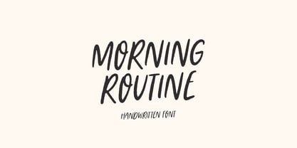 Morning Routine is a handwritten display font perfect for creating quotes, logos, or just adding a handwritten touch to any project! Font is an open type with clean shapes and precise kerning. It includes ligatures encoded by the PUA. Language support: All European languages Don't forget to subscribe so you don't miss out on the new awesome fonts Dima
 - Headline Brush by MJB Letters,
$16.00 Headline Brush is a versatile brush script font designed for a natural, casual feel. Crafted from hand-brushed letters scanned into vector format. Making it ideal for diverse projects like logo design, poster design, blog titles, posters, clothing, and branding. The font's variations and alternative underlines enhance text and design, adding a distinctive touch to any professional endeavor.
 - Kufwan by Twinletter,
$15.00 Kufwan Arabic style display font can be used to give your designs a genuine Arabic touch. The display font displays a beautiful style similar to the handwriting on a typical Arabic book. Use this font in your super projects to grab everyone’s attention. Don’t put off adding an elegant Arabic touch to your designs any longer.
 - Tragicomic by Veil of Perception,
$20.00 Tragicomic is a handwritten font which was originally conceived as a style which could be used in word balloons in comics and graphic novels. Swash characters, alternative letter forms, and a dingbat font were added to make it usable for brochures, personal notes, invitations, holiday greetings and other more general applications requiring a style with a personal handwritten touch.