9,069 search results
(0.022 seconds)
- Dontheus by Lemonthe,
$12.00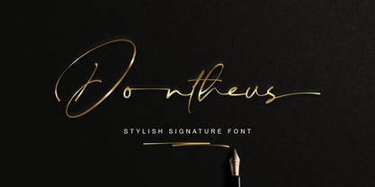 Dontheus is a Stylish Signature font, with a natural & stylish flow. Dontheus Font is perfect for many different project such as logos & branding, invitation, stationery, wedding designs, social media posts, advertisements, product packaging, product designs, label, photography, watermark, special events or anything.
 - Born Strong by Rook Supply,
$16.00 Born Strong is built with athletics in mind. The goal was to make the perfect typeface for sports teams, college football, athletic wear and everything in between. The font family supports a wide range of languages and is available in many different weights.
 - Farmer by SparkyType,
$19.00The OpenType version of Farmer contains two sets of slightly different upper-case letters. The alternate version is accessible as Titling Caps in OpenType feature enabled software. Mixed and matched they create a strong and persuasive headline, logo or For Sale notice. - Auster Rounded by Resistenza,
$39.00 Auster Rounded is a based on our First sans serif font Auster . The structure is based on reversed contrast, with a rounded corner. We recommend Auster Rounded, for branding, magazines, logos, ads, banner etc More About Opentype Features: https://bit.ly/opentype-rsz
 - Kinderly by FallenGraphic,
$19.00 Kinderly is perfect for many different projects such as logos & branding, invitation, stationery, wedding designs, social media posts, advertisements, product packaging, product designs, label, photography, watermark, special events, or anything. what’s inside : Accents (Multilingual Characters) PUA encoded Numerals and Punctuations (OpenType Standard) ligature
 - Meter Room JNL by Jeff Levine,
$29.00 The design idea for Meter Room JNL comes from a vintage brass hand-cut stencil of the words "High Voltage". What makes this stencil font a bit different than others is the placement and angle of some of the "breaks" within the letters.
 - Mourning by FallenGraphic,
$19.00 Mourning is perfect for many different projects such as logos & branding, invitation, stationery, wedding designs, social media posts, advertisements, product packaging, product designs, label, photography, watermark, special events, or anything. what’s inside : Accents (Multilingual Characters) PUA encoded Numerals and Punctuations (OpenType Standard) ligature
 - Thunderhouse by Aerotype,
$29.00 A tasty jambalaya of two different weights of wood type, Thunderhouse has alternates for every capital and lowercase letter, consecutive characters are controlled with the OpenType Ligature feature. Thunderhouse Pro extends the character set to support Eastern European Latin, Baltic, Greek and Turkish.
 - Osaka Japan by Yoga Letter,
$20.00 "Osaka Japan" is a Japanese font style. This font is very unique and elegant, so it can be used for various purposes, such as posters, banners, branding, logos, restaurant promotions, film titles, and others. Equipped with uppercase, lowercase, numerals, punctuation, and multilingual support.
 - Sugar Sand by Ira Natasha,
$10.00 Sugar Sand is a handwritten sans serif font. A new fresh handmade font with rough edges. This font is support multi language. It will be perfect for many different project ex: quotes, logo, blog header, poster, branding, fashion, apparel, letter, invitation, stationery, etc….
 - Astrab by Yoga Letter,
$18.00 "Astrab" is a very elegant modern brush font. This font is equipped with uppercase, lowercase, numerals, punctuation, and multilingual support. It is suitable for logos, banners, posters, prints, branding, stickers, business branding, svg, kdp, Christmas, graduation, the 4th of July, and others.
 - Fokers by Letterhend,
$14.00 Fokers, a new display typeface with classy and luxury look! Fokers' different styles works perfectly for headline, logotype, apparel, invitation, branding, packaging, advertising, and more. Fokers comes in uppercase, lowercase, with punctuation, symbols, numerals, stylistic set alternate, ligatures and also multi-lingual support.
 - RMU Royal Sans by RMU,
$35.00 RMU Royal Sans is an early 20th century sans serif which was first released as Wotan by Wagner & Schmidt in 1914. The regular version is the most beautiful and characteristic of this family which contains several styles of different weights and widths.
 - Daddy The Comicaze by Colllab Studio,
$19.00 "Hi there, thank you for passing by. Colllab Studio is here. We crafted best collection of typefaces in a variety of styles to keep you covered for any project that comes your way! So, you know the fonts that look like handwriting in the movies by Disney? Well, ours is like that! But it can also be used for other purposes, and it's fun to write with. Daddy The Comicaze is fun handwriting font, it was inspired by our love of cartoons and comic books, but as always, we wanted to add a little bit of humor to it. So we played around with the kerning and spacing until we came up with something that was both fun-looking and easy to read. What else is special about Daddy The Comicaze? Well, for one thing, it includes a lot of different characters! There are tons of punctuation marks and accented letters you won't find in normal fonts. And since it's based on our handwriting style, each character has its own unique personality. Basically, we've taken the best parts of our handwriting and turned them into a beautiful font. A Million Thanks Colllab Studio www.colllabstudio.com
 - Bintank by Twinletter,
$12.00 Bintank is a playful script font made in freehand and abstract nuances but still beautiful and elegant when used. This font is designed beautifully in each letter, there are alternate options in lowercase letters so that when written, it can produce words or sentences that are pleasing to the eye so that it automatically beautifies the visual appearance in your design project. this font also offers the beauty of abstract typography harmony for a wide variety of design projects, including digital natural handwriting for designs, wedding invitations, quote designs, for social media business designs, advertisements, trademarks, food and beverage promotion banners, text, posters, a signature, and all designs require handwriting or whatever design you want. This font is equipped with uppercase, lowercase, numbers, punctuation marks, swhases, and several variations on each character including multi-language. What's Included: Font file Web Fonts Standard glyph Binder Works on PC & Mac It can be accessed in Adobe Illustrator, Adobe Photoshop, Adobe InDesign, and even works in Microsoft Word. PUA Encoded Characters - Fully accessible without additional design software. Fonts include multilingual support for; Afrikaans, Albanian, Croatian, Czech, Danish, Dutch, English, Estonian, Finnish, French, German, Hungarian, Italian, Norwegian, Polish, Portuguese, Slovak, Slovenian, Spanish, Swedish
 - Tailpen by Yumna Type,
$25.00 It is a tough task to create a visual identity without using a characteristic, multipurpose font to represent your brand in order to look different, yet unexaggerating. For that reason, let us welcome Tailpen, the perfect balance of simplicity, charm, and boldness to live up your brand identity. Tailpen is a display font in simple, inclined square letter shapes to show charming, real, attractive nuances. It is greatly legible due to the simple shapes in high contrasts with which you can apply this font for various text sizes. It also gives you a clipart as a bonus and you can make use of the available features here as well. Features: Multilingual Supports PUA Encoded Numerals and Punctuations Tailpen fits best for various design projects, such as brandings, posters, banners, headings, magazine covers, quotes, printed products, merchandise, social media, etc. Find out more ways to use this font by taking a look at the font preview. Thanks for purchasing our fonts. Hopefully, you have a great time using our font. Feel free to contact us anytime for further information or when you have trouble with the font. Thanks a lot and happy designing.
 - Raina by Nathatype,
$29.00 Want to have a more unique design? Raina is a new way to show uniqueness and freedom in your design. Raina is one of the sans serif font combinations with the display font. Unlike the other solid, firm displays of sans serif font, Raina expresses more artistic, unique displays as a result of the display font’s character combinations. Its differing letter shapes from ordinary alphabets create uniqueness for this font because each letter has no straight lines, but indentations or cavities instead, and no tiny lines or hooks as a sans serif font character. With the unique shape of this font, use this font on bigger screens for a legibility reason. This font has included outstanding features to take your creativity and ideas to the next level. Features: Ligatures Multilingual Supports PUA Encoded Numerals and Punctuations Raina fits for various design projects, such as posters, banners, logos, book covers, quotes. , headings, printed products, merchandise, social media, etc. Find out more ways to use this font by taking a look at the font preview. Feel free to contact us if you require more information when you are experiencing a problem. Thank you. Happy designing.
 - Gravesend Sans by Device,
$39.00 Smart, legible and elegant, Gravesend Sans is a based on the unique typeface used for the iconic grass-green signage for the Southern Railway. In existence from 1923 to 1948, when the network was nationalised, the Southern Railway linked London with the Channel ports, South West England, the South coast resorts and Kent. The same design was also used for the ‘hawkeye’ signs on the London, Midland and Scottish Railway, differentiated by black letters on a yellow background. Reference for each letter was taken from vintage ‘target’ station nameplates and other platform signage. The rarest letters were the Q, seen in Queens Road Battersea, the X, seen in East Brixton, and the Z, used in Maze Hill, site of an infamous train crash in 1958. Being hand-made, the letters often differ in width and thickness. There was no lower case. The Bluebell Railway, a heritage steam line, runs over part of the old Southern Railway network and uses a very similar type. The design of the numbers differed considerably, but here have been taken from the Device 112 Hours font Smokebox. As well identifying platforms, they were used on the front of the steam engine’s smokebox, hence the name, and stylistically are more in keeping with the letters than some of the squarer versions that can be seen in old photographs. William Caslon IV is credited with the first Latin sans-serif type, shown in a 1816 Caslon specimen book. ‘Two Lines English Egyptian’, as it was called, was caps-only, and there are several other correlations between that type design and this one. Includes a selection of authentic arrows and manicules, plus abbreviated ligatures such as ‘St.’ (Saint or Street) ‘Rd.’ (Road) and ‘Jn.’ (Junction). The Cameo version includes many graphic banner elements that can be freely combined.
 - Eyadish by Eyad Al-Samman,
$7.00 Eyadish is an entertaining, comic, and childish font. The name of this font is originally derived from two main syllables. The first one is "Eyad-" which refers to my first name and the second syllables is "-ish" which means characteristics of or relating to. Hence, "Eyadish" refers to the characteristics that "Eyad", the typographer, himself has and had during his childhood. I do like this font for its childish and comic shapes. I have decided to design this font trying to leave a humble and personal imprint regarding the magic and innocent world of all children. Frankly, it is my most favorable designed font. This font comes in two different weights with facilities for writing and publishing in different alphabets included in various Latin and Cyrillic texts and scripts. "Eyadish" is primarily designed to be fit with all prints of kids, children, and juveniles' products. It is major usage is in advertisements and publications. It is suitable for T-shirts, books' covers of children such as fairy tales and comic stories, advertisement light boards in malls, and titles in parental, childish, comic, and other related magazines. "Eyadish" also can be printed in many children's products such as garments, towels, shoes, socks, toys, pacifiers, diapers, exhibitions, festivals, books titles and contents, medicines' packages, kindergartens' signs, buses, comic and TV series, kids and children organizations and charities names, images, software, foods including milk cans, candies, chocolates, and other related products. The font is extremely and distinguishably attractive when it is used with various, and vivid colorful letters and words in posters, cards, and placards. "Eyadish" is specifically designed for commercial, educational, cultural, and social purposes related to infants, babies, kids, and children. The main characteristic of "Eyadish" Typeface is in its childish look that remains when anyone reads or types or even deals visually with its characters.
 - FS Shepton by Fontsmith,
$80.00 Handy Andy Andy Lethbridge had only just completed his graphic design BA at the University of Portsmouth when he was spotted by Jason, who’d seen Andy’s exquisite hand lettering at his degree show and on Instagram. Keen to push the handwritten theme further, having recently launched a digitally-created, chalky script font (FS Sammy), Jason offered Andy a job and the chance to develop a suite of more stylised, truly hand-drawn fonts. Andy duly got out his pads, pencils and pens, and started experimenting with styles and textures. Magic followed. Imperfection perfected Most ‘handwritten’ typefaces are created entirely digitally. Not FS Shepton. From the start, the intention was to create a collection of alphabets of similar character but different texture and style – 100% hand-drawn and purposely imperfect, with the kind of inconsistent, organic shapes and textures of market stall signs, dashed off in chalk or paint. FS Shepton Regular, drawn with a wet brush pen, is solid with a rough outer edge and a casual but controlled feel. The dry brush used to create FS Shepton Light gives it more inner texture and a more formal, slanted, calligraphic style. FS Shepton Bold, drawn using a wider, looser dry brush pen, has a woody grain in the middle of its broad strokes and greater solidity where the brush moves more slowly. Fresh as a daisy Think of FS Shepton not as a family of three weights of the same font so much as a collection of three fonts penned by the same author. All of them – the light, regular and bold – were created independently as display fonts that offer something different to labelling, packaging, point-of-sale and advertising. Lovingly crafted by hand, they’re a good match for products and settings that share the same artisinal qualities: organic foods, drinks and healthcare products, as well as premium chocolate, coffee and condiments.
 - Churchward Tua by BluHead Studio,
$25.00 Churchward Tua and Churchward Tua Italic are two more OpenType font releases by Bluhead Studio from the exciting and unique library of Joseph Churchward type designs. The Tua fonts sport an Old West, cattle drive sort of look. One can imagine Tua being used on the swinging front doors of the local saloon or jailhouse. These fonts are perfect for headlines, posters or wherever you want to express your inner cowboy. Giddy-up!
 - Jenriv by Linh Nguyen,
$25.00 Inspired by designs of the early Renaissance, Jenriv brings out a sedate atmosphere and generous inner spaces. Starting with the idea of mixing straightforward strokes and curves, it results in kind masculine figures, but calm and humble. It reminds some archaic air but a simplified one. Jenriv embraces text flows, multiple languages, and various styles with standard OpenType features. It is well adapted to various applications, from medium body text to large headlines, or logotypes.
 - Sforza by Ampersand Type Foundry,
$65.00 After visiting Milan, I stumbled upon the Sforza castle, and found some interesting type on the inner courtyard castle walls. I became inspired by what I found, and decided to design a typeface based off of the limited quirky letterforms. Thus Sforza was born, with ligatures galore, alternates, pictograms, and swooshes. Sforza is a roman style typeface with a quirky flair. It has loads of ligatures, nested letterforms, and tails and swooshes for endless combinations.
 - Maestrale by Catharsis Fonts,
$25.00 Maestrale is a paradigm-breaking new take on calligraphy, built around a compact, serif-style core and outrageously long, flamboyant extenders. At large sizes, its confident, charismatic lettershapes are ideally suited for branding and decorative uses, whereas longer texts at smaller sizes naturally weave themselves into a flowing texture. The font comprises 1299 glyphs, including many stylistic alternates, ligatures, small capitals, and initial, terminal, and linking forms, and offers extensive OpenType programming to support them. The calligraphic form of Maestrale is complemented by a matching text font (Maestrale Text) with short extenders, available in three cuts (a serif-style Roman, an upright Cursive, and a tilted Italic). Maestrale is all about the lowercase; its capitals are deliberately understated so as not to steal the limelight. In fact, the font works very well when set exclusively in lowercase. Maestrale�s small capitals are fitted into the core space of the lowercase, allowing them to be freely interspersed with lowercase characters. Alternately, an OpenType feature is available to replace a and e in small-caps text with their lowercase equivalents for a fresh unicase look. Since alternates and ligatures play such an important role, Maestrale offers three different modes of use. The most straightforward approach is simply to start typing using Maestrale Pro � the extensive OpenType programming will ensure that collisions between extenders are avoided and attractive ligatures are substituted for common glyph combinations. A more interactive approach is provided by the font Maestrale Manual, which allows the user to manually select alternate forms and ligatures even in typographically unsavvy applications, such as PowerPoint (as long as standard ligatures are supported). Stylistic alternates are simply represented as ligatures of their base forms with one or more instances of the rarely-used by easily-accessed characters "~" (ASCII tilde) and "`" (spacing grave accent); linking forms are built with �_� (underscore), multi-character ligatures with "|" (pipe), and initial and terminal forms with the �less than� and �greater than� characters. For instance, the Maestrale wordmark in the posters above was simply typeset with the string (`ma`est|r_a```l```e)| in Maestrale Manual (The parentheses represent �less than� and �greater than� characters here.) Feel free to type this string into the test line below and see what happens! Make sure Standard Ligatures are enabled. An instruction sheet listing all alternate forms and their accessibility is available from the Gallery tab on this page. The third mode of usage is aimed at professional designers, who make use of sophisticated software with extensive OpenType support. These power users are advised to use the font Maestrale Pro again, where all glyphs are accessible as stylistic alternates. Maestrale Text is a less extravagant but more versatile variation on the design of Maestrale, replacing Maestrale�s swashes with efficiently compact extenders. It is intended to serve as a perfectly matching text companion to Maestrale calligraphy, but constitutes a full-fledged typeface in its own right. It is equally at home at display sizes as it is in pull quotes, titles, and high-impact blocks of text. Maestrale Text comes in three complementary faces: A serif-style Roman, an upright Cursive, and a tilted Italic. Maestrale is the Italian word for �masterful�. It is also the traditional Italian name for the northwesterly mediterranean wind, better known by its French name, Mistral. Acknowledgements: I am grateful to the helpful souls on the Typophile forums for extensive feedback and encouragement on Maestrale, and to the TypeDrawers forum for feedback on Maestrale Text. This font is dedicated to Simone.
 - Freigeist by René Bieder,
$29.00 The story of Freigeist is a journey into the past, back to the early grotesk fonts and long before Helvetica and Co were standard fonts in operating systems. For what we take for granted today is the result of innovation and pioneering spirit of type foundries such as Caslon or Stephenson Blake in the 19th century, whose expressive designs are mostly forgotten today. The Freigeist family captures this untamed spirit — hence the name (German for “free spirit”) — and puts it into a contemporary context, resulting in a multi-faceted family with a wide range of applications, font styles and features for modern typesetting. Design Details Unlike other modern grotesk typefaces like Helvetica or Univers, Freigeist is characterized by a warm and dynamic appearance. It draws inspiration from various historical models such as Caslon’s Doric or the Grotesque variants of Stephenson Blake. Particularly noticeable are the narrow terminals, the serpentine S or the dynamic g in combination with ascenders that reach to the cap-height only. Italics Many italic grotesk fonts are strongly oriented towards their upright counterparts. Unfortunately, this often means that they cannot do justice to their actual task, which is to highlight words or sections of a text. The italic cuts of Freigeist try to remedy this situation by using the greatest possible formal distance while reinforcing the untamed spirit. What adds to this, is a reminiscent of handwritten forms, which can be found in a, n, y or g, as well as the German sharp s or the ampersand. Alternate Characters Alternative letterforms are ideal for customizing the overall appearance of a text, for usage in logos or they can even work as custom fonts for companies. Freigeist comes with ten stylistic alternatives that are easy to insert via the Opentype window, such as the single-storey a, a tail-less version of the a for compact text, when uses in condensed widths or a dialed down version of the r. Languages Freigeist has a built-in support for Latin and Cyrillic based languages and covers more than 210 languages. Opentype Features and Symbols The family comes with many opentype features to support modern typesetting. This includes ligatures, different number sets or alternative shapes for texts set in all caps. Styles Freigeist is available in five widths (XCon, Con, Normal, Wide, XWide) and six weights (Thin, Light, Regular, Medium, Bold, Black). Including the accompanying italics, the family comes in 60 cuts that are suitable for any application. Testfonts If you like to test the fonts before buying the full version, please follow the link below: https://www.renebieder.com/test-fonts Update 1 A lot has changed in this first update. It is more than just a 1.01 or 1.02. It is actually the 2.0! I’ve gone through all! single glyphs of the 18 master files, making the family more sharp and even a bit more modern. I’ve added some new opentype features and redesigned the italics, because I wasn’t happy enough with the result. I’ve added new kerning pairs, new metrics, and even new glyphs. Please check my website for more details on the new design and overview about the opentype features and alternate shapes. If you purchased the Freigeist family already, thanks a lot!! It is the most advanced family that I published so far. I hope that you’re happy with this new version. Thanks!
 - Liliana by Letritas,
$30.00 Liliana is a geometrical typeface, born throughout comprehensive formal studies while testing new ways of displaying certain words and sentences. The essential structure of Liliana is very conservative: It can look similar to other geometrical typographies, however, it has unique features that make this project very special. Liliana is a typeface that will work perfectly while setting short texts, words, and phrases as well. It shall perform greatly even when the paragraph is too short. Thanks to the versatility of its alternate characters, Liliana is perfect to achieve eye-catching texts. The spirit of this typography is focused on its “s” character, which originates from manuscript writings and provides a very special identity. If the text does not contain the letter "s", the intended personality can still be achieved by using alternate characters such as "f", "l", “r” and “L”, which are aligned with the same concept. On top of that, may all this still not be enough, you can furthermore use its ligatures and swashes. It is actually hard not to set a spectacular text with Liliana! Liliana is a typeface optimal for being used in marketing assets, packaging design, magazines, branding, film captions, headlines, editorial, quotes, logos, corporate identity, and motion graphics. The italic version has a 10-degree slant. This feature is intended to convey a gorgeous feeling of tension, power, and agility. It’s very interesting to realize how the dynamism in the italic characters works when compared with the regular ones. The typeface has 9 weights, ranging from “thin” to “heavy”, and two versions: "regular" and "italic". Its 18 files contain 642 characters with ligatures, alternates, and swashes. It supports 219 Latin-based languages, spanning through 212 different countries. Liliana supports this languages: Abenaki, Afaan Oromo, Afar, Afrikaans, Albanian, Alsatian, Amis, Anuta, Aragonese, Aranese, Aromanian, Arrernte, Arvanitic (Latin), Asturian, Atayal, Aymara, Bashkir (Latin), Basque, Bemba, Bikol, Bislama, Bosnian, Breton, Cape Verdean Creole, Catalan, Cebuano, Chamorro, Chavacano, Chichewa, Chickasaw, Cimbrian, Cofán, Corsican Creek,Crimean Tatar (Latin),Croatian, Czech, Dawan, Delaware, Dholuo, Drehu, Dutch, English, Estonian, Faroese, Fijian Filipino, Finnish, Folkspraak, French, Frisian, Friulian, Gagauz (Latin), Galician, Ganda, Genoese, German, Gikuyu, Gooniyandi, Greenlandic (Kalaallisut)Guadeloupean, Creole, Gwich’in, Haitian, Creole, Hän, Hawaiian, Hiligaynon, Hopi, Hotcąk (Latin), Hungarian, Icelandic, Ido, IgboI, locano, Indonesian, Interglossa, Interlingua, Irish, Istro-Romanian, Italian, Jamaican, Javanese (Latin), Jèrriais, Kala Lagaw Ya, Kapampangan (Latin), Kaqchikel, Karakalpak (Latin), Karelian (Latin), Kashubian, Kikongo, Kinyarwanda, Kiribati, Kirundi, Klingon, Ladin, Latin, Latino sine Flexione, Latvian, Lithuanian, Lojban, Lombard, Low Saxon, Luxembourgish, Maasai, Makhuwa, Malay, Maltese, Manx, Māori, Marquesan, Megleno-Romanian, Meriam Mir, Mirandese, Mohawk, Moldovan, Montagnais, Montenegrin, Murrinh-Patha, Nagamese Creole, Ndebele, Neapolitan, Ngiyambaa, Niuean, Noongar, Norwegian, Novial, Occidental, Occitan, Old Icelandic, Old Norse, Oshiwambo, Ossetian (Latin), Palauan, Papiamento, Piedmontese, Polish, Portuguese, Potawatomi, Q’eqchi’, Quechua, Rarotongan, Romanian, Romansh, Rotokas, Sami (Inari Sami), Sami (Lule Sami), Sami (Northern Sami), Sami (Southern Sami), Samoan, Sango, Saramaccan, Sardinian, Scottish Gaelic, Serbian (Latin), Seri, Seychellois Creole, Shawnee, Shona, Sicilian, Silesian, Slovak, Slovenian, Slovio (Latin), Somali, Sorbian (Lower Sorbian), Sorbian (Upper Sorbian), Sotho (Northern), Sotho (Southern), Spanish, Sranan, Sundanese (Latin), Swahili, Swazi, Swedish, Tagalog, Tahitian, Tetum, Tok Pisin, Tokelauan, Tongan, Tshiluba, Tsonga, Tswana, Tumbuka, Turkish, Turkmen (Latin), Tuvaluan, Tzotzil, Uzbek (Latin), Venetian, Vepsian, Volapük, Võro, Wallisian, Walloon, Waray-Waray, Warlpiri, Wayuu, Welsh, Wik-Mungkan, Wiradjuri, Wolof, Xavante, Xhosa, Yapese, Yindjibarndi, Zapotec, Zulu, Zuni.
 - Moksha - 100% free

- Sortie Super by Lewis McGuffie Type,
$40.00 Sortie Super is a take on one of the kings of display lettering - Caslon's high-contrast, reversed stress 'Italian' style. It looks great at big sizes and in short flurries... and shouldn't be used in confined spaces. When compared with the original face, the weight and contrast of Sortie Super has been exaggerated. To add gravity to the letters I've increased their width overall and reduced the spacing to a hair-line fracture for added visual impact. Characters like 'S', 'E','O' and 'Z' are relatively close to their historical precedents - however the terminals on the 'C-G-S-З-Є', which have been drawn so to be more consistent. Other aspects, such as the leg of the 'R' and 'Я', the apex of the 'A' and the spur of the 'G' are revised and simplified, to help spacing and optical weight across the alphabet. Also, to reduce visual noise terminals in characters like 'C', 'J' and 'R'' are horizontally aligned. Meanwhile, the central horizontal strokes in the 'B', 'P' and 'R' etc are reduced to a hairline, so as to create a more simplified system of thick-to-thin. The temptation when drawing this kind of esoteric display alphabet is to start to rely on modular components. Which, while copy-paste-repeat is a sure-fire way to make the face more visually consistent, it's a lazy method that risks allowing the font become soulless and mechanical. An early experiment I made was making a monospaced version, which was useful in headlines, but it lost that loving feeling. So, by maintaining a handful of flourishes – the tail of the '?', the inky drop of the '!', the bulbous gloop of arms of the 'Ж' and 'К', the swirling legs in the 'R', 'Я' and 'Л', the big-bowling weight of the 'J' and 'U' – plus a few in-built inconsistencies and a bit of its own silliness, Sortie Super retains some of the organic warmth of its ancestor. Conversely, the counters, apertures and negative space are largely rigidly geometric, which helps give the revival font a bit of a modern touch. Sortie Super is an uppercase-only display font that comes with Western, Central and East European Latin, extended Cyrillic, Pinyin, as well as a set of hairline graphic features and symbols.
 - ITC Ellipse Neo by Typorium,
$30.00 The Typorium presents a new optimized and enriched version of ITC Ellipse which first appeared in 1996 in the International Typeface Corporation typeface library. ITC Ellipse Neo design has been lightly modified. Three weights have been added (light, Medium, Extra Bold, including Italics) to the original Regular and Bold styles. ITC Ellipse Neo is both modern and classic. Modern in the unusual shape based on the geometric ellipse form. And classic in the structure of some letters like the lower cases c, e, g, o, s. These letters alone could come from a traditional typeface, but they fit perfectly with the atypical rest of the alphabet giving it a present-day and traditional mix. Furthermore, the ellipse shape fits naturally in the italic styles, giving the font an organic and fluid feeling. ITC Ellipse Neo offers OpenType features such as alternate characters for upper and lower case, and an extended accented character set to support many languages. Five weights have been created for each style to offer a wide range of graphic possibilities in a tidy digital footprint. Designer: Jean-Renaud Cuaz Publisher: Typorium MyFonts debut: December 15, 2020 Le Typorium présente une nouvelle version optimisée et enrichie d'ITC Ellipse qui est apparue pour la première fois en 1996 dans la bibliothèque de caractères de l'International Typeface Corporation. Le design de ITC Ellipse Neo a été légèrement modifié. Trois graisses ont été ajoutées (léger, moyen, extra gras, y compris les italiques) aux styles originaux Regular et Bold. ITC Ellipse Neo est à la fois moderne et classique. Moderne dans le dessin inhabituel basé sur la forme géométrique de l’ellipse. Et classique dans la structure de certaines lettres comme les minuscules c, e, g, o, s. Ces lettres pourraient provenir d'une police de caractères traditionnelle, mais elles s'intègrent parfaitement avec le reste de l'alphabet plus insolite en lui donnant un mélange de modernité et de tradition. De plus, la forme de l'ellipse s'intègre naturellement dans les styles italiques, donnant à la police une sensation organique et fluide. ITC Ellipse Neo offre des fonctionnalités OpenType telles que des caractères alternatifs pour les capitales et les bas de casse, et un jeu de caractères accentués étendu pour prendre en charge de nombreuses langues. Cinq graisses ont été créés pour chaque style afin d'offrir un large éventail de possibilités graphiques pour une empreinte numérique rigoureuse.
 - Wilhelm Klingspor Schrift by Alter Littera,
$25.00 A comprehensive and faithful rendition of one of the finest metal typefaces of the 20th century. Rudolf Koch designed Wilhelm Klingspor Schrift (initially conceived as “Missal Schrift”, and later referred to also as “Wilhelm Klingspor Gotisch”) between 1919 and 1925 for the Gebr. Klingspor Type Foundry in Offenbach am Main. It is an impressive textura typeface, being sharp, elegant, spiky, sensitive and noble at the same time. Some of its most notable features have to do with the delicate decorations, the thin but subtly swelling lines that parallel or bridge strokes in the capitals, the hairline endings that terminate each stroke in both the capitals and the lowercase letters, the subtle joining of hairlines to thicker strokes, and the tension of some of the transitional curves. Koch’s original design included two sets of capitals (normal and condensed); alternates for a, d, e, r, s and z, plus long s; short and long flourished finial forms for f and t; thirty-five ligatures; and eighteen decorative pieces (Zierstücke). All of these features, plus several additional ones for modern use (including the usual standard characters for typesetting in modern Western languages, additional alternates and ligatures, plus carefully coded Opentype features), have been thoroughly implemented to the highest and most lively level of detail in the present font, in the hope that the past greatness of Wilhelm Klingspor Schrift will finally step into the modern OpenType realm. The main sources used during the font design process were several pages from a specimen book issued by the Gebr. Klingspor Type Foundry in 1927. Other sources were as follows: Bain, P., and Shaw, P. (Eds.) (1998), Blackletter: Type and National Identity, New York: Princeton Architectural Press (p. 43); Hendlmeier, W. (1994), Kunstwerke der Schrift, Hannover: Bund für Deutsche Schrift und Sprache (pp. 56-7); Kapr, A. (1983), Schriftkunst, Dresden: VEB Verlag der Kunst (p. 453); Kapr, A. (1993), Fraktur - Form und Geschichte der gebrochenen Schriften, Mainz: Verlag Hermann Schmidt (pp. 124-5); and Klingspor, K. (1949), Über Schönheit von Schrift und Druck, Frankfurt am Main: Georg Kurt Schauer (pp. 136-7). Some public and private comments by renowned designer and design historian Paul Shaw have also influenced both the design and the description of the present font. Specimen, detailed character map, OpenType features, and font samples available at Alter Littera’s The Oldtype “Wilhelm Klingspor Schrift” Font Page.
 - Bodoni Ornamental by FontMesa,
$30.00 New for 2020 Bodoni Ornamental now has two italics to choose from, one basic italic and a second which is more of a true italic with a few uppercase letters that have been stylized. Only one italic can be style linked to the regular upright version so in the second italic we've added Avanti to the name which means forward in Italian. When purchasing the regular upright and Avanti italic together they will install as two separate families. Bodoni Ornamental is a revival of a very old typeface based on the Poster Bodoni letter shape. Giambattista Bodoni passed away in 1813, this decorative version was created in the 1820’s or 1830’s which was the time period when many of these ultra bold decorated type faces began to appear, the original artist is currently unknown. The original version of this ornate classic was only available as a set of uppercase letters, today over one hundred eighty years later this font is now complete with a new lowercase, numbers and accented characters for Eastern, Central and Western European countries. Due to the ornate detail in Bodoni Ornamental when printing itís recommended to use a laser printer 600dpi or greater, a 1200dpi printer will give you the best results rendering the most detail at the smallest possible point size for this font. Small home user Ink Jet printers are not recommended for Bodoni Ornamental unless you set the font to a very large point size. With Ink Jet printers much of the detail in the letters will bleed together as the ink hits the page, commercial Ink Jet printers such as GiclÈe printers may give good results. When using Bodoni Ornamental for digital images including web site graphics it may help to add a one pixel stroke fill around the letters setting color to white or grey, this may help the web site images display better on some computer's. You will need a photo editing application such as Adobe Photoshop to create your image adding the stroke fill and save as a jpg , png or gif file. I hope you enjoy this old font as much as I did making it. Note: When previewing the Bodoni Ornamental font in the Windows font preview you may notice some letters appearing lighter and some darker, this is a problem with the preview window and some ornate fonts, Bodoni Ornamental will print normal and not with mixed light and dark letters.
 - Kids Place by Sabrcreative,
$10.00 Introducing Kids Place, a delightful and vibrant display sans serif font designed to bring joy and playfulness to your designs. This font is perfect for adding a touch of whimsy to children's books, nursery decor, party invitations, and more. Let your creativity soar with Kids Place and create designs that capture the imaginations of both young and young-at-heart. With its charming combination of uppercase and lowercase letters, Kids Place offers versatility and adds a sense of fun to your typography. The extensive set of numbers and punctuations ensures consistency and usability in various design projects. Kids Place goes beyond language barriers with its multilingual support, allowing you to express your messages in different languages and connect with a global audience. From English to Spanish, French to German, Kids Place provides a seamless experience. Unlock the full potential of Kids Place with its PUA encoding, which grants easy access to additional glyphs and characters. This feature enables you to add playful elements and unique touches to your designs, making them truly stand out. Let your imagination run wild with Kids Place, the perfect font for all your whimsical and playful projects. Whether you're designing for children or simply embracing your inner child, Kids Place is the font that will bring a smile to your face.
 - Kremlin Grand Duke - Unknown license

- Lugano by Greater Albion Typefounders,
$14.00 Lugano has it’s inspiration in 1920s advertising material and is ideal for lively banner lettering, posters and cover design. Four typefaces are offered - Lugano comes in regular, alternate, striped and alternate striped forms. Try it out and inject a little fun into your work today!
 - Magis Authentic by Lemonthe,
$14.00 Magis Authentic is a signature style font, with a natural & stylish flow. Magis Authentic Font is perfect for many different project such as logos & branding, invitation, stationery, wedding designs, social media posts, advertisements, product packaging, product designs, label, photography, watermark, special events or anything.
 - Aldersgate by Elemeno,
$25.00Aldersgate was designed as a comfortable, easy-to-read sans serif alternative font for a series of retirement community brochures. It was intended to compliment existing sans serif fonts for subheads and captions and is ideal when a conservative but subtly different font is needed. - Jumbox by Tour De Force,
$25.00 Jumbox is display family containing five weights that are actually layers. Combining them with different colours, Jumbox will bring strong sense of graphicism in your titles, product names, signage, billboards, packaging, web page headings – for wide range of uses. Comes with pack of ligatures.
 - Only Wishing by FallenGraphic,
$19.00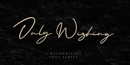 Only Wishing is perfect for many different projects such as logos & branding, invitation, stationery, wedding designs, social media posts, advertisements, product packaging, product designs, label, photography, watermark, special events, or anything. what’s inside : Accents (Multilingual Characters) PUA encoded Numerals and Punctuations (OpenType Standard) ligature
 - JustTall by OneSevenPointFive,
$10.00 JustTall is an ultra condensed typeface with open type features, 400+ characters with 80+ languages support made for tight spaces. Useful for - Logos for companies with really long names Different texts with very little space available Very tall design types Give feedback: https://bit.ly/3FlmhDS
 - Schattig by Aisiv,
$39.00 Schattig was designed by Alexis Carrillo, published by Aisiv. Schattig is ideal for titles, booklets, and old photograph-style designs, the font contains Basic Latin and Latin-1 (ISO 8859-1) characters, along with 53 different ligatures for more realism to your titles and designs.

