9,069 search results
(0.031 seconds)
- Sukkergris by Bogstav,
$15.00 Need a catchy headline font with a clear handmade and organic look? Look no further, because Sukkergris is here to do the job! Each letter is handmade and manually cleaned up, but keeping the original quirky curves. I have added 6 different versions of each letter, which automatically cycle as you type. I also added a set of small caps, just because I think they look awesome!
 - Khamai Pro by DBSV,
$30.00 Khamai Pro is a first attempt at writing a monoline main feature of the curves. Completed after 17 months with many design twists,and also an attempt to provide a different visual design and style as Staccato: (dashed line) Rail: (double line) and Tribe: (triple line). This series of 16 fonts with 625 glyphs each includes true italics and supports Latin, Greek and Cyrillic.
 - Geekabeat by PizzaDude.dk,
$20.00 Geekabeat is my wooden lookalike grunge typeface! All uppercase letters has got a funky swirl. Comes with different upper- and lowercase letters, alternate letters (both upper- and lowercase!) and ligatures for both double letters and double numbers, along with ligatures for most common letter-combinations - and of course it has got unique accented letters! You will need to use OpenType supporting applications to use the ligatures.
 - Flowa by Cihangir Öziş,
$10.00 Flowa typeface is designed to make a difference in your work with its strong and contrasting stance that contain in itself soft and hard lines simultaneously. Flowa is suitable for branding, album cover designs, posters designs, packaging and editorial. It can be used for websites and digital media. It is an excellent choice for short sentences, big hero titles, unique logo fonts, in particular.
 - Threatening Letter by AineX,
$14.00 Threatening Letter is a decorative font, inspired by vintage looking newspaper letters with grunge effect added to it. It’s meant to resemble a ransom note and it allows the user to play with combinations of uppercase and lowercase to always get different effects and avoid letter repetition. This font can be used for various things such as posters, T-shirts, magazines, book covers and headlines.
 - Baremy by Luxfont,
$19.00 Get ready to wow the world with inspiring 'Baremy' family of doodle fonts. Three unique styles, one art. Unleash your creativity! These three unique typefaces, while diverse in appearance, share a common theme—they add a unique handcrafted charm and artistic touch to your projects. Features: - 3 doodle fonts in the family - All fonts of different types, combined with a style. - Multilingual - Kerning ld.luxfont@gmail.com
 - 2 Quadro by Apostrof,
$50.00 This big family summarizes and develops the tradition of boldface squared-off 45° shear sanserifs. Known from the middle of 19th century and actively used in different times (1920s, 1970s) is still usable now, thanks to its brutal expression, monumentality and possibility to fully maximize the flatness without loss of readability. This font is especially good for filling letters with photos or to create geometrical “constructivist” compositions.
 - Tamitsa by QubaType,
$20.00 Tamitsa is a condensed display sans font. The font is universal and can be used in different directions of graphic design - Internet, printed materials, clothing, logos, posters, labels, navigation and more. Thanks to character compression, you can place a large amount of information in a compressed space. It will read equally well in large and small sizes. Tamitsa contains 4 fonts: 2 regular and 2 slanted.
 - Black Blocker by Sign Studio,
$10.00 This is Black Blocker, a font that can make contrast to the text. Having a corner of the box on the inside that becomes unique. It is suitable for posters, titles,banding, tags, quotes and more. Developed from the sans-syerif family makes it easy to apply to designs. Reach many languages with Adobe CE standards (over 331 characters). Take it to make your design be different.
 - Quatsity by Ingrimayne Type,
$5.00 Quatsity is a squarish or boxy serifed font with rounded corners. Quatsity is is suitable for titles or signage and legible enough for small blocks of text. Quatsity-Light was constructed in 1995 by blending two very different faces, a typeface very similar to Kwersity (with low contrast) and one similar to Qwatick (with high contrast). The other seven styles were added in 2020.
 - Hob Gob NF by Nick's Fonts,
$10.00Although not credited, the inspiration for this typeface, originally called "Dancer", has all the earmarks of the work of legendary lettering artist Alf Becker. Creepy and kooky, mysterious and spooky, but not in the least ooky, this monocase face is just what the doctor ordered; Dr Frankenstein, that is. Both versions of this font include the complete Unicode Latin 1252 and Central European 1250 character sets. - Astrella by Handpik,
$13.00 Hello, this time we want to introduce a new product. namely "Astrella Typeface", a Serif display font that has a classic, feminine and elegant style. Mechta font is perfect for many different projects such as logos & branding, invitation, stationery, wedding designs, social media posts, advertisements, printed quotes, product packaging, product designs, label, photography, watermark, special events or anything. Feature Uppercase Lowercase Numeral Functional Ligature Stylistic Multilingual
 - Ovaltown by Ingrimayne Type,
$9.00 Ovaltown is a geometric font family with three weights in which the letters are derived from ovals or ellipses. It does to have true lower-case letters but many of the characters in the lower-case slots differ from the corresponding characters in the upper-case slots. Ovaltown is strange, unusual, and bizarre and can be useful when one wants strange, unusual, and bizarre lettering.
 - Sigwald by Good Java Studio,
$20.00 Sigwald is born from bold and fun style fonts. That's available on other file from letter A-Z and a-z. Versatile for design poster, logo, branding, label, quote, headline profil, banner, t-shirt design, packaging, magazine, brochure, and many more your amazing work with this fonts. Features: - Included file: Sigwald Regular (OTF) - Simple installation - Support for MAC and PC - PUA encoded - Stylistic Alternates
 - Easter Park by Yoga Letter,
$17.00 "Easter Park" is a very cute display font and is perfect for your Easter moments. This font is equipped with uppercase letters, lowercase letters, alternate lowercase letters, alternate uppercase letters, multilingual support, symbols and numbers. This font is very easy to use and there is already a user guide in the preview. Can also be used for posters, stickers, banners, logos, covers, movie titles, and more.
 - Elemental Sans Pro by Latinotype,
$39.00 Elemental is a font created in 1997 and launched in 2001. It is a Sans Serif of humanist type and its principal characteristic is a hybrid between different form of calligraphic outlines. In 2010 it was redesigned for Chile’s bicentenary in Opentype version and an improved italic. It is offered in eight weights: Light, Regular, Bold and Extrabold and small capitals for each one of them.
 - Bakersfield by Arendxstudio,
$19.00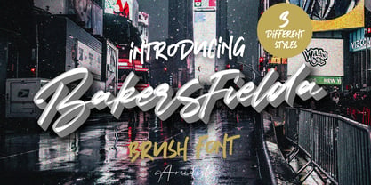 Bakersfield is a combination font with 3 different style variations that will make you feel easy to apply in your various design projects. Bakersfield comes with OpenType features such as stylistic alternates, stylistic sets and ligatures. Bakersfield is perfect for logotypes, posters, badges, book covers, tshirt designs, packaging and much more. Features : • Character Set A-Z • Numerals & Punctuations (OpenType Standard) • Accents (Multilingual characters) • Ligature • Alternate
 - Callient by Ergibi Studio,
$20.00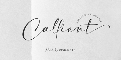 Callient is a Modern signature font presentation from Ergibi Studio. This font includes uppercase, lowercase letters, numbers, punctuation, symbols, binders and multilingual support. Callient is perfect for branding, photography, invitations, quotes, watermarks, advertisements, product designs, social media posts, stationery, labels, and more! I hope you enjoy this font. If you have any questions please don't hesitate to drop me a message :) Thank You, Ergibi Studio
 - Ritz Stencil JNL by Jeff Levine,
$29.00Browsing online auctions and other webs sites often unearths wonderful examples of lettering from the past. A perfect example is Ritz Stencil JNL, modeled after a page from a 1930s-era lettering book. Although this font has similar characteristics to other better-known designs, there are enough unique differences to let it stand on its own as a great example of the Art Deco era. - Halavah Twist JNL by Jeff Levine,
$29.00Halavah Twist JNL is a casual serif font designed by Jeffrey N. Levine and modeled after an early-1960s display font that was quite popular in its day. This new interpretation takes on an entirely different look from the original, creating a modern-yet-retro design. Light, playful and fun-loving, Halavah Twist JNL is perfect for any project that exudes a bubbly warmth and enthusiasm. - Nanumunga by insigne,
$11.95Insigne is pleased to release Nanumunga, inspired by the carefree antics of tropical fish. Designers will find this typeface is useful whenever a relaxed and lighthearted typeface is required. Nanumunga is a versatile face. The font includes small caps and a shadow alternate for titling. Some potential uses are advertising for children's products, tropical destinations, or just whenever you need a slightly different "cartoon" look. - Fastest by Letterara,
$16.00 Fastest is a unique and modern sans serif font, specially designed for headlines, big text, branding, logotypes, marketing graphics, banners, posters, signage, and display usage. It can easily be matched to an incredibly large set of projects, so add it to your creative ideas and notice how it makes them stand out! This font is PUA encoded which means you can access all of the amazing glyphs.
 - Snushane by PizzaDude.dk,
$17.00 Another one of those "perfect for a headline that needs an organic and handdrawn look" fonts. Snushane has a lot of character and likes to play with it's organic typographic muscles. I've added 5 different versions of each letter that automatically cycles as you type - and that goes for the Regular, Outline and Inside versions. All of these versions have multilingual support as well!
 - Running Hipster by Hanoded,
$15.00 Running Hipster is a tall, thin and all caps font with a funny name. The upper and lower case letters differ and can be mixed. You don’t necessarily have to use it to market your free range sheep woolen jumpers or organic button squash and soy based sour cream soup, feel free to use it for just about anything. Comes with a vintage amount of diacritics.
 - Birdland by Gatype,
$14.00 Birdland is a sweet and romantic handwritten font featuring a unique up and down flow. Use it for wall displays, product packaging, wedding invitations, social media post logos, and any project that requires impressive typography. It will add a splash of luxury to any design project you want to make! This font is PUA encoded which means you can access all the amazing glyphs and binders easily!
 - Tact Slab by Pesic,
$35.00 Tact Slab is geometrically slab serif font, black and condensed looks glyphs, with an alternative glyph set to improve its use in different graphic contexts. Tact Slab is compatible with the sans serif font Tact. It is suitable for use in the fields of science, art, architecture, urban planning, techniques, electronics, advertising, futuristic themes, sport, film, computers, phones, video games, magazines... Contains all Latin and Cyrillic glyphs.
 - LT Chickenhawk - Personal use only

- Technical Signature by MMC-TypEngine,
$42.00 ‘Technical Signature’ 2015-2021. A Pixel labyrinthine Display Type System! Plus, Digital “Layer Game”, Futuristic & Sci-Fi Optical Texting for interfaces evolution Landmarks! Now with 3D Styles! 18 Styles total! Revised, Verified & Updated New Edition ! It was inspired also by antique juxtaposed zig-zag Greek mosaics ornaments “ancient times computer” which defined it into a Small Caps Font, while another pair font with same metrics was made to reminisce the manuscript look as a “sister” and Cursive symbiont. Searching for a technical language and perpetration, resulted in many combined styles by matching the primary ones so there’s plenty variations for multi-purpose texting like layered typesetting or simply monochromatic designs… Plus got accurate streaming resolution, therefore some sub-families like Stamp and Texture implicates greater points for minimum size as Regular and Light is appropriated to Small Optical Text reductions. *The New 3’s Upgraded Edition Improvements consisted of Correct ‘Font Info’ (verified data-debugging) rescaled glyphs, quick design review, better correspondent renamed fonts & style linking, addition of responsive OT features encoding and 3D Styles. Multilanguage Support: Western & Eastern European, Baltic, Turkish, Greek, and Cyrillic. This Type is ideal to Technician Designs, things like Footer Signage, Engineering & Crafts Logos, Op-Art Posters, Stamps, Labels, Printed & Digital Certificates, Plus Movies interfaces, Internet Headings and Text and of course Video Games!
 - Geiger by WyldType,
$14.99 Geiger is a geometric typeface inspired by type found in the intros of Commodore 64 games, its attention to the grid and its limited set of building blocks. The design of Geiger respects these criteria to create a sturdy alphabet without diagonals, and loosen its grip on the classic limitations to produce a complete character set worthy of today`s high-resolution displays with a retro touch. The properties of classic computing platforms, like their limited memory and low-resolution displays, required that the designers and programmers of the time devise and use certain techniques to produce interesting visual results. These platforms offered limited sets of default building blocks from which to build more complex graphics and type, and some skilled coders would work around these limitations to produce the unexpected. One of the areas that saw experimental digital type flourish is the Commodore 64 intro scene. The Geiger family includes four styles (regular, oblique, bold and bold oblique), all include common ligatures (fi, ff, ffi, fj, fl, jj, tt, Th, TT) and a few stylistic alternates (K, L). A particular attention was paid to the pattern created by the vertical stem and negative spaces of tightly set text, especially for Geiger Bold. Geiger produces good results at a size of 30pt or more, but we suggest using it at higher display sizes.
 - Farfa by Eurotypo,
$44.00 The Farfa fonts were designed for institutional use, commissioned by the City of Fara in Sabina, Italy. This project started from the study of the manuscripts found in the Abbey of Farfa, penned in a variant of the lower case of “Carolingian” typical style of that area. The Capital, ligatures and Small Caps, however, are based on the uncial writing that often appears in those codes and manuscripts. Farfa Abbey is a territorial abbey in northern Lazio, central Italy. It is one of the most famous abbeys of Europe. It belongs to the Benedictine Order and is located about 60 km from Rome, in the commune of Fara Sabina The origin of the Abbey is still unknown. Archaeological discoveries seem to prove that the first monastic establishment was built on the ruins of a pagan temple. The Vandals destroyed the first monastery in the fifth century. Only a few documents from the sixth-century prove the early presence of the monastic community. It had the heritage of Charlemagne (S VIII), the Lombard chiefs, and later the Carolingians, succeeded in withdrawing Farfa from obedience to the Bishops of Rieti, and in securing many immunities and privileges for the monastery. Farfa was at this period the most important monastery in Italy both from the point of view of worldly possession and ecclesiastical dignity.
 - Matahari Sans by Studio Sun,
$36.00 Matahari (English : Sun) is the power source of life. The symbol of power and energy that synergies with other part of daily lives. It is one of the most fundamental thing us humans need, just like communication. And like Matahari itself, words are powerful enough to make a living. Referring to Grotesque Font and influenced by the works of Eric Gill, Matahari Typeface is available in 3 widths and 7 weights, also in Oblique version in each font. The font uses oldstyle and transitional letters (double-story ‘a’ and ‘g’). It has a humanist gesture, the thickness of the font is semi-monolinear where the horizontal and vertical size is almost equal, making the font reach its maximum optical readability even in small sizes. The font anatomy refers to the basic geometric square-sized of the letter ‘M’, while the letters of S/C/G/c/e have uneven curve shape which give the sense of humanist and flexibility. This typeface is ideal for various design needs, from Printing to On-Screen/Digital Reading, from Brand Identity, Posters, Caption, Headline, to Body Text. With the numbers of widths available, the font can be used for all kinds of purposes (Label, Signage, Packaging, Website, etc). Supported well over 75+ languages, including Greek & Cyrillic, Matahari Typeface will give you an excellent way in aesthetic communication and message-delivering.
 - Maya Tiles by Aga Silva,
$25.00 Maya Tiles was designed as a set of 62 seamless, endless patterns accompanied by font map(s) and “Idea Book” to get you started on designing your own wallpapers, textiles, stained/etched/privacy glass window films, or even wooden fancy trellises - the choice is yours :) The font features simple, fancy, intricate patterns in three variants (Fill, Outlines and Stencil). - Outlines were designed with an idea of serving as an unobtrusive pattern on its own, or as a playful addition to the Fill pattern. - Fill pattern was designed to give more statement to Outlines, which in some cases may be too subtle for the job you have to be done. - Stencil has the most robust shapes. I have thrown this one in just in case you might want to do some DIY stencils. You may also use this file as a starting point for some CNC cut fancy trellis, however please do match pattern to the cutting method (ie. CNC, bolt cutter etc) and the material you intend to cut. -By overlaying Outlines & Fill (or Stencil & Fill) and manipulating those two layers you may get “more flat” or “more 3D” look. Have fun! Note: Please be aware that you may need to prepare those patterns in order to work with them in CAD-CAM or if you intend them for bolt cutter etc.
 - Ivy Tiles by Aga Silva,
$9.50 Ivy Tiles was designed as a set of 62 seamless, endless patterns accompanied by font map(s). They well might be a base for designing your own wallpapers, textiles, glass wall opaque foil privacy screens or even wooden fancy trellises - the choice is yours :) The font features simple, fancy, intricate patterns in three variants (Fill, Outlines and Stencil). - Outlines were designed with an idea of serving as an unobtrusive pattern on its own, or as a playful addition to the Fill pattern. - Fill pattern was designed to give more statement to Outlines, which in some cases may be too subtle for the job you have to be done. - Stencil has the most robust shapes. I have thrown this one in just in case you might want to do some DIY stencils. You may also use this file as a starting point for some CNC cut fancy trellis, however please do match pattern to the cutting method (ie. CNC, bolt cutter etc.) to the pattern and the material you intend to cut. -By overlaying Outlines & Fill (or Stencil & Fill) and manipulating those two layers you may get “more flat” or “more 3D” look. Have fun! Note: Please be aware that you may need to prepare those patterns in order to work with them in CAD-CAM or if you intend them for bolt cutter etc.
 - Farao by Storm Type Foundry,
$21.00Originally designed in 1998 as a 3-font family, updated in 2016 by new italics, small caps and many OpenType functions, resulting in a set of highly visible poster typefaces. If a text is set in a good Egyptienne, we can observe a kind of sparkle in the lines. Slab-serifs are cheerful typefaces, possibly due to the fact that they developed simultaneously with Grotesque typefaces. The design principle originating from the first half of the 19th century does not have such firm and long-established roots as for example, the Venetian Roman typefaces, hence it’s much more prone to a “decline”. We know of Egyptiennes with uneven color, with letters falling backwards (this often happens in the case of “S”), and especially with slightly bizarre modeling of details. In the course of time, however, it was realized that such things could be quite pleasant and tempting. After a century and a half, we find that such Egyptiennes could refresh uniform computer typography. The forms of many twisted letters resemble the gestures of a juggler: others, rectangularly static ones, reflect the profile of a rail or a steel girder – things which, in their times, were new and were observed by the first creators of Egyptiennes. These typefaces are ideal for circus posters and programs for theatre performances, just as for printing on cement sacks. - Arturo by Hackberry Font Foundry,
$24.95 Arturo is a brand new font family drawn from the original inspiration of an old alphabet in one of Dan Solo 's Dover Clip Art books. It has moved far away from those raw roots, however. Every character has been redrawn. For example, I had a light version that I never could get working. Arturo is based on that light style and called Arturo Book. The name comes from a good friend of mine in El Paso. He was the guinea pig upon whom I foisted off the beginnings of this style so many years ago. I did several marketing pieces for him using the raw drawings. I figured that he deserved to have the family named after him, at the very least. This is a normal font family for me in that it has caps, lowercase, small caps with the appropriate figures for each case. This font has all the OpenType features in the set for 2009. There are several ligatures for your fun and enjoyment: bb gg ff fi fl ffi ffl ffy fj ft tt ty Wh Th and more. Like all of my fonts, there are: caps, lowercase, small caps, proportional lining figures, proportional oldstyle figures, & small cap figures, plus numerators, denominators, superiors, inferiors, and a complete set of ordinals 1st through infinity. Enjoy!
 - Maison Luxe by FontMesa,
$25.00 Maison Luxe is a revival of a very old font designed in France in or around the year 1820. You may have seen this font in the past under the names of Circus, Roma, Madame and Gillé Classic. As of November 2016 we have changed the name of this font from Gillé Classic to Maison Luxe which means Luxury House in French. For many years Joseph Gillé was credited as the original designer of this font however we've recently been contacted by a type historian in France reporting that he could not find any evidence supporting Joseph Gillé as the designer and to the best of his knowledge an artist by the name of Sylvestre may be the true designer. If you love this classic font then you're sure to enjoy the alternate version also with a matching lowercase available from FontMesa under the name of Home Style. This version of the classic with its squared off shadow is true to the original design where Home Style has diagonal lines creating a cast shadow. New in 2016 for Maison Luxe is a new matching lowercase, an uppercase German Double S (versal eszett), Greek character set, opentype features including case sensitive forms and old style numerals. We know you'll enjoy the new additions to this timeless classic design.
 - Berenjena by PampaType,
$40.00 Berenjena is a captivating font family designed by type designer Javier Quintana Godoy in Santiago de Chile. Berenjena has the right combination of comfort in reading and a lyric spirit. This helps keep readers in the delicate atmosphere in which novels and tales can display all their charm. Most typefaces created for books cannot reach this. Either they are too expressive so they tire the eyes of the reader, or they are dull and reading becomes a tedious task. Berenjena was designed for text use bearing in mind this concept of subtle balance. Berenjena (Spanish for aubergine or eggplant) gives your text that spicy environment in which words shapes are easy to read while letterforms maintain their capricious feeling. It comes in roman and cursive declined in four weights: Blanca, Fina, Gris, Negra. All Berenjena character sets include extensive diacritics coverage for more than 200 languages plus the usual contextual features. The Berenjena Pro fonts (available at PampaType.com) include smalls caps, elegant ligatures, cute swashes, every kind of figures, and all contextual sorts. Berenjena will give your design a very individual character. It wears captivating details of calligraphic poetry which link subtlety to vernacular sign painting from Santiago de Chile. See a pdf of Berenjena here http://origin.myfonts.net/s/aw/original/306/0/156716.pdf or visit PampaType.com for more information.
 - Artis Sans by Wiescher Design,
$30.00 »Artis« is the name for my latest art-project-font. Obviously I just chopped off the last »t«. Then I looked it up on Wikipedia and what do you know, it is of latin descent. »Ars Gratia Artis« which means »art for arts sake« or in French »l’art pour l’art«, a perfect font name. If I would cut off the »s« as well it would mean disambiguation and that in turn is, what I just did here. Enough disambiguation! »Artis« is a modern classical beauty with extreme contrast between up- and downstrokes that make it unique with a touch of art deco and showing Renaissance roots. But – »Artis« is a twin-font that has an elegantly decorated twin sister »Artis-Swing«. Between the 2 fonts you have endless possibilities for combination. I love these twins! It is a great everyday workhorse with seven weights from ExtraLight to Bold and all the necessary weights in between. Great for short copy and elegant headlines! With 879 Glyphs it is a truly European font designed for all Central European and Latin using countries. »Artis« has a set of Cyrillic that is – besides Russia – also good for Serbia, Macedonia and Ukraine. It has oldstyle- and lining-, tabular- and tabular-oldstyle-figures and many ligatures. »Artis« comes in Sans and Swing and is an elegant, playful and friendly font. Enjoy!
 - Techari by Letterjuice,
$35.00 Techarí comes from a commission in which the brief consisted of the creation of a typeface family to be used for the design of the third disc of the band called Ojos de Brujo based in Barcelona. This disc was called Techarí, which means “free” in Caló, the language of the Spanish gypsies. The starting point of the design was the music of this band, the meaning of the disc 's name, and three words given by the band as key concepts: ethnic, baroque and graffiti. Techarí is a mixture of lots of influences, which give it its unique personality. From its technical viewpoint designing Techarí was a challenge, on the one hand it had to have lots of personality, and on the other it had to work in text at 9 or 10 pt size. Its goal is precisely that, while keeping a strong personality it works in text size. The typeface also contains a Stencil version for use in display sizes which keeps Techarí's innovative spirit. The way it has been “cut" is unconventional, it has been carefully done to keep the freshness of the typeface by taking advantage of the letterforms' flow. Techarí extra complements the typeface by taking a classical typographic form, the ornament, and making it a contemporary graphic tool, vindicating this wonderful typographic element.
 - Lech Sans Pro by Ingo,
$44.00 A modern sans serif – large x-height, lively forms The Lech Sans Pro is businesslike-modern but at the same time present the effect of liveliness and movement. The shapes of the individual characters follow the "humanistic" form language of modern faces. In this way, Lech Sans Pro offers an attractive alternative to most of the sans serif fonts used today. The proportions have been selected to be very legible even as a body type for longer texts. The font is so robust in detail that a title in large capitals is very eye-catching. It can function positively as well as negatively and is also still legible from a great distance. Lech Sans Pro supports West European languages including Scandinavian, Central and Eastern European languages, also including Turkish, Vietnamese as well as Greek and Cyrillic. Along with ligatures for the letter combinations fi, ff, fl, tt and tz the font also includes stylistic alternates for N, R, f, l as well as for the German sharp s and the figure 3. Additionally, Lech Sans Pro offers several sets of figures: proportional standard figures of equal height lining figures in height of the capitals proportional medieval figures with ascenders and descenders disproportional tabular figures of equal width superior and inferior scientific figures and numerators resp. denominators for fractions circled figures
