10,000 search results
(0.017 seconds)
- bearerFond by JOEBOB graphics,
$9.00 BearerFond has been in my pen for years and I've used this way of writing a lot on cassette cases. Anyone still using cassettes? Me neither, so in order to keep it alive I have made a font out of it and named it bearerFond; as in bearer bond, since it looks like it could be used on official documents. Nothing too official though.
 - Monopola Script by Wacaksara co,
$16.00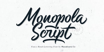 Monopola is a casual script font inspired by pop cultures and urban fashion. This font is great for your next creative project such as Logotype, printed quotes, invitations, cards, product packaging, headers, Letterhead, Poster, Apparel Design, Label, and etc. Monopola comes with uppercase, lowercase, numerals, punctuations and so many variations on each character include OpenType alternates, and common ligatures to let you customize your designs.
 - Bling by Hackberry Font Foundry,
$24.95 My second font for 2009, Bling is a hoot. This vaguely Deco, sparkly sans is for those heads that need bling. This is the first font released in a long time without my complete feature set. It has lining and oldstyle figures, many wild ligatures, the x-height is too high to make a small caps set worth the effort. It's just for fun. Enjoy!
 - ALS Zheldor by Art. Lebedev Studio,
$63.00 The Zheldor typeface was designed specially for the Railroad movie credits, but wasn’t used there. As a result, here comes an original type product that fits nicely into the urban environment. This vigorous, twitching and deconstructive font works well for emotional large-letter designs and non-too-serious teenage style headings. But however extreme it may seem, Zheldor also has a simple and friendly feel to it.
 - Fiesta De Los Muertos by Mvmet,
$10.00 Fiesta De Los Muertos is a fun and festive display font! Not only can be used for Halloween theme needs, you can use it too for other things for daily needs. Use it on t-shirts and clothing, book designs, greeting cards, stickers, posters, banners, or anything that needs a fun touch. Try it to create fabulous designs and feel the fun and cool vibes with it!
 - Toyster by Sharkshock,
$115.00 Toyster is an all caps display font designed with playfulness in mind. The childlike characters are defined by their rounded corners, low contrast, and pudgy weight. Smooth contours ensure this will look great for large print projects. Use it for a children's' book, toy packaging, cartoon, or store signage. With 3 different versions Toyster is sure to resonate with kids and the young at heart.
 - Megar by Viaction Type.Co,
$20.00 Megar is a display font with a bold retro feel and available in 2 styles, regular & oblique. It is suitable to complement your work with a retro or pop art theme. Megar is sold at affordable prices and you will get lots of bonus background gradient & gradient shapes. Get this font right now! Don't miss this product from us! Also check out our other products. Viaction Type
 - Deco Roundpoint JNL by Jeff Levine,
$29.00 On the sheet music cover of the 1931 song "When the Autumn Leaves of Life Begin to Fall", the title is hand-lettered using a round tipped nib pen. The combination of both an Art Deco lettering style and the rounded ends of the characters creates an exquisite, yet simple type design digitally preserved as Deco Roundpoint JNL; available in both regular and oblique versions.
 - Note by Little Fonts,
$15.00 Note is a fresh and dynamic hand writing font. Inspired by graffitti and street style writing, executed using a flat tip calligraphy pen. The typeface is hand drawn on paper, then the resulting alphabets and punctuation scanned in and rendered to create the font. The resulting characters are bold yet energetic with an obvious human touch creating an interesting and original hand drawn typeface.
 - New Boston NF by Nick's Fonts,
$10.00Another addition to the Whiz-Bang Woodtype series, this offering is patterned after a typeface issued by the old Boston firm of Baker & Greele in 1826. Named after a small town in Texas just a hop, skip and a jump from the Red River and Arkansas. Both versions of this font include the complete Latin 1252 and CE 1250 character sets, with localization for Romanian and Moldovan. - Salsiccia by Bech Type,
$19.00 Inspired by bold and rounded typefaces on signs from the 1970s, Salsiccia can promote both your hot dog stand and your international toy store enterprise. Its boldness and roundness is combined with classical proportions, with wide letters — like the O — next to little nubby ones — like the T. This not only looks nice, but helps us even out the white spaces across words and sentences.
 - Alexa by Adobe,
$29.00In 1994, John Benson designed Alexa, Caliban and Balzano, three typefaces with a similar style. Characteristic of all of them is their calligraphic touch and the likeness to handwriting. Alexa shows a hint of a broad tipped pen style and its legible figures are reserved yet lively. Alexa is best for short and midsized texts as well as headlines and gives texts a personal, classic look. - Gangstown GT by Gartype Studio,
$13.00 Inspired by quick handwritten graffiti tagging around city, we are make this graffiti typeface called Gangstown. This font comes with contextual and stylistic alternates that way easy to use, multilingual glyphs, and swashes too. Create your uniquely mix combination with swashes and alternates. Your project will look cool while using this for project like tagging, product package, ads, title, headlines, logo, stickers, apparel, etc.
 - CCS Sofiera by Creative Corner Studio,
$19.00 CCS Sofiera is a New Luxury Vintage font that is both elegant and unique with smooth curves and tons of special alternative glyphs, ornament and multilingual support. It's a very versatile font that works great in large and small sizes. CCS Sofiera is perfect for branding projects, Logo design, Clothing Branding, product packaging, magazine headers, or simply as a stylish text overlay to any background image.
 - CCS Monalesa by Creative Corner Studio,
$29.00 Monalesa is a New Vintage font that is both elegant and unique with smooth curves and beautiful ligatures, tons of special alternative glyphs, ornament and multilingual support. It's a very versatile font that works great in large and small sizes. Monalesa is perfect for branding projects, Logo design, Clothing Branding, product packaging, magazine headers, or simply as a stylish text overlay to any background image.
 - Yan 333 Pro by JY&A,
$45.00 JY&A’s most distinctive calligraphic font, Yan Series 333 is usable at all resolutions and remains legible. Even though it has a strong calligraphic influence, the Yan Series is ideal for text settings that have to appear special. Designed by Jack Yan, the family was developed between 1987 and 1993. Yan studied the effect of a nylon-tip, rather than steel-nib, pen on paper.
 - Dark Shade by Letterhend,
$16.00 Meet Dark Shade, the font that dares you to venture into the shadows where creepy and fascination intertwine. This font an aura of spine-tingling dread, perfect for instilling suspense but playful too in your designs. Whether you're channeling classic horror or crafting a display masterpiece, Nights Side versatility is your creative companion. Features : Uppercase & lowercase Numbers and punctuation Alternates & Ligatures Multilingual PUA encoded
 - Chicago by Rezastudio,
$5.00 CHICAGO is a Fancy Modern vintage serif typeface with beautiful ligatures, tons of special alternative glyphs, ornament and multilingual support. It's a very versatile font that works great in large and small sizes. Perfect for editorial projects, Logo design, Clothing Branding, product packaging, magazine headers, or simply as a stylish text overlay to any background image. 2 Weights font Lowercase and Uppercase Stylistic Alternates & Ligatures Numerals & Punctuation
 - Nina by Microsoft Corporation,
$49.00Nina™ Family is a new condensed sans serif typeface designed to be as readable as possible at small sizes, whilst squeezing in as many characters per inch as feasibly possible. Nina Family typeface was designed for Microsoft by world renowned type designer Matthew Carter, and hand-instructed by leading hinting expert, Tom Rickner. Character Set: Latin-1, WGL Pan-European (Eastern Europe, Cyrillic, Greek and Turkish). - Karaoke JNL by Jeff Levine,
$29.00Karaoke JNL is one of the many alphabets created by the late Alf R. Becker that was showcased in Signs of the Times magazine from the 1930s through the 1950s. Thanks to Tod Swormstedt of ST Media (and who is the curator of the American Sign Museum in Cincinnati, Ohio) for providing Jeff Levine the research material from which this font design was modeled. - General Chang JNL by Jeff Levine,
$29.00General Chang JNL is one of a number of fonts redrawn by Jeff Levine from the creative output of the late Alf R. Becker. Becker's alphabets were a monthly feature of Signs of the Times Magazine from the 1930s through the 1950s. Thanks to Tod Swormstedt of ST Media (who also is the curator of the American Sign Museum in Cincinnati, Ohio) for the resource material. - Guess by DearType,
$59.00 Guess is a versatile, connecting script, designed to convey elegance and style. It is slender, feminine and friendly, let alone sexy. Guess will work perfectly for fashion, e-commerce brands, trend blogs, or any business that wants to appear classy and chic. The font is ideal for high-end logotypes and magazine headlines, but let’s not forget greeting cards, invitations, posters, ads and the various web usages. When it comes to the glyph set, well, Guess Pro has quite a lot of that (2500+ glyphs) - think multiple languages and tons of swashes and stylistic alternates to unleash your creativity. For all pragmatists out there, there is also a basic version of the font with an extended latin glyph set (no swashes, contextual alternates or stylistic sets). Last, but not least, Guess comes with a neat geometric sans in capital letters, which makes a great addition to the script, and a set of beautiful ornaments and borders that complete the whole look with a bang.
 - Mountella by Kereatype,
$14.00 Mountella is a modern editorial serif font family that includes 18 fonts, uprights, italic, and 2 variable font from Extra Light to Black which has more than 500 characters, and still has all the nostalgic vibes!. Mountella is a beautiful serif family that includes many visual details, adding uniqueness that looks incredible in both large and small settings as a display and body text. Mountella can be used in high-end branding, logo designs, magazines, product packaging & invitations. One thing to note about Mountella is the letter spacing. It was intentionally for clean reading if you wanted to use it for the body type, so I recommended setting the spacing a little tighter for display use (around -10 to -50 should do!). Design Tips: combine the regular and italic, whether all in one word or body text for logo or quote. Adjust your letterspacing to add more groove! Tighter letterspacing for large headers.
 - Tropical Punch by Missy Meyer,
$12.00 I am shocked to my very core that the name "Tropical Punch" hasn't been used for a font yet. What a delight, that my very first name choice is available, and I can grow my collection of fonts named after delicious food and drink! Tropical Punch is a retro-tropical font with a ton of variety: I've included nearly 200 multi-letter ligatures with nesting letters, to add quirky and fun variety to all of your projects. There are also a few alternate vowels, plus a few dingbats to add jazzy pizzazz; and 10 smaller catchwords like THE, AND, WITH, and more! I've also made an outline version--Tropical Punch Outline--which surrounds the solid letters beautifully, so you have even more options! Of course, both versions have my usual 300+ extended Latin characters for language support. And I've included a set of uppercase Greek letters as well! And everything, as always, is fully PUA-encoded so all characters are easy to access.
 - BUNK by AdultHumanMale,
$20.00 BUNK is an 11 font system that can be layered in different ways to create various classic titling effects, think Old Timey signage 'COME IN WE'RE OPEN'. It's a display font that produces the different results by mixing and matching the various fonts together. Bunk's layer combos give you the control to create brilliant bevel, convex and 3-D styles. Each font contains the same metrics, so when your title is set, copy and paste-in-place to create layers of different weights/styles to build out your desired effect. Unlike other Layered Fonts out there, BUNK has upper case and lower case as well as currency symbols and lots of foreign characters too. Over 180 glyphs!. Five of the fonts (Shades 1,2,3,4,5) are clearly dependent on each other to create a complete font, so theses are only available in the Full family pack (11 fonts) or in the Layer Kit Family pack (7 fonts).
 - Hot Pursuit by Wing's Art Studio,
$18.00 Hot Pursuit: A Hand-Drawn Grind-house Roller Derby Font A grungy hand-drawn font with attitude inspired by comic books, Roller Derby and bad Grindhouse movies. Hot Pursuit is a boiling pot of pop-culture references ranging from 70s chase movies to Roller Derby, horror comics to Grindhouse cinema. All combining to create a hand-drawn font for grungy designs with maximum punch. Supplied in regular and italic styles, it creates titles that race off the page, perfectly suited for dynamic movie posters and headlines. Along with the 4 font styles you’ll also find a host of original comic art by Christopher King, plus symbols and underlines to compliment your type. Hot Pursuit contains unique uppercase and lowercase characters, numerals, punctuation and language support. It’s a bad-ass font ready for your t-shirts, posters, stickers, movie titles, YouTube videos and more! Check out the visuals to see it in action for yourself.
 - LTC Village by Lanston Type Co.,
$24.95 Village was originally designed by Frederic Goudy in 1903 for Kuppenheimer & Company for advertising use, but it was decided it would be too expensive to cast. It was later adopted as the house face for Goudy's Village Press. The design was very much influenced by William Morris's 'Golden' type. Paul Hunt began working on a digital version of Frederic Goudy's Village type prior coming to P22 in 2006 for an internship (which evolved into a staff designer position at P22.) Around this time, The Tampa Book Arts Studio was looking for a digital version of Village to complement with a letterpress edition of a book called "The Rich Mouse" by JJ Lankes. Many years later the Rich Mouse project has been completed, so we decided to release the Village type on the same day as the release of the Rich Mouse Book!
 - 1523 Holbein by GLC,
$28.00 This typeface is an attempt to offer as a font the well known marvelous Hans Holbein “Death Alphabet”, first published in 1523. We have tried to preserve as much as possible the spirit and appearance of the original Initials set — incredibly fine and enriched with detailed figures — trying at the same time to create a font not too complex to be usable. Neverteless, the font files are large, and when used, the decorated initials may appear on screen more slowly than ordinary characters. (Minimum size recommended : 96 pts) We are offering here two complete standard sets (no accented characters) : Initials and capitals. We have reconstructed the missing letters : J and U, Eth, Lslash, Thorn and Oslash. The font may be used with all our Humane and Garalde fonts, like 1543 Humane Jenson or 1592 GLC Garamond and others from the GLC foundry catalog.
 - Cormac by Typedepot,
$19.00 Cormac is a humanist typeface characterized with it's large x-height and slightly flared stems. The word that best describes our ideas in the beginning of the project is "simple" - the idea behind it was to strip the letter forms of everything unnecessary, and yet keep the typeface interesting. The typeface is friendly without being too cheezy thanks to its humanistic character, flared ascenders and stems reminding of its calligraphic origin. The proportions are closer to the traditional old style typefaces. Cormac is open and readable typeface coming in 7 weights plus their matching 'true' italics - from Extra Thin to Bold. The family comes with Cyrillic support, great range of numerals, fractions, ligatures, alternates and a lot of special characters making Cormac a great solution for greate range of design work - branding, editorial, web, wayfinding, etc.
 - Gathes by thirtype,
$25.00 Gathes is vintage pop script with layered style, Since a few years I try to exploration of script with layered system. and this my third script layered from my collection font. Gathes is basic from 5 styles layered type. Base layer is regular, add an shine, extrude, extrude detail, and shadow to create a dimensional look. Several styles can be mix and matched together or can be used alone and/or in layered. The Script font have a opentype feature such a stylistic set, ligature, swash ornament. For additional we add a serif version in this family, so that it can be combined with script fonts. Gathes works great in any graphics app that allow to create a layered type and good to create the logo, badge, poster, heading, magazine, advertising design purpose and more. Features: - Opentype features - Ligatures - Alternates - PUA Encoded - Multilanguange
 - Somatype by ArtyType,
$29.00 As with any attempt at a new typeface, you want to create something different. A difficult task as most legible fonts are based on something previous. Somatype isn't actually based on any particular font but it has unavoidable similarities to others. The important difference here being the distinctive quirk of the connection points going opposite to the norm; exemplified best by the lower case d & e. Once devised, the unique characteristic was applied wherever possible, keeping the rest of the characters in a sympathetic, rounded style. I first designed this in the light weight version, seeing it working best as a large open display font for magazines etc. but realized it would be too light for body copy at small scale, so, medium and bold weights were created to resolve that issue. Incidentally, the word ‘somatype’ literally means body-type.
 - Dear Gray by Redy Studio,
$17.00 Dear Gray – Modern Wedding Fonts Dear Gray is a beautiful, feminine, and modern calligraphy script for your wedding designs. Dear Gray includes a full set of uppercase and lowercase letters, numerals, punctuation, and common ligatures for a more harmonious look. With Opentype features and stylistic alternatives, Dear Gray gives you a lot of possibilities to make your design even more special. Following the trend of modern hand-drawn typography, Dear Gray is a friendly choice to convey your loving words. Dear Gray features: A full set of upper & lowercase characters Numbers & punctuation Ligatures Lowercase beginning swashes Lowercase ending swashes A ton of stylistic alternatives PUA Encoded Characters – Fully accessible without additional design software. Feel free to give me a message if you have a problem or question. Thank you so much for taking the time to look at one of our products.
 - Police JNL by Jeff Levine,
$29.00Police JNL was modeled from one of the many fonts created by the late Alf Becker exclusively for Signs of the Times magazine during the 1930s through the 1950s. This was a bit of a difficult design to translate into a digital font file, because the individual characters did not follow a formal structure as to the width and length of the cast shadows or the letter shapes—such is the way of the hand-lettered alphabet. Special thanks to Tod Swormstedt of ST Publications (and curator of the American Sign Museum in Cincinnati) for providing the archival material to work from in creating this font. Police JNL has a limited character set. The basic A-Z character is on the upper and lower case keys, along with numbers, some punctuation and the dollar and cents signs. - Rahere Roman Display by ULGA Type,
$30.00 Rahere Roman Display is an elegant design with flared stems and subtle old style features, influenced by Berthold Wolpe’s wonderful Albertus font and (to a lesser extent) fonts based on Roman square capitals. It’s a classic design for the modern age, appealing to serious typographers, graphic designers and anyone looking for a beautiful, multipurpose font that also offers value for money. Originally conceived as a display companion for the Rahere Sans typeface family, Rahere Roman harmonizes perfectly with its sans counterpart: use it for headings, sub-headings or pull-out quotes. Want an eye-catching introduction? The small caps have been sized to optically align with the x-height of Rahere Sans or start a paragraph with a swash drop cap. There are also ornaments and devices on hand to spice things up. Of course, Rahere Roman Display works beautifully as a standalone font too. Although predominantly a display font, with a quick flick of its lowercase switch, Rahere Roman transforms effortlessly into a readable text font. Like a Swiss Army Knife, this is a hugely versatile font, capable of conveying different messages from classic and romantic to historical and modern. It’s suitable for a wide range of applications including: branding, posters, advertising, packaging, labels, signage, wedding stationery, museums, art galleries and book covers. Weighing in at well over 2,000 glyphs, Rahere Roman contains a myriad of alternative characters (mostly capitals) including two sets of small caps that allow certain letter combinations - such as RO, LA, LI, TY, etc. - to mimic ligatures. The advantage of this is that if letter spacing is increased or decreased, the letter combinations aren’t fixed and can move too, which helps the space between letters to remain even. However, for lovers of ligatures there is still a bucketload of goodies to play with, including the obligatory ‘OO’ ligature. If that’s not enough, the font also contains start & end swashes, alternative numerals, seven ampersands, ornaments and devices. .ss01 - Initial swash capitals .ss06 - Superior small capitals (aligned to the cap height) .ss07 - Small capitals (sitting on the baseline)
 - Pollen by TypeTogether,
$49.00 This typeface finds a perfect balance between technical excellence, careful design of letter forms for extended reading, and a measured dose of charm and personality. Its informal feel allows for successfully typesetting a wide range of applications, from magazines and fiction books to advertising and websites. Calligraphy, be it done with the broad-edge pen, brush, or other tools, has been fundamental in the development of Pollen. Its influence is clearly visible in the construction of the top serifs contrasting the curved bottom serifs and the fluid aspect of terminals and tails, such as on “g” and “r”. The shapes of the diagonal letters are based on a less formal calligraphic model, but still uses the broad edge pen. The letters were then subject to a further process of pencil drawing and digital re-interpretation, which gave them the final shape. The designs of “e” and “c” are derived from drawings made with only one continuous line, with the pencil always touching the paper. The letters “g” and “y” express the intention to bring informal elements to a typeface intended for long text reading, usually characteristic of casual writing. Pollen consists of 3 basic styles with an extended OpenType Pro character set and large language support, perfectly serving the most common typographic needs.
 - Poultry Sign by Ingrimayne Type,
$5.95 While searching through microfilm of an old, 1932 newspaper, I stumbled on the word "Poultry" written with trapezoidal letters. I did not recall seeing lettering like this and it inspired me to design a typeface that could produce a similar result. Poultry Sign has two widths each with three weights giving the family six styles. It is monoline, monospaced, and all caps. The letters on the lower-case keys reverse the trapezoid of those on the upper-case keys. The designer's expectation is that the most common use for this typeface will alternate upper-case and lower-case keys, and to make this effect easy, included in the font is a contextual alternatives (calt) OpenType feature that automatically produces this result if your word processor supports this feature. To get text with all letters with big bottoms or all letters with with big tops, this feature must be turned off. The spacing of the letters is identical within each width so the styles can be layered to produce bi-colored or tri-colored letters. There is a second set of numbers that can be accessed with an OpenType stylistic alternative. Also accessible with OpenType stylistic alternatives are variations of letters T, N, L, Y, and V.
 - Campeno by Craft Supply Co,
$20.00 Geometric Precision Let’s step into the world of Campeno, a Geometric Sans Serif font that embodies precision and order. This font is the epitome of geometric perfection, making it an ideal choice for various editorial applications. Editorial Excellence Campeno’s geometric form is what sets it apart and makes it a top choice for editorial needs. Whether you’re working on magazines, long-form text, or other editorial projects, its geometric precision enhances readability and offers editorial excellence. Versatile Typography What makes Campeno even more exceptional is its versatility. It seamlessly adapts to diverse design contexts, ensuring that it can be used for a wide range of projects, from magazines to websites and beyond. Engaging Readability Beyond its geometric aesthetics, Campeno excels in providing engaging readability. It guides the reader through the content, focusing on the message while maintaining a visually appealing design. In Conclusion In summary, Campeno – Geometric Sans Serif is the font that brings precision and clarity to your editorial projects. Its geometric form ensures that your content is not only engaging but also visually appealing, catering to a broad readership while maintaining a high standard of clarity. Whether you’re working on magazines, websites, or other editorial endeavors, Campeno stands out as a font that combines aesthetics with functionality, offering editorial excellence for your projects.
 - Revla Sans Text by Eclectotype,
$30.00 Fun. Fun isn't it? But sometimes you can have too much fun, and things can get out of hand. Revla Sans is, in certain situations, too much fun. So, without further ado, let me introduce the straight man to Revla Sans's buffoon - Revla Sans Text. It represents a complete overhaul of Revla Sans. The bounciness has been removed and details reined in, all for the purpose of optimizing the fonts for use in longer runs of text. 'Text' is perhaps a strong word here; you're not going to be setting novels in this typeface. It still retains the charm of the original, and could well be used in display settings. Think of it like this - Revla Sans would be a great choice for the logo and branding of a board game, no? Revla Sans Text, then, would be good for setting the instructions, or body copy on the website. Revla Sans Text is not as feature-rich as Revla Sans, and is priced accordingly. Enjoy!
 - ALS Neuch by Art. Lebedev Studio,
$63.00 Neuch is a neat typeface for greeting cards, children's books, labels and signs, handmade goodies packaging, and other cheerful designs. Drawn with a sharp-tipped ink pen, the letters kick their legs up and down, stretch out their tails, and hop along gaily, as if not obeying any rules. The cute characters look like they are one big family—they get into arguments, mix noisily and good-humoredly, push each other, yet always stick together. Neuch can speak several languages and has ligatures, decorative elements, and even a cat and a dog.
 - Amfibia by ROHH,
$40.00 Amfibia™ is a soft, flat-sided geometric grotesk family with a lot of character, equipped with tons of ligatures and swashes. Its main function is display use of all kinds, however it is prepared to serve as paragraph text typeface thanks to its 5 widths, giving total amount of 100 fonts. It is crafted for a broad variety design situations - from posters, magazine editorial use, logo design & branding, to web design, user interfaces and mobile applications. Main features: - 5 widths (Narrow, Condensed, Normal, Expanded, Wide), each consisting 20 fonts - 10 weights for each width (from Hairline to Black) - handdrawn, carefully crafted obliques - over 900 glyphs, full of swashes, initial forms, terminals and ligatures - pronounced ink traps and large x-height improving legibility in small sizes as well as adding strong personality to display sizes - flat-sided letter shapes adding vertical rhythm and elegance to narrow widths - extended latin language support - OpenType features (swashes, initials, terminals, standard and discretionary ligatures, stylistic sets, contextual alternates, case sensitive forms, lining, oldstyle and tabular figures, slashed zero, fractions, superscript and subscript, ordinals, currencies and symbols)