10,000 search results
(0.206 seconds)
- Rubiesque by Nootype,
$45.00 Rubiesque is the sans serif version of Rubis, these two families share the same skeleton and weights. Rubiesque is a sans combining humanist and grotesk references which give this typeface an interesting & unique personnality. The regular and medium weights are perfect for text while the italic give an interesting texture to the text. The range of style give a good flexibility to this family. It’s a perfect family for editorial use. Rubiesque consists in a 10 styles family, from Light to Black with their corresponding italics. Each font includes OpenType Features such as Small Caps, Proportional Figure, Tabular Figures, Numerators, Superscript, Denominators, Scientific Inferiors, Subscript, Ordinals, Fractions and ligatures. Rubiesque family supports Latin and Cyrillic, all these languages are covered: Latin language support: Afar, Afrikaans, Albanian, Asturian, Azeri, Basque, Bosnian, Breton, Bulgarian, Catalan, Cornish, Corsican, Croatian, Czech, Danish, Dutch, English, Esperanto, Estonian, Faroese, Filipino, Finnish, Flemish, French, Frisian, Friulian, Gaelic, Galician, German, Greenlandic, Hungarian, Icelandic, Indonesian, Irish, Italian, Kurdish, Latin, Latvian, Lithuanian, Luxembourgish, Malagasy, Malay, Maltese, Maori, Moldavian, Norwegian, Occitan, Polish, Portuguese, Provençal, Romanian, Romansch, Saami, Samoan, Scots, Scottish, Serbian, Slovak, Slovenian, Spanish, Swahili, Swedish, Tagalog, Turkish, Walloon, Welsh, Wolof Cyrillic language support: Adyghe, Avar, Belarusian, Bulgarian, Buryat, Chechen, Erzya, Ingush, Kabardian, Kalmyk, Karachay-Balkar, Karakalpak, Kazakh, Komi, Kyrgyz, Lak, Macedonian, Moldovan, Mongol, Permyak, Russian, Rusyn, Serbian, Tatar, Tofa, Tuvan, Ukrainian, Uzbek
 - Rusty Forest by Mans Greback,
$69.00 Rusty Forest is a typeface that takes you back to the days of golden design, when travel and adventure were celebrated in striking posters. This font's rustic appearance, created by its brush-style strokes, evokes images of a cabin in the woods, surrounded by the beauty of nature. It's as if you can smell the campfire smoke and hear the rustling of leaves in the wind. This font is perfect for designers looking to add a touch of vintage charm to their projects, whether it be a poster for a national park or a logo for a wilderness-themed brand. Its 1950s-inspired style will transport viewers back in time to a simpler era, where the call of the wild was all one needed to feel free. The Rusty Forest family includes Bold, Italic, Bold Italic, and Regular, offer a range of options to suit different design needs. The font is built with advanced OpenType functionality and has a guaranteed top-notch quality, containing stylistic and contextual alternates, ligatures and more features; all to give you full control and customizability. It has extensive lingual support, covering all Latin-based languages, from Northern Europe to South Africa, from America to South-East Asia. It contains all characters and symbols you'll ever need, including all punctuation and numbers.
 - Gravitica Rounded by Ckhans Fonts,
$34.00 Features: • Support for 28 languages: Afrikaans Albanian Catalan Croatian Czech Danish Dutch English Estonian Finnish French German Hungarian Icelandic Italian Latvian Lithuanian Maltese Norwegian Polish Portugese Romanian SlovakSlovenian Spanisch Swedish Turkish Zulu Swedish Turkish Zulu • Contains OpenType features with alternates or substitutes • Tabular Figures • Ordinal numbers • 74 icons (It will keep updating.) • 28 brand symbols (It will keep updating.) • 27 arrows glyphs • 0-99 line circled glyphs • 0-99 solid circled glyphs • A-Z line circled glyphs • A-Z solid circled glyphs Gravitica is a modern sans serif with a geometric touch. It comes in 6 weights, 13 uprights and its matching rounded, italics, patterned, so you can use them to your heart’s content. Designed with powerful opentype features in mind. Each weight includes extended language support, fractions, tabular figures, arrows, ligatures, icons and patterned. Gravitica family consists of 13 styles (6 weights, 6 Italics, 1 patterned), in each of which there are more than 940+ glyphs. In the typeface, each weight includes extended language support, fractions, tabular figures, arrows, ligatures and more. Perfectly suited for graphic design and any display use. It could easily work for web, signage, corporate as well as for editorial design. documents and folders, mobile interface. Useful links: Gravitica PDF Type Guide and Specimen (You can know how to use icons and arrows, other glyphs.)
 - Serapion by Storm Type Foundry,
$39.00Another variation on the Renaissance-Baroque Roman face, it extends the selection of text type faces. In comparison with Jannon, the contrast within the letters has been enhanced. The dynamic elements of the Renaissance Roman face have been strengthened in a way which is illustrated best in the letters "a", "b" and "s". These letters contain, in condensed form, the principle of this type face - in round shapes the dark stroke invariably has a round finial at one end and a sharp one at the other. Another typical feature is the lower-case "g"; the upper part of this letter consists of two geometrically exact circles, the inner of which, a negative one, is immersed down on the right, upright to the direction of the lower loop and the upright knob. The vertical strokes slightly splay out upwards. Some details of the upper-case letters may seem to be too daring, but they are less apparent in the text sizes. It has to be admitted that typographers tend to draw letters in exaggerated sizes, as a result of which they stick to details. Serapion Italic are italics inspired partly by the Renaissance Cancelleresca. This is obvious from the drop-shaped finials of its lower-case descenders. The type face is suitable for illustrated books, art posters and short texts. It has a rather ugly name - after St. Serapion. - Nova Quinta by Mans Greback,
$69.00 Nova Quinta is a breathtaking, enchanting formal script font that weaves an air of magic and sophistication into your designs. With its delightful swirls and exquisite swashes, this font radiates a lovely charm, perfect for adorning wine labels, farm produce packaging, and luxury branding. Imagine your design coming to life with the genuine elegance of Nova Quinta, transforming your work into an enchanting piece of art. The font's irresistible beauty and decorative allure make it a dreamy choice for projects that require a touch of refinement and grace. The Nova Quinta font family includes four mesmerizing styles to suit various design needs: Regular: A gracefully balanced, enchanting style Bold: A more assertive and captivating presence Italic: A whimsical dance of flourishes and movement Bold Italic: The perfect blend of boldness and flair Unleash your creativity with the advanced OpenType functionality of Nova Quinta. This font family ensures top-notch quality and provides you with full control and customizability. It includes stylistic and contextual alternates, ligatures, and other features to make your designs a vibrant, one-of-a-kind masterpiece. Nova Quinta embraces an extensive lingual support, covering all Latin-based languages, from Northern Europe to South Africa, from America to South-East Asia. It contains all the characters and symbols you'll ever need, including all punctuation and numbers.
 - Limes by Piñata,
$9.90 The idea of Limes emerged at the seashore last year in late summer. Getting ready in advance for a dark winter, we've decided to design a special fontfamily which would bring a bit of vitamins and summer sun into the rough everyday routine and help us survive the cold winter. Limes is both a dream of the sun while it’s gone and a refreshing breeze for the time when it finally gets warm! Limes is a completely handwritten fontfamily and consists of 23 typefaces. To create Limes Sans and Limes Slab families, we've used regular watercolor brushes, and to create monolinear Limes Script, as well as for Catchwords and Dingbats, we've used a felt-tip pen with circular section. Limes Sans and Limes Slabs fonts work perfectly together with Limes Script due to the general handwritten idea, as well as due to the widths contrast – despite its width, Limes Script mixes well with narrower opponents and adds a bit of human spontaneity into the general handwritten concept. The Limes collection includes: Limes Sans (Thin, Light, Regular, Bold, Black & italics), Limes Slab (Thin, Light, Regular, Bold, Black & italics), Limes Script, Catchwords and Dingbats. Limes Sans and Limes Slab widely support OT features: tnum, ordn, frac, case, numr, dnom, subs, sups, and Limes Script uses a large number of context alternatives.
 - Flintlock by CozyFonts,
$25.00 The Flintlock Font Family has a Bold personality. The 'Rough' version of the Flintlock Font has a hand-carved or hand-etched edge, carefully crafted for each of over 300 glyphs. Caps, lower case, all numbers, fractions, accents and European characters that work in over 70 languages. 'Classically Built with a Vintage Flair'. Vintage in the American West Tradition that might have been forged and implemented from the 1860s through the 1930s and consequently fresh again. Flintlock Rough can be envisioned on many things dated from 1860 to present day. The font is available in 3 basic weights as of this release date. There are other versions on the drawing board... Flintlock Rough works extremely well with Posters, Branding, Movie Titles, Invites, Stationary, Signage, Embroidery, Letterpress, Ads, Logos and anything that feels Industrial or Hand-Crafted, eg. Coffee, Breweries, Antiques, Woodcuts, Western Styles, Sports Styles, Holidays, Menus, and more. Flintlock Flat & Flintlock Flat Italic are the siblings to Flintlock Rough without the hand-carved edge but rather clean with slightly rounded corners and edges. Extremely Legible, Bold and best used in all the same application descriptions mentioned above and more, specifically contemporary uses and settings, eg. Sports, Titles, Branding, Headlines, Logos and more. Curiously the Flat & Italic versions of Flintlock work extremely well in 1960s and 1970s settings.
 - Gravitica Slab by Ckhans Fonts,
$34.00 Features: • Support for 28 languages: Afrikaans Albanian Catalan Croatian Czech Danish Dutch English Estonian Finnish French German Hungarian Icelandic Italian Latvian Lithuanian Maltese Norwegian Polish Portugese Romanian SlovakSlovenian Spanisch Swedish Turkish Zulu Swedish Turkish Zulu • Contains OpenType features with alternates or substitutes • Tabular Figures • Ordinal numbers • 74 icons (It will keep updating.) • 72 graphic patterns for designer (It will keep updating.) • 28 brand symbols (It will keep updating.) • 27 arrows glyphs • 0-99 line circled glyphs • 0-99 solid circled glyphs • A-Z line circled glyphs • A-Z solid circled glyphs Gravitica Slab is a modern serif with a geometric touch. It comes in 6 weights, 12 uprights and its matching italics, so you can use them to your heart’s content. Designed with powerful opentype features in mind. Each weight includes extended language support, fractions, tabular figures, arrows, ligatures, icons and patterned. Gravitica Slab family consists of 12 styles (12 weights, 12 Italics), in each of which there are more than 940+ glyphs. In the typeface, each weight includes extended language support, fractions, tabular figures, arrows, ligatures and more. Perfectly suited for graphic design and any display use. It could easily work for web, signage, corporate as well as for editorial design. documents and folders, mobile interface. Useful links: Gravitica PDF Type Guide and Specimen (You can know how to use icons and arrows, other glyphs.)
 - Cosma by Wiescher Design,
$35.00 »COSMA« is an old greek word that stands for »beauty« and »order«, I thought it a very befitting name for my new font-family. My »Cosma« has that special high-contrast Renaissance beauty but is very orderly in appearance. »Cosma« is a classical beauty with modern touches that make it unique. You will love this font. It is a great everyday workhorse with seven weights from UltraLight to Bold and all the necessary weights in between. Great for body copy and headlines! With 964 Glyphs it is a truly European font designed for all Central European and Latin using countries. »Cosma« has a set of Cyrillic that is also good for Serbia, Macedonia and Ukraine. Sorry, no Greek! But it has oldstyle- and lining-, tabular- and tabular-oldstyle-figures, many alternative letters and ligatures. On top I designed two sets of alternative, decorated caps each in normal and oblique. »Cosma« comes in Normal, Italic and Oblique, sometimes you just don’t want to use Oblique instead of Italic that would be too playful for the occasion. »Cosma« doesn’t come cheap, but I start off with an 80 % reduction, so that is a good chance to get all 49 cuts for a phantastic price. Oh, I almost forgot, If you buy the whole family, you get the variable fonts to go with it for free, that’s a good investment into the future. Enjoy!
 - Range Sans by Eclectotype,
$36.00 This is Range Sans, the sans-serif counterpart to Range Serif . It can be categorized as a grotesque, with the idiosyncratic angular details from the serif family making themselves known in the arches and bowls of the lower case. The range of weights is larger than Range Serif, with two more weights at the lighter end of the spectrum. The weights from light to black correspond to their seriffed sisters, so can be interchanged with them freely while maintaining a similar text color and vertical metrics. This is useful for adding emphasis; Range Sans is deliberately lacking an italic, but the italics from Range Serif work better than you might expect in running text, particularly for the light and regular weights. Range Sans has a contemporary, somewhat geometric look that lends itself to uses such as corporate identities, minimalist graphic design, and logos. The middle weights do work well in running text, however, with the angled details being less noticeable at small sizes. Designed for demanding typography, supporting most Latin-based languages, Range Sans is equipped with true small caps for all weights, an array of numeral styles (proportional- and tabular- lining and oldstyle figures, small cap figures, numerators, denominators, superscripts and subscripts/scientific inferiors), automatic fractions, a set of useful arrows, case-sensitive forms, and a range of currency symbols including recent additions: Turkish Lira, Indian Rupee and Russian Ruble.
 - Marche Script by Mans Greback,
$69.00 Marche Script is a bold and expressive brush font that exhibits high-quality and genuine craftsmanship. Its thick strokes and playful curves make it perfect for creating impressive logos. Designed with a focus on brush lettering, Marche Script offers a retro and rustic vibe that is sure to make your designs stand out. This font is perfect for logotypes, headlines, and other creative projects that require a touch of authenticity. Marche Script comes in four styles: Regular, Italic, Bold, and Bold Italic. Each style offers its own unique character, and all are equipped with ligatures to add even more flair to your designs. Use this font to add a touch of handmade charm to your next project, and watch it come to life with the high-quality and expressive strokes of Marche Script. Use underscore _ anywhere in a word to make a swash. Example: World_score Use multiple underscores to make swashes of different lengths. Example: Brand_____Genie The font is built with advanced OpenType functionality and has a guaranteed top-notch quality, containing stylistic and contextual alternates, ligatures and more features; all to give you full control and customizability. It has extensive lingual support, covering all Latin-based languages, from Northern Europe to South Africa, from America to South-East Asia. It contains all characters and symbols you'll ever need, including all punctuation and numbers.
 - Thicker by Zetafonts,
$39.00 Thicker is a type-family designed for Zetafonts by Francesco Canovaro with Andrea Tartarelli. A geometric sans typeface on steroids, it was first designed in the muscular Extrablack weight with the aesthetics of high-power dynamic typefaces used in sports communication, and then developed in the lighter weights where the shapes show some vintage-inspired proportions and the slightly squared look that nods to Novarese famous Eurostile, eponymous with retro-futurism. With these diverse influences the typeface allows for both impressive display use and effective logo design as well as more fine-tuned editorial use in body text - with a natural inclination for effective and powerful advertising. Sports typography usually uses italics to add dynamism and impact, and Thicker complies with this by offering a choice of three alternate italic forms with different slant, made even more customizable by the inclusion of variable font technology that allows fine tuning of the weight range as well as precise choice of typeface slant. In each of the 44 weights of the typeface family (as well as in the all-in-one variable type solution) Thicker offers a extended charset of over 900 latin, Cyrillic and Greek glyphs, covering over two hundred languages and including useful Open Type features (Alternate forms, Positional Numerals, Small Caps and Case Sensitive Forms) for flawless typesetting.
 - "Dot.com" by Iconian Fonts is an eclectic and modern typeface that exemplifies the digital age with its unique characteristics, blending creativity and functionality in equal measures. Designed by th...
- Viareggio by Hanoded,
$15.00 Viareggio is a city in Northern Tuscany, Italy. Viareggio is famous for its carnival and its mascot, the clown Burlamacco (designed by Uberto Bonetti in 1930). Viareggio font was based on the hand lettering found on a 1931 poster, advertising the carnival. Viareggio font comes with extensive language support.
 - Liguria NF by Nick's Fonts,
$10.00Discovered within the pages of a turn-of-the-Twentieth-Century specimen book of the Società Nebiolo of Turin, Italy, was this little gem, which shows both antique and Art Nouveau influences. Both versions of this font include the complete Latin 1252 and Central European 1250 character sets. - Betting Soker by Alcode,
$20.00 Betting Soker is an casual handwitten fontinspired by natural brush typography. Written in rapid motion using a slightly dry brush pen. This will give you a fresh and elegant design. Betting Soker comes with uppercase and lowercase letters, large sets and small sets, numbers, alternative styles for several lowercase characters are also available that make your text and design more attractive. Try Betting Soker, enjoy the richness of OpenType features and let her fun and elegant excitement make you happy and enhance your creativity! You can use this font very easily. - Included multilingual support and special ligatures
 - 1920 My Toy Print by GLC,
$38.00 This family was inspired by a small French "toy print" box, with rubber stamp characters, from the 1920s. The set contained only capital letters, no accented letters and limited punctuation. We have reconstituted a complete modern standard set. The doubling of each usual character in each style (A-Z/a-z and numerals) gives a rich and variously uneven appearance, looking like the results of the real use of those old rubber stamps. The bold style may be used as a reinforcement, mixed with Normal style without disadvantage, allowing four choices for each usual letter... The original size is 6mm (about 17 pts).
 - Lempicka by Molly Suber Thorpe,
$17.99 Lempicka is a ligature-rich typeface duo with support for Latin and Greek. Lempicka Display and Small Caps are a pair of light, clean fonts with strong Art Deco character. Lempicka Display has over 150 ligatures and alternates (in Greek, too!), so it's extremely customizable and versatile. Lempicka Small Caps is Display's little sister: the perfect complement for creating hierarchy in a layout.⠀ This is a beautiful typeface for wedding invitations and personal stationery, as well as unique logo design and branding projects. The name of this type family is an homage to Art Deco painter Tamara de Lempicka.
 - Angkora Volk by Skinny Type,
$18.00 Angkora Volk - a stylish OpenType rich serif with letters that seem to dance and swirl in harmony - to form a unique & elegant typographic design. A large selection of interwoven Opentype binders and replacements, meaning lots of choice and variety in your final look. To access these OpenType features, you need Opentype-enabled software such as: Word, Textedit, Photoshop, Sketch, Pages, Keynote, Numbers, iBooks Author, QuarkXPress, Indesign and Illustrator. A wide variety of useful glyphs are included - see preview images of all glyphs. Angkora Volk also includes the full set: -uppercase and lowercase letters -multilingual symbols -number -punctuation -alternative style -fastener
 - Dragmatis Whiplash by Alcode,
$23.00 Dragmatis Whiplash is a classic font, I built it with my relaxed hands. designing a classic font but having a modern element in it, which makes it particularly suitable for wedding media, book covers, greeting cards, logos, branding, business cards and certificates, in fact for any design work that requires a clasik, formal or luxurious. Includes multilingual support Try Dragmatis Whiplash, enjoy the richness of OpenType features and let her fun and elegant excitement make you happy and enhance your creativity! You can use this font very easily. Do not forget to see, buy, like and share my other great products, klick here.
 - Buckthorn by Hanoded,
$15.00 Buckthorn is a genus of about 110 species of shrubs and small trees, native to North America and Asia. Its uses are varied: it is used for dye, oil, printing ink and oil. That concludes the botany class for today, on with Buckthorn ‘The Font’. Buckthorn is a handmade typeface with a lot of character. It is severely eroded, giving your designs an authentic look. It comes in 4 styles, including a ‘hollow’ style, plus a dingbat font with very nifty shapes. Buckthorn is quite a pleasing font and comes with a rich harvest of diacritics.
 - Byemalkan by Allouse Studio,
$16.00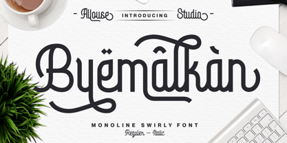 Proudly Presenting, Byemalkan a Monoline Swirly Font that carefully crafted by us with rich swashes for your need! Byemalkan is perfect for any titles, logo, product packaging, branding project, megazine, social media, wedding, or just used to express words above the background. Byemalkan come with much swashes, alternates and also Multi-Lingual Support. We highly recommend using a program that supports OpenType features and Glyphs panels like many of Adobe apps and Corel Draw, so you can see and access all Glyph variations. Enjoy the font, feel free to comment or feedback, send me PM or email. Thank You!
 - Confirm by Twinletter,
$14.00 Introducing our newest font, Confirm. This font is rich in uniqueness in various characters in each letter, especially uppercase letters. This font is designed as an answer to the need for innovative and new designs, for that this font has different character characters. the impression of luxury and beauty that appears when you write the name or sentence you want with a wide selection of alternative letters in it This font is perfect for strong text with displays for a wide variety of branding, advertising, posters, banners, packaging, news headlines, magazines, websites, logo design, and more.
 - Noir by Mindburger Studio,
$39.00 Noir is a sans serif font family of 12 fonts with contemporary aesthetics heavily influenced by early 20th century geometric typefaces. While having its geometric structure it carries organic personality with touch of warmth injected to each form. Noir font family ranges from light and elegant weights perfect for small text, to extremely heavy and masculine weights suited for large display sizes. Noir has a rich arsenal of Open Type features for highly professional use and extended Latin, Cyrillic and Greek language support. Noir is delivered as Std and Pro version. Cyrillic and Greek are available in Pro package only.
 - Delaware Pro AOE by Astigmatic,
$24.95 Constructivist flavor typography goes pro enters the digital era with Delaware Pro AOE. Delaware Pro AOE is the revival and elaboration of a limited lettering specimen from a series of old loose book pages. What began as just Capitals & Lowercase was expanded to a rich pro glyphset including numerals, punctuation, small caps, small caps scaled figures, unlimited fractionals, superiors & inferiors, ordinals, tabular & proportional figures, and an expanded language glyph set. From titling to nightclub posters, fashion spreads to stencil play, the Constructivist Era is built up and out, waiting for you to put it to use.
 - Mramor Pro by Storm Type Foundry,
$52.00 The Mramor family first appeared in the Stormtype catalogue in 1994. The first sketch arose in 1988 through the narrowing of Roman capitals. It has uniform width proportions and, above all, original lower-case letters, unprecedented with Roman Capitals. The text designs are discontinued since they were replaced by the related Amor Serif family (along with its -sans version). Now, Mramor has “only” 10 designs that each include true small caps, Cyrillics and a rich variety of figures, ligatures and alternates. Mramor excels in corporate identity or bottle-label design, also whenever there is a need for a “classic” looking face.
 - Voger by Jafar07,
$14.00 VOGER is a work of art in the form of a modern serif font, with a design that exudes a clean, timeless elegance. With its upright and meaningful serif lines, "Voger" combines classic elements with a subtly refreshing modern aesthetic. Its enduring beauty meets a gentle touch of luxury, making "Voger" an ideal choice for various exclusive design projects. The simplicity and clarity in its design ensure that your message always appears clearly, regardless of size or medium. Moreover, "Voger" comes with a variety of unique alternate letters and ligatures, providing richness and creative flexibility in all your design creations.
 - Benefits by Mchcrafter,
$18.00 Benefits font – a stylish OpenType rich serif with letters that seem to dance and twist harmoniously together – to form unique & elegant typography designs. A large selection of interwoven Opentype ligatures and alternates, means ample selection and variety in your finished look. To access these OpenType features, you will need Opentype capable software such as : Word, Textedit, Photoshop, Sketch, Pages, Keynote, Numbers, iBooks Author, QuarkXPress, Indesign and Illustrator. A wide range of useful glyphs are included – see preview image of all glyphs. Benefits includes: All uppercase & lowercase letters All numbers 0-9 & Punctuation Ligatures & Alternates Symbols Multiligual Letters
 - Chofines by Viaction Type.Co,
$18.00 Chofines is a serif font with a retro style that is suitable for a variety of design purposes. Has a very soft curve, looks elegant and attractive when applied to the design. Equipped with opentype features such as Stylistic Alternate and rich Standard Ligature. It can be used in various countries because it supports Multilingual, adding to the maximum power of this font. You will get including: This font includes 2 styles, regular & oblique. It is very profitable to buy the Chofines font. Get it Now ! I hope you enjoy it and thank you. Viaction Type
 - As of my last update in early 2023, Gartentika may not be widely recognized in mainstream font directories or among the most commonly cited fonts by designers. Nonetheless, the description provided h...
- As of my last knowledge update in 2023, there isn't a widely recognized font named "Complete" that has gained significant attention in the graphic design or typography communities. However, the conce...
- Day Roman, designed by Apostrophic Labs, is a distinctive and elegant typeface that pays homage to the classic and timeless beauty of Roman inscription letterforms. Its creation stems from a devotion...
- The Grinched 2.0 font is a display sans-serif typeface that is both highly decorative and playful, making it instantly suitable for cartoon and holiday themes. The characters are heavy and bold, with...
- Manises by Eurotypo,
$32.00 Located in the Valencian Community, Spain, Manises is very famous for its pottery. In the Middle Ages and the Renaissance, Manises was the most important production center for Spanish-Moresca ceramics, which was exported throughout Europe. At the beginning of the 16th century, Manises tiles were very commercially successful, especially of the heraldic type. Much appreciated by the Aragonese crown, Manises ceramics was also exported to France, Italy, and especially to Naples. As a big fan of Paterna and Manises ceramics, Naples influenced other Italian courts. Calixto III and Alejandro VI continuously commissioned Valencian pieces and tiles for the halls of the Vatican. The export also extended to Sicily, Venice, Turkey, Cyprus and even Flanders and the Baltic countries. The palaces of all the courts of Europe were enriched with this art. Many painters reproduced it in his paintings. It can be seen in the work of Hubert and Jan Van Eyck, and in the central panel of a triptych by Hugo Van der Goes (Uffizi Gallery, Florence). In this city there are also some frescoes by Domenico Ghirlandaio in which the Arabic-Valencian earthenware appears. Manises font is inspired by a text written on a 16th century tile, but adapting it to our times and giving it a very modern air. It is characterised by being able to combine uppercase and lowercase letters in a conventional manner, or use only capitals, or only lowercase letters, or, a random combination of both. It comes with an extra of many ligatures, stylistic alternates, and a set of very useful catchwords, to give more modernity to your text. This OpenType features may only be accessible via OpenType-aware applications, or the Character Map to view and copy any of the extra characters to paste into your favourite text editor/app. Manises looks lovely on wedding invitations, greeting cards, logos, posters, labels, t-shirt design, logos, children's material, in ink or water-colour based designs, fashion, magazines, food packaging and menus, book covers and whatever your imagination holds!
 - Auberge Script by Sudtipos,
$79.00 It took me a long time, but I think I now understand why people of my generation and older feel the need to frame current events in an historical context or precedents, while most of the young couldn't care less about what happened ten years ago, let alone centuries back. After living for a few decades, you get to a point when time seems to be moving quite fast, and it’s humbling to see that your entire existence so far can be summed up in a paragraph or two which may or may not be useful to whoever ends up reading the stuff anyhow. I suppose one way to cope with the serenity of aging is trying to convince yourself that your life and work are really an extension of millenia of a species striving to accept, adapt to, and improve the human condition through advancing the many facets of civilization -- basically making things more understandable and comfortable for ourselves and each other while we go about doing whatever it is we are trying to do. And when you do finally convince yourself of that, history becomes a source of much solace and even a little premonition, so you end up spending more time there. Going far back into the history of what I do, one can easily see that for the most part it was ruled by the quill. Western civilization’s writing was done with quill pens for more than thirteen centuries and with newer instruments for about two. By the mid-18th century, the height of the quill experience, various calligraphy techniques could be discerned and writing styles were arranged in distinct categories. There are many old books that showcase the history of it all. I recommend looking at some whenever the urge comes calling and you have to get away from backlit worlds. Multiple sources usually help me get a better perspective on the range of a specific script genre, so many books served as reference to this quill font of mine. Late 17th century French and Spanish professional calligraphy guides were great aides in understanding the ornamental scope of what the scribes were doing back then. The French books, with their showings of the Ronde, Bâtarde and Coulée alphabets, were the ones I referenced the most. So I decided to name the font Auberge, a French word for hotel or inn, because I really felt like a guest in different French locales (and times) when I going through all that stuff. Because it is multi-sourced, Auberge does not strictly fit in a distinct quill pen category. Instead, it shows strong hints of both Bâtarde and Coulée alphabets. And like most of my fonts, it is an exercise in going overboard with alternates, swashes, and ornamental devices. Having worked with it for a while, I find it most suitable for display calligraphic setting in general, but it works especially well for things like wine labels and event invitations. It also shines in the original quill pen application purpose, which of course was stationery. Also, as it just occurred to me, if you find yourself in a situation where you have to describe your entire life in 50 words or less, you may as well make it look good and swashy, so Auberge would probably be a good fit there as well. This is one quill script that no large bird had to die for. A few technical notes The Auberge Script Pro version includes 1800 glyphs, everything is included there. Also latin language support. We recommend you to use the latest design application to have full access to alternates, swashes, small caps, ornaments, etc. The images from the gallery uses this version. For better results use the fonts with “liga” feature on. Awards During 2014 the early develop of Auberge Script was chosen to be part of Tipos Latinos, the most important type exhibition in South America.
 - Aretino by Eurotypo,
$24.00 Pietro Aretino (1492 – 1556) Was an Italian author, playwright, poet, satirist and blackmailer, who wielded influence on contemporary art and politics. The most vigorous and versatile vernacular writer of the 16th century He was a very versatile writer, famous for his Lascivious Sonnets – which caused great scandal at the time – but also for his satirical verses, addressed to all the powerful people in Italy, without forgetting the many plays that he wrote for the theatre. Part of the charm of his letters is that through them you may know the whole of Venetian society from the top to the bottom. The little-known church of San Luca in Venice (in St Mark's district) has been a place of pilgrimage for centuries for people who are decidedly not devout: journalists, writers, free thinkers. In 1556 Pietro Aretino, a unique character of the Italian and Venetian Renaissance period was buried there. Such strong of personality, has contributed to generate the powerful wind of change that emerged from the italian renaissance. We have inspired on that talent searching for a new sight the famous Venetian typefaces. Probably looking for more vigour and contemporary digital style. This typeface is slightly condensed, lighter and has more contrast between the thick and thin letter-strokes, it has concave bracketed serif. Their ascender and descenders strokes are very shorts. Aretino family is completed by four weigh: Regular, SemiBold, Bold and ExtraBold, while Italics has three weighs. These fonts came with a full OpenType features and CE languages.
 - Robur by Canada Type,
$24.95 It shouldn't be a surprise to anyone that these letter shapes are familiar. They have the unmistakable color and weight of Cooper Black, Oswald Cooper's most famous typeface from 1921. What should be a surprise is that these letters are actually from George Auriol's Robur Noir (or Robur Black), published in France circa 1909 by the Peignot foundry as a bolder, solid counterpart to its popular Auriol typeface (1901). This face precedes Cooper Black by a dozen of years and a whole Great War. Cooper Black has always been a bit of a strange typographical apparition to anyone who tried to explain its original purpose, instant popularity in the 1920s, and major revival in the late 1960s. BB&S and Oswald Cooper PR aside, it is quite evident that the majority of Cooper Black's forms did not evolve from Cooper Old Style, as its originators claimed. And the claim that it collected various Art Nouveau elements is of course too ambiguous to be questioned. But when compared with Robur Noir, the "elements" in question can hardly be debated. The chronology of this "machine age" ad face in metal is amusing and stands as somewhat of a general index of post-Great War global industrial competition: - 1901: Peignot releases Auriol, based on the handwriting of George Auriol (the "quintessential Art Nouveau designer," according to Steven Heller and Louise Fili), and it becomes very popular. - 1909-1912: Peignot releases the Robur family of faces. The eight styles released are Robur Noir and its italic, a condensed version called Robur Noir Allongée (Elongated) and its italic, an outline version called Clair De Lune and its condensed/elongated, a lined/striped version called Robur Tigre, and its condensed/elongated counterpart. - 1914 to 1918: World War One uses up economies on both sides of the Atlantic, claims Georges Peignot with a bullet to the forehead, and non-war industry stalls for 4 years. - 1921: BB&S releases Cooper Black with a lot of hype to hungry publishing, manufacturing and advertising industries. - 1924: Robert Middleton releases Ludlow Black. - 1924: The Stevens Shanks foundry, the British successor to the Figgins legacy, releases its own exact copies of Robur Noir and Robur Noir Allongée, alongside a lined version called Royal Lining. - 1925: Oswald Cooper releases his Cooper Black Condensed, with similar math to Robur Noir Allongée (20% reduction in width and vectical stroke). - 1925: Monotype releases Frederick Goudy's Goudy Heavy, an "answer to Cooper Black". Type historians gravely note it as the "teacher steals from his student" scandal. Goudy Heavy Condensed follows a few years later. - 1928: Linotype releases Chauncey Griffith's Pabst Extra Bold. The condensed counterpart is released in 1931. When type production technologies changed and it was time to retool the old faces for the Typositor age, Cooper Black was a frontrunning candidate, while Robur Noir was all but erased from history. This was mostly due to its commercial revival by flourishing and media-driven music and advertising industries. By the late 1960s variations and spinoffs of Cooper Black were in every typesetting catalog. In the early- to mid-1970s, VGC, wanting to capitalize on the Art Nouveau onslaught, published an uncredited exact copy of Robur Black under the name Skylark. But that also went with the dust of history and PR when digital tech came around, and Cooper Black was once again a prime retooling candidate. The "old fellows stole all of our best ideas" indeed. So almost a hundred years after its initial fizz, Robur is here in digital form, to reclaim its rightful position as the inspiration for, and the best alternative to, Cooper Black. Given that its forms date back to the turn of the century, a time when foundry output had a closer relationship to calligraphic and humanist craft, its shapes are truer to brush strokes and much more idiosyncratic than Cooper Black in their totality's construct. Robur and Robur Italic come in all popular font formats. Language support includes Western, Central and Eastern European character sets, as well as Baltic, Esperanto, Maltese, Turkish, and Celtic/Welsh languages. A range of complementary f-ligatures and a few alternates letters are included within the fonts.
 - Indie by Lián Types,
$37.00 A FEW THOUGHTS Indie is a trendy script, result of the wide range of possibilities that can be achieved using a pointed brush. (1) “You Only Live Once” say The Strokes, (to me, symbols of indie music) so, what would represent that sensation of volatility better than a brush? As you may already know, this time inspiration came from hipsters and indies around us: We may sometimes criticise them, we may sometimes want to be like them, but the truth is that the universo gráfico they generated these past years is gigantic, full of colour and variations. (2) Brush lettering and Sign painting are fields I've been fond of since I started as a designer. Nowadays, these styles are getting a lot of attention and maybe it’s due to the undeniable mark of life that is materialised when using a brush. This tool is so expressive that shows the passions and fears of the artist, and materialises that idea of “living the present”, so popular in this era. When you see Indie, you think of skaters, rollers, surfers, hiphop dancers, street artists, summer, and why not? California beaches. So if you feel life is only one, it’s high time you got Indie into your fonts' collection! STYLES Indie comes in 4 styles plus another one which consists only in capitals. Indie; Indie Shade; Indie Shade Solo; Indie Inline are all open-type programmed and have exactly the same glyphs and metrics, so you can combine them without probem. (I.E. You may use Indie Inline, then write the same word using Indie Shade Solo, and finally put them together). In applications such as Adobe Illustrator, the font has nice results when fi ligatures is activated. However, if you want a more casual look, activate the contextual and the decorative ligatures. NOTES 1. After several years of practicing calligraphy I can say that to me, there’s nothing more satisfying than being able to create fonts out of your own handlettering. I owe a lot of this brush-style to Carl Rohrs. He was the very first calligrapher who taught it to me. His style is unique and what he can do with a brush is truly marvelous. I'm serious. 2. In spite of some particular cases, I can say I'm happy to live in a present in which Typography is living a kind of Renaissance along with Lettering. Like it happened with W. Morris a hundred years ago, handcrafts are being revalued/reborn, and some of this may be happening thanks to these indie designers that, trying to be unique, gave new/fresh air to different areas of graphic design.
 - TT Rationalist by TypeType,
$39.00 Please note! If you need OTF versions of the fonts, just email us at commercial@typetype.org TT Rationalist useful links: Specimen | Graphic presentation | Customization options We thought, "What if we provide the user with a collection of matching fonts, each of which would still be unique?"—and so we started developing TT Rationalist. For those familiar with the bestsellers TT Norms® Pro and TT Commons Pro, the new font will be intuitive to use. It has similar proportions, characteristics and functionality, but yet it is an independent and original font family. Unlike the geometric sans serifs TT Norms® Pro and TT Commons Pro, TT Rationalist is a slab serif typeface. It is functional and original. Slabs are characterized by massive rectangular serifs, but in TT Rationalist they are trapezoidal and refined, which makes them look modern. Speaking of modernity, when creating the typeface, we wanted to avoid the excessive historicism that can be seen in many slab serif fonts. We have been particularly careful working on the Black style, which in the first sketches had something in common with the Wild West posters. When we balanced out the excessive contrast caused by visual compensation, the font stopped evoking retro associations. Now TT Rationalist Black is perfect for headlines, especially on posters and posters, and works great with Light styles in TT Norms® Pro and TT Commons Pro. The new typeface works well for both headings and text arrays. It looks especially aesthetically pleasing in printed production (books, magazines, brochures). The TT Rationalist typeface consists of 22 two styles: 10 upright, 10 real Italics and two variable fonts, each with over 950 glyphs. It supports over 200 languages and contains 27 OpenType features. In addition to the standard ones, there are Small Capitals for Latin and Cyrillic languages, alternative versions of the ampersand and the letter g. The italics have two stylistic sets allowing to switch the design of style-forming characters (k, v, w, y, z) between italic and classical forms. TT Rationalist font field guide including best practices, font pairings and alternatives. FOLLOW US: Instagram | Facebook | Website
 - Asterisk Sans Pro by Eclectotype,
$45.00 The market for humanistic sans serif type families is saturated, so what can a new release add, and what does it take to stand out from the crowd? Asterisk Sans Pro (named after my favourite glyph to make) aims to be a highly versatile type family; massively useful due to its pan-European language support and bounty of OpenType features which make it the ideal choice for demanding typography. The look is contemporary; details which give the fonts character at large sizes all but disappear when small, making the middle weights suitable for large chunks of text. The family ranges from a hairline ultra light to a pretty weighty black – a must in a new typeface. Asterisk Sans Pro supports Latin, modern Greek and Cyrillic, with localized forms for Bulgarian, Serbian and Macedonian to boot. This is rare enough, but to have small caps for all these scripts in both upright and italic fonts is a big plus. Your client may not need all this language support right now, but this typeface gives them the option to grow while keeping a consistent look, and at a similar price point to families with a much narrower scope. The ability to customize Asterisk Sans Pro through the use of Stylistic Sets in OpenType savvy layout programs means you are really in control. Want more italic forms in the uprights? Go for it. A more Roman italic? Easy! The spurless m, n, r and u, accessible through SS13 give a graphic, almost bauhaus feel. The Dutch IJ glyph can be changed to a much cooler thing using SS14, and the family even supports ij-acute. Other OpenType features include a wealth of numeral styles (tabular and proportional, lining and oldstyle, plus small cap figures, numerators, denominators, subscript and superscript) and automatic fractions. There are also case-sensitive forms for all caps settings, a bunch of useful arrows, and superscript lower case Latin letters. All in, there are well over 1200 glyphs per font, making Asterisk Sans Pro an invaluable tool in your typeface arsenal, great for everything from corporate identities to editorial work, apps to cookbooks.