8,496 search results
(0.034 seconds)
- Rare Bird Specimen I by Rare Bird Font Foundry,
$100.00 RARE BIRD SPECIMEN I From the the doyenne of modern calligraphy - Maybelle Imasa-Stukuls - we bring you Specimen I, a charming script lettered in Ms. Imasa-Stukuls' signature hand. OBSERVATIONS Specimen I stands on its own. Its subtle nuances make it stand out in a flock of fonts. It is easily recognizable, but it is never one to be too showy. Give it plenty of white space, so every quirk and curve can be noted. DEFINING CHARACTERISTICS Opentype programming, old style numerals, in and out-stroked letter forms at beginning and end of words, six alternate lowercase t cross-strokes, Roman numerals, seamlessly connecting script ligatures, alternate lowercase letters, realistic double-letter ligatures, basic Latin encoding. POTENTIAL SIGHTINGS Book covers, children's literature, broadcast titling, unique product designs, website titles, logo designs, restaurant menus, and gourmet food labels.
 - Albrecht Fraktur by New Renaissance Fonts,
$20.00 In his 1538 book on measurement, Albrecht Dürer gave clear descriptions and drawings about the proportions of the letters in both Roman and 'fraktur' alphabets (from Latin 'fractura', meaning that it's broken up with lots of different angles rather than smooth curves). Here is the fraktur alphabet as a font completed for use today, with a few characters modernised and some gaps filled. Of course there are countless examples of fraktur fonts already circulating, and indeed one foundry even has another version of this particular one; but we have different approaches to some of the questions raised, we have aimed at a more even tracking (horizontal spacing), and the 260 glyphs in our version include accents and other diacritics, and the modern symbols which Dürer would surely have embraced if he had had access to the internet.
 - Rusch by Proportional Lime,
$9.99 Adolf Rusch von Ingweiler, was in the 19 th century known mysteriously as the “R'' printer. He was the first printer North of the Alps to introduce the new Roman style of type known now as Antiqua. He was active in the city of Strasbourg from around the early 1460's to 1489. One wonders if the unusual form of “R'' was a personal conceit. This font is, therefore, an Antiqua style font and has over a 1000 defined glyphs with wide support for medieval characters that have since fallen out of use. The baseline was slightly tidied up in order to give the printed text an even cleaner look than the original. The letters are very close approximations of the original type catalogued by the “Veröffentlichungen der Gesellschaft für Typenkunde des 15. Jahrhunderts” as Typ.1:103R GfT1197.
 - Fansan by W Type Foundry,
$25.00 Organic and sublime, Fansan is an Art Nouveau type family that includes roman, italic, and optical sizes. Its roots can be found in famous works such as Benguiat, Windsor, and Melbourne — worldwide typographic references which all have a sense of being imperfectly appealing. The aesthetic influence of Art Nouveau on Fansan can be seen in the top-heavy stress found in most characters. Applying this stress consistently throughout the character set was a significant challenge in the design of the family. The sharp terminals of numerous lowercase characters — including the a, f and g — provide a visual link between the upper and lowercase forms. As a result, Fansan is able to be elegant and pointed in its lighter weights, and playful and full of character in its heavier styles. Fansan is ideally suited for use at display sizes where personality is needed.
 - PR8 Charade - Unknown license

- Lisbeth by TypeTogether,
$39.00 Louisa Fröhlich’s Lisbeth is the charming all-italic trailblazer that handles branding and text with internal vividness. With no roman style, it’s an italic-only family whose creation was guided by imagination instead of restrictive writing tools. Some type families aren’t sure what they want. Lisbeth proceeds with the utmost confidence on its own terms — it’s a feisty three-dimensional thespian amidst the cast of strait-laced characters you’re used to. With branding and magazine usage in mind, Lisbeth addresses the distinct challenges of text and display in a characterful way. The curves of the text weights show a soft angularity, emphasising the handwritten quality and the subtle twist inside the letters. The stroke’s carefully balanced contrast is more pronounced in the vibrant heavier weights but almost absent in the graceful structure of the thin weight. The angle of the letters is almost upright and the x-height is relatively large, so longer texts can be read comfortably and without effort. Lisbeth is slightly condensed and so uses a smaller area to efficiently impart much information. So if a type design can be thought of as the clothing letters wear, then Lisbeth is an energetic, freely flowing stroke wrapped around practical and efficient letter proportions. Another highlight of the family is the quirky high-contrast display style, easily catching every eye. The design concept of the twisted stroke shows at the extreme here and makes the letters dance a little on the page. Even though the shapes behave wildly, every letter is carefully balanced in itself so that the rhythmic repetition of the lettershapes results in an even and harmonic total picture. Lisbeth’s five text weights (from thin to bold) perform excellently in text settings, and its funky display style amps up the internal shimmer within each glyph. It supports numerous languages (Latin-A extended) and comes with ligatures and contextual alternates to produce beautiful typography. The character set contains proportional lining and oldstyle figures, tabular figures, subscripts, superscripts, and fractions. The complete Lisbeth family, along with our entire catalogue, has been optimised for today’s varied screen uses.
 - Romance Fatal Sans, a creation by the talented Juan Casco, is a font that masterfully blends elegance with modernity, striking a perfect balance between form and function. At first glance, it captiva...
- Simply Royal by Gleb Guralnyk,
$14.00 Introducing a vintage font Simply Royal. This typeface has a victorian medieval look. It's an all caps typeface with decorative classic style. Simply royal has three layer fonts for more conenient recoloring. Thank you and have a nice day!
 - TT Runs by TypeType,
$39.00 TT Runs useful links: Specimen PDF | Graphic presentation | Customization options TT Runs Version 2.0—an Unusual Wide-Proportioned Sans Serif! An update that expands the font's capabilities. TT Runs is a font designed for the sports industry. Before starting the development, we researched the identities of various Olympic venues and analyzed current sports brands. We put in maximum effort to design a unique yet elegant modern font well-suited for the sports sector. TT Runs has wide and unusual proportions that are different from traditional ones. It is because of the reversed contrast, which refers to the distinction between the upper and lower parts of letters. The uppercase letters have distinctive inverted proportions, particularly noticeable in characters like K, C, S, and R. This design choice gives the font an original personality and makes the letters look stylish and suitable for both athletic and casual sportswear. While updating the font, we kept its distinctive characteristics and preserved the graphical look of the majority of the characters. However, we thoroughly redesigned the outlines and italic font styles and updated the font's technical aspects entirely. As a result, TT Runs has become more convenient to use, and its range of applications has significantly broadened. - More projects and countries! The set of each font style has expanded from 791 to 917 characters. We added new languages and characters of the expanded Latin and Cyrillic writing systems. - Perfect italics! The new italic font styles are flawless from both graphical and technical points of view. The updated variable font. We have united the roman and italic font styles. You can now change the font on the axes of slope and weight, choosing the suitable values. - The new set of OpenType features! We added the updated numerators with currency symbols, numbers in filled circles, and localization features for the Dutch, Catalan, Turkish, Serbian, Bashkir, Chuvash, Bulgarian, and Romanian languages. TT Runs is an expressive font. It looks aesthetically pleasing on both athletic and casual clothing and is well-suited for printing on any material. Due to its proportions, the font is an ideal choice for headings, offering excellent readability and an elegant appearance in bigger blocks of text. Created with the sports industry in mind, this font brings a touch of style to any modern project. FOLLOW US: Instagram | Facebook | Website TT Runs OpenType features: aalt, ccmp, locl, subs, sinf, sups, numr, dnom, frac, ordn, tnum, onum, lnum, pnum, case, dlig, liga, salt, ss01, ss02, ss03, ss04, ss05, ss06, ss07, ss08, ss09, ss10, ss11, ss12, calt. TT Runs language support: English, Albanian, Basque, Catalan, Croatian, Czech, Danish, Dutch, Estonian, Finnish, French, German, Hungarian, Icelandic, Irish, Italian, Latvian, Lithuanian, Luxembourgish, Maltese, Moldavian (lat), Montenegrin (lat), Norwegian, Polish, Portuguese, Romanian, Serbian (lat), Slovak, Slovenian, Spanish, Swedish, Swiss German, Valencian, Azerbaijani, Kazakh (lat), Turkish, Uzbek (lat), Acehnese, Banjar, Betawi, Bislama, Boholano, Cebuano, Chamorro, Fijian, Filipino, Hiri Motu, Ilocano, Indonesian, Javanese, Khasi, Malay, Marshallese, Minangkabau, Nauruan, Nias, Palauan, Rohingya, Salar, Samoan, Sasak, Sundanese, Tagalog, Tahitian, Tetum, Tok Pisin, Tongan, Uyghur, Afar, Asu, Aymara, Bemba, Bena, Chichewa, Chiga, Embu, Gikuyu, Gusii, Jola-Fonyi, Kabuverdianu, Kalenjin, Kamba, Kikuyu, Kinyarwanda, Kirundi, Kongo, Luba-Kasai, Luganda, Luo, Luyia, Machame, Makhuwa-Meetto, Makonde, Malagasy, Mauritian Creole, Meru, Morisyen, Ndebele, Nyankole, Oromo, Rombo, Rundi, Rwa, Samburu, Sango, Sangu, Sena, Seychellois Creole, Shambala, Shona, Soga, Somali, Sotho, Swahili, Swazi, Taita, Teso, Tsonga, Tswana, Vunjo, Wolof, Xhosa, Zulu, Ganda, Maori, Alsatian, Aragonese, Arumanian, Asturian, Belarusian (lat), Bosnian (lat), Breton, Bulgarian (lat), Colognian, Cornish, Corsican, Esperanto, Faroese, Frisian, Friulian, Gaelic, Gagauz (lat), Galician, Interlingua, Judaeo-Spanish, Karaim (lat), Kashubian, Ladin, Leonese, Manx, Occitan, Rheto-Romance, Romansh, Scots, Silesian, Sorbian, Vastese, Volapük, Võro, Walloon, Walser, Welsh, Karakalpak (lat), Kurdish (lat), Talysh (lat), Tsakhur (Azerbaijan), Turkmen (lat), Zaza, Aleut (lat), Cree, Haitian Creole, Hawaiian, Innu-aimun, Lakota, Karachay-Balkar (lat), Karelian, Livvi-Karelian, Ludic, Tatar, Vepsian, Guarani, Nahuatl, Quechua, Russian, Belarusian (cyr), Bosnian (cyr), Bulgarian (cyr), Macedonian, Serbian (cyr), Ukrainian, Gagauz (cyr), Moldavian (cyr), Kazakh (cyr), Kirghiz, Tadzhik, Turkmen (cyr), Uzbek (cyr), Azerbaijan, Lezgian, Abazin, Agul, Archi, Avar, Dargwa, Ingush, Kabardian, Kabardino-Cherkess, Karachay-Balkar (cyr), Khvarshi, Kumyk, Lak, Nogai, Rutul, Tabasaran, Tsakhur, Buryat, Komi-Permyak, Komi-Yazva, Komi-Zyrian, Shor, Siberian Tatar, Tofalar, Touva, Bashkir, Chechen (cyr), Chuvash, Erzya, Kryashen Tatar, Mordvin-moksha, Tatar Volgaic, Uighur, Rusyn, Karaim (cyr), Montenegrin (cyr), Romani (cyr), Dungan, Karakalpak (cyr), Shughni, Mongolian, Adyghe, Kalmyk, Talysh (cyr) .
 - Yorkten by insigne,
$- Clean and welcoming, the distinct look of Yorkten is remarkably satisfying to the eye. Straight to the point, Yorkton features a fashionable, geometric composition with angled main stems. There are no fewer than fifty-four fonts in the family, all of which are characterized by one of three widths – extended, normal or condensed. Each individual subfamily is equipped with eight weights from Thin to Black with respective Italics, giving Yorkten a breathtaking range of fonts to boast. The greater value for you, though, is its members’ ability to work well together. With a deep toolbox of weights and widths to choose from, this family provides you with significant value and a broad number of design solutions, making sure you have the tools you need for each challenge. So where should you use the font? Jeremy Dooley designed Yorkten’s underpinning structure to be compact. Combined with its superior features and terrific legibility, this versatile font can be used effectively for many jobs, whether in print or on screen. Use it freely for e-books and apps. Yorkten is particularly great for headlines, banners, posters, and websites. As with all insigne fonts, fonts that are well received by the market are expanded into future variants such as rounded or slab serif types. Yorkten’s later expansions will increase the versatility and functionality of the family. There’s no need to wait for these future releases, though. This new face already complements a number of other insigne faces, such as Grayfel, Look, or the Cabrito Superfamily. So what are you waiting for? Get Yorkten today and bask in the rich potential it offers! Get Yorkten and luxuriate in its straightforward multifunctionality!
 - Emploi by ParaType,
$30.00 The type family includes two decorative designs that combine features of an italic typefaces and calligraphy. The elegant swashes and curls in upper case letters make the fonts rich and showy. Emploi Ingenue has rather developed decorative elements, and Emploi Travesti is more modest. Both fonts are intended for titles, display typography, especially advertising and for initials.
 - Father Christmas by Letterara,
$12.00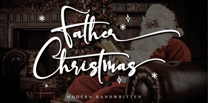 Father Christmas is a festive, fresh, rich, and elegant calligraphy font. It’s great for Christmas-themed greeting cards, branding materials, business cards, quotes, posters, apparel and more! This font is PUA encoded which means you can access all of the amazing glyphs and swashes with ease! It also features a wealth of special features including alternate glyphs and ligatures.
 - Plage by Hurufatfont,
$19.00 Plage draws inspiration from the fluid and organic typography of the '60s and '70s. Ideal for branding, poster and packaging designs. Equipped with rich ligature and opentype features for professional typographic designs. Diacritical marks in line form, which was widely used by graphic designers in Turkey at that time, were added as a style set (ss02).
 - Minion by Adobe,
$35.00In designing Minion font, Robert Slimbach was inspired by the timeless beauty of the fonts of the late Renaissance. Minion was created primarily as a traditional text font but adapts well to today's digital technology, presenting the richness of the late baroque forms within modern text formats. This clear, balanced font is suitable for almost any use. - MBF Hourglass by Moonbandit,
$10.00 a display typeface inspired by the elegant and exotic shape of hourglass. This typeface is perfect if you are in need of a fresh new elegant, rich and expensive feel. This font is filled with unique shaped glyph and several alternate letters. This typeface also comes with 2 styles, regular and connected. Switch in between according to your liking.
 - Sweet Vanity by Prestige Artsy Studio,
$20.00 Sweet Vanity is a remarkable modern and rich serif that comes with its beautiful outline. It works beautifully for branding projects, headlines, magazines, product packaging, quotes, posters and more. Sweet Vanity can be easily read thanks to its sophisticated and clean curves. WHAT’S INCLUDED: • Sweet Vanity – Regular • Sweet Vanity – Outline Follow me on Instagram for future updates : www.instagram.com/zak.mansouri/
 - Vaelor by nasirbaradari,
$20.00 The coolest royal font is here. This font was designed with the goal of exotic and rich looking, every single letter and every single character itself is a logo in this typeface. You can use it for any purpose that you want and this font will make your design stand out. Certain characters are designed to look unique.
 - Monospaceland by Pepper Type,
$25.00 Monospaceland is a round monospaced typeface in 7 weights with rich language support (Cyrillic included), small capitals, and some double-width alternatives for added fun. It includes obliques and reverse obliques, making a total of 21 fonts. Plus, the family pack comes with a two-axis variable font to allow setting arbitrary weight and slant angle.
 - Brunswick Black by Letterbox,
$80.00 Named after its place of birth, Brunswick (Melbourne, Australia), this black display face builds upon the rich heritage of Cooper Black whilst minimizing the more cartoon-like aspects of the original and basing it on a very sturdy broad serif. With its solidity responding well to tight kerning, Brunswick Black features not only small caps but also petite caps.
 - JTT Uyugeopum by Ziwoosoft,
$300.00 It's a font designed to remind you of milk bubbles. Curved strokes were used to add a bouncy feeling, and jasos were designed in various sizes to make them look rich when making. Numbers and English, which contain a bouncy feeling like Hangeul, can feel a more lively atmosphere when used together through rhythmically designed writing lines.
 - Wild Loops by Michael Rafailyk,
$9.00 Wild Loops is a handwritten monolinear typeface for wild ideas. Inspired by the marker sketches and graffiti on the walls, the font perfectly complements Doodle illustrations. It speaks to a young audience and looks a bit crazy with stretched Ascenders and Descenders. At the same time, the font is elegant and will work well for invitations, greetings, clothing brands and jewelry. The main feature of the font is a smart Contextual Alternates that substitute different versions of letters depending on its position in the word (at the beginning, middle, and the end of a word), which makes the writing more natural. View PDF Specimen: https://michaelrafailyk.com/typeface/specimen/WildLoops.pdf Contextual Alternates: ACDEFGHIJKMRSUWZabcdefghjlmnqrstvwxyzАДЕЁЗІЇКЛМНСШЩЯгдеёжзклмнстухцщьΑΕΖΗΙΚΛΜΞΥΆΈΉΪϲÀÁÂÃÄÅĄĂĀẢẠẮẰẲẴẶẤẦẨẪẬȦĎĐÐÈÉÊËĚĒĖẺẼẾỀỂỄƐĞǦĠÌÍÎÏĮĪĨỈỊİṂŘŔŠŚȘŽŹŻçğģǧġņṇřŕŗşṣýỳÿỷỹỵžźżЈјЅѕўӯ123456789. Stylistic Alternates: ABCDEFGHIJKLMNQRSUVWXZabcdefghjklmnqrstvwxyzАВДЕЁЗІЇКЛМНСТШЩЯгдеёжзклмнстухцщьΑΕΖΗΙΚΛΜΞΥΆΈΉΪκϲÀÁÂÃÄÅĄĂĀẢẠẮẰẲẴẶẤẦẨẪẬȦĎĐÐÈÉÊËĚĒĖẺẼẾỀỂỄƐĞǦĠÌÍÎÏĮĪĨỈỊİṂŘŔŠŚȘŽŹŻçğģǧġņṇřŕŗşṣýỳÿỷỹỵžźżЈјЅѕўӯ123456789&. Ligatures: jj ll. Superscript, Subscript, Fractions: ⁰¹²³⁴⁵⁶⁷⁸⁹ ₀₁₂₃₄₅₆₇₈₉ ½ ¼ ¾. Glyph count: 994. Languages count: 104. Languages: Afar, Afrikaans, Albanian, Asturian, Azerbaijani (Latin), Basque, Belarusian, Bislama, Bosnian, Breton, Bulgarian, Catalan, Chamorro, Chewa (Latin), Croatian (Latin), Cornish, Corsican, Czech, Danish, Dinka, Dutch, English, Erzya, Estonian, Faroese, Finnish, French, Frisian, Friulian, Fula, Gaelic (Scottish), Galician, German, Greek, Greenlandic, Guarani, Hausa (Latin), Hungarian, Icelandic, Igbo (Latin), Indonesian, Irish, Italian, Karelian, Kashubian, Kinyarwanda (Ruanda), Kirundi (Rundi), Kumyk, Kurdish (Latin), Ladin, Latvian, Lithuanian, Luxembourgian, Macedonian, Malagasy (Latin), Malay (Latin), Maltese, Maori, Marshallese, Moksha, Mongolian (Cyrillic), Northern Sotho, Norwegian, Occitan, Oromo (Afan, Galla), Papiamentu, Polish, Portuguese, Quechua, Rhaeto-Romance, Romani (Latin), Romanian, Russian, Rusyn, Sami, Samoan, Sardinian, Serbian, Shona, Slovak, Slovene, Somali, Sorbian, Spanish, Swahili (Kiswahili), Swedish, Tagalog, Tatar (Cyrillic, Latin), Tongan, Tsonga, Tswana, Turkish, Turkmen (Latin), Ukrainian, Ulithian, Uzbek (Latin, Cyrillic), Venda, Vietnamese, Walloon, Welsh, Wolof (Latin), Xhosa, Yapese, Yoruba (Latin), Zulu. The promo images used illustrations from the city walls of Groningen and Wrocław, photos of Cottonbro, Karolina Grabowska, Marlene Leppänen, Zhugewala from Pexels, and photos of Kevin Grieve, Liwei Zhang, Nathan Dumlao from Unsplash.
 - ALS Schlange Slab by Art. Lebedev Studio,
$63.00 Schlange is a rich typeface with rounded terminals. The family includes five sans serifs and five slab serifs in weights from ultra light to bold. Schlange’s personality is determined by an open aperture and quite large lower case characters in comparison with the upper case set. Schlange’s personality is open and friendly, giving a text it’s used for a soft, warm appeal. Schlange will work well as a display type (think titles, short magazine call-outs, ad banners, and such), but it’s not a good choice for extensive bodies of academic text. Available in numerous weights, the typeface provides rich opportunities for mixing and matching and is great for typographic compositions. These qualities make Schlange a dream type for a packaging designer. It will feel at home in design for cosmetics or sweets, postcards, children’s books and menus.
 - ALS Schlange Sans by Art. Lebedev Studio,
$63.00 Schlange is a rich typeface with rounded terminals. The family includes five sans serifs and five slab serifs in weights from ultra liight to bold. Schlange’s personality is determined by an open aperture and quite large lower case characters in comparison with the upper case set. Schlange’s personality is open and friendly, giving a text it’s used for a soft, warm appeal. Schlange will work well as a display type (think titles, short magazine call-outs, ad banners, and such), but it’s not a good choice for extensive bodies of academic text. Available in numerous weights, the typeface provides rich opportunities for mixing and matching and is great for typographic compositions. These qualities make Schlange a dream type for a packaging designer. It will feel at home in design for cosmetics or sweets, postcards, children’s books and menus.
 - Linotype Fehrle Display by Linotype,
$29.99Erich Fehrle designed this robust alphabet for headlines and titles in 1976. The constructed figures of Linotype Fehrle Display were built on the geometric form of the rectangle. Lines of text look closed and compact. The letter forms are the result of fine open spaces. Design-specific characteristics of Linotype Fehrle Display are its serif-like additions to the strokes of the figures a, c, G or M, and the alternating rounded and angular outlines of the figures a, e, s and others. Typefaces similar to Linotype Fehrle Display: Bigband, Frutiger 95. - JP Hand - 100% free

- Archequare by Midtype,
$26.00 Archequare is a square font made with geometric shapes by adding a slight curve to the font to make it more varied and specifically designed for text content, long sentences such as mechanical instructions. However, Also useful for display, titling, captions by their sophisticated glyph shapes and their eye-catching geometry
 - Maggies Luck by Gleb Guralnyk,
$15.00 Hello! Introducing a layered display font — Maggie's Luck. It's a vintage style bold typeface with layered feature. Maggie's Luck Font has five "fonts-layers" for more convenient recoloring. This font has a multilingual support (check out a screenshot with available letters and signs). Thank you and wish you a peaceful sky!
 - Valgan by Patria Ari,
$15.00 Valgan is a bold, slanted, all-capital display font designed to energize sport-themed apparel and related content. Its dynamic style exudes power and motion, making it perfect for team logos, jerseys, posters, and event branding. Versatile and contemporary, Valgan ensures your designs command attention and convey the spirit of competition.
 - Space Show by David Engelby Foundry,
$25.00 Space Show and tell. This font is the no-nonsense choice in your design of clear and big display typography for many types of media – infographics, websites, menu cards, posters, web banners, logo, signs etc. The font has ligatures, unique alternates, hybrid and oldstyle numerals – and specially designed subscripts and superscripts.
 - Serba by Sealoung,
$15.00 Serba is a fun, unique look serif display. With a modern look, it looks perfect when paired with a conventional serif/sans serif. It can be used for mastheads, posters, business identity and just about anything else. The all-inclusive also includes the complete set: All caps Multilingual character Number Punctuation
 - Landscape Alphabet by Celebrity Fontz,
$24.99A set of charming letters of the alphabet combining picturesque landscapes with inventive lettering. This entrancing and uniquely inventive font depicts a beautiful and decorative alphabet representing an idyllic era now gone. Includes one set of A-Z ornamental initials conveniently assigned to both the upper and lower case alphabet characters. - Institut by Brownfox,
$18.99 Institut is an industrial-strength display face, with a no-nonsense feel of a research lab and audacity of a space mission control. Based on assertive geometric forms, it is suitable for a variety of on-screen and print uses. Designed by Vyacheslav Kirilenko with participation of Gayaneh Bagdasaryan in 2013.
 - Kendrick by Monotype,
$15.99 A heavy-set but lively font, Kendrick’s dense strokes were hand-painted using a thick wet brush. This all-caps set of letters is bold but brushy, textured and expressive; fun but very much meaning business. Kendrick is streetwise and no-nonsense, but with a big cheesy grin to boot.
 - Xpress Rounded by Wiescher Design,
$12.00 »XPress-Rounded« is my new addition to »XPress«, my Sans-Serif that impresses – especially in small sizes – with its outstanding readability. »XPress-Rounded« looks very different, almost like a completely new font. But the rounded version has the same seven precisely calibrated weights from »Thin« to »Heavy« and its corresponding italics make this font-family universally usable. The »XPress« fonts got their bearings from the fabulous American »Gothic« fonts of the twenties of last century. Modern, present day elements, high lowercase letters and infinitesimal elegant slight curves in start- and end strokes make the font family not only great for body copy, but also very useful in advertising. Enjoy! »XPress-Rounded« ist meine neue Erweiterung zur »XPress« Familie, die durch aussergewöhnliche Lesbarkeit auffällt. »XPress-Rounded« sieht jedoch vollkommen anders aus als sein älterer Bruder. »XPress-Rounded« hat jedoch die selben sieben präzise aufeinander abgestimmten Schnitte von »Thin« bis »Heavy« und die dazu passenden Kursiven. Das macht die Schriftfamilie vielseitig einsatzfähig. Die »XPress« Schriften basieren auf der Formensprache der grossen amerikanischen Groteskschriften der zwanziger Jahre des letzten Jahrhunderts. Durch moderne Formelemente, große Mittellängen und unendlich leichte, elegante An- und Abstriche ist die Schrift jedoch nicht nur als Textschrift, sondern auch im gesamten Bereich der Werbung vielseitig einsetzbar. Viel Erfolg!
 - MC Bonica by Maulana Creative,
$14.00 Bonica is a casual modern condesned sans serif font. With medium low contrast stroke, fun character with a bit of ligatures and alternates. To give you an extra creative work. Bonica font support multilingual more than 100+ language. This font is good for logo design, Social media, Movie Titles, Books Titles, a short text even a long text letter and good for your secondary text font with sans or serif. Make a stunning work with Bonica font. Cheers, Maulana Creative
 - Litto by VladB,
$12.00 The name of the font is taken from the concept "Littoral zone" - this is the part of the sea that is close to the shore. The width of the shore varies as a result of the tides. Hence the idea of my font family — changing the width of a character from condenced to extra expanded. Litto is a modern sans serif geometric font, includes upper and lower case characters, Latin and Cyrillic. Graphically, the characters have uniform thickness for all family.
 - Azbuka by Monotype,
$29.99 The Azbuka™ typeface family has its roots in a fairly pedestrian source. “The idea came in part from an old sign in London that read ‘SPRINKLER STOP VALVE’,” says Dave Farey, designer of the typeface. Like all good sign spotters, Farey took a photograph of the sign and filed it away for possible use in a lettering or typeface design project. In Prague a number of years later, the street signs reminded Farey of the London signage - and his camera came out again. Comparing the two back in his studio, he realized that the signs from London and Prague were not as similar as he initially thought. However, they were enough alike to serve as the foundation for a no-frills, 21st century sans serif typeface family. “I wanted to draw a wide range of weights, italic and condensed designs all in one go,” recalls Farey, “rather than add on to the family later.” His goal was to create a family that could be used for text and display copy, with sufficient weights to provide a broad typographic palette. Indeed, the completed design, created in collaboration with fellow type designer Richard Dawson, consists of twenty typefaces in eight weights ranging from extra light to extra black. The five mid-range designs have complementary italics. Seven condensed designs round out the family. Azbuka’s lighter weights perform remarkably well in blocks of text composition. “They’re clean and legible - and perhaps a little boring,” says Farey, “but they are perfect for copy with a down-to-earth, yet contemporary flavor.” The heavier weights are equally well suited for a variety of display uses. The designs are authoritative but not overbearing and will readily make a strong statement without calling attention to themselves. The condensed weights of Azbuka are ideal for those instances where you have a lot to say - and not much room to say it. The name Azbuka? It’s Russian for “alphabet.” And what more appropriate name could there be for this utilitarian, industrial-strength type family than alphabet? The Azbuka family is available as a suite of OpenType Pro fonts. Graphic communicators can now work with this versatile design while taking advantage of OpenType’s capabilities. The Azbuka Pro fonts also offer an extended character set that supports most Central European and many Eastern European languages
 - Waschkueche - 100% free

- cbe - 100% free

- XAyax - 100% free


