10,000 search results
(0.033 seconds)
- Widdershins by Hanoded,
$15.00 I like strange words. Widdershins is one of them: it means ‘to go counter clockwise’ and I picked it up from a book I am reading at the moment. Widdershins font was created using a broken bamboo satay skewer and Chinese ink. It is a little messy, uneven and maybe even unnerving, but I am sure you’ll find a way to put it to good use.
 - Bargain Hunter by Hanoded,
$15.00 I am somewhat of a bargain hunter. Not at all cost, mind you, but I like a discount! Having said that, I guess I am not a true bargain hunter, because I only buy stuff I need; not because it is a bargain. I also refuse to buy fake items or products that are unsustainably produced. Bargain Hunter is a font I made with a cheap pencil (a bargain!) and my trusted Chinese Ink (environment friendly). It comes with a set of alternates and all the accents you need. And at this price, it is a genuine bargain!
 - Far Space AT by Andrew Tomson,
$10.00 Hi, friends! Sitting under the starry sky, I thought about extraterrestrial life and was inspired. I imagined if there was extraterrestrial life and their means of communication. The outline of this font popped up in my mind and I quickly sketched it out so I wouldn't forget it! This font is great for logos, quotes, space-themed inscriptions, it's also just pleasing to the eye and makes you think about the extraterrestrial!
 - Foxcroft NF by Nick's Fonts,
$10.00The inspiration for this proto-Art Nouveau typeface showed up in the 1887 type specimen book of Farmer, Little & Co. under the name Vassar. Its bold, sinuous curves, which take unexpected turns now and then, make it the perfect choice when you want to command attention...in a dignified, Ivy League kind of way, of course. All versions of this font include the complete Latin 1252 and CE 1250 character sets, with localization for Romanian and Moldovan. - Baby Boho by Bosstypestudio,
$12.00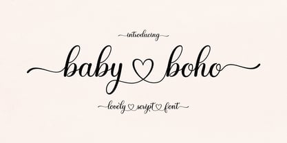 Introducing Baby Boho Baby Boho with a smooth handwriting style and very pretty and lovely. Baby Boho is perfect for branding projects, home appliance design, product packaging, use in business cards, invitation cards, etc. Just like a stylish text overlay to a wallpaper or anything that needs a touch of love. Thanks for checking! I really hope you enjoy it.
 - Hey Magdison by Amelia Studio,
$12.00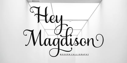 Introducing Hey Magdison Hey Magdison with a smooth handwriting style and very pretty and lovely. Hey Magdison is perfect for branding projects, home appliance design, product packaging, use in business cards, invitation cards, etc. Just like a stylish text overlay to a wallpaper or anything that needs a touch of love. Thanks for checking! I really hope you enjoy it.
 - Forward Script by Bosstypestudio,
$14.00 Introducing Forward Script Forward Script with a smooth handwriting style and very pretty and lovely. Forward Script is perfect for branding projects, home appliance design, product packaging, use in business cards, invitation cards, etc. Just like a stylish text overlay to a wallpaper or anything that needs a touch of love. Thanks for checking! I really hope you enjoy it.
 - After Nightfall by Hanoded,
$10.00 After Nightfall is a handmade fairytale font. It was called Bunting Nook first (after a spooky story of a black dog that haunts a town in Britain), but I figured it was a bit of a weird name, so I settled for After Nightfall. This font comes with some lovely swashes, which should be used sparingly. But that, of course, is entirely up to you.
 - Heanffe by Letterara,
$12.00 Heanffe is a one-of-a-kind handwritten font with a beautiful feel. To maintain a true, hand lettered experience, this font includes the following ligatures: Alu, at, ch, dd, ee, ff, ll, oo, pp, ss, tt, ef, es, et, eth, ily, it, ith, om, ot, on, ou, ont, th, ov, ow, sh, st, ut, zz Just use your imagination, your project will become more alive and look Elegant than ever with one of the Heanffe font. Feel free to play with all the whole alternates! Heanffe also includes full set of uppercase and lowercase letters, multilingual symbols, numerals, punctuation. The font has smooth wet ink texture, so would be perfect for all designs. You can make a greeting card or a package design, or even a brand identity, craft design, any DIY project, book title, wedding invitation, identity card, packaging, Website or any purpose to make your art / design project look pretty and trendy.
 - Alt Juk01 by ALT,
$30.00 Yet another experimental typeface. I love trying different things I’m very happy with the results here. See the whole presentation here: Behance,net
 - Kurkuma by Hanoded,
$15.00 Kurkuma (Turmeric in Dutch) is a spice I use in all of my curries. And I love curry! It's not more than fair to name a font after my favorite ingredient, so here you have it: Kurkuma. It is a unique and somewhat bizarre font with both an angelic and a diabolical side. I wouldn't set a whole text in it, but it does look great in headlines, posters and websites.
 - Sitting Duck by Kitchen Table Type Foundry,
$15.00 I have no particular affection for ducks, nor do I keep them, but I thought it was about time someone named a font after them! Sitting Duck is a jolly comic/kids font. Handmade (of course), cute and useful. Comes with extensive language support and a cool alternative asterisk in the shape of a duck.
 - Reardon AOE by Astigmatic,
$19.95 Disco lives on in the alphabet stylings of Reardon AOE. From its uber-fat letterforms to its hole punched counters, Reardon AOE started as a digitization of a film typeface called Joyce Black by LetterGraphics. This flashback typestyle was taken from its limited A-Z and numerals set and fleshed out to include an expanded language glyph set. Reardon AOE finds itself thrown into a late 70’s-early 80’s flashback frame of mind, appealing to all of the disco and video game typography of that time, ready to throw down the vibe for your designs.
 - Secret Granola by Pen Culture,
$19.00 Introducing Granola. A modern calligrphy font with modern and lovely style of script font. This font comes with more than 50 ligatures and more than 20 alternates, so you will find it very easy to mix and match this font in your projects. This font will be very suitable for branding, logo design, magazines, posters, invitations and much more. I really hope you enjoy it – please do let me know what you think, comments & likes are always hugely welcomed and appreciated. More importantly, please don’t hesitate to drop me a message if you have any issues or queries. Thanks
 - Lycian Monolith by Thomas Käding,
$- I know what you're thinking: Where can I find a Lycian font that looks good and is easy to use? Look no further! This font has the Lycian characters both in their unicode positions, and where you can find them on the keyboard. The glyphs in this font were based on those on a Kerei monument in Lycia. I am not an archaeologist, so your feedback would be most welcome.
 - Studio Neon by LLW Studio,
$22.00 Studio Neon is an all-caps display font constructed with three rounded-end strokes; the lowercase set is included as a repeat of the uppercase to make setting type just that little bit easier. It’s a modern rendition of neon sign lettering, with a decidedly art deco pedigree, and is intended for use in larger sizes of type, upwards of 36 pt. It’s perfect for a design that wants to imitate neon — use Photoshop layer effects to light it up! I originally started this font with only a few letters, since I could not find a neon-style font made with 3 strokes that looked modern. (Once I started, I found out why. It's a LOT of work!) Most traditional neon fonts include a “bent tube” element in the design; however, not all modern neon signage is constructed with the tubes bent. I also wanted to design a fun font that would have more life than just as an imitation of signage — something to inspire designers who love the geometry of art-deco type. So I made all the corners consistent, with no references to bent tubes. Use this font for any application that needs a bold and decorative look. Studio Neon should work well for sign production and even vinyl cut applications at larger sizes.
 - Arta by Olivier Blanc,
$34.00 ARTA is an ArtDeco style font, inspired by classic font like Newport Classic with elongated typeface with high waisted uppercase letters which curve in an geometric and elegant way. It consisted of really condensed lettering which had little space available. It's a well complet font with 315 Glyphs for most latin languages as "English, French, Spanish, German, Icelandic, Afrikaans, Catalan, Czech, Esperanto, Hungarian, Latin, Latvian, Lithuanian, Maltese, Northern Sami, Polish, Serbo-Croatian, Slovak, Slovene, Sorbian, Turkish and Welsh". ARTA will give to your design an chic presentation, you will be able to generate beautiful writings,thanks to 3 differents type "Light, Regular & Bold". It can be used for Shop, Restaurant, Jewelry, Cosmetic, Press identity & more. I started to work on this typeface at the creation of a logo in 2017 for the butcher shop of my uncle in Luchon in France named "Le Louchébem". I always had in mind to complete & share it. So after some years, I decided that it was time to finish it. This was my first Typography creation and I wanted to make it as an Art Deco typeface. I really love this elegant, high & classy lettering style. I want to bring this 1910's vibes back to be more use in our days.
 - Danger Agenda by PizzaDude.dk,
$17.00 "Punk is not dead, grunge is not dread, skateboarding and grafitti is forever" - shouted by some (possibly drunk!) person one late night. I had these "wise" words in the back of my mind, while making this font. I wanted to capture the wildness of both punk/grunge/skateboarding and grafitti without overdoing any of them!
 - Shameless by Positype,
$79.00 I will spare you the long-winded description this time and all of the motivations and witty innuendoes. Quite frankly, I forgot about creating this typeface and it sat on my hard drive for almost a year. Luckily, my daughter Isobel saw the initial drawings one day and ask me about those pretty letters and I remembered… yep, that happened. That said, time made this a better typeface… with fresh eyes and time, much was redrawn, retooled and expanded to something I truly enjoy playing with. Shameless makes extensive use of Contextual alternates to create a proper ebb and flow from letter to letter. Interestingly, there are only a handful of ligatures… instead many special combinations are accounted for solely by relying on Contextual Alts. Mix in Stylistic Alts, Swashes, responsive Titling Alts, numerous Style Sets, etc and you can have a lot of fun. I created 2 versions. A ‘Standard’ version that has 2200+ characters and a ‘Deluxe’ version that has 2400+ characters and an interesting caveat… I plan on expanding the Deluxe version any time I have an idea to add to the typeface… and as such, buyers will receive all of those updates at no charge (with updates going directly to the distributors). You get what you pay for… no insane discounts. Oh, and if you are wondering… Shameless is based on my handwriting using Kuretake Zig CocoIro pens. I love these pens.
 - Jodler by Beau Williamson,
$4.99 Inspired by show card lettering and the more human side of art deco, I wanted this font to retain the casual unevenness of informal hand lettering. As decorative as the font looks, I do envision it being used for text more than display. Obviously not a workhorse, but rather a quirky niche font. I find it makes dense philosophic texts more friendly to read.
 - Veggie Spray by PizzaDude.dk,
$16.00 I bet a lot of people would love to have a Veggie Spray - I bet they would use it to turn candy, ice cream, cakes and other fattening products into something more healthy! Well, this font has zero calories and is 100% handmade, and comes with contextual alternates - which means that every letter has 5 different versions!
 - Weltschmerz by Hanoded,
$15.00 Weltschmerz, world-weariness… I love the sound of it, so I chose this name for my new font. Weltschmerz font is a hand made Jugendstil typeface which was modeled on a 1910 poster from Austria. Weltschmerz is a classy typeface, a little melancholic, but with a positive uplift in the end. Weltschmerz comes with extensive language support.
 - Abrikos by PizzaDude.dk,
$15.00 Abrikos is apricot in danish. A lovely and sweet fruit, often underestimated and not very well known - but if you ask me, it is delicious! The letters were drawn using a small brush, and as you can see, I almost ran out of ink - leaving the letters somewhat rough. I made 4 different versions of each lowercase letter, and these cycle automatically as you type in order to make some randomness. I threw in an extensive set of international characters as well! Enjoy!
 - Easy Answer by Bogstav,
$17.00 Is there such a thing as an easy answer, or is it just because you know the question? Anyway, as a kindergarten teacher I like to make these quizzes with the kids. The object of the game is not to answer right, but to get a feeling of knowing a lot. I thought of these questions as being logical and really easy, but I also found out that it is a great way for the kids to remember and recall their knowledge! This font is easy to read, even if you use some of the many choices of swashes!
 - Garden Gnome by Hanoded,
$15.00 I am not really fond of Garden Gnomes, but this font is kinda cute and I figured it'd be a nice name. Garden Gnome is a very happy, easy to read Children's Book font. It is bouncy, rounded and comes with all the diacritics you need.
 - Chalkaholic by Hanoded,
$15.00 It seems black crayons are out of stock where I live. I can buy all the colors I want, except black ones… I really needed a crayon, so I bought this ridiculously expensive professional marker crayon ($14 for 1!!!) and created this font. Use it for… well, uhm, dunno… book covers, product packaging and restaurant menus? Just have a ball!
 - Cedar Street by Three Islands Press,
$39.00 There's something satisfying about tweaking to perfection a typeface based on the particular style of lettering applied to a particular kind of paper by a particular human hand. One day, in pursuit of this curious sense of satisfaction, I sat down with a porous pad of lined note paper and printed out the alphabet with a ballpoint pen. I found particularly interesting the bulbous ends of the strokes where the ink soaked in. I couldn't help myself: I drew out the rest of the character set, scanned, hand-traced, and -- as with all 3IP font designs -- manipulated every glyph to an obsessive degree. Named it Cedar Street, after a favorite address of mine. Full release has a single medium weight with a thorough character set.
 - Fendysa by Stringlabs Creative Studio,
$25.00 Fendysa is a script font with beautiful romantic calligraphy style. Whether you’re looking for fonts for calligraphy scripts for DIY projects, Styll Love will turn any creative idea into a true piece of art! This font is PUA encoded which means you can access all of the cute glyphs with ease! It also features a wealth of special features including stylistic alternate glyphs and ligatures.
 - Regalhisa by Stringlabs Creative Studio,
$25.00 Regalhisa is a script Font with modern beautiful calligraphy Style. Whether you’re looking for fonts for calligraphy scripts for DIY projects, Styll Love will turn any creative idea into a true piece of art! This font is PUA encoded which means you can access all of the cute glyphs with ease! It also features a wealth of special features including stylistic alternate glyphs and ligatures.
 - Bodybag - Unknown license

- FS Lola by Fontsmith,
$80.00 L-O-L-A Like the subject of the Kinks’ song, FS Lola is a little bit of both – a font with a rare combination of masculine and feminine. The font was inspired by the song, which itself was inspired by the night the Kinks’ manager spent dancing drunkenly in a Soho club with a beautiful woman... Or so he’d thought, until her stubble started to show halfway through the evening. Masculine/feminin Phil Garnham’s experience in designing FS Lola was similar to the one related by Ray Davies. Setting out to create a sans serif font, he realised along the way that he was actually dealing with a semi-serif. He went with it, though, and produced a font with the best masculine and feminine qualities: hard edges and corners tempered by shapes of softness and generosity, the outcome of what Phil calls an “organic” design process. “Initially, my designs were very graphic and hard but not very distinctive. By printing and redrawing the letters in pencil I achieved a softer and friendlier alphabet with a strong personality.” Broad Lola, as you’d expect, is very broad-minded. Available in five weights with italics – and fluent in central European languages – FS Lola offers a confident combination of feminine softness and male steeliness to any kind of design. As the song says, “It’s a mixed-up, muddled-up, shook-up world... except for Lola.
 - Plain Stupid by PizzaDude.dk,
$17.00 Really, there is nothing stupid about this font. In some strange and weird way, I just thought that the name sounded like something eye-catching - in the same way that the font is eye-catching! It may look like your average comic font, but it's not! I carefully put a lot of funk, twist, comic and a spoonful of pizzadude into each and every letter. The result is a bouncy crazy looking comic font. Oh, I almost forgot - I topped the letters with a spoonful of grafitti mixed with the sounds of a party...that's the recipe for this lovely multilingual font! :)
 - Karamelia by PizzaDude.dk,
$20.00 Karamelia is my grungy hand drawn brush script. Uppercase is pretty steady, while the lowercase dances and bounces in an unpredictable way. The font has got at lot of of OpenType features such as swashes, ligatures and stylistic alternates - which easily makes your text look more like authentic handwriting. I can think of loads of great opportunities in which this font would look absolutely great ... invitations, weddings, café menus, birthdays, various greeting cards ... or maybe even a loveletter?! I could mention more, but I think I got your fantasies started! Go crazy with Karamelia, and the world will love you for it!
 - Tartufo by Hanoded,
$15.00 A Tartufo is a truffle in Italian. I have to admit, I have never eaten one, so I couldn’t really tell you if they’re any good. I suppose they are, but you’ll have to find that out for yourselves! Tartufo font is a bit of a weird font. It was hand made with a rollerball pen on some very expensive French paper. As I was drawing each glyph, I figured I might as well include Cyrillic and Greek. Tartufo is not a text font - I’d use it for packaging, posters, book covers and T-shirts. Comes with a whole bunch of diacritics!
 - Dreadnought by Hanoded,
$15.00 With Dreadnought I go back to my roots: one of my very first fonts was a scary brush typeface called Face Your Fears - a very popular typeface with horror lovers, thrill seekers and gangsta rappers. Dreadnought was created using a stiff brush and some very high quality paint on textured paper. The result is a lively, scary and very legible font. Use it for your movie, book or album: you won't be disappointed!
 - Affair by Sudtipos,
$99.00 Type designers are crazy people. Not crazy in the sense that they think we are Napoleon, but in the sense that the sky can be falling, wars tearing the world apart, disasters splitting the very ground we walk on, plagues circling continents to pick victims randomly, yet we will still perform our ever optimistic task of making some little spot of the world more appealing to the human eye. We ought to be proud of ourselves, I believe. Optimism is hard to come by these days. Regardless of our own personal reasons for doing what we do, the very thing we do is in itself an act of optimism and belief in the inherent beauty that exists within humanity. As recently as ten years ago, I wouldn't have been able to choose the amazing obscure profession I now have, wouldn't have been able to be humbled by the history that falls into my hands and slides in front of my eyes every day, wouldn't have been able to live and work across previously impenetrable cultural lines as I do now, and wouldn't have been able to raise my glass of Malbeck wine to toast every type designer who was before me, is with me, and will be after me. As recently as ten years ago, I wouldn't have been able to mean these words as I wrote them: It’s a small world. Yes, it is a small world, and a wonderfully complex one too. With so much information drowning our senses by the minute, it has become difficult to find clear meaning in almost anything. Something throughout the day is bound to make us feel even smaller in this small world. Most of us find comfort in a routine. Some of us find extended families. But in the end we are all Eleanor Rigbys, lonely on the inside and waiting for a miracle to come. If a miracle can make the world small, another one can perhaps give us meaning. And sometimes a miracle happens for a split second, then gets buried until a crazy type designer finds it. I was on my honeymoon in New York City when I first stumbled upon the letters that eventually started this Affair. A simple, content tourist walking down the streets formerly unknown to me except through pop music and film references. Browsing the shops of the city that made Bob Dylan, Lou Reed, and a thousand other artists. Trying to chase away the tourist mentality, wondering what it would be like to actually live in the city of a billion tiny lights. Tourists don't go to libraries in foreign cities. So I walked into one. Two hours later I wasn't in New York anymore. I wasn't anywhere substantial. I was the crazy type designer at the apex of insanity. La La Land, alphabet heaven, curves and twirls and loops and swashes, ribbons and bows and naked letters. I'm probably not the very first person on this planet to be seduced into starting an Affair while on his honeymoon, but it is something to tease my better half about once in a while. To this day I can't decide if I actually found the worn book, or if the book itself called for me. Its spine was nothing special, sitting on a shelf, tightly flanked by similar spines on either side. Yet it was the only one I picked off that shelf. And I looked at only one page in it before walking to the photocopier and cheating it with an Argentine coin, since I didn't have the American quarter it wanted. That was the beginning. I am now writing this after the Affair is over. And it was an Affair to remember, to pull a phrase. Right now, long after I have drawn and digitized and tested this alphabet, and long after I saw what some of this generation’s type designers saw in it, I have the luxury to speculate on what Affair really is, what made me begin and finish it, what cultural expressions it has, and so on. But in all honesty it wasn't like that. Much like in my Ministry Script experience, I was a driven man, a lover walking the ledge, an infatuated student following the instructions of his teacher while seeing her as a perfect angel. I am not exaggerating when I say that the letters themselves told me how to extend them. I was exploited by an alphabet, and it felt great. Unlike my experience with Ministry Script, where the objective was to push the technology to its limits, this Affair felt like the most natural and casual sequence of processions in the world – my hand following the grid, the grid following what my hand had already done – a circle of creation contained in one square computer cell, then doing it all over again. By contrast, it was the lousiest feeling in the world when I finally reached the conclusion that the Affair was done. What would I do now? Would any commitment I make from now on constitute a betrayal of these past precious months? I'm largely over all that now, of course. I like to think I'm a better man now because of the experience. Affair is an enormous, intricately calligraphic OpenType font based on a 9x9 photocopy of a page from a 1950s lettering book. In any calligraphic font, the global parameters for developing the characters are usually quite volatile and hard to pin down, but in this case it was particularly difficult because the photocopy was too gray and the letters were of different sizes, very intertwined and scan-impossible. So finishing the first few characters in order to establish the global rhythm was quite a long process, after which the work became a unique soothing, numbing routine by which I will always remember this Affair. The result of all the work, at least to the eyes of this crazy designer, is 1950s American lettering with a very Argentine wrapper. My Affair is infused with the spirit of filete, dulce de leche, yerba mate, and Carlos Gardel. Upon finishing the font I was fortunate enough that a few of my colleagues, great type designers and probably much saner than I am, agreed to show me how they envision my Affair in action. The beauty they showed me makes me feel small and yearn for the world to be even smaller now – at least small enough so that my international colleagues and I can meet and exchange stories over a good parrilla. These people, whose kindness is very deserving of my gratitude, and whose beautiful art is very deserving of your appreciation, are in no particular order: Corey Holms, Mariano Lopez Hiriart, Xavier Dupré, Alejandro Ros, Rebecca Alaccari, Laura Meseguer, Neil Summerour, Eduardo Manso, and the Doma group. You can see how they envisioned using Affair in the section of this booklet entitled A Foreign Affair. The rest of this booklet contains all the obligatory technical details that should come with a font this massive. I hope this Affair can bring you as much peace and satisfaction as it brought me, and I hope it can help your imagination soar like mine did when I was doing my duty for beauty.
 - Katoria Sans by Dora Typefoundry,
$15.00 Introducing Katoria is a luxury font duo with elegant combinations. You can use it as an addition or main. In this font, all letters are Uppercase, you will find various ligatures and alternatives that will help you create a unique design for your project, try changing the ligatures and alternatives and you will see how many options you can choose which are perfect for logos, magazines, social media, and more. This font is easy to use and has OpenType features. This type of family has become the work of true love, making it as easy and fun as possible. I really hope you enjoy it!
 - Visine FF by Koral Creative,
$32.00 Visine FF is a typeface that aims to question the geographical borders that in so many ways can define people's lives. It was developed with the experience of advertising and commercial use in mind. The name Visine can be translated most simply as HEIGHTS. Visine FF was developed out of the necessity to make the most of the space on the visual format. With the tall arches and narrow bodies with exceptional, easy-to-read features, Visine FF aims to complement visual languages in many linguistic regions. Visine FF was developed in the Balkans, where Cyrillic, Latin and Glagolitic were the three historical writing systems used in the former Yugoslavia to denote cultural, ethnic, religious and political identities. Today, the languages of the Western Balkans are so similar that they can easily be called dialects, although they are written in different scripts. This is the result of their coexistence and parallel evolutions, which gave a rise to the common traits. This font family celebrates all the languages and scripts of the Western Balkans and is a labour of love. Love of design, love of language and the human need to communicate across borders, cultures and identities.
 - Apla Clare by Hooper Type,
$9.00 Apla Clare comes from the love of my wife.. She's 'Simply' Clare. It's a straihght forward sans, but with a little bit of play, and a friendliness that ensures it moves away from sterile, serious sans. PLease enjoy!
 - Ata Rounded by Bülent Yüksel,
$19.00 My son’s name is Ata Caner Yüksel. After building this character, I wanted to honor him by using his name for this font. I think it fully reflects the character I created in my mind. Ata Rounded, only one of the four other deep end with rounded corners consist of sharpened flat plate. Matched to one another and are optimized for screen. The family, with eight weights plus matching italics, was designed by Bülent Yüksel in 2016. Ideally suited for advertising and packaging, editorial and publishing, logo, branding and creative industries, poster and billboards, small text, way-finding, and signage, as well as web and screen design. ATA provides advanced typographical support for Latin-based languages. Case-sensitive forms, classes and features, small caps from letter cases, fractions, superior, inferior, denominator, numerator, old-style figures, stylistic alternates; just one touch easy In all graphic programs. You can enjoy using it.
