10,000 search results
(0.048 seconds)
- Parkour by Resistenza,
$39.00 Parkour Brush Font takes the repertoire of moves and free spirit of this modern sport and bring it to a graphic definition. Handwritten with authentic dry brush imperfections and a bouncy baseline to evoke the energy of this urban sport discipline which emphasizes the athlete to be strong and flexible as to be able to move quickly and efficiently through any given environment. Sounds like a fun game, right? This font comes with a full set of upper and lower case characters - giving you the extra freedom to turn your text into authentic custom-made hand lettering. Parkour Marker font Includes a large range of glyphs including numerals, punctuation & multilingual support. It comes with a perfectly paired handy set of bonus Swashes and extras perfect to complete and customize your layout. Perfect for branding, social media, stationery, advertising, logos, handwritten quotes, product packaging, header, poster, merchandise & greeting cards. Features: - OTF Font file - Punctuation & numbers - Splashes & Splatters - Alternate letters - Uppercase letters - Multi Language To enable the OpenType Stylistic alternates, you need a program that supports OpenType features such as Adobe Illustrator CS, Adobe Indesign & CorelDraw X6-X7. There are additional ways to access alternates, using Character Map (Windows), Nexus Font (Windows), Font Book (Mac) or a software program such as PopChar (for Windows and Mac).
 - FATTIP - Unknown license

- Penny Pincher by Great Lakes Lettering,
$12.00 Penny Pincher is here to deliver a great fun and fancy at a super value. Penny Pincher is perfect for childrens books, cereal boxes and board games. Makes you wish you were a kid again.
 - Cute Bubble by Creaditive Design,
$14.00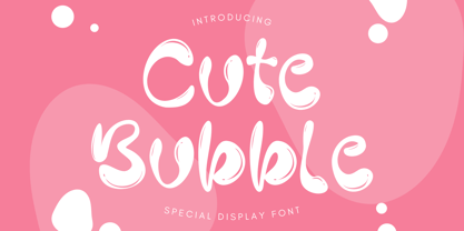 Cute Bubble is a fun, playful and friendly display font. It is perfect for any kid or cute design that need bubble effect. Just choose this font, your special cute project can be more cuteness.
 - Vox by Canada Type,
$39.95 The original brief for Vox was a extensive monoline typeface that can be both precise and friendly, yet contain enough choice of seamlessly interchangeable variants for the user to be able to completely transform the personality of the typeface depending on the application. Basically, a sans serif with applications that range from clean and transparent information relay to sleek and angular branding. When the first version of Vox was released in 2007, it became an instant hit with interface designers, product packagers, sports channels, transport engineers and electronics manufacturers. This new version (2013) is the expanded treatment, which is even more dedicated to the original idea of abundant application flexibility. The family was expanded to five weights and two widths, with corresponding italics, for a total of 20 fonts. Each font contains 1240 glyphs. Localization includes Cyrillic and Greek, as well as extended Latin language support. Built-in OpenType features include small caps, caps to small caps, four completely interchangeable sytlistic alternates sets, automatic fractions, six types of figures, ordinals, and meticulous class-based kerning. This kind of typeface malleability is not an easy thing to come by these days. For additional versatility, take a look at Vox Round, the softer, but just as extensive, counterpart to this family.
 - Auldroon by Ingrimayne Type,
$12.00 Auldroon was inspired by the pseudo-medieval fonts that were fairly popular in the late 19th century. Auldroon comes in two variants. Auldroon-Eld was designed first and is a bit more compact than the regular version. Both are decorative and distinctive and neither was created with a specific use in mind.
 - Regalia by Philatype,
$30.00 Regalia is an angular display face created with octagonal forms. There are 4 fonts to suit your needs. Regalia Basic and Regalia Basic Stamped includes only the alphabet and numerals; perfect for simple poster or logo work. For more comprehensive typesetting needs, you can find full character sets in Regalia and Regalia Stamped.
 - Airbuzz by Spinefonts,
$14.00 Airbuzz is a typeface created by Spinefonts in Warsaw, Poland. The idea was to create something between grotesk and 'lcd' typefaces; something which is strong and condensed. Airbuzz looks best in large sizes (30+ pts). You may find it useful for posters, titling, infographics, signage and corporate identity. Airbuzz features only uppercase characters.
 - Cathedral Display by Clint English,
$25.00 Cathedral is a display typeface with regular, semi bold, and bold weights with alternate glyphs for select characters. This font comes with bonus vector graphics that accompany the font. The bonus vector graphics have editable stroke weights, so they can match each type weight, or any other need you have in mind.
 - Gelsson by madeDeduk,
$16.00 Really excited to introduce Gelsson is a realistic brush script! Gelsson will be perfect for all your designs project. Included: Uppercase Lowercase Number & Symbol International Glyphs Ligature If you need anything else just shoot me on email at: dedukvic@gmail.com find more previews on my website here : https://typeclassheroes.com/ Hope you enjoy it.
 - Linotype Salamander by Linotype,
$29.99Linotype Salamander is a part of the Take Type Library, selected from the contestants of Linotype’s International Digital Type Design Contests of 1994 and 1997. Designed by German artist Michael Struller, the font seems to be composed of strokes and curves jointed together to form characters. Yet Salamander also looks like a handwriting font, in part because of its slight lean to the right. The font contains four basic weights, from regular to demibold, and two particularly heavy double-weights. Linotype Salamander is a light and lively font, particularly good for short texts of point size 10 and up or, in its heavier weights, for headlines and displays. - Agakê by Sea Types,
$19.00 Agakê is a typography for comics with 03 weights, variations in italics and shadow. It has 432 glyphs with support for multiple languages and was designed to adapt to a variety of styles and narrative genres, whether adventure, fiction, graphic novel or even superhero. Traditionally, the typeface in the comics are applied in capital letters, seeking the optimization of the space without losing the readability. But Agakê was designed to work also in lowercase, allowing a greater number of combinations and an incredible reading experience. Valuing the foundations of the graphic narrative, Agakê obtains total harmony next to the most diverse styles of illustration of the comic books.
 - Trypillya 2D by 2D Typo,
$36.00 This ornamental font is the interpretation of ornaments of Trypillya culture. Trypillya culture, or Cucuteni-Trypillya is an archaeological culture of neolithic times. Its name derives from the name of the village of Trypillya nearby Kyiv. This culture experienced its culmination between 5500 and 2750 BC. The Trypillians lived in the territories between the Carpathian Mountains and the Dniper River of the modern Ukraine, Moldova and Romania. Many interesting ceramics decorated with original geometric ornaments survived to amaze us. Its heritage is still a little unknown to the public and therefore the patterns that are reproduced in this font have no analogues in the digital format.
 - MVB Embarcadero by MVB,
$79.00 MVB Embarcadero lies in a space between grotesque sans serifs and the vernacular signage lettering drawn by engineers. It’s a style that happens to convey credibility and forthrightness without pretense—it’s anti-style, actually. All of this makes for the most versatile of typefaces, capable of delivering any kind of message while staying out of the way. As is often the case with a type design that develops over several years, Embarcadero isn’t the realization of a specific concept. In the ’90s Mark van Bronkhorst began digitizing a blocky slab serif from the Victorian era, which was then set aside for many years. He later revisited the design, paring it down to its bare essentials, and as more time passed, it evolved from a grid-based outline to curves that echoed the rigid skeleton of the original. Eventually it became a complete family with all the readability requirements of a text sans serif, yet maintaining the subtle eccentricities of its inspiration. Functionally, the Embarcadero family is as adaptable as its design. The OpenType Pro set of 20 fonts contains two widths and five weights, each with italics, small caps, a full set of figures, bullets and arrows, and support for most Latin-based languages. In all, Embarcadero is suitable for headlines or text. And—thanks to its simple, square form—it’s ideal for type on screen too.
 - AW Conqueror Std Sans by Typofonderie,
$59.00 AW Conqueror Sans was born out of this desire to fuse geometric and humanistic sans. It remains a typeface fundamentally influenced by both Bauhaus spirit — with its simplified geometric forms — and Jan Tschichold’s attempts to link this modular spirit to Eric Gill’s humanist sans serif. AW Conqueror Sans is a claimed French synthesis of Germanic Modernism and English classical tradition. Spheres of influence The core set of capitals are based on the proportions of the Roman capitals like Futura, Erbar, Nobel, Johnston, Gill Sans. During the 1930s, the Futura was a true success. Since then, Monotype offered a geometric version of the Gill Sans, and Linotype added Futura-like variants to WA Dwiggins’ Metro. AW Conqueror Sans is kind of a “fusion” of this approach. The lower case “b, d, p, q” are also directly influenced by Eric Gill’s, while the “y” is influenced by some of Jan Tschichold’s alphabets. In italics, drawn narrower, AW Conqueror Sans reinterprets Gill’s idea: a rigorous italic like a roman but which sometimes reveals some aspects of a Renaissance italic. AW Conqueror Sans and its extensions AW Conqueror Sans is the initial reference point for an extended family, including AW Conqueror Inline, Slab, Carved, Didot. The potential of these mixed families is powerful. Because AW Conqueror typefaces are based on an identical structure, and compatible proportions.
 - Resistance Is by Comicraft,
$19.00 You will not move. You will not breathe. You will not think. You WILL buy this font. You are our prisoner. There is no escape... RESISTANCE IS FUTILE! Also Useless. RESISTANCE IS… was created for the voice of the evil robot Sentinels in X-MEN: AGE OF APOCALYPSE, and later used for the friendly robot in BATTLE CHASERS and robot police in ELEPHANTMEN. A font for all your robot needs! See the families related to Resistance Is Futile and Useless: Resistance is Lowered
 - Hyldemoer by Hanoded,
$15.00 Hyldemoer (in Nordic folklore) is a tree spirit, or nymph, who lives in elder trees. H.C. Andersen also wrote a story about Hyldemoer (‘The Little Elder-Tree Mother’ in English). Hyldemoer font is based on my Mysterious font and the first letters of the Beowulf manuscript (Hwæt! We Gardena…). Hyldemoer is a jumpy fairytale font, which comes with some interesting alternate glyphs and ligatures, plus a harvest of diacritics. Use it for your book covers, product packaging, posters and art work.
 - Franken Jr AOE Pro by Astigmatic,
$24.95 Franken Jr. Pro was inspired by the title screen from the 1966 Hanna Barbera cartoon titled, "Frankenstein Jr." The original titling had a unique presence to it, overflowing with charm and offbeat personality. The addition of a Small Caps set, Unlimited Fractionals, Superiors & Inferiors, and Ordinals gave the a bit more serious, but not too serious) titling stance to the Franken Jr. Pro typestyle. Franken Jr. Pro truly embodies the comic lettering of its time, and gives designs a lively retro spark.
 - Bellisa Script by Matra Creative,
$10.00 Bellisa Sript is inspired by classic typography and brings its own unique style to every design project. This fantastic script font is best suited for headers of all sizes, and for blocks of text that have maximum and minimum variations. Be it for the web, printing, moving images or whatever - Bellisa Sript will look spectacular. This font is PUA encoded which means you can access all the funny glyphs and swash easily! It also has many special features including alternative glyphs and ornaments.
 - Lost Arcade by Chris Rogers Fonts and Symbols,
$19.00 Are you a game developer, retro enthusiast or lover of pixel art? Ever had trouble tracking down an 8-bit display font that's classy, coherent and truly complete? This type enthusiast and veteran pixel artist once had the same problem, and cut no corners to solve it. Lost Arcade features four styles, a myriad of special characters, broad language support and an accompanying symbol font with 64 pixel art symbols. For the purists out there, each square is proportional to its neighbor.
 - Alma Mater by Studio K,
$45.00 As the Latin tag for one’s college or university, Alma Mater seemed to me to be an appropriate title for a font family reminiscent of the lettering commonly used on college sweaters and sports jerseys. Essentially Alma Mater is an extension of my Oscar Bravo font family, but the lively demand for Oscar Bravo Blank persuaded me to go the whole nine yards and and offer inline, outline and shadow variations on the theme. Pick 'em up and run with 'em!
 - Lustra Text by Grype,
$16.00 The Lustra Text family is the next evolution of our Lustra Family, which finds its origin of inspiration in the HYUNDAI automotive company logo, and from there expands to an 8 font family of weights. Lustra Text still nods its head to the techno display styling of the inspiration logotype, but evolves its brand inspired origin from a display to a text font family that pulls on modern and historical styles like Eurostyle and Bank Gothic. This text family inherits a sturdy yet approachable geometric style with its uniform stroke forms and curves, and includes a lowercase with a Stylistic Alternate for the lowercase "a", a numerals set, and a comprehensive range of weights. This is a straightforward, powerful, and uncompromising collection of typefaces that lend a solid foundation and a broad range of expression for designers.
 - Imagine, if you will, sneaking into a bustling cityscape deep in the heart of a neon-lit night. Everywhere you look, shimmering lights dance against the dark, outlining shapes and letters with a glow...
- Headey by Alex Couture,
$15.00 Headey is a clean and lining brush script with a bouncing baseline. Include OpenType alternates and common ligatures. Try the alternates and ligatures to give your designs looks good, fresh, casual, stylish, and modern. That's it! I really hope you enjoy it.
 - Toxic Brew by PizzaDude.dk,
$15.00 The Toxic Brew font was initially designed to be a Halloween font, but I guess it turned out not so scary in the end. But maybe you can use it for something scary anyway? I've added several versions, and they mix very well
 - Life Cinema Screen by Andrey Ukhanev,
$- This font was inspired by an old photographic film package I found. Over time, the vertical slits in the letters have become more complex and acquired slanted sections. The font is suitable for accidences: headlines, posters... maybe you can suggest something interesting ;)
 - Cuckoo by Very Good Fonts,
$19.00Cuckoo was first seen in 1988 when I painted it on a record shop's window. Since then this hand lettered font has been there and done that. Cuckoo is strong, classic and informal display font designed to work well on any job. - Fleurons Two by Wiescher Design,
$39.50Fleurons are embellishments and here is my second round. I again looked at some old ones and made some new, more modern ones. These go very well with my scripts Nadine and Ellida! Yours once more in a beautiful mood, Gert Wiescher - Fleurons V by Wiescher Design,
$39.50 Fleurons are embellishments and here is my fifth set. I again found some nice old ones and made them completely new. These very elaborate ones go extremely well together with my scripts Nadine and Ellida!!! Yours in an elaborate mood, Gert Wiescher
 - Narziss by Hubert Jocham Type,
$39.00 Since Mommie I gradually got more into swirly ornaments. The massive contrast in the neoclassic style is perfect for thin swirly extensions to the characters. Even in an upright typeface. Narziss is very elegant in big headline sizes. Use it only very big.
 - Valuable Time by Bogstav,
$14.00 Sometimes you need a slim, elegant good old fashioned serif font. And, voila! Here you are - Valuable Time fits all those needs. I didn't spend much time cleaning up the letters, so they stand out just the way they are: organic and handmade!
 - Kapra by Typoforge Studio,
$15.00 To design a font Kapra, I was inspired by a You And Me Monthly published by National Magazines Publisher RSW „Prasa” that appeared from Mai 1960 till December 1973 in Poland. The font Kapra is designed in eight versions – lower and uppercase characters.
 - Quarter Braille by Echopraxium,
$20.00 Presentation QuarterBraille (Abbreviated as "QB" thereafter) is a decorative, steganographic and lattice font. Its core design concept is that Braille dots are represented as "quarters of a square"[1]. This is illustrated by posters 1 and 2 (NB: these glyph parts will be called "QB dots" thereafter). The other glyph parts (see poster 3) are purely decorative and meaningless in terms of Braille dots encoding[2]. All glyph parts are meant to generate a wide variety of patterns from horizontal and vertical combinations of glyphs. There is also a graphic convention to differentiate uppercase from lowercase letters with the presence or absence of shape subparts (in the "endings", "quarter of a circle with a ring" and "quarter of a diamond with a small square in the middle") like shown by poster 4. This font is suitable for very short texts (e.g. logos, acronyms, quotes, ambigrams, pangrams, palindromes, etc...) but on the other hand it may be used for steganographic purpose like geocaching as well as fictive alphabets (e.g. Alien/SciFi/Fantasy/Antique civilizations). Posters 1. Font Logo: the displayed text is " Quarter " followed by " Braille". There's a rainbow layer above the text to highlight the "QB dots", this is achieved by A..Z glyphs with "only QB dots" (codes 230..255) 2. Anatomy of a Glyph (L) and "QB Dots" (quarters of a square) 3. Glyphs Parts: Square and Cross (Inverted square), Circle and Inverted Circle (with or without the small circle in the middle), Diamond (with or without the small square in the middle), Inverted Square and Circle, Shape combos, Ending 4. Uppercase vs Lowercase (tiny shape subparts are shown in red) 5. Sample 1: Bathroom sink with QB tiles on the credence 6. Sample 2: Hands knuckle tatoos: "LOVE/HATE"[4] 7. Sample 3: Poker Hand: pocket Aces. It's an Ace of Hearts (Ah) on the left and an Ace of Spades (As) on the right. Like in regular cards, the card value (e.g. Ah) is displayed twice: at the top and rotated by 180 degrees at the bottom. This poster also illustrates that QB could be used to print embossed playing cards with tactile and visual display of card values. 8. Sample 4: Pangram: "Adept quick jog over frozen blue whisky mix" 9. Sample 5: Latin Magic Square: "SATOR AREPO TENET OPERA ROTAS" (NB: for compensation of the 2/3 glyph ratio, letters on each line are separated by a space: "S A T O R", ...). 10. Sample 6: Quote of Mahatma Gandhi: "Learn as if you will live forever, live like you will die tomorrow.". This is also a demonstration of border glyphs combinations. 11. Sample 7: Steganography use case: the text is a sequence of 64 aminoacids (1 Letter notation), this protein was described in a research paper "The complete Aminoacid sequence of an amyloid fibril protein AA of unusual size (64 residues) 1975". 12. Sample 8: Border Glyphs with the provided styles and mixed styles. The words are the same than in poster 9 ("SATOR AREPO TENET OPERA ROTAS"). Despite the 2/3 glyph ratio, the "TENET cross" was achieved by both inserting spaces in horizontally ("T ENE T") and by using the "thin borders glyphs". Notes a. Border glyphs[3] are meant to enhance the esthetics of text samples displayed with QB b. Special characters (e.g. *$()[].,;:&@# ...) are provided and follow the NABCC (North American Braille Computer Code) convention. c. A..Z Glyphs with only the "QB dots" are provided as demonstrated by posters 1 and 2 (A/N: this was very useful to create them). d. Glyph Map: 32..64: Special characters - 161..187: "Thin variant" of Border glyphs, 192..229: Border glyphs, 230..255: A..Z with only the "QB dots" - Codes 176 an 181 are "regular SPACE" (empty glyph). Footnotes 1. There is indeed two shapes which represent the braille dot: the "quarter of a square" and the "quarter of a cross". It's because a cross may be considered as an "inverted square" because the square corners are merged in the center. 2. That's why the SPACE glyph is only made of decorative/meaningless glyph parts (i.e. no "QB dots"). 3. For other fonts with border glyphs, please take a look at my other "decorative Braille fonts" (GoBraille, HexBraille, KernigBraille, StackBraille, MaBraille, DiamondBraille, LorraineBraille). 4. LOVE/HATE knuckle tatoos are inspired by the anthology scene from "The Night of the Hunter" movie (Charles Laughton 1955), it also appearead in "Do The Right Thing" movie (Spike Lee 1989). Disclaimer This font is not appropriate and not meant to print text documents in Braille for the blind readers audience.
 - Caryn by Typodermic,
$11.95 Y’all, have you met Caryn? She’s a typeface that’s as friendly as a front porch conversation on a sunny day. With her short brush strokes and swooping flourishes, she’ll make your words sing with genuine warmth and charm. Caryn is like a cozy quilt or a hot apple pie, bringing a homemade touch to everything she touches. Whether you’re crafting a wedding invitation, designing a logo for your farm stand, or just writing a letter to a friend, she’ll help you express your message with a down-to-earth grace. And here’s the best part: Caryn doesn’t put on airs. She’s unassuming and approachable, like a neighbor who always has a smile and a kind word. You don’t need fancy design skills or a big budget to make Caryn work for you. She’ll fit right in with your homespun style and make you look like a pro. So if you want to add a touch of warmth and hospitality to your next project, give Caryn a try. She’s the perfect typeface to welcome your readers, customers, or loved ones with open arms. Most Latin-based European writing systems are supported, including the following languages. Afaan Oromo, Afar, Afrikaans, Albanian, Alsatian, Aromanian, Aymara, Bashkir (Latin), Basque, Belarusian (Latin), Bemba, Bikol, Bosnian, Breton, Cape Verdean, Creole, Catalan, Cebuano, Chamorro, Chavacano, Chichewa, Crimean Tatar (Latin), Croatian, Czech, Danish, Dawan, Dholuo, Dutch, English, Estonian, Faroese, Fijian, Filipino, Finnish, French, Frisian, Friulian, Gagauz (Latin), Galician, Ganda, Genoese, German, Greenlandic, Guadeloupean Creole, Haitian Creole, Hawaiian, Hiligaynon, Hungarian, Icelandic, Ilocano, Indonesian, Irish, Italian, Jamaican, Kaqchikel, Karakalpak (Latin), Kashubian, Kikongo, Kinyarwanda, Kirundi, Kurdish (Latin), Latvian, Lithuanian, Lombard, Low Saxon, Luxembourgish, Maasai, Makhuwa, Malay, Maltese, Māori, Moldovan, Montenegrin, Ndebele, Neapolitan, Norwegian, Novial, Occitan, Ossetian (Latin), Papiamento, Piedmontese, Polish, Portuguese, Quechua, Rarotongan, Romanian, Romansh, Sami, Sango, Saramaccan, Sardinian, Scottish Gaelic, Serbian (Latin), Shona, Sicilian, Silesian, Slovak, Slovenian, Somali, Sorbian, Sotho, Spanish, Swahili, Swazi, Swedish, Tagalog, Tahitian, Tetum, Tongan, Tshiluba, Tsonga, Tswana, Tumbuka, Turkish, Turkmen (Latin), Tuvaluan, Uzbek (Latin), Venetian, Vepsian, Võro, Walloon, Waray-Waray, Wayuu, Welsh, Wolof, Xhosa, Yapese, Zapotec Zulu and Zuni.
 - FS Olivia Paneuropean by Fontsmith,
$90.00Antwerp On a visit to Belgium and the Netherlands while still an MA student at Reading University, Eleni Beveratou made some important discoveries. First, there was the letter ‘g’ from the Didot family seen at Plantin Moretus Museum in Antwerp, which seemed “almost like a mistake”. Then there were strange details such as the serifs on the “l”, “h”, “k”, “b” and “d” in Egmont Cursive and other typefaces by Sjoerk Hendrik de Roos, found in volumes of poetry she picked up from a chaotic bookshop in Amsterdam. These were characters that stood out from the text but seemed to blend harmoniously with the rest of the letters. “And there it was, the spark. I decided to design a typeface that would capture the details of the process of writing.” A guiding hand Eleni shared her initial thoughts with Phil Garnham and Jason Smith. They liked what they saw in her tentative first sketches, and gave her the chance to develop her ideas further. Phil, in particular, provided valuable input as FS Olivia took shape. Eleni’s main influence – the handwritten – would give the font its character. “When creating a typeface,” says Eleni, “it’s fair to say that it reflects some of the designer’s personality. And that’s certainly the case with FS Olivia. “Although technology is part of my everyday life. I am a great admirer of traditional graphic design where you can touch and feel paper and ink.” Irregular “What I particularly like,” says Eleni, “is that a printed item can develop its own personality sometimes as a result of imperfections in the print. “FS Olivia has some of these characteristics as it’s inspired by handwriting, and yet it also includes some very modern features.” Feminine and fascinating, FS Olivia captures the expressive twists and turns of (the poet’s?) pen on paper, with low junctions, deep top serifs and semi-rounded edges. Round outstrokes contrast with the rough corners of the instroke, while strong diagonals and inclined serifs create a richly textured pattern. Polytonic It’s only fitting that there should be a version of this poetic font for one of the birthplaces of poetry and song. Eleni, who hails from Athens, developed an extensive range of glyphs that could be used for the Greek language, in both modern and ancient texts. For the latter, there is a version of Olivia for displaying polytonic Greek (a system that utilises a range of accents and “breathings”), which brings the 21st century technology of OpenType to the presentation of poetic texts from Ancient Greece. Just think what Homer could have done with that. - FS Olivia by Fontsmith,
$70.00 Antwerp On a visit to Belgium and the Netherlands while still an MA student at Reading University, Eleni Beveratou made some important discoveries. First, there was the letter ‘g’ from the Didot family seen at Plantin Moretus Museum in Antwerp, which seemed “almost like a mistake”. Then there were strange details such as the serifs on the “l”, “h”, “k”, “b” and “d” in Egmont Cursive and other typefaces by Sjoerk Hendrik de Roos, found in volumes of poetry she picked up from a chaotic bookshop in Amsterdam. These were characters that stood out from the text but seemed to blend harmoniously with the rest of the letters. “And there it was, the spark. I decided to design a typeface that would capture the details of the process of writing.” A guiding hand Eleni shared her initial thoughts with Phil Garnham and Jason Smith. They liked what they saw in her tentative first sketches, and gave her the chance to develop her ideas further. Phil, in particular, provided valuable input as FS Olivia took shape. Eleni’s main influence – the handwritten – would give the font its character. “When creating a typeface,” says Eleni, “it’s fair to say that it reflects some of the designer’s personality. And that’s certainly the case with FS Olivia. “Although technology is part of my everyday life. I am a great admirer of traditional graphic design where you can touch and feel paper and ink.” Irregular “What I particularly like,” says Eleni, “is that a printed item can develop its own personality sometimes as a result of imperfections in the print. “FS Olivia has some of these characteristics as it’s inspired by handwriting, and yet it also includes some very modern features.” Feminine and fascinating, FS Olivia captures the expressive twists and turns of (the poet’s?) pen on paper, with low junctions, deep top serifs and semi-rounded edges. Round outstrokes contrast with the rough corners of the instroke, while strong diagonals and inclined serifs create a richly textured pattern. Polytonic It’s only fitting that there should be a version of this poetic font for one of the birthplaces of poetry and song. Eleni, who hails from Athens, developed an extensive range of glyphs that could be used for the Greek language, in both modern and ancient texts. For the latter, there is a version of Olivia for displaying polytonic Greek (a system that utilises a range of accents and “breathings”), which brings the 21st century technology of OpenType to the presentation of poetic texts from Ancient Greece. Just think what Homer could have done with that.
 - Juxta Sans Mono by NaumType,
$19.00 Juxta Sans Mono is an experimental monospace sans, an extension of the Juxta superfamily. During the creation of the Juxta script, I felt that the aesthetics and the main idea of the font had promising potential and I started thinking about a pair for it. So the idea of Juxta Sans Mono was formulated. Juxta has several style-forming elements: 45° beveled or cross out bowls, squared m and w arcs and other unobvious letter structures. Despite its unusual and sometimes odd (f, g, m) letterforms, Juxta Sans is fairly easy to read due to its monospace font nature and wide spacing. Juxta Sans Mono offers great customization potential. It has two sets of stylistic alternates — [salt] makes a letter underscored, but keep it in line, [ss01] replaces some of the glyphs with different letterforms. The [case] function automatically adjusts the height of the punctuation marks to the neighbor letter and [onum] is a set of old style numbers. Juxta Sans Mono also has subscript and superscript features, but they are utilized a bit unconventionally — if you want to customize your logo or headline, you can make a glyph superscript and the one next to it subscript and they automatically kern into one letter width. You can see examples of using these features in the presentation. Juxta Sans Mono is available in 8 weights, including Thin, Light, Regular, Medium, SemiBold, Bold, ExtraBold and Black. It extends multilingual support to Basic Latin, Western European, Euro, Catalan, Baltic, Turkish, Central European, Pan African Latin, Afrikaans, and Basic Cyrillic.
 - Marujo by PintassilgoPrints,
$15.00 Marujo is a highly decorative typeface inspired by painted pieces of Arthur Bispo do Rosário, a striking Brazilian artist who lived for 50 years in a psychiatric institution. Besides its spirited Regular and Light cuts, Marujo family brings nifty eye-catching variations adorned with dots and stripes. It also brings complementary fonts to spice things up even more: there are 2 shadow options and yet a picture font packed with doodles, mostly on nautical subjects (which are strongly present on Bispo do Rosário, a former seaman apprentice.) Bispo do Rosário's works employs a multitude of materials and are often very intricate. Words are everywhere, painted or embroidered at most. He produced a vast amount of works, and is now - posthumously - widely recognized in Brazilian art scene. The psychiatric institution in which he lived is now a museum dedicated exclusively to his work. Marujo draws inspiration not only from Bispo's works, but also from this man's potency, a persistent man who produced amazing art locked in such a tough environment for a life-long. Marujo fonts are positively adventurous and will safely navigate through a sea of feelings, reaching free spirits everywhere. To navigate is precise...
 - Base&Bloom by NaumType,
$35.00 Base & Bloom is an experimental (but relatively organic) fusion of geometric monoline sans and high-contrast flourish didone. It was inspired by the lack of curious modern display sans as opposed to the uprise of contemporary serifs past couple of years. The idea was to incorporate flourishes not as unnecessary elements like swashes, but as a part of letter structure, which was an especially interesting task considering it was not a serif, which potentially could give more room for that. And after all, the idea pays off by generating many inventive letterform solutions. Base & Bloom has alternates for each letter (up to 11) so you can make endless combinations to find the perfect look. It is a bold choice for posters, album covers, identity and packaging, headlines, oversize typography, and editorial design.
 - Expectation by Linotype,
$29.99Making a Christmas card takes a lot of work! Finding the right typeface can be tough, too. Have you ever spent hours searching for the right one? Well, in 2003, instead of spending hours searching, German designer Guido Bittner made his own. Expectation was first used on the Christmas card for Bittner's Wiesbaden design studio. This delicate series of letters maintains a handwritten feel, in part because it began as a digitalization of Bittner’s own handwriting. Expectation Swash includes additional swash letters, which can be paired with regular version of Expectation to create superior effects. Perhaps it is already time for you to begin working on next year’s holiday cards. Let these fonts be the starting port for your inspiration! Expectation was a winner in the 2003 International Type Design Contest, sponsored by Linotype GmbH.
