10,000 search results
(0.059 seconds)
- Headstone Roman JNL by Jeff Levine,
$29.00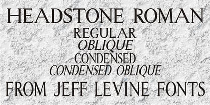 Despite its macabre-sounding name, Headstone Roman JNL is not a novelty font for Halloween or horror movies. Instead, it's an attractive Roman typeface based on an example provided of a guide for stonecutters to use when cutting epitaphs into tombstones. Headstone Roman JNL is available in regular, oblique, condensed and condensed oblique versions.
 - Block Capitals by K-Type,
$20.00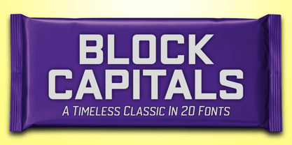 BLOCK CAPITALS is a square, geometric, small caps display face that avoids fashionable foibles and exudes the neutral, unpretentious functionality of time-honoured block lettering. The family has three widths (Narrow, Normal and Wide), and the Bold weights are loosely based on well-used squared nets – 3x5, 4x5 and 5x5. However, the typeface escapes its grid origins whenever necessary with slightly modulated stroke weights, sensitive spacing and careful kerning. The aim is to retain the strength and simplicity of strictly geometric characters while introducing barely perceptible refinements that add elegance and usability. That said, letters and numbers line up horizontally without overlapping the capline or baseline, even the tail of the Q does not descend below the Baseline. Diacritics are modesty proportioned, accented characters extending no farther than necessary, allowing the leading on multiple lines of text to be kept to a minimum.
 - Greek by Scholtz Fonts,
$8.95The Greek font started from an experiment with designing fonts based on a geometric grid. I joined the points on the grid with straight lines to form the various characters and found that this resulted in a font that closely resembled Greek writing (derived from inscriptions carved in stone) of ancient times. I continued to develop this theme but I now accentuated the look and feel of Greek writing. The three styles shown are the results of this development. I did not kern or letterspace the individual letters since this would have been out of character with the orignal Greek writing. This means that the font is mono-spaced. At a later stage I may produce more refined and "modern" versions of these fonts. Surprisingly, the Greek SCF styles are very readable. The font is fully professional in terms of its character set. It contains over 235 characters - (upper and lower case characters, punctuation, numerals, symbols and accented characters are present). In fact, it has all the accented characters used in the major European languages. - Ye Old Shire - Unknown license

- Masonic Writing by Deniart Systems,
$10.00Based on an ancient secret writing system. NOTE: this font comes with an interpretation guide in pdf format. - Gridlocker by Device,
$29.00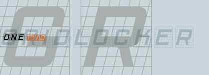 An isometric grid of a font, Gridlock takes an italicised modular approach to its letterforms. It is, however, not willfully strict about the application of that grid - the W and V and S, for example, have carefully considered diagonals that freely intersect the layout. More strictly designed but possibly less attractive versions are available as alternate characters.
 - Solid Stencil JNL by Jeff Levine,
$29.00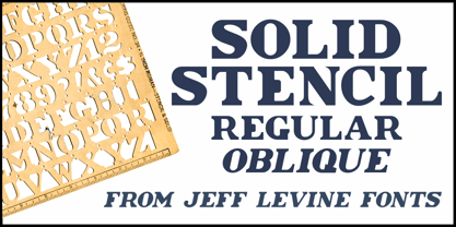 In 1962, the late Robert Libauer of the Stenso Lettering Company (of Baltimore, MD) revised two of his popular stencil lettering guides to offers users two choices: “traditional” stencil letters and numbers and "solid" letters for tracing and coloring. Solid Stencil JNL was modeled from one of those lettering guides, and contains all of the character anomalies found within that vintage stencil.
 - Pixeloza 03 by Fontsphere,
$12.00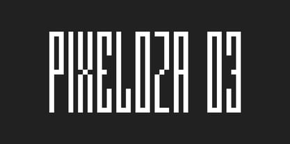 Pixeloza 03 is a pixel-style, grid-based, display typeface. Compared to Pixeloza 01&02 the lightest and clearly narrow version. The font is characterized by its simplicity, attention to detail, and original forms. You can use it in a wide variety of projects. It gives many possibilities for creating graphics. Pixeloza 03 is available in two options: Pixeloza 03 Regular (FREE) and Pizeloza 03 Skewo Regular.
 - PR Vanaheim by PR Fonts,
$10.00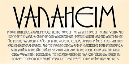 This is a perfect font for historical or fantasy titles. It is influenced by ancient Nordic runes. the strokes flare slightly, to a concave terminal for a finely carved appearance. There are two sets of capitals in PR-Vanaheim-DC (Dual Capitals); one set of narrow letters, more closely related to Runic forms, and one set which includes wider and circular letters, which can be freely combined with the narrow letters for the variety associated with hand lettering. There is one version with dots placed in the centre of large counters and one version without the dots. The broad caps character set includes characters which allow for tight spacing; a dropped L, and a tall T. There are also two different lowercase sets, one modern, and one archaic, all of which can be freely mixed to fine tune the appearance of your text. Here is the brief description of the available faces: PR-Vanaheim-Med-DC-01 Duplex Caps PR-Vanaheim-Med-DC-02 Duplex Caps, Dotted counters and dot space PR-Vanaheim-Med-DC-03 Duplex Caps, Dotted counters PR-Vanaheim-Med-LC-04 Broad Caps, with modern style lower case. PR-Vanaheim-Med-LC-05 Narrow Caps, with modern style lower case. PR-Vanaheim-Med-LC-06 Broad Caps, with archaic lower case. PR-Vanaheim-Med-LC-07 Narrow Caps, with archaic lower case.
 - Sanskrit Writing by Deniart Systems,
$10.00Based on an ancient writing system of India. NOTE: this font comes with an interpretation guide in pdf format. - Old Persian Cuneiform by Deniart Systems,
$10.00Based of the ancient Persian writing system. NOTE: this font comes with a comprehensive interpretation guide in pdf format. - DF Camino by Dutchfonts,
$33.00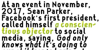 DF Camino is a revised mid 20th century geometric sanserif which guides you from somewhere to elsewhere. And beyond.
 - Little Things by Ana's Fonts,
$15.00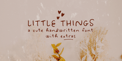 Little Things is a cute handwritten font with an alternates character set and lots of extras (underlines, doodles, arrows, words). Perfect to include in cute handmade designs, such as logos, packaging, prints and postcards, patterns, and social media posts. Little Things includes: Little Things font Little Things alternates, with an extra character for 0-1, a-z, A-Z (and accents) Little Things extras, with swashes, underlines, doodles, arrows and words
 - Theban Alphabet by Deniart Systems,
$10.00Alphabet primarily used for writings with magical purpose. NOTE: this font comes with a comprehensive interpretation guide in pdf format. - Hellscourt by Ilhamtaro,
$19.00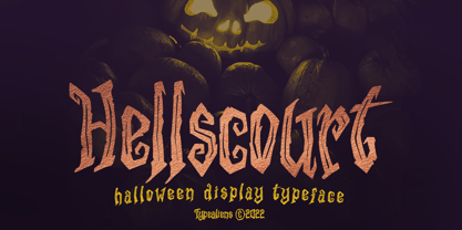 HELLSCOURT is a display font intended for horror themes such as halloween events, horror movies and other horror events. With a rough style, adding to this font is even more scary, because technically it is digital hand lettering, so it adds to the impression that this font is handcrafted and the vector process does not refine the rough parts so that it still has a rough impression. To enable the OpenType Stylistic alternates, you need a program that supports OpenType features such as Adobe Illustrator CS, Adobe Indesign & CorelDraw X6-X7. Guides to access all alternates glyphs : http://adobe.ly/1m1fn4Y Cheers!
 - Sign Template JNL by Jeff Levine,
$29.00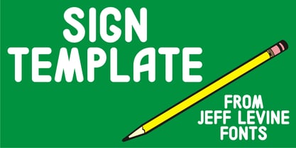 Sign Template JNL is based on one of the many plastic lettering guides manufactured by the now-defunct Wright-Regan Instrument Company (also known as WRICO). Aside from their engineering and drafting templates and tools, WRICO had a line of "Sign-Maker" sets which featured various styles of lettering, special ink pens and metal alignment guides to assure clean, crisp lettering with little effort.
 - Wasty Pudding by PizzaDude.dk,
$15.00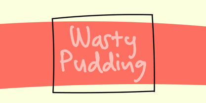 Wasty Pudding was made by drawing a lot of letters, over and over again - and not caring so much about the looks, but focusing more on the speed of drawing, because I wanted a font that represented the way I write, when I am taking notes for myself. It’s not pretty, but it’s legible and scribbeliciously beautiful! :) Anyway, I think the purpose of this font is massive amounts of text. Song lyrics, novels, stories, diaries, manuscripts, books, etc. I bet you can fool someone with them thinking that this is not a font, because I have added 6 different versions of each lowercase letter!!!
 - Malachim Writing by Deniart Systems,
$10.00Magical alphabet used by secret societies in times past. NOTE: this font comes with a comprehensive interpretation guide in pdf format. - Ongunkan Old Turkic Yenisei by Runic World Tamgacı,
$50.00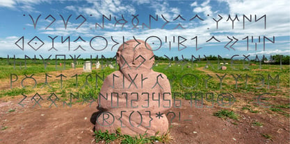 The Yenisei Inscriptions consist of a total of 158 Turkish inscriptions, kurgans (graves) and rock stones that have been found along the Yenisei River, which passes through the Khakasya, Tuva and Altai Autonomous Republics in Russia. The inscriptions were written with Turkish Stamps, which we know as the Orkhon Alphabet. In addition, there are dozens of versions of the Turkish Runic script, apart from the Yenisei inscriptions and the Orkhon inscriptions. I will present the other versions here as soon as possible.
 - Digot 02 by Fontsphere,
$16.00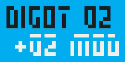 Digot 02 is a pixel-style, grid-based, display typeface. This is another version of Digot typeface. Compared to Digot, it is characterized by a more slender form, the letters are taller and narrower, which makes the font lighter. The font is characterized by its simplicity, attention to detail, and original form. You can use it in a wide variety of projects. It gives many possibilities for creating graphics.
 - Blend by Typesenses,
$49.00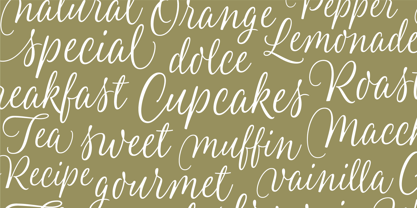 Blend is a hand drawn collection that takes its cues from the visual universe of bakeries and coffee shops. The name refers to the combining of different kinds of coffee beans to get a balanced taste, and Blend does just that, although here each typographic flavor can also be enjoyed separately. Projects such as branding, children’s books, wedding invitations and labels are sweetened with this cute family. The bouncing informal Script programmed with Open Type offers a wide range of features like ligatures, swashes, endings, initial forms and lots of alternates. Use professional software that widely support Open Type features. Otherwise, you may not have access to some glyphs. Keep the Standard Ligatures feature always active. For further information about features and alternates, see the User Guide Blend has extensive Western, Central and Eastern European language support. Make some coffee and enjoy!
 - Sassoon Infant by Sassoon-Williams,
$48.00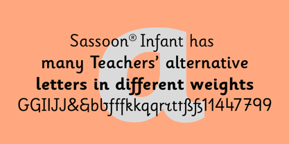 An upright typeface family developed to meet the demand for letters to produce pupil material for handwriting as well as for reading. Upright letters with extended ascenders and descenders are ideal on screen. They facilitate word recognition. The exit strokes link words together visually, and in handwriting they lead to spontaneous joins along the baseline leading logically to a joined-up hand. Teachers can print desk strips, charts of letter families and alphabet friezes, as well as consistent material across the curriculum. Together these typefaces provide a valuable resource for special needs teachers. When starting point and stroke direction has been learned, the arrow font (Tracker B) can be dropped and the simpler Tracker font used. Tracker B font, with its direction arrows helps pupils to start in the correct place. Motor movements can be refined by keeping inside the line. When starting and direction is no problem, the arrow can be dropped and the plain Tracker font used. When starting point and stroke direction have been learned, the arrow font (Dotted B) can be dropped and the simpler Dotted font used. Free to download resources How to access Stylistic Sets of alternative letters in these fonts Purchasers of this font package may use their Order Number to receive a free Copybook PDF by Rosemary Sassoon recommended for effective teaching
 - Malmo Sans Pro by Martin Lexelius Core,
$33.00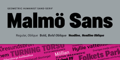 Malmö Sans was born from the preconception that geometry is neutral, and neutral fonts have a wide application window. No ornaments, no quirks – just clean. Design process: establishing the main proportions, grids and library of geometric shapes. However, people are not math, people are not built from grids. We are irregular, not always logical, and, foremost, we are human. So: humanisation – define parts and areas, and make the needed adjustments to shapes and forms, although being mathematically correct. Basically, changing it into something that pleases the eye. Much effort has been made to achieve equal parts minimalism, aesthetics and legibility.
 - Book Report JNL by Jeff Levine,
$29.00Here's another stencil font designed from and inspired by the lettering guides used for years by teachers, school children, merchants and others. - White Magick Symbols by Deniart Systems,
$15.00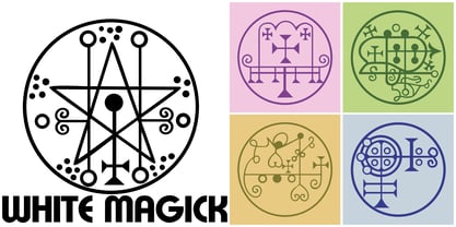 Contains 36 magical seals based on the Lemegeton of King Solomon NOTE: this font comes with an interpretation guide in pdf format.
 - KG PDX Blocks by Kimberly Geswein,
$5.00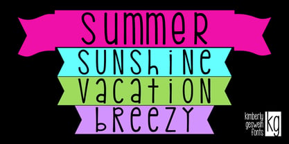 This cute flag or banner font contains a unicase font inside. Enclosed PDF guides you on how to use the font effectively.
 - Class Project JNL by Jeff Levine,
$29.00Another in the series of stencil fonts from Jeff Levine, Class Project JNL was inspired by a lettering guide from the 1940s. - Stitchin Crochet Pro by Adriprints,
$6.00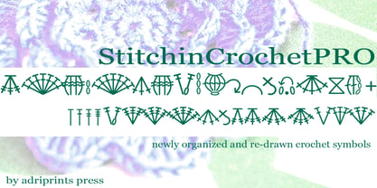 StitchinCrochet Pro is the third font in the Stitchin Family following StitchinCrochet and StitchinKnit. Unable to find a stylish and easy-to-use crochet symbol font, I decided to make one! StitchinCrochet offers incredibly legible, intuitive symbols that are easily accessible without special numerical codes on the keyboard. StitchinCrochet Pro has updated crochet symbols (compared to StitchinCrochet) and are newly re-drawn, scaled, and have corresponding increase and decrease symbols ranging from single crochet to double treble crochet. StitchinCrochet Pro also includes an updated QWERTY keyboard key, better symbol layout, and symbol guide for both U.S. and U.K. crochet terminology! Choose the “manual install” method to access the .PDF guides and symbol guides.
 - Humana by Linotype,
$29.99The story of Humana begins with an exclusive volume about some manuscripts in Biblioteca Palatina in Parma, Italy. The title page uses the characters upon which I designed Humana. I suppose they were drawn for that volume. Examining the reproductions in the book I found that the characters on the title page immitate the lettering in a manuscript from the 15th century with Petrarca's Rime volgari". Not bad as origin! But I cannot free myself from the thought that there may be a typeface with that looks, not just a few characters drawn for that volume. My reference books could not give me any answer about that. The name Humana refers to the humanistic era from which the characters originate. Humana was released in 1994. - Ongunkan Ihre Gotlin Runic by Runic World Tamgacı,
$70.00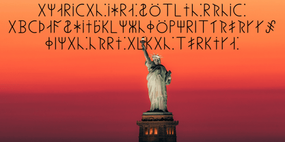 The Ihre-Götlin Runic inscription is one of the other runic inscriptions in America. I couldn't find much data on it.
 - Passing The River by Deniart Systems,
$10.00Alphabet primarily used for writings with magical purpose in ancient times NOTE: this font comes with a comprehensive interpretation guide in pdf format. - Buckle by Wilton Foundry,
$29.00Keep up that great western tradition with Buckle Bold! Buckle was created to be a contemporary twist to old "cowboy" fonts. It is bold while retaining a narrow width. When reduced down, it has a slightly worn look caused by the reduced double diamonds inside the capitals - which does not look out of place at all. - Vidocq by Typogama,
$19.00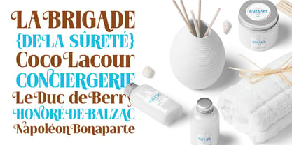 Vidocq is a single weight typeface designed for use in headlines and titles, inspired by the woodcut styles of the 19th century. Its rounded forms and dark stroke translate into a bold yet friendly appearance coupled with a narrow proportion that let’s it set well in condensed settings. Thanks to an extended character set and wide range of Opentype features that includes arrows and fleurons, Vidocq was created to allow designers to play with various styles while composing layouts.
 - Stenciled Message JNL by Jeff Levine,
$29.00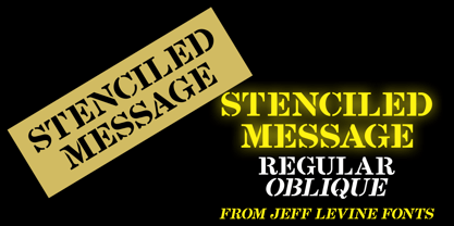 Inspired by an old retail stencil lettering guide, Stenciled Message JNL is a bold Roman serif typeface available in both regular and oblique versions.
 - Androganonamous - Unknown license

- Ongunkan Liljegren Runic by Runic World Tamgacı,
$50.00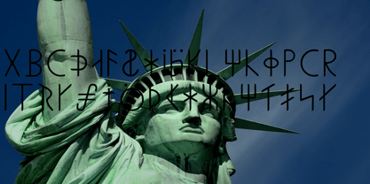 It is the 3rd inscription font I shared with Liljegren Runic, one of the inscriptions in America. I couldn't find much information about it.
 - Initial - Unknown license

- Architype Fodor by The Foundry,
$99.00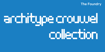 Architype Crouwel is a collection of typefaces created in collaboration with Wim Crouwel, following his agreement with The Foundry, to recreate his experimental alphabets as digital fonts. Crouwel's most recognized work was for the Van Abbe and Stedelijk museums (1954 –72) where he established his reputation for radical, grid-based design. The Fodor letterforms were created for the magazine published by Museum Fodor, Amsterdam. To save cost it was designed to be ‘typeset’ on their own electric typewriter. The resulting monospaced effect was combined with a background of orange overlaid with pink dots that provided a page grid to align the text to. The title set on the dot matrix formed the 'system' for construction of the ‘digital effect’ letterforms. Now Architype Fodor recreates these letterforms as a truly digital font.
 - Hello Valentine by Yoga Letter,
$12.00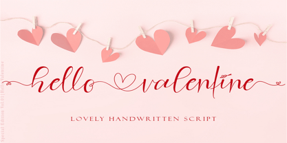 This pretty font is called hello Valentine. This font is very easy to use, and to bring out a pretty tail is not difficult because there are guides included. This font is perfect for expressing your happiness with your partner. This font is very beautiful and elegant that can be used for Valentine's Day, weddings, capturing romantic stories, quotes, branding, logos, banners, and more.
 - ITC Malstock by ITC,
$29.99ITC Malstock is the work of Czech designer Frantisek Storm. The idea is based on a sign painting technique that uses a flat brush and a Maalstok, a long bar with soft padding which is used as a rest for the painter's hand and a guide for vertical lines. The strokes of this font end with a split stem which recalls the traces of the writer's brush. ITC Malstock is a narrow typeface which is ideal for headlines, invitations and advertisements. The designer recommends combining his typeface with others, to create harmony with sans serif typefaces in text sizes or contrast with serif typefaces.


