10,000 search results
(0.028 seconds)
- Foxrights by Maulana Creative,
$15.00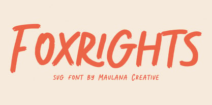 Foxrights is an Handwritten font, with bold stroke, a bit slant and fun character. It has Opentype features ligatures of character, To give you an extra creative work. Foxrights font support multilingual more than 100+ language. This font is good for logo design, Social media, Movie Titles, Books Titles, a short text even a long text letter and good for your secondary text font with sans or serif. Make a stunning work with Foxrights font. Cheers, MaulanaCreative
 - Milky Skies by Bogstav,
$15.00 Thursday Afternoon is like a typewriter that was out in the rain all night - all wobbly and worn, but with the well-known details of a typewriter, just a bit...well a lot...out of the ordinary! Although being awkward, Thursday Afternoon is surprisingly legible. I'd like that the font should be used for labels, toys for kids, candy or any kind of organic product. It even looks really well with headlines or shoutouts in all-caps!
 - P22 Clementine by IHOF,
$29.95 A bit of Victoriana whimsy from this set of two fonts is heavily inspired by a variety of 19th Century faces without being a direct revival of any one in particular. Undulating curves, swirly terminals and bifurcated semi-serifs give these faces plenty of character. Both fonts include f ligatures and ct/st ligatures. Clementine Curly includes a full set of alternate curly caps as opentype alternates making it essentially a bonus font within a font!
 - Terrorista by Just in Type,
$20.00 Terrorista is a homage to everyone who fought against the Millitary Regime in Brazil from 1964 to 1985. The Terrorista Marighella features generous inktraps, fits perfect for small sizes. Terrorista Dilma has the same design as the Marighella, but without inktraps, made for display. The last typeface from the package is Terrorista Lamarca, stencil version, all three weights have the same metrics, making it easier to use them together. Have a look at the Terrorista Specimen.
 - Amici by Greater Albion Typefounders,
$12.00 Amici means 'friends' and the Amici family was conceived as a big friendly Roman typeface for headings, posters, signs and anywhere else that an approachable easy-reading typeface is needed. It's the sort of thing you used to see in Magazine mastheads before everything went boringly sans serif. Three faces are offered within the family, Regular - solid and clear, Bold - with that bit more body and presence and italic - bringing in script elements to its design.
 - Miss Rhythm JNL by Jeff Levine,
$29.00 An early 1960s hand-lettered trade publication ad for an upcoming single 45 rpm release inspired the type design of Miss Rhythm JNL. The nickname of "Miss Rhythm" was given to Ruth Brown because of her popular "jump tunes"; that is rhythm and blues with an uptempo beat. Because the trade ad for her record was the inspiration for the font, it was only fitting to use that nickname as the font's name in honor of her.
 - Kento by Graphicfresh,
$18.00 This time we present a font with a bit of a classic touch. The font is slightly stretched to the sides. The font is simple and luxurious, so it leaves a deep memory impression when used on a brand. Simple and powerful. This is an overview of the font as a whole. Kento will be perfect for many projects: fashion, magazines, logos, branding, photography, invitations, wedding invitation, quotes, blog headers, posters, advertisements, postcards, books, websites, etc.
 - Cristal Stitches by Johannes Krenner,
$5.99 Whether it's your grandparents birthday, „Almabtrieb“ (ceremonial driving cattle down from the alpine pastures) or Oktoberfest (ceremonial drinking of huge amounts of beer): create the homely feeling of embroidery with this font. It comes with a vast language support, open type features, stylistic alternatives, boxes and frames, various numeral sets ... DEUTSCH: Ob Alm-Abtrieb oder Oktoberfest: Erzeuge das heimelige Gefühl großelterlicher Stickereien mit diesem Font. Große Sprachvielfalt, Opentype-Features, stylistische Alternativen, Boxen und Rahmen, diverse Zahlensysteme …
 - Highills by Grontype,
$14.00 Highills is awesome bold decorative font. created in rounded corner that give this font a tough and calm feel. this font has s good looking as header and as text both. Highills is fit perfectly for branding projects, movies, logos, social media posts, posters, books, and many more. Features: Basic Latin Glyphs Bold Uppercase and Lowercase Letters Alternates & Ligatures Numeral and Punctuation Multilingual Support Thankyou for picking up this font, hope you enjoy it. Regard. Grontype
 - Friendly by Positype,
$29.00 Friendly is an homage to Morris Fuller Benton's adorable Announcement typeface. It is not a strict interpretation, digital revival or reverent reproduction of the original letterforms… but I would be remiss and shady to not acknowledge the letterforms that inspired this typeface. If you are looking for a more accurate 'scanned revival' I would recommend searching "Announcement" on MyFonts. As stated earlier, it is an homage to the original letterforms of the typeface but takes a great bit of freedom tightening the construction up in order to loosen up the movement of the variant letterforms to allow a great deal of usable personality. I enjoy stating this dichotomy… "loosen up to tighten up the forms" and vice versa. It seems counterintuitive or silly but by allowing the letterforms to normalize, I felt more comfortable going back and adding rather indulgent personality. Infused with stylistic alternates, swashes, titling, many many contextual alternates, 9 stylistic sets and 2 stylistic sets with wordmarks, the typeface became far more 'friendly' for me… how could it not? With so many loops, swashes and typographic indulgences, it was bound to be fun. The more elaborate and 'overdone' Friendly got, the more I wanted to slant it. Here's where my thinking differs from MFB's original. I like slanted romans… especially ones with long ascenders, but I do not like much of a slant. It has to be the lettering person in me. It's hard for me to do a completely upright serif and not pair it with an angle, but I did not feel Announcement's 'Italic' offered much and the actual slant needed to be far less. If it's not an italic, I prefer the letters to slant with an angle equivalent to the thickness of the vertical stroke. The Slanted version of Friendly is set at 3.6 degrees, is quite subtle, and very fitting for me. You will find that most characters have a contextual, stylistic, swash and titling alternate assigned to them and some have an echoed alternate to the swash and titling options if the stylistic alt has been selected in tandem. Additionally, all of these are accessible in the glyph palette directly from the base glyph typed or through selecting options through the Stylistic Sets 1–9. Stylistic Sets 10 & 11 are a little different. They are actually configured as complex majuscule ligatures… a result of me getting carried away. Other features like a default old style numeral set and coordinating glyphs have been produced along with case support, ordinals, and more have been added to make it more relevant for contemporary use.
 - Poster Paint by Canada Type,
$24.95 Poster Paint is a fun shocard alphabet which came about from Jim Rimmer’s admiration of Goudy Stout, a design he liked in spite of the fact that Goudy himself claimed to detest it. Extremely eye-catching and humourous to a fault, Poster Paint is an ideal fit for fun environments like theme parks, concession stands, cofee and juice bars, and in print design for children books and fun food packaging. Poster Paint was updated and remastered for the latest technologies in 2012. It comes with a glyphset of over 375 characters, and supports the majority of Latin-based languges. 20% of this font’s revenues will be donated to a GDC scholarship fund, supporting higher typography education in Canada.
 - Limit Corner by Storictype,
$15.00 Introducing new serif display typeface its called Limit Corner. Inspired by victorian style with classic style .OpenType features some characters that allows you to mix and match pairs of letters to fit in your designs. It’s an all caps typeface, with strong and sleek letters. It features over 50 stylised alternatives, offering an infinite opportunity to customise and create logos, headlines, titling, product packaging, labeling, logo, classic shop, badges, movie title, t-shirt, posters, label, greetingcard, letterhead, book cover, etc. To access the alternat glyphs, you need a program that supports OpenType features such as Adobe Illustrator CS and Adobe Indesign Features : Character Set A-Z Numerals & Punctuations (OpenType Standard) Accents (Multilingual characters) Thanks and enjoy designing.
 - Gradable by Ditatype,
$29.00 Introducing Gradable, a mesmerizing script font that seamlessly blends elegance with boldness. This unique typeface is characterized by its graceful, connected letters that flow effortlessly from one to the next. With a low-contrast design, this font exudes a sense of stability, What sets Gradable apart is its distinctive swinging endings on select letters, adding a touch of playful sophistication to your text. These stylish flourishes give your words an air of dynamic movement, making your message stand out with a touch of charm. Gradable fits in headlines, logos, posters, flyers, branding materials, print media, editorial layouts, and many more designs. Find out more ways to use this font by taking a look at the font preview.
 - Grandecort by Ingrimayne Type,
$9.95Grandecort is derived from the OakPark family. It has lost the serifs, and has moved to a more traditional look. The upper case letters are a bit heavier than the lower case letters, but overall the letter shapes are fairly conventional for a bold, display face. In later 2018 the family was expanded to 9 fonts. GrancMitStripes was reworked to make four new faces: GrancAllStripes, GrancTopStripes, GrancBottomStripes, and GrancCaps. The last can be used as a background layer for the others. Also, The interior of GrandecortShadow was separated out to form GrandecortShadowInside. It has the same shapes as Grandecort-Regular but the spacing of GrandecortShadow and can be layered with the shadowed style to easily create bi-colored letters. - Nighty by Ahmad Jamaludin,
$17.00 Inspired by vintage magazine around 70s, so this font born for all of you, Nighty! Nighty is a display typeface that says we’re here to nostalgia! It brings back the 70s vibes with groovy, retro and unique typeface This font fits perfectly into those nostalgic moodboards and vintage logos. It come with 95 unique alternate and ligature that to give your any project to a unique vintage look, What's you get? Has 95 alternate and ligatures Unique letterforms Multilingual Works on PC & Mac Simple Installations Accessible in the Adobe Illustrator, Adobe Photoshop, Microsoft Word even work on Canva PUA Encoded Characters Fully accessible without additional design software. Drop any message if you any question, thanks Dharmas Studio
 - Dip Pen JNL by Jeff Levine,
$29.00 Answer Songs have been around for [probably] just as long as there have been songs. 1917's "If I Catch the Guy Who Wrote Poor Butterfly" was the answer to the 1916 hit "Poor Butterfly" [by Raymond Hubbell and John Golden], which in turn was inspired by the Puccini opera "Madame Butterfly". "Poor Butterfly" was so popular that this "answer" tune had as part of its lyrics "That melody haunts me in my sleep; it seems to creep." Nonetheless, the sheet music for William Jerome and Arthur Green's comic lament had the title hand lettered with an oval nib lettering pen and is now availably as a digital type face called Dip Pen JNL.
 - Aksen by Tokotype,
$40.00 Aksen is a humanist sans-serif typeface that draws influence from Roger Excoffon’s Antique Olive. Its design is formed by the rounded, curving letters found in ancient Greek and Roman inscriptions but is implemented with a contemporary and pragmatic approach. This typeface comes in 56 styles consisting of four widths and seven weights, each with matching italics. Also available in variable font format, Aksen Variable boasts three variable axes: width, weight and italic. These axes open up a plethora of stylistic choices making this typeface highly adaptable. Aksen is a versatile typeface that seamlessly blends contemporary humanistic aesthetics with a touch of historical sophistication, making it a perfect fit for a wide range of design applications.
 - Rachel Brown by Fargun Studio,
$25.00 Introducing Rachel Brown! A chic & modern serif font. This font is perfect for branding, logos, social media, prints, stickers, shirts, svg files and more! Rachel Brown is unique as it can be used for a variety of design styles. It fits in wonderfully for free-spirited, boho designs and also for more classy editorial looks! There are a lot of fun stylistic alternates available to use with this font. These letters are embedded into the font file and easily accessible in programs such as photoshop and illustrator. Rachel Brown comes with a wide range of OpenType -features. Keep Standard Ligatures on in normal use. Try Discretionary Ligatures, Swash, Stylistic or Titling Alternates for custom headlines or logos.
 - Combinado by My Creative Land,
$20.00 Please welcome a new Combinado Font Family that has it all: elegant display sans serif and serif fonts in three weights each; a modern calligraphy script that looks beautiful next to them; a sans serif font designed specifically for the best on-screen reading experience, which comes in two weights (for now! more to come); and the last but not least - Design Elements font that has more than 70 elements to compliment your designs. This font family is very universal and you can use it everywhere: websites, instagram ads, magazines, books, cards and invitation designs, as well as in all possible personal design project that do not fit in any of the listed categories! Enjoy!
 - New Roshelyn Script by Get Studio,
$15.00 Introducing New Roshelyn Font Family, a new carefully crafted and nicely balanced curve on script typefaces with personality. Also with Extrude Version and Swash Tail make it look Retro. You can use it as a logo, badge, insignia, packaging, headline, poster, t-shirt/apparel, greeting card, wedding invitation, etc. The flowing characters are ideal to make an attractive message. Mix and match New Roshelyn Script with a bunch of weights and alternative characters to fit your project. The alternative characters in this font were divided into several OpenType features such as Stylistic Alternates, Stylistic Sets, and Ligature. The OpenType features can be accessed by using the OpenType program such as Adobe Illustrator, Adobe Photoshop, and Adobe InDesign.
 - Snips by G.A.R.M. Company,
$22.00 Monoweight / Geometric / Utilitarian Although sturdy straight out of the keyboard, this true mono weight sans is built for more. Snips sacrifices several traditional letterform nuances for the sake of being easily broken apart and customised. Its modular construction is perfect for novice and experienced designers interested in modifying existing typefaces to fit their project needs. Font Key Features: Uppercase & Lowercase Characters Numbers & Punctuation Multiple Language Support Single Weight Usage: Snips provides an excellent base for lettering and logotype projects. It’s modular construction makes it easy to break apart and rebuild into unique custom letterforms, the potential variations are endless. In addition, Snips is also great for headlines and callouts in you favorite working class / industrial era designs.
 - Ekeras by Type Innovations,
$39.00 Ekeras is an original design by Alex Kaczun. It is a display font not intended for text use. It was designed specifically for display headlines, logotype, branding and similar applications. Primarily a display, this extremely versatile font has generous proportions, large counters and loose fitting which also allow the font to work well across a wide range of text sizes. The entire font has an original look which is strong, dynamic, machine generated and can be widely used in publications and advertising. Ekeras is a futuristic, techno-looking and dynamic typeface with an appearance of machined-like parts with sharp and rounded edges. The large Pro font character set supports most Central European and many Eastern European languages.
 - Bondist by Fargun Studio,
$12.00 Introducing Bondist Display! A chic & modern display font. Bondist Display is unique as it can be used for a variety of design styles. It fits in wonderfully for free-spirited, boho designs and also for more classy editorial looks! This font is perfect for branding, logos, social media, prints, stickers, shirts, svg files and more! There are a lot of fun stylistic alternates available to use with this font. These letters are embedded into the font file and easily accessible in programs such as photoshop and illustrator. Bondist Display comes with a wide range of OpenType -features. Keep Standard Ligatures on in normal use. Try Discretionary Ligatures, Swash, Stylistic or Titling Alternates for custom headlines or logos.
 - Kigali by Monotype,
$50.99Designed by Arthur Baker in 1994 for URW, Kigali is a wide-bodied display type with bold, uneven, pen-drawn strokes that taper dramatically downward. This unusual theme creates a unique, recognizable look. Furthering the effect, the Kigali typeface family contains additional decorative design fonts, one with a zigzag pattern filling the spacious strokes, and another with the letters in black squares for use as ornamental initials. The regular and italic versions include two alternate faces: one with long, tall ascenders and regular-length descenders, and one with shortened ascenders and descenders that allow it to fit where its companion might not. Use Kigali sparingly in display advertising, labels, flyers, and other incidental work. - Dunhill Script by Lipton Letter Design,
$29.00 A bit of happenstance and accident are always full of possibility — Richard Lipton’s Dunhill Script is based on observations of the work of his left-handed calligraphy students and then from a small detail generated by his own freehand sketching. Like his other script typefaces, Dunhill was born from the desire to achieve a certain visual drama. Many details show the pen at work, like the terminal shapes and the caps and ascenders. Dunhill also has a range of alternate stylistic glyphs and contextual features that can transform it into a connected script. It’s a great choice for editorial display or advertising and branding settings on its own or paired with a Roman sans or serif.
 - Chevron by Altered Ego,
$45.00For that tight fit, STF Chevron is perfect. An ultra-condensed display font, with a complete character set. The name? It's named after an oil company, but the shapes of the serifs reflect that as well. With some art deco overtones, try Chevron in places that you might want a simple art deco typeface. How should you use it? It's perfect for posters, packaging and advertising, CD covers and publications. Fully hinted and exquisitely kerned, Chevron will be one of your favorite faces for tall copy that need to get noticed. It's really ideal for calendars, when you want big numbers without losing space for writing in the date fields. License it today! - Lunation by Ditatype,
$29.00 Lunation is a versatile script font that marries the charm of script fonts with a contemporary twist. Crafted with a fairly bold weight to command attention. Its slightly reduced contrast ensures that each character stands out clearly, providing optimal readability in various design applications. The defining characteristic of Lunation is its carefully crafted swinging endings. These artistic flourishes gracefully embellish specific letters, lending an air of sophistication to your text. The subtle yet distinctive curves and sweeps add a playful rhythm. Lunation fits in headlines, logos, posters, flyers, invitations, branding materials, print media, editorial layouts, and many more designs. Find out more ways to use this font by taking a look at the font preview.
 - Pexico Micro by Setup,
$- Pexico Micro is a pixel typeface that uses 5 by 7 grid (capital letter) in 8 styles: 4 basic styles for text setting — Regular, Bold, Narrow, and Mono and 4 stylistic variations of the Regular style for display setting — Outline, Dots, Round, and Inverse. It fits the display's pixel grid when used at 10pt size or its multiples. Pexico Micro supports Latin, Cyrillic, and Greek Monotonic scripts, all with thoroughly designed diacritics. Moreover, Pexico Micro makes use of advanced OpenType features, just as any other modern text typeface. Each style also has 9 sets of numbers, small capitals and is properly kerned. For more information go to For more information go to Urtd.
 - Full English by Hanoded,
$15.00 I have always been fascinated by the ‘Full English Breakfast’. A Full English usually consists of toast, baked beans, sausages, fried eggs, fried tomatoes, fried mushrooms and sometimes blackpudding (a kind of sausage made from pig’s blood). When I lived in England, my friends were always quite happy to stow away a big full breakfast, but I, on the other hand, could not really set myself to eating one. Full English is a hand made stencil font. If you own a pub and you serve breakfast, you could use it for your signs, but I guess this font looks good on anything that needs a bit of attention. For attention, it will get!
 - TG Frekuent Mono by Tegami Type,
$30.00 TG Frekuent Mono a new modern geometric sans serif with monospaced style. This typeface is made with precise calculations so that it displays a beautiful and modern appearance. Besides this new typeface is also equipped with six different styles, ranging from ultra light to extra bold plus variable font. This typeface also has various alternative characters that can be used according to the needs in the design. Alternative characters that exist in this type of font have a touch of script typeface so that it makes the alternative character of this type of letter a little quirky and different but still fits well with the combination of modern main characters. And supports approximately 100 languages.
 - Pontina by KaiserType,
$30.00 Pontina is the name of a multilingual didone typeface. Its elegant character is built up of playful and lively strokes combined with high ascenders and high capital letters, that gives the classical forms a modern individual touch. It combines both: legibility and an ornamental curvy look for display purposes. The typeface provides true italic fonts for each weight, which fit harmoniously to the regular fonts. Pontina can be used for headlines and also works well in smaller text sizes. The text styles have slightly lower capitals and ascenders for better legibility. Also the font comes along with a set of different ligatures as well as swash letters and all necessary open-type features.
 - Joanna by Monotype,
$40.99 The English stone carver, artist, and typographer Eric Gill conceived the Joanna typeface as a personal design for use in books printed at his Joanna Press."" Gill saw his press work there as a continuation of the British Arts and Crafts Movement, pioneered in the 19th Century by William Morris. Joanna is notable for its almost vertical ""upright"" italics, and the unusally small size of its italic characters. Joanna is versatile and extremely legible. The letterforms are a bit narrow, so the face is very economic as well. A lot of text may be packed densely together onto a page with Joanna. Joanna mixes very well with other typefaces designed by Eric Gill; especially Gill Sans.
 - Kondes by Tour De Force,
$25.00 Kondes is our "101 Dalmatians" – it's 101th release in our catalog! And it is the 1st one that belongs to variable typefaces. Kondes (which is made up word as mixture of "condensed" and "kondezovan" on Serbian) is simple, compact, straight-in-your-face sans serif family with 9 weights and 9 Italics. It was designed with purpose to serve and to be use in any project, from editorial to website. For example, Black weight could be used effectively as poster type, in big sizes while Regular fits perfectly as main webfont. Stem joining is done with generous ink trap that divides and opens letter contours, so letter breaths in smaller sizes. Contains extended Latin character set. Enjoy!
 - Estefania Bold Script by Shaltype Co,
$12.00 Estefania is based on Retro Bold Script Typeface that could fit any Graphic Project. Using bold and contrast strokes to get eye-catchy and smooth looking, this project is just born and will come with other styles and more glyphs in the future. Drawn manually by hands, and reform into a clean Typeface. Natural stroke from original lettering. It can be used for Titles or even for writing. In this font, you will get : - TTF & OTF files - WOFF & WOFF2 - Over 299 Glyphs - 11 OpenType features - Support Multilingual languages Get Estefania now! It will be best used for any design requirement, many fonts will come with a unique concept. Thank you! Best Regards, FM-STCO.
 - Monaly by Nathatype,
$29.00 Monaly is a display serif font. Designed with large, heavy letters, Monaly is a display font that makes a bold statement. Each letter is meticulously crafted with strong, confident serifs that lend a sense of grandeur and sophistication to your design projects. The artistic flair of Monaly is evident in its carefully balanced letterforms, which blend tradition with a contemporary edge. The font's heavy weight adds a sense of weightiness and substance, making it a reliable choice for conveying authority in your designs. Monaly fits in headlines, logos, posters, flyers, invitations, branding materials, print media, editorial layouts, and many more designs. Find out more ways to use this font by taking a look at the font preview.
 - Pinkerton by LetterStock,
$20.00 Pinkerton Introducing Pinkerton font. It was inspired from a cartoon that i saw on television, and it was originally crafted by hand to add natural handmade feeling than i make it clean with pentool. We improvise it a little bit to make a playful feel, this font is bold so and it can look strong if you use it for branding or even title for your poster design with playful decorative style. Opentype features Pinkerton Font is very good looking in playful decorative logotype, labels, t-shirt prints, product packaging, invitations, advertising and others. If you looking for a playful decorative font, than this item is a good choice for you because this font have a strong playful feel. This fonts works with folowing languages: Afrikaans, Albanian, Asu, Basque, Bemba, Bena, Chiga, Cornish, Danish, English, Estonian, Filipino, Finnish, French, Friulian, Galician, German, Gusii, Indonesian, Irish, Italian, Kabuverdianu, Kalenjin, Kinyarwanda, Low German, Luo, Luxembourgish, Luyia, Machame, Makhuwa-Meetto, Makonde, Malagasy, Malay, Manx, Morisyen, North Ndebele, Norwegian Bokmål, Norwegian Nynorsk, Nyankole, Oromo, Portuguese, Romansh, Rombo, Rundi, Rwa, Samburu, Sango, Sangu, Scottish Gaelic, Sena, Shambala, Shona, Soga, Somali, Spanish, Swahili, Swedish, Swiss German, Taita, Teso, Vunjo, Zulu Thank you for using this font. LS
 - Telepath by Coniglio Type,
$19.95 TELEPATH Telepath by Coniglio Type, first appeared in 1998. It is now in opentype .otf as of 2021. Telepath is a master sampling of a Royal office typewriter of industrial strength provided by the Miller Furniture store, of Dunkirk, New York. It had a baseline set of numbers to make accounting practices easy and line up nicely on the statements. (No gentile old fashioned numerical ascenders and descenders.) Yet, for a a rather old and stolid machine, it was very luxurious and built to definitely take the test of time. Cudo's for Royal Typewriter Company, is all I can say. The set of images were very carefully gathered and has fallen into the preferred category for a typewriter font that has it all. The font has exceptional value as a text font -and- a display font. It contains a great deal of graphic information and doesn't spike at higher sizes. Telepath presents a strikingly handsome typewriter font with a uniquely intuitive difference. Unlike the original source material—scans of monospaced typewriter copy, every font is painstakingly hand kerned for your most demanding copy fitting work in justified or casually ragged settings for print or the web. All Coniglio Type fonts are 100% embeddable. It will get you there.
 - Mir by Juliasys,
$22.00 Мир is Mir. The Russian word Мир (Mir) means both World and Peace. The rendezvous of the two terms seems quite unique and utopistic today, but it is comforting to see that it was natural at some time deep down in Russian history. Bits of both meanings were going through my mind while I was designing this typeface. Mir’s character set is multiscript – Latin, Cyrillic and Greek – and extends to many parts of the linguistic world. In fact it covers more than 100 languages. Stylistic consistency between the language systems make typographic border crossings painless even where national borders are still closely guarded. And in regions where mathematics, physics or chemistry are to be expressed, a rich set of OpenType features lets Mir master also these situations. Serious things are best be said in a relaxed, unpretentious way. So Mir doesn’t put on a show. Mir has authority without being authoritarian, it is serious but not stern. It can explain difficult things and stay calm and down to earth at the same time. Mir Medium has another useful feature: It can be freely downloaded and used by anybody anywhere. You can test the Mir Family with free Mir Medium and get more styles when you need them. @juliasys
 - Jantar Sharp by CAST,
$45.00 Jantar Sharp is a text family with flared terminals that eludes the categories of serif or sans. Its most recognisable features are taken from both styles to achieve proper design and high legibility standards. Jantar Sharp performs especially well when used for continuous reading including texts on web platforms. Its personality lies in the flared stroke endings and certain details which make its shapes neither sans nor serifs. Rather than following any particular historical model, it picks up elements from various periods to achieve an organically dynamic look which is entirely compatible with the reading process. Jantar Sharp Italic makes a nice contrast, though the pace and proportions are not drastically different from the upright. This allows for effortless reading of longer passages of italicised text. Jantar Sharp – as well as its teammate Jantar Flow – has been designed in seven weights from ExtraLight to Heavy, all with accompanying italics; it has a tabular and proportional set of figures in both old style and lining options are included together with a special set of hybrid figures sitting between x-height and capitals. Superscripts and subscripts are provided together with a vast collection of diacritics covering all European language and a set of case-sensitive characters.
 - EDB Indians - Unknown license

