10,000 search results
(0.023 seconds)
- DIN Next Shapes by Monotype,
$29.99 Sabina Chipară's DIN Next Shapes typeface is a twist on the original German industrial classic, taking its skeleton and re-clothing it in dots, hearts, snowflakes and stars. The design offers a more approachable and whimsical tone of voice than the original, while maintaining all the legibility and clarity of form that makes DIN Next such a reliable and versatile design. It works in harmony with DIN Next, and is particularly suited for designers looking to be a little more expressive. DIN Next Shapes includes four fonts: Dots, Flakes, Hearts and Stars, and has pan European language support including Greek and Cyrillic. It also has OpenType features including stylistic alternatives, ligatures and fractions.
 - Forgotten Dream by Hanoded,
$15.00 I had a really weird dream the other night, but when I woke up, I had forgotten it. I had the feeling it was about something important, but I cannot, for the life of me, recall what I dreamt about! Forgotten Dream is a horror brush font, which I made with a brushy brush and Chinese ink. It looks like something right out of a nightmare, but you can also use it for something important. Like a ‘keep your distance’ poster, or a sign about the importance of washing ones hands. But then again, if you play in a death metal band, then Forgotten Dream font could be exactly what you need for your album cover!
 - Istoria by Hooper Type,
$12.00 New foundry on the block, Hooper Type, kicks off it's catalogue with a versatile, story-telling serif font. With a love of the magical and a yearning for adventure, Istoria pushes away from the static, drawing in whisps and whirls that entice and excite, without distracting. Unassuming in it's long form, with delicate strokes that draw the eye, it commands attention when used in short punchy titles, or set in caps. Istoria (meaing both history and story in Greek) delights in having unusual curves, curvy straights and twisty feet which emulate those adventures and myths from days gone by. Type shouldn't interfere with the content, but it absolutely can enhance it. Hope you enjoy it!
 - Modesto Text by Parkinson,
$25.00 The Modesto Text Family is text in name only. It’s called Text because it has a Lower Case, and also to distinguish it from the rest of the Modesto clan. Modesto is a loose-knit family based on a signpainters lettering style popular in the late-19th and early-20th centuries. It evolved from the lettering I used for the Ringling Bros. and Barnum & Baily Circus Logo. The Modesto family was not planned. It just happened, a few fonts at a time over about fifteen years. In 2014 seven new Italic fonts and two Chromatic families were added. There is a downloadable MODESTO USER MANUAL PDF in the Gallery section for this family.
 - Peloric by TanveerType,
$8.00 Introducing fresh PELORIC sans serif typeface which is well crafted for the classic and modern outlook. It can be read easily from a small size to a large size. Feeling fresh & trendy with it’s distinctive visual. It is well suited for branding, website & mobile layout and many more. It can also be used for branding materials, business cards, social media, packaging, prints, quotes & posters, etc. It comes up with 12 different weights as thin, thin italic, light, light italic, regular, italic, medium, medium italic, bold, bold italic, inline & inline italic. So, if you are looking for a new stylish and unique font, then here is the best font just designed for you and supporting any operating system and platform.
 - Konya by 38-lineart,
$12.00 Konya is a signature script-style font with a very luxurious look. It can look very soft and very firm in an elegant frame, high but not too towering, and flat but not too low. Its appearing with a balance like dervish whirling around in ‘Konya town’ with two hands stretched, one hand facing to the sky and the other hand facing to the earth. This font is perfect for branding, as we equipped it with a number of alternatives that allow you to make it a feminine and masculine logo, and some swash to add to the firmness of signature. This font also has ligatures to present a natural handwritten impression.
 - Marlina Melvin by Silverdav,
$15.00 Marlina Melvin is a modern calligraphy font with handwritten, sophisticated flows. It is full of hearts and glyphs. It is perfect for branding, wedding invites, and cards. Marlina Melvin includes a full set of lovely uppercase and lowercase letters, multilingual symbols, numerals, punctuation and ligatures. Also it includes: -short lowercase beginning and ending swashes -lowercase ending heart swashes, which serve to connect two words or letters (This is so perfect for invitations, monograms) -long lowercase beginning and ending heart swashes. The font has a smooth texture, so it would be perfect for all types of printing techniques you can do embroidery, laser-cut, gold foil, and is ideal for cutting. Marlin Melvin supports 162 languages.
 - Eligra by Eliezer Grawe,
$- Eligra is a modern and elegant sans-serif typeface family inspired by old and new classics like Helvetica and Gotham. Its geometric and precise strokes create a versatile and timeless font. However, Eligra has unique features, like its subtle swirls and curves, that add a dash of personality while still maintaining the font's simplicity and clarity. Eligra has more than 800 glyphs, with a large set of Latin, Cyrillic and Greek characters, several alternates, and different styles of numerals. It is clean, clear, stable, and contemporary, making it a perfect choice for branding projects, websites, advertisements, documents, presentations or any other occasion where you want to convey evenness while maintaining a contemporary and innovative look.
 - Bigplace ExtBd ExtCond - Personal use only

- Mrs Eaves XL Serif by Emigre,
$59.00 Originally designed in 1996, Mrs Eaves was Zuzana Licko’s first attempt at the design of a traditional typeface. It was styled after Baskerville, the famous transitional serif typeface designed in 1757 by John Baskerville in Birmingham, England. Mrs Eaves was named after Baskerville’s live in housekeeper, Sarah Eaves, whom he later married. One of Baskerville’s intents was to develop typefaces that pushed the contrast between thick and thin strokes, partially to show off the new printing and paper making techniques of his time. As a result his types were often criticized for being too perfect, stark, and difficult to read. Licko noticed that subsequent interpretations and revivals of Baskerville had continued along the same path of perfection, using as a model the qualities of the lead type itself, not the printed specimens. Upon studying books printed by Baskerville at the Bancroft Library in Berkeley, Licko decided to base her design on the printed samples which were heavier and had more character due to the imprint of lead type into paper and the resulting ink spread. She reduced the contrast while retaining the overall openness and lightness of Baskerville by giving the lower case characters a wider proportion. She then reduced the x-height relative to the cap height to avoid increasing the set width. There is something unique about Mrs Eaves and it’s difficult to define. Its individual characters are at times awkward looking—the W being narrow, the L uncommonly wide, the flare of the strokes leading into the serifs unusually pronounced. Taken individually, at first sight some of the characters don’t seem to fit together. The spacing is generally too loose for large bodies of text, it sort of rambles along. Yet when used in the right circumstance it imparts a very particular feel that sets it clearly apart from many likeminded types. It has an undefined quality that resonates with people. This paradox (imperfect yet pleasing) is perhaps best illustrated by design critic and historian Robin Kinross who has pointed out the limitation of the “loose” spacing that Licko employed, among other things, yet simultaneously designated the Mrs Eaves type specimen with an honorable mention in the 1999 American Center for Design competition. Proof, perhaps, that type is best judged in the context of its usage. Even with all its shortcomings, Mrs Eaves has outsold all Emigre fonts by twofold. On MyFonts, one of the largest on-line type sellers, Mrs Eaves has been among the 20 best selling types for years, listed among such classics as Helvetica, Univers, Bodoni and Franklin Gothic. Due to its commercial and popular success it has come to define the Emigre type foundry. While Licko initially set out to design a traditional text face, we never specified how Mrs Eaves could be best used. Typefaces will find their own way. But if there’s one particular common usage that stands out, it must be literary—Mrs Eaves loves to adorn book covers and relishes short blurbs on the flaps and backs of dust covers. Trips to bookstores are always a treat for us as we find our Mrs Eaves staring out at us from dozens of book covers in the most elegant compositions, each time surprising us with her many talents. And Mrs Eaves feels just as comfortable in a wide variety of other locales such as CD covers (Radiohead’s Hail to the Thief being our favorite), restaurant menus, logos, and poetry books, where it gives elegant presence to short texts. One area where Mrs Eaves seems less comfortable is in the setting of long texts, particularly in environments such as the interiors of books, magazines, and newspapers. It seems to handle long texts well only if there is ample space. A good example is the book /CD/DVD release The Band: A Musical History published by Capitol Records. Here, Mrs Eaves was given appropriate set width and generous line spacing. In such cases its wide proportions provide a luxurious feel which invites reading. Economy of space was not one of the goals behind the original Mrs Eaves design. With the introduction of Mrs Eaves XL, Licko addresses this issue. Since Mrs Eaves is one of our most popular typefaces, it’s not surprising that over the years we've received many suggestions for additions to the family. The predominant top three wishes are: greater space economy; the addition of a bold italic style; and the desire to pair it with a sans design. The XL series answers these requests with a comprehensive set of new fonts including a narrow, and a companion series of Mrs Eaves Sans styles to be released soon. The main distinguishing features of Mrs Eaves XL are its larger x-height with shorter ascenders and descenders and overall tighter spacing. These additional fonts expand the Mrs Eaves family for a larger variety of uses, specifically those requiring space economy. The larger x-height also allows a smaller point size to be used while maintaining readability. Mrs Eaves XL also has a narrow counterpart to the regular, with a set width of about 92 percent which fulfills even more compact uses. At first, this may not seem particularly narrow, but the goal was to provide an alternative to the regular that would work well as a compact text face while maintaining the full characteristics of the regular, rather than an extreme narrow which would be more suitable for headline use. Four years in the making, we're excited to finally let Mrs Eaves XL find its way into the world and see where and how it will pop up next.
 - Mojacalo AH - Unknown license

- Castile by Eyad Al-Samman,
$3.00 Castile is a central region of Spain that formed the core of the Kingdom of Castile, under which Spain was united in the 15th and 16th centuries. "Castile" is a Kufic modern Arabic typeface. It is suitable for books' covers, advertisement light boards, and titles in magazines and newspapers. It is very distinctive when used in black and white printout. It decorates colored pages and makes artworks more attractive. This font comes in three different weights. I adore Spain and the historical achievements of the Islamic civilization existed there in the past. By designing "Castile" Typeface, I wanted to refer to the Islamic civilization that Muslims had in Spain and especially in Andalusia. Today the name of Castile survives in two autonomous regions of Spain: Castile-La Mancha (capital city is Toledo) and Castile-Leon (capital city is Valladolid). The main characteristic of "Castile" Typeface is in its modern open-end style for some of its Arabic characters such as "Sad", "Dad", "Seen", "Sheen", "Qaf", "Faa", "Yaa" and others. The shape of the characters' "dot", "dots", and "point" is innovative; a triangle with a semi-circle shape. "Castile" Typeface is suitable for books' covers, advertisement light boards, and titles in magazines and newspapers. Its charactersí modern Kufic styles give the typeface more distinction when it is used also in posters, greeting cards, covers, exhibitionsí signboards and external or internal walls of malls or metroís exits and entrances. It can also be used in titles for Arabic news and advertisements appeared in different Arabic and foreign satellite channels.
 - Belda by insigne,
$29.99 Step into the beauty of Belda’s elegant form and discover the richness flowing from both its historic influence and its strong elements. At its heart, Belda's graceful style embodies the classical calligraphy of the Roman capital, best known from such Roman monuments as Trajan's Column. To lessen the possibility for error, the builders of these defining structures brushed their templates onto the marble before taking their first cuts from the expensive stone. These simple strokes now mark a simple but wonderful path full of life and mystery. Beyond a copy of the past, Belda has grown from its roots to offer a brave, new world of potential through its still-simple structure. The new design strongly contrasts thickness and stroke. Its delicate shape, curves and sharp serifs provide a unique style of harmony and beauty. The resulting balance? The lighter weight design remains subtle and elegant, while the combination in its bolder counterparts provides an intense luster and sparkle, pulling the reader’s eye to the font’s captivating features. A quick look beyond its surface of standard forms also reveals Belda has more layers to discover with OpenType small capitals, titling capitals and more. With a wealth of weights and many widths beside, the font is capable of serving as both text and titling. While especially strong as a movie title or poster font, it’s also great for book jackets, advertising, and packaging. So start your journey with Belda. The possibilities to explore on this path are practically endless. Production assistance from Lucas Azevedo and ikern.
 - CA Capoli by Cape Arcona Type Foundry,
$29.00 CA Capoli is a fine script typeface with a vintage touch. Perfect for illustrative titles or logotypes. It comes in two styles, Regular and Stroke. The inspiration came during our trip to Italy, where we took a short rest in a bar during a hot day. We discovered a simple ceramic ashtray on the table. The word “Nido” was inscribed in a typeface that looked like it dated back to the 1950s. We made some investigations about the word, its meaning and origin but it still remains a big mystery. Was it the name of a hotel or a restaurant or some vintage Italian cigarettes? We don’t know. We were so amazed about the design of the logo that we decided to create a typeface out of it. A sophisticated endeavor because we just had four letters. How could the rest of the letters – if it ever existed – have looked like? Our hypothesis is CA Capoli. A typeface with a full Central European character set and some nice alternative letters to chose from. When we thought about “Nido” and its possible derivation of hotel business, we felt like creating a small side project for this typeface, a brand for a fictional hotel called Hotel Capoli with business cards, letterheads, a reception book, key fobs and embroidered patches for the service dress of the hotel service stuff. The Hotel Capoli is located at the wonderful beach of Cape Arcona on the fictional country of Arcona Islands where our type foundry is located.
 - Cooker Cake by Sabrcreative,
$25.00 Elevate your design projects with Cooker Cake, a vibrant and playful sans serif display font. With its charismatic style and versatile nature, this font adds a touch of excitement and creativity to any typography-based endeavor. Whether you're designing logos, posters, headers, or website elements, Cooker Cake will captivate your audience and make your text pop. Cooker Cake features all capital letters, giving your designs a bold and impactful appearance. The font also includes a wide range of numbers and punctuation, ensuring that your compositions are complete and functional. Its multilingual support allows you to incorporate various languages seamlessly, making it ideal for global projects. One of the standout features of Cooker Cake is its PUA (Private Use Area) encoding. This means that you have access to additional special characters, glyphs, and ligatures, expanding your creative possibilities and enabling you to add unique flourishes to your designs. Let your imagination run wild as you explore the various alternates and stylistic options available in this font. With its sans-serif style, Cooker Cake strikes the perfect balance between modern aesthetics and a playful vibe. It works harmoniously in both digital and print formats, making it suitable for a wide range of applications. From branding and packaging to social media graphics and advertising campaigns, this font will bring a sense of joy and energy to your projects. Experience the versatility and captivating charm of Cooker Cake Sans Serif Display Font. Let its playful and dynamic personality infuse your typography with excitement.
 - Sherbrooke by Eyad Al-Samman,
$- Sherbrooke is a simple and sans serif font. I have chosen the name of this typeface after the "Sherbrooke" Street in Montreal, Canada, that I daily walked in for several months in the late 2005 while I was studying in Montreal, Quebec, Canada. I do adore this street and also I adore the whole city of Montreal. This font comes in two different weights. "Sherbrooke" can be used in wide fields of publications such as the titles of novels, literary texts, short stories, dictionaries, books, newspapers, websites, and magazines. It is suitable for T-shirts, mugs, advertisement light boards in malls, subtitles of movies, logos, cans of foods, and medicines' names. The font is more attractive when it is printed in calendars and for displaying the contents and paragraphs of electronic encyclopedias and different online websites. "Sherbrooke" is specifically designed for educational, journalistic, literary, and social purposes. The main characteristics of "Sherbrooke" Typeface are in its sans serif new designed letters and also in its lowercase special numerals. I think that these characteristics have made "Sherbrooke" exceptionally unique with its alphanumeric combinations. You can enjoy this typeface and use it anywhere at any product or service. It is simply gratuitous for all. The word "Sherbrooke" is a person's name. Sherbrooke Street - officially Rue Sherbrooke - is a major east-west artery at 31.3 kilometers in length and it is the second longest street on the Island of Montreal in Canada. The street is named for John Coape Sherbrooke, the Governor General of British North America from 1816 to 1818.
 - Achates by Karandash,
$29.00 Good, faithful Achates… Named after the trusty Trojan that followed Aeneas throughout his adventures, Achates is a humanist sans workhorse well suitable for broad range of design projects. Its soft, delicate and almost cursive shapes define warm and friendly typeface that is legible and easy on the reader's eye. Following into the footsteps of its namesake, it is humble, informal yet stable and trustworthy. Ideally suited for advertising and packaging, editorial and publishing, logo, branding and creative industries, poster and billboards, small text and signage as well as web and screen design. Achates provides a broad range of advanced typographical features such as language localization, alternates, stylistic alternates, extended ligatures, fractions and case-sensitive forms. It comes with a complete figure range set of old-style, lining and tabular figures. The family has extensive multilingual support, covering more than 70 Latin-based languages and specially designed Cyrillic with Bulgarian and Russian localization. As Achates was a humble hero, a devoted friend and faithful companion to Aeneas on his journey to greatness, so this font can be your trusty sidekick on your creative path. The marvelous Agate is also named after the Trojan hero. It is considered as the stone to call on for support when you need stability and grounding in your life. Along with its supportive energy, the Agate stone has been long admired for its incredible beauty. So… a Trojan hero or a thing of beauty – it is up for you to decide… or just maybe both!
 - Prossima Moda by Mans Greback,
$59.00 Prossima Moda is a font that radiates modernity and fashion-forward style. Its sleek and contemporary design evokes a sense of sophistication and elegance, while its contrasting lines add a touch of visual interest and intrigue. The font exudes a cool and sweet vibe, creating a captivating and alluring atmosphere. With Prossima Moda, each letter is meticulously crafted to showcase its unique beauty, creating a harmonious blend of form and function. The font's smooth curves and clean lines give it a polished and refined look, reflecting the precision and attention to detail that are synonymous with the fashion industry. This font not only captures the spirit of the latest fashion trends, but it also embodies a sense of individuality and self-expression. It is a font that speaks to the modern individual who seeks to make a statement and stand out from the crowd. The font is built with advanced OpenType functionality and has a guaranteed top-notch quality, containing stylistic and contextual alternates, ligatures, and more features; all to give you full control and customizability. It has extensive lingual support, covering all Latin-based languages, from Northern Europe to South Africa, from America to South-East Asia. It contains all characters and symbols you'll ever need, including all punctuation and numbers. Mans Greback is the innovative designer behind the captivating Prossima Moda font. Hailing from Sweden, Mans has established himself as a prominent figure in the world of typeface design, renowned for his diverse and versatile portfolio.
 - Sarcasticity by Thomas Käding,
$10.00 You don't like this font. You wouldn't want to buy it.
 - Signs Of Faith by Fonts of Chaos,
$10.00 Signs of Faith maturity font for artworks. Make cash with it.
 - FG Erin by YOFF,
$14.95FG Erin is simply perfect handwriting. I want it! Do you? - Bordonaro Spur Rounded by Estudio Calderon,
$35.00 The new version of Bordonaro Spur includes rounded corners. Meet it!
 - Lazy Rock - Personal Use - Personal use only

- Silky Smoke - Personal use only

- Chilly Medium - Personal use only

- Cream Cake - Personal use only

- Shade Blue - Personal use only

- Speedwriter - Personal use only

- Victorian Ornamental Capitals by Intellecta Design,
$27.90 These are the classical arabesques published in Ludwig Petzendorfer's Schriften-Atlas. Eine Sammlung der wichtigsten Schreib- und Druckschriften aus alter und neuer Zeit nebst Initialen, Monogrammen, Mappen, Landeskarten und heraldischen Motiven fur die praktischen Zwecke des Kunstgewerbes, 1889. See Frompac 1889 Arabesques for another example of these arabesques.
 - Eilis by Agnieszka Ewa Olszewska,
$25.00 Another modern, fun, and experimental display font in my library. Looks like made with a strong gesture. A bit constructive with cursive elements. Contains 2 uppercase sets, and some extra characters. You can play with them and mix them at your will. Contains European languages diacritics and punctuation signs.
 - Pacific Island JNL by Jeff Levine,
$29.00 Lettering on the sheet music cover for the title song from the 1957 Marlon Brando movie "Sayonara" was the model for Pacific Island JNL. The design has an Asiatic influence, but also reflects a bit of show card lettering as well. Available in both regular and oblique versions.
 - Mollroy by Orenari,
$17.00 Please welcome Mollroy. A simple but special handwritting and it's perfect for quotes. Mollroy also fit for any range of your design projects. This font is naturally written by my self, so the flow of each characters became unique. Take your design project to the next level with Mollroy.
 - Spectral Bridge by Namara Creative Studio,
$15.00 Spectral Bridge is a strong serif inspired by timeless elegance and luxurious appeals. Feel free to mix & match with style, alternates, and also ligatures. Combined sharp and soft appeals, make a versatile typeface that will fit any project such as branding, lettering, quotes, print design, and much more.
 - The Wave by Bluestudio,
$15.00 Introducing our latest product The Wave. The Wave fits all the needs of design projects for clothing, t-shirts, branding, quotes, covers, magazine, posters, books and others. What's included? Multilingual support - spread your message globally AÀÁÂÃÄÅCÇDÐEÈÉÌÍÎÏIÌÍÎÏNÑOØÒÓÔÕÖUÙÜÚÛWYÝŸÆßÞþ Encoded PUA CharactersFonts are fully accessible without additional design software . Happy designing!
 - Federal Case JNL by Jeff Levine,
$29.00Federal Case JNL is a stencil version of Government Issue JNL... adding the feel of industrial, military or high-level government espionage... From the lettering on a shipping crate to the cover of a secret folder of undercover plans, this font fits like a hand in a glove. - Narapati by Dotzeem,
$15.00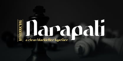 Introducing, Narapati is a clean Blackletter Typeface for your Design Narapati is a clean Blackletter Typeface for your Design that is fit for your next creative project such as logos, product packaging, Logotype, Letterhead, Poster, Apparel Design, Label, and etc. This Narapati Typeface includes also support a Multilingual Characters.
 - Framistat by Comicraft,
$39.00Face Front, True Believers, here comes another Spectacular Smash Hit from the Comicraft House of Ideas! A worthy companion to our Monster Mash and Doohickey Masterworks, Framistat is an All-New, Truly Titanic Typeface designed to dutifully display cover copy as demanded by Collector's Item Classic comic book tradition! - Linndale Square NF by Nick's Fonts,
$10.00A typeface named, simply, Geometric, from the 1885 Cleveland Type Foundry specimen book, has been beefed up a bit and softened with round serifs to create this everything-old-is-new-again gem. Both versions of this font include the complete Latin 1252 and Central European 1250 character sets. - RM Scrapheap by Ray Meadows,
$19.00 Put together from a collection of old bits and pieces, RM Scrapheap is a distinctive display face with many uses. Due to the modular nature of this design there may be a slight lack of smoothness to the curves at very large point sizes (around 100 pt and above).
 - Materniva by Rillatype,
$15.00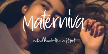 introducing, Materniva. a natural handwritten font with a feminine feel. this font is designed to fit your needs to a beautiful natural handwritten font. this font is perfect for branding, packaging, wedding invitation, logo, magazine, book, wedding card, etc. Features : uppercase & lowercase numbers and punctuation multilingual ligatures PUA encoded


