10,000 search results
(0.021 seconds)
- Lunatica by André do Carmo Gonçalves,
$29.00 Lunatica Display is a single weight, all capitals, slanted typeface ideal for titles and headlines due to its strong presence. It is constructed in a very modular fashion, stepping away from some typographic conventions, while keeping the form of its characters familiar and easily recognisable. This typeface is heavily inspired on the aesthetics of the space related sci-fi movie genre, specifically on the movie Moon (2009), directed by Duncan Jones and starring Sam Rockwell, from where it also picks up the inspiration for the name “Lunatica”. It was first designed as a branding exercise, thought to be the official typeface of Lunar Industries Ltd. — the company through wich the movie exists and unfolds. You can use Lunatica Display in more conventional contexts like branding but also in more experimental and futuristic-looking ways.
 - Vernyhora by Bohdan Hdal,
$21.00 The vintage display font family Vernyhora. The typeface is intended to be used in those places where the letters when it is necessary to transmit the strong character, stability and historicity. The font has got 6 weights. It contains extended Cyrillic and Latin alphabets. It also consists of the alternative set of characters from the old Ukrainian alphabet. It can be used for the state institutions names. It was planned to be a font of old cities and towns. From the very beginning the font was created in order to execute signboards at the entrance of towns. For the font creation the author was inspired by the graphic designers of the early 20th century, such as Georgiy Narbut and Fedir Krychevs'kyi. From the Ukrainian language the font name is translated into English as mountains mover.
 - Paneuropa 1931 by ROHH,
$19.00 Paneuropa 1931™ is a faithful recreation of XX-century Polish classic, made by Idzikowski foundry in Warsaw, 1931. Original Paneuropa was a renowned and highly popular typeface in XX-century Poland, and was widely used in all kinds of design, editorial use and printed materials for decades. Paneuropa is a geometric, clean and versatile font family inspired by Paul Renner's famous Futura - it is a bit narrower, with different proportions and details in drawing, completely different figures and punctuation shapes than Futura. It is an interesting and refreshing alternative to Futura with its own distinct personality and a subtle authentic vintage flavour. Paneuropa 1931 contains separate styles for display and large sizes as well as styles for small text sizes - differing in spacing and the softness of letterforms. The family features an original Paneuropa Double font - a beautiful inline style for headlines and display use. The whole family is completed with added missing inbetween styles as well as italics. The original subfamily set is available for purchase and it contains solely the original Paneuropa styles (Thin, Regular, Bold, Text Regular, Text Italic, Double). Paneuropa 1931 characteristics: letter shapes and proportions are very faithful to the original, keeping its idiosycrasies and inconsistencies spacing and kerning are carefully adjusted in order to achieve the colour of the original fonts, keeping maximum possible consistency - a compromise between authentic vintage feel and legible consistent text colour (for hardcore users: just turn off the kerning) weights precisely matching the original (Thin, Regular, Bold, Text Regular, Text Italic, Double), inbetween weights were added (Light, Demi Bold, as well as missing italic styles) italic angle faithful to the original (8 degrees) softened corners help achieving the character of old imprecise printed display styles for big sizes are sharper and have tight spacing, text styles have softer shapes (recreating small print imperfect print) and broader spacing for use in paragraph text (spacing in both display and text styles matches the original as well) original style names in Polish for devices with Polish set as their primary language The family is very versatile. The Inline style as well as bold and thin weights are perfect for headlines and display use, other styles works wonderfully as paragraph text. Paneuropa 1931 consists of 18 fonts - 5 display weights with corresponding italics + 3 text weights with corresponding italics + 2 inline styles (for big and small print sizes). It has extended support for latin languages, as well as broad number of OpenType features, such as case sensitive forms, fractions, superscript and subscript, ordinals, currencies and symbols.
 - Bourton Text by Kimmy Design,
$25.00 Bourton Text is a modern sans-serif typeface family perfect for both text type settings and display purposes. While it’s not a layering type family like its brother, Bourton, it come packed with features, extras and over 2,000 characters that make it stand on its own. HISTORY Bourton Text is a new take of the Bourton family that was one of the best-selling and favorite fonts of 2016. After countless requests for lowercase alphabet, or suggestions for a font pairing with Bourton, this new text setting family is based on the original shapes of Bourton. DESIGN & CREATION In taking Bourton Base was the starting point as they narrowest width and boldest weight. From there, lowercase shapes were designed that matched the aesthetic and details of the popular capitals. As Bourton was a heavy display font, some small tweaks were done to make it more fitting for smaller text settings, including reducing the letter-spacing and reworking some counters. Some areas needed complete reconstruction, such as the figures. The design of those began anew with a style that worked with the capitals and lowercase but also as a standalone set. Currency shapes were updated to match the numerals. Punctuation was also reimagined to work better in smaller type settings. Diacritics and extended language support was also updated and expanded to include full Latin plus language support for 219 latin based language spoken in 212 countries. Once the basic alphabet for Bourton Text Bold Narrow was formed, the font was expanded in both weight and width. Taking the weight from Bold down to Hairline, it allowed for more range in use. The typeface needed to be expanded in order to reach better as a book weight and width, in addition to a regular width, a wider version was create as well. FEATURES Once the extremes were set in place, small capital forms were designed for text and display purposes. These also allow for nested capital letters, lifted small caps and other display features offered in the typeface. One of the most popular fonts in the Bourton layering font family is Bourton Line. This led to an experimentation with rounded Bourton Text completely and thus a complete set of duplicated characters with rounded terminals. By using the Opentype Panel, a rounded font is a single click away. Every feature has been carefully thought out and updated across the entire font. In total, Bourton boasts over 2,300 glyphs, 42 font files with 3 widths and 7 weights in upright and italic.
 - Allrounder Grotesk by Identity Letters,
$40.00 A true workhorse. The only Grotesk you’ll ever need. Allrounder Grotesk is a neutral, powerful Neogrotesk member of the Allrounder superfamily. An unobtrusive teamplayer as well as an excellent soloist, this hard-working sans-serif typeface is ready for any task you’ll throw it at. A workhorse that lives up to its name, Allrounder Grotesk consists of ten weights ranging from a delicate Air to a powerful Black with 900+ glyphs per font. Each weight is accompanied by carefully hand-corrected italics. Allrounder Grotesk supports more than 200 Latin-based languages, containing the complete “LatinPlus” glyph set developed by Underware. It also provides you with plenty of OpenType features and additional goodies: small capitals, ten sets of figures, case-sensitive forms, ligatures, superiors, fractions and arrows. Equipped like this, you’ll be ready for any kind of sophisticated typesetting scenario you might encounter. With Allrounder Grotesk, you’ve got a sans that works great for body text, yet looks crisp and clean in headlines and display sizes. Whether annual reports, magazine and editorial layouts, nonfiction books, branding and packaging work, large-scale advertising, forms and contracts, or contemporary posters: Allrounder Grotesk is up for it. This multitalented font family was developed in a 2-year process by Moritz Kleinsorge. It was the first release of the Allrounder superfamily, a series of typefaces sharing the same color and horizontal metrics (cap height, small cap height and x-height): a typesetting system whose components match each other perfectly. Any other part of this design kit, e. g., Allrounder Antiqua or Allrounder Monument, may be easily combined with Allrounder Grotesk. Perfect Pairing: Allrounder Antiqua + Allrounder Grotesk Allrounder Antiqua is the ideal complement to Allrounder Grotesk. They both share common vertical metrics and a common color. This allows you to pair both typefaces within the same layout—even within the same paragraph—without creating visual disruption. Head over to the Family Page of Allrounder Antiqua to get more information about this typeface. Design Trick: Bilingual Design With the Allrounder Superfamily Combining Allrounder Grotesk with Allrounder Antiqua is an ideal approach for bilingual designs, wherein both languages get the same emphasis yet are distinguished with two different typefaces. It's also best practice to set headlines in a different typeface than the body text if they harmonize with each other. Allrounder Grotesk and Allrounder Antiqua provide you with the perfect pair for this purpose. In any kind of design, in any type of medium, working with Allrounder fonts is effortless. That’s why Allrounder got its name.
 - Air Superfamily by Positype,
$29.00 In B-movie awesomeness, Air began as Grotesk vs. Grotesque. I was trying to unify the prevailing traits of German and English Grotes(que/k)s in order to make something different but familiar. I am NOT trying to reinvent Helvetica (snore), so get that out of your system. From the onset, I intended this typeface to be a true workhorse that offers infinite options and flexibility for the user. At its core, it is the maturation of the Aaux Next skeleton I developed years ago. I worked out Aaux Next to settle my issues and love for Akzidenz. With Aaux Next, I strove to be mechanical, cold and unforgiving with it. I was single, young, cocky and it fit. Now I'm married, kids, dog and have found that I've turned into a big softy. When I look at Aaux Next (and have for the past few years) I see another typeface trying to eek out. I wanted it to avoid the trappings of robotic sans, quick tricks and compromises. The typeface’s DNA needed to be drawn and not just generated on a screen — so I set aside a year. I love type. I love working with type. I hate when my options for a slanted complement is only oblique or italic. I set out to produce both to balance usage — there are more than enough reasons to prepare both and I want the user to feel free to consciously choose (and have the option to choose) the appropriate typeface for print, web, etc. That flexibility was central to my decision-making process. The Oblique is immediate and aggressive. The Italic was redrawn at a less severe angle with far more movement and, as a result, is far more congenial when paired with the Uprights. Condensed and Compressed. Yep, why not? I know I would use them. There are nine weights currently available. The logical progression of weights and the intended flexibility demanded I explore a number of light weights and their potential uses — this has produced a number of ‘light without being too light’ options that really work based on the size. The result is a robust 81-font superfamily that is functional, professional, and highly legible without compromising its personality. Pair that with over 900 characters per font that includes ligatures, discretionary ligatures, stylistic alternates, fractions, proportional/tabular lining and proportional/tabular oldstyle figures, numerators, denominators, ordinals, superiors, inferiors, small caps, case-sensitive functionality and extensive language support and you have a versatile superfamily well-suited for any project.
 - Terfens Gothic by insigne,
$29.00 Terfens Gothic is the perfect choice for your next project! With its medium contrast and approachable design, this calligraphic sans serif has a classic feel that will never go out of style. Terfens Gothic is the perfect typeface for anyone looking to add a touch of uniqueness to their designs. With its generous x-height and rounded terminals, it's perfect for creating one-of-a-kind designs that are sure to impress. Its large x-height gives it a welcoming, but not too casual vibe. With forty-eight different typefaces, it has the versatility and aesthetic options you need to make your project stand out. Choose from regular, condensed, and extended styles, each with nine different weights and italics. Terfens Gothic has the look you need to make a powerful impression. Terfens is the ideal typeface for any project that has to stand out, thanks to its towering verticality. Terfens may be utilized for a variety of purposes because of its adaptable design. Terfens is a sans unlike any other- it starts with a beautiful calligraphic chancery script and then adds movement and personality. This sans is guaranteed to make your next project more exciting! The Terfens Type System's third typeface, Terfens Gothic, is an amazing addition to any type collection. The Terfens Type System's adaptability is unrivaled, with its vast choice of styles, widths, and weights. This font family has everything you need to create unique, customized designs that will suit your individual needs. Whether you need a narrow or wide font, or a hairline or bold weight, the Terfens Type System has you covered! And, with its Opentype features, the Terfens Type System is perfect for anyone who wants to add a personal touch to their projects.
 - FM Bolyar Sans Pro by The Fontmaker,
$29.00 This is Bolyar Sans font family. For us it is a dream-come-true. It took more than 1 year hard work to transform the existing Bolyar Pro from Serif to Sans Serif version. The result really surprised even us from The Fontmaker and we decided to develop it in 9 instead of 7 weights. So at the end we created 7 different styles of Bolyar sans each consisting from 9 precise weights. Bolyar Sans is not just another font family in our portfolio - it is the essence from all our efforts thru the past 5 years to create a powerful type tool that could easily meet very diverse and complex demands of modern design. Furthermore, like all its predecessors, Bolyar Sans is a type concept created by Designers for Designers. If you are in wine and spirits industry, packaging design, or you just love to work with strong headlines that effortlessly could turn into brand logos, then you should definitely try our Bolyar Sans. It is designed for this. Of course there are plenty of different features like multilingual support, ligatures, alternates, we even added adaptive over- and underlining to make it even more complex in its use. Bolyar Sans pairs perfectly with other members of Bolyar Family - Pro , Ornate and Typecraft . So as you see Bolyar is developed as a type platform with own character and style. By using it you could be vintage, classic, modern, soft, even bold, rough and ornate. It is a visual bridge between different typographic periods united under Bolyar name. With our Sans version we aim to be contemporary and to provide powerful type tool to those designers who often love to swim between past and modernity.
 - Suburban Collier by Paula Minelgaite,
$80.00 Suburban Collier is a dreamy, humanist demi-serif sister of Romford Stencil typeface. It was created during the COVID-19 pandemic and its name is inspired by Collier Row, a suburban area of Romford, East London (UK). Suburban Collier features subtle ligatures, an alternative ‘a’ and supports Western, Central, Southern, and Eastern European as well as Pinyin. Use it to add character to your body copy or as fancy display text.
 - Quite Something by Hanoded,
$15.00 I have always liked the word ‘quite’ - you can stick it in a sentence and all of a sudden that sentence looks quite sophisticated! Quite Something may not be all that sophisticated; in fact, it is a rather messy font. But that’s where the fun begins! Use it for your children’s book covers, toy packaging and posters. I am sure people will say that your designs are Quite Something!
 - Sloboda BT by Bitstream,
$50.99A calligrapher, graphic designer and teacher, Duško Trifunović of Belgrade created this handsome calligraphic typeface called Sloboda. It has an open design, an outline of sorts, and though the lowercase is small and compact, it sets beautifully in text. The generously sized uppercase has a swash flavor to it yet works harmoniously with itself. This OpenType font has extra ligatures and the extended character set supports Central Europe. - Brazza by Scholtz Fonts,
$17.00Brazza is a a font that fuses the look of handwriting, brush and comic script. It is loose, very versatile and informal, yet it is very readable. Suggestions for use: - music video marketing - greeting cards - valentines day media - comic books - captions The font is fully professional: carefully letterspaced and kerned. It contains over 235 characters - (upper and lower case characters, punctuation, numerals, symbols and accented characters are present). - Havoks by Maulana Creative,
$14.00 Havoks is a Hand-lettered font inspired by the vintage 70's sign board, music, shop and movies, it has a rough stroke outline and then we fill it. Havoks includes opentype features Ligatures. It support multilingual more than 100+ language. This font is good for logo design, Movie Titles, Books Titles and any awesome project you create. Make a stunning work with Havoks Rough sans font. Cheers, Maulana Creative
 - Slantinel by Illunatic,
$9.95 Slantinel is a versatile sans-serif type family with lots of personality! It consists of 9 fonts coming with 3 weights in 3 versions each and supports many international languages. Slantinel works best in small to medium sizes and is useful in a wide variety of settings such as childrens books, packaging designs, greeting cards and much more due to its handwritten feel and its many distinct details.
 - Magnetica by Galaxa,
$10.00 Magnetica font family combines design simplicity of modern sans serifs with a futuristic feel based on semi-rounded concept. Its fluent lines can bring unusual spark to logo designs, headlines, magazine designs, quotes, documentaries, advertisements or similar projects. This font, especially its Italic variation, will find its use also in larger text blocks where simplicity, clean lines and well applied kerning is a must. Create something spectacular with Magnetica.
 - Mister Mustard by AdultHumanMale,
$12.00 MisterMustard is a chubby art deco style font, not thin or elegant, but plump and jolly. The font is available in two styles regular and italic. While it was designed to be playful, this font has both an uppercase and a lower case, so it works for practically everything (maybe not a headstone or obituary). It’s loaded with extra foreign glyphs so it gives you plenty of options. Buy. Install. Enjoy.
 - Fairlady by Studio Indigo,
$17.00 Fairlady is a somewhat chunky script font that is developed from my own handlettered brush letters. My idea was to design a bold cursive script font with a strong 1950's vintage feeling to it. Fairlady is a decorative and quite tightly spaced font with preserved legibility which makes it perfect for vintage cards, labels, posters, logos, packaging and more. It has multilingual support for most European countries.
 - Folk Retro by Mvmet,
$9.00 Folk Retro is a cool and playful handlettered font, inspired by vintage western sign paintings. It will elevate a wide range of design projects to the highest level. You can use this font for many design ideas such as stickers, t-shirt designs, amazing logo designs, magazine or book covers, comics, cartoon drawings, and many more. Fall in love with its incredibly versatile style, and use it to create lovely designs!
 - Kaviron by Graphicfresh,
$18.00 Kaviron is the name of a street in a Greek city. A city that has many civilizations. This font is designed in a more classic way. So it has its own experience in using it. This font is synonymous with 70s or 80s style design visuals, Bold and strong. I hope you enjoy using this font and can come up with clever and brilliant ideas in your designs.
 - Satsuma by Hanoded,
$20.00 Satsuma. It used to be only a Japanese orange, but now it's a typeface as well. A rather unusual typeface. Satsuma is rough around the edges, squarish and playful. It is handmade and comes with over 400 interlocking ligatures. If that ain't fun, I don't know what is! Of course, Satsuma comes with extensive language support AND accented ligatures! Due to the complexity of this font, it only comes as TTF.
 - Blob Control by Rachel McBride Creative,
$9.00 Blob Control is the perfect typeface to use for any project that needs a youthful or juvenile flair. It's inspired by the messy, eccentric nature of adolescence. It comes with seven fonts and weights, so it can work with any project it's needed in! It comes equipped with over 400 characters to support most western languages! Great for use on children's books, toys, handwritten projects, retro projects, websites, and animations/cartoons.
 - Jolly by Sebastian Losch,
$- Jolly is a cheery, little display typeface that is suitable for headlines and informal body-copy. Being slightly slanted to the right, jolly has a fairly positive straightforward appearance which makes it pleasant to read. Its various Open Type features, such as swashy alternates for the capitals, ligatures and stylistic alternates as well as the small caps and the extended language support make it versatile and open for different applications.
 - Causten by Trustha,
$25.00 Causten is a geometric sans serif font family with maintains rationality in designing each form. With use the sharpness of the eyes, and remain logical, so that balance is maintained in each form. So, it will get a clean, neat, and perfect shape. Causten comes with 9 weights and matching oblique, making it 18 styles. It makes perfect for all creative projects. Also, some alternative glyphs will be an attractive choice.
 - Cannoli by Eurotypo,
$36.00 Cannoli is a brush lettering style font, designed specially for use in logotypes, advertising and packaging. It is interesting to note the use of free-flowing lettering to perform its own eye-catching. This vintage typeface is a reminiscent of the posters of the 50s, painted with a brush in enamel advertising signs. Cannoli was inspired by the delicacy of the Sicilian pastry, and the robust charm of its landscape.
 - Helttox Brush by Gatype,
$14.00 Helttox is a casual hand brush script so it has a nice texture and flow. Helttox has many alternatives to make it look like real handwriting; four sets of lowercase and two sets of uppercase. suitable for design projects; logos, branding, posters, quotes, beautiful wedding invitations, beautiful stationery art, eye-catching social media posts, and cute greeting cards and other designs. It is unique, very natural and attractive
 - Our Pal Hal NF by Nick's Fonts,
$10.00Of the many lettering gurus who published chapbooks on handlettering during its heyday, one of the most prolific was H. C. Martin. This quirky poster face was offered in one of his many Idea Books, and it remains as fresh and frolicsome today, some seventy years later, as when it first appeared. Both versions of this font include the complete Unicode Latin 1252 and Central European 1250 character sets. - Kroine by Craft Supply Co,
$20.00 Meet Kroine – Versatile Serif Typeface Kroine redefines versatility. It’s a serif that suits any display size. Subtle Elegance in Low Contrast Its low contrast strokes offer modern simplicity. Also, Kroine delivers a clean reading experience. The delicate serifs enhance legibility, perfect for extended text. Designed for Flexibility Kroine thrives in both small and large displays. Furthermore, its uniform thickness ensures consistency. Thus, it becomes an ideal choice for diverse design needs.
 - Norseman 3 by Alphabet Agency,
$21.00 Forged to be as imposing as a Norse horde ready to stampede into battle, Works great in all caps which it was initially designed to. I designed the lowercase characters to match really well with each other and the uppercase, so it works well in title case. Plus it has a great set of looking numbers and loads of extras. Fully kerned pairs so all letter combinations look great
 - Signpost by Studio K,
$45.00 The name says it all. Signpost is a display font purpose-designed for directional, informational and publicity signage, as well as posters, public notices and advertisments. It comes complete with a choice of 'pointing hands' symbols and quartrefoil borders of the kind used on traditional British street signs. It is essentially a drop shadow version of my Red Top font family, which has a similar range of applications.
 - Kingstone Sans by Unitype Studio,
$19.00 Introducing the majestic "Kingstone Sans" a typeface that exudes power, elegance, and timeless appeal. With its commanding presence and exquisite details, this font is designed to make a bold statement in your designs. Let the "Kingstone Sans " reign over your projects and elevate them to new heights of sophistication. Its sturdy serifs and balanced letterforms exude a sense of authority, making it ideal for prestigious branding, editorial designs, and luxury packaging.
 - Hazard by Ergibi Studio,
$20.00 Introducing Hazard! Stylish Marker Font is a smooth brush font. With a style that looks original, this font has its own uniqueness and when meeting with others will provide a dynamic and pleasant closeness. It is suitable for all your design projects such as quotes, poster designs, personal branding, promotional materials, logos, product packaging, and more. It includes a bonus swash weight to let you add even more to your design.
 - Crossfit by TypeThis!Studio,
$54.00 Crossfit is a new headline font family, designed by Anita Jürgeleit at TypeThis!Studio. It’s suitable for big sizes and titles, such as big movie posters, advertising or editorial headlines. Matching topics might be adventures, sports, strong nature and all kind of challenging life events. Its bold stability transformes your creation into a non questionable design. It is bold, clear and also friendly thanks to its rounded corners. www.typethis.studio
 - Prussak BC by Jujumisur’s Ficus,
$19.00 I wanted to do somewhat like Blackletter, but Blackletter is hard to read sometimes, so I tried to solve this problem and to do something unique. This font is able to be used with all European languages including ancient and reconstructed languages like Old Church Slavonic (it can be written by Cyrillic or Glagolitic script), Proto Slavic, Ancient Greek etc. It also includes IPA, so it can be used in education.
 - Peacy by Craft Supply Co,
$20.00 Introducing Peacy – Psychedelic Font Playful and Vibrant Typography Peacy Psychedelic Font, the ultimate psychedelic font, radiates fun and cheerfulness with its lively shapes and vibrant colors. Each letter dances with its unique personality, creating a dynamic visual experience. Reggae-Inspired Vibes Infused with the spirit of reggae music, Peacy captures freedom and positivity. Its flowing curves and wavy lines mirror the rhythmic melodies and laid-back vibes of reggae culture.
 - Vegas x by XdCreative,
$25.00 Vegas-X is a futuristic squared display font. This font is inspired by films, books, science and space technology, composed of a squared shape with smooth curves that gives a modern and futuristic impression. Vegas-X It is perfect for display, logo, icon and it will look stunning on any poster flyer or print. Use this font for your designs and explore its endless possibilities. Thank you _xd
 - Michael Signature by Stefani Letter,
$14.00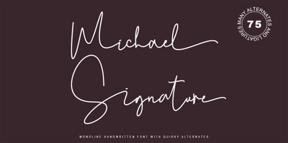 Michael Signature feels just as charming and elegant. This stunning Monoline script font is a stylish homage to classic handwriting. It features a varied baseline, smooth lines, gorgeous glyphs, and stunning alternatives. This font is PUA-coded which means you can access all the amazing glyphs and swashes with ease! It also features many special features including glyphs and alternate ligatures so that it displays natural and original handwriting.
 - Millena by Letterara,
$12.00 Millena is a sweet, soft hand-lettered handwritten font. Fall in love with its authentic feel and use it to create gorgeous wedding invitations, beautiful stationary art, eye-catching social media posts and much more! This font is PUA encoded which means you can access all of the cute glyphs and swashes with ease! It also features a wealth of special features including alternate glyphs and ligatures and a Monogram style.
 - Fructosa by Typo5,
$14.95This unique type treatment was born after working in a mixture between a pixel based font and a retro logo. With lot of details it looks great a bigger sizes, but you can also apply it to write long sentences or even as body text! This font was chose as the official online font of our favorite band Foo Fighters some time ago, when it was just a work in progress. - Antagometrica BT by Bitstream,
$50.99 Antagométrica BT is the creation of Argentine designer Maximiliano Giungi. A clean and slightly condensed sanserif, it is ideal for use in text settings, but its trendy design makes it distinctive enough for display work. The CFF OpenType glyph repertoire includes additional ligatures, full sets of superior and inferior figures as well as unlimited fractions. There are also tabular and proportional figure sets, and the extended glyph set supports Central Europe.
 - Fox Cupid by Fox7,
$16.00 Fox Cupid is a cute and fun color display font. Fall in love with its authentic feel and use it to create gorgeous invitations, beautiful stationary art, eye-catching social media posts, and cute greeting cards. Add this beautiful font to each of your creative ideas, and notice how it makes them stand out. 🌺🌺 Please note that the Canva do not support color fonts! 🌺🌺