10,000 search results
(0.052 seconds)
- Retail Shop JNL by Jeff Levine,
$29.00 Vintage New York neon signage alongside the landmark Dubrow's Cafeteria [probably circa the 1940s] of the words "retail shop" inspired the namesake digital type design. Retail Shop JNL is a bold and somewhat eccentric Art Deco font with varying widths and unusual character forms available in both regular and oblique versions.
 - La Obrige by Hishand Studio,
$15.00 La Obrige is serif font that inspired from the beauty, aesthetic, elegant and Paris. It is really good for water mark, logotype, advertisement, social media posts, product packaging, and more. complete with ligatures regular italic icon kerning multilingual support Shampoo mock up from https://www.graphicsfuel.com/2018/09/dispenser-bottle-psd-mockup/
 - French Bistro JNL by Jeff Levine,
$29.00 The 1930s French publication L'Art du Tracé Rationnel de la Lettre was a treasure trove of font revival ideas from the Art Deco era. One example featured a serif typeface with a number of stylized characters. This is now available as French Bistro JNL, in both regular and oblique versions.
 - Roaring 20s by Thomas Käding,
$5.00 This is a decorative font containing the letters A-Z, numbers 0-9, and enough punctuation to make invitations, playbills, posters, and the like. It is meant to have the feel of the theatre district early last century. "Roaring 20s" comes in three styles: regular/engraved, hollow/white, and black. Enjoy!
 - Lindisfarne Nova BT by Bitstream,
$50.99 Lindisfarne Nova is an uncial-like design based on the script found in the Lindisfarne Gospels. Created by Harry Pears and Margaret Layson, it is available in two weights, regular and bold. Lindisfarne Nova is Harry’s first completed font. There are also two companion styles, Lindisfarne Nova Incised and Lindisfarne Runes.
 - Kemading by Differentialtype,
$10.00 Kemading is a retro serif font that has a vintage, cute, fun and bold feel. Comes with four styles, regular, italic, outline and outline italic. Kemading's design is unique and energetic, making it perfect for adding a touch of fun nostalgia to logos, crafts, posters, branding, stickers and many other projects.
 - Retail Price JNL by Jeff Levine,
$29.00 Redrawn from lettering found on a British publication circa the 1930s, Retail Price JNL is an extra bold display inline sans that’s great for catchy headlines, price cards, banners or any other attention-getters. Retail Price JNL is offered in regular, oblique, solid and solid oblique versions. Caps only Fonts.
 - Caniago by Wildan Type,
$10.00 Introducing new typeface. Caniago- A modern, luxury, fashionable display serif font. Embargo perfectly used for product presentation, elegant logo design, packaging or invitation cards or heading text. it is allcap with symbol and multilingual support Two style, Caniago Italic Caniago Regular Features Two style/ Numbers & Punctuation / Extensive Language Support/ligature/Alternate
 - Balcon Round by Tour De Force,
$25.00 Balcon is condensed sans family designed to be your first web font choice. Contains 5 weights: Light, Regular, Bold, ExtraBold and Black, it fits perfect into any project, from editorial editions to packages, labels, posters. If you're looking for "sharp" version of this family, feel free to check Balcon sans family.
 - RePublic by Suitcase Type Foundry,
$75.00In 1955 the Czech State Department of Culture, which was then in charge of all the publishing houses, organised a competition amongst printing houses and generally all book businesses for the design of a newspaper typeface. The motivation for this contest was obvious: the situation in the printing presses was appalling, with very little quality fonts existing and financial resources being too scarce to permit the purchase of type abroad. The conditions to be met by the typeface were strictly defined, and far more constrained than the ones applied to regular typefaces designed for books. A number of parameters needed to be considered, including the pressure of the printing presses and the quality of the thin newspaper ink that would have smothered any delicate strokes. Rough drafts of type designs for the competition were submitted by Vratislav Hejzl, Stanislav Marso, Frantisek Novak, Frantisek Panek, Jiri Petr, Jindrich Posekany, and the team of Stanislav Duda, Karel Misek and Josef Tyfa. The committee published its comments and corrections of the designs, and asked the designers to draw the final drafts. The winner was unambiguous — the members of the committee unanimously agreed to award Stanislav Marso’s design the first prize. His typeface was cast by Grafotechna (a state-owned enterprise) for setting with line-composing machines and also in larger sizes for hand-setting. Regular, bold, and bold condensed cuts were produced, and the face was named Public. In 2003 we decided to digitise the typeface. Drawings of the regular and italic cuts at the size of approximatively 3,5 cicero (43 pt) were used as templates for scanning. Those originals covered the complete set of caps except for the U, the lowercase, numerals, and sloped ampersand. The bold and condensed bold cuts were found in an original specimen book of the Rude Pravo newspaper printing press. These specimens included a dot, acute, colon, semicolon, hyphens, exclamation and question marks, asterisk, parentheses, square brackets, cross, section sign, and ampersand. After the regular cut was drafted, we began to modify it. All the uppercase letters were fine-tuned, the crossbar of the A was raised, E, F, and H were narrowed, L and R were significantly broadened, and the angle of the leg and arm of the K were adjusted. The vertex of the M now rests on the baseline, making the glyph broader. The apex of the N is narrower, resulting in a more regular glyph. The tail of Q was made more decorative; the uppercase S lost its implied serifs. The lowercase ascenders and descenders were slightly extended. Corrections on the lower case a were more significant, its waist being lowered in order to improve its colour and light. The top of the f was redrawn, the loop of lowercase g now has a squarer character. The diagonals of the lowercase k were harmonised with the uppercase K. The t has a more open and longer terminal, and the tail of the y matches its overall construction. Numerals are generally better proportioned. Italics have been thoroughly redrawn, and in general their slope is lessened by approximatively 2–3 degrees. The italic upper case is more consistent with the regular cut. Unlike the original, the tail of the K is not curved, and the Z is not calligraphic. The italic lower case is even further removed from the original. This concerns specifically the bottom finials of the c and e, the top of the f, the descender of the j, the serif of the k, a heavier ear on the r, a more open t, a broader v and w, a different x, and, again, a non-calligraphic z. Originally the bold cut conformed even more to the superellipse shape than the regular one, since all the glyphs had to be fitted to the same width. We have redrawn the bold cut to provide a better match with the regular. This means its shapes have become generally broader, also noticeably darker. Medium and Semibold weights were also interpolated, with a colour similar to the original bold cut. The condensed variants’ width is 85 percent of the original. The design of the Bold Condensed weights was optimised for the setting of headlines, while the lighter ones are suited for normal condensed settings. All the OpenType fonts include small caps, numerals, fractions, ligatures, and expert glyphs, conforming to the Suitcase Standard set. Over half a century of consistent quality ensures perfect legibility even in adverse printing conditions and on poor quality paper. RePublic is an exquisite newspaper and magazine type, which is equally well suited as a contemporary book face. - Quadranta - 100% free

- Neighbourhood - 100% free

- JBCursive - Unknown license

- Limbus Sans by Luker Type,
$19.00 Limbus Sans Double Vision is a psychedelic approach on the Limbus Sans Regular created in 2023 by Lukas Gerber of LukerType.
 - Fertigo Pro Script by exljbris,
$19.95 Fertigo Pro Script. Fine connected type with a lyrical calligraphic touch. Don't forget to have a look at the regular version.
 - NEON LED Light - Personal use only

- Antique Slabserif JNL by Jeff Levine,
$29.00 Antique Slabserif JNL is a reinterpretation of Monotype's Modern Antique 26, released in 1909. The name of the typeface is an oxymoron because Modern conflicts with Antique. Despite many critics of the "mechanical" look of the font's design, it has developed a bit of charm with age and the passing of time. Available in both regular and oblique versions, Antique Slabserif JNL can be used as both a text and headline font.
 - Qe Laurenty by Hishand Studio,
$15.00 The newly released Qe Laurenty sans serif font exudes an air of timeless sophistication and elegance. Its clean lines and precise geometry make it a truly classy choice for any design project. Qe Laurenty's refined curves and delicate letterforms add a touch of luxury to any typographic composition. This font's exquisite detailing and balanced proportions make it perfect for creating elegant branding materials. Complete with ligatures alternates regular italic icon kerning multilingual support
 - Cyclo by Cubo Fonts,
$39.00 Ainsi que le considérait Geoffroy Tory, typographe et philosophe de la Renaissance, chaque lettre de l'alphabet peut être dessinée à partir d'un cercle et d'un trait. La fonte "cyclo" actualise et radicalise ce principe graphique visionnaire. Le pack contient une version "regular" assez sage et une version "alternate" plus fantaisiste dans les accents et des signes de ponctuation. La fonte cyclo est dont adaptée à tous les usages (titres, sous-titres, chapitres et blocs de text), et peut servir efficacement l'identité visuelle de votre projet.
 - Boberia by Linotype,
$29.99Linotype Boberia is part of the Take Type Library, which features winners of Linotype’s International Digital Type Design Contest. Designed by Bo Berndal, its historical roots lie in the neoclassicism of the turn of the 20th century. The slender letters with a large x-height and marked stroke contrast give the font an elegant character. The nostalgic, flowing forms are typical of Art Deco fonts and allow designers a number of possibilities for the font’s use. Boberia includes regular, italic and bold type styles. - Skisterstone by Maulana Creative,
$12.00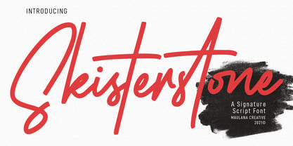 Skisterstones Signature Script Font Skisterstone is a Casual Signature Script font. With regular mono-line stroke, fun character with a bit of ligatures. To give you an extra creative work. Skisterstone font support multilingual more than 100+ language. This font is good for logo design, Social media, Movie Titles, Books Titles, a short text even a long text letter and good for your secondary text font with sans or serif. Make a stunning work with Skisterstone font. Cheers, MaulanaCreative
 - Casinova by Vozzy,
$10.00 Introducing vintage label font named Casinova. The font is inspired by vintage signs from the mid-20th century, as well as neon casino signs. This font has a multilingual support (check out all available characters on previews). The font family has two styles: Regular and Color. Also the font has six layer effect styles you can see them on preview. This font will look good on any vintage styled designs like a poster, T-shirt, label, logo, etc.
 - Apothecary by Pixel Colours,
$26.00 Apothecary is a modern stylish font duo that includes a sweet flowing script font and a typewriter font made from an authentic typewriting. Combine both fonts to create beautiful logos and branding. Design professional apothecary and botanical labels and packaging or make elegant wedding invitations. Includes: Apothecary regular: a script flowy monoline font Apothecary typewriter: an antique typewriter font perfect for small texts, taglines or info Lowercase and uppercase characters Numerals, alternates and ligatures. Language support
 - Yesterday Morning by Mans Greback,
$59.00 Yesterday Morning is a lively handwriting font that captures the essence of an active and cute brush style. This handmade calligraphy font is perfect for fashion projects, adding a sense of energy and excitement to your designs. The font family's hand-brushed appearance brings an authentic, personal touch to your creative work, making it feel warm and approachable. The Yesterday Morning font family includes four engaging styles to suit various design needs: Regular: A balanced and energetic style for everyday use Regular Italic: Adds a playful touch and a sense of movement Bold: Offers a bolder, more assertive presence for impactful designs Bold Italic: Combines the strength of bold with the flair of italic Built with advanced OpenType functionality, Yesterday Morning ensures top-notch quality and provides you with full control and customizability. It includes stylistic alternates, ligatures, and other features to make your designs truly unique.
 - Beloved Karins by Say Studio,
$15.00 About The Product Lemonade Fresh font is a Display Serif Typeface with a unique circular shape inspired by the alternate shapes in most serif fonts, but Lemonade Fresh makes it a regular shape, and Lemonade Fresh still has 50+ other alternate that you can combine to get curves and beautiful shapes easily just in seconds. It is a display font with moderate contrast that perfect for branding projects, logo, wedding designs, social media posts, advertisements, product packaging, product designs, label, photography, watermark, invitation, stationery, and any projects, it makes with a high level of legibility. What's Included: - Fresh Lemonade Regular - Fresh Lemonade Italic - Accented Characters (West Europe) - Ligature & Huge Stylistic alternate - Works on PC & Mac - Recommended using Adobe Illustrator or Adobe Photoshop. Wish you enjoy our font and if you have any questions, don't hesitate to drop message & I'm happy to help :) Thanks, Have a wonderful Day, Say Studio
 - Blackberry Macarons by PeachCreme,
$13.00 Say hello to the Blackberry Macarons Font Trio! Heart-warming Script, Display, and Sans Serif fonts that will brighten your design. Blackberry Macarons Display - includes all caps regular and multilingual letters, punctuation, numbers, and as a bonus the letters A, K, M, Q, R with beautiful swashes to keep your designs attractive :) Blackberry Macarons Script - has all uppercase and lowercase letters, numerals, punctuation, and 42 fancy ligatures as well to add a cheesy flair to your words. Blackberry Macarons Sans - a cute and fun hand-drawn typeface with a little imperfect look that works great to add a handmade touch to your projects. Includes a full set of regular letters, numbers, and punctuation. Sweet and quirky, the Blackberry Macarons Font trio is perfect for recipes, book illustrations, lettering, fun packaging, greeting cards and so much more!
 - Queulat Soft by Latinotype,
$- The font is the soft version of the Queulat basic and condensed families, but keeping the same features as the original typeface. Queulat Soft is a hybrid font that combines different styles, reflecting charm, freshness and, especially, a strong personality. The font is inspired by Modern and Grotesk styles. The former is shown in some characteristic features such as teardrop terminals, which give the typeface an attractive unique look, making it an ideal choice for logotypes and labelling. The latter, with its rationality, makes Queulat Soft a stable and strong face for headings and subheadings. The combination of styles can be clearly seen by comparing the Regular with the Alt version. The Regular version is more simple than the Alt one. Differently, the alternative version possesses more features of the Modern style, like teardrop terminals in ‘k’ and ‘v’.
 - Trailmade by Adam Ladd,
$18.00 Trailmade is a rugged and stylish brush font with regular, italic, and extras styles. Explore an adventurous path with this typeface that ventures a little outside the typical brush script genre but still carries echoes of it. The upright design of the regular style has a confident appearance, while the italic style gives a little more of a signature look. Hand-lettered with a brush pen on paper, Trailmade includes swash characters, automatic double-letter ligatures, and a complete second set of lowercase stylistic alternates to switch in and out for a more authentic feel. There is also a matching Extras font featuring a variety of lines and dingbats that will complement your typography. All alternates, swashes, and ligatures are PUA-encoded for more accessibility in a variety of programs. This font has extensive Latin language support for Western, Central, and Eastern European.
 - The Hoods Brother by Tigade Std,
$20.00 Brotherhood is a masculine modern bold font with touch of craftmanship. It was designed by hand with passion and inspired by the love of adventure. All characters were carefully drawn on a iPad before crafted to become a Typeface. It is easy and perfect to match this typeface for style logos, labels, package design, lettering, patterns and others. Below what’s included in this product: Brotherhood Regular • A hand drawn modern bold sans font. It contains upper & lowercase characters, all punctuation and numerals. Brotherhood Brush • This is a modification of the Regular by adding brush touch. It is another set of upper & lowercase characters. Language Support; It does support basic International Characters That's a wrap! I do really hope you like this font, and please don't hesitate to contact me if you have any questions. Also, drop by to our instagram! Tigadestd | Doli Harahap
 - Roves by Andrew Footit,
$12.00 Roves is a font family dedicated to exploration, adventure and the early merchants of history. The word rove means “a journey, especially one with no specific destination; an act of wandering”. the family consists of three Stencil versions each with a Regular and Bold weight as well as two Sans versions each also with a regular and bold weight, this is a total of 10 different options to work with. When combined these two fonts create great looking typography that compliment each other but each also strong enough to be used on their own. The Roves family is a display font with a great rust vintage feel to it which gives the user an authenticity when working with typographic projects. Roves has been created with the designer in mind, to create with and explore the different options with in the family.
 - Sweet Pancake by Locomotype,
$15.00 We often see calligraphy fonts with a standard style developed from the brush pen strokes. Sweet Pancake fonts come in different calligraphy styles. The usual shape has been customized to make it look more personal and special. Sweet Pancake is available in two versions, regular and X. The second version is the development of the regular version by adding sharp corners to the stem. To be more specific, this font also includes several swash so that you can easily mix and match unique and different typographic designs. To attach a special swash to the letter end automatically, you only need to add two / three / four hyphens (the standard ligature feature must be activated). Sweet Pancake is suitable for logotype, invitation, poster and more. Available in OTF and TTF formats, also supports multi-language and PUA encoded.
 - Radilen Aveline by Dora Typefoundry,
$18.00 Introducing a fancy serif font with italics. Radilen Aveline is a series of elegant serif fonts that give traditional design elements a modern feel with their clean lines, smooth curves and sharp details making them suitable for a variety of your design projects making them ideal for titles, headlines, editorial designs, monograms, branding, logos, poster designs, and more. The regular Radilen Aveline has 47 Ligatures and 28 Alternatives. WHAT'S INCLUDED: Radilen Aveline Regular Radilen Aveline Italic We highly recommend using a program that supports OpenType features and Glyphs panels like Adobe apps and Corel Draw, so you can see and access all Glyph variations. This type of family has become the work of true love, making it as easy and fun as possible.I really hope you enjoy it! Thank you Enjoy the font and go get creative :)
 - Antiquary by DimitriAna,
$22.00 The Antiquary font collection was designed and illustrated, to reanimate the art of vintage advertising design. The fonts are inspired by the old ad posters and product labels, as well as the art of sign-making. The 4 typographic styles are combined with shapes and ornaments to create a variety of designs. They are ideal for logos, packaging, branding and all kinds of advertisements. Typographic styles: Antiquary: Old fashioned, serif, with 2 styles (Regular and Outline), stylistic alternates and ligatures. Antiquary Wide: All caps, bold, serif, vintage, with 3 styles: Regular, Inline and Outline. Antiquary Script: Modern brush calligraphy with terminal forms, contextual alternates, stylistic alternates and ligatures. Antiquary Thin: All caps, minimal, old fashioned. Antiquary Elements: 52 symbols, ribbons, frames and ornaments. The font collection supports Western, Central, Eastern, European, Baltic, Turkish and Greek languages.
 - Atto Serif by Wilton Foundry,
$29.00I set out to design a contemporary font that is condensed with thick and thin strokes. The highly structured forms of this condensed font was made more interesting and softer by giving it a slightly calligraphic tone and by adding round corners. Atto's express purpose is to be both utilitarian, compact and technical but with a friendly face. The name "atto" was adopted since it refers to the measurement of "smallness" or detail. You will no doubt discover all the many pleasant nuances within Atto. Adopted in 1964, "atto" comes from the Danish "atten", meaning eighteen. Atto - (symbol a) a SI prefix to an unit and means that it is 10 to the power- 18 times this unit. Examples are one attosecond or one attometer/attometre. Atto is available in for Mac and Windows in Postscript, Truetype and Opentype. See also the companion font Atto Sans. - Temeraire by TypeTogether,
$49.00 Quentin Schmerber’s Temeraire serif font family was not designed to be invisible. It is a typographic exploration meant to be seen — with its beauty, one could even say beheld. While some fonts aim to be as easily ignored as possible, Temeraire is offered as a gift to wide-eyed readers with its anything-but-boring character and its conspicuous inconsistency in styles. Most type families increase the weight of each character to expand the family. Instead, research into 17th century sources produced Temeraire’s wide range of letterforms, from the predictable to the odd and loosely related through time. Each style is designed to work alongside the others but are also standalone homages to specific parts of English lettering tradition: gravestone cutting, writing masters’ copperplates, Italiennes, and others. Temeraire’s Regular style is a contrast-loving Transitional Serif with vertical stress, making it great for period and classic works, ironic pieces, and modern throwbacks. The weight of the Bold squares off the ends of each glyph to give it stability, and the italic style rings true: flowing, contrasting, and purposefully inconsistent. Temeraire’s Display Black style is one salvaged from expressive gravestone artistry. The details most easily noticed are the ‘g’ with its descending bowl that has been pressed back up in the centre, and the additional serif on the ‘t’ crossbar that holds its neighbouring character at bay. (The ‘g’ and ‘Q’ have loopless alternates.) The final style is the Italienne, the horizontally stressed counterpoint to the family. By design its characters flow and bend in ways not in step with the rest of the family. All the weight has been pushed to either hemisphere within each glyph, resulting in a display style that demands space and peacefulness around it so its presence can impress. As with all TypeTogether families, Temeraire meets the current designer’s needs. Not only does its five styles shine in print work, it includes alternates for when the defaults are too boisterous and has been expertly crafted for screens. The Temeraire serif font family is resurrected from echoes in time and finds its family relation through impeccable taste.
 - Cloverside by IKIIKOWRK,
$17.00 Proudly present Cloverside - Vintage Label Font, created by ikiiko. Where timeless elegance meets vintage charm in the world of typography. This exceptional font is a nod to the classic label style, meticulously crafted to add a touch of nostalgia to your designs. With its seamless blend of sophistication and retro flair, Cloverside captures the essence of a bygone era while maintaining a contemporary edge. Give yourself to the charm of two unique looks: the striking and adaptable Regular font and the minutely detailed Inline font. Every word is a unique piece of art, painstakingly created to convey the feeling of fine craftsmanship found in old-fashioned labels. This font is very suitable for making a vintage or retro stuff, magazine layout, book cover, food & beverages packaging, quotes, or simply as a stylish text overlay to any background image. What's Included? 2 Styles : Regular & Inline Uppercase & Lowercase Numbers & Punctuation Multilingual Support Works on PC & Mac
 - Austina Capitton by HansCo,
$15.00 Austina Capitton is our new modern, clean, and stylish monoline signature font and was created to look as a naturally handwritten as possible. Built with unique style in OpenType features, this script comes to life as if you are writing it yourself. This font is very suitable to be used to brand a product because if you write a brand name it will look like your company signature. Austina Capitton is perfect for photographers, bloggers, trademarks, magazines, fashion, logos, business cards and much more. There are two styles in this font package, they are Alt and Regular. You can use Regular style if you like the curve of the font or you can use Alt style if you like simple and minimal ones. It's highly recommended to use it in OpenType capable software - like a Coreldraw, Photoshop, Illustrator and Indesign. This font come with Uppercase, Lowercase, Numbers, Punctuation and swash. It offers Multilingual Support, works on Mac and Windows OS and is easy to install. Enjoy!
 - Dufour by Scholtz Fonts,
$19.00 Dufour was named in honor of an art deco font called "Independent" designed in the 1930s by Collette and Dufour. "Dufour" is influenced by the original font, however, there are substantial differences: instead of small caps, a true lower case was created, the upper case character proportions and shapes have been greatly modified, and all missing characters have been created to make a truly modern font which nevertheless has all of the panache of the original. A related font is Collette, designed by Anton Scholtz, however, Dufour has a softer feel that is more true to the original art deco period. Dufour comes in four styles: Dufour Regular, Dufour Regular Outline, Dufour Condensed, and Dufour Condensed Outline. The font has been carefully kerned and best results are obtained if kerning is switched on. (All-caps passages work well.) It is best used to create a retro feel and in headings, subheads and in short passages of text. Very effective in marketing for products for children.
 - Super Duty by Typeco,
$29.00Stencil fonts often evoke rigid and sterile images such as packing crates or military vehicles, but Super Duty is somewhere between serious and fun. Super Duty is designed with sharp mechanical angles which give the letterforms a square-jawed and ready-for-action feel. A rounder companion version is included that has the sharp edges smoothed out. Unlike most stencil fonts this one has a lowercase that matches the strength of the uppercase. The lowercase has been designed with an x-height equivalent to the cap height and barely protruding ascenders so that the user can interchange the upper and lower letterforms for a funky graphic effect. Super Duty is a robust and versatile stencil font family of 25 fonts — sharp and round variations with closed versions in 2 weights each. These are provided in 3 widths — regular, narrow and condensed. Super Duty includes a text version that has more regular proportions and letter forms for a well rounded display font system. - Fishwrapper by E-phemera,
$25.00 Fishwrapper is a three-member font family (Regular, Bold, and Italic) designed to replicate the look of authentic vintage newspaper typography. The fonts are rough and are meant to be used at newspaper sizes. All three fonts have a complete alternate alphabet built in: using the contextual alternates feature will automatically substitute alternate versions of most glyphs, so that identical characters do not appear side by side, thus helping to create the look of metal type. Fishwrapper Regular has a complete set of small caps built in. Each font features assorted rule lines and other decorative material, many accessible through the discretionary ligature OpenType feature (three em dashes in a row, for example, will become a rule line), as well as fractions and a full international character set. Used in conjunction with some of E-phemera's vintage headline fonts, the Fishwrapper family is intended as a complete vintage newspaper and job-printing type solution.


