10,000 search results
(0.293 seconds)
- Le Atallier by Hishand Studio,
$15.00 Introducing Le Atallier an elegant sans serif font that look classy. Perfect for Logo brand, product packaging, advertisement, social media post, clothing brand, magazine headers and many more complete with ligatures alternates regular italic icon kerning multilingual support
 - Suredog by Fontmill Foundry,
$20.00One year old Suredog font. Affectionate with print and good with other sans but will probably chase a serif. Suredog is truly deserving of a loving home for the rest of her life. Please give Suredog a chance. - Balboa Shaded by Parkinson,
$20.00 Originally released as a Type 1 font, Balboa Shaded was refreshed (version2) and re-released as simple Open Type in 2013. Balboa is a contemporary display design. It draws elements and details from 19th-century British san serifs.
 - Noopla by Rex Face,
$20.00 Noopla is a modern sans-serif display font. Key characters are formed with sweeping and flowing lines, resulting in some really interesting word forms. With four weights, Noopla is great for branding, headlines, signage, social media and more.
 - Phenix American by Monotype,
$40.99 Phenix American was designed by M.F. Benton in 1935. The Phenix American font is a headline design with condensed sans serif characters that look good on corporate stationery and packaging as well as on magazine and brochure covers.
 - Rostock Kaligraph - 100% free

- Prop Ten by Galapagos,
$39.00Some years ago we developed a monospaced 12 pitch sans serif for a client. We also created a 10 pitch version that was later discarded. PropTen is the 10 pitch version modified to proportional widths. The name PropTen refers to 'Proportional 10 Pitch'- which is a technical impossibility. It does have a slight 'its time to vote' twist to it. You know, after you pick your candidate you also need to vote yes or no on the following Propositions, don't forget Prop10, the team needs those uniforms. - Gulden Display by Studio Gulden,
$20.00 Gulden Display - Introducing our new psychedelic display font, perfect for adding some trippy vibes to your designs. This bold and eye-catching font features swirling, abstract shapes and patterns that seem to move and shift right before your eyes. With its unique, otherworldly aesthetic, this font is perfect for album covers, concert posters, and any project that wants to make a bold, unconventional statement. Whether you're a graphic designer, artist, or just looking to add some visual interest to your personal projects, this font is sure to make an impact. Give it a try and let your creativity take flight! Features: - Uppercase & Lowercase - Narrow and Wide Versions - Number - Multilingual Support - Punctuation Stay pop and inspiring! Regards, Studio Gulden.
 - Apla Clare by Hooper Type,
$9.00 Apla Clare comes from the love of my wife.. She's 'Simply' Clare. It's a straihght forward sans, but with a little bit of play, and a friendliness that ensures it moves away from sterile, serious sans. PLease enjoy!
 - ITC Busorama by ITC,
$40.99Part of the first typeface release package from ITC in 1970, Busorama melds Art Deco and 70s flower-power into a delightful sans serif design. Designed by Tom Carnase, this three-weight sans serif family still turns heads. - Sango by Katatrad,
$29.00 Sango is a monospaced Sans Serif family with the closed forms — a normal sans and rounded version in 6 weights. This typeface is ideally suited for publication, corporate identity, branding, wayfinding as well as web and screen design.
 - Rahere Roman Display by ULGA Type,
$30.00 Rahere Roman Display is an elegant design with flared stems and subtle old style features, influenced by Berthold Wolpe’s wonderful Albertus font and (to a lesser extent) fonts based on Roman square capitals. It’s a classic design for the modern age, appealing to serious typographers, graphic designers and anyone looking for a beautiful, multipurpose font that also offers value for money. Originally conceived as a display companion for the Rahere Sans typeface family, Rahere Roman harmonizes perfectly with its sans counterpart: use it for headings, sub-headings or pull-out quotes. Want an eye-catching introduction? The small caps have been sized to optically align with the x-height of Rahere Sans or start a paragraph with a swash drop cap. There are also ornaments and devices on hand to spice things up. Of course, Rahere Roman Display works beautifully as a standalone font too. Although predominantly a display font, with a quick flick of its lowercase switch, Rahere Roman transforms effortlessly into a readable text font. Like a Swiss Army Knife, this is a hugely versatile font, capable of conveying different messages from classic and romantic to historical and modern. It’s suitable for a wide range of applications including: branding, posters, advertising, packaging, labels, signage, wedding stationery, museums, art galleries and book covers. Weighing in at well over 2,000 glyphs, Rahere Roman contains a myriad of alternative characters (mostly capitals) including two sets of small caps that allow certain letter combinations - such as RO, LA, LI, TY, etc. - to mimic ligatures. The advantage of this is that if letter spacing is increased or decreased, the letter combinations aren’t fixed and can move too, which helps the space between letters to remain even. However, for lovers of ligatures there is still a bucketload of goodies to play with, including the obligatory ‘OO’ ligature. If that’s not enough, the font also contains start & end swashes, alternative numerals, seven ampersands, ornaments and devices. .ss01 - Initial swash capitals .ss06 - Superior small capitals (aligned to the cap height) .ss07 - Small capitals (sitting on the baseline)
 - Quercus 10 by Storm Type Foundry,
$69.00 Quercus is characterised by open, yet a little bit condensed drawing with sufficient spacing so that the neighbouring letters never touch. It has eight interpolated weights with respective italics. Their fine gradation allows to find an exact valeur for any kind of design, especially on the web. Quercus serif styles took inspiration from classicistic typefaces with vertical shadows, ball terminals and thin serifs. The italics have the same width proportion as upright styles. This “modern” attitude is applied to both families and calls for use on the same page, e g in dictionaries and cultural programmes. Serif styles marked by “10” are dedicated to textual point sizes and long reading. The sans-serif principle is rather minimalistic, with subtle shadows and thinned joints between curved shapes and stems. Quercus family comprises of the usual functionality such as Small Caps, Cyrillics, diacritics, ligatures, scientific and aesthetic variants, swashes, and other bells & whistles. It excels in informational and magazine design, corporate identity and branding, but it’s very well suited for book covers, catalogues and posters as well. When choosing a name for this typeface I've been staring out from my studio window, thinking helplessly without any idea in sight. Suddenly I realised that all I can see is a spectacular alley of oaks (Quercus in Latin) surrounding my house. These oaks were planted by the builders of local ponds under the leadership of Jakub Krčín in the fifteenth century.
 - Quercus Whiteline by Storm Type Foundry,
$69.00 Quercus is characterised by open, yet a little bit condensed drawing with sufficient spacing so that the neighbouring letters never touch. It has eight interpolated weights with respective italics. Their fine gradation allows to find an exact valeur for any kind of design, especially on the web. Quercus serif styles took inspiration from classicistic typefaces with vertical shadows, ball terminals and thin serifs. The italics have the same width proportion as upright styles. This “modern” attitude is applied to both families and calls for use on the same page, e g in dictionaries and cultural programmes. Serif styles marked by “10” are dedicated to textual point sizes and long reading. The sans-serif principle is rather minimalistic, with subtle shadows and thinned joints between curved shapes and stems. Quercus family comprises of the usual functionality such as Small Caps, Cyrillics, diacritics, ligatures, scientific and aesthetic variants, swashes, and other bells & whistles. It excels in informational and magazine design, corporate identity and branding, but it’s very well suited for book covers, catalogues and posters as well. When choosing a name for this typeface I've been staring out from my studio window, thinking helplessly without any idea in sight. Suddenly I realised that all I can see is a spectacular alley of oaks (Quercus in Latin) surrounding my house. These oaks were planted by the builders of local ponds under the leadership of Jakub Krčín in the fifteenth century.
 - Quercus Serif by Storm Type Foundry,
$69.00 Quercus is characterised by open, yet a little bit condensed drawing with sufficient spacing so that the neighbouring letters never touch. It has eight interpolated weights with respective italics. Their fine gradation allows to find an exact valeur for any kind of design, especially on the web. Quercus serif styles took inspiration from classicistic typefaces with vertical shadows, ball terminals and thin serifs. The italics have the same width proportion as upright styles. This “modern” attitude is applied to both families and calls for use on the same page, e g in dictionaries and cultural programmes. Serif styles marked by “10” are dedicated to textual point sizes and long reading. The sans-serif principle is rather minimalistic, with subtle shadows and thinned joints between curved shapes and stems. Quercus family comprises of the usual functionality such as Small Caps, Cyrillics, diacritics, ligatures, scientific and aesthetic variants, swashes, and other bells & whistles. It excels in informational and magazine design, corporate identity and branding, but it’s very well suited for book covers, catalogues and posters as well. When choosing a name for this typeface I've been staring out from my studio window, thinking helplessly without any idea in sight. Suddenly I realised that all I can see is a spectacular alley of oaks (Quercus in Latin) surrounding my house. These oaks were planted by the builders of local ponds under the leadership of Jakub Krčín in the fifteenth century.
 - Selini Display by Eliezer Grawe,
$9.00 Selini Display is a font that incorporates the classic and the modern: “mathematical” curves, classic proportions, thin body, needle-like serifs. It brings the lightness and modernity present in the Didot style, with more classic and wide forms. It is composed of capitals and small capitals, and an extensive set of ligatures, initial and terminal swashes. It came in five widths: condensed, semi condensed, regular, semi expanded and expanded. Selini Display is a thin, elegant and light font ideal, for luxury-related designs, traditional events, fashion magazines and brands and any material that needs a delicate, light and refined touch. Its use is recommended for large sizes and short texts, such as titles, logos, banners and posters.
 - Bubpop by SAMUEL DESIGN,
$19.00 The name of this font is Bubpop. The features of the serif body are combined with the non-sans-serif body. Structuring and reconstructing the serif font, we get a very modern font effect. The font effect is not only rounded, but also has clever ideas and solemn details. This treatment makes this font more widely used and remains different.
 - Punchado by MyAnvil,
$20.00 This font titled "Punchado" original was designed in light of its sharp angels and bold impact type. This font would theme in the realm of: engineering, technology, science fiction, science, futures, etc... This font could be described as energetic, and motivational.
 - Vantely by Din Studio,
$29.00 Vantely is a modern sans serif font. Made for any professional project branding. It is perfect for printing, branding and quotes. Every letter has a unique and beautiful touch. Includes: Vantely (OTF) Features: PUA Encoded Multilingual Support Numerals and Punctuation Thank you for downloading premium fonts from Din Studio
 - Kimora by Scoothtype,
$9.00 Kimora is a versatile, modern unique and elegant sans serif font. File Type (Desktop Font): Style: Regular, Shadow, Bold Create unique & beautiful logotype, use it as an elegant solution for your next magazine layout, or choose Kimora for any graphics that require a sleek look with a elegant flair.
 - Magsen by Gholib Tammami,
$14.00 Magsen is a modern sans serif font that offers a perfect combination of elegance, minimalism, and a semi-technological vibe. This font has been crafted with a focus on simplicity, clean lines, and a contemporary aesthetic, making it an ideal choice for designers seeking a modern and minimalist look.
 - Bartkey by Zamjump,
$11.00 Bartkey is a modern sans serif display all caps font. The font is distributed in OpenType format including kerning and other features. Ideally suited for a space mood, future tech and innovative products great for big titles and small subtexts. Combine with images to really wow them humans.
 - Throll by Skiiller Studio,
$18.00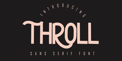 THROLL Modern sans serif font. It has a elegant, classy look and modern. It’s a great font for fashion, apparel projects, signature, album cover, logo, branding, magazine, social media, & advertisements. What's include: Stylistic alternate PUA Encoded Characters - Fully accessible without additional design software. Basic Latin Language Support (AÀÁÂÃÄÅCÇDÐEÈÉÊËIÌÍÎÏÑOØÒÓÔÕÖUÙÜÚÛWYÝŸÆß )
 - Kanetin by Din Studio,
$29.00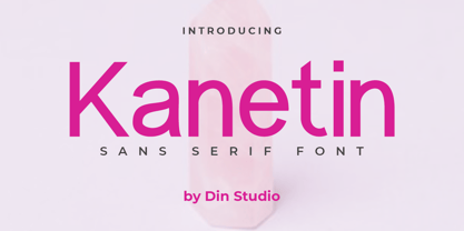 Kanetin is a elegant sans serif font. Made for any professional project branding. It is perfect for printing, branding and quotes. Every letter has a unique and beautiful touch. Includes: Kanetin (OTF) Features: PUA Encoded Multilingual Support Numerals and Punctuation Thank you for downloading premium fonts from Din Studio
 - Rockgen by Typebae,
$10.00 Rockgen is a sans serif font that has 4 cool styles. It has a strong and unique look and it is perfectly suited for branding, logos, magazines, films, websites, headlines, titles and more. What's Included? 4 Font Style Regular, Expanded & Rounded Uppercase & Lowercase Numbers & Punctuation Multilingual support PUA Encoded
 - Antartida Rounded by Latinotype,
$26.00 Antartida Rounded is a sans serif with rounded terminals, its simple, kind of neutral feeling, is functional, clean and minimal, rounded terminals make it friendly and warm. Is a family of 8 fonts, weights 4 and in italics. This font contains glyphs that help emphasize alternate text or headlines.
 - Galexica Mono by Ingrimayne Type,
$6.00 GalexicaMono is an attempt to create a futuristic typewriter font, which may be an oxymoron. Unlike most typewriter fonts, it is sans-serif. The family has two weights, plain and bold, each with an oblique style. For a variant of the design that is not monospaced, see Galexica.
 - Dysanian by Gassstype,
$28.00 Dysanian is Hand Drawn Sans Font with a natural style and dramatic movement.is a Authentic Font that is written casually and quickly. Dysanian is has 4 style Normal,Italic,Black and Black Italic styles is perfect for the purposes of designing templates, brochures, videos, advertising branding, logos and more.
 - Stereohead by Stationjack,
$13.00 Stereohead is a retro sans serif display typeface inspired by old eighties video cassette cover designs. This font would work perfectly in magazine headlines, t-shirt design, posters, packaging, advertising purposes. Uppercase and lowercase characters, numbers, punctuation and extended latin characters included. 2 font styles available, regular and italic.
 - Royal Ambition by Lemonthe,
$13.00 Royal Ambition is a perfect mix modern script and sans serif font. Together or apart, these fonts are ideal for adding a chic and cheery touch to your crafts. It was created to help you designing makes gorgeous logos, posters, wedding invitations, blog posts, social media, and more!
 - Fathoms PB by Pink Broccoli,
$14.00 A totally off-the-wall sans serif font based on the titling from one of ABC's Movie of the Week series from 1969 called Daughter of the Mind. Turn on Contextual Alternates to automatically alternate between Capitals and Lowercase as you type to really make the font dance!
 - Cairoline by Muksal Creatives,
$17.00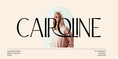 Caroline Modern Display sans serif Font, special glyphs, ornament and multilingual support. It's a very versatile font that works great in large and small sizes. Perfect for editorial projects, Logo design, Clothing Branding, product packaging, magazine headers, or simply as a stylish text overlay to any background image.
 - Chicken Wings by Linecreative,
$16.00 Chicken Wings A playful display font,It's Perfect for logo, layout,headers, or oven large scale artwork What you get dear, you will get : Chiken Wings- A clean San serif font including Upper & Lowercase characters, Ligatures Character & Stylistic alternates Character Supports Multi linguage (Latin Western Europe), Numbers and Punctuation
 - Refanea by Muksal Creatives,
$15.00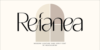 Rafanea Modern ligature sans serif font, special glyphs, ornament and multilingual support. It's a very versatile font that works great in large and small sizes. Perfect for editorial projects, Logo design, Clothing Branding, product packaging, magazine headers, or simply as a stylish text overlay to any background image.
 - Hiylard by Muksal Creatives,
$16.00 Hiylard Modern Display sans serif Font, special glyphs, ornament and multilingual support. It's a very versatile font that works great in large and small sizes. Perfect for editorial projects, Logo design, Clothing Branding, product packaging, magazine headers, or simply as a stylish text overlay to any background image.
 - NeueType by NicolassFonts,
$- NeueType is a modern sans serif font family. This family is ideally suited for web and print use. It comes in 16 weights, 8 uprights, matching Italics, and Variable font. Each weight includes 549 glyphs and 22 OpenType features (including Ligatures, Case Sensitive Forms, Tabular Figures, and Typographic Variants).
 - Lovely Brought Dreams script by Nk Studio,
$15.00 Lovely Brought Dreams Script and Sans are beautiful and romantic writing fonts. Looks amazing on wedding invitations, thank you cards, quotes, greeting cards, logos, business cards and other designs. This font is PUA encoded which means you can access all the glyphs and sweeps easily! This font includes OpenType features with alternative styles, ligatures, and multiple language support. To enable the OpenType Stylistic alternative, you need a program that supports OpenType features such as Adobe Illustrator CS, Adobe Indesign & CorelDraw X6-X7, Microsoft Word 2010 or later. There are additional ways to swap/swap, using Character Map (Windows), Nexus Fonts (Windows), Font Book (Mac) or software programs like PopChar (for Windows and Mac). How to access all alternative characters, using Windows Character Map with Photoshop: https://www.youtube.com/watch?v=Go9vacoYmBw How to access all alternative characters using Adobe Illustrator: http://youtu.be/iptSFA7feQ0 How to use the stylish font set in Microsoft Word 2010 or later versions: https://youtu.be/x1A_ilsBsGs Happy Designing!
 - Kingthings Conundrum Pro by CheapProFonts,
$10.00 This pearl by Kevin King was the best faux chinese font I've ever come over, and now it can be used for setting themed text and menus in many more languages! :) Kevin King says: "I have said before you know - I can if I want to (Stamp! Scowl!). Cod Chinese of the worst kind, I wanted a "Chinese" font for a project and couldn't find what I wanted. I painted this font with a Chinese brush and imported the resultant mess - it's been a while since I did any Chinese calligraphy - add that to the fact that I don't read or speak Chinese..." ALL fonts from CheapProFonts have very extensive language support: They contain some unusual diacritic letters (some of which are contained in the Latin Extended-B Unicode block) supporting: Cornish, Filipino (Tagalog), Guarani, Luxembourgian, Malagasy, Romanian, Ulithian and Welsh. They also contain all glyphs in the Latin Extended-A Unicode block (which among others cover the Central European and Baltic areas) supporting: Afrikaans, Belarusian (Lacinka), Bosnian, Catalan, Chichewa, Croatian, Czech, Dutch, Esperanto, Greenlandic, Hungarian, Kashubian, Kurdish (Kurmanji), Latvian, Lithuanian, Maltese, Maori, Polish, Saami (Inari), Saami (North), Serbian (latin), Slovak(ian), Slovene, Sorbian (Lower), Sorbian (Upper), Turkish and Turkmen. And they of course contain all the usual "western" glyphs supporting: Albanian, Basque, Breton, Chamorro, Danish, Estonian, Faroese, Finnish, French, Frisian, Galican, German, Icelandic, Indonesian, Irish (Gaelic), Italian, Northern Sotho, Norwegian, Occitan, Portuguese, Rhaeto-Romance, Sami (Lule), Sami (South), Scots (Gaelic), Spanish, Swedish, Tswana, Walloon and Yapese.
 - Biotrip Serif - Personal use only

- Majesty by Monotype,
$25.99 Majesty is a refined and elegant incised serif typeface designed to convey a sense of drama with any implementation of it. However, Majesty’s austerity is softened by the inherent familiarity of its letterforms. Having being inspired by classic engraved type, it has the echoes of familiar stone inscriptions over the centuries embodied within this 7-font type family. Majesty has a branding and titling focus, this is most apparent in the all cap letter combinations that are incorporated. Just activate Discretionary Ligatures and watch your type shape-shift on the fly to create interesting and appealing typography. There are a select number of Swash/Stylistic Alternates included that can also help you embellish your designs. Other features include Proportional, Tabular, and Old Style Figures, as well as Small Caps and Petite Caps, with the latter harmonising perfectly with the lowercase glyphs so that you can create unicase-style typography. You can find out more at majesty-font.com . Key features: • 5 text weights – Light to Black, plus Display and Poster weights • Small Caps, Petite Caps, Ligatures and Discretionary Ligatures • European Character Set – Latin Only • 840 glyphs per font.

