10,000 search results
(0.039 seconds)
- Core Sans C by S-Core,
$20.00 Core Sans C family is a part of the Core Sans Series, such as N, M, E, A, D, G, R and B. Core Sans C is inspired by classic geometric sans (Futura, Avenir, Avant Garde etc.). It is based on geometric shapes, like near-perfect circle and square. It has a much higher x-height (height of lowercase letters), an effect which promotes readability especially at small print sizes. The Core Sans C Family consists of 9 weights (Thin, Extra Light, Light, Regular, Medium, Bold, Extra Bold, Heavy, Black) and Italics for each format. Core Sans C supports complete Basic Latin, Cyrillic, Greek, Central European, Turkish, Baltic character sets. Each font includes proportional figures, tabular figures, oldstyle figures, numerators, denominators, superscript, scientific inferiors, subscript, fractions and case features. Core Sans C is an ideal font family for use in magazines, web pages, screens, displays, and so on.
 - Core Sans BR by S-Core,
$20.00 The Core Sans BR Family is a part of the Core Sans Series, such as N, NR, N SC, M, E, A, D, G, R and B. The Core Sans BR Family is designed with rounded stroke endings for visual comfort. This family has very small x-heights and large ascenders(descenders) which give an elegant feeling in body text. It is a sans-serif family but it’s structure is similar to serif fonts, so you can make paragraph beautiful with this font family. It is very legible and readable even in small size because of its open counters and distinctive shapes. This font family consists of 7 weights (Thin, Light, Regular, Medium, Bold, Heavy, Black) and Italics for each format. Core Sans BR supports complete Basic Latin, Cyrillic, Central European, Turkish, Baltic character sets. Each font includes proportional figures, tabular figures, oldstyle figures, numerators, denominators, superscript, scientific inferiors, subscript, fractions and case features. We highly recommend it for use in books, web pages, screen displays, and so on.
 - Core Sans G by S-Core,
$40.00 The Core Sans G Family is a part of the Core Sans Series, such as Core Sans N SC, Core Sans N, Core Sans NR, and Core Sans M. Core Sans G is constructed of straight, circular or square shapes. These geometric shapes are inspired by classic geometric sans (Futura, Avenir, Avant Garde etc.). Every stem is a rectangle or a straight line and every letter, lowercase or uppercase, seems to be in perfect geometric form and even weighted. The small x-height makes readability clean and clear. Core Sans G can be used equally well in headings or in body copy. The Core Sans G Family consists of 9 weights (Thin, Extra Light, Light, Regular, Medium, Bold, Extra Bold, Heavy, Black), 3 for rounded (Medium, Bold, Extra Bold) with matching Italics. It also includes 4 effects fonts (Outline, Neon, Shadow, Dimensional), Alternate Characters (a,g,t) and a bunch of ligatures. The Core Sans G provides a wide range of character sets to support (Cyrillic, Central and Eastern European characters) and advanced typographical support with features such as proportional Figures, tabular Figures, numerators, denominators, superscript, scientific Inferiors, subscript, fractions, standard ligatures, discretionary ligatures and stylistic alternates. Core Sans G is an ideal font family for use in magazines, web pages, screens, displays, and so on.
 - Typist Code Mono by VanderKeur,
$25.00 The typeface Typist originated during an extensive research on the origin and development of typewriter typestyles. The first commercially manufactured typewriter came on the market in 1878 by Remington. The typestyles on these machines were only possible in capitals, the combination of capitals and lowercase came available around the end of the nineteenth century. Apart from a few exceptions, most typestyles had a fixed letter width and a more or less unambiguous design that resembled a thread-like structure. A lot of this mechanical structure was due to the method the typestyles were produced. Looking at type-specimens for print before the first typewriters were good enough to came on the market we can see that in 1853 and in 1882 Bruce’s Type Foundry already had printing type that had a structure of the typewriter typestyles. Of course printing types were proportional designed as typewriter typestyles had a fixed width. So it is possible that except from the method of production for typewriter typestyles, the design of printing types were copied. In the design of the Typist, the purpose was – next to the monospace feature – to include some of the features of the early typewriter typestyles. Features such as the ball terminals and the remarkable design of the letter Q. This new typeface laks the mechanical and cold look of the early typewriter typestyles. The Typist comes in six weights with matching italics in two versions. One that resembled the early typewriter typestyles (Typist Slab) and a version designed with coding programmers in mind (Typist Code).
 - Baby Cakes NF by Nick's Fonts,
$10.00This robust, roly-poly typeface is patterned after a 1974 release from the Ludwig & Mayer foundry of Frankfurt am Main named Big Band, and designed by Karlgeorg Hoefer. The type color is even darker than the original, and the result is a delightful face that will definitely attract attention. The PC Postscript, Truetype and Opentype versions contain the complete Latin language character set (Unicode 1252) plus Central European (Unicode 1250) languages as well. - MC Coding Cincoy by Maulana Creative,
$15.00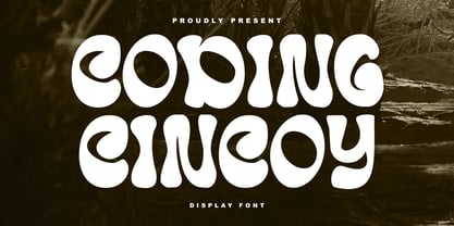 Coding Cincoy display font. Bold stroke, fun character with a bit of ligatures and alternates. To give you an extra creative work. Coding Cincoy display font support multilingual more than 100+ language. This font is good for logo design, Social media, Movie Titles, Books Titles, a short text even a long text letter and good for your secondary text font with script or serif. Make a stunning work with Coding Cincoy display font.
 - Core Sans ES by S-Core,
$29.00 The Core Sans ES Family is a rounded version of Core Sans E and a part of the Core Sans Series such as Core Sans N, M, A, G, D. This is a modernized grotesque font family with horizontal terminals, low stroke contrast, enclosed apertures and little line width variation. Its tall x-height makes the text legible and the spaces between individual letter forms are precisely adjusted to create the perfect typesetting. The Core Sans ES Family consists of 9 Weights (Thin, ExtraLight, Light, Regular, Medium, Bold, ExtraBold, Heavy, Black) and Italics for each format. It supports WGL4, which provides a wide range of character sets (CE, Greek, Cyrillic and Eastern European characters). Each font includes support for Superiors and Inferiors, Fractions, Tabular numbers, Arrows, Mathematical operators and Opentype Features such as Proportional Figures, Tabular Figures, Numerators, Denominators, Superscript, Scientific Inferiors, Subscript, Fractions, Case Features and Standard Ligatures. We highly recommend it for use in books, web pages, screen displays, and so on.
 - Core Sans M by S-Core,
$25.00 The Core Sans M Family is a part of the Core Sans Series, such as Core Sans N, Core Sans N Rounded, Core Sans N SC, and Core Sans G. This font family has open and square letter shapes, and overall rounded finishes provide a soft and friendly appearance. Simple and modern shapes with a tall x-height make the text legible and the spaces between individual letter forms are precisely adjusted to create the perfect typesetting. The Core Sans M Family consists of 2 widths (Condensed, Normal), 7 weights (ExtraLight, Light, Regular, Medium, Bold, ExtraBold, Heavy), and Italics for each format. Small Caps versions are also available. It supports WGL4, which provides a wide range of character sets (CE, Greek, Cyrillic and Eastern European characters). Each font includes support for Tabular numbers, Arrows, Box drawings, Geometric shapes, Block elements, Mathematical operators, Miscellaneous symbols and Opentype Features such as Proportional Figures, Numerators, Denominators, Superscript, Scientific Inferiors, Subscript, Fractions and Standard Ligatures. The Core Sans M Family provides both OpenType (.OTF) and TrueType (.TTF) versions in the same package. We highly recommend it for use in books, web pages, screen displays, and so on.
 - Typist Code Prop by VanderKeur,
$25.00 The Typist Code SansSerif is part of a big family, the Typist Family. The family consists of a monospaced, a Slab Serif and a SansSerif version. The idea behind this family originated from the research into the design of typewriter typestyles, which is also the reason why the monospaced version was released first. Since it was decided from the start to make a SlabSerif and a SansSerif version of these monospaced fonts, it was also a logical consequence that the proportional variants also became available in these versions. The monospaced SansSerif fonts have been given the name 'Code' since they are designed to be used while writing code for a software program, for example. The proportional variants with each 6 weights of the Typist Slab Serif and Code (SansSerif) are now available. Although the name may seem a bit strange, it is a logical consequence from the monospaced variant. The SansSerif variant therefore has Typist Code Prop, written in full the Typist Code Proportional. After all, who wants to be bothered with long font names in their font menu. The entire Typist family is designed as a font for use in editorial and publishing publications. A lot of attention has been paid to the spacing and kerning of the fonts. Due to the many variants and weights, this font is versatile. Typist Font Family was designed by Nicolien van der Keur and published by vanderKeur design. Typist Slab Prop and Typist Code Prop contains each 6 styles (Thin, Light, Regular, Medium, Semi-Bold and Bold, each weight also designed as a true italic) and has family package options. The links to the monospaced version of The Typist are here: https://www.myfonts.com/collections/typistslabfont-vanderkeur https://www.myfonts.com/collections/typist-code-font-vanderkeur
 - Core Sans CR by S-Core,
$20.00 Core Sans CR family is a rounded version of Core Sans C; a part of the Core Sans Series, such as Core Sans N, Core Sans M, Core Sans E, Core Sans A, Core Sans D, Core Sans G, Core Sans R and Core Sans B. Core Sans CR is inspired by classic geometric sans (Futura, Avenir, Avant Garde etc.). It is based on geometric shapes, like near-perfect circle and square. It has a much higher x-height (height of lowercase letters), an effect which promotes readability especially at small print sizes. The Core Sans C Family consists of 9 weights (Thin, Extra Light, Light, Regular, Medium, Bold, Extra Bold, Heavy, Black) and Italics for each format. Core Sans C supports complete Basic Latin, Cyrillic, Central European, Turkish, Baltic character sets. Each font includes proportional figures, tabular figures, oldstyle figures, numerators, denominators, superscript, scientific inferiors, subscript, fractions and case features. Core Sans C is an ideal font family for use in magazines, web pages, screens, displays, and so on.
 - Zombies Coming Graffiti by Sipanji21,
$15.00 Zombie Coming is a display font with a monoline Dripping graffiti style, there is some swash for your awesome design. It will elevate a wide range of design projects to the highest level, be it branding, headings, wedding designs, invitations, signatures, logos, labels, and much more! Featured : Uppercase Number and Punctuation Stylistic Alternate (Swash)
 - Spring Has Come by Stefani Letter,
$12.00 Spring has come is a stylish modern handwritten script. It has an unique, striking look which can be used to make any design stand out. Incredibly versatile, this font fits a wide pool of designs, elevating them to the highest levels. Add this font to your favorite creative ideas and notice how it makes them come alive! This font is PUA encoded which means you can access all of the glyphs.
 - Core Gothic N by S-Core,
$72.00 Core Gothic N is a simple and modern sans-serif Korean font consists of 9 weights (Thin, ExtraLight, Light, Regular, Medium, Bold, ExtraBold, Heavy & Black). Character set is consist of Korean 11,172 characters, Hirakana & Katakana, Latin and Korean symbols. It is well balenced between Korean and Latin characters. Latin typeface (Core Sans N) was adjusted to be matched with korean typeface. Spaces between individual letter forms are adjusted in detail so that it makes perfect typesetting. Supported codepages are MS Windows 1252 Latin1 and MS Windows 949 Korean. We recommend to use for books, web, screen displays and so on.
 - Core Sans DS by S-Core,
$20.00 Core Sans DS is a rounded version of Core Sans D and a modern interpretation of condensed sans-serif typeface designed by S-Core and the whole family consists of 2 widths (Condensed, Normal), 7 weights (Thin, Light, Regular, Medium, Bold, Heavy, Black) with their corresponding italics. Core Sans DS features a condensed geometric construction and has a large x-height which enhances legibility. The family is ideal for signage, headline as well as body text. Core Sans DS is a part of the Core Sans Series such as Core Sans N SC, Core Sans N, Core Sans NR, Core Sans M, Core Sans G,Core Sans A, Core Sans GS and Core Sans ES. Letterform in this type family is simple, clean and highly readable. The spaces between individual letter forms are precisely adjusted to create the perfect typesetting. Core Sans DS supports complete Basic Latin, Cyrillic, Central European, Turkish, Baltic character sets. Each font includes proportional figures, tabular figures, numerators, denominators, superscript, scientific inferiors, subscript, fractions and case features.
 - Core Sans E by S-Core,
$29.00 The Core Sans E family is part of the Core Sans series, such as Core Sans N, Core Sans M, Core Sans A, Core Sans G and Core Sans D. This is a modernized, grotesque font family with horizontal terminals, low-stroke contrast, enclosed apertures and little-line-width variation. Its tall x-height makes the text legible; and the spaces between individual letter forms are precisely adjusted to create the perfect typesetting. The Core Sans E family consists of 9 weights, from Thin to Black with italics. It supports WGL4, which provides a wide range of character sets—Greek, Cyrillic, and Central and Eastern European characters. Each font includes support for tabular numbers, arrows, mathematical operators, and OpenType features (such as proportional figures, numerators, denominators, subscript, superscript, scientific inferiors, fractions, case features, and standard ligatures). We highly recommend it for use in books, web pages, screen displays, and so on.
 - Rogue Hero Italic - Unknown license

- Rogue Hero Condensed - Unknown license

- Rogue Hero Left - Personal use only

- Rogue Hero Expanded - Unknown license

- Rogue Hero Outline - Unknown license

- Rogue Hero Distressed - Unknown license

- Hero Of Fools - Unknown license

- Hero Sandwich Ingredients by Comicraft,
$19.00 As comic book readers know all too well, team ups are every super hero’s bread and butter... when the brave and the bold are in a pickle, and super villains are running onion rings around them, here’s how they roll: They Meat! They Team-Up with your taste buds! They Fight Hunger! Yes, some hero combos may get along better than others, but they are always more powerful together. So take a footlong bite out of crime, and make the subways safe again with our mouthwatering HERO SANDWICH! Prepared with plastic gloves on by those awfully nice chaps at the Comicraft deli. Anyway you slice it, these five Ingredients can be layered to generate a Hero Sandwich with the carbs and protein you need to deliver a knuckle sandwich to the bulking agents of your deadliest foes! See these families related to Hero Sandwich Ingredients: Hero Sandwich Combos Hero Sandwich Pro
 - MC Sero Aromad by Maulana Creative,
$14.00 Sero Aromad brush script font. This font is good for logo design, Social media, Movie Titles, Books Titles, a short text even a long text letter and good for your secondary text font with signature or script typeface. Make a stunning work with Sero Aromad brush script font. Cheers, Maulana Creative
 - Costumed Hero JNL by Jeff Levine,
$29.00 Comic books are filled with pages full of the daring adventures of crime fighters with colorful costumes, amazing abilities and wondrous powers. They have enthralled kids of all ages since the 1930s. Costumed Hero JNL emulates both the hand lettered cover titles of those vintage comics as well as the title credits from a 1960s television show based on one of these characters. With its non-conforming letter shapes and varying widths, the lighthearted look of classic comic title art can be yours. The font is available in both regular and oblique versions.
 - My Hero Father by Putracetol,
$18.00 My Hero Father is a quirky playful font with father's day theme. This font has 7 variations of fonts, each variation has a different decoration. The decorations are items that a father often wears, such as: cigarettes, glasses, hats, mustaches, ribbons and crowns. I made this font specifically for the Father's Day theme, but other than that this font can also be used for other projects. This font is suitable for logos, crafting, greeting cards, invitation cards, social media, products, stickers, headings, quotes and more. This font is also support multi language.
 - Hero Sandwich Combos by Comicraft,
$19.00 As comic book readers know all too well, team ups are every super hero’s bread and butter... when the brave and the bold are in a pickle, and super villains are running onion rings around them, here’s how they roll: They Meat! They Team-Up with your taste buds! They Fight Hunger! Yes, some hero combos may get along better than others, but they are always more powerful together. So take a footlong bite out of crime, and make the subways safe again with our mouthwatering HERO SANDWICH! Prepared with plastic gloves on by those awfully nice chaps at the Comicraft deli. If you're an avenging hero on the go, have no fear, we've pre-assembled these eight classic Hero Sandwich Combos! Because choosing your fillings shouldn't get in the way of knocking out a supervillain’s fillings. See these families related to Hero Sandwich Combos: Hero Sandwich Ingredients Hero Sandwich Pro
 - Hero If Plus by Ingo,
$12.00 A type of “handwriting” discovered by chance, extremely abstract On April 8, 1948 a certain Walter Plaga wrote a crude poem about a hero on a commemorative plaque. The very poor reproduction of the handwritten original, etched into a metal sheet, produced extremely abstract forms so that — even if unintentional — a script completely void of bowls was created. That which originally was the normal clumsy handwriting of a layman thus transformed into a pseudo-modern deconstructive typeface, which in the 21st century appears contemporary. The capital letters especially reflect the original: in part they show forms labeled incorrectly ”old German“ handwriting, which is actually Latin, in the letters A D G I J K L S V W X Z , whereas C H N O P R appear very modern. Truly a form of handwriting: without joining the letters, especially between the lower case characters, a silhouette effect is formed. To a great extent Hero is impressive due to its driven-to-the-limit abstraction and to a lesser extent by retaining an antiquated and nearly illegible effect.
 - Hero Sandwich Pro by Comicraft,
$19.00 As comic book readers know all too well, team ups are every super hero’s bread and butter... when the brave and the bold are in a pickle, and super villains are running onion rings around them, here’s how they roll: They Meat! They Team-Up with your taste buds! They Fight Hunger! Our original Hero Sandwich font has become a go-to for video game and app graphics, due to its easy readability and friendly demeanor. The new Pro version adds nine weights from Thin to Heavy, with matching italics, plus a versatile Variable Font to dial in your preferred combination of weight and italic slant. Each weight includes four numbering options and support for 222 languages, including Cyrillics. So take a footlong bite out of crime, and make the subways safe again with our mouthwatering Hero Sandwich! Prepared with care and plastic gloves by those awfully nice chaps at the Comicraft deli.
 - LD Rock Hero by Illustration Ink,
$3.00 - Rose Cake - Personal Use - Personal use only

- KR Birthday Cake! Dings - Unknown license

- Code Of Life BRK - Unknown license

- Core Sans N SC by S-Core,
$15.00 Core Sans N SC is the Small Caps version of the Core Sans N that is a part of the Core Sans Series (Core Sans N SC, Core Sans N Rounded, Core Sans M, and Core Sans G). Letters in the Core Sans N SC Family are designed with genuine neo-grotesque and neutral shapes without any decorative distractions. The spaces between individual letter forms are precisely adjusted to create the perfect typesetting. The Core Sans N SC Family consists of 3 widths (Condensed, Normal, Extended), 9 weights (Thin, ExtraLight, Light, Regular, Medium, Bold, ExtraBold, Heavy, Black), and Italics for each format. It also supports WGL4, which provides a wide range of character sets (CE, Greek, Cyrillic and Eastern European characters). Each font includes support for Tabular numbers, Arrows, Box drawings, Geometric shapes, Block elements, Mathematical operators, Miscellaneous symbols and Opentype Features such as Proportional Figures, Numerators, Denominators, Superscript, Scientific Inferiors, Subscript, Fractions and Standard Ligatures. The Core Sans N SC Family provides both OpenType (.OTF) and TrueType (.TTF) versions in the same package. We highly recommend it for use in books, web pages, screen displays, and so on.
 - Maybe I Was Joking by PizzaDude.dk,
$20.00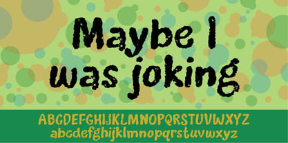
- Pre Code Movies JNL by Jeff Levine,
$29.00 The hand lettered credits from the 1931 melodrama “Safe in Hell” inspired the typeface Pre Code Movies JNL, which is available in both regular and oblique versions. The design is strongly influenced by the popular Art Deco style of thick-and-thin characters and also features rounded corners. The font’s name comes from the early era of talking pictures and the short period before the establishment of the Hays Office in 1934 when Hollywood did not self-censor itself. Many then-taboo topics were exploited on film until Will Hays cracked down on such productions. To read more about Pre-Code Hollywood, visit the Wikipedia link: https://en.wikipedia.org/wiki/Pre-Code_Hollywood
 - Captura Now Core Edition by TypeThis!Studio,
$50.00 Carefully refined shapes and sensitively balanced spacing and kerning create the gentle rythm that grants Captura its warm-hearted face, perfect in form and shape. www.typethis.studio This version covers all the essentials of Captura 265 Characters 8 Styles, including Italics Western European Language Support Numbers Symbols Punctuation If you need more features like small caps, special symbols, Cyrillic or Vietnamese language support, you may review the expert version of CapturaNow.
 - Mighty Zeo 2.0 - Personal use only

- BIRTH OF A HERO - Unknown license

- BIRTH OF A HERO - Unknown license


