10,000 search results
(0.027 seconds)
- M Lava PRC by Monotype HK,
$523.99 M Lava PRC is a graphic style Simplified Chinese typeface. Graphic font designs have strong personalities and visual impact. Graphic style Simplified Chinese fonts feature decorative elements and pronounced graphics characteristics, suitable for catching attention in display applications.
 - M Yoyo PRC by Monotype HK,
$523.99 M Yoyo PRC is a graphic style Simplified Chinese typeface. Graphic font designs have strong personalities and visual impact. Graphic style Simplified Chinese fonts feature decorative elements and pronounced graphics characteristics, suitable for catching attention in display applications.
 - M Ngai HK by Monotype HK,
$523.99 M Ngai HK is a graphic style Traditional Chinese typeface. Graphic font designs have strong personalities and visual impact. Graphic style Traditional Chinese fonts feature decorative elements and pronounced graphics characteristics, suitable for catching attention in display applications.
 - M Stream PRC by Monotype HK,
$523.99 M Stream PRC is a graphic style Simplified Chinese typeface. Graphic font designs have strong personalities and visual impact. Graphic style Simplified Chinese fonts feature decorative elements and pronounced graphics characteristics, suitable for catching attention in display applications.
 - Double Aunofa by Konstantine Studio,
$13.00 Double Aunofa, a couple of beautiful fonts with the approach to luxury branding and classy feels. Comes in clean tall serif and handwritten script style. Perfectly fit for your simple branding, logo, classy visual identity, you name it.
 - M Lava HK by Monotype HK,
$523.99 M Lave HK is a graphic style Traditional Chinese typeface. Graphic font designs have strong personalities and visual impact. Graphic style Traditional Chinese fonts feature decorative elements and pronounced graphics characteristics, suitable for catching attention in display applications.
 - M Ngai PRC by Monotype HK,
$523.99 M Ngai PRC is a graphic style Simplified Chinese typeface. Graphic font designs have strong personalities and visual impact. Graphic style Simplified Chinese fonts feature decorative elements and pronounced graphics characteristics, suitable for catching attention in display applications.
 - HV Clio by Harmonais Visual,
$12.00 Clio - a display sans serif with simple, clean, and visual elegance. Specially designed for elegant-themed projects, perfectly suitable for creating simple, clean, lifestyle design such as logos, title, and magazine and more. The font features standard ligatures.
 - M Yoyo HK by Monotype HK,
$523.99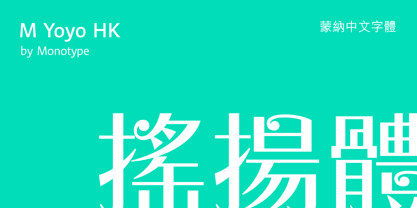 M Yoyo HK is a graphic style Traditional Chinese typeface. Graphic font designs have strong personalities and visual impact. Graphic style Traditional Chinese fonts feature decorative elements and pronounced graphics characteristics, suitable for catching attention in display applications.
 - Jerky by Noir Typo,
$15.00 Jerky is a strange and vibrant titling typeface.Drawn with a ruling pen, this typeface work with capital and small capital only by default. Inspired by calligraphy it emanates an Rock&Roll visual atmosphere or an horror movie ambiance.
 - M Windy PRC by Monotype HK,
$523.99 M Windy PRC is a graphic style Traditional Chinese typeface. Graphic font designs have strong personalities and visual impact. Graphic style Traditional Chinese fonts feature decorative elements and pronounced graphics characteristics, suitable for catching attention in display applications.
 - Kollate by Invasi Studio,
$19.00 Kollate - a display serif with a line, simple, clean, and visually elegant. Specially designed for elegant-themed projects, perfectly suitable for creating simple, clean, lifestyle designs such as logos, titles, magazines, and more. The font features standard ligatures.
 - Loftype by Gleb Guralnyk,
$15.00 Hello! Presenting a design set named "Loftype". It includes a font files with various OpenType features - lots of ligatures and alternate characters with swashes (you can access them trough "OpenType" tab, or manually insert them from "Glyphs" tab).
 - M Stream HK by Monotype HK,
$523.99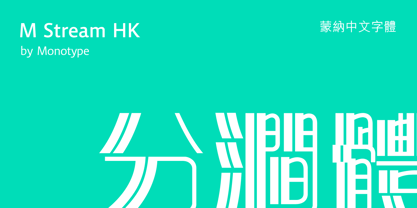 M Stream HK is a graphic style Traditional Chinese typeface. Graphic font designs have strong personalities and visual impact. Graphic style Traditional Chinese fonts feature decorative elements and pronounced graphics characteristics, suitable for catching attention in display applications.
 - M Rocky PRC by Monotype HK,
$523.99 M Rocky PRC is a graphic style Simplified Chinese typeface. Graphic font designs have strong personalities and visual impact. Graphic style Simplified Chinese fonts feature decorative elements and pronounced graphics characteristics, suitable for catching attention in display applications.
 - M Circus PRC by Monotype HK,
$523.99 M Circus PRC is a graphic style Simplified Chinese typeface. Graphic font designs have strong personalities and visual impact. Graphic style Simplified Chinese fonts feature decorative elements and pronounced graphics characteristics, suitable for catching attention in display applications.
 - M Rocky HK by Monotype HK,
$523.99 M Rocky HK is a graphic style Traditional Chinese typeface. Graphic font designs have strong personalities and visual impact. Graphic style Traditional Chinese fonts feature decorative elements and pronounced graphics characteristics, suitable for catching attention in display applications.
 - M Computer HK by Monotype HK,
$523.99 M Computer HK is a graphic style Traditional Chinese typeface. Graphic font designs have strong personalities and visual impact. Graphic style Traditional Chinese fonts feature decorative elements and pronounced graphics characteristics, suitable for catching attention in display applications.
 - Quiroga Serif Pro by TipoType,
$29.00 Quiroga Serif began in 2007 with the name Quadratta Serif. This typography was designed for continuous text, legible at medium and small sizes, with great saving of space, optimized for 6, 8, 10 and 12 points. The morphology is a mix between tradition and innovation; it has a vertical axis, thick serifs, tall x-height, light modulation and a lot of internal space between letters: key to improve legibility at small sizes. Formally, my idea was to make a serif type that had a unique color, this is visible due to the light modulation. This is also complemented with the incorporation of not common, alternative signs. Some parts of the letters that are usually curb or diagonal where made horizontal (for example: a, q, p, etc.), this makes the eye of each character to be wide and unique. The serifs (wedge type) suffered diverse variations during the process. At the begining they where thicker and ended vertically, but this caused a great deal of printing errors. And so we decided to modify them by giving them an angle to avoid visible errors in medium and small sizes. The ch, and ll ligatures where rescued because they are a part of our current spanish alphabet. The historic ligatures and stylistic alternates give different options to users who want different alternatives within a text. The accentuation signs were composed in a middle line above all signs to avoid visual shock. We also gave plenty of importance to small caps numbers, mathematical signs and currency signs so that the could interact well.
 - Solpera by Storm Type Foundry,
$32.00This type face fills one of the gaps between the world of Roman alphabets and that of linear alphabets. The first to be designed was the set of upper-case letters. The expression of these characters cannot conceal that they were originally intended only for the sculptor's use, as a type face for three-dimensional inscriptions. Their width proportions reflect a dialogue between the contemporary feeling and the legacy of classical Roman inscriptions. The type face was later complemented with a set of lower-case letters and elaborated into further designs. Its clear, concise letter forms end with small serifs which not only make the type face more refined, but above all anchor the individual letter signs visually to the horizontal of the text line. The austere construction of the majority of the letters is balanced by the more exuberant, humanizing forms of the most frequently used letters "a"; "e". (The three variants of the lower-case "e" enable to create rhythmically differentiated texts.) The letters in which a straight stroke is connected with an arch are designed in two ways. That means that the letters "n", "h","m" and the group of letters "b","d","p","q" are conceived in a different way. Thus an interesting tension is created in the structure of the text, which, however, does not endanger legibility. The economizing, slightly narrowed design of this type face predetermines its use for the setting of usual texts. In larger sizes, however, it produces a rather serious, even solemn, impression. - Stat Text Pro by Jure Kožuh,
$45.00 www.Stat-Type.com Complementary Type Family Stat Display Pro Stat Text Pro is an information design sans serif type family which was developed as a complementary to Stat Display Pro. Stat Text Pro retains many characteristics of its display counterpart, while giving readability a greater importance. It has simpler letter shape details which enable it to accomplish a constant rhythm whiles being read. Its main intended use is to accompany Stat Display Pro in places where longer passages of text are needed. In this way the visual character of the composition is retained and at the same time readability of text is given attention. As its display counterpart it has a large character set with multiple weights, which are defined by optimal size ratio, wide aperture and balanced counters. It contains nearly 700 glyphs, including diacritics, ligatures, small caps, old–style figures, arrows and more. This enables it to achieve wide language support. It consists of four weights (Light, Regular, Medium, Bold) which are accompanied by their corresponding obliques. Stat Text Pro type family has higher than average x height (72% of cap height) which is accompanied by matching ascender and descender size ratios. The development of the type family was based on research in legibility to achieve highly legible letter shapes, while not diminishing their visual character. A detailed description of Stat Pro type family is available at Stat-Type.com where a DEMO font can be downloaded.
 - Bloemgracht by Hanoded,
$15.00 In the old Amsterdam neighborhood of 'De Jordaan', you will find a canal called Bloemgracht (Flower Canal). For many years, a coffee store called Schildmeijer could be found here. Their paper coffee bags and advertisements sported a hand made font which I have tried to recreate and the result is Bloemgracht typeface. It is an all caps art deco font, quite angular, but very legible and distinct. Bloemgracht comes with extensive language support.
 - Sforza by Ampersand Type Foundry,
$65.00 After visiting Milan, I stumbled upon the Sforza castle, and found some interesting type on the inner courtyard castle walls. I became inspired by what I found, and decided to design a typeface based off of the limited quirky letterforms. Thus Sforza was born, with ligatures galore, alternates, pictograms, and swooshes. Sforza is a roman style typeface with a quirky flair. It has loads of ligatures, nested letterforms, and tails and swooshes for endless combinations.
 - Pot roaster - Unknown license

- Annyeong by Ditatype,
$29.00 Annyeong welcomes you with a display font that captures the essence of Korean vibes. This display is a celebration of the dynamic and inviting nature of Korean design. It's a versatile tool that allows you to infuse your projects with a sense of cultural richness and visual impact. The characters in Annyeong are generously sized, ensuring a powerful and visually striking impact. The bold weight adds a sense of solidity, embodying the strength and confidence found in Korean aesthetics. Infused with Korean vibes, Annyeong brings a touch of cultural richness to every letter. In addition, enjoy the features here. Features: Stylistic Sets Multilingual Supports PUA Encoded Numerals and Punctuations Annyeong fits in headlines, logos, posters, flyers, branding materials, greeting cards, print media, editorial layouts, and many more designs. Find out more ways to use this font by taking a look at the font preview. Thanks for purchasing our fonts. Hopefully, you have a great time using our font. Feel free to contact us anytime for further information or when you have trouble with the font. Thanks a lot and happy designing.
 - Quiel by Ardyanatypes,
$15.00 QUIEL is a font inspired by modern and retro styles blended with elegance. With its dynamic shape, this font is suitable for any design to showcase a stylish, retro, or classic ambience. With nine available weights, QUIEL can easily be adjusted to suit various design preferences. The advantages of QUIEL are not only in its appealing appearance but also in its flexibility in terms of language. This font supports multiple languages, making it easy to use in different countries and languages. Furthermore, QUIEL comes with ligatures and alternate styles, which can enhance the visual appeal of your designs. The inclusion of alternative fonts also provides a range of options for combination. QUIEL is highly suitable for branding projects and various design needs, such as business cards, name tags, advertisements, posters, invitations, branding, logos, magazines, merchandise, and presentations. The unique modern letterforms of QUIEL allow for interesting combinations with various other font types. With its diversity and flexibility, QUIEL is the perfect choice to elevate the visual aspect of your designs, providing an elegant and captivating touch.
 - Poeta by Tarallo Design,
$18.99 Poeta is an ornamental font for making patterns and text decoration. It contains floral and nature motifs. The symbols are versatile enough for simple decoration or festive holiday moods. Designers can use Poeta to make unique lines, fields, borders, or ornamentation within or around text. Try replacing a simple straight line with repeated symbols. Make a background to add visual interest to a design. Use the forms to decorate a chapter title or to mark the end of a magazine article. Replace a letter in a word with a symbol to create a memorable statement. Poeta will add visual poetry to any design project. This font began with sketches of patterns seen in ceramic tiles around Sicily. It is named Poeta because Sicily is an island rich in poetry traditions. Using this font is simple. Install it and type. Symbols will appear instead of letters. Choose the precise symbols through a software’s glyph palette. Use the type/character menu controls to vary the spacing and density of patterns.
 - Hivives by IbraCreative,
$17.00 Hivives – A Geometric Sans Serif Typeface Hivives is a contemporary geometric sans serif typeface that embodies a harmonious balance between precision and warmth. With its clean, straight lines and minimalist design, this typeface exudes a modern aesthetic while maintaining a sense of approachability. The geometric construction of Hivivies lends it a distinct and timeless quality, making it versatile for a wide range of design applications. The letterforms are characterized by consistent stroke widths, sharp angles, and well-defined geometric shapes, resulting in a visually cohesive and sophisticated appearance. Hivives stands out as a stylish choice for branding, editorial design, and digital interfaces, where its crisp and clear lettering contributes to a polished and contemporary visual identity. Hivives is perfect for branding projects, logo, wedding designs, social media posts, advertisements, product packaging, product designs, label, photography, watermark, invitation, stationery, game, fashion and any projects. Fonts include multilingual support for; Afrikaans, Albanian, Czech, Danish, Dutch, English, Estonian, Finnish, French, German, Hungarian, Italian, Latvian, Lithuanian, Norwegian, Polish, Portuguese, Slovak, Slovenian, Spanish, Swedish.
 - Calista Brighton by Timurtype,
$14.00 Introduced by Timurtype Studio! Calista Brighton is a Handwritten Script Font This font depicts a journey of typography where the art of handwriting transcends the ordinary, revealing the captivating dance of ink on paper. This beautiful font, decorated with stylish alternate ligatures, weaves a narrative of elegance and sophistication. Every stroke is a stroke of creativity, proof of the perfect blend of tradition and modernity. As your eyes trace its curves and turns, you are transported to a world where each character is a work of art, an embodiment of meticulous craftsmanship. The interplay of alternating styles provides a rhythmic rhythm, inviting the eye to linger on the page, enjoying the visual symphony of each letter. It's not just a font; it is a visual poem that whispers tales of timeless charm and unparalleled elegance, leaving an indelible mark on the design canvas." Calista Brighton Font also supports multilingualism. Enhance your designs with our original fonts, feel free to comment or provide feedback, Enjoy the fonts 😊 Thank You
 - Nostalgic Typewriter by Typehead Studio,
$10.00 Nostalgic Typewriter is a typewriter font that exudes classic vintage charm with an irresistible allure. Inspired by the iconic typewriters that once dominated the world of manual typing, this font brings forth warm nostalgia and timeless appeal in every character. Key Features: Classic Aesthetics: Every letter in the Nostalgic Typewriter is meticulously crafted to create a classic look that harks back to bygone eras of manual writing. Vintage Power: The font captures invaluable retro vibes in its design, with rough edges and character placement that evoke an authentic feel from yesteryears. Character Diversity: Nostalgic Typewriter boasts a variety of characters, including uppercase, lowercase, numbers, and special symbols. All are designed to cater to your diverse design needs. Ease of Use: This font is ready to enhance a wide range of projects, such as poster designs, stickers, greeting cards, t-shirts, and more. With flexible licensing, you can confidently use it for personal or commercial projects. High-Quality: Nostalgic Typewriter is crafted with attention to detail and top-notch quality, ensuring that your printed or digital output will always captivate.
 - Ibrani by Arabetics,
$39.00 A completely isolated letters typeface design with an overall Hebrew look and feel. Glyphs were designed with an emphasis on isolation and vertical feel with a visual connectivity measure to help easy reading. The Ibrani (Arabic for Hebraic) font family has two members, regular and left-slanted italic styles. This font family design follows the guidelines of Mutamathil Taqlidi type style with one glyph for every basic Arabic Unicode character or letter, as defined in the latest Unicode Standards, and one additional final form glyph, for the freely-connecting letters in traditional Arabic cursive text. Ibrani employs variable x-height values. It includes only the Lam-Alif ligatures. Soft-vowel diacritic marks, harakat, are selectively positioned. Most of them appear by default on the same level, following a letter, to ensure that they would not interfere visually with letters. Tatweel is a zero-width glyph. Keying the tatweel key before Alif-Lam-Lam-Ha will display the Allah ligature. Ibrani includes both Arabic and Arabic-Indic numerals, in addition to standard punctuations.
 - Friendly by Positype,
$29.00 Friendly is an homage to Morris Fuller Benton's adorable Announcement typeface. It is not a strict interpretation, digital revival or reverent reproduction of the original letterforms… but I would be remiss and shady to not acknowledge the letterforms that inspired this typeface. If you are looking for a more accurate 'scanned revival' I would recommend searching "Announcement" on MyFonts. As stated earlier, it is an homage to the original letterforms of the typeface but takes a great bit of freedom tightening the construction up in order to loosen up the movement of the variant letterforms to allow a great deal of usable personality. I enjoy stating this dichotomy… "loosen up to tighten up the forms" and vice versa. It seems counterintuitive or silly but by allowing the letterforms to normalize, I felt more comfortable going back and adding rather indulgent personality. Infused with stylistic alternates, swashes, titling, many many contextual alternates, 9 stylistic sets and 2 stylistic sets with wordmarks, the typeface became far more 'friendly' for me… how could it not? With so many loops, swashes and typographic indulgences, it was bound to be fun. The more elaborate and 'overdone' Friendly got, the more I wanted to slant it. Here's where my thinking differs from MFB's original. I like slanted romans… especially ones with long ascenders, but I do not like much of a slant. It has to be the lettering person in me. It's hard for me to do a completely upright serif and not pair it with an angle, but I did not feel Announcement's 'Italic' offered much and the actual slant needed to be far less. If it's not an italic, I prefer the letters to slant with an angle equivalent to the thickness of the vertical stroke. The Slanted version of Friendly is set at 3.6 degrees, is quite subtle, and very fitting for me. You will find that most characters have a contextual, stylistic, swash and titling alternate assigned to them and some have an echoed alternate to the swash and titling options if the stylistic alt has been selected in tandem. Additionally, all of these are accessible in the glyph palette directly from the base glyph typed or through selecting options through the Stylistic Sets 1–9. Stylistic Sets 10 & 11 are a little different. They are actually configured as complex majuscule ligatures… a result of me getting carried away. Other features like a default old style numeral set and coordinating glyphs have been produced along with case support, ordinals, and more have been added to make it more relevant for contemporary use.
 - General Merchant JNL by Jeff Levine,
$29.00 General Merchant JNL is a bold, compressed sans design in the 'Grotesk' fashion with varying character widths and flattened tops on the usually rounded characters.
 - M Metallic Hei PRC by Monotype HK,
$523.99 M Metallic Hei PRC is a graphic style Simplified Chinese typeface. Graphic font designs have strong personalities and visual impact. Graphic style Simplified Chinese fonts feature decorative elements and pronounced graphics characteristics, suitable for catching attention in display applications.
 - M Elite Hei PRC by Monotype HK,
$523.99 M Elite Hei PRC is a graphic style Simplified Chinese typeface. Graphic font designs have strong personalities and visual impact. Graphic style Simplified Chinese fonts feature decorative elements and pronounced graphics characteristics, suitable for catching attention in display applications.
 - M Metallic Hei HK by Monotype HK,
$523.99 M Metallic Hei HK is a graphic style Traditional Chinese typeface. Graphic font designs have strong personalities and visual impact. Graphic style Traditional Chinese fonts feature decorative elements and pronounced graphics characteristics, suitable for catching attention in display applications.
 - M J Ngai HK by Monotype HK,
$523.99 M J Ngai HK is a graphic style Traditional Chinese typeface. Graphic font designs have strong personalities and visual impact. Graphic style Traditional Chinese fonts feature decorative elements and pronounced graphics characteristics, suitable for catching attention in display applications.
 - M Bitmap Round HK by Monotype HK,
$523.99 M Bitmap Round HK is a graphic style Traditional Chinese typeface. Graphic font designs have strong personalities and visual impact. Graphic style Traditional Chinese fonts feature decorative elements and pronounced graphics characteristics, suitable for catching attention in display applications.
 - Ughten by Dieza Design,
$10.00 Meet Ughten - a script with a huge personality. Warm, amiable and organic, yet elegant, Ughten is perfect if you want to convey individuality and style. Ughten works easily together to create visually appealing logos, packaging, presentations, headlines or editorials.
 - HV Simplicité by Harmonais Visual,
$9.00 Simplicité typeface was designed by Harmonais Visual. A display typeface, with beautiful contrasts. You will be pleased to use the many options of alternates and ligatures, perfectly suitable for creating nice design such as logos, mash head or titles.
