10,000 search results
(0.063 seconds)
- Grapo by EclipseType,
$12.00 Grapo - are handwritten fonts with a unique bounded shape, is perfect for any titles, logo, product packaging, branding project wedding invitations, stationery, photography, social media posts, product packaging, greeting cards, and much more! Grapo also come with Multi-Lingual Support.
 - Happy arila script by Sulthan Studio,
$10.00 Happy arila Hello, I made two handwritten fonts, one with thickness and can be used for whatever you are working on clarifying what you want to display, and a smooth script font is also here to make your work be sweeter
 - Delichan by Prioritype,
$19.00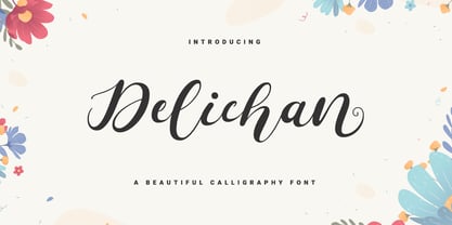 Introducing. Delichan: Beautiful and modern fonts that are so special to use in your projects. It is suitable for wedding invitation designs, social media posts, blogs, crafts, quotes etc. Features: Uppercase, Lowercase, Numeral, Punctuation, Multilingual, Ligature, Alternates & PUA Encoded. Thanks!
 - LCS Amsterdam by Mevstory Studio,
$25.00 LCS Amsterdam is a condensed sans-serif typeface, inspired by college sports and football (soccer) jerseys. Features both outline and regular solid fill versions. Perfect for titles and headlines, included are uppercase and lowercase letters, numbers, symbols and European language support.
 - Wondershine by Handpik,
$13.00 wondershine is elegant,beauty and smoothless serif display .This font is suitable for invitation cards, decorations, clothing products, greeting cards and others. This font also has uppercase, lowercase, numeric, puntuation and multilingual. and there are several ligature and stylistic alternate.
 - LD Buttercream by Illustration Ink,
$3.00LD Buttercream is such a great font...it mimics the look of a frosted remembrance on a birthday cake...but it's uses are so universal and fun, you'll find many ways to put this font to work in your clever creations! - Skammefy by Andreas Søren Johansen,
$69.00 Skammefy holds a detailed set of letters, that are intended to be both readable when small - and charismatic when large. Strong details of letters like e, a, g, f, y draws attention to headlines, signs or wherever it might be used.
 - Aventura by Sudtipos,
$59.00 Aventura is burlesquely round, stylishly seductive, eternally sugar-fixed, and loving to a fault. Plenty of stylistic alternates are included to heighten the mood or soften it. Either way you look at it, there's a lot of love in the air.
 - KlipJoint by Ingrimayne Type,
$14.95 KlipJoint is a novelty font in which all the characters are formed from paper clips. It does not have a true set of lower case letters, but in their place is a second and often different set of upper-case letters.
 - Black Isometric by Funk King,
$10.00 The Black Isometric Family is the progression of the Isometric series from funk_king. Currently two fonts that evoke science and engineering. These are full sets with 99 characters each. Designed for use as display type and for limited text use.
 - Propeller by Gleb Guralnyk,
$15.00 Introducing a script font named "Propeller". This font has a trendy look inspired by vintage aircraft ads. It has connected letters with smooth shape and round endings. Intersecting lines are made with a small overlay that gives a tiny volume effect.
 - Nottingham Stencil JNL by Jeff Levine,
$29.00 Nottingham Stencil JNL and its companion oblique version are the third set of fonts modeled from vintage lettering stencils made in England. These designs join British Stencil JNL and Trafalgar Stencil JNL in Jeff Levine's large library of stencil-themed typefaces.
 - Faqro Extended by ffeeaarr,
$9.00 Ditch the generic, embrace the expressive. In a world saturated with pixels and noise, your brand deserves to stand out. Our meticulously crafted digital tech fonts are more than just letters – they're the secret weapon to unlocking your brand's full potential
 - HU Blackout KR by Heummdesign,
$25.00 HU BlackoutKR is a typeface for titles that feels like letters are trapped in a square and has a constant and very narrow inner space. It is composed of three types of family typeface to increase usability. HU BlackoutKR includes Korean.
 - Plance by Hsan Fonts,
$16.00 Plance is a font for simplified logo design. The font is suitable for creating headlines, logos, text and advertising tags All alternate options for characters are included in each font. You can use the alternatives in most major photo editors.
 - Letoys by Zamjump,
$19.00 Letoys are inspired by 70s typography with a touch of psychedelic and retro vibes. This type is perfect for creating posters, magazine layouts, brand logos, sleeve covers, party flyers, quotes, or simply as a stylish text overlay on any background image.
 - Hvala by Etewut,
$35.00 Hvala is a display typeface based on slab serif. All european languages are included. 'Hvala' means praise. Remember it when you design your graphics using my font. It's a pure magic to express your respects or/and expect them back.
 - Anabelia by Rockboys Studio,
$23.00 The Anabelia is a handcrafted monoline font. It has a vintage and classic feel with an old, handmade look. Included in this download are various styles which gives you the opportunity to create unique designs, every time you use it!
 - Flowertype by Okaycat,
$29.95 Want your type in flowers? With Flowertype all letters, numbers & symbols are made of flowers. Combine flower font styles for many cool possibilities. Flowertype is an extended font, containing West European diacritics & ligatures, making it suitable for multilingual environments & publications.
 - Oksana Sans Condensed by AndrijType,
$33.00 Oksana Sans Condensed is designed for tight-fitting text. It has six weights from Thin to Heavy. Supports Western, Central, Baltic Latin and European Cyrillic codepages. Old-style digits, some ligatures, alternative characters and Ukrainian hryvnia sign are also included.
 - TF Wasted Growth by Teenage Foundry,
$19.00 Wasted Growth is a display font with a strong style is back. There are 2 styles, Regular & Blur. Suitable for merchandise designs, covers, posters and others. Features: Uppercase, Lowercase, Numeral, Punctuation & Multilingual. For any questions please contact me 🙂 Thanks!
 - Kular by Wilton Foundry,
$9.00 I set out to design a monospaced font and decided it would look way better if it wasn't. It gave me the freedom to make the individual glyphs more interesting while retaining the mono-look. The numerals are tabular! Enjoy!
 - Flavellya by Stringlabs Creative Studio,
$25.00 Flavellya is luxurious, fun and elegant. This script is simply the ideal font for any branding project! The Flavellya font is a great choice to increase the prominence in your project. Although the typography is traditional, the basic elements are great.
 - Union by Alias Collection,
$60.00 A softer, streamlined and more elegant development of the ideas originally explored in Jude. Incised letterforms are now rounder and more intuitive, less geometric. Union is a modern classic‚ typeface, avoiding quirky idiosyncrasies to produce a useable and highly contemporary type.
 - MPI No. 507 by mpressInteractive,
$5.00 No. 507 is an elegant headline font with added angled flourishes. Its unique features are angled terminals, small, pointed serifs, and no contrast in stroke weight. It is similar to No. 506, designed by William H. Page & Company around 1890.
 - Courant by Hanoded,
$20.00 Courant means "newspaper". Courant font was modeled on 17th century Dutch newspapers and most of the glyphs are authentic. The 'modern' glyphs, like @, $, €, * and several others have been designed by me, as they were not in use in the 1600's.
 - Juni july by Sulthan Studio,
$12.00 Juni july - I made this lovely font full of love for my work with heart balloons tied with a ribbon The swashes are attachable and perfect for any craft needs as well as logos, stickers, wedding invitations, greeting cards and more.
 - XXII Total Death by Doubletwo Studios,
$25.99 The XXII TotalDeath is a metallogofont and it is perfect for creepy, bad readable, symmetric bandlogos like known in the extreme music scene. Its OpenType features are scripted to get easy and quick results. Read more in the PDF or Behance .
 - Roman Cyrillic Three by MacCampus,
$20.00This font offers the images of a used stamp. There are a wide variety of numbers, months, and years. Just that what you might have in your office to stamp your incoming mail. Tagesstempel is part of the TakeType library. - Domek by Kulturrrno,
$7.00 Domek is a tall modern typeface. Includes 3 styles (Regular, Shadow, Halftone shadow), you can combine layers to make effects. Some stylistic alternates Extended latin glyph set This fonts are perfect for : logo design, headers, posters, packaging designs and more.
 - Upona by Bunny Dojo,
$17.00 Inspired by 19th century storybook lettering, Upona is a font fit to tell all tales. Fresh yet familiar, Upona blends classical styling with whimsical flourishes. Carrying a sense of history and tangibility, stories set in Upona are worth holding onto.
 - TAN Angleton by TANTypeCo.,
$17.00 TAN ANGLETON is an elegant combination of serif and serif-italic. They are classy and the perfect match if you needs something modestly stylish. Its high legibility makes it versatile to be used as a display type or body copy.
 - Xahosch by Ingrimayne Type,
$9.95 Xahosch uses a calligraphic pen to form a set of letters in which circular elements are based on a bottom-heavy egg shape. A pen-drawn san-serif face, it is available in three weights, each with an italic style.
 - Tecna Standard by Descarflex,
$20.00 The Tecn@ Standard family was designed so that its characters are legible and easy to interpret in any writing; among them, the descriptive memory of plans for example. Tecn@ Standard complements the Tecn@ Background Light and Dark Square Triangle font family.
 - Bell Ring by Seemly Fonts,
$12.00 Warmth and friendliness are at the heart of Bell Ring, a handwritten font that captures the essence of the season. Its distinct charm makes it an ideal choice for a wide spectrum of design projects, where your creativity knows no bounds.
 - Lui by Joachim Frank,
$22.00 The German typeface designer Joachim Frank designed this font 2022. The name stands for his youngest grandson Lui. Naturalness and harmony, soft lines and uniqueness are the characteristics of this font. This font is ideal for logos, advertising, branding, posters, billboards.
 - Neue Frutiger Paneuropean by Linotype,
$79.00During planning for the new Roissy Charles de Gaulle airport in Paris at the beginning of the 1970s, it was determined that the airport's signage system had to include the clearest and most legible lettering possible. The development of all signage was put into the hands of Adrian Frutiger and his studio. The team carried out their task so effectively that a huge demand for their typeface soon arose from customers who wanted to employ it in other signage systems, and in printed materials as well. The Frutiger® typeface not only established new standards for signage, but also for a range of other areas in which a clear and legible design would be required, especially for small point sizes and bread-and-butter type. The typeface family that which emerged as a result of this demand was added into the Linotype library as "Frutiger" in 1977. Frutiger Next, created in 1999, is a further development of Frutiger, not necessarily a rethinking of the design itself. It was based on a new concept, the most obvious visual characteristics of which is the larger x-height, as well as a more pronounced ascender height and descender depth for lower case letters in relation to capitals. This new design created a balanced image and included considerably narrower letterspacing. Frutiger Next meets the demand for a space-saving, modern humanist sans. 2009's Neue Frutiger is a rethink of the 1977 Frutiger family, now revised and improved by Akira Kobayashi in close collaboration with Adrian Frutiger. Despite the various changes, this "New Frutiger" still fits perfectly with the original Frutiger family, and serves to harmoniously enhance the weights and styles already in existence. The perfect mix, guaranteed Neue Frutiger has the same character height as Frutiger. As a result of this, already existing Frutiger styles can be mixed with Neue Frutiger where necessary. Likewise, Neue Frutiger is perfect for use alongside Frutiger Serif. Newly added are the "Neue Frutiger 1450" weights. Especially for the requirements of the newly released German DIN 1450 norm we have built together with Adrian Frutiger specific weights of the Neue Frutiger. The lowercase l" is curved at the baseline to better differentiate between the cap "I", additionally the number "0" has a dot inside to better differentiate between the cap "O", and the number "1" is now a serifed 1. The font contains additionally the origin letterforms from the regular Neue Frutiger font which can be accessed through an Opentype feature." - Gradl Initialen ML by HiH,
$12.00 Max Joseph Gradl designed Art Nouveau jewelry in Germany. At least some of his designs were produced by Theodor Fahrner of Pforzheim, Germany -- one of the leading manufacturers of fine art jewelry on the Continent from 1855 to 1979. I don't know if he designed for Fahrner exclusively, but every example I found was produced by that firm. I assume it was also the same M.J, who edited a book, Authentic Art Nouveau Stained Glass which was reissued by Dover and is still available. For an artist as accomplished as Gradl was, he is very tough to research. There just does not seem to have been much written about him. The jeweler is visible in most of his typeface designs. They exhibit a sculptural quality as if they were modeled in clay (or gold) rather than drawn on paper. His monograms, especially, reflect that quality. Those shown in plates 112 through 116 in Petzendorfer actually appear to have been designed specifically for fabricating in the form of gold or silver pendents. Of the initial letters that came out of Germany during this period, these by Gradl seem unusually open and lyrical. They seem to be dancing on the page, rather than sitting. Please note that Gradl designed only the decorated initials. All other characters supplied were extrapolated by HiH, including the accented initials. Orn.1 (unicode E004) is based on a jeweled gold clasp designed by Gradl (please check out Gallery Image on Myfonts.com). Also included are an art nouveau girl’s face, a swan and the face from Munch’s “Scream”, from scans of old printer’s ornaments. Gradl Initialen M represents a major extension of the original release, with the following changes: 1. Added glyphs for the 1250 Central Europe, the 1252 Turkish and the 1257 Baltic Code Pages. Added glyphs to complete standard 1252 Western Europe Code Page. Special glyphs relocated and assigned Unicode codepoints, some in Private Use area. Total of 341 glyphs. Both upper & lower case provided with appropriate accents. 2. 558 Kerning Pairs. 3. Added OpenType GSUB layout features: salt, dlig, ornm and kern. 4. Revised vertical metrics for improved cross-platform line spacing. 5. Refined various glyph outlines. 6. Alternative characters: 16 upper case letters (with gaps in surrounding decorations for accents above letter). 8. Four Ornaments: face1, face2, swan and orn1 (silhouette of Gradl clasp) The zip package includes two versions of the font at no extra charge. There is an OTF version which is in Open PS (Post Script Type 1) format and a TTF version which is in Open TT (True Type)format. Use whichever works best for your applications.
 - LFT Iro Sans by TypeTogether,
$49.00 Milan-based Leftloft studio developed LFT Iro Sans, an expansive family that solves the significant, wide-ranging challenges of branding, wayfinding, pictographic language, and complex editorial use. LFT Iro Sans began as the clear and welcoming wayfinding project of San Siro stadium in Milan. Over time many other styles and weights have been added. LFT Iro Sans never finds itself outmatched by the task at hand. The primary aim was to design a technical typeface that was readable in any low visibility condition, for instance in a poorly lit area with awkward wall shapes and overhangs. This worked well for stadium and large lettering use, but other problems also needed to be addressed, such as complementary iconography. A location developer was left mixing — clashing, really — one type family with a different family of icons, resulting in a cobbled-together look which diluted the brand and the experience. They set out to radically simplify and clarify each shape and its meaning, accepting uniqueness as part of the final visual language. LFT Iro Sans pictograms answers the need for having a consistent and large group of icons, perfectly suited to the text typeface. As it concerns public spaces, this didn’t exist before. LFT Iro Sans incorporated a branding project too, so they decided to let LFT Iro Sans go out on a limb and created a unicase style that demands attention. Each unicase letter is a combination of the lowercase and capital form, quite noticeable in the ‘i’, ‘m’, ‘t’, and unique ‘d’ and ‘b’, balanced by more restrained forms of ‘a’, ‘s’, ‘c’, and ‘e’. LFT Iro Sans is not only a technical typeface, but, thanks to letters’ proportions, can also be used for editorial purposes. Assertive and economical in stature, the text weights are clear and assured. And a display version for headlines in Ultralight and Heavy (with italics) was developed for stunning headlines. For enthusiasts of every stripe, LFT Iro Sans can be a brand’s rallying cry with its arresting unicase, be a developer’s go-to pictogram choice, or set the most demanding editorial text in digital or print. With its many OpenType features, simplified pictogram commands (even available in Apple’s Pages and Microsoft Word), and a total of 30 targeted family members, LFT Iro Sans is a brilliant, easy choice. As with the rest of the TypeTogether catalogue, the complete LFT Iro Sans family, designed by Lefloft and developed by Octavio Pardo, has been optimised for today’s varied screen uses.
 - Neue Frutiger Cyrillic by Linotype,
$89.00During planning for the new Roissy Charles de Gaulle airport in Paris at the beginning of the 1970s, it was determined that the airport's signage system had to include the clearest and most legible lettering possible. The development of all signage was put into the hands of Adrian Frutiger and his studio. The team carried out their task so effectively that a huge demand for their typeface soon arose from customers who wanted to employ it in other signage systems, and in printed materials as well. The Frutiger® typeface not only established new standards for signage, but also for a range of other areas in which a clear and legible design would be required, especially for small point sizes and bread-and-butter type. The typeface family that which emerged as a result of this demand was added into the Linotype library as "Frutiger" in 1977. Frutiger Next, created in 1999, is a further development of Frutiger, not necessarily a rethinking of the design itself. It was based on a new concept, the most obvious visual characteristics of which is the larger x-height, as well as a more pronounced ascender height and descender depth for lower case letters in relation to capitals. This new design created a balanced image and included considerably narrower letterspacing. Frutiger Next meets the demand for a space-saving, modern humanist sans. 2009's Neue Frutiger is a rethink of the 1977 Frutiger family, now revised and improved by Akira Kobayashi in close collaboration with Adrian Frutiger. Despite the various changes, this "New Frutiger" still fits perfectly with the original Frutiger family, and serves to harmoniously enhance the weights and styles already in existence. The perfect mix, guaranteed Neue Frutiger has the same character height as Frutiger. As a result of this, already existing Frutiger styles can be mixed with Neue Frutiger where necessary. Likewise, Neue Frutiger is perfect for use alongside Frutiger Serif. Newly added are the "Neue Frutiger 1450" weights. Especially for the requirements of the newly released German DIN 1450 norm we have built together with Adrian Frutiger specific weights of the Neue Frutiger. The lowercase l" is curved at the baseline to better differentiate between the cap "I", additionally the number "0" has a dot inside to better differentiate between the cap "O", and the number "1" is now a serifed 1. The font contains additionally the origin letterforms from the regular Neue Frutiger font which can be accessed through an Opentype feature."