10,000 search results
(0.741 seconds)
- TT Marxiana by TypeType,
$59.00 TT Marxiana useful links: Specimen | History of creation | Graphic presentation | Customization options Please note! If you need OTF versions of the fonts, just email us at commercial@typetype.org About TT Marxiana: TT Marxiana is a project to reconstruct a set of pre-revolutionary fonts that were used in the layout of the "Niva" magazine, published by the St. Petersburg publishing house A.F. Marx. In our project, we decided to focus on a specific set of fonts that were used in the preparation and printing of the "Niva" magazine in 1887, namely its Antiqua and Italic, Grotesque and Elzevir. As part of the TT Marxiana project, we sought to adhere to strict historicity and maintain maximum proximity to the paper source. We tried to avoid any “modernization” of fonts, unless of course we consider this to be kerning work, the introduction of OpenType features and creation of manual hinting. As a result, with the TT Marxiana font family, a modern designer gets a full-fledged and functional set of different fonts, which allows using modern methods and using modern software to create, for example, a magazine in a design typical of the late 19th century. The TT Marxiana project started in the late summer of 2018 and from the very beginning went beyond the traditional projects of TypeType because of the importance of preserving the historical identity. Since up to this point, we had never before reconstructed the font from historical paper sources and with such a level of elaboration and attention to detail, it took us two years to implement this project. You can read more about all stages of the project in our blog, and here we will briefly talk about the result. As it turned out, drawing a font following the scanned pages of a century-old magazine is a very difficult task. In fact, such a font reconstruction very much resembles archaeological excavations or solving a complex cipher, and all these efforts are needed only in order to finally understand what steps need to be taken so that the resulting font is not just an antiqua, but the specific and accurate antiqua from "Niva" magazine. In addition, due to the specifics of printing, same characters in the old magazine setting looked completely different, which greatly complicated the task. In one place, there was less ink than needed, and the letter in the reference was not well-printed and thin, in some other place there was more ink and the letter had flooded. An important task was to preserve and convey this feeling of typographic printing, but at the same time it was important to identify the common logic and character of the dot gains so that the font would form a harmonious, single, but at the same time lively picture. Since the "Niva" magazine was historically published in Russian, the magazine had no shortage of references for the reconstruction of Cyrillic characters, but there were not many Latin letters in the magazine at all. In addition, the paper source lacked a part of punctuation, diacritics, there were no currency signs nor ligatures at all—we developed all these characters based on font catalogs of the 19–20 centuries, trying to reflect characteristic details from the main character composition to the max. So, for example, the Germandbls character, which is not in the original "Niva" set, we first found in one of the font catalogs, but still significantly redesigned it. We decided that in such a voluminous project, only graphic similarities with the original source are not enough and we came up with a feature that can be used to exchange modern Russian spelling for pre-revolutionary spelling. When this feature is turned on, yat and yer appear in the necessary places (i, ѣ, b, ѳ and ѵ), the endings of the words change, and so appears a complete sensation of the historical text. This feature works in all fonts of the TT Marxiana font family. TT Marxiana Antiqua is a scotch style serif, the drawing of which carefully preserved some of the artifacts obtained by printing, namely dot gain, a slight deformation of the letters and other visual nuances. TT Marxiana Antiqua has an interesting stylistic set that imitates the old setting and in which some of the signs are made with deliberate sticking or roughness. Using this set will provide an opportunity to further simulate the setting of that great time. TT Marxiana Grotesque is a rather thick and bold old grotesk. Its drawing also maximally preserved the defects obtained during printing and characteristic of its paper reference. In addition to pre-revolutionary spelling, TT Marxiana Grotesque has a decorative set with an inversion. This is a set of uppercase characters, numbers and punctuation, which allows you to type inverse headers, i.e. print white on black. As a result of using this set, you get the text against black bars—this way of displaying was very characteristic for print advertising at the turn of the century. In addition, about 30 decorative indicator stubs were drawn for this set: arrows, hands, clubs, etc. TT Marxiana Elzevir is a title or header font and is a compilation of monastic Elzevir that were actively used in the "Niva" magazine for all its prints. Unlike the antiqua, TT Marxiana Elzevir has sharper forms, and the influence of deformations from typographic printing is not as noticeable in the forms of its signs. This is primarily due to the specifics of its drawing and the fact that it was usually used as a heading font and was printed in large sizes. The height of the lowercase and uppercase characters of Elsevier is the same as the heights of the antiqua, but the font is more contrasting and lighter, it has a lot of white and, unlike the antiqua and the grotesque, there are a lot of sharp corners. An exclusive feature of the TT Marxiana Elzevir is an alternative set of uppercase characters with swash. • TT Marxiana Antiqua consist of 625 glyphs each and and it has 23 OpenType features, such as: aalt, ccmp, locl, subs, sinf, sups, numr, dnom, frac, ordn, lnum, pnum, tnum, onum, salt, calt, liga, ss01, ss02, ss03, ss04, ss05, case. • TT Marxiana Antiqua Italic consist of 586 glyphs each and and it has 22 OpenType features, such as: aalt, ccmp, locl, subs, sinf, sups, numr, dnom, frac, ordn, lnum, pnum, tnum, onum, salt, calt, liga, ss01, ss02, ss03, ss04, case. • TT Marxiana Grotesque consists of 708 glyphs and it has 22 OT features, such as: aalt, ccmp, locl, subs, sinf, sups, numr, dnom, frac, ordn, lnum, pnum, tnum, onum, salt, calt, liga, ss01, ss02, ss03, ss04, case. • TT Marxiana Elzevir consists of 780 glyphs and it has 21 OT features, such as: aalt, ccmp, locl, ordn, frac, tnum, onum, lnum, pnum, calt, ss01, ss02, ss03, ss04, ss05, ss06, salt, c2sc, smcp, case, liga. FOLLOW US: Instagram | Facebook | Website TT Marxiana language support: Acehnese, Afar, Albanian, Alsatian, Aragonese, Asu, Aymara, Banjar, Basque, Belarusian (cyr), Bemba, Bena, Betawi, Bislama, Boholano, Bosnian (cyr), Breton, Bulgarian (cyr), Catalan, Cebuano, Chamorro, Chiga, Cornish, Corsican, Cree, Danish, Dutch, Embu, English, Erzya, Estonian, Faroese, Fijian, Filipino, Finnish, French, Friulian, Gaelic, Galician, German, Gusii, Haitian Creole, Hiri Motu, Hungarian, Icelandic, Ilocano, Indonesian, Interlingua, Irish, Italian, Javanese, Judaeo-Spanish, Kabuverdianu, Kalenjin, Karachay-Balkar (cyr), Kashubian, Khasi, Khvarshi, Kinyarwanda, Kirundi, Kongo, Kumyk, Ladin, Leonese, Luganda, Luo, Luxembourgish, Luyia, Macedonian, Machame, Makhuwa-Meetto, Makonde, Malagasy, Malay, Manx, Mauritian Creole, Minangkabau, Montenegrin (cyr), Mordvin-moksha, Morisyen, Nauruan, Ndebele, Nias, Nogai, Norwegian, Nyankole, Occitan, Oromo, Palauan, Polish, Portuguese, Rheto-Romance, Rohingya, Romansh, Rombo, Rundi, Russian, Rusyn, Rwa, Samburu, Sango, Sangu, Scots, Sena, Serbian (cyr), Seychellois Creole, Shambala, Shona, Soga, Somali, Sotho, Spanish, Sundanese, Swahili, Swazi, Swedish, Swiss German, Tagalog, Taita, Tetum, Tok Pisin, Tsonga, Tswana, Ukrainian, Uyghur, Valencian, Volapük, Võro, Vunjo, Walloon, Xhosa, Zulu.
 - ITC Nova Lineta by ITC,
$29.99The ITC Nova Lineta™ design is the first commercial typeface from Slobodan Jelesijevic. As with many typeface designs, it began as simple sketches. “I was working on a packaging design project,” recalls Jelesijevic, “and wanted an informal, slightly cursive design for the type. I could not find anything that matched my need, so I began sketching.” The preliminary design had an elegant yet fresh quality that, once developed, turned out to be perfect for Jelesijevic’s project. After its first use, however, Nova Lineta lay dormant for over a year. Other projects came and went, and new typeface ideas filled Jelesijevic’s notebook. Although Nova Lineta continued to tickle the creative crevices of his mind, no more work was done on the face. Then, in a period between projects, Jelesijevic began to polish the design – and, in the process, created extended and condensed versions to complement the normally-proportioned original. Born in Gornji Milanovac, Serbia in 1951, Jelesijevic graduated with a degree in graphic communication and lettering from the Faculty of Applied Arts in Belgrade. These days, Jelesijevic is sought out not only as a typeface designer, but also as a graphic designer and illustrator. When not working on design projects, he teaches graphic communication at the Faculty of Art in Niš, Serbia. Although it is a casual and inviting design, Nova Lineta has been carefully constructed and refined. As a result, it performs exceptionally well within a wide range of sizes and in a wealth of applications. An ample x-height, open counters and distinctive character shapes also ensure a high level of legibility. And, although at first glance Nova Lineta may appear to be a sans serif design, subtle serifs make their presence known at large sizes. Nova Lineta emanates warmth when used for extensive text, and it has a fresh quality at display sizes. The small family’s range of proportions also provides added flexibility. The result is a friendly yet powerful communication tool in a remarkably modestly-sized package. - Hilberta Austine by Timurtype,
$14.00 Introduced by Timurtype Studio! Hilberta Austine is a Modern Script Font This font leads you into the enchanting world of modern script fonts, where written words transcend mere communication and turn into visual masterpieces. These fonts, decorated with elegant and eye-catching strokes, redefine the art of typography. Each letter becomes a brushstroke , meticulously crafted to weave a narrative of sophistication and elegance. Graceful curves and intricate sweeping details add a touch of luxury, turning every word into a work of art. Hilberta Austine Font also supports multilingualism. Enhance your designs with our original fonts, feel free to comment or provide feedback, Enjoy the fonts 😊 Thank You
 - london 2012 - Personal use only

- Sisters by Type-Ø-Tones,
$40.00 Sisters is a lively set of stencil display typefaces designed by Type-Ø-Tones’ co-founder Laura Meseguer. The family features four fresh fonts that share foundational principles of construction yet complement each other—as sisters do—by celebrating their differences. Variations in contrast, weight, and design characteristics result in four distinct styles dubbed One through Four. This cool quartet contains no lowercase, asserting the family’s rightful place in the titling typography space. Like many Type-Ø-Tones typefaces, Sisters was conceived as a custom lettering project—in this case, the design was crafted for the identity of an art exhibition. Laura initially drew only the limited character set the show required, but from the outset, she saw great potential for a fully developed type family based on her lettering concept. The first member of Laura’s new family was, naturally, Sisters One. She later added contrast to produce Sisters Two, then equalized the weight of Sisters Two to create Sisters Three. To round out the group, Laura added a deco touch to Sisters Two, resulting in the festive but retro-elegant Sisters Four. Each Sister shares DNA with the other members of the family, just as human siblings do :). Credit for the Sisters name goes to Eider Corral and we couldn’t imagine a more fitting moniker for this little family.
 - Ciclamino by TrueBlue,
$16.00 “Ciclamino” is the Italian name for a small, elegant forest flower with a sweet but strong fragrance. This font is inspired by the peculiars characteristics of this flower, to the elegant shapes of the petals and its intense fragrance but sweet and refined. The result is a font with a particularly incisive but elegant layout suitable for high-impact graphic projects with a modern and decisive flavor but with a note of balanced elegance. There are no limits to the situations in which you can use it to give a touch of originality to your graphic creations but there are some project categories in which it could be a choice of great visual impact and help you express all your creativity. The particular can give excellent results in all those situations that have a flavor of modernity, and innovative technology and express innovation and dynamism and decision. At the same time, its decisive and sinuous lines also adapt to situations with a gothic and fantasy relish and even to tribal graphics. But this is just a minimal list of situations in which it can express its potential, it is a very versatile font and you can find a lot of other situations in which its use can make a difference and help you obtain an original result with a great visual impact.
 - Boxer Punch by Putracetol,
$28.00 Boxer Punch - Soft Bold Font Boxer Punch - Soft Bold Font is a stylish and modern font designed to catch the attention of your audience. The font's unique design combines a soft bold shape with a cute sans serif, making it perfect for creating eye-catching designs. The idea behind creating Boxer Punch was to incorporate the concept of understated realism into the font. This is evident in the font's smooth and elegant lines, which make it perfect for a variety of design projects. The font is ideal for those looking to create a professional touch in their designs, while also maintaining a stylish and modern feel. Boxer Punch is an excellent choice for anyone looking for a font that is versatile and can be used in a variety of different contexts. It is perfect for sports-themed work projects, as well as branding, packaging, logo design, album covers, posters, and social media graphics. One of the standout features of Boxer Punch is its versatile OpenType features, including alternates and ligatures, which allow for even more creative freedom when designing with the font. Additionally, the font comes with uppercase and lowercase characters, as well as support for multilanguage, numbers, punctuation, and symbols. Inside the font package, you'll find three different file formats: Boxer Punch otf, Boxer Punch ttf, and Boxer Punch woff. This means that no matter what platform you are using, Boxer Punch will work seamlessly with your software. Boxer Punch is a font that is sure to make your designs stand out from the crowd. Its unique design and versatile features make it perfect for anyone looking to add a touch of elegance and style to their work. If you're looking for a stylish and modern font that is perfect for sports-themed work projects or a variety of other design projects, then Boxer Punch is the font for you. In summary, Boxer Punch - Soft Bold Font is a versatile and modern font that combines a soft bold shape with a cute sans serif to create a unique and stylish design. With its versatile OpenType features, multilanguage support, and uppercase and lowercase characters, Boxer Punch is perfect for a wide range of design projects.
 - Nerdropol by Typodermic,
$11.95 As I perused the latest offerings in the realm of graphic design, I chanced upon a curious creation that caught my discerning eye. Nerdropol, an offspring of the Neuropol X typeface, is a simulated bitmap typeface that touts a bevy of striking effects. This digital wonder is designed to capture the essence of original pixel fonts, rendering each character with precision and attention to detail. As I delved deeper into Nerdropol’s aesthetic, I couldn’t help but marvel at its distinctly industrial feel. Indeed, this font exudes a hard-edged, high-tech vibe that is sure to turn heads and captivate the senses. Every letter, meticulously crafted to evoke a sense of raw, unadulterated power, is sure to make an impact in any project. Nerdropol takes things to a whole new level by limiting kerning to full pixel increments, further emphasizing its digital origins. This meticulous attention to detail serves to heighten the overall effect of the font, resulting in a truly unique and visually stunning experience. In conclusion, if you seek to infuse your graphic design projects with a touch of cyberpunk flair, look no further than Nerdropol. With its daring aesthetic and unrivaled attention to detail, this font is sure to take your creations to new heights of digital excellence. Most Latin-based European writing systems are supported, including the following languages. Afaan Oromo, Afar, Afrikaans, Albanian, Alsatian, Aromanian, Aymara, Bashkir (Latin), Basque, Belarusian (Latin), Bemba, Bikol, Bosnian, Breton, Cape Verdean, Creole, Catalan, Cebuano, Chamorro, Chavacano, Chichewa, Crimean Tatar (Latin), Croatian, Czech, Danish, Dawan, Dholuo, Dutch, English, Estonian, Faroese, Fijian, Filipino, Finnish, French, Frisian, Friulian, Gagauz (Latin), Galician, Ganda, Genoese, German, Greenlandic, Guadeloupean Creole, Haitian Creole, Hawaiian, Hiligaynon, Hungarian, Icelandic, Ilocano, Indonesian, Irish, Italian, Jamaican, Kaqchikel, Karakalpak (Latin), Kashubian, Kikongo, Kinyarwanda, Kirundi, Kurdish (Latin), Latvian, Lithuanian, Lombard, Low Saxon, Luxembourgish, Maasai, Makhuwa, Malay, Maltese, Māori, Moldovan, Montenegrin, Ndebele, Neapolitan, Norwegian, Novial, Occitan, Ossetian (Latin), Papiamento, Piedmontese, Polish, Portuguese, Quechua, Rarotongan, Romanian, Romansh, Sami, Sango, Saramaccan, Sardinian, Scottish Gaelic, Serbian (Latin), Shona, Sicilian, Silesian, Slovak, Slovenian, Somali, Sorbian, Sotho, Spanish, Swahili, Swazi, Swedish, Tagalog, Tahitian, Tetum, Tongan, Tshiluba, Tsonga, Tswana, Tumbuka, Turkish, Turkmen (Latin), Tuvaluan, Uzbek (Latin), Venetian, Vepsian, Võro, Walloon, Waray-Waray, Wayuu, Welsh, Wolof, Xhosa, Yapese, Zapotec Zulu and Zuni.
 - Courage by Positype,
$35.00 High-contrast? High impact? Have Courage? Eye-catching and (extra, extra) bold, Courage balances ultra-high stroke weight, delicate details, and unique letterforms with a self-indulgent passion that will make you feel a little guilty using it. Honestly, use it large and don’t try to force it into a small space, because these fearless letterforms need room to move. Flavored with both upright and italic styles, each font includes an indulgent level of alternates, swashes and titling options, visual elements and more. A backstory with a different name Years ago, I was commissioned to take my Lust typeface and produce something unique to use for large format graphics for an event…cool. It needed to be hyper-contrast with a lot of over-the-top details. With a tight turnaround, I looked for primers within my development catalogue to help me, and settled on some early work on a typeface I had drawn called Hedonist. I used those sketches and its conventions to retrofit and build out Lust Hedonist (only to see the project go bust on the client’s end). I intended to go back shortly after the Lust Hedonist release to finalize a retail version of the OG Hedonist, but I never could settle on the look of the 'g' or the numerals, got distracted with other projects, and never picked it back up… until last year. After randomly doodling a fat, flat ‘g’ with an extremely tilted counter axis, I knew immediately how it could be used and that (re)set things in motion. Only problem was, in the process of refining the letterforms I began truly dissecting the pieces, rediscovering all of the recklessness within Hedonist, and decided on fundamentally rewriting the approach to the typeface… literally flaying it to the bone. I’m much, much happier with this finished typeface now, but the name no longer fit the moniker given to the first, adolescent approach—there’s far more audacity and cleverness in these letterforms, tenacious in their resolution now. As a result, the name Courage fit the mettle of this typeface so much more, so I kept it.
 - Oita by insigne,
$- Oita might be a carefully crafted typeface family, created by a meat-bag human. Or, it might have been made by a supremely clever sentient robot. Found in the dark recesses of a top secret spy agency’s quantum computer, this font came with this somewhat unusual description, which is presented without comment. "To conquer, we cannot simply overcome. Success is found in supremacy--in the dominance of Oita. While looking for the right tool for this success, our research has led us to the finely executed forms found of military domination throughout history. In our labs, we've used our specialized machines to harness these forms' power and refined their impact through elements of contemporary and computer design. The structure proves to be robotic and squared on its edges. However, the chutzpah of this technical face still allows it to pass as if created by human hands. Our resulting payload, Oita, is modern and sturdy. While based on a practical, octagonal structure, make no mistake; this new instrument will drive forward the energy you want to push through your projects. Oita has 42 cuts certain to encompass your designs on world domination. Each font contains the glyphs to support over 52 languages. The font also includes tabular and lining figures, numerous ligatures, and selected advanced Opentype options, including stencil and experimental options to bring out the dynamic characteristics that have already been crafted into Oita. Early tests have found that the new instrument is easily scalable to smaller dimensions without reducing its impact. The font remains highly readable across a variety of applications. We speculate from our findings that it will be successful for sporting and technical applications. So for you who venture to use Oita, use it boldly. Don't just overcome. Dominate. Go and conquer mightily with Oita. We'll be watching." We may never know whether Oita hails from mind or mechanism. What we do know is that, should you choose to take on Oita, you'll be acquiring a dynamic poster and packaging face, a minigun-toting bad robot of a font that exudes pace and power.
 - Quella Amber by Create Big Supply,
$15.00 Quella Amber is a remarkable signature handwriting font that brings a touch of elegance and sophistication to your design projects. With its unique and authentic style, this font captures the essence of handwritten script with graceful curves and smooth strokes, making it the perfect choice for adding a personal and intimate feel to your creations. Crafted with meticulous attention to detail, Quella Amber showcases a seamless blend of uppercase and lowercase characters, allowing for versatile typography options. Whether you're designing a logo, creating invitations, or working on brand identity materials, this font will elevate your work and leave a lasting impression on your audience. One of the standout features of Quella Amber is its extensive language support. With multilingual capabilities, this font ensures that you can express your creativity in various languages and cater to a global audience. From English to Spanish, French to German, Quella Amber enables seamless communication and allows you to deliver your message effectively. In addition to its aesthetic appeal, Quella Amber is also equipped with practical features that enhance its usability. With a wide range of numbers and punctuations, you can easily incorporate numerical information into your designs. The font also supports PUA (Private Use Area) encoding, which provides access to special characters, ligatures, and alternate letterforms, allowing you to customize and tailor your typography to suit your specific needs. Quella Amber is a downloadable font that empowers you to unleash your creativity and bring your vision to life. By incorporating this exquisite signature handwriting font into your projects, you can infuse a sense of personality and warmth into your designs, making them truly unique and captivating. With Quella Amber, you can create stunning visuals that resonate with your audience, leaving a lasting impression and setting yourself apart from the competition. Experience the beauty and versatility of Quella Amber by downloading it today and embark on a journey of creativity and self-expression with this exceptional signature handwriting font.
 - Vendetta by Emigre,
$69.00 The famous roman type cut in Venice by Nicolas Jenson, and used in 1470 for his printing of the tract, De Evangelica Praeparatione, Eusebius, has usually been declared the seminal and definitive representative of a class of types known as Venetian Old Style. The Jenson type is thought to have been the primary model for types that immediately followed. Subsequent 15th-century Venetian Old Style types, cut by other punchcutters in Venice and elsewhere in Italy, are also worthy of study, but have been largely neglected by 20th-century type designers. There were many versions of Venetian Old Style types produced in the final quarter of the quattrocento. The exact number is unknown, but numerous printed examples survive, though the actual types, matrices, and punches are long gone. All these types are not, however, conspicuously Jensonian in character. Each shows a liberal amount of individuality, inconsistency, and eccentricity. My fascination with these historical types began in the 1970s and eventually led to the production of my first text typeface, Iowan Old Style (Bitstream, 1991). Sometime in the early 1990s, I started doodling letters for another Venetian typeface. The letters were pieced together from sections of circles and squares. The n, a standard lowercase control character in a text typeface, came first. Its most unusual feature was its head serif, a bisected quadrant of a circle. My aim was to see if its sharp beak would work with blunt, rectangular, foot serifs. Next, I wanted to see if I could construct a set of capital letters by following a similar design system. Rectangular serifs, or what we today call "slab serifs," were common in early roman printing types, particularly text types cut in Italy before 1500. Slab serifs are evident on both lowercase and uppercase characters in roman types of the Incunabula period, but they are seen mainly at the feet of the lowercase letters. The head serifs on lowercase letters of early roman types were usually angled. They were not arched, like mine. Oddly, there seems to be no actual historical precedent for my approach. Another characteristic of my arched serif is that the side opposite the arch is flat, not concave. Arched, concave serifs were used extensively in early italic types, a genre which first appeared more than a quarter century after roman types. Their forms followed humanistic cursive writing, common in Italy since before movable type was used there. Initially, italic characters were all lowercase, set with upright capitals (a practice I much admire and would like to see revived). Sloped italic capitals were not introduced until the middle of the sixteenth century, and they have very little to do with the evolution of humanist scripts. In contrast to the cursive writing on which italic types were based, formal book hands used by humanist scholars to transcribe classical texts served as a source of inspiration for the lowercase letters of the first roman types cut in Italy. While book hands were not as informal as cursive scripts, they still had features which could be said to be more calligraphic than geometric in detail. Over time, though, the copied vestiges of calligraphy virtually disappeared from roman fonts, and type became more rational. This profound change in the way type developed was also due in part to popular interest in the classical inscriptions of Roman antiquity. Imperial Roman letters, or majuscules, became models for the capital letters in nearly all early roman printing types. So it was, that the first letters in my typeface arose from pondering how shapes of lowercase letters and capital letters relate to one another in terms of classical ideals and geometric proportions, two pinnacles in a range of artistic notions which emerged during the Italian Renaissance. Indeed, such ideas are interesting to explore, but in the field of type design they often lead to dead ends. It is generally acknowledged, for instance, that pure geometry, as a strict approach to type design, has limitations. No roman alphabet, based solely on the circle and square, has ever been ideal for continuous reading. This much, I knew from the start. In the course of developing my typeface for text, innumerable compromises were made. Even though the finished letterforms retain a measure of geometric structure, they were modified again and again to improve their performance en masse. Each modification caused further deviation from my original scheme, and gave every font a slightly different direction. In the lower case letters especially, I made countless variations, and diverged significantly from my original plan. For example, not all the arcs remained radial, and they were designed to vary from font to font. Such variety added to the individuality of each style. The counters of many letters are described by intersecting arcs or angled facets, and the bowls are not round. In the capitals, angular bracketing was used practically everywhere stems and serifs meet, accentuating the terseness of the characters. As a result of all my tinkering, the entire family took on a kind of rich, familiar, coarseness - akin to roman types of the late 1400s. In his book, Printing Types D. B. Updike wrote: "Almost all Italian roman fonts in the last half of the fifteenth century had an air of "security" and generous ease extremely agreeable to the eye. Indeed, there is nothing better than fine Italian roman type in the whole history of typography." It does seem a shame that only in the 20th century have revivals of these beautiful types found acceptance in the English language. For four centuries (circa 1500 - circa 1900) Venetian Old Style faces were definitely not in favor in any living language. Recently, though, reinterpretations of early Italian printing types have been returning with a vengeance. The name Vendetta, which as an Italian sound I like, struck me as being a word that could be taken to signifiy a comeback of types designed in the Venetian style. In closing, I should add that a large measure of Vendetta's overall character comes from a synthesis of ideas, old and new. Hallmarks of roman type design from the Incunabula period are blended with contemporary concerns for the optimal display of letterforms on computer screens. Vendetta is thus not a historical revival. It is instead an indirect but personal digital homage to the roman types of punchcutters whose work was influenced by the example Jenson set in 1470. John Downer.
 - Girasol by Lián Types,
$35.00 This is a cute story about a mother and her son. :) About a decade ago my own mother got very interested in my work. She used to say my letters had so many swirls and dazzling swashes, and suggested my job seemed to be very fun. She wondered if she could ever try to make her own alphabet... Well, she is a civil engineer and a maths teacher, and appeared to be a little tired of exact sciences... I remember answering this, while she was listening with her typical tender look: -"Mamá... While type-design may be a really enjoyable thing to do, it also involves having a great eye and knowledge about the history of letters: nice curves and shapes require a meticulous study and, like it happens in many fields, practice makes perfect"-. Well, she raised her eyebrows at me. -"and so what?"- She didn't have any experience neither in the field of art nor in the field of graphic design so, I told her that if she really wanted to get into this she should borrow some of my calligraphic books from my beloved shelves in my office. So... she did. Some weeks after that, she came to me with many sketches made with pencils and markers: some letters where very nice and unique while others naturally needed some work. I remember she added ball terminals to all of her letters (even if they didn't need them) because that was one of the rules she imposed. After some back and forth, we had the basis for what would be today, ten years later, the seed of this lovely font Girasol. Her proposal was nice, something I was not accustomed to do, that’s why many years later I decided to watch it with fresh new eyes and finished it. While she was in charge of making the lowercase letters, I helped with the uppercase and also added my hallmark in the alternates, already seen in others of my expressive fonts. The result is an upright decorative font that follows the behavior of the copperplate nib with a naive touch that makes it really cute and useful for a wide range of products. Many alternates per glyph make Girasol a very fun to use font which will delight you. Above posters are a proof of that! This font is a gift for my mother, Susana, who, in spite of her exacts academic background, taught me that beauty can also be found in the imperfect. 1 NOTES (1) In my fonts I'm always in seek of the perfect curve. When I designed Erotica and Dream Script, I read about Fibonacci’s spirals!
 - Adorable - Unknown license

- Kijkwijzer - Unknown license

- Kena Open Face Display SSi - Unknown license

- Goethe - 100% free

- Grunja - Unknown license

- Whackadoo Upper - Unknown license

- Sidewinder JNL by Jeff Levine,
$29.00 Sidewinder JNL is based on ultra-compressed serif wood type and is perfect for fitting long copy into limited space.
 - PixelZoo by Just in Type,
$20.00PixelZoo gathers over 70 animal species turned into pixels. They are wild and domestic animals, mixing mammals, fishes and birds. - BillieKid by JOEBOB graphics,
$- BillieKid is a so called stencil font. Created by firmly pushing a small marker into the holes of the stencil.
 - Comic Boys by Stringlabs Creative Studio,
$25.00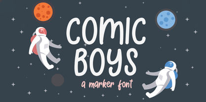 Comic Boys embodies fun, quirkiness and authenticity. This enchanting display font will turn any creative idea into a true standout.
 - Brookhurst JNL by Jeff Levine,
$29.00Brookhurst JNL has strong Art Deco influence, and features an ultra-compressed width to set copy into a tighter space. - Caramel Pro-ROB by TypeSETit,
$29.95 Caramel Pro combines the entire Caramel Family into one OpenType font. Use alternates and style sets to customize your work.
 - Bendina Sambat by Aldedesign,
$13.00 Bendina Sambat features an incredibly sophisticated and classy feel. Use it to turn any design project into a true standout!
 - Birhuk Lord by Twinletter,
$17.00 Welcome to the world of courage with Birhuk Lord, a display font with a superhero style that is ready to add tension and strength to your projects. With strong, bold themes and bold looks, Birhuk Lord is the perfect solution for creating memorable messages in movies, games, and designs. In its electrifying light, Birhuk Lord conveys the feel of a superhero that captivates everyone. Each letter exudes courage and strength, taking your project to the next level and creating an extraordinary user experience. In addition to a stunning style, Birhuk Lord is also equipped with excellent features that will enrich your creativity. With ligatures and alternative characters, you can combine typography in unique and interesting ways. Apart from that, this font also supports multiple languages, allowing you to reach an international audience with a strong and bold message. With the presence of the Birhuk Lord, you will experience the magic at every touch. Get unforgettable courage, thrill, and strength with this font. Don’t waste the opportunity to have a Birhuk Lord and create extraordinary works that inspire and captivate each of your potential customers. What’s Included : File font All glyphs Iso Latin 1 Alternate, Ligature Simple installations We highly recommend using a program that supports OpenType features and Glyphs panels like many Adobe apps and Corel Draw so that you can see and access all Glyph variations. PUA Encoded Characters – Fully accessible without additional design software. Fonts include Multilingual support
 - Avenir Next Paneuropean by Linotype,
$99.00 Avenir Next Paneuropean is a new take on a classic face—it’s the result of a project whose goal was to take a beautifully designed sans and update it so that its technical standards surpass the status quo, leaving us with a truly superior sans family. This family is not only an update though, in fact it is the expansion of the original concept that takes the Avenir Next design to the next level. In addition to the standard styles ranging from UltraLight to Heavy, this 56-font collection offers condensed and semi condensed faces that rival any other sans on the market in on and off—screen readability at any size alongside heavy weights that would make excellent display faces in their own right and have the ability to pair well with so many contemporary serif body types. Overall, the family’s design is clean, straightforward and works brilliantly for blocks of copy and headlines alike. Akira Kobayashi worked alongside Avenir’s esteemed creator Adrian Frutiger to bring Avenir Next Pro to life. It was Akira’s ability to bring his own finesse and ideas for expansion into the project while remaining true to Frutiger’s original intent, that makes this not just a modern typeface, but one ahead of its time. Complete your designs with these perfect pairings: Dante™, Joanna® Nova, Kairos™, Menhart™, Soho® and ITC New Veljovic®.
 - Metairie by insigne,
$24.99 Get in the swing with Metairie. This high-contrast script from Jeremy Dooley sets the rhythm for your next headline or short phrase with its fresh, expressive forms. Metairie’s (sometimes exaggerated) scrawled letterforms play on the colorful world of calligraphy to bring you a fully developed personality of its own. Inspired by elixirs and pharmaceuticals of the 1800s, this design has forms that dig down deep to the soul. It brings a unique, vibrant feel for your next message. The typeface supports all major Latin languages, and the expanded OpenType capabilities let you slide elements easily and quickly into your design. Metairie also includes a number of distressed options. Improv a bit, too, with Metairie’s decorative ornaments, variations on the fleur de lis. Ornaments and tails are accessed through the glyph palette or using the Swash function. An extensive set of ligatures gives you more options for humanizing the handwriting on the page. Then take it up a notch by using the glyph palette to find the perfect solution for project. You have full access to this amazing capability with InDesign, Illustrator, QuarkXpress and similar software. We recommend that you explore what this font can offer by using the glyph palette. Get a glimpse of the font’s strength by looking over the brochure in PDF format in the "Gallery" section. Ready to step in? Take a stab at your next design with Metairie. It could be just the color you need.
 - TT Espina by TypeType,
$19.00 Addition to the collection of TypeType display fonts! TT Espina useful links: Specimen | Graphic presentation | Customization options TT Espina is a display antiqua with expressive serifs. Inspired by the historical shape of the letter O, which took on a diamond shape due to print quality, the designers created a modern typeface with high contrast between horizontals and verticals. TT Espina is yet another proof that antiquas can be stylish and expressive display fonts suitable for modern projects. TT Espina will look harmoniously in headlines of posters or billboards, in gallery and exhibitions design, in large-format printed materials or on websites. The font is easily distinguishable among other antiquas by its high contrast, expressive and large serifs, closed aperture and diamond-shaped circles. TT Espina’s characters are quite narrow, which adds to the materials designed using the font a special aesthetic. It makes you to look closely into each letter, so the headlines set in TT Espina will definitely be read. A full set of different icons is a nice addition for designers who will work with a new typeface. TT Espina consists of 7 typefaces: 6 romans and 1 variable. Each typeface has 648 glyphs. The font family has 21 OpenType features, including changing the shape of some characters (Q, g, j), the possibility to replace characters with high-set diacritics with characters with low-set diacritics, which is convenient for poster design.
 - Lust Didone by Positype,
$49.00 Lust Didone’s character set was expanded as well during the redraw and update, the Italics were separated and reimagined anew from the universal italics in the original offering. Lust Didone also includes the new Fine optical size with complementing Italics for each size as well. And, yes, more swashes. The Lust Collection is the culmination of 5 years of exploration and development, and I am very excited to share it with everyone. When the original Lust was first conceived in 2010 and released a year and half later, I had planned for a Script and a Sans to accompany it. The Script was released about a year later, but I paused the Sans. The primary reason was the amount of feedback and requests I was receiving for alternate versions, expansions, and ‘hey, have you considered making?’ and so on. I listen to my customers and what they are needing… and besides, I was stalling with the Sans. Like Optima and other earlier high-contrast sans, they are difficult to deliver responsibly without suffering from ill-conceived excess or timidity. The new Lust Collection aggregates all of that past customer feedback and distills it into 6 separate families, each adhering to the original Lust precept of exercises in indulgence and each based in large part on the original 2010 exemplars produced for Lust. I just hate that it took so long to deliver, but better right, than rushed, I imagine.
 - Noctis by Italiantype,
$39.00 Noctis was originally born as a single weight display typeface, designed by Luca Terzo who took inspiration by the unusual wedge serifs of Aldo Novarese's 1972 typeface for H. Berthold A.G., Primate. The design was developed by the Italian Type team into a full family of five weights from thin, each with its own true italic, and with a complementary set of decorative patterns. The strong Didonesque contrasts make this typeface both impressive at display sizes and easily readable in text size, while the sharp shapes of the triangular serifs and the distinctive letter shapes show their strength in logo design and impressive editorial use. Inspired by the elegant, self conscious and over-the-top aesthetics of Italian fashion scene of the eighties and nineties, Noctis finds its strength in its strong textural nature, that is explored in the Noctis Texturae subfamily, where each letter is used as a tile to produce seamless patterns that can be used to extend the branding capabilities of Noctis. Noctis features an extended latin character set of 481 glyphs covering over 190 languages, and includes advanced open type features like standard and discretionary ligatures, positional numerals, stylistic alternates and case sensitive brackets. Mixing versatility and personality, Noctis is ready to be like a top model on the design catwalk, making your projects looking classic but contemporary, finely tuned but assertive, and elegant as the best Italian luxury fashion.
 - TA Bankslab by Tural Alisoy,
$33.00 The building of the Northern Bank of St. Petersburg's Baku branch was built in 1903-1905. It was the first Art Nouveau-style building in Baku, Azerbaijan. Later the bank was transformed into the Russian-Asian Bank. After the oil boom in Baku in the 19th century, branches of many banks and new banks were opened in the city. The branch of the Northern Bank of St. Petersburg was among the first banks that was opened in Baku. N.Bayev was the architect of the building for the branch of the Northern Bank of St. Petersburg located at Gorchakovskaya 3 in 1903-1905. The building currently houses the Central Branch of the International Bank of Azerbaijan. My purpose in writing this is not to copy and paste the information from Wikipedia. What attracted me to the building was the word "Банкъ" (Bank) written in Cyrillic letters, which was also used in Azerbaijan during the Soviet era. The exact date of the writing is not known. Every time I pass by this building, I always thought of creating a font of this writing someday. I had taken a photo of the building and saved it on my phone. I did a lot of research on the font and asked a lot of people. However, some did not provide information at all and some said they did not have any information. I was interested in the history of this font but I do not know if this font really existed or it was created by the architect out of nowhere. If there was such a history of this font, I wanted to recreate this font and make it available. If not, I had to create it from scratch in the same way, using only existing letters on the building. Finally, I made up my mind and decided to develop the font with all letters I have got. It was difficult to create a font based on the word, Банкъ. Because in the appearance of the letters, the midline of the letters on A, H, K was very distinct, both in the form of inclination and in more precise degrees. The serif part of the letters, the height of the upper and lower sides, differed from each other. I don't know whether it was done this way when the building was constructed or it happened over time. I prepared and kept the initial version of the font. I took a break for a while. I started digging on the story of the font again. Meanwhile, I was researching and got inspired by similar fonts. Unfortunately, my research on the font's history did not yield any results. I decided to continue finishing up the font. After developing the demo, I created the font by keeping certain parts of these differences in the letters. In addition, I had to consider the development of letters in the Cyrillic, as well as the Latin alphabet, over the past period. Thus, I began to look at the appearance of slab-serif or serif fonts of that time. In general, as I gain more experience in developing fonts, I try to focus on the precision of the design for each font. In recent years, I specifically paid attention to this matter. YouTube channel and articles by Alexandra K.'s of ParaType, as well as, information and samples from TypeType and Fontfabric studios on the Cyrillic alphabet were quite useful. I gathered data regarding the Latin alphabet from various credible sources. I do not know if I could accomplish what I aimed at but I know one thing that I could develop the font. Maybe someday I'll have to revise this font. For now, I share it with you. I created the font in 10 styles. 7 weight from Thin to Extra Black, an Outline, Shadow, and Art Nouveau. The Art Nouveau style was inspired by the texture in the background used for the text on the building. The texture I applied to capital letters adds beauty to the font. If you like the font feel free to use it or simply let me know if your current alphabet doesn't support this font.
 - TA Bankslab Art Nouveau by Tural Alisoy,
$40.00 TA Bankslab graphic presentation at Behance The building of the Northern Bank of St. Petersburg's Baku branch was built in 1903-1905. It was the first Art Nouveau-style building in Baku, Azerbaijan. Later the bank was transformed into the Russian-Asian Bank. After the oil boom in Baku in the 19th century, branches of many banks and new banks were opened in the city. The branch of the Northern Bank of St. Petersburg was among the first banks that was opened in Baku. N.Bayev was the architect of the building for the branch of the Northern Bank of St. Petersburg located at Gorchakovskaya 3 in 1903-1905. The building currently houses the Central Branch of the International Bank of Azerbaijan. My purpose in writing this is not to copy and paste the information from Wikipedia. What attracted me to the building was the word "Банкъ" (Bank) written in Cyrillic letters, which was also used in Azerbaijan during the Soviet era. The exact date of the writing is not known. Every time I pass by this building, I always thought of creating a font of this writing someday. I had taken a photo of the building and saved it on my phone. I did a lot of research on the font and asked a lot of people. However, some did not provide information at all and some said they did not have any information. I was interested in the history of this font but I do not know if this font really existed or it was created by the architect out of nowhere. If there was such a history of this font, I wanted to recreate this font and make it available. If not, I had to create it from scratch in the same way, using only existing letters on the building. Finally, I made up my mind and decided to develop the font with all letters I have got. It was difficult to create a font based on the word, Банкъ. Because in the appearance of the letters, the midline of the letters on A, H, K was very distinct, both in the form of inclination and in more precise degrees. The serif part of the letters, the height of the upper and lower sides, differed from each other. I don't know whether it was done this way when the building was constructed or it happened over time. I prepared and kept the initial version of the font. I took a break for a while. I started digging on the story of the font again. Meanwhile, I was researching and got inspired by similar fonts. Unfortunately, my research on the font's history did not yield any results. I decided to continue finishing up the font. After developing the demo, I created the font by keeping certain parts of these differences in the letters. In addition, I had to consider the development of letters in the Cyrillic, as well as the Latin alphabet, over the past period. Thus, I began to look at the appearance of slab-serif or serif fonts of that time. In general, as I gain more experience in developing fonts, I try to focus on the precision of the design for each font. In recent years, I specifically paid attention to this matter. YouTube channel and articles by Alexandra K.'s of ParaType, as well as, information and samples from TypeType and Fontfabric studios on the Cyrillic alphabet were quite useful. I gathered data regarding the Latin alphabet from various credible sources. I do not know if I could accomplish what I aimed at but I know one thing that I could develop the font. Maybe someday I'll have to revise this font. For now, I share it with you. I created the font in 10 styles. 7 weight from Thin to Extra Black, an Outline, Shadow, and Art Nouveau. The Art Nouveau style was inspired by the texture in the background used for the text on the building. The texture I applied to capital letters adds beauty to the font. If you like the font feel free to use it or simply let me know if your current alphabet doesn't support this font.
 - Centola by Supfonts,
$12.00 Centola - a perfect clean modern serif Font is an open type with clean shapes and precise kerning. Centola Font Features: - Full Set of standard alphabet and punctuation - Ligatures - PUA Encoded - no special software needed to access extra characters - Language support: All European languages - Multilingual Characters AÁĂÂÄÀĀĄÅÃÆBCĆČÇĊDÐĎĐEÉĚÊËĖÈĒĘẼFGĞĢĠḠHĦIIJÍÎÏİÌĪĮĨJKĶLĹĽĻŁMNŃŇŅÑ OÓÔÖÒŐŌØÕŒPÞQRŔŘŖSŚŠŞȘẞTŤŢȚUÚÛÜÙŰŪŲŮŨVWẂŴẄẀXYÝŶŸỲỸZŹŽŻ aáăâäàāąåãæbcćčçċdðďđeéěêëėèēęẽfgğģġḡhħiıíîïìijīįĩjȷkķlĺľļłmnńňņñoóôöòőōøõœpþ qrŕřŗsśšşșßtťţțuúûüùűūųůũvwẃŵẅẁxyýŷÿỳỹzźžż Thanks so much for checking out my shop, and please get in touch if you have any questions! Don't forget to subscribe so you don't miss out on the new awesome fonts Dima
 - Fabejan by Supfonts,
$12.00 Fabejan a perfect mixed calligraphy and modern serif Font is an open type with clean shapes and precise kerning. Fabejan Font Features: - Full Set of standard alphabet and punctuation - PUA Encoded - no special software needed to access extra characters - **Language support**: All European languages - Multilingual Characters AÁĂÂÄÀĀĄÅÃÆBCĆČÇĊDÐĎĐEÉĚÊËĖÈĒĘẼFGĞĢĠḠHĦIIJÍÎÏİÌĪĮĨJKĶLĹĽĻŁMNŃŇŅÑ OÓÔÖÒŐŌØÕŒPÞQRŔŘŖSŚŠŞȘẞTŤŢȚUÚÛÜÙŰŪŲŮŨVWẂŴẄẀXYÝŶŸỲỸZŹŽŻ aáăâäàāąåãæbcćčçċdðďđeéěêëėèēęẽfgğģġḡhħiıíîïìijīįĩjȷkķlĺľļłmnńňņñoóôöòőōøõœpþ qrŕřŗsśšşșßtťţțuúûüùűūųůũvwẃŵẅẁxyýŷÿỳỹzźžż Thanks so much for checking out my shop, and please get in touch if you have any questions! Don't forget to subscribe so you don't miss out on the new awesome fonts Dima
 - Bebopalula by Studio K,
$45.00 No prizes for guessing this font family was inspired by the 1950s - the sounds (Buddy, Eddie, Elvis), the styles (polka dots, petticoats and Dior's New Look), and the kitsch, from furry dice above the dashboard to plaster ducks over the mantlepiece! A particular point of reference is the furnishings and fabrics of the Fifties (with their distinctive kidney shapes and angular curves) as showcased in the Festival of Britain 1951. See also my other fun fonts Barrowboy, Calypso and Pier Arcade.
 - Andreash by Rometheme,
$25.00 Andreash – Sans Serif Font. It has a elegant, classy look and beauty. It’s a great font for fashion, apparel projects, signature, album cover, logo, branding, magazine, social media, & advertisements, but also works great for other projects. Highlight: - Easy instalation - Work on PC or Mac - PUA Encoded Support - Basic Latin A-Z and a-z - Numbers - Symbols - No special software is required, The fonts can be opened and used in Adobe Illustrator, Adobe Photoshop, Adobe InDesign, even work on Microsoft Word.
 - Agile Sans by Fenotype,
$25.00 Agile Sans is a contemporary humanist font family with classicist roots. Hence its name, Agile Sans suits many occasions from branding to publications, web and applications. From formal to casual, bold to refined, this font covers it all. Agile Sans comes with nine weights with corresponding true-italics. Built-in small capitals and several numeral styles are included as well. If you’re seeking for an alternative to more common humanist sans serifs, look no further and grab a future classic.
 - Keks by Hubert Jocham Type,
$29.90 And now something completely different. Keks has broken elements like a blackletter typeface, but the actual forms are roman. That keeps it very legible although there is no curve at all. What was the inspiration for designing the font? Blackletter has an interesting history here in Germany. We need to find contemporary interpretations for this tradition. What are its main characteristics and features? Legible roman blackletter Usage recommendations: any usage that needs a black letter athmosphere where legibility is important.


PreviousPage 250 of 250