10,000 search results
(0.331 seconds)
- MC Bregor by Maulana Creative,
$18.00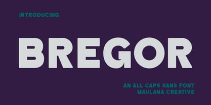 Bregor is an All caps simply strong sans serif font. With Bold stroke, fun character with a bit of ligatures and alternates. To give you an extra creative work. Bregor font support multilingual more than 100+ language. This font is good for logo design, Social media, Movie Titles, Books Titles, a short text even a long text letter and good for your secondary text font with script or serif. Make a stunning work with Bregor font. Cheers, Maulana Creative
 - Quick On by eyetype,
$16.00 Quick On is a script font with typical handmade, a work that is purely a result of handmade, has a natural characteristic. This is perfect for invitations, signatures, blogs, social media, business cards, product brands. Quick On has Stylistic standard, Stylistic Alternates and ligatures. OpenType features can be accessed by using OpenType smart programs such as Adobe Photoshop, Adobe Illustrator, Adobe Indesign, Corel Draw and Microsoft Office. They can also be accessed through the character map.
 - MC Jenki by Maulana Creative,
$16.00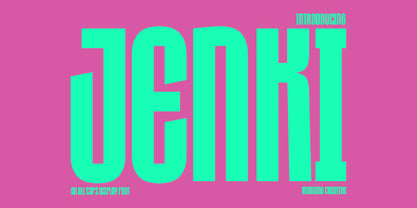 Jenki is an all caps sans serif display font. With medium consist stroke, fun character with a bit of ligatures, To give you an extra creative work. Jenki font support multilingual more than 100+ language. This font is good for logo design, Social media, Movie Titles, Books Titles, a short text even a long text letter and good for your secondary text font with sans or serif. Make a stunning work with Jenki font. Cheers, Maulana Creative
 - Merlove by Pixesia Studio,
$15.00 Introducing Merlove - A Contemporary Display Font Merlove is a strong and contemporary display font. It has an unique vintage style, that is perfect for branding. Add it to your most creative ideas and notice how it makes them come alive! FEATURES - Stylistic Alternates - PUA Encoded - ALL Caps - Numbering and Punctuations - Multilingual Support - Works on PC or Mac - Simple Installation - Support Adobe Illustrator, Adobe Photoshop, Adobe InDesign, also works on Microsoft Word Hope you Like it. Thanks.
 - Flecto by Maulana Creative,
$12.00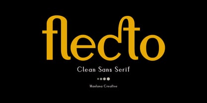 Flecto Clean Sans Serif is an all caps display font. With bold weight, unique and fun character with a bit of ligatures. To give you an extra creative work. Flecto font support multilingual more than 100+ language. This font is good for logo design, Social media, Movie Titles, Books Titles, a short text even a long text letter and good for your secondary text font with script. Make a stunning work with Flecto font. Cheers, Maulana Creative
 - Night Wind Sent by Ana's Fonts,
$12.00 Night Wind Sent is an elegant handwritten script font family inspired by old-fashioned handwritten postcards and letters. It includes ligatures (for a true handwritten feel), stylistic alternates, handwritten small caps, and swashes (for an extra bit of drama). Plus! Extra versions of the font: underline and strikethrough, and an ornaments font, to help decorate your text. Night Wind Sent is perfect for any design that needs a handwritten look, such as signatures, notes and quotes, logos and branding.
 - Citrus Gothic by Adam Ladd,
$25.00 Citrus Gothic is a hand drawn, sans featuring solid, texture, inline, rough, shadow, and italic styles. It’s design leans on the classic, condensed gothic appearance but adds flair with the irregular details and curled terminals. An all-caps typeface that is functional and unique, making it great for branding, packaging, headlines, and other display uses. The uppercase and lowercase are each individually drawn so switch between them as you typeset for a more authentic, hand drawn appearance.
 - Aliens & Cows by Zetafonts,
$39.00 Aliens and Cows is an ultra condensed sans serif display typeface designed by Francesco Canovaro. Inspired by the title cards of 1980's science fiction movies, it features thin letterforms with a ultra wide spacing - perfect for minimal logo design and editorial display use. It features sci-fi themed alternates as well a set of lined small caps and word ligatures, and covers over forty languages using the Latin alphabet as well as Greek and Cyrillic.
 - Matogrosso Script by Sudtipos,
$59.00 Matogrosso is another rough script from Argentine calligraphy team Koziupa and Paul. With its expressive urge at the importance of discovery, it is ideal to use on wine labels or organic food packaging, stationery and old maps. It also makes a great choice for designs relating to outdoor activities and rugged travel, where the concept of the wild is to be accentuated. Matogrosso's OpenType programming combines several alternate lowercase characters to generate perfectly fit and more natural textures.
 - Glore by Heinzel Std,
$12.00 Gloré is an elegant and modern serif font. Fall for its ravishing style and use it to create gorgeous wedding invitations, beautiful stationary art, branding, logos, headlines, headings, magazines, eye-catching social media posts, and much more! This font is PUA encoded which means you can access all of the amazing glyphs and ligature with ease! Gloré Features : Gloré Regular and Italic version, serif font all caps, numerals, and more punctuations. Multilingual support for various languages Stunning Ligatures
 - MuskitosCaps by Ingrimayne Type,
$8.95 MuskitoCaps is a Tuscan (split-serif) font that is rather narrow and a bit awkward. It is caps only, though the lower case differs from the upper case(the lower case lacks the mid-stem spike). The family has three styles, plain, shadowed, and shadowinside. The last has the same shapes as the plain style but has the spacing of the shadowed style so it can be layered with the shadowed style to easily produce bi-colored lettering.
 - Berkshire Pro by Stiggy & Sands,
$35.00 This family began with Berkshire Swash Pro, an alluring semi-sweet typestyle with a bold yet feminine flair to it. This was always meant to be a trio family, complete with Regular, Loops, and Swash Pro styles. See the last graphics for a comprehensive character map preview. Opentype features include: A collection of ligatures. Smallcaps. Full set of Inferiors and Superiors for limitless fractions. Tabular, Proportional figures for Berkshire Pro, and Oldstyle figure sets for Loops & Swash Pro.
 - Wagnesday by Arterfak Project,
$19.00 don't think you're alone, watch your behind "Wagnesday" is a thriller-horror styled font, inspired by thriller movies and designed with an elegant touch of horror, and thrilling. This all-caps font adds a dark vibe to your designs, making them more attention-grabbing. With its bold and sharp font style, Wagnesday can be applied to various themes, including underground, gothic, sports, and even vintage designs. Wagnesday becomes even more versatile with the addition of stylistic alternates.
 - Rubas by QubaType,
$12.00 Rubas is an all-caps display typeface with octagonal design. Rubas consists of a solid basic font (Athletics) and its eleven inline variants. With its bold and confident appearance, it's perfect for sports logos, branding, posters, apparel design. Rubas supports many Latin-based languages including: Afrikaans, Basque, Breton, Catalan, Danish, Dutch, English, Finnish, French, Gaelic, German, Indonesian, Irish, Italian, Norwegian, Portuguese, Sami, Spanish, Swahili and Swedish. Also we add Cyrillic glyphs for supporting Russian, Ukrainian and Belarusian.
 - Komorebi by LiffeyType,
$9.00 Komorebi consists of handmade letters made with just a Stabilo pen. It is perfect for large scale texts and headlines. This font is suitable for posters, flyers, business cards or just a beautiful visual with a signature word. The family consists of three styles with both lower and upper case letters, accent characters and special characters. Though I personally recommend using all caps to give your words that bold touch, lower case works just as well!
 - Ferghaus Sans by Fontdation,
$15.00 Introducing Ferghaus Sans, a modern sans serif font. This all-caps font is crafted with high attention to the details, gives you a clean and sharp feeling using it on your designs. Packed with so many OpenType features (such as alternate chars, swashes, ligatures, etc), lets you play and explore every possibilities with the letters combo. Ferghaus Sans is highly versatile, suits best for almost everything, whether you're working on classic themed design, or the modern ones.
 - Upside by Little Fonts,
$15.00 Upside is an all caps font. The design of the font is tied to historic golden ages gone by, but with a modern flair giving it a contemporary edge. It is a tall and condensed geometric sans serif, with four unique styles and appearances. Upside is a distinctive display font, perfect for headlines and headings across a range of formats such as graphic design posters, editorial pieces, or anything that needs that extra eye-catching touch.
 - MC Groben by Maulana Creative,
$15.00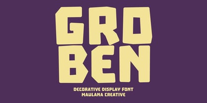 Groben is a All Caps Bouncy Sans Display font. Bold stroke, fun character with a bit of ligatures and alternates. To give you an extra creative work. Groben font support multilingual more than 100+ language. This font is good for logo design, Social media, Movie Titles, Books Titles, a short text even a long text letter and good for your secondary text font with script or serif. Make a stunning work with Groben font. Cheers, Maulana Creative
 - Antemowa by Gatype,
$12.00 Antemowa is modern script font, where every single letter has been carefully crafted to make your text look beautiful. With a modern script style, this font will perfect for many different project such as: quotes, blog headers, posters, weddings, branding, logos, fashion, apparel, letters, invitations, stationery, and more. This font includes alternate glyphs and beautiful swirls How to access alternate glyphs: Windows Character Map: https://www.youtube.com/watch?v=BScPsiubM1k Adobe Illustrator: https://www.youtube.com/watch?v=y5XTaWYwWA4 Thanks for looking.
 - Calla Script by Great Lakes Lettering,
$30.00 Calla is a scripted typeface with an interesting personality. Each letter was created many times so you can get a truly distinctive look to your designs. Notice when you type with open type feature switched on, your letters will bounce around and change as you type? This feature ensures you get a new version of each letter throughout the words you use! Want to get even more custom? Pair all caps words with your lowercase words to create hierarchy!
 - Le Havre Titling by insigne,
$24.00 Throughout time, history’s architects have incorporated some of the finest illustrations of type into their great works--cuneiform on Mesopotamian ziggurats; Greek etched into the temples of the gods; inscriptions marking the monuments of mighty Rome. From these Roman inscriptions specifically, we take our capital letters of today; and while we've lost the need for serifs over time, our current characters maintain the classical foundations, even after being distilled to their simplistic forms. Here’s where we have the basis for Le Havre Titling. This updated face is a carefully optimized version of Le Havre that uses purely capital lettering. Originally inspired by the golden period of the passenger ship and the French port that bid a rich bon voyage to so many famed, luxurious ocean liners of the Roaring Twenties and Thirties, the typeface includes an exciting array of ligatures that brings it into the present day and gives designers a tremendous amount of versatility in their work. With its seven weights, Titling looks equally at home on the side of a building as it does in a finely crafted invitation. With over five hundred glyphs, Le Havre Titling offers a multiplicity of options for your projects. Combine ligatures, play around with two sets of art deco forms, use original caps, and more; every one of these is obtainable with the OpenType functionality. The new design also shares five weights with the original Le Havre, allowing you to maximize your potential through its interchangeability. Titling’s Thin weights are delicate but not too fragile, and its geometric forms give each individual composition you create an exquisite and beautiful sense of emotion. Without a doubt, this fresh, fashionable take on the classical forms offers your reader refined, yet unanticipated approach as he or she travels through your text.
 - Aspire Narrow SmallCaps by Grype,
$18.00 While the Aspire SmallCaps family finds its roots of inspiration in the ACURA automotive company logo, with its wider base, the Aspire Narrow SmallCaps family condenses those styles into something more suitable for larger bodies of text in a more standardized width. Aspire Narrow SmallCaps is perhaps the most true to form tribute to the original all capitals inspiration logotype. It maintains all capital forms (whether standard or smallcaps) and yet is still strikingly powerful in its presence and readability including numerals, and a comprehensive range of weights, creating a straightforward, uncompromising collection of typefaces that lend a solid foundation and a broad range of expression for designers. Here's what's included with the Aspire Narrow SmallCaps Family bundle: - 430 glyphs per style - including Capitals, Small Caps, Numerals, Punctuation and an extensive character set that covers multilingual support of latin based languages. (see the 6th graphic for a preview of the characters included) - Stylistic Alternates - alternate characters that remove the angled stencil cuts for a more standardized text look. - 3 weights in the family: Light, Regular, & Black. - 3 obliques in the family, one for each weight: Light, Regular, & Black. - Fonts are provided in TTF & OTF formats. The TTF format is the standard go to for most users, although the OTF and TTF function exactly the same. Here's why the Aspire Narrow SmallCaps Family is for you: - You're in need of automotive sans font family with a range of weights and obliques - You're love that ACURA letter styling, and want to design anything within that genre - You're looking for an alternative to Eurostile with more stylized letterforms. - You're looking for a battle-tech typeface for your futuristic war chest labelling. - You just like to collect quality fonts to add to your design arsenal
 - Landa by Sudtipos,
$39.00 As good as Nylon is, there’s nothing better than a nice woolly blanket. The smell and coarse, uneven texture are relaxing and feel reassuring. More comfortable. In a world where technology can reach millimetric precision, sometimes it’s good to connect with the imperfect and controlled impurity that is nature. Font design in particular has matured through software that can generate the most perfect letters in the world. But most of them don’t have soul. Landa is a glimpse from the cutting edge into the past. Inspired by Venetian lettering from the 15th century, whilst giving them new meaning, its letters become expressionist and have a modern touch. A rendez-vous between Nicolas Jenson, Oldřich Menhart, and nature itself. In Landa you can feel the texture of trunks and branches, from full fertile splendour to dried-out frailty. It takes the reader for a stroll through the woods on a late autumn evening, or on an adventure through the Amazonian rainforest, depending on the weight chosen. In the lighter and italic options, Landa text is organic and rustic, and very comfortable to read. What’s more, while it’s discreet on smaller screens, when enlarged it reveals brittle and expressive calligraphic shapes. This also makes it ideal for packaging or display elements. Landa provides advanced typographical support in several languages and OpenType features including case-sensitive forms, small caps, contextual alternatives, stylistic alternates, fractions, proportional and tabular figures. In this case it is technology that serves lettering, not the latter being technology dependent. Let’s not forget, as Erik Spiekermann said “we are still analogical beings. Our brains and eyes are analogical.” Perhaps that’s why to disconnect we always need to go back to forests, rivers, nature. Perhaps that’s why we still prefer wood to steel or wool to nylon.
 - Birthday by Canada Type,
$34.95What do you imagine the ideal casual invitation font would look like? It has to be cheerful, inviting, legible, creative, and loads of fun. But first and foremost, it has to look like real handwriting. Fonts seeming like real handwriting are always a major task, and although Canada Type already has plenty of fonts that solve the “looks like handwriting” issue in a variety of ways, we're once again raising the bar a little higher with this one. Birthday is a massive package that crosses the traditional font/handwriting solution of 2-letter ligatures and waltzes into the land of 3-letter combinations. Plenty of them, too! The complete Postscript and True Type versions of Birthday ship with no less than five separate fonts full of nothing but ligatures. And for even more realism, an alternates font is also included in the package, for a total of seven fonts of happy handwriting that can be used anywhere and everywhere personalization is of importance to a layout. For layout artists with advanced typography tools that take advantage of the power of OpenType, Birthday Pro is a wunderkind. All the individual letter alternates are accessible through the Stylistic Alternates feature, the 2-letter ligatures through the standard Ligatures feature, and the 3-letter ligatures via the Discretionary Ligatures feature (for the technically inclined: this includes a nice liga-to-dlig crossover, where the maximum number of possible ligated letters is automatically chosen at the push of a button). If you enjoy using OpenType, Birthday Pro is definitely for you. If on the other hand you like your fonts in Postsript or True Type, it is advisable to keep a character map handy while using Birthday. You will need it to take advantage of the many, many alternates and ligatures distributed over the fonts. The next time someone asks you for the perfect casual invitation font is, look no further. And as usually is with Canada Type, quality fonts are more affordable than ever. - Touch Tone by Jeff Kahn,
$29.00 Touch Tone introduces a condensed lowercase and oblique italics to the uppercase font inspired by the "Dr. Strangelove" movie titles – designed by Pablo Ferro. Touch Tone's naive hand-drawn strokes rely on a quirky variable width-brush. They are looser, more textured, tactile, more informal, with quirky nervous lines. A family of four fonts: it includes two weights, light and medium, and both with roman and italics. All the fonts include the same patterns and ornaments. However, many of the “medium” font weight ornaments are beefed up to visually match. Touch Tone utilizes OpenType features. It imitates handcrafted lettering by including 2 glyphs for each U&lc letter (4 sets) – all kerned with care. This medley avoids a repetitious appearance so each sentence looks original and hand-drawn. The uppercase includes two widths – extra condensed and extended. Add whimsy and eccentricity by mixing the extra condensed caps with extended caps and the lowercase alphabet. Use the Contextual Alternates, or Stylistic Alternates features panel, or select the alternates in the Glyphs palette. Touch Tone includes oldstyle numerals, a variety of retro patterns, dingbats, speech bubbles, icons, banners, graphic arrows and ornaments. Each font includes 403 glyphs. Suitable for display or text and many European alphabets. Purchase both weights, roman and oblique italics to emphasize words. Touch Tone combines cool graphics and patterns with OpenType. Generously apply Touch Tone for added warmth and a "Rat Pack" groovin' message.
 - Odile by Kontour Type,
$50.00 Odile is a text typeface with bracketed head and bracket-free bottom lower case serifs, a quality that counters rigidness most traditional slab serif typefaces possess. This contemporary design draws inspiration from an experimental typeface named Charter originally designed by the American book and type designer William Addision Dwiggins. It consisted of an informal lowercase alphabet, a narrow seemingly non-inclined vertical letter with script attributes, featuring non-joining letterforms. Dwiggins’ contemplated Charter as the italic companion to Arcadia, Experimental No. 221. The Charter project progressed sporadic stalled during the Second World War and came to a halt in 1955. Charter remained incomplete and was never commercially released. Assessing Charter’s whimsical design, its fragments were rethought and developed into a comprehensive text family. Odile Upright Italic reveals recognizable similarities shared by Dwiggin’s Charter and defines the design approach for the family. The steep calligraphic outstroke and low junctions off the stem as in the upright italic “n” or “r”, for example, are gradually lessened in the italic and moved up for the roman weights. The six optically balanced weights range from the delicate Light to stark Black, accompanied by display variants with feminine flair and ardent Ornaments. Two sorts of Initials, one amplified with interweaving swashes, the other more restrained, both are clearly derived from the Upright Italic. This mid-contrast serif offers a wide range of tools for text and display typographies with a palette of strict to playful. This family shines in magazine, book and display use. The graceful serifed type harmonizes perfectly with Elido, Odile’s sans companion. Sans and serif share the family array and OpenType features in perfect tune. Odile offers an extensive character set, numerous OT features including roman and italic Small Caps, five sets of numerals, alluring ligatures, and many more. OT stylistic variants (with accents) offer a one-story “a” for the roman weights, alternate “g” and “s” designs for the italics, and a variant “s” for the Upright Italic.
 - Garava - 100% free

- Address Sans Pro by Sudtipos,
$39.00 History is always in sight; it is constantly being reconsidered and reformulated in the context of now. We see approaches to art, fashion, textiles, homewares, furnishings … not to mention music, graphics and everything else that culturally enriches our daily lives, revisited and made anew for today. Address Sans indulges in the spirit and aesthetics of mid-century Modern – Italian industrial design, sleek coffee makers, stylish cars, seductive jazz pressed on vinyl – with a charm and charisma that defies time. It evokes history but is decisively created for today. Its design, in reality, is rooted in the condensed structure and block modulation of early 1950s German lettering intended for use in street signage, but when we started to work on the various weights and widths, the result was a set of fonts in a style similar to the typographic work developed by Butti and Novarese in the 60s. The multitude of potential applications for Address Sans then became clear. In a range of 3 widths and 8 weights each, Address Sans includes little verses, true italics, small caps and numerous alternative signs for a total of 48 fonts. The result is a functional typeface that is effortlessly seductive, with geometric features and design details that ooze cool, and take it away from mere reinterpretation towards typographic forms that adapt perfectly for contemporary use.
 - Compatil Fact by Linotype,
$50.99Compatil is the first comprehensive type system which enables all typographical elements to be used to full effect in order to reproduce the message conveyed by text information. Four different type styles with a total of 16 weights including italics have been merged into a unique typographical network. There are now no limits to the font user's creativity. The system is a product of technical innovation and constitutes a new design approach which meets the highest aesthetic standards. For almost two years, a team of experts from Linotype has been working with initiator Professor Olaf Leu under the direction of Silja Bilz, Erik Faulhaber and Reinhard Haus to create the Compatil type system. Despite the Internet and TV, it is essential today to be able to absorb information quickly by being able to read it with ease. A fact that is becoming increasingly important both on-screen and on paper. It is the role of the font to increase legibility and to ensure typographically perfect results for text design work. The new Compatil type system meets all these needs. The Compatil is a part of the Platinum Collection. The following four different styles are available: Compatil Exquisit, Compatil Fact, Compatil Letter and Compatil Text. Compatil is available in various font formats: 16 separate OT Pro fonts including the small caps and Adobe Central European character set for OpenType-supporting applications like Adobe InDesign, or as 32 separate OpenType Com fonts for office communication, with the following special features: 1. Optimized display capabilities for computer screens eXcellent Screen Fonts (XSF-quality). 2. An extended, international character set, which supports 48 different languages for Microsoft Office applications like MS Word or as 64 PostScript fonts, which can be used in non-OpenType-supporting applications like Quark XPress. - Compatil Fact Paneuropean by Linotype,
$103.99Compatil is the first comprehensive type system which enables all typographical elements to be used to full effect in order to reproduce the message conveyed by text information. Four different type styles with a total of 16 weights including italics have been merged into a unique typographical network. There are now no limits to the font user's creativity. The system is a product of technical innovation and constitutes a new design approach which meets the highest aesthetic standards. For almost two years, a team of experts from Linotype has been working with initiator Professor Olaf Leu under the direction of Silja Bilz, Erik Faulhaber and Reinhard Haus to create the Compatil type system. Despite the Internet and TV, it is essential today to be able to absorb information quickly by being able to read it with ease. A fact that is becoming increasingly important both on-screen and on paper. It is the role of the font to increase legibility and to ensure typographically perfect results for text design work. The new Compatil type system meets all these needs. The Compatil is a part of the Platinum Collection. The following four different styles are available: Compatil Exquisit, Compatil Fact, Compatil Letter and Compatil Text. Compatil is available in various font formats: 16 separate OT Pro fonts including the small caps and Adobe Central European character set for OpenType-supporting applications like Adobe InDesign, or as 32 separate OpenType Com fonts for office communication, with the following special features: 1. Optimized display capabilities for computer screens eXcellent Screen Fonts (XSF-quality). 2. An extended, international character set, which supports 48 different languages for Microsoft Office applications like MS Word or as 64 PostScript fonts, which can be used in non-OpenType-supporting applications like Quark XPress. - Compatil Letter by Linotype,
$50.99Compatil is the first comprehensive type system which enables all typographical elements to be used to full effect in order to reproduce the message conveyed by text information. Four different type styles with a total of 16 weights including italics have been merged into a unique typographical network. There are now no limits to the font user's creativity. The system is a product of technical innovation and constitutes a new design approach which meets the highest aesthetic standards. For almost two years, a team of experts from Linotype has been working with initiator Professor Olaf Leu under the direction of Silja Bilz, Erik Faulhaber and Reinhard Haus to create the Compatil type system. Despite the Internet and TV, it is essential today to be able to absorb information quickly by being able to read it with ease. A fact that is becoming increasingly important both on-screen and on paper. It is the role of the font to increase legibility and to ensure typographically perfect results for text design work. The new Compatil type system meets all these needs. The Compatil is a part of the Platinum Collection. The following four different styles are available: Compatil Exquisit, Compatil Fact, Compatil Letter and Compatil Text. Compatil is available in various font formats: 16 separate OT Pro fonts including the small caps and Adobe Central European character set for OpenType-supporting applications like Adobe InDesign, or as 32 separate OpenType Com fonts for office communication, with the following special features: 1. Optimized display capabilities for computer screens eXcellent Screen Fonts (XSF-quality). 2. An extended, international character set, which supports 48 different languages for Microsoft Office applications like MS Word or as 64 PostScript fonts, which can be used in non-OpenType-supporting applications like Quark XPress. - Compatil Text by Linotype,
$50.99Compatil is the first comprehensive type system which enables all typographical elements to be used to full effect in order to reproduce the message conveyed by text information. Four different type styles with a total of 16 weights including italics have been merged into a unique typographical network. There are now no limits to the font user's creativity. The system is a product of technical innovation and constitutes a new design approach which meets the highest aesthetic standards. For almost two years, a team of experts from Linotype has been working with initiator Professor Olaf Leu under the direction of Silja Bilz, Erik Faulhaber and Reinhard Haus to create the Compatil type system. Despite the Internet and TV, it is essential today to be able to absorb information quickly by being able to read it with ease. A fact that is becoming increasingly important both on-screen and on paper. It is the role of the font to increase legibility and to ensure typographically perfect results for text design work. The new Compatil type system meets all these needs. The Compatil is a part of the Platinum Collection. The following four different styles are available: Compatil Exquisit, Compatil Fact, Compatil Letter and Compatil Text. Compatil is available in various font formats: 16 separate OT Pro fonts including the small caps and Adobe Central European character set for OpenType-supporting applications like Adobe InDesign, or as 32 separate OpenType Com fonts for office communication, with the following special features: 1. Optimized display capabilities for computer screens eXcellent Screen Fonts (XSF-quality). 2. An extended, international character set, which supports 48 different languages for Microsoft Office applications like MS Word or as 64 PostScript fonts, which can be used in non-OpenType-supporting applications like Quark XPress. - Xiomara - Personal use only

- Gridlite PE Variable by Rosetta,
$290.00 The two great technical constraints a type designer can tackle are low resolution, which limits detail and dictates proportions between negative and positive shapes, and uniform width, which restricts each letter to a fixed horizontal space. Wrestle with both at once, and each letter becomes a black-and-white chessboard that challenges every design decision. Sometimes battling these constraints gets in the way of a good idea, but other times, tinkering with fewer options can make the job irresistibly easy and lead straight to a grid addiction. Gridlite, an experiment with a modular negative space, is the side effect of such an addiction. It’s simplified, monospaced, and variable: foreground and background alike are ready to be animated, typed, scaled up, scaled down, rounded, or otherwise deformed. Gridlite is primarily a variable font with axes that control the size of the elements, their shape, and the background (one for the rectangular field and one for the compact envelope around the letters). The fonts cover Cyrillic, Greek, and Latin scripts. Small caps are included, for no apparent reason ... and there is a monospaced elephant, too.
 - DT Augustina Slab by Deveze Type,
$29.00 DT Augustina Slab is an original Clarendon's style slab serif font family of 98 styles including 7 weights, 7 widths plus Italics. There is no such a big choice of Clarendons with a wide range of styles on a market. Super wide range family will satisfy almost any request. Ultra Lights and Light styles will add elegance and lightness to your headlines, especially with using Italic swashes. Regulars, Mediums and Semi Bold will make your text blocks readable and stylish. Combine with Italics and Small Caps for sub-headers and highlights to get an incredible result. And finally Bold and Extra Bold for massive and heavy text headers. Strong, stable and reliable. The whole family has been working well in almost any type of a project: Websites, Apps, E-Books, Books, Magazines, TV broadcasting, Packaging. The family has an Open Type Features like a Ligatures, Italic Swashes, Small Capitals, Case Sensitive Forms, Tabular Figures, Old Style Figures, Tabular Old Style Figures, Circled Figures, Black Circled Figures, Fractions, Superscripts, Subscripts, Stylistic Sets, Localisation forms for Moldavian / Romanian, Catalonian and Turkish.
 - Ways by Fontfabric,
$30.00 Born at a crossroads, the collaborative sans family of 18 styles Ways is the latest arrival in our portfolio. The name is no coincidence, as Ways pulls out all the stops to bring you excellent legibility. Combined with brutal and elegant details for a distinct humanist flair, this sans offers perfect functionality across all weights. Visual compensations, extra white space, wider apexes, subtle tweaks, and moderate inktraps distinguish Ways among similar typefaces. Use over 690 glyphs, extended Latin and Cyrillic support, extensive OT features set, icon set of more than 60 navigation pictograms, and one variable style, to design full-fledged signage systems that get you from point A to point B without relying on G-Maps. Family overview: 9 weights (from Thin to Black) + italics Extended Latin Cyrillic 690+ glyphs languages 1 variable font (2 axes) 1 free font - Ways SemiBold OpenType Features: Localized Forms Standard Ligatures Contextual Alternates Lining Figures Tabular Figures Subscript Scientific inferiors Superscript (Superiors) Numerators Case-Sensitive Forms Standard and Discretionary Ligatures Stylistic Alternates Contextual Alternates
 - Oceanwide Pro by California Type Foundry,
$47.00 A font perfect for not just one, but many projects! Introducing Oceanwide Pro, a sans that loves to be used in just about any situation! Designed with ultra clean lines and versatility in mind, Oceanwide wants to be your new favorite sans! Oceanwide’s ultra clean letters work anywhere you want to communicate orderliness and competence, and designed to build trust and rapport with your audience. Its wide proportions make it ideal for display and logo use. Oceanwide especially shines for white/bright letters on black/dark backgrounds! That’s because the inside shapes are nearly perfect circles in many weights. Here's a quick video tour of Oceanwide Pro by Dave Lawrence, including all the great things Oceanwide can be used for! We've tested Oceanwide for these industries, with stunning results!: Tech Arts Fashion & Style Business & Branding Corporations Logistics Architecture Food and many more... Oceanwide can be used for: Headers Subheadlines Logos Even body text, if tracked. Print & Screen The styles it can take are also many. It's great for: Modern/minimalist design Flat design Cut out design User Interface (UI) Technical designs In combination with text effects, even for grunge and other situations. And many others... DESIGN FEATURES Simplicity Tall x-height Hand-sloped obliques (italics) Narrow spacing Semi-wide proportions Expert kerning Well proportioned, usable lights & extra lights Large caps Great ALL CAPS MODE Uppercase punctuation Uppercase spacing with California Type Foundry’s Smart Tracking™ Advanced fraction support Proportional lining figures Thick joins Smooth curves Sturdy—great for textures and effects Variable font available Latin Pro character set for Central European languages. That's the writing for over 782 languages and transliterations worldwide! DESIGN STORY—THE FORGOTTEN SANS by Dave Lawrence, Lead Designer, California Type Foundry Adrian Frutiger was the 20th century master of sans, but I didn't realize he had made—not one—but TWO geometric sans! It wasn't until I had purchased the book “Adrian Frutiger: Typefaces”. I had hoped to someday meet Adrian Frutiger, but he passed away that very same year. Here is the story of Frutiger's forgotten sans. Back in 1968, Frutiger was approached by Pentagram to make a design for British Petroleum. They wanted a "new version of Futura". However, they wanted him to make a couple adjustments. First, they felt that Futura was "too fiddly." By this, they meant that it narrowed too much at the joins. (Joins are for example where the round and straight parts of the 'd' meet.) This is something that is necessary for small print text (to prevent ink clogging), but is not necessary at large sizes. Second, they wanted it to be entirely geometric, using the circular shape with minimal optical corrections. Unfortunately this font was not even used very consistently in the BP brand. A haphazard mix of Futura and Frutiger's BP font ensued. It was then replaced by another font design very soon after. My design is different in several ways. First, the commas and quotes are a more modern style. I tried his original commas, but these just didn’t work to 21st century eyes. Second, in his drawings, Frutiger went for a more standard u with a downstroke on the right. However, Oceanwide has a simpler u. Third, I made more optical adjustments. At the direction of his employer, Frutiger reluctantly put no font optical corrections into the letters. So I think my optical adjustments are similar to what Frutiger would have wanted. Fourth, I extended the weight into the light and extra light ranges. Fifth, the rest of the font I created according to the principles of Adrian Frutiger, but with no sources for inspiration. Here is Frutiger’s design philosophy, in his own words: “If you remember the shape of your spoon at lunch, it has to be the wrong shape. The spoon and the letter are tools; one to take food from the bowl, the other to take information off the page... When it is a good design, the reader has to feel comfortable because the letter is both banal and beautiful.” The words about the spoon were the ones I kept in my mind as I tried to make the curves ultra smooth, and the shapes ultra simple. Hopefully this font is a worthy successor to the font that inspired it. Released on the 93rd birthday of Adrian Frutiger, to celebrate the life and achievements of this amazing designer. ——————— Simplicity. Versatility. Oceanwide.
 - Gravesend Sans by Device,
$39.00 Smart, legible and elegant, Gravesend Sans is a based on the unique typeface used for the iconic grass-green signage for the Southern Railway. In existence from 1923 to 1948, when the network was nationalised, the Southern Railway linked London with the Channel ports, South West England, the South coast resorts and Kent. The same design was also used for the ‘hawkeye’ signs on the London, Midland and Scottish Railway, differentiated by black letters on a yellow background. Reference for each letter was taken from vintage ‘target’ station nameplates and other platform signage. The rarest letters were the Q, seen in Queens Road Battersea, the X, seen in East Brixton, and the Z, used in Maze Hill, site of an infamous train crash in 1958. Being hand-made, the letters often differ in width and thickness. There was no lower case. The Bluebell Railway, a heritage steam line, runs over part of the old Southern Railway network and uses a very similar type. The design of the numbers differed considerably, but here have been taken from the Device 112 Hours font Smokebox. As well identifying platforms, they were used on the front of the steam engine’s smokebox, hence the name, and stylistically are more in keeping with the letters than some of the squarer versions that can be seen in old photographs. William Caslon IV is credited with the first Latin sans-serif type, shown in a 1816 Caslon specimen book. ‘Two Lines English Egyptian’, as it was called, was caps-only, and there are several other correlations between that type design and this one. Includes a selection of authentic arrows and manicules, plus abbreviated ligatures such as ‘St.’ (Saint or Street) ‘Rd.’ (Road) and ‘Jn.’ (Junction). The Cameo version includes many graphic banner elements that can be freely combined.
 - Greater Amberjack by Mega Type,
$14.00 Greater Amberjack is a modern script typeface, a modern script that is elegant and fun. A combination of classic and modern style fonts. This font can be used easily, even in mixing and matching with other fonts so that it can provide alternatives and new sensations for you when working on various projects. Greater Amberjack can be used for various purposes such as logos, brochures, wedding invitations, cover magazines, packaging, t-shirts, letterheads, labels, news, posters, and more. Greater Amberjack features OpenType stylistic alternates, ligatures and International support for most Western Languages. To enable the OpenType Stylistic alternates, you need a program that supports OpenType features such as Adobe Illustrator CS, Adobe Indesign & CorelDraw X6-X7, Microsoft Word 2010 or later versions. Greater Amberjack is coded with PUA Unicode, which allows full access to all the extra characters without having special designing software. Mac users can use Font Book and Windows users Character Map to view and copy any of the extra characters to paste into your favorite text editor/app. If you have any question, don't hesitate to contact me by email : megatype04@gmail.com Thanks so much for looking and Enjoy it!
 - Lambresia by Kotak Kuning Studio,
$16.00 Lambresia is a handwritten script with a natural & stylish flow. This font has a multitude of natural looking ligatures in its OpenType features - making the font look as close to natural handwriting as possible. This collection of scripts is perfect for personal branding. Lambresia is perfect for many different projects such as logos & branding, invitation, stationery, wedding designs, social media posts, advertisements, product packaging, product designs, label, photography, watermark, special events or anything. I highly recommend using a program that supports OpenType features and Glyphs panels such as Adobe Illustrator, Adobe Photoshop CC, Adobe InDesign, or CorelDraw, so you can see and access all Glyph variations. This font is encoded with Unicode PUA, which allows full access to all additional characters without having special design software. Mac users can use Font Book, and Windows users can use Character Map to view and copy one of the extra characters to paste into your favorite text editor/application. We hope you enjoy the font, please feel free to comment if you have any thoughts or feedback. Or simply send me a PM or email me at kotakkuningstudio@gmail.com. Thanks for purchasing and have fun!

