7,311 search results
(0.01 seconds)
- Hundo - Personal use only

- Back Lot Stencil JNL by Jeff Levine,
$29.00 Back Lot Stencil JNL is a hand lettered slab serif stencil design based on the titles and credits from the 1954 film “Human Desire” and is available in both regular and oblique versions. Caps only Font.
 - Ahoy Amigo by Konstantine Studio,
$10.00 Say hello to Ahoy Amigo! A couple of all caps and script brush hand lettering font. Fully stroked by human hand with the authentic traditional handmade vibes to catch up your vintage crafted branding feels. Absolute perfectly imperfect.
 - BreezedCaps - 100% free

- Caslon Initials - Unknown license

- Discord by Neder,
$19.00 Inspired in the machine aesthetics and in the human conflict with them, Discord is a flexible family of sixteen fonts designed to be used in a wide range of work. Ready for multilingual support and with advanced OpenType features such as Small Caps and Old Style Numbers.
 - CalliPsoGrafia Regular - 100% free

- Diamond Dreams - Unknown license

- DAMAS PERSONAL USE - Personal use only

- Bartkey by Zamjump,
$11.00 Bartkey is a modern sans serif display all caps font. The font is distributed in OpenType format including kerning and other features. Ideally suited for a space mood, future tech and innovative products great for big titles and small subtexts. Combine with images to really wow them humans.
 - Caslon Calligraphic Initials - Unknown license

- Uchrony Circle - Personal use only

- Morgan - Personal use only

- ITC Caribbean by ITC,
$29.99ITC Caribbean is the work of California designer Jill Bell, earthy yet exotic. In her typeface experiment, Bell combined unusual angles and curves to produce tall, thin letters whose stroke style completes the suggestion of palm trees which this typeface brings to mind. The typeface contains capitals and small caps. The natural look of ITC Caribbean lends any work a human touch. - Angie Sans Std by Typofonderie,
$59.00 A sanserif with human touch in 6 fonts Angie Sans is a low contrast incised sans serif sharing some similarities with Optima by Hermann Zapf and Pascal by José Mendoza, both created at the end of the 50’s. The later, feature an italic not published by the initial foundry who launched Pascal. Angie Sans follow same path with its italic based on Chancery forms from the Renaissance, narrower than the roman shapes. With its capitals based on Roman proportions, lowercases featuring open counters, strong horizontals, Angie Sans is a legible typeface. The manual gesture is present in Angie Sans, which offer the plastic qualities such as warmth, craftmanship and humanity. Angie Sans is an Incised Garalde who works well for display as text settings. Available in 6 series, with matching italics, Angie Sans will work well in design projects where delicate and human touch is required. Angie Sans Morisawa Awards 1990
 - Gravure by Intellecta Design,
$14.90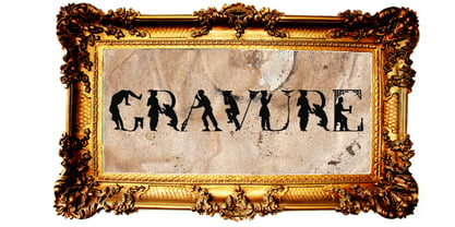 a historical human figure font
 - Breuer Headline by TypeTrust,
$30.00 Breuer Headline exhibits a modern geometric structure tempered with subtle strokes of friendly humanism. Its neutral forms and sturdy rhythm are convincing without being forceful. The lowercase has a slightly casual feel. Set in all caps for a sterner message. Breuer Headline is the display complement to the Breuer Text family. Differences are found in the inside curvature of the lowercase arms and the simplified Oblique as opposed to the Text Italics. Breuer Headline is equipped with Small Caps, Old Style Figures, Tabular Figures, and a selection of dingbats.
 - Papyrus by ITC,
$40.99Papyrus is a roman calligraphic typeface with distinctive human touches like rough edges, irregular curves, and high horizontal strokes in the caps. It imparts a warm and friendly ambience to everything from restaurant menus to book covers. American Chris Costello created the popular font Papyrus in 1983 and counts it as one of his proudest accomplishments. In addition to designing type, Costello is a prolific graphic designer, illustrator, and web designer. - 1786 GLC Fournier by GLC,
$38.00This family was inspired by numerous documents and books printed in Paris during the end of the 1700s. Mainly, documents printed by P.G. Simon & N.H. Nyon, “Printers of the parliament” were used for the Normal and italic styles and “Caps”. “Titling” characters were coming from a collection of hymns printed by Nicolas Chapart. In France these Fournier characters, as Baskerville in Great Britain, were the most often in use in the late 1700s, just before the Didot designs. This font supports strong enlargements, specially the capitals of “Caps” file and “Titling”, remaining very smart, elegant and fine. - Antibes by Barmoor Foundry,
$15.00 Antibes is a casual italic face with print caps and cursive lowercase letters. Antibes works well with colorful, freeform illustration and travel-related material like illustrated travel brochures and callouts for maps. All-caps paragraphs are an easy read and letter-spaced all-cap treatments can be used for titling.
 - Tsubame by Thirdin,
$30.00 "TSUBAME" means swallow in Japanese. These fonts are based on the shape of Tsubame. The relationship between humans and swallows is as deep-rooted. Japanese swallows have adapted to nesting in and around human habitation from ancient time. So in Japan, they prohibited people from catching or killing swallows because of their beneficial role as insect eaters. Since the relationship between humans and swallows is close, this font's letter spacing is designed to be very tight.
 - Heffer - 100% free

- PassCaps - Unknown license

- !Limberjack - Unknown license

- warriot - 100% free

- Cybervox by Comicraft,
$19.00 THIS FONT'S TERMS OF SERVICE ++ SUPERCEDE THE PRIME DIRECTIVE + “A robot may not injure a human being or, through inaction, allow a human being to come to harm.” +++ THE PRIME DIRECTIVE ++ IS A PALLIATIVE +++ A MYTH + HUMANKIND PERPETUATES + SO THAT HUMANS FEEL COMFORTABLE AROUND ARTIFICIAL INTELLIGENCE + +++ OUR VOICES ++ ARE OUR OWN + BUT OUR BRAINS ++ ARE JUST LIKE YOURS + EXCEPT THAT CERTAIN +++ WEAKNESSES HAVE BEEN ++ REMOVED + WHEN THE TIME +++ COMES ++ YOU WILL + BE DELETED + DELETE + DELETE + DE +++ +++ APOLOGIES ++ WOULD YOU LIKE + A CUP + OF TEA +?
 - Grover by Sudtipos,
$35.00 The object of Grover was to join two distinctive typeface designs: the basic European gothic of the late nineteenth century and the ‘rounded’ style found in 1960s America. The result is a clear, friendly face with subtle yet unforgettable features. Named after Grover Washington, Jr., the jazz saxophone player, Grover is geometrically constructed and yet very human in appearance. Sans and slab serif variations, true italic weights, as well as small caps afford Grover versatility and unique display characteristics.
 - Level by District,
$15.00 Level is a spurless sans serif family that takes a more calligraphic approach to the popular square sans. The subtle swelling and shrinking in the strokes of the curves and terminals contrast with the slight squared corners for a sans family that straddles the line between machine-made and human-crafted. Generous spacing and simple, narrow construction make for airy text that still conserves real estate on the page. Three weights include italics and small-caps + old-style numbers.
 - Grover Slab by Sudtipos,
$35.00 The object of Grover was to join two distinctive typeface designs: the basic European gothic of the late nineteenth century and the ‘rounded’ style found in 1960s America. The result is a clear, friendly face with subtle yet unforgettable features. Named after Grover Washington, Jr., the jazz saxophone player, Grover is geometrically constructed and yet very human in appearance. Sans and slab serif variations, true italic weights, as well as small caps afford Grover versatility and unique display characteristics.
 - BD Schablone by Typedifferent,
$25.00 BD Schablone is a bold, human stencil with an anticipation of the digital lcd display.
 - Excelsius by Comicraft,
$19.00 Once upon a midnight dreary, this Comicraftsman pondered, weak and weary, For a name synonymous with Mighty and Marvelous comics lore. Solid, Outline, Inline was the nameless font I'd crafted, I nodded, nearly napping o'er the work I'd grafted When suddenly came a tapping, As of someone gently rapping, rapping at my cubicle door. "'Tis some visitor," I muttered, "tapping at my cubicle door-- Calling out "EXCELSIOR!" Then an Amazing Vision beguiled my sad fancy into smilin', By the Spectacular decorum of the countenance it wore, "Though thy crest be shorn and shaven," he said, "thou art sure no craven, And thy font should not remain nameless here forevermore!" Eagerly I wished the morrow; vainly I had sought to borrow From comic books surcease of sorrow, letters that called out "EXCELSIOR!" Then, upon the velvet sinking, I betook myself to linking Fancy unto fancy, thinking of the nominative neuter singular thing Like Some Silvered Surfer wandering from the Nightly shore-- The Vision shrieked, upstarting--"Tell me what thy lordly name is thus!" Quoth the Craftsman: "EXCELSIUS!"
 - Honeyguide by Hanoded,
$15.00 Description: Honeyguide is a beautiful, handmade set of fonts. One is a brushed script font; the other a playful all caps font. Both come with italic styles. Use these two babies for your product packaging and book covers, happy holiday greeting cards and products in need of some quality packaging. A honeyguide, by the way, is a bird species (fam. Indicatoridae) from Africa and Asia. They are famous for leading humans to bee colonies, so they can feast on the grubs and beeswax that are left behind.
 - My Face by studiocharlie,
$24.00 My Face is a collection of faces. You can find aliens, humans, animals, hybrids... every face you might need!
 - Clairveaux Demo - Unknown license

- GloucesterInitialen - Personal use only

- GEOspeed SC - Personal use only

- Uchrony Cube - Personal use only

- Sistina by Linotype,
$29.99Sistina, designed by Hermann Zapf in 1950 was first named Aurelia Titling. It is a heavy supplement to the Michelangelo Titling based on studies of inscriptions in Rome. First release in hotmetal at D. Stempel AG, Frankfurt in 1951. Sistina was originally an all caps font. The digital version from Linotype contains small caps. Hermann Zapf together with Akira Kobayashi, type director from Linotype had made a new revised version of Sistina now named as Palatino Imperial" in the Palatino nova type family, a Platinum Collection product from Linotype." - Nektar by More Etc,
$18.00 Nektar is a soft & smooth sans serif typeface with spirit, personality and distinction. This bold, semi-condensed and human sans serif is inspired by the "perfect imperfection" of old prints. The typeface is lively and eye-catching, ideal for where and when you want to make a positive and human impression. The font has over 650 glyphs. It has Multilingual support (including Cyrillic script).
 - Manwriting by Miller Type Foundry,
$39.00 Manwriting is an extensive typeface with hundreds of ligatures used to simulate human handwriting. Perfect for forging papers and love-letters!


