7,199 search results
(0.015 seconds)
- Studio Brush by Hanoded,
$15.00 I really enjoy making brush fonts. I usually just get my Chinese ink and a bunch of brushes and start drawing glyphs. It took some time to get Studio Brush right, but I think spending that extra time paid off. Studio Brush is quite a neat brush font: the glyphs of this all caps font are of equal height (more or less) and complement each other perfectly. Studio Brush comes with double letter ligatures and some alternate glyphs.
 - Euroque by CozyFonts,
$20.00 Euroque is the 23rd font family from Cozyfonts Foundry, a California Foundry established in 2012 by designer and typographic illustrator Tom Nikosey Euroque began with pencil sketches, as all my fonts trace their beginnings. Influenced by European poster art of the 1920s and 1930s Euroque takes its name almost literally, European Style. These fonts are designed as a Small Caps Family, where the lower case mirrors the Upper case in design but its weights are compatible and consistent.
 - Komorebi by LiffeyType,
$9.00 Komorebi consists of handmade letters made with just a Stabilo pen. It is perfect for large scale texts and headlines. This font is suitable for posters, flyers, business cards or just a beautiful visual with a signature word. The family consists of three styles with both lower and upper case letters, accent characters and special characters. Though I personally recommend using all caps to give your words that bold touch, lower case works just as well!
 - Gunter by That That Creative,
$15.00 Gunter is a bold modern quirky half serif half sans serif display font that is in a category all on its own. it has a super-strong grounded horizontal present with playful cuts and loops inspired by 60's and 70's design. It was designed with Social Media in mind as it is sure to stand out. It comes with an alternate style set with more traditional caps if you don't want to get too crazy.
 - Ferghaus Sans by Fontdation,
$15.00 Introducing Ferghaus Sans, a modern sans serif font. This all-caps font is crafted with high attention to the details, gives you a clean and sharp feeling using it on your designs. Packed with so many OpenType features (such as alternate chars, swashes, ligatures, etc), lets you play and explore every possibilities with the letters combo. Ferghaus Sans is highly versatile, suits best for almost everything, whether you're working on classic themed design, or the modern ones.
 - Crowd Funded by Hanoded,
$15.00 Crowd Funded fonts wasn’t really crowd funded… In fact, all of the funding came from me, as I had to buy paper and a new pen to get this font going! Crowd Funded is an all caps display font, which I based on a recent font of mine called Longreach. Crowd Funded is narrower and rounder than Longreach and, in a way, more delicate. It comes with a generous amount of diacritics and basic Cyrillic as well!
 - Hammered by Ingrimayne Type,
$14.95 In Hammered all the letters are made up of hammers and an occasional nail. It is caps only, but the characters on the lower-case keys differ from those on the upper-case keys. It has a large set of accented characters. It is not often that one needs a typeface made of hammers and nails, but if one does, there is a font for that. For related, tool-based typefaces, see Screwged, NailsNStaples, and WrenchedLetters.
 - Flagstaff JNL by Jeff Levine,
$29.00Flagstaff JNL takes the lettering from Roma Initial Caps JNL and gives them the movement of an unfurled banner. For added effect, there are flagpoles facing in either direction on the lesser and greater keys. Left and right flag ends are placed on the parenthesis keys; a wide blank flag panel is on the left brace key and a narrow blank flag panel is on the right brace key. Letters only; no punctuation or extended characters. - Upside by Little Fonts,
$15.00 Upside is an all caps font. The design of the font is tied to historic golden ages gone by, but with a modern flair giving it a contemporary edge. It is a tall and condensed geometric sans serif, with four unique styles and appearances. Upside is a distinctive display font, perfect for headlines and headings across a range of formats such as graphic design posters, editorial pieces, or anything that needs that extra eye-catching touch.
 - Coltan Gea by deFharo,
$11.00 Coltan Gea is a Slab Serif typographic family with 6 Weights plus the italic versions all include small capital letters and cryptocurrency symbols. It is a geometric, minimalist typeface, with neo-grotesque modulations and slightly rounded corners. The typeface has alternative letters and numbers, small caps and advanced OpenType functions. The proportions, metrics and kerning I have configured meticulously for a perfect reading in any size. The complete package includes the roman version in VariableFont format.
 - Yeti by Glyphon,
$10.00 Yeti is tall and hand-drawn with a hint of calligraphy. It is quite possibly influenced by a yeti’s penmanship, but even that cannot be proven. Whether you enjoy writing or designing in all-caps or not, this font has something for you. Something furry. Yeti supports multiple languages and includes graphics and web icons to help get those creative juices flowing. Naturally, yetis love Easter egg hunts and being superstitious. This font is no exception.
 - The great by Sulthan Studio,
$14.00 The great display font. The great -This font is perfect for modern projects, quotes, shirt designs, websites, branding, children's designs, svg designs, blogs, logos, invitations and more! The great - includes alternative characters. Coded with Unicode PUA, which allows full access to all additional characters without having special design software. Mac users can use Font Book. Windows users can use the Character Map to view and copy one of the additional characters to paste into your favorite text editor.
 - MC Groben by Maulana Creative,
$15.00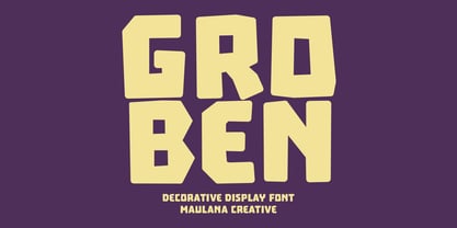 Groben is a All Caps Bouncy Sans Display font. Bold stroke, fun character with a bit of ligatures and alternates. To give you an extra creative work. Groben font support multilingual more than 100+ language. This font is good for logo design, Social media, Movie Titles, Books Titles, a short text even a long text letter and good for your secondary text font with script or serif. Make a stunning work with Groben font. Cheers, Maulana Creative
 - Winooski by Oddsorts,
$29.00 A little goofy, a little nerdy, Winooski mixes loose pen-drawn gestures with legible forms to deliver a playful workhorse. It’s packed with goodies like small caps, ligatures, case-sensitive alternates, and broad linguistic support. It also sports extras like two styles of catchwords that can be fired up by flanking the desired word with either asterisks or underscores and discretionary ligatures for pricing. There are even easter eggs in the OpenType features for the scavenger hunters among us.
 - Isbellium Pro by No Bodoni,
$35.00 Isbellium is a sans serif version of Dick Isbell’s Americana type, designed in 1967 and the last type cut in metal by the American Type Founders Co. (ATF). Isbellium retains the large x-height, open character, wide stance and elegance of Americana, but with a quieter voice and polite authority. Isbellium is a display face with broad Latin support along with small caps, fraction support and other typographic niceties are included in the ten font family.
 - Treasure Trove by Comicraft,
$19.00 X marks the spot -- and the height of the lower case letters -- in this cartographic calligraphy mapped out for you by lettering landlubber Jolly ’JG’ Roshell and his trusty crowquill. Mapquest "Mystery Island" and be sure to keep your eyes on those scurvy dogs that call themselves your crew, this font is spilling over with dubloons and pirate booty and it’s finders keepers! Artwork by Chris Bachalo from Captain Stoneheart and the Truth Fairy and Carlos Pacheco from Arrowsmith
 - Grover Slab by Sudtipos,
$35.00 The object of Grover was to join two distinctive typeface designs: the basic European gothic of the late nineteenth century and the ‘rounded’ style found in 1960s America. The result is a clear, friendly face with subtle yet unforgettable features. Named after Grover Washington, Jr., the jazz saxophone player, Grover is geometrically constructed and yet very human in appearance. Sans and slab serif variations, true italic weights, as well as small caps afford Grover versatility and unique display characteristics.
 - Donkeyman by Hanoded,
$15.00 A Donkeyman is a person who is in charge of a ship’s engine room. I didn’t know this, but when I was looking for a nice name for this font, I sort of stumbled upon it. Donkeyman font is quite a useful font: it is a handmade, all-caps font that comes with two sets of alternate glyphs. The alternates cycle as you type, creating a ‘random’ effect. Comes with extensive language support, including Sami and Vietnamese.
 - Bunga Pro by Graptail,
$15.00 Bunga is a serif typeface that gives a romantic feel to every curve. With 45 ligatures and alternates which are included, it is very helpful in creating the title of each of your projects such as film titles, book covers, branding, logos, packaging, magazines and more. Also supported PUA encoded. Simply copy and paste the alternate characters using the Character Map (Windows), Font Book (Mac) or a software program such as PopChar (for Windows and Mac).
 - Antemowa by Gatype,
$12.00 Antemowa is modern script font, where every single letter has been carefully crafted to make your text look beautiful. With a modern script style, this font will perfect for many different project such as: quotes, blog headers, posters, weddings, branding, logos, fashion, apparel, letters, invitations, stationery, and more. This font includes alternate glyphs and beautiful swirls How to access alternate glyphs: Windows Character Map: https://www.youtube.com/watch?v=BScPsiubM1k Adobe Illustrator: https://www.youtube.com/watch?v=y5XTaWYwWA4 Thanks for looking.
 - Mensura Slab by Graviton,
$20.00 Mensura Slab font family has been designed for Graviton Font Foundry by Pablo Balcells in 2013. It is a modular, geometric typeface with subtle rounded angles that provides a soft, pleasant appearance. It has been conceived to be primarily a display typeface, but given its clarity it can also be used for composing short and intermediate length texts. Mensura Slab consists of 8 styles and 4 weights plus italics. Each containing small caps and several alternate characters.
 - Salacious by PizzaDude.dk,
$18.00 Salacious is my soft/rough all-caps font, inspired by both comics and grafitti. The weight and width of the letters varies a bit. Not in a disturbing way, but more in a lively and organic way. I've added 5 (slightly) different versions of each letter (which automatically cycles as you type!) The letter shapes are a bit rough, due to the fact that they are handmade, and all corners are rounded, which gives a nice soft look!
 - Endurant by Baps Patil,
$15.00 Endurant is a font inspired by futuristic conceptual arts from the late-20th century. The question it answers is, "What if someone in the late 20th century were to imagine a futuristic font?" Endurant is a brave, all-caps display font. Because of what it's inspired by, it is suitable for futuristic and retro-modern designs in the modern-day world. It can be used for graphic design, poster design, web and mobile UI design—and many other applications.
 - Calla Script by Great Lakes Lettering,
$30.00 Calla is a scripted typeface with an interesting personality. Each letter was created many times so you can get a truly distinctive look to your designs. Notice when you type with open type feature switched on, your letters will bounce around and change as you type? This feature ensures you get a new version of each letter throughout the words you use! Want to get even more custom? Pair all caps words with your lowercase words to create hierarchy!
 - Mother VP by VP Creative Shop,
$20.00 Introducing Mother Serif Typeface - 5 fonts Mother is named after all the moms and children left behind. This typeface is feminine, fragile typeface with 5 fonts loaded with ligature glyphs, alternates and multilingual support to enchant your next project. Very versatile fonts that works great in large and small sizes. Mother is perfect for branding projects, home-ware designs, product packaging, magazine headers - or simply as a stylish text overlay to any background image. Uppercase, lowercase, numeral, punctuation & Symbol Light Regular Medium Bold Black ligature glyphs ab ac ad ae ag ai al am an ap ar as at au ba be bi bl bo br ca cc ce ch ci cl co cr cs ct cu da de di do dr ea ec ed ee ei el em en eo ep er es et eu fa fb ffb fh ffh fj fk ffk ft fft ga gi gl gn go gr ha he hi ho hy ic id ie il im in io ip ir is it iv ka ke la le li ll lo lu ma me mi mo mp na nc nd ni no nt oc od ol om op or os ot ou pa pe pi po ra rc rd re ri ro sh si sm sp su ta te th ti to tr ts tt ul um un ur us ut ff fi fl ffi ffl st alternates Multilingual support How to access alternate glyphs? To access alternate glyphs in Adobe InDesign or Illustrator, choose Window Type & Tables Glyphs In Photoshop, choose Window Glyphs. In the panel that opens, click the Show menu and choose Alternates for Selection. Double-click an alternate's thumbnail to swap them out. Feel free to contact me if you have any questions! Mock ups and backgrounds used are not included. Thank you! Enjoy!
 - Defense by Reserves,
$49.00 Defense is an unyielding rectangular slab-serif stencil face designed with consistently balanced letterforms and a refined finish. It’s extremely angular geometric form commands attention in display settings, yet is also legible in short text blocks. The stencil mark width varies accordingly with each weight, helping to further define each style. Numerous alternate character sets allow room for customization, while the expanded ligatures push letter combinations to the limit. Stylistically, Defense’s almost crude, sharp-cornered construction is balanced by it’s sophisticated finish and attention to detail, often unrealized in similar faces of this genre. The upright weights are complimented by pairings of true italics, completely rebuilt, slightly narrower in width with modified letterforms, increasing their contrast and flow. Features include: Precision kerning Standard Ligatures set including 'f' ligatures (fi, fl, ff, fh, fj, ffl, ffi, ffj) Discretionary Ligatures set including (ft, rt, ae, oe, st, ft, ct, oc, oo, ry, AE, OE, AL, TH, HE, AK, AN, TT, HD, AM, AP, AR, NF, NE, NH, NL, NB, FL, ND, FE, AB, OB, OD, OF, OG, OH, OK, OL, OM, ON, OO, OP, OQ, OR, OU, AH, UE, UF, UB, UD, UH, UK, UL, UM, UN, UP, UR, UU, MP, XY, YX, KY, WY, VY, AF, FF, FI) Alternate characters (O, o, S, s, a, h circumflex, @, ®, ™, ¶, $, &, _, and various ligature alternates) Case forms (shifts various punctuation marks up to a position that works better with all-capital sequences) Capital Spacing (globally adjusts inter-glyph spacing for all-capital text) Slashed zero Full set of numerators/denominators Automatic fraction feature (supports any fraction combination) Extended language support (Latin-1 and Latin Extended-A) *Requires an application with OpenType and/or Unicode support.
 - Waschkueche - 100% free

- Berlin Email - 100% free

- XAyax - 100% free

- cbe - 100% free

- Kandidat by Fontroll,
$30.00 Imagine being printer in the early nineteenth century, your stock isn’t the finest, your lead characters are worn out: Voilá Kandidat Rough. But wait, Kandidat isn’t the usual scan-an-old-book,-put-the-glyphs-in-a-font-and-you’re-done-font. Kandidat Rough has a variety of whopping 14 alternates for most characters. Our algorithm changes the letters automatically. All you have to do is turn on Contextual Alternates in your layout app. The algorithm is the best we’ve seen so far, and it’s so good that even same words appear in different forms. And should by coincidence words have the same glyphs, just assign a different Style Set to the first letter, and all other letters in the word will change as well (well, it depends a bit on your software). The mechanism isn’t perfect and maybe we stretched OpenType capabilities a bit over the top, but we yet haven’t seen any better routine for switching letters on the fly. Is it worth to mention that Kandidat Rough not only speaks English, but also German, French, Spanish, Dutch, Danish, Norwegian, Swedish, Croatian, Turkish and most likely some other languages? Maybe. To be sure whether your language is supported, this is the typeset of all letters: ABCDEFGHIJKLMNOPQRSTUVWXYZÀÁÂÃÄÅÆÇÈÉÊËÌÍÎÏÑÒÓÔÕÖØÙÚÛÜÝĆČĐĞ݌ފŸŽ abcdefghijklmnopqrstuvwxyzàáâãäåæçèéêëìíîïñòóôõöøùúûüýÿćčđğıœşšž Apart from that we also included the following punctuation and currency symbols: !"#$%&'()*+,-./:;?@[\]_{|}¡©«®°±¶·»¿×–—‘’‚“”„†•…‹›⁄≠☞ €¢$£¥ This sums up to nearly 3000 glyphs per font, and we have three of them: Regular, Italic and Bold. All neatly kerned. All in all a great repertoire for even the most demanding book or advert jobs with a look of old times. And now imagine you are sick of the rugged print experience Kandidat Rough delivers: go for Kandidat. This is our Scotch-ish ancestor the Rough version was made from. A sturdy, friendly, round, warm friend from the beginning of the nineteenth century. A bit dark, maybe. You will like it. Kandidat has the aforementioned type set plus complete Baltics, Eastern Europe and Cyrillic. Plus a couple of gimmicks like fleurons, stars, circled numbers, arrows, and, and, and… Kandidat Regular additionally has small caps for Latin based scripts (not Cyrillic). The spick and span Kandidat font set also consists of Regular, Italic and Bold cuts. The bold cut is on the very bold side and can nicely be used for headings, whereas Italic is a great companion for Regular. It took us some time and trouble to finish this project, but after all we are very proud of our little feat and hope you will enjoy Kandidat as much as we do. Enjoy!
 - Toby Font by Ingo,
$19.00 A playful handwriting of a child Twelve-year old Tobias Düsel designed the characters of this font in 2002 during his family’s furlough in the USA. He drew the alphabet freehand in pencil on a piece of stationery, and clearly had examples of the well-known college and military fonts in mind. The characters in their basic form are geometrically thought out, as well as the construction of the shadows. But remarkably, while drawing, Tobias Düsel did not reach for the obvious aid of a ruler. In fact, the strokes of the letters are not linear, rather are recognizably well-balanced with declining and increasing straights as can be seen in polished classical fonts. Originally this font consists only of upper case letters — all other characters (punctuation marks, figures and similar) have been modified from the components of the capital letters. Complementary to the original Outline-Shadow-Version TobyFont Empty, the variations TobyFont Inside and TobyFont Full are also available. ”Empty“ is, so to speak, the frame of the typeface as “Inside” is the filling, and “Full” is the sum of both. All three versions have the exact same body size so that they can be placed over one another congruently. In this way the effect of a font in two or three colors can be attained. TobyFont is excellently suitable for designing “picturesque” or “hand-carved” contents; large weights are especially charming and striking.
 - Avenir Next Georgian by Linotype,
$49.00 The original Avenir typeface was designed by Adrian Frutiger in 1988, after years of having an interest in sans serif typefaces. The word Avenir means “future” in French and hints that the typeface owes some of its interpretation to Futura. But unlike Futura , Avenir is not purely geometric; it has vertical strokes that are thicker than the horizontals, an “o” that is not a perfect circle, and shortened ascenders. These nuances aid in legibility and give Avenir a harmonious and sensible appearance for both texts and headlines. In 2012, Akira Kobayashi worked alongside Avenir’s esteemed creator Adrian Frutiger to bring Avenir Next to life, as a new take on the classic Avenir. The goal of the project was to take a beautifully designed sans and update it so that its technical standards surpass the status quo, leaving us with a truly superior sans family. Since then, Monotype expanded the typeface to accommodate more languages. Akira’s deep familiarity with existing iterations of the Frutiger designs, along with his understanding of the design philosophy of the man himself, made him uniquely suited to lead the creation of different language fonts. Avenir Next World family, the most recent release from Monotype, is an expansive family of fonts that offers support for more than 150 languages and scripts that include Latin, Cyrillic, Greek, Hebrew, Arabic, Georgian, Armenian and Thai. Avenir Next World contains 10 weights, from UltraLight to ExtraBlack.
 - Lux by URW Type Foundry,
$35.99 Many times, when a new creative process is starting, it is triggered by an everyday action or item. In this case, the looks of a lady’s watch inspired Michael Herold to create his new typeface LUX. The sight of the chronograph sparked associations of the 1950s in Mr. Herold: While this decade was predominantly dominated by brush and feather scripts, there was also a bloom of strict and modern architecture. This special mix of strength and retro style is exactly what Michael Herold is trying to capture in his LUX. The result is a typeface which is perfectly suitable for use on book covers, posters and claims – thanks to its striking impression. The name LUX, Latin for light, is inspired by the high bright-dark contrast within the individual characters. Oft sind es alltägliche Gegenstände, die das Bestreben eines neuen kreativen Prozesses auslösen. So entspringt auch die Inspiration zur Erschaffung der LUX von Michael Herold dem Anblick einer Damenuhr. Der Chronograph löste bei Herrn Herold Assoziationen zu den 1950er Jahren aus: Während diese Zeit hauptsächlich von Schreibschriften aus Federn und Pinseln beherrscht wurde, nahm auch die streng und modern anmutende Architektur starken Einfluss auf die Epoche. Diese Mischung aus Strenge und 50er Jahre Retro-Stil soll in der LUX zum Ausdruck kommen. Das Ergebnis ist eine Schrift, die sich mit ihrer plakativen Wirkung perfekt für Buchumschläge, Poster und Claims eignet. Namensgebend war der starke hell-dunkel Kontrast innerhalb der Schrift – festgehalten in dem lateinischen Wort für Licht.
 - Distefano Slab by Tipo,
$60.00 Designed from the perspective of a multi-purpose font family, comprehending the slab-serif and humanist-sans subtypes, the Distéfano typefaces were specifically developed and subsequently tested considering the needs of editorial products, for both print and digital media. Includes a comprehensive program where formal, style, thickness and slant attributes are especially indicated for the composition of text and headings in newspapers, journals and magazines. For that reason, in addition to the more traditional weights, others, ranging from Light to Black were added. The identity and systemic criteria of this font family doesn’t fall short on diversity of specific solutions, flair and quirks for each variant, especially noticeable in the contrast of the italics to the roman styles. The original drawings of Distéfano date back to 1983; embodied in pencil on paper, provided only the alphabetical characters and punctuation signs for Spanish, and the Sans Serif family. By digitalizing them, their possibilities of use were widened, the set of characters of each typeface were considerably completed considering the current requirements for the majority of the latin and germanic languages, and the slab-serif family was developed. This type family bears the name of the most notable argentinian designer, and it is a homage to his work, that influenced the youth of the 50’s decade of the 20th century, and especially to him, whom I have always recognized as a friend, and a teacher.
 - Distefano Sans by Tipo,
$60.00 Designed from the perspective of a multi-purpose font family, comprehending the slab-serif and humanist-sans subtypes, the Distéfano typefaces were specifically developed and subsequently tested considering the needs of editorial products, for both print and digital media. Includes a comprehensive program where formal, style, thickness and slant attributes are especially indicated for the composition of text and headings in newspapers, journals and magazines. For that reason, in addition to the more traditional weights, others, ranging from Light to Black were added. The identity and systemic criteria of this font family doesn’t fall short on diversity of specific solutions, flair and quirks for each variant, especially noticeable in the contrast of the italics to the roman styles. The original drawings of Distéfano date back to 1983; embodied in pencil on paper, provided only the alphabetical characters and punctuation signs for Spanish, and the Sans Serif family. By digitalizing them, their possibilities of use were widened, the set of characters of each typeface were considerably completed considering the current requirements for the majority of the latin and germanic languages, and the slab-serif family was developed. This type family bears the name of the most notable argentinian designer, and it is a homage to his work, that influenced the youth of the 50’s decade of the 20th century, and especially to him, whom I have always recognized as a friend, and a teacher.
 - P22 Klauss Kursiv by IHOF,
$29.95 P22 Klauss Kursiv is the first ever digital revival and expansion of the last face Karl Klauß designed for the Genzsch & Heyse foundry in Stuttgart before he died in 1956. Karl Klauß’s classical training in the graphic arts gave him solid chops to use as a springboard for design ideas that remained relevant among the countless trends fleeting around the turmoil of two world wars. By the mid-1950s, a kind of ornamental deco aesthetic was well on its way into mainstream design in post-war Europe, and demand was high for unique, lively and non-minimal ad faces. Klauß, a reliable designer with a proven track record of calligraphic faces, pushed the envelope on his own calligraphy and designed something that packages elegance in a boldness seldom seen before in luxury scripts. Quite a bit of talent is on display in Klauss Kursiv. In spite of the restraint this kind of design imposes on itself almost by default, the interplay between thick and thin never seems forced or challenging. Clear, natural strokes build a compact alphabet that demonstrates the wrist control of a veteran calligrapher. Creative nib angling segues into very clever start-and-stop constructs to make attractive forms that work quite well together, yet stand well to individual scrutiny. P22 Klauss Kursiv comes with a load of built-in alternates and ligatures in a font of over 470 glyphs, providing extended support for Latin languages.
 - Cornelius by Artcity,
$19.00 Cornelius is a playful hand-drawn font family designed by Daniel Bak (Artcity). It is available in three handy weights: regular, bold and screaming. It contains international language accent marks and diacriticals, including Greek and Cyrillic in both OTF and TTF formats. Font family name is inspired by the main male ape character from the 1968 science fiction film Planet of the Apes and Pierre Boulle novel of the same name. Boulle published his La Planète des singes in 1963, which was originally translated in 1964 as Monkey Planet by Xan Fielding, and later re-issued as Planet of the Apes . Dr. Cornelius is a chimpanzee archaeologist and historian who appears in the original novel, and also the first three installments of the classic movie series, from the 1960s and 1970s. He was portrayed mainly by actor Roddy McDowall, but also by David Watson.
 - Yiggivoo - Unknown license

- Morris Sans by Linotype,
$40.99 Morris Sans is a newly revised and extended version of a small geometric family of typefaces originally produced by Morris Fuller Benton in 1930 for ATF. His initial design consisted of an alphabet of squared capital letters with a unique twist that characterized its appearance: corners with rounded exteriors and right-angle interiors. The types were intended for use in the fine print found on business cards, banking or financial forms, and contracts. But over the ensuing decades, this design became a popular element in all sorts of design environments, and several foundries revived the typeface in digital form. Since digital fonts are bicameral, with slots for both upper and lowercase letters, new cuts of the type opted filled the lowercase slots with small caps. In 2006, Linotype commissioned its own version of the typeface-an extension for 21st century use. Under the advisement of Linotype's type director Akira Kobayashi, Dan Reynolds redrew the uppercase and added an original lowercase for the first time. Additionally, a number of extras were brought into the fonts, including six figure styles (tabular and proportional lining figures, tabular and proportional oldstyle figures, and special tabular and proportional small cap" figures). Small caps, which have become an iconic element over time, are accessible in each font as an OpenType feature. To differentiate this version from the original, Linotype's new family is named Morris Sans, in honor of Morris Fuller Benton. All fonts in the Morris Sans family are OpenType Com fonts; they include a character set capable of setting 48 European languages that employ the Roman alphabet, including all Central and Eastern Europe languages, those from the Baltics, and Turkish. This glyph coverage extends to the small caps as well. Morris Sans is a wide typeface, especially in its regular widths; the condensed faces set a more conventional line of text. The new lowercase letters are less geometric than the uppercase, except for those that share the same basic forms (e.g., c, o, and s). Instead of following this geometric trend, the new lowercase tends to strengthen the humanist elements that were present in several characters from the original type, including the uppercase D and the figures 5, 6, and 9. Morris Sans also sports a number of glyphic flares, like the stroke found on the original uppercase Q. Morris Sans is a clean, modern design best suited for headlines, advertising, posters, expressive signage (especially on storefronts), and corporate identity work."


