1,690 search results
(0.022 seconds)
- Hugest by Graphicxell,
$19.00 This typeface encapsulates a rhythm that is symmetrical and balanced due to a unique mix of different sources of inspiration. Proportions are precisely adjusted with subtle contours and subtle contrasts. These shapes give the font an attractive look without compromising on elegance and minimalism, ensuring that any glyph will work well in any graphic design purpose such as brochures, videos, advertising branding, logos, magazines, layout designs, posters, post templates, games and others
 - Kunst by Matt Grey Design,
$24.00Inspired by European brutalist design aesthetic, Kunst strives for form dominated by pure geometric precision, utilising 45° angles based on a strict grid. See the PDF specimen | Also available in Rounded and Imprint styles. Covers Western and Cyrillic character sets with a full range of Smallcaps. Includes Tabular Figures, Standard and Discretionary Ligatures, and Contextual Alternates such as arrows, Smart Quotes, and German Capital Eszett/scharfes (Sharp s). - Zan Zan by Pitt's Hand,
$20.00 A fun font to create pop and young graphics, with a non-obvious font created starting from a handcrafted line. For an urban, snappy and fresh result.
 - Zar - Unknown license

- Zapped - Unknown license

- Zag - Unknown license

- Zapped by Cool Fonts,
$24.00 Zapped is a grungy font with a sort of extruded look. I was working on a poster for the punk band MAXILLA (they are hot check'm out). It looks like it came out of a war zone. Abuse it!
 - Zag by Fontfabric,
$25.00 Zag is a custom sans font which is applicable for any type of graphic design - web, print, motion graphics etc and perfect for t-shirts and other items.
 - ZAP by Wannatype,
$9.90 ZAP is an all-caps monospaced and (almost) monolined typeface family. ZAP comes along in square and round shape, 2 widths (ZAP 360 and ZAP 500), and 8 weights. ZAP also offers Slant and BAckslant styles. ZAP covers multiple languages with Extended Latin. Even complete Greek alphabets are part of the ZAP keymap.
 - Kab by Typo5,
$16.95Kab has a big impact, is very legible and at the same time has plenty of details that makes it really unique. Perfect for headers and display, it also can be used at smaller sizes and even as a body text with great results. Complete character set. - Fab by Canada Type,
$24.95 It's 1984 and everything has sideburns. Shoulder-padded "dress for success" is in, with power suits for women, black and white layers for men, neon brights for the youngsters. Maggie's "enemy within" and "no society" speeches preface the arrival of shopping malls and corporate status symbols. The economy is a philosophy and accountants carry ambiguous but very sophisticated-sounding titles. Thousands of words and expressions are reduced to initials or monosyllabic sounds. Synthesizers are very refined and the music is very catchy. The Macintosh and MTV are making waves. Brands are lifestyles. "Yuppy," Yummy," "Bobo," "Dinky" and "Woopie" are standard consumer categories in advertising lingo. The Volkswagen identity, only 5 years old now, is all the rage in design. VAG Rundschrift, by all appearances a rounded and slightly condensed Futura, is everywhere. Tube design is king. Fast forward two dozen years. Replay, but bigger and much louder. Fab. Let's dance. Fab is Canada Type's tribute to the Eighties. It's a five-font unicase family that brings tube design into the 21st century. The main font is an all-in-one treatment of the shiny roundness that the 1980s were. Fab White is a tightly packed thick outline font that conveys luscious contentedness like nothing else. The Fab Trio package is very useful for layered and colorful design, with the Black style serving as a backdrop, the Bold style as the front forms, and the Fill style for inlining. Fab comes in all popular formats and contains support for Western, Central and Eastern European languages, as well as Baltic, Esperanto, Maltese, Turkish and Celtic/Welsh languages.
 - Humanist 970 by Bitstream,
$29.99Bitstream's version of Adsans originally released by Linotype & Machinery. - Humanist 521 by ParaType,
$30.00 Humanist 521 is a Bitstream digitized version of Gill Sans typeface. The font was designed by Eric Gill and released by Monotype circa 1928-1930. Gill’s design is based on the typeface of Edward Johnston, the innovative British letterer and teacher, designed in 1916 for the signage of the London Underground. However, it has more classical proportions close to those of old style serifs, and thus is more suitable for text setting. With distinct roots in handwritten scripts, Gill’s typeface is classified as a humanist sans serif and is very legible and readable in text and display work. Having been released more than 80 years ago, it’s still very popular and in fact is an icon of British typographic style. The Cyrillic version of Ultra Bold weight was designed by Tagir Safaev in 1997. Six text styles and Extra Bold style in Cyrillic were designed later by Vladimir Yefimov and Isabella Chaeva. The Cyrillic version, in addition to the original Bitstream implementation of Humanist 521, has an alternative numeral 1 with the traditional shape and a set of old-style figures. Rereleased by ParaType in 2013.
 - Trivia Humanist by Storm Type Foundry,
$53.00 I decided to draw the Regular style of Trivia Humanist not too light and the Bold not too dark. Delicate anatomy and moderate contrasts of serifed humanist typefaces aren’t usually born by interpolating between extremes, but rather by meticulous care for each individual letter. A delicious blend of a trace of punchcutter’s tool and calligrapher’s hand with as few historical reminiscences as possible. It stays away from any strong aesthetic colorations as well, which is a common feature of the Trivia family system. I wanted a clear and majestic typeface for book jackets, LP cover designs, posters, exhibition catalogues and shorter texts. But at the end it turned out excellent for largest books as well.
 - Humanist 521 by Bitstream,
$29.99
- Humanist 777 by Bitstream,
$29.99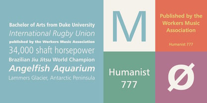
- FF Humanist by FontFont,
$47.99 German type designer Jürgen Brinckmann created this blackletter FontFont in 1993. The font is ideally suited for advertising and packaging, poster and billboards as well as software and gaming. FF Humanist provides advanced typographical support with features such as ligatures, small capitals, alternate characters, case-sensitive forms, and stylistic alternates. It comes with proportional oldstyle figures.
 - Humanist 531 by Bitstream,
$29.99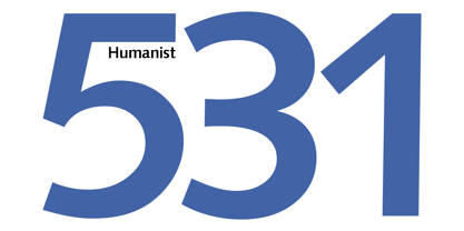
- Humanist 531 by ParaType,
$30.00Humanist 531 is the Bitstream version of Syntax (Stempel, 1968) by Hans Eduard Meier. A humanist sans serif typeface with an optically even thickness of the line which interprets a humanist old style type of the Renaissance. Its vertical strokes are inclined to the right by one degree. Serves well in text and display typography. Cyrillic version was developed at ParaType in 1999 by Isay Slutsker and Manvel Shmavonyan and was awarded Diplomae at Kirillitsa'99 and "bukva:raz!" type design contests. - Kunst Rounded by Matt Grey Design,
$24.00Inspired by European brutalist design aesthetic, Kunst strives for form dominated by pure geometric precision, utilising 45° angles based on a strict grid. See the PDF specimen | Also available in Normal and Imprint styles. Covers Western and Cyrillic character sets with a full range of Smallcaps. Includes Tabular Figures, Standard and Discretionary Ligatures, and Contextual Alternates such as arrows, Smart Quotes, and German Capital Eszett/scharfes (Sharp s). - Kunst Imprint by Matt Grey Design,
$24.00Inspired by European brutalist design aesthetic, Kunst strives for form dominated by pure geometric precision, utilising 45° angles based on a strict grid. See the PDF specimen | Also available in Normal and Rounded styles. Covers Western and Cyrillic character sets with a full range of Smallcaps. Includes Tabular Figures, Standard and Discretionary Ligatures, and Contextual Alternates such as arrows, Smart Quotes, and German Capital Eszett/scharfes (Sharp s). - Zapped Sticks - Personal use only

- Secret Labs - Unknown license

- Lab Mix - Unknown license

- Lab Bats - Unknown license

- Rad Zad - Unknown license

- Zar Condensed by SzarDesign,
$19.95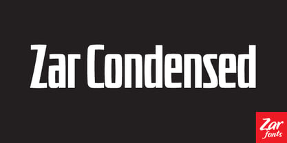
- Dirty Jab by PizzaDude.dk,
$15.00 Using Dirty Jabfor your graphical adventures is like having brunch when being hungry! The surface of the font is actually kind of grunge. Use the font at large sizes with reveal the authentic worn look. Comes with extensive language support and 6 contextual alternates that automatically cycles as you type!
 - Crab Labs by Mightyfire,
$15.00 Crab Labs exudes a refined and modern aesthetic, characterized by its sleek and minimalistic design. This typeface features slender, unembellished letterforms that convey a sense of elegance and simplicity. The absence of serifs, or decorative strokes, imparts a clean and contemporary appearance, making it well-suited for a variety of design applications.
 - FF Zan by FontFont,
$41.99 French type designer Albert Boton created this display FontFont in 2002. The font is ideally suited for advertising and packaging, music and nightlife as well as poster and billboards. FF Zan provides advanced typographical support with features such as ligatures, alternate characters, and case-sensitive forms. It comes with proportional lining figures.
 - Zar Casual by SzarDesign,
$19.95 ZarCasaul has a soft side with a bouncy attitude. Informal font works for taglines to logos, inspired by my background in showcard lettering.
 - Zap Bats by Elemeno,
$10.00 - Zar Brush by SzarDesign,
$19.95 ZarHand began as my "speedball" showcard lettering font, used when the boss brought in a pile of urgent work at the end of the day. We would get out our "4 o'clock brushes" hoping to finish at a reasonable hour.
 - Fab Figures by Letterwerk,
$10.00 Fab Figures is a numbers-only font. This high contrast display font family with curly terminals is a great choice for infographics and posters. The entire font family consists of 10 styles: 2 styles for big usage, 2 styles for normal usage, 2 styles for small usage and 3 patterned styles (fitting to the big styles). Character Set: 1 2 3 4 5 6 7 8 9 0 | % # • ~ { $ £ € } . , : ; + - = ÷ / ° * ' ’ (Arrows) (No-Symbol) (Nr-Symbol)
 - FF Mab - Personal use only

- Cal Humanist Minuscule by Posterizer KG,
$16.00 Calligrapher Humanist Minuscule Font, is one of the calligraphic group of fonts called “21 Alphabets for Calligraphers“. All graphemes are taken from calligraphic pages written in traditional Humanist Minuscule calligraphic style. This font is ideal for calligraphic sketches or for imitation of ancient manuscripts. Font contains all the Latin glyphs.
 - Humanist Slabserif 712 by Bitstream,
$29.99 - Zapf Humanist 601 by Bitstream,
$29.99
- ITC Stone Humanist by ITC,
$40.99 Type designers have been integrating the design of sans serifs with serifed forms since the 1920s. Early examples are Edward Johnston's design for the London Underground, and Eric Gill's Gill Sans. These were followed by Jan van Krimpen's Romulus Sans, Frederic Goudy's ITC Goudy Sans, Hermann Zapf's Optima, Hans Meier's Syntax and Adrian Frutiger's Frutiger. Now, ITC Stone Humanist joins this tradition. It is a careful blend of traditional sans serif shapes and classical serifed letterforms. ITC Stone Humanist grew out an experiment with the medium weight of ITC Stone Sans, a design that already showed a relationship to these sans serif-serif hybrids. ITC Stone Sans has proportions based on those of ITC Stone Serif, and its thick-and-thin stroke contrast suggests the bloodline of humanistic sans serif typefaces. But other aspects of ITC Stone Sans are more closely aligned to the gothics and grotesques, a tradition that accounts for the largest portion of sans serif designs. Enter ITC Stone Humanist. During his experiments with the earlier design, Sumner Stone recalls, I was actually quite surprised at how seemingly subtle changes transformed the face," moving the design firmly into the humanist tradition. "The form of the 'g,' 'l,' 'M,' 'W,' and more subtly the 'a' and 'e' are part of the restructuring of the family," he explains. The top endings of vertical lower case strokes have been cropped on an angle, as have the ascender and descender stroke endings. ITC Stone Humanist is a full-fledged member of the ITC Stone family. It has been produced with the same complement of weights, and the x-heights, proportions, and underlying character shapes are completely compatible with the three original designs. The original ITC Stone Sans is a popular typeface, in part because of its notable versatility. ITC Stone Humanist shares this virtue, and can be used successfully at very small sizes, in long passages of text copy, and even as billboard-sized display type."
 - Cal Humanistic Cursive by Posterizer KG,
$16.00 Calligrapher Humanistic Cursive is one of the calligraphic group of fonts called “21 alphabets for Calligraphers“. All graphemes are taken from calligraphic pages written on traditional cursive calligraphic stile. This font is ideal for calligraphic sketches or for imitation of ancient manuscripts. It contains all the Latin and specially-created Cyrillic glyphs.


Page 1 of 43Next page