10,000 search results
(0.017 seconds)
- DIN Next Shapes by Monotype,
$29.99 Sabina Chipară's DIN Next Shapes typeface is a twist on the original German industrial classic, taking its skeleton and re-clothing it in dots, hearts, snowflakes and stars. The design offers a more approachable and whimsical tone of voice than the original, while maintaining all the legibility and clarity of form that makes DIN Next such a reliable and versatile design. It works in harmony with DIN Next, and is particularly suited for designers looking to be a little more expressive. DIN Next Shapes includes four fonts: Dots, Flakes, Hearts and Stars, and has pan European language support including Greek and Cyrillic. It also has OpenType features including stylistic alternatives, ligatures and fractions.
 - Vin Mono Pro by Mint Type,
$35.00 Vin (translated from Ukrainian as “he”) is a superfamily consisting of three robust typefaces with pronounced vertical stems and rounded corners. All three typefaces feature very large x-height for even more expression and assertiveness. Vin Mono Pro is a squarish monospaced font family with extra-large x-height and rounded corners. It is characterized by evident straight elements even in horizontal stems. Be sure to check other two typefaces of Vin superfamily: Vin Sans Pro and Vin Slab Pro .
 - Ein Karem MF by Masterfont,
$59.00 - PF DIN Serif by Parachute,
$36.00 DIN Serif: Specimen Manual PDF The DIN Type System: A Comparison Table This is the first ever release of a true serif companion for the popular DIN typeface. DIN Serif originated in a custom project for a watchmaking journal which required a modern serif to work in unison and match the inherent simplicity of DIN. As a result, a solid, confident and well-balanced typeface was developed which is simple and neutral enough when set at small sizes, but sturdy and powerful when set at heavier weights and bigger sizes. It utilizes the skeleton of the original DIN and retains its basic proportions such as x-height, caps height and descenders, whereas ascenders were slightly increased. DIN Serif makes no attempt to impress with ephemeral nifty details on individual letters, but instead it concentrates on a few modern, functional and everlasting novelties which express an overall distinct quality on the page and set it apart from most classic romans. This is a low contrast typeface with vertical axis and squarish form which brings out a balance between simplicity and legibility. Its narrow proportions offer economy of space which is critical for newspaper body text and headlines. At small sizes the text has an even texture, it is comfortable and highly readable. The serifs are narrow at heavy weights and when tight typesetting is applied at large sizes, the heavier weights become ideal for headlines. DIN Serif was inspired by late 19th century Egyptian and earlier transitional roman faces. Bracketed serifs were placed on the upper part of the letterforms (this is where we mostly concentrate our attention when we read) whereas small clean square serifs were placed on and under the baseline to simplify the letterforms. In order to reduce visual tension at the joins and make reading smooth and comfortable, a slight hint of bracketed serif was added at the joins in the form of a subtle angular tapered serif, which softens the harsh angularity. These angular tapered serifs tend to disappear at smaller sizes (or smooth out the joins) but stand out at bigger sizes exuding a strong, modern and energetic personality. What started out as a custom 2 weight family, it has developed into a full scale superfamily with 10 styles from Regular to ExtraBlack along with their italics. Additional features were added such as small caps, alternate letters and numbers as well as numerous symbols for branding, signage and publishing. All weights were meticulously hinted for excellent display performance on the web. Finally, DIN Serif supports more that 100 languages such as those based on the Latin, Greek and Cyrillic alphabet.
 - Vin Sans Pro by Mint Type,
$35.00 Vin (translated from Ukrainian as “he”) is a superfamily consisting of three robust typefaces with pronounced vertical stems and rounded corners. All three typefaces feature very large x-height for even more expression and assertiveness. Vin Sans Pro is a quite narrow rigid sans-serif typeface with extra-large x-height and rounded corners. It is perfect for any kind of short copy with lots of attention guaranteed. Be sure to check other two typefaces of Vin superfamily: Vin Slab Pro and Vin Mono Pro .
 - PF DIN Text by Parachute,
$79.00 The purpose of the original DIN 1451 standard was to lay down a style of lettering which is timeless and easily legible. Unfortunately, these early letters lacked elegance and were not properly designed for typographic applications. Ever since its first publication in the 1930’s, several type foundries adopted the original designs for digital photocomposition. By early 2000, it became apparent that the existing DIN-based fonts did not fulfil the ever-increasing demand for a diverse set of weights and additional support for non-Latin languages. Parachute® was set out to fill this gap by introducing the PF DIN series which has become ever since the most comprehensive and sophisticated set of DIN typefaces. It was based on the original standards but was specifically designed to fit typographic requirements. Its letterforms divert from the stiff geometric structure of the original and introduce instead elements which are familiar, softer and easier to read. The first set of fonts was completed in 2002 as a group of 3 families which included condensed and compressed versions. With its vast array of weights, the extended language support, but most of all its meticulous and elaborate design, it has proved itself valuable to numerous design agencies around the world. Ever since its first release, it has been used in diverse editorials, packaging, branding and advertising campaigns as well as a great number of websites. It was quoted by Publish magazine as being “an overkill series for complex corporate identity projects”. The whole PF DIN Text type system (with normal, condensed and compressed styles) includes 45 weights from Hairline to Extra Black including true-italics. Additionally, every font in the Pro series is powered by 270 very useful symbols for packaging, environmental graphics, signage, transportation, computing, fabric care. There are 2 versions to choose from: The PRO version is the most powerful. All weights support Latin, Cyrillic, Greek, Central/Eastern European, Romanian, Baltic and Turkish, with 20 advanced opentype features including small caps. The standard STD version is more economic. All weights support Latin, Central/Eastern European, Romanian, Baltic and Turkish, with 18 advanced opentype features including small caps. In 2010 Parachute® released 4 new families DIN Monospace, DIN Stencil, DIN Text Arabic and DIN Text Universal. All these are complemented by the popular DIN Display version. Altogether the Parachute DIN series is a set of 8 superfamilies with a total of 96 weights.
 - DIN Next Devanagari by Monotype,
$103.99DIN Next is a typeface family inspired by the classic industrial German engineering designs, DIN 1451 Engschrift and Mittelschrift. Akira Kobayashi began by revising these two faces-who names just mean ""condensed"" and ""regular"" before expanding them into a new family with seven weights (Light to Black). Each weight ships in three varieties: Regular, Italic, and Condensed, bringing the total number of fonts in the DIN Next family to 21. DIN Next is part of Linotype's Platinum Collection. Linotype has been supplying its customers with the two DIN 1451 fonts since 1980. Recently, they have become more popular than ever, with designers regularly asking for additional weights. The abbreviation ""DIN"" stands for ""Deutsches Institut für Normung e.V."", which is the German Institute for Industrial Standardization. In 1936 the German Standard Committee settled upon DIN 1451 as the standard font for the areas of technology, traffic, administration and business. The design was to be used on German street signs and house numbers. The committee wanted a sans serif, thinking it would be more legible, straightforward, and easy to reproduce. They did not intend for the design to be used for advertisements and other artistically oriented purposes. Nevertheless, because DIN 1451 was seen all over Germany on signs for town names and traffic directions, it became familiar enough to make its way onto the palettes of graphic designers and advertising art directors. The digital version of DIN 1451 would go on to be adopted and used by designers in other countries as well, solidifying its worldwide design reputation. There are many subtle differences in DIN Next's letters when compared with DIN 1451 original. These were added by Kobayashi to make the new family even more versatile in 21st-century media. For instance, although DIN 1451's corners are all pointed angles, DIN Next has rounded them all slightly. Even this softening is a nod to part of DIN 1451's past, however. Many of the signs that use DIN 1451 are cut with routers, which cannot make perfect corners; their rounded heads cut rounded corners best. Linotype's DIN 1451 Engschrift and Mittelschrift are certified by the German DIN Institute for use on official signage projects. Since DIN Next is a new design, these applications within Germany are not possible with it. However, DIN Next may be used for any other project, and it may be used for industrial signage in any other country! DIN Next has been tailored especially for graphic designers, but its industrial heritage makes it surprisingly functional in just about any application. The DIN Next family has been extended with seven Arabic weights and five Devanagari weights. The display of the Devanagari fonts on the website does not show all features of the font and therefore not all language features may be displayed correctly. - DIN Next Cyrillic by Monotype,
$65.00DIN Next is a typeface family inspired by the classic industrial German engineering designs, DIN 1451 Engschrift and Mittelschrift. Akira Kobayashi began by revising these two faces-who names just mean ""condensed"" and ""regular"" before expanding them into a new family with seven weights (Light to Black). Each weight ships in three varieties: Regular, Italic, and Condensed, bringing the total number of fonts in the DIN Next family to 21. DIN Next is part of Linotype's Platinum Collection. Linotype has been supplying its customers with the two DIN 1451 fonts since 1980. Recently, they have become more popular than ever, with designers regularly asking for additional weights. The abbreviation ""DIN"" stands for ""Deutsches Institut für Normung e.V."", which is the German Institute for Industrial Standardization. In 1936 the German Standard Committee settled upon DIN 1451 as the standard font for the areas of technology, traffic, administration and business. The design was to be used on German street signs and house numbers. The committee wanted a sans serif, thinking it would be more legible, straightforward, and easy to reproduce. They did not intend for the design to be used for advertisements and other artistically oriented purposes. Nevertheless, because DIN 1451 was seen all over Germany on signs for town names and traffic directions, it became familiar enough to make its way onto the palettes of graphic designers and advertising art directors. The digital version of DIN 1451 would go on to be adopted and used by designers in other countries as well, solidifying its worldwide design reputation. There are many subtle differences in DIN Next's letters when compared with DIN 1451 original. These were added by Kobayashi to make the new family even more versatile in 21st-century media. For instance, although DIN 1451's corners are all pointed angles, DIN Next has rounded them all slightly. Even this softening is a nod to part of DIN 1451's past, however. Many of the signs that use DIN 1451 are cut with routers, which cannot make perfect corners; their rounded heads cut rounded corners best. Linotype's DIN 1451 Engschrift and Mittelschrift are certified by the German DIN Institute for use on official signage projects. Since DIN Next is a new design, these applications within Germany are not possible with it. However, DIN Next may be used for any other project, and it may be used for industrial signage in any other country! DIN Next has been tailored especially for graphic designers, but its industrial heritage makes it surprisingly functional in just about any application. The DIN Next family has been extended with seven Arabic weights and five Devanagari weights. The display of the Devanagari fonts on the website does not show all features of the font and therefore not all language features may be displayed correctly. - DIN Next Paneuropean by Monotype,
$92.99DIN Next is a typeface family inspired by the classic industrial German engineering designs, DIN 1451 Engschrift and Mittelschrift. Akira Kobayashi began by revising these two faces-who names just mean ""condensed"" and ""regular"" before expanding them into a new family with seven weights (Light to Black). Each weight ships in three varieties: Regular, Italic, and Condensed, bringing the total number of fonts in the DIN Next family to 21. DIN Next is part of Linotype's Platinum Collection. Linotype has been supplying its customers with the two DIN 1451 fonts since 1980. Recently, they have become more popular than ever, with designers regularly asking for additional weights. The abbreviation ""DIN"" stands for ""Deutsches Institut für Normung e.V."", which is the German Institute for Industrial Standardization. In 1936 the German Standard Committee settled upon DIN 1451 as the standard font for the areas of technology, traffic, administration and business. The design was to be used on German street signs and house numbers. The committee wanted a sans serif, thinking it would be more legible, straightforward, and easy to reproduce. They did not intend for the design to be used for advertisements and other artistically oriented purposes. Nevertheless, because DIN 1451 was seen all over Germany on signs for town names and traffic directions, it became familiar enough to make its way onto the palettes of graphic designers and advertising art directors. The digital version of DIN 1451 would go on to be adopted and used by designers in other countries as well, solidifying its worldwide design reputation. There are many subtle differences in DIN Next's letters when compared with DIN 1451 original. These were added by Kobayashi to make the new family even more versatile in 21st-century media. For instance, although DIN 1451's corners are all pointed angles, DIN Next has rounded them all slightly. Even this softening is a nod to part of DIN 1451's past, however. Many of the signs that use DIN 1451 are cut with routers, which cannot make perfect corners; their rounded heads cut rounded corners best. Linotype's DIN 1451 Engschrift and Mittelschrift are certified by the German DIN Institute for use on official signage projects. Since DIN Next is a new design, these applications within Germany are not possible with it. However, DIN Next may be used for any other project, and it may be used for industrial signage in any other country! DIN Next has been tailored especially for graphic designers, but its industrial heritage makes it surprisingly functional in just about any application. The DIN Next family has been extended with seven Arabic weights and five Devanagari weights. The display of the Devanagari fonts on the website does not show all features of the font and therefore not all language features may be displayed correctly. - Engschrift DIN 1421 by URW Type Foundry,
$35.00
- Dont Walk Run - Unknown license

- Scriptissimo Forte Swirls by Wiescher Design,
$39.50 Scriptissimo-Forte-Swirls is the bold version of Scriptissimo but with lots of swirls. Sometimes a job just calls for lots of embellishments, that's what this version is good for. Yours very swirly, Gert Wiescher.
 - Front Page Pro by Jonahfonts,
$45.00 A heavy slab face for many applications.
 - Conte Script Plus by Ingo,
$61.00 A personal handwriting done in pencil. Conté Script is a computer font but has the extraordinary look of handwriting. The typeface is exceedingly lively, diversified and distinct thanks to more than 300 different ligatures, i.e. letter combinations. In addition to the letter combinations in Conté Script, there are also double letters and figures included (aa, ff, AA, MM, 22, 66…) as ligatures with stylistic alternates. Type set in Conté Script appears remarkably similar to a text actually handwritten with a pencil. The typical style of the pencil — crumbliness where pressure lessens and the deep darkness where the pressure of the graphite in it's fullest denseness smudges — is another earmark of Conté Script. The font appears to be written quickly, fleetingly, casually, as if not really to be taken seriously, and as if it would be written one minute and erased the next. Conté Script looks most ”authentic“ around the point size of 18 to 22.
 - Fort Courage JNL by Jeff Levine,
$29.00 Fort Courage JNL is a bold slab serif wood type in the French Clarendon genre, taking its name as a tongue-in-cheek reference to the cavalry fort populated by a number of post-Civil War misfits in the 1960s television comedy "F Troop".
 - The Abrown Monte by The Ocean Studio,
$14.00 The Abrown Monte is a elegant handwritten font. It brings a beautiful and attractive typeface. Made for any professional project branding. It is the best for logos, branding, wedding and quotes. Features: Standard Ligatures Multilingual Support PUA Encoded Numerals and Punctuation Thank you for downloading premium fonts from Ocean Stud
 - Front Row JNL by Jeff Levine,
$29.00 Front Row JNL is an all-caps reinterpretation of Morris Fuller Benton's 1937 type design "Empire", and is available in both regular and oblique versions. As is often the case when a digital type font is based on a few letter examples found on a printed sample [in this case, the sheet music of the 1946 Guy Lombardo hit "What More Can I Ask For"], the missing characters were drawn from scratch.
 - Monte Casino NF by Nick's Fonts,
$10.00Adapted from lettering found on a poster by an Italian artist with the unlikely name of Marcello Dudovich, this ultrabold Art Deco font, with its graceful curves, commands attention. Primarily an uppercase only font, there's a variant lowercase m with a strong design element. - Fonce Sans Pro by Ryan Ford,
$10.95 Fonce Sans Pro is a mono-weight, Swiss-style typeface with influences from great typefaces like Din, Helvetica, Interstate, and Trade Gothic. Its form is unique and sophisticated with an unmistakable Dutch style. It’s subtle and enjoyable, and works beautifully in both display and body copy.
 - Ponte Vecchio NF by Nick's Fonts,
$10.00An elegant typeface from the turn of the last century named "Venezia", issued by Karl Brendler and Son of Vienna, provided the inspiration for this little gem, with hints of the exotic. Both versions of this font include the complete Unicode Latin 1252 and Central European 1250 character sets. - Big Foot Forest by RodrigoTypo,
$30.00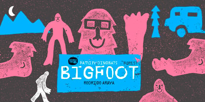
- My Left Foot by Rocket Type,
$14.00 Don’t let the name fool you! My Left Foot was made by hand. Alts, ligatures and Vietnamese all included in this whimsical typeface. Go ahead and dip your toes in!
 - Pappo's Blues Band Official Font - Unknown license

- The Font With No Name - Unknown license

- Exit font (for a film) - Unknown license

- Nanncie Fancy Groovy Display Font by Maulana Creative,
$15.00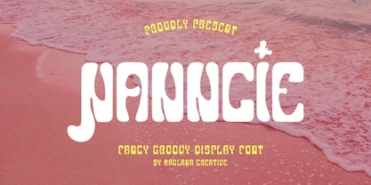 Nanncie fancy groovy display font. Bold stroke, fun character with a bit of ligatures and alternates. To give you an extra creative work. Nanncie font support multilingual more than 100+ language. This font is good for logo design, Social media, Movie Titles, Books Titles, a short text even a long text letter and good for your secondary text font with script or serif. Make a stunning work with Nanncie font. Cheers, Maulana Creative
 - Sister Pamella Font Cyrillic Duo by Ira Dvilyuk,
$18.00 Sister Pamella font duo Cyrillic is a pair of script and sans serif fonts, which perfectly complement one another. With a handwritten script font and a modern sans serif Sister Pamella font duo Cyrillic will be perfect for use in all your design projects be it logos, signatures, labels, packaging design, blog headlines. Also, it will look great on mugs, cards, gorgeous typographic designs, wedding stationery and much more. The Cyrillic part of the font contains the uppercase letters and lowercase letters and 17 ligatures, giving a realistic hand-lettered style. Sister Pamella script Cyrillic includes a full set of uppercase 2 sets of lowercase letters, numerals, a large range of punctuation and 38 ligatures, giving a realistic hand-lettered style. Sister Pamella sans serif containing uppercase only characters, numerals and a large range of punctuation. Creates a perfect contrast with the Sister Pamella script font. Multilingual Support for 32 languages: Afrikaans, Albanian, Basque, Bosnian, Catalan, Danish, Dutch, English, Estonian, Faroese, Filipino, Finnish, French, Galician, Indonesian, Irish, Italian, Malay, Norwegian Bokmål, Portuguese, Slovenian, Spanish, Swahili, Swedish, Turkish, Welsh, Zulu. And Cyrillic glyphs support for Russian, Belorussian, Bulgarian, Ukrainian and Kazakh languages. Works perfectly on the Canva platform. For Cricut & Silhouette recommended.
 - Reprizo Condensed Sans Display Font by Maulana Creative,
$17.00 Reprizo is a modern condensed sans display font. Bold stroke, fun character with a bit of ligatures and alternates. To give you an extra creative work. Reprizo font support multilingual more than 100+ language. This font is good for logo design, Social media, Movie Titles, Books Titles, a short text even a long text letter and good for your secondary text font with script or serif. Make a stunning work with Reprizo font. Cheers, Maulana Creative
 - Emorical Typeface Western Display Font by Maulana Creative,
$17.00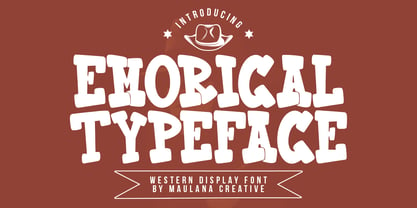 Emorical typeface western display font. Bold stroke, fun character with a bit of ligatures and alternates. To give you an extra creative work. Emorical typeface western display font support multilingual more than 100+ language. This font is good for logo design, Social media, Movie Titles, Books Titles, a short text even a long text letter and good for your secondary text font with script or serif. Make a stunning work with Emorical typeface western display font. Cheers, Maulana Creative
 - KG A Teeny Tiny Font by Kimberly Geswein,
$5.00 The handwriting of A Teeny Tiny Teacher, Kristin Oldham.
 - Happy Go Lucky Display Font by Goldfish Girl Creative,
$9.00 A Feel Good Kinda Font This playful and light-hearted, sans serif, display font includes uppercase letters, numbers, and punctuation. Great for carefree, boho, and fun designs like stationery, logos, wall art, stickers, patterns, and products. Use the font styles separately or try layering them! Built for easy use in Canva too. Includes: Happy Go Lucky font in 3 styles: Regular, Outlined, and Rounded
 - Portilla Rounded Bold Sans Font by Maulana Creative,
$15.00 Portilla is a modern round sans serif font. Bold stroke, fun character with a bit of ligatures and alternates. To give you an extra creative work. Portilla font support multilingual more than 100+ language. This font is good for logo design, Social media, Movie Titles, Books Titles, a short text even a long text letter and good for your secondary text font with script or serif. Make a stunning work with Portilla font. Cheers, Maulana Creative
 - Pollet Signature Script Sans Font by Maulana Creative,
$14.00 Pollet is a fancy signature script and sans serif font duo. With light contrast stroke, fun character with a bit of ligatures. To give you an extra creative work. Pollet font support multilingual more than 100+ language. This font is good for logo design, Social media, Movie Titles, Books Titles, a short text even a long text letter and good for your secondary text font with sans or serif. Make a stunning work with Pollet font. Cheers, MaulanaCreative
 - Is Not A Brazilian Font by Intellecta Design,
$17.95 an art deco font based on brazilian Rio's lettering old publish lettering style
 - KG I Need A Font by Kimberly Geswein,
$5.00 A neat handwritten font in 2 styles- one with hearts and one without hearts.
 - THE BOLD FONT (FREE VERSION) - Personal use only

- IN APPLE - Unknown license

- 4YEO IN - Unknown license

- All in by Handpik,
$13.00 hello !! this time I released a new product called "all in" which has an elegant and modern style.This font is suitable for invitation cards, decorations, clothing products, greeting cards and others. This font also has uppercase, lowercase, numeric, puntuation and multilingual. and there are several ligature and stylistic alternate.
 - PF DIN Display Pro by Parachute,
$79.00 While DIN Display seems to retain DIN’s basic characteristics, it shines with its sharper corners and contemporary look. Completed in 2002, it was first released and published in Parachute’s award-winning 2003 catalog and immediately was a hit. It has been used successfully in magazines, corporate applications and packaging in fields such as music, fashion, technology, visual arts. The ‘Pro’ series has been enhanced with more weights, multilingual support and opentype features in all different styles. Specifically, this superfamily supports simultaneously Latin, Greek and Cyrillic, while each one of its 15 weights contains 1197 glyphs and 20 opentype features. Additionally, every font in this superfamily has been completed with 270 copyright-free symbols, some of which have been proposed by several international organizations. This is a set of very useful daily symbols for packaging, branding and advertising. Symbols for public areas, environment, transportation, computers, fabric care and urban life.


