10,000 search results
(0.038 seconds)
- Ash - Unknown license

- Perfect Day by Hanoded,
$15.00 Perfect Day is a stylish handmade font: it is cute, neat and happy. I can’t guarantee that this font will make your days perfect, but you can give it a go and see where it takes you!
 - Chorine by The Flying Type,
$24.00 Chorine is a retro face, impacting and comfy, available in two cuts. It's great for vintage, nostalgic and psychedelic pieces yet also for creative contemporary designs. Chorine sounds sixties, sounds seventies and sounds perfectly now. Play it!
 - Petit Oiseau by Hanoded,
$15.00 Petit Oiseau (Little Bird in French) is a very nice and very legible 'back-to-school' kind of typeface. It is thin, elegant and stylish, yet retains a certain youthfulness. Petit Oiseau comes with Babylonian language support!
 - Stellus by The Arborie,
$11.00 Stellus is a handmade futurist font. It symmetrical and geometric nature make it perfect for modern uses. The separation on the glyphs makes it look a little alien, yet it maintains softer qualities like the rounded ends.
 - KG Chasing Pavements by Kimberly Geswein,
$5.00 This handwriting font uses the texture of canvas or linen showing through the lettering. The texture lends itself well to chalk or crayon, although with a close enough look you can see the true texture of fabric.
 - Gans Titania by Intellecta Design,
$19.95See also other font families inspired by Gans' original typefaces: Gans Tipo Adorno , Gans Lath Modern , Gans Titular Adornada , Gans Ibarra , Gans Antigua , Gans Antigua Manuscrito , Gans Fulgor , Gans Radio Lumina , Gans Carmem Adornada , and Gans Italiana . - Maxos by Mysterylab,
$17.00 Maxos is a modern hyper-stylized font that is simultaneously sleek & futuristic, yet retro & whimsical. This font package contains two variations: Extra Bold and Extra Bold Oblique. Excellent for posters, album graphics, motorsports, sports, high-tech, etc.
 - Gans Titular Adornada by Intellecta Design,
$14.95See also other font families inspired by Gans' original typefaces: Gans Tipo Adorno , Gans Lath Modern , Gans Titular Adornada , Gans Ibarra , Gans Antigua , Gans Antigua Manuscrito , Gans Fulgor , Gans Radio Lumina , Gans Carmem Adornada , and Gans Italiana . - Eastlake by Solotype,
$19.95Eastlake was a popular furniture style of the period when the MacKellar, Smiths & Jordan foundry brought out this font. As with many types, we find it difficult to see the connection between the name and the face. - Graphique-AR by ARTypes,
$35.00Graphique-AR is a digital version of a type designed by Hermann Eidenbenz and issued by the Haas foundry in 1946. - La storia by Abo Daniel,
$15.00 Introducing La storia - a fine tip signature font. Beautiful monoline signature, looking so classy and natural. There are 2 version, - Regular - Bold La storia is perfect for branding, photography, invitations, quotes, watermarks, advertisements, product designs, labels, and more that needs a natural sign feel. Includes number-punctuations and multilingual support. I created 89 ligatures to keep this font looks natural. at ct dt et ft gt ht it jt kt lt mt nt ot qt rt st tt ut vt wt xt zt an in un en on ar ir ur er or aa ant int unt ent ont att itt utt ett ott ii ee oo uu ff rr ss xx zz ll adl idl udl edl odl ald ild uld eld old art irt urt ert ort fl fh fb jl Fr Gr Hr Ir Kr Mr Nr Or Pr Tr Ur Vr Wr Dr space-r Titling and Ending Swash - Quick Access Add underscore 2x before or after a lowercase (you can see this on the presentation posters). For example a_ _ or _ _a Swash Lines make this font complete. Add underscore 2x before numbers from 1 to 9, you'll get 9 variations of swash line (as shown in the posters). For example _ _1 Thank You so Much!
 - Anethysta by Twinletter,
$12.00 Anethysta is an authoritative bold script font carrying a crisp and flexible theme for use in various projects, feminine or masculine this font will remain elegant when you use it, this font has a unique and different impression but is still beautiful to look at. made with natural handwriting to create an attractive impression when all your audience sees it. This font is designed by considering the portion and composition that suits your needs, also designed with a natural hand touch, has alternative features, ligatures and also supports multi-language, So this font is suitable for crafts, outdoor activities, logotypes, posters, titles, banners, wedding invitations, product packaging logos, quotes, social media page covers, book covers and more. what are you waiting for start creating special projects with this font!
 - Bruno Ace Pro Rounded by Stiggy & Sands,
$29.00 Auto-Techno-Motive Stance in a softer package. Bruno Ace Rounded Pro is a fresh derivative of our Bruno Ace Pro typeface. It draws its inspiration from modern automotive logotypes. This geometric sans-serif has a wide stance with a tall x-height for a strong look and appeal, as well as ease of legibility. The SmallCaps and extensive figure sets offer a more extensive range of use as well as a more intense vibe. Bruno Ace Rounded Pro has an obviously softer feel to it compared to the original. See the 5th graphic for a comprehensive character map preview. Opentype features include: - SmallCaps. - Full set of Inferiors and Superiors for limitless fractions. - Tabular, Proportional, and Oldstyle figure sets (along with SmallCaps versions of the figures). - Stylistic Alternates for Caps to SmallCaps conversion.
 - Acid Green by The Flying Type,
$26.00 Acid Green has quite a psychedelic flair, but its origins are from long before the sixties psychedelia. Its roots date back to 1914, from an unnamed alphabet by J.M. Bergling, the amazing jewelry engraver and 'letterform inventor'—as he considered himself—whose books of art alphabets and lettering influenced countless artists, including, not surprisingly, those involved with the genesis of Art Nouveau and Art Deco movements. Perfect for multiple display uses, including retro designs and trippy letterings, Acid Green has an extensive character set, with multilingual support covering 208 languages. There are yet some handy stylistic alternatives for some extra grooviness. Acid Green is somewhat retro looking, for sure, but it can sound perfectly contemporary too. Tune in and enjoy a creative trip! [Pizza illustration on the first graphic by our neighbor @pedrocorrea84]
 - Marian Churchland Journal by Comicraft,
$39.00 Tall, thin and elegant, Marian Churchland’s fonts are very much like her.. and now available from those awfully nice chaps at Comicraft to allow you to pretend that you are too! Marian Churchland was born in Canada in 1982, and was raised on a strict diet of fine literature and epic fantasy video games. She has a BA in Interdisciplinary Studies (English Literature and Visual Arts) from the University of British Columbia, and has been doing professional illustration work, including book covers and magazine articles, since she was 17. Last year, she became the first woman to solo-illustrate a CONAN story, and this year she’s illustrating three issues of ELEPHANTMEN for Image Comics. Artwork by Marian Churchland from Elephantmen #20. See the families related to Marian Churchland Journal: Marian Churchland .
 - AmpleAlt by Soneri Type,
$50.00 AmpleAlt is a alternate version derived from Ample type family. AmpleAlt is a display type family, optical mono linear and a bit squarish in nature. It has smooth curve instead of sharp angle formed by the junction of two strokes, which is a prominent feature of its design. It is designed to be a little eye-catching yet legible. It has clear and distinguishable letterforms, which helps to elaborate and emphasis the message. It is graphically strong and command viewer's attention. The overall appearance of type is suitable in setting it as heading, title, headline, etc. The type family consists of six weights viz. Thin, ExLight, Light, Regular, Medium and Bold. Considering the nature of this type family, italics have been excluded. AmpleAlt is designed by Aakash Soneri in the year 2014.
 - AmpleSoft by Soneri Type,
$50.00 AmpleSoft is a softer version derived from Ample type family. AmpleSoft is a display type family, optical mono linear and a bit squarish in nature. It has smooth curve instead of sharp angle formed by the junction of two strokes, which is a prominent feature of its design. It is designed to be a little eye-catching yet legible. It has clear and distinguishable letterforms, which helps to elaborate and emphasis the message. It is graphically strong and command viewerís attention. The overall appearance of type is suitable in setting it as heading, title, headline, etc. The type family consists of six weights viz. Thin, ExLight, Light, Regular, Medium and Bold. Considering the nature of this type family, italics have been excluded. AmpleSoft is designed by Aakash Soneri in the year 2014.
 - Point by Ndiscover,
$29.00 Point™ aims to be an epitome of the Geometric Style. Inspired by intemporal classics such as Futura, Avant Garde or Avenir, passing through more contemporary approaches of the same style; ignited by the overarching narrative of the Modernity (Perfect Geometric Shapes) and careful design decisions, Point™ is a font that references the past as well as projects itself to the contemporaneity. With a total of 10 weights, with respective hand adjusted obliques, Point™ has a total of 20 styles with Extended Latin support as well as Cyrillic, all with the most needed Opentype features, such as fractions, tabular and oldstyle figures, alternates, case sensitive forms, etc. Point™ has a superb versatility and can be used in almost every circumstance, try it for yourself and see what point Point™ makes.
 - Treacherous by Comicraft,
$29.00 Midnight, Pacific Coast Highway. You're driving home alone at night and your battery's dying. Your headlights have dimmed and you can barely see the road or the signpost up ahead. But there's an eerie green light glimmering in your rear view mirror and that strange warning uttered by the pump attendant at the Devil's Elbow gas station has put the frighteners on you. Is that Satan's face glowering at you through the mist, or something far worse? The only way to handle this font is with one foot on the gas pedal and one foot on the brake. Originally designed by John Roshell for GAMBIT titles, this sharp font has appeared on vampire & rock magazine covers, Star Wars & Star Trek merch, and the logo for the INHUMANS comic & TV show!
 - Hollander by Linotype,
$29.99Hollander is a refined, yet sturdy text typeface designed by Gerard Unger. The name stems from the font’s similarity to the types attributed to van Dijk and Voskens, two Dutch punchcutters from the seventeenth century. Like those earlier Dutch types, Hollander has generous proportions, a tall x-height, and high contrast between thick and thin strokes. It was designed to work in the early arenas of digital technology, when letters were generated as coarse pixels with a cathode ray tube in the typesetters of the 1970s, and then as finer pixels with a laser beam in the machines of the 1980s. Hollander has a well-drawn stability that maintains legibility even on inferior quality paper. When used as a display face, Hollander is an excellent companion to one of Unger’s most successful text faces, Swift. - AmpleSoftPro by Soneri Type,
$60.00AmpleSoft Pro is an extended version of AmpleSoft type family. AmpleSoft Pro Includes Extended Languages Character Set for following: Azerbaijan, Belarus, Bulgaria, Czech Republic, Kazakhstan, Latvia, Lithuania, Polish, Romania, Russia, Slovakia, Ukraine, Uzbekistan, Vietnam. AmpleSoft Pro is a display type family, optical mono linear and a bit squarish in nature. It has smooth curve instead of sharp angle formed by the junction of two strokes, which is a prominent feature of its design. It is designed to be a little eye-catching yet legible. It has clear and distinguishable letterforms, which helps to elaborate and emphasis the message. It is graphically strong and command viewer's attention. The overall appearance of type is suitable in setting it as heading, title, headline, etc. The type family consists of six weights: Thin, ExLight, Light, Regular, Medium and Bold. - Slacker by Fenotype,
$35.00 Slacker is a carefree brush script with soft features, low contrast and well balanced character forms. Slacker is excellent for creating easygoing yet catchy headlines, logotypes or even longer texts. Slacker is equipped with Standard Ligatures and Contextual Alternates - they help to keep the flow lively and balanced and connections smooth so you should normally keep the features on. In addition Slacker has Stylistic, Swash and Titling Alternates for more showy letterforms. If you want to keep letters connecting to one another at maximum try turning on Stylistic Set 01 (SS01). On top of these Slacker has even more alternates in the Character Window making the total glyph count to 660. Slacker Extras is a set of 50+ brush strokes with the same style as the brush and a set of catchwords.
 - Ransite Medieval by Mans Greback,
$69.00 Ransite Medieval is a bold blackletter typeface. Put together and refined by Mans Greback in 2022, this Old-English style lettering is drawn based on studies of multiple historical documents and typographic resources. With black calligraphy strokes, this heavy middle ages typeface is decorative but clean and clear. Ransite Medieval is provided in four styles: Regular, Bold, Italic and Bold Italic Use it for a logotype or in a medieval context where you want a genuine, yet legible, typography. The font is built with OpenType functionality and has a guaranteed top-notch quality. It has extensive lingual support, covering all Latin-based languages, from North Europa to South Africa, from America to South-East Asia. It contains all characters and symbols you'll ever need, including all punctuation and numbers.
 - 99 Names of ALLAH Spiral by Islamic Calligraphy75,
$12.00 We have transformed the “99 names of ALLAH” into a font. That means each key on your keyboard represents 1 of the 99 names of ALLAH Aaza Wajal. The fonts work with both the English and Arabic Keyboards. We call this Calligraphy "Spiral" because of the spiral like design. The first "Alef" has a "hamzit wasel", this indicates that you can pronounce the names both ways, "AR-RAHMAAN" or "R-RAHMAN". (in the zip file you will find a pdf file explaining the differences in the "harakat", pronunciation and spelling according to the Holy Quran). The "Ye" doesn't have 2 dots at the end of a name, instead we chose to include a small "ye" on the letter "ye". Also, we used the traditional "soukoun" instead of the Quranic "soukoun". Decorative letters used in this calligraphy: "Mim, Aain, Sin, HHe, He, Kaf, Alef & Ye". Purpose & use: - Writers: Highlight the names in your texts in beautiful Islamic calligraphy. - Editors: Use with kinetic typography templates (AE) & editing software. - Designers: The very small details in the names does not affect the quality. Rest assured it is flawless. The MOST IMPORTANT THING about this list is that all the names are 100% ERROR FREE, and you can USE THEM WITH YOUR EYES CLOSED. All the “Tachkilat” are 100% ERROR FREE, all the "Spelling" is 100% ERROR FREE, and they all have been written in accordance with the Holy Quran. No names are missing and no names are duplicated. The list is complete "99 names +1". The +1 is the name “ALLAH” 'Aza wajal. Another important thing is how we use the decorative letters. In every font you will see small decorative letters, these letters are used only in accordance with their respective letters to indicate pronunciation & we don't include them randomly. That means "mim" on top or below the letter "mim", "sin" on top or below the letter "sin", and so on and so forth. Included: Pdf file telling you which key is associated with which name. In that same file we have included the transliteration and explication of all 99 names. Pdf file explaining the differences in the harakat and pronunciation according to the Holy Quran. --------------------------------------------------------------------------------------------------------------------------- Here is a link to all the extra files you will need: https://drive.google.com/drive/folders/1Xj2Q8hhmfKD7stY6RILhKPiPfePpI9U4?usp=sharing ---------------------------------------------------------------------------------------------------------------------------
 - Chellion by Beary,
$12.00 Introducing the elegant Chellion! Chellion is a modern feminine font, every single letters has carefully been crafted to make your text looks beautiful. With modern script style this font will be perfect for many different project like photography, watermark, quotes, blog header, poster, wedding, branding, logo, fashion, apparel, letter, invitation, stationery, etc. This font including ligature glyphs: ee tt ss ll Foreign languages support: ÀÁÂÃÄÅÆÈÉÊËÌÍÎÏÐÑÒÓÔÕÖÙÚÛÜÝßàáâãäåæèéêëìíîïðñòóôõöùúûüýÿ
 - Fundevogel by Hanoded,
$15.00 Fundevogel is a Brothers Grimm fairytale about a boy who was found in a tree. The story, of course, has all the obligatory characters in it: a fair maiden, a wicked cook, an old forester and lots and lots of shapeshifting. And, yes, a happy end! Fundevogel font is a handmade fairytale font. It comes with extensive language support and all the cuteness you could wish for.
 - Classic Grotesque by Monotype,
$40.99 Classic Grotesque by Rod McDonald: a traditional font with a modern face. The growing popularity of grotesque typefaces meant that many new sans serif analogues were published in the early 20th century. Setting machines were not compatible with each other but all foundries wanted to offer up-to-date fonts, and as a result numerous different typeface families appeared that seem almost identical at first glance and yet go their separate ways with regard to details. One of the first fonts created with automatic typesetting in mind was Monotype Grotesque®. Although this typeface that was designed and published by Frank Hinman Pierpont in 1926 has since been digitalised, it has never achieved the status of other grotesque fonts of this period. But Monotype Grotesque was always one of designer Rod McDonald’s favourites, and he was overjoyed when he finally got the go-ahead from Monotype in 2008 to update this “hidden treasure”. The design process lasted four years, with regular interruptions due to the need to complete projects for other clients. In retrospect, McDonald admits that he had no idea at the beginning of just how challenging and complex a task it would be to create Classic Grotesque™. It took him considerable time before he found the right approach. In his initial drafts, he tried to develop Monotype Grotesque only to find that the result was almost identical with Arial®, a typeface that is also derived in many respects from Monotype Grotesque. It was only when he went back a stage, and incorporated elements of Bauer Font’s Venus™ and Ideal Grotesk by the Julius Klinkhardt foundry into the design process, that he found the way forward. Both these typefaces had served as the original inspiration for Monotype Grotesque. The name says it all: Classic Grotesque has all the attributes of the early grotesque fonts of the 20th century: The slightly artificial nature gives the characters a formal appearance. There are very few and only minor variations in line width. The tittles of the ‘i’ and ‘j’, the umlaut diacritic and other diacritic marks are rectangular. Interestingly, it is among the uppercase letters that certain variations from the standard pattern can be found, and it is these that enliven the typeface. Hence the horizontal bars of the “E”, “F” and “L” have bevelled terminals. The chamfered terminal of the bow of the “J” has a particular flamboyance, while the slightly curved descender of the “Q” provides for additional dynamism. The character alternatives available through the OpenType option provide the designer with a wealth of opportunities. These include a closed “a”, a double-counter “g” and an “e” in which the transverse bar deviates slightly from the horizontal. The seven different weights also extend the scope of uses of Classic Grotesque. These range from the delicate Light to the super thick Extrabold. There are genuine italic versions of each weight; these are not only slightly narrower than their counterparts, but also have variant shapes. The “a” is closed, the “f” has a semi-descender while the “e” is rounded. Its neutral appearance and excellent features mean that Classic Grotesque is suitable for use in nearly all imaginable applications. Even during the design phase, McDonald used his new font to set books and in promotional projects. However, he would be pleased to learn of possible applications that he himself has not yet considered. Classic Grotesque, which has its own individual character despite its neutral and restrained appearance, is the ideal partner for your print and web project.
 - Crown Title - Unknown license

- Hello Doll by The Arborie,
$11.00 Looking for a clean and feminine type? This font is perfect to use for branding in a bistro or even for doll or toy packaging. It's tall and neat styling give this font a stylized yet organic look.
 - Golden Moment JNL by Jeff Levine,
$29.00 The hand lettered cast credits for the 1939 film “Golden Boy” (starring Barbara Stanwyck, Adolphe Menjou, William Holden and Lee J. Cobb) was the model for Golden Moment JNL, which is available in both regular and oblique versions.
 - Highman by Eko Bimantara,
$19.00 Highman is a modern condensed bold font. Its contain all caps letter yet its have a different height between the uppercase and lowercase. Its fit for brand, titling, stacking or grid layout and all kind of display usage.
 - Decade Nouveau JNL by Jeff Levine,
$29.00 Decade Nouveau JNL is based on examples of an Art Nouveau wood type with a bit of Latin/Western typographic flare, and yet it is also reminiscent of the style's revival during the hippie movement of the 1960s.
 - Sonita by HansCo,
$15.00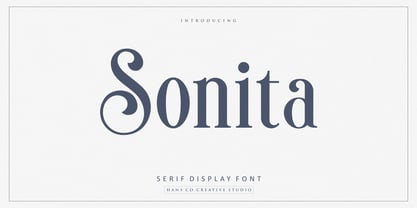 Sonita is an elegant serif display font designed with lovely circle tails to create a classy feeling. It perfectly represents a classic yet modern style. This font is perfect for elegant logo design, packaging or invitation cards. Enjoy!
 - Cheesegum by PizzaDude.dk,
$20.00 Cheesegum is super legible even at very small sizes. If you use Cheesegum at larger sizes, you can see the delightful crucnhy edges! Kinda like roasted cheese! The crunchier, the lovelier! :) Just go ahead and eat some Cheesegum!!!
 - Muju by Okaycat,
$29.95 Muju is created by classic Japanese calligraphy brush. This casual, friendly yet professional style is perfect for restaurant menus, titling, logos & more. Muju features extended characters, containing West European diacritics & ligatures, making it suitable for international environments & publications.
 - LF Loose Goose by Lo-Fi Fonts,
$5.00 Loose Goose was designed specifically for comic book lettering, but its uses are only limited by your imagination. Its loose yet legible letterforms make this font fun for classroom applications and your next crafting project on the Cricut.
 - Velvet Script by Typadelic,
$19.00A pretty handwriting typeface. Smooth and feminine. You'll find an alternate "r" and "s" (Option 9 and Option 10 on the keyboard) which have a beginning stroke to achieve a finished look. Try it and see for yourself. - Grundee by Ingrimayne Type,
$9.00 Grundee is a grungy serifed face. It is sloppy and irregular but still quite legible. It was one of several efforts to draw a serifed typeface by pen; see also SarahfSlob, which contains a complete family of styles.
 - Unadorned JNL by Jeff Levine,
$29.00 Unadorned JNL is the stripped down version of 2011's Troubador JNL; an ornate wood type font. With the inner ornamentation removed, this Western-influenced type design takes on a bolder look, yet retains its Victorian decorative charm.

