10,000 search results
(0.122 seconds)
- MTC Agrinaya by Martype co,
$22.00 Agrinaya is a condensed display font with high contrast and feels like a serif style to make it more stylish and modern, this font is made for logotypes, branding, editorial designs, and more. Thank You & Happy Designing!
 - Moonshadow by Curvature Creations,
$10.00 My font Shadowmoon was created with the PowerPoint shape moon and just like the real moon, my font has amazing curves that brightly standout. The curves take on a flowing action that visibly attracts an amazing style.
 - B Complex by Chank,
$99.00 The best things in life begin with a B. Bikes, Burgers, Beers, Babes. The B Complex font is a picture font by illustrator Adam Turman that shows his drawings of some of the things he draws best.
 - Sagrantino by Monotype,
$50.99 Sagrantino™ shines at large sizes – and in vibrant colors. Think big posters, commanding headlines, massive banners and oversized packaging. Set headlines in the Highlight or Shadow designs and running copy in the Regular – all on the same page! Sagrantino could be called the Lava Lamp of fonts. It’s slick, glossy, retro and futuristic. Somehow, it’s fresh and quirky-classic at the same time. This is a design that challenges you to think outside the text box. In fact, Sagrantino is so lively, it took three Monotype typeface designers, Karl Leuthold, Juan Villanueva and Carl Crossgrove, to draw it. Because it’s a script, Sagrantino pairs perfectly with just about any other design – except another script. Maintain the futuristic retro vibe by combining Sagrantino with a typeface like Biome™ or Neo™ Tech. Looking for a counterpoint? Try a cool sans like Avenir® Next or Univers® Next. OpenType® Pro fonts of Sagrantino enable automatic insertions from a crowd of fancy ligatures and delightful alternate characters – in addition to offering an extended character set supporting most Central European and many Eastern European languages.
 - Spaghetti Western by Comicraft,
$19.00 If you're a man with no name and you like your Westerns a little more continental, we've got a Fistful of Fonts for you! Load up your guns with our dynamite new offering, SpaghettiWestern. Lip synch the Good, the Bad AND the Ugly scripts you're presented with and we guarantee that Spaghetti Western will make Spanish lettering look a little bit more Mexican. Don't try to understand 'em, just rope and throw and grab 'em!
 - Yaungtinai by IM Studio,
$18.00 Yaungtinai is actually a unique font, I made it with the relaxed spontaneity of my hands. designing formal fonts but with a classic elements, which makes it very suitable for wedding media, book covers, greeting cards, logos, branding, business cards and certificates, even for any design work that requires a classic, formal or fancy appearance. Try Yaungtinai, enjoy the wealth of OpenType features and let the powerful yet elegant excitement delight you and increase your creativity! You can use this font very easily. There are many features in it. Yaungtinai contains the full set of lowercase and uppercase letters, punctuation, numbers, and multilingual support. This font also includes several alternative Ligature and Stylistic Set styles for those of you who have software that can work with OpenType (Corel Draw / Photoshop / Illustrator / InDesign). If you don't have a program that supports OpenType features like Adobe Illustrator and CorelDraw X Version, you can access all alternative glyphs using Font Book (Mac) or Character Map (Windows). Don't forget to see, buy, like, and share with friends.
 - Ryden by Graphicfresh,
$18.00 Ryden - A Handwriting Display Font In making this font, I spent a lot of time thinking about handwriting with a display style. Each letter is carefully made to look as natural as possible. This font is suitable for use in brands or logos with the theme of handwriting. I hope you like the font we made. Thanks
 - Nodhe by Wontenart,
$18.00 Fonts with special characters in lowercase vowels: a, i, u, e, o Make sentences more colourful. This font is neutral for use in any product. Especially for happy things, or life motivational words. or contemporary like the teenage years, discover the beauty of harmony in your work with this font. The right choice of fonts, makes a great product.
 - Gistany by Typebae,
$15.00 Gistany Font is an exquisite handwritten signature script font that exudes elegance and sophistication. Whether it's a logo, invitation, or branding materials, Gistany Font brings a sense of refinement and style, making every word appear like a work of art. Elevate your designs with the captivating charm of Gistany Font and let your words speak with elegance.
 - The Bossman by Sipanji21,
$15.00 The Bossman is a display font with a graffiti-like appearance, this font only uses uppercase letters and the standard number as well as the standard punctuation. This font is good for various design purposes, such as: title posters, banners, logotypes, apparel, wall displays, crafting, packaging, advertising, or whatever. make your design more attractive with this font.
 - Bomber Urban by Nirmana Visual,
$22.00 Bomber Urban Inspired by Graffiti Street Art, Bomber Urban is a fun, urban-style display font. This font is suitable for designs like logos, advertising, apparel, jerseys, sportswear, skateboard designs, and more. Take your concepts to the next level with this stunning font! Make your designs stand out with the urban and edgy look of our Graffiti font.
 - Groove Town Sans by Dino Feed,
$20.00 Fonts should be living, breathing organisms. Dino Feed wanted to see a font with character, so we created Groove Town Sans. This hand-drawn font has 122 glyphs and is made for Latin-based languages. Play around with the font and make it original; we like to keep everything lowercase. See more @dinofeed on Instagram or at dinofeed.com.
 - Barbed Wire by Monotype,
$29.99Andrew Smith played with his pencil and scetched an alphabet with several strokes. and as he made come cross strokes it lokes like barbed wire. - Nathaniel by Mevstory Studio,
$25.00 Nathaniel The "Nathaniel " font family epitomizes beauty and elegance in every character. With two distinct styles, Regular and Italic, this font is the perfect choice to infuse sophistication into your design projects. Key Features: Elegance and Beauty: Nathaniel has been meticulously crafted to ensure each letter is visually captivating. It's an ideal choice for creating stunning quotes and long paragraphs in your designs. Feminine Appeal: This font is perfectly suited for designs with a feminine touch, such as fashion, magazines, and logos with a simple yet enchanting design. Artistic Pairings: Nathaniel seamlessly complements script fonts, enhancing the artistic appeal of your projects. Combine these two font styles to create unique and attention-grabbing designs. Recommended Uses: Inspirational Quote Designs: Use Nathaniel to create motivational and inspirational quotes for social media, posters, or merchandise. Fashion and Magazine Design: Nathaniel is the perfect choice to create a luxurious and feminine look in magazine layouts and fashion promotions. Simple and Classy Logos: Craft simple yet character-filled logos using Nathaniel to represent your brand with unmatched style. Nathaniel is the perfect fusion of beauty and functionality, elevating your design projects to the next level. With this font, you'll be able to create impressive and captivating works. Get Nathaniel today and start making your design projects stand out. Don't miss out on this opportunity! Get Nathaniel now and start inspiring the world with your captivating designs.
 - Fleursdumal by Letterhead Studio-YG,
$40.00 How should an authentic baudelairean type look like? Aesthetically beautiful, that’s for sure. Intellectual, neurotic. Uptight — oh, the conventions of the time. Easily readable — still 20 years to go until the age of art nouveau with its outrage of typefaces. It may have a vibe of a Paris salon - salute to the Parnassiens. Such a modern-class (don’t mix it with the modern-styled) pharmaceutical Antiqua. Contrasts, thin serifs, the integrity of the operating theatre. But Baudelaire is not Heredia. «Une charogne» is not that much a vivid metaphor as a drawing from nature. The baudelairean typeface should have its cavern, flow, dark side. Not to demonstrate the fragile romantic profile of a cursed poet, as Baudelaire was seen 130 years ago, but to express the real pain. A true, unattractive, egoistic, suicidal passion.
 - Typist Slab Mono by VanderKeur,
$25.00 The typeface Typist originated during an extensive research on the origin and development of typewriter typestyles. The first commercially manufactured typewriter came on the market in 1878 by Remington. The typestyles on these machines were only possible in capitals, the combination of capitals and lowercase came available around the end of the nineteenth century. Apart from a few exceptions, most typestyles had a fixed letter width and a more or less unambiguous design that resembled a thread-like structure. A lot of this mechanical structure was due to the method the typestyles were produced. Looking at type-specimens for print before the first typewriters were good enough to came on the market we can see that in 1853 and in 1882 Bruce’s Type Foundry already had printing type that had a structure of the typewriter typestyles. Of course printing types were proportional designed as typewriter typestyles had a fixed width. So it is possible that except from the method of production for typewriter typestyles, the design of printing types were copied. In the design of the Typist, the purpose was – next to the monospace feature – to include some of the features of the early typewriter typestyles. Features such as the ball terminals and the remarkable design of the letter Q. This new typeface lacks the mechanical and cold look of the early typewriter typestyles. The Typist comes in six weights with matching italics in two versions. One that resembled the early typewriter typestyles (Typist Slab) and a version designed with coding programmers in mind (Typist Code).
 - Typist Code Mono by VanderKeur,
$25.00 The typeface Typist originated during an extensive research on the origin and development of typewriter typestyles. The first commercially manufactured typewriter came on the market in 1878 by Remington. The typestyles on these machines were only possible in capitals, the combination of capitals and lowercase came available around the end of the nineteenth century. Apart from a few exceptions, most typestyles had a fixed letter width and a more or less unambiguous design that resembled a thread-like structure. A lot of this mechanical structure was due to the method the typestyles were produced. Looking at type-specimens for print before the first typewriters were good enough to came on the market we can see that in 1853 and in 1882 Bruce’s Type Foundry already had printing type that had a structure of the typewriter typestyles. Of course printing types were proportional designed as typewriter typestyles had a fixed width. So it is possible that except from the method of production for typewriter typestyles, the design of printing types were copied. In the design of the Typist, the purpose was – next to the monospace feature – to include some of the features of the early typewriter typestyles. Features such as the ball terminals and the remarkable design of the letter Q. This new typeface laks the mechanical and cold look of the early typewriter typestyles. The Typist comes in six weights with matching italics in two versions. One that resembled the early typewriter typestyles (Typist Slab) and a version designed with coding programmers in mind (Typist Code).
 - Barataria by Scriptorium,
$24.00When designing a font, I often imagine how I think it should be used or where I'd be likely to see it out in the real world. With Barataria I envisioned it on decorative, antique-looking signs hanging outside shops in the French Quarter of New Orleans - hence the name. Barataria is based on samples of 1920s period poster lettering. It's a bold, heavy roman font with strong, rounded character forms. Barataria also has some unique alternative character forms, like the super-looped 'g' shown in the sample. - Bricksram by Parker Creative,
$18.00 Bricksram is a sleek and modern geometric sans serif font that draws inspiration from popular typefaces like Futura, Gotham, and Proxima Nova. With its own unique flair and minimalistic design qualities, Bricksram is the perfect choice for those looking to achieve a clean and contemporary look across a variety of mediums. Featuring sharp angles and smooth mathematical curves, Bricksram's meticulous balance creates a super clean and eye-catching aesthetic. With a choice of eight different font weights, this versatile typeface is ideal for demanding design applications like websites, logos, mockups, apps, ads, and more.
 - Ashtronaut by Chank,
$20.00 Like a phoenix rising from the ashes, the new Ashtronaut font is on fire and blasting off into outer space. This futuristic new font combines basic geometric forms like circles and dashes to form uppercase shapes that are softer and more traditional and lowercase letters with sharp and abstract characteristics. The result is a minimalist style that creates distinct and innovative new glyphs and letter combinations. The basic Bold variety is the strongest of the bunch. Try overlapping it with the other styles — Inlines, Outlines, and Bulbs — in different colors for dramatic and exciting effects.
 - Grandheron Sans by André Simard,
$11.99 If you are looking for a font with very good readability, even with its square appearance and condensed design, Grandheron is for you. You should find attractive the design of some glyphs like those one: a,f,k,l,v,y and also AJKMNVXY to name a few. Grandheron could be use as well in small size as in huge size. You will certainly like its Thin or Light font which give an awsome effect for titles, subtitles, caption for magazines related to fashion, architecture or even cultural in general. You could easily mix Grandheron with serif typeface as Harfang Pro. There is no limit to create great designs with this large typeface family, so enjoy!
 - Maestrale by Catharsis Fonts,
$25.00 Maestrale is a paradigm-breaking new take on calligraphy, built around a compact, serif-style core and outrageously long, flamboyant extenders. At large sizes, its confident, charismatic lettershapes are ideally suited for branding and decorative uses, whereas longer texts at smaller sizes naturally weave themselves into a flowing texture. The font comprises 1299 glyphs, including many stylistic alternates, ligatures, small capitals, and initial, terminal, and linking forms, and offers extensive OpenType programming to support them. The calligraphic form of Maestrale is complemented by a matching text font (Maestrale Text) with short extenders, available in three cuts (a serif-style Roman, an upright Cursive, and a tilted Italic). Maestrale is all about the lowercase; its capitals are deliberately understated so as not to steal the limelight. In fact, the font works very well when set exclusively in lowercase. Maestrale�s small capitals are fitted into the core space of the lowercase, allowing them to be freely interspersed with lowercase characters. Alternately, an OpenType feature is available to replace a and e in small-caps text with their lowercase equivalents for a fresh unicase look. Since alternates and ligatures play such an important role, Maestrale offers three different modes of use. The most straightforward approach is simply to start typing using Maestrale Pro � the extensive OpenType programming will ensure that collisions between extenders are avoided and attractive ligatures are substituted for common glyph combinations. A more interactive approach is provided by the font Maestrale Manual, which allows the user to manually select alternate forms and ligatures even in typographically unsavvy applications, such as PowerPoint (as long as standard ligatures are supported). Stylistic alternates are simply represented as ligatures of their base forms with one or more instances of the rarely-used by easily-accessed characters "~" (ASCII tilde) and "`" (spacing grave accent); linking forms are built with �_� (underscore), multi-character ligatures with "|" (pipe), and initial and terminal forms with the �less than� and �greater than� characters. For instance, the Maestrale wordmark in the posters above was simply typeset with the string (`ma`est|r_a```l```e)| in Maestrale Manual (The parentheses represent �less than� and �greater than� characters here.) Feel free to type this string into the test line below and see what happens! Make sure Standard Ligatures are enabled. An instruction sheet listing all alternate forms and their accessibility is available from the Gallery tab on this page. The third mode of usage is aimed at professional designers, who make use of sophisticated software with extensive OpenType support. These power users are advised to use the font Maestrale Pro again, where all glyphs are accessible as stylistic alternates. Maestrale Text is a less extravagant but more versatile variation on the design of Maestrale, replacing Maestrale�s swashes with efficiently compact extenders. It is intended to serve as a perfectly matching text companion to Maestrale calligraphy, but constitutes a full-fledged typeface in its own right. It is equally at home at display sizes as it is in pull quotes, titles, and high-impact blocks of text. Maestrale Text comes in three complementary faces: A serif-style Roman, an upright Cursive, and a tilted Italic. Maestrale is the Italian word for �masterful�. It is also the traditional Italian name for the northwesterly mediterranean wind, better known by its French name, Mistral. Acknowledgements: I am grateful to the helpful souls on the Typophile forums for extensive feedback and encouragement on Maestrale, and to the TypeDrawers forum for feedback on Maestrale Text. This font is dedicated to Simone.
 - Cheese Delight by Shakira Studio,
$21.00 Introducing Cheese Delight - A Retro Serif Font with Unparalleled Elegance! 🧀✨ What sets Cheese Delight apart are its uniquely crafted special characters, each a work of art that adds an extra layer of beauty and distinction to your designs. 🎨✨ Whether you're working on a vintage-inspired logo, elegant invitations, or captivating posters, Cheese Delight infuses your projects with a touch of sophistication that's currently dominating . 🔥🌟 Don't miss the chance to make your designs stand out! Elevate your creative endeavors with Cheese Delight, where every character tells a story of its own. 🧀🌈 Here's what you get: All Multilingual symbol Opentype features ( ligature, alternate ) Accessible in the Adobe Illustrator, Adobe Photoshop, Adobe InDesign, even work on Microsoft Word. PUA Encoded Characters - Fully accessible without additional design software. Multilingual character supports : (Afrikaans, Albanian, Catalan, Croatian, Czech, Danish, Dutch, English, Estonian, Finnish, French, German, Hungarian, Icelandic, Italian, Lithuanian, Maltese, Norwegian, Polish, Portuguese, Slovenian, Spanish, Swedish, Turkish, Zulu) Follow my shop for upcoming updates, and for more of my work, Thank you!
 - Nourishe by Arterfak Project,
$12.00 Nourishe is our our brand new minimalist font, made with the combination of duo-line. A sans serif font which is suitable for branding and editorial design. As we know, sans-serif nowadays becomes a part of the new trending of graphic design in typography. Nourishe is a great choice to make your design more elegant with minimalist strokes and feminine curves. This font family has OpenType features like some alternates to gives you an option. Also complete with some swashes that you can apply to get more beautiful looks. Nourishe has 2 styles : - Inline: Suitable for headline in a poster, flyer or label. the empty space in every stroke give the attractive-typographic taste - Normal: Recommended for an editorial like sub-headline, quotes, and body text. Nourishe includes : - Uppercase - Lowercase - Symbols - Numerals - Punctuation - Multilingual accents - Stylistic Alternates - Swashes Well, thank you for visiting and hope you like it!
 - Volta by Linotype,
$29.99Volta is a robust typeface from the 1950s. A revisit to styles that were en vogue at the turn of the century, Bauer type foundry designers Walter Baum and Konrad Bauer designed this type family in1955. The form of Volta's letters are similar to those in New Transitional Serif typefaces, like Cheltenham and Century. Developed after the Didone (i.e., Bodoni) style types, New Transitional Serifs speak more to the zeitgeist of the late 19th Cntury, and were typographic adaptations to it's newer technologies. Already in the period of mass production, typographers and printers at the dawn of the 20th Century had to cope with larger print runs on cheaper materials. The robust letterforms of New Transitional Serifs were designed to compensate for this, but they were also ingenious little inventions in their own right. Form the beginning, the new, peculiar forms of New Transitional Serif letters were adopted for use by advertisers. Their robustness also allowed them to be used in virtually all sizes. Volta was designed especially with advertising display usage in mind. The x-height of Volta's letters is higher than average for serif faces. It is recommended that Volta be used exclusively for shorter tracks of text, above 12 point. Headlines look dashing set in Volta. Four different font styles are available for the Volta typeface: Regular, Medium, Medium Italic, and Bold." - Tabac Big by Suitcase Type Foundry,
$39.00 Tabac Big can satisfy all expressionists desiring idiosyncratic colouring in setting because it provides black weights. But at the same time it offers solutions for orthodox environmentalists who like to save ink and toner — all the fragile hair styles are intended just for them. Less clearly-defined typographers can then choose from the six other weights, from Thin through Light, Regular, Medium, Semibold and Bold, including true italics. Tabac Big is a first and universal choice where we look for pronounced display type as a complement to text type. Its modern drawing, made up of precise arcs, sharp lines and seemingly simple segments, gives a clear and unmistakeable impression every time. And yet the typeface knows how to intrigue — especially in shaping the italics, which fully expresses the typeface’s unique details, such as its large bulbous instrokes and outstrokes and heavy wedge serifs.
 - Spottydotty by Ilse Joubert,
$7.00 My font is a playful, quirky handwritten font with child-like qualities. It is meant to be slightly imperfect in appearance and for even more fun, I have included a few mini icons, as an add-on to this font.
 - Hatchira by Maulana Creative,
$13.00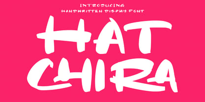 Hatchira is a Japan vibes handwritten display font. With reverse contrast stroke, fun character. To give you an extra creative work. Hatchira font support multilingual more than 100+ language. This font is good for logo design, Social media, Movie Titles, Books Titles, a short text even a long text letter and good for your secondary text font with sans or serif. Make a stunning work with Hatchira font. Cheers, Maulana Creative
 - Aviano Sans Layers by insigne,
$19.00 With this charismatic new type system, the possibilities are as large as your vision behind them. Achieve the impact you're looking for by layering the different fonts and colorations for a custom, hand-drawn look that likes to be noticed. Play around with the potential. Create effects such as realistic 3D looks by adding centerlines, dotted centerlines, and shadow variations. Inspired by the affable look of vintage handmade signage, the Aviano Sans Layers spacing accommodates these shadows and other features well with its generous width and helps you hit your message home. Try mixing it with the other members of the Aviano Hyperfamily, too. There are lots of funky options for you to explore. See what you can create with Aviano Sans Layers!
 - Marioline Barnard by Asd Studio,
$14.00 Introducing my Marioline Barnard Script, a passionatly crafted fancy script. Marioline Barnard script fully meets my expectations for a script that gives you luxurious vibes as much as casual vibes, elegant but simple, strong but light vibes. Marioline Barnard comes with beautiful uppercase and lowercase alternates (up to 11 level alternates, ligatures include), and swashes. Marioline Barnard has Multilingual support (Western European characters) and works with following languages: English, French, Italian, Portuguese, German, Swedish, Norweigan, Danish, Dutch, Finnish, Indonesian, Filipino, and Malay. Marioline Barnard is modern script font, every single letters has been carefully crafted to make your text looks beautiful. With modern script style this font will perfect for many different project, example: invitations, greeting cards, posters, name card, quotes, blog header, branding, logo, book cover, fashion, apparel, letter, logotypes, wedding invitations, product labels, and clothing product, stationery and more. Thank you.
 - LTC Tourist Gothic by Lanston Type Co.,
$39.95 Tourist Gothic is a Lanston Monotype adaptation of Modern Condensed Gothic (a design from the late 1800s.) Rounded alternate caps were designed by Sol Hess in 1928. The alternate version is offered as LTC Tourist Gothic Alt. Tourist Gothic Pro combines both variations and includes a full Central European character set and several other OpenType features. Digitized in 2006 by Paul Hunt.
 - Clochard by Hanoded,
$15.00 Clochard is a handmade, Bodoni-like font. It is a little loose, a little rough in places and a little uneven, but it all adds to Clochard's charm. Comes with plenty of diacritics!
 - Knappolog by Cercurius,
$19.95 Negative sans-serif capitals in squares with rounded corners, looking like tiles, pushbuttons or computer keys. The font can be used for logos, signs and labels, and for markings on maps and charts.
 - P22 Mayflower by IHOF,
$39.95 P22 Mayflower is a classical Roman font taken from a Bible of 1610, the edition likely carried to America by the pilgrims on the Mayflower. Good for period reproductions, with its companion italic.
 - Bibiana by Otto Maurer,
$19.00 Swashy Newstyle Tattoo-Font Gangsterstyle. Bibiana is the Sisterfont to Tinka Babe Tattoofont. Bibiana is best for Tattoart like Tattooflash.Bibiana Tattoofont comes with many OpenType Features. Alternate Ends Alternate Caps Ligatures Extra swashes
 - Alexander Lettering by Mans Greback,
$69.00 Alexander Lettering is a handwriting font that captures the wild and choppy essence of a sloppy signature. With its childish and fast-paced strokes, this font gives off a sense of spontaneity, making it perfect for projects that require a less formal and more playful touch. This typeface was created by exploring the unpolished side of handwriting, drawing inspiration from the hurried notes and scribbles that often accompany our everyday lives. Alexander Lettering embraces the imperfections of the human touch, giving your designs an authentic and relatable feel. The font is built with advanced OpenType functionality and has a guaranteed top-notch quality, containing stylistic and contextual alternates, ligatures, and more features; all to give you full control and customizability. It has extensive lingual support, covering all Latin-based languages, from Northern Europe to South Africa, from America to South-East Asia. It contains all characters and symbols you'll ever need, including all punctuation and numbers.
 - Octavian by Monotype,
$29.99Octavian font was designed by Will Carter and David Kindersley for the Monotype Corporation in 1961. Mr. Carter writes: While the ultimate authority is the ancient inscriptional pattern, the physical characteristics of the present rendering are manifest in the economic proportions of the shapes and the modified relations of the strokes. Thus, the letters are narrower than the classical forms and their weight heavier." Octavian is a fine book font and works well for other text settings that are less demanding, such as magazines and brochures." - Tall Tales by Comicraft,
$39.00 In a World where no stories are small stories... In a Land where words need to be Bold, Meaningful and maybe even Italic... Comes a font worthy of telling Marvelous Tales some thought Too Tall, Too Astonishing to be told... And when those Untold Stories, those Astounding Tall Tales, are finally told... THAT WORLD WILL NEVER BE THE SAME AGAIN! From Visionary Font Director John Roshell and the Studio that brought you BlahBlahBlah, you must not miss TALL TALES! In theaters and Streaming now.
 - Alpen Jack by HandletterYean,
$14.00 Alpen Jack is a handwritten display font with its own style to distinguish your design from others. Alpen Jack is suited for any work, especially if it is unique. Also great for craft and any kind of custom design. This font is compatible with any design software like Photoshop, Illustrator, Silhouette design studio, and so on. Maximize your inspiration and creativity with this font.
 - Cursive Signa Script Variable by Pedro Teixeira,
$670.00 Cursive Signa Script Variable, quite possibly the first true cursive and signature variable font. It has 90 styles that range between weight, slant and alternates. It can be use in a lot of projects, like logos, end of a statement, pairing with a beautiful sans serif like Aleante, in a title, invites and so on. Designed by Pedro Alexandre Teixeira