10,000 search results
(0.048 seconds)
- Wolverhampton by Greater Albion Typefounders,
$12.50 Wolverhampton is a new Neo-Victorian face from Greater Albion Typefounders. It's something of an example of starting with a small idea and running with it. This family of three typefaces (Regular, Small Capitals and Capitals) was inspired by a line of lettering seen on a late 19th Century enamel advertisement made by Chromo of Wolverhampton (hence the family name). The family grew, topsy-like, from a recreation of these initial fifteen capital letterforms to the three complete typefaces offered here. The three typefaces are ideal for advertising and poster work with a Victorian, Edwardian, or 'Steam-punk' theme. They would also be eminently suitable for signage inspired by the same eras or (as we've seen a number of our other typeface families prove very popular) for book covers of period related novels and historical works. Finally, these slender elegant display faces are just plain fun!
 - Eskorte Latin by Rosetta,
$60.00 Eskorte is a diligently designed Latin type family with an uncomplicated, engaging poise that conveys a crisp, businesslike tone. Its precise range of styles looks to no-nonsense efficiency and ease of use by non-designers in the office and text-intensive professional environments. Eskorte supports over ninety languages in a full range of weights, with both upright and matching italics. The italics are lively, fluid forms that infuse their charms into text settings or take on their own personality in large, dominant headlines. In concert with the hardworking upright styles, the two fit smartly into a range of publications, from corporate to casual. All of the weights and styles offer an adept set of features like small caps, case-sensitive punctuation, and both tabular and proportional figures to make short work of any typographic task. Whether employed in enterprise reports, lifestyle publications, or identity work, Eskorte is ready for business.
 - Restora Neue by Nasir Udin,
$25.00 Restora Neue is an evolution of its precursor, Restora. While the Restora has an authentic imperfect letterforms, Restora Neue comes with a neater shape and higher contrast. It’s a mix of old-style roman serif styles. Its sharp and longer serif with a bit touch of medieval, makes Restora Neue a versatile type family that can be used in many different themes of design projects, from classic style to modern. It comes in nine weights from thin to black with matching italics. Its mixture of weights provide a wide range of styles that will help you find the best vibe for your projects, for headlines or a short paragraph. The set of special ligatures and stylistic alternates can be perfect mates for your brand. It is well suited for book covers, editorial, branding, advertising and more. To see the complete presentation please visit my Behance profile.
 - Qualion Round by ROHH,
$39.00 Qualion Round™ is a soft geometric sans serif with lots of swashes and ligatures, a sibling of successful Qualion™ and Qualion Text™ families. The rounded family is designed by carefully adjusting letter shapes, tapering and ink traps to in order to achieve optimal legibility as well as strong personality. The family is intended to serve in display situations like branding and advertising as well as in paragraph text and user interfaces. Its versatility can be even strengthened by pairing it with Qualion™ or Qualion Text™ families. Qualion Round™ family consists of 10 weights with corresponding oblique styles. It has extended language support, as well as broad number of OpenType features, such as case sensitive forms, standard and discretionary ligatures, swashes, terminal forms, stylistic sets, contextual alternates, lining, oldstyle, tabular figures, slashed zero, fractions, superscript and subscript, ordinals, currencies and symbols.
 - Edgethorn by Up Up Creative,
$16.00 Edgethorn is a beautiful, italic-only transitional serif typeface that was born after I became obsessed with a few small paragraphs of italic text on a type specimen broadside from 1785. Working on this type revival allowed me to delve much more deeply than I ever have before into type history and typeface classification, and I’ve included some type history for you with your download so that you can play around with the smattering of historical characters I included (like the medial s). Although it is based on centuries-old typefaces, Edgethorn is elegant, timeless, and perfect for 21st century projects. Edgethorn includes approximately 525 glyphs — including 64 standard and discretionary ligatures and a handful of contextual alternates and character variants — and supports over 200 languages. The OpenType features can be very easily accessed by using OpenType-savvy programs such as Adobe Illustrator and Adobe InDesign.
 - Paradise Garden by Nathatype,
$29.00 Would you like a professional, yet friendly looking design? If so, Paradise Garden is the best option. Paradise Garden is a serif font in thick weights and round shapes. Due to the weight and shape, this font expresses cute, friendly impressions on your designs. Its main characters are first, the noticeable differences between the thick and the thin lines and second, vertical and horizontal hooks or little wipes on the edges of each letter. It is better applied for big texts for a legibility purpose. You can also enjoy fascinating features on this font. Features: Ligatures Stylistic Sets Multilingual Supports PUA Encoded Numerals and Punctuations Paradise Garden fits for various design projects, such as posters, banners, logos, book covers, album covers, quotes, invitations, greeting cards, printed products, social media, etc. Find out more ways to use this font by taking a look at the font preview. Feel free to contact us if you require more information when you are dealing with a problem. Thank you. Happy designing.
 - Rafaella by Lián Types,
$37.00 To Rafaella, a menina dos cachos. We, designers, have grown accustomed to seeing that lowercase letters—not only in calligraphy but also in typography (1)—may be very playful and decorative. Almost every part of them can become a potential swash, ligature or decorative accolade (2) if the designer has some expertise regarding this matter. However, since we are living in an era that elevates the status of handcrafts, lettering has gained a lot of ground in different kinds of mediums, and with it there’s a sort of overuse of capitals. This may be due to the reason that lettering pieces need a high impact to convey their messages and many times why big capitals are the only solution. With this in mind, I started Rafaella: A font consisting entirely of capitals which go from unadorned to very decorative. Rafaella has ductus and forms vaguely based on the 1970s Bookman-like styled fonts. The presence and behaviour of serifs and ball terminals in this style were the perfect excuse to make really attractive aternates which the user can choose from the glyphs panel. The result is a font full of life. Able to be both very playful and formal due to its roman style which can be combined with (and between) a wide range of other styles of expressive scripts or geometric fonts with nice results (3). Also try Rafaella Shade Solo combined with Rafaella or Rafaella Bold for a layer effect to emphasize any given word or phrase. NOTES (1) See my fonts Erotica from 2013 or Dream from 2014. (2) Accolades is a wonderful word that refers to the ornaments made around the words in the spencerian style of calligraphy (3) Combinations often seen in different pieces of lettering were usually a contrast of style is wanted.
 - Belgato by Molly Suber Thorpe,
$9.00 Belgato is a vintage-inspired typeface with delicate details. It comes in six weights – plus italics! – for a total of 12 fonts, making it a highly versatile display face. The variable font version allows for ultimateweight and slant customization in print and web. Belgato has Latin, Greek, and Cyrillic alphabets, and supports dozens of languages, making it ideal for multilingual branding, publications, ads, social media, and more! I had so much fun designing this typeface, playing with classic serif letterforms to create an elegant, mid-century modern vibe. Belgato Light is fresh, airy, and delicate – perfect for feminine branding. By contrast, Belgato Black boasts fat curves with thin details, perfectly-suited to bold layouts and retro branding projects. Each Belgato font has 665 glyphs, encompassing: - the Latin alphabet (including hundreds of accented characters) - the Modern Greek alphabet - the Cyrillic alphabet (for Russian, Ukrainian, Bulgarian, and Serbo-Croatian) - discretionary ligatures - stylistic and alternate glyphs - numerals (lining and old style), small figures, and fractions - extensive punctuation, symbols, and diacritical markings Software: No special software is required to use Belgato fonts. You can even use these fonts with Canva! To access Belgato’s variable font features, ligatures, and stylistic alternates, it is best to use software that supports these functions (Adobe programs, Corel Draw, Sketch, etc). Languages: Belgato supports dozens of languages which use the Latin, Greek, and Cyrillic alphabets. Among the most common languages it supports are: English, Bulgarian, Catalan, Croatian, Czech, Danish, Dutch, Filipino, Finnish, Flemish, French, German, Modern Greek, Hungarian, Icelandic, Indonesian, Italian, Luxembourgish, Maltese, Norwegian, Polish, Portuguese, Russian, Serbo-Croatian, Spanish, Swedish, Swiss German, Turkish, and Ukrainian.
 - Rough Print JNL by Jeff Levine,
$29.00 The Superior Marking Equipment Company was originally located in Chicago, Illinois and over the years produced a line of both commercial and toy rubber stamp printing sets which were used for making signs, posters, tickets and other printed items. Rough Print JNL reproduces the scanned images printed from one of the toy rubber stamp sets. The sample characters were smaller than one half inch in height and were further reduced during scanning. This gives the end result of a typeface which looks like rubber stamp imprints at small sizes, and very angular, distorted, somewhat grunge type when printed at larger sizes. There is a limited character set consisting of alphabet, numerals, some punctuation and currency symbols. No kerning was added to keep the hand-made appeal. Rough Print JNL is an all caps font with the letters and numbers jogged randomly on both the caps and lower case keystrokes. For a similar design with lower case, Amateur Printer JNL is recommended.
 - Ragna Runes by Mans Greback,
$79.00 Ragna Runes is not just a font; it's a journey back to the days of lore and legend. Using it feels like rediscovering a long-lost civilization, where every rune is more than a letter; it's an artifact of a bygone era. The typeface features characters modeled after historical runes, making it uniquely suited for projects that require an ancient or mystical aesthetic. Ragna Runes is built with advanced OpenType functionality and has a guaranteed top-notch quality, containing stylistic and contextual alternates, ligatures, and more features; all to give you full control and customizability. It has extensive lingual support, covering all Latin-based languages, and includes all the characters and symbols you'll ever need. Behind this exquisite creation is Mans Greback. Known for pushing the boundaries of type design, Greback has ventured into the intricacies of aesthetic diversity with Ragna Runes. His portfolio is a testament to his versatility and daring, turning simple alphabets into powerful visual narratives.
 - Cozy Sweater by Larry Nickname,
$9.00 It was originally inspired by my winter scarf knitting exploits. I discovered that making wool scarves was generating beautiful patterns and I wanted them to become a source of inspiration for a style. I made a few collages, and they became letters. Other characters came up with ease. It is readable, but long essays are not its main purpose. It is decorative and will look casual and very attractive on any ad as a title or a short phrase. It also demonstrates very good performance in automatic 3D generators, like Xara 3D maker, used in making examples of how this font can be utilised. It was designed to be thin, soft, with the capacity to cover empty space and to create a vibrant environment. Small characters are different from capital letters, they are stylistic alternates. Some letters are slightly ominous or dynamic, others create a soothing feeling. Using several colors make it shine, but it is complex, it looks good in monochromatic compositions as well.
 - Magic Heart by Mans Greback,
$49.00 Magic Heart is a swirly script typeface. A valentine typeface with a romantic flow, Magic Heart has a lovely personality and a passionate appearance. Its swashy capital letters gives any project a sincere vibe. Use characters # ¤ for decorative heart symbols. Use underscore _ anywhere in a word for swashes. Example: Won_der Use multiple underscore for different swashes. Example: Love____rose The Magic Heart family consists of eight styles: The ornamental Swash and Swash Bold, the normal Regular and Bold, plus each of the styles as Italic. The font is built with advanced OpenType functionality and has a guaranteed top-notch quality, containing stylistic and contextual alternates, ligatures and more features; all to give you full control and customizability. It has extensive lingual support, covering all Latin-based languages, from North Europe to South Africa, from America to South-East Asia. It contains all characters and symbols you'll ever need, including all punctuation and numbers.
 - Fieldwork by TipoType,
$24.00 Download Fieldwork’s PDF Type Specimen Fieldwork brings back the manual tradition of typography production, veering away from lab interpolations. Each of its 24 variants was drawn based on optical evaluation; many of its curves and details were specifically adjusted for each weight, reformulating them to better suit the requirements of the distinct stroke weighs. It is the product of a collaborative effort by the TipoType team, combining their personal strengths and “most importantly” their enriching individual outlooks to achieve a more versatile and fresh outcome. Its shapes successfully combine geometric strokes (in the Geo variants) with the humanistic warmth of the double-storey glyphs (like a and g in the Hum variant) in a system that grows with alternates, swashes and the corresponding italics for every weight. It includes a very thorough coverage for a wide variety of Latin alphabet-based language families. Special thanks to: • José “Pollo” Perdomo: Font production assistent. • Rasmus Jappe Kristiansen: Detroit City project
 - ITC Abaton by ITC,
$29.00 ITC Abaton, by Argentinian designer Luis Siquot, is an exercise in geometry and simplification. “It is done,” says Siquot, “with few elements, with modules of only straight lines (horizontals, verticals and diagonals of almost 45 degrees). Drawing the I and the O, I got the basic elements, and so started the fight between strict geometry and optical impression, until I obtained the rest of the characters.” The basic rectangular form is characterized by wedge-shaped serifs, almost like caps on the heads and feet of the letters. “Abaton has the 'spirit' of 19th-century faces used on money bills or postage stamps, but the realization is totally different,” Siquot explains. Abaton is a “shaded” typeface of caps and slightly smaller caps, upright and slightly condensed in form. Although the letterforms are legible at small sizes, the shading tends to clog up if it gets too small, so Abaton is happiest as a distinctive display face.
 - The qoestter by Alit Design,
$19.00 Presenting the ✨The Qostter Retro Serif Font✨ by alitdesign. The Qostter Retro Serif font is inspired by stylish designs from the 80s to 90s. At that time the font style like "The Qotter" had a firm and trendy impression. The Qotter retro font has a wide selection of alternative characters and swashes that make it easy to create bold retro-style designs. The Qostter Retro Serif font is very suitable for making designs with retro concepts, simple and playful designs, for example making magazine cover designs, music covers, YouTube thumbs, text headers, logotypes and so on with an elegant retort theme. Besides that this font is very easy to use both in design and non-design programs because everything changes and glyphs are supported by Unicode (PUA). The Qostter Retro Serif font has a total of 758 glyphs including symbol, multilingual and alternative glyphs. We really enjoyed the process of making The Qostter Retro Serif font, we hope you are also happy when using The Qostter Retro Serif font. Language Support : Latin, Basic, Western European, Central European, South European,Vietnamese. In order to use the beautiful swashes, you need a program that supports OpenType features such as Adobe Illustrator CS, Adobe Photoshop CC, Adobe Indesign and Corel Draw. but if your software doesn't have Glyphs panel, you can install additional swashes font files.
 - Arkham Land by Artisticandunique,
$15.00 Arkham Land - Sans Serif Font Family - Multilingual - 12 Style Arkham Land Sans serif font family helps you create many alternatives in your creative projects with its 12 styles.With its elegant and strong structure, different weights, it is also assertive about being a highly readable font. It provides flexibility in the width of usage areas in your projects, from thin styles to Black styles. It is a timeless font family with is rich styles, multilingual supports and modern structure. You can use Thin styles in elegant and stylish projects, and Black styles in strong titles. This font comes with uppercase, lowercase, punctuation, symbols and numbers, ligatures and multilingual options. Great for books and magazines, editorials, headlines, websites, logos, branding, advertising and more. This font family can meet your needs in all creative projects, modern and classic. With this font you can create your unique designs. If you have a question, please contact me. Have a good time.
 - French Typewriter by Typorium,
$15.00 French Typewriter is a slab serif typeface created in 2019 by Jean-Renaud Cuaz. It takes roots in the typewriting font styles with a French flair. In the history of this font style, early typewriters were initially thought to be replacements for printing and so featured proportional fonts, before being replaced by monospaced typefaces. French Typewriter was created with proportional design, departing from the constraint of identical width and space. Designed for vintage and modern use with a script influenced italic, French Typewriter provides a large range of weights from Extra Light to Black with matching italics offering a large palette of styles for both vintage and modern design. A series of swash capitales has been created for all 6 italic weights along with ligatures and alternative a, g, y signs to provide opportunities for attractive text design. Fine tuned kerning has been implemented to make this slab serif font family greatly legible in small size. Condensed styles will be available in 2019.
 - Brand SS by Sensatype Studio,
$15.00 Brand is a lovely elegant font for branding and logo design. Based on our experience as a graphic designer who works for a lot of companies, we often are requested to design a logo in a unique style but with an elegant shape. So, we try to brainstorming and create this font to make the idea is going out. This is perfect for BRANDING and LOGO DESIGN. You will get classy, elegant, and certainly unique logos with this font. Brand is also included full set of: All uppercase letters multilingual characters numerals punctuation ligatures collection *) ALL LIGATURE CHARACTERS CAN BE ACCESS USING LOWERCASE TYPE (for example: r+a) Wish you enjoy our font and if you have a question, don't hesitate to drop message & I'm happy to help :)
 - PAG Demokratie by Prop-a-ganda,
$19.99Prop-a-ganda offers retro-flavored fonts inspired by lettering on retro propaganda posters, retro advertising posters, retro packages all the world over. This is perfect font for your retrospective project. When you type in this font, the typography looks like that small guards are marching in the street. This retro font is pretty, but it also has a punctual impression. PAG Demokratie is a perfect font for posters, magazines, product packages and all of your creations. - New Romantine by Orenari,
$18.00 Hi! It's Orenari here want to introduce a romantic display serif font, New Romantine. This font has lovely curves and almost of all the uppercase and lowercase has stylishtic alternates. The fact of this font is Romantine was my very first font. This New Romantine is the newer version of Romantine. It's bolder than the old version. Just launch the New Romantine in February so this font will bring the Valentine's Vibe to your creative projects.
 - Modica Pro by Monotype,
$30.00 Modica Pro is here to expand upon the success and versatility of the original Modica typeface (2019). Modica has been compressed, condensed, narrowed, widened, and extended to a mega-family of 108 fonts that now includes small caps as well as additional language coverage. Modica Pro is a nimble typeface that can handle a multitude of applications – everything from body copy to retail fashion to corporate identities... why not put Modica Pro to task today? There are 108 fonts in this family, ranging from Hairline to Ultra weights across six widths in both roman and italic. A single variable font (included with the full family) covers all weights, widths, and italic angle with every increment in between to suit whatever style you prefer. Modica Pro has a character set that covers all Latin European languages. Key features: 1 Variable Font 9 Weights in Roman and Italic 6 Widths Small Caps Full European character set (Latin only) 650+ glyphs per font.
 - Geo Deco by Tipo Pèpel,
$28.00 Geodeco font family brings to you the recovery of the typographic forms from the beginning of the 20th century, with a strong ArtDecó flavour but from a new point of view: modernity and geometry. Modernity in the visual contrast between lowercase and capital letters, where rounded shapes are opposed to the breaks and graphic tensions of the strokes of the capital letters. which gives it an enormous originality. Generous doses of internal whites, assure a powerful legibility even with the spite of its short ascending and descending strokes. What we get is a coherent and martial look where fluidity and homogeneity is the main note. Soft and rounded minuscule, with large internal whites for super legibility, bombproof, especially on screens, where Geodeco lives with an astonishing naturalness. The capital letters, used alone as display, or as companions of the minuscule characters, give the family a touch of originality and exotic flavor. Like the spices in the food; a brief but intense note. Breaking the rectangular shapes so that the appearance of the letter comes out benefits from enlarging the internal whites and making them consistent with the white of the lower case. GeoDeco works very well in plain text with the obvious limitation that it is not a type for small bodies, but exceptionality weldon for plain text and signage. Maximum visibility, total beauty on screens. A family of this new century with the flavour of that epoch of experimentation that were the years 20. Extensive multilanguage support and almost all Opentype functionalities. Try it and it will convince you - for sure!
 - Singularity Type by Davide Mascioli,
$15.00 Singularity Type is a Modern sans-serif Geometric font with homogeneous thickness, based on essential geometric shapes. Built around 4 different widths, ranging from Extra Light up to Bold, the font contains 744 glyphs and supports more than 30 Latin alphabet languages. Singularity Type is Designed by Davide Mascioli ©2021
 - Juwitha by Letterafandi Studio,
$14.00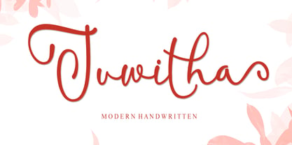 Juwitha is a modern handwitten font featuring charming, playful characters that seem to dance along the baseline. It will add a luxury spark to any design project that you wish to create! This font is PUA encoded which means you can access all of the glyphs and swashes with ease!
 - Febriella by Letterafandi Studio,
$12.00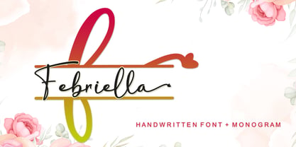 Febriella is a lovely script font featuring charming, playful characters that seem to dance along the baseline. It will add a luxury spark to any design project that you wish to create! This font is PUA encoded which means you can access all of the glyphs and swashes with ease!
 - Klose Slab by Studio Sun,
$20.00 Introductory Klose Slab Another Vintage Typeface from Studio Sun (SUN014) for your Fonts collection. Klose comes with 4 style (condensed, normal, semi expanded, and expanded) also available in Variable Font format (for customize widths). Perfect for logotype, head text, displayed text, and many more). Klose support more 75 language (Latin pro).
 - Internacional by Los Andes,
$26.00 Internacional, inspired by the International Style, is a Latin American-flavored neo-grotesque sans serif typeface made with organic ingredients and sweetened with organic sugar and chocolate. Internacional is well-suited for corporate identity, branding, publishing projects, logotypes, magazines and advertising. Its large x-height and small difference between x-height and cap-height make it a high-impact font, ideal for powerful headings, while providing legibility. Internacional was designed for use with short and mid-length paragraphs that require a balanced type color. Internacional is an extended width font with rounded forms and angled terminal ends, in characters such as “c” or “a”, which make it suitable for use in advertising and branding. The proportional relation in height between uppercase and lowercase letters may be useful when composing text in German language. The Internacional font family comes in 7 weights with matching italics and includes an alternative version, with the same number of styles, yet it tastes differently. Special thanks to everyone in the Latinotype Team (especially to Rodrigo Fuenzalida) for their support, help with corrections and digital editing.
 - Maree by Ashton,
$5.00 If you want to write something sincere and genuine but not too formal then this is the font for you. It is based on real handwriting, not some artificial calligraphy made to be either too haphazard or spiky or have loads of elegant flourishes but an ordinary person's writing, and designed to look as natural and as close to the original lettering as possible. Like any person's writing it is individual and distinctive, but so easy going on the eye those differences sit comfortably with you. It is friendly and open with easy to read glyphs both as lowercase and uppercase. The letters are relatively wide with clearly shaped distinct outlines. This font may be ideal for projects where you expect a wide readership with different reading abilities from young to old. When you are using this font a slightly bigger point size usually gives a better result so for a standard letter or similar you should size up to 15 points or more. Maree has been individually crafted to the smallest detail. To create a realistic handwriting font that looks relatively simple but works in a wide variety of languages requires a complexity and attention to detail most fonts will never require. This font in any ordinary business environment would never have been made, the effort required to make it too great, the length of time too long. There have been no shortcuts in this font, no automatic scanning or tracing, no automatic generation, no class kerning. Not only is each glyph individual but the width of letters, the height, the accents and the positions of the accents are all different. Even the line weight of the letters is designed to have natural variation but yet similar enough that the font appears as though it were written effortlessly in the same pen. And in order to keep the spacing consistent even though the letters have different widths, heights, lengths of descenders and so on, there are a vast number of kerning pairs, letter to letter, number to number, letter to number... All kerning has been individually assessed with an eye to proportionality taking in character shape, size and weight. For instance if you write a telephone number the numbers all sit close together but if you write a number before a letter such as in a UK post code or before a unit of measurement an extra little bit of space has been added which makes the number more distinct and therefore readable. That space is so natural to the eye that you don’t even know it is there. However even in the spacing allowance has been made for the fact it can’t be too perfect because when you write by hand the spacing is inconsistent. There have to be some letters which are too close or far apart otherwise the font would look artificial. For similar reasons if you are going to print out this font for a letter, etc, check the print version before you make any letter spacing changes because with the zoom functions in modern applications that uneven spacing and lettering can seem more pronounced than it actually is. When this font is printed out you will find it is surprisingly neat. This font is what it is, simple clear handwriting. You will not go wow. But if you want something unique and different and looks good on the page you won’t be disappointed. This font is not a work of art but it is a work of love. This font has a soul. How many fonts can you say that about?
 - Esenka by Differentialtype,
$10.00 Esenka is a family sans that comes with 9 weights, 9 italics and 2 outlines. Esenka has an expanded uppercase alternate, with a choice of 2x and 3x width options. Esenka is PUA encoded which mean you can access alternate with ease.
 - PG Grotesque by Paulo Goode,
$30.00 This is my interpretation of Edel Grotesk – a “lost typeface” from circa 1914 produced by Johannes Wagner GmbH of Ingolstadt, Germany. PG Grotesque is definitely not a revival, or even a faithful reproduction of that typeface as I was unable to source enough accurate references. What I have done is take the essence and unique characteristics of that typeface and brought this forgotten gem right into the 21st century. The full family features 99 fonts spread across 9 weights and 6 widths. PG Grotesque is also available as a single variable font so that you can fine tune the width, weight, and italic angle to your exact preference. Distinctive features include high-waisted capitals, a straight-legged capital ‘R’, and flattened arches in the ‘a’ and ‘g’ glyphs. Using PG Grotesque will give your typography a distinctly retro feel with its vintage heritage inherent in every character. You will find this is an incredibly versatile typeface with added value from its extensive language coverage along with small caps availability at the click of a button. PG Grotesque will prove to be a valuable asset in your type arsenal. Test drive PG Grotesque today – both the Regular and Italic fonts are offered as a free download. See full details and hi-res images at https://paulogoode.com/pg-grotesque Key features: 9 Weights 6 Widths 99 Fonts Small Caps Old Style Figures European Language Support (Latin) 550+ Glyphs per font
 - Guillermo by Homelessfonts,
$49.00 Homelessfonts is an initiative by the Arrels foundation to support, raise awareness and bring some dignity to the life of homeless people in Barcelona Spain. Each of the fonts was carefully digitized from the handwriting of different homeless people who agreed to participate in this initiative. Please Note: these fonts include only the latin alphabet; no accented characters, no numbers or punctuation. MyFonts is pleased to donate all revenue from the sales of Homelessfonts to the Arrels foundation in support of their mission to provide the homeless people in Barcelona with a path to independence with accommodations, food, social and health care. Guillermo was born in Argentina. And after crossing four continents and travelling in more than twenty countries, he still has his accent. His luck ran out on the streets of Barcelona. But despite his circumstances, he hasn’t lost a bit of his wit or articulacy. “The worst thing about the street is something that touches your heart, your brain. Not being able to have sex, not having any privacy until it leaves you empty.” On the street he follows his passion for art and writing as best he can, using old cardboard when he can’t find paper and listening to the music that comes to him. His way of thinking and expressing himself leaves people wide-eyed and open-mouthed, but even so he admits he’s a solitary man. “Solitude is an individual word. A solitary type like me can’t bring the word solitude to the whole world.”
 - Praxis Next by Linotype,
$57.99 Praxis® Next has the same robust shapes and proportions as the original 1976 Praxis design. Its large x-height, substantial counters and open apertures guarantee high levels of legibility and reading ease in print and on screen. More weights, condensed designs and true cursive italics differentiate Praxis Next from the older design. Praxis Next shines where space is at a premium. The regular designs are modestly narrow while the condensed typefaces perform with grace in the most crowded of environments. The bold designs create powerful headlines and banners and the lighter weights are ideal for both long and short-form text copy. Because of its many weights and proportions, Praxis Next is also an ideal design to build a brand identity. Praxis Next Variables are font files which are featuring two axis and have a preset instance from Light to Ultra and Condensed to Roman. Pair Praxis Next with old-style designs like Bembo® Book and Stempel Garamond™ to create a dynamic typographic contrast. Or complement the design with its serifed counterpart, Demos® Next . Unger also drew ITC Flora® as an alternative italic design. Looking for something a little different? Pair Praxis Next with Masqualero™ .
 - DT Skiart Lexiconic by Dragon Tongue Foundry,
$10.00 Apparently, Lexicon is the most expensive font in the world. ‘Skiart Lexiconic’ has been on a long growing path getting to where it is now. This font family was originally inspired by the san serif font ‘Skia’, by Mathew Carter for Apple. ‘Skiart’ was designed to feel more like a serifed font, but without any actual serifs. It took a small step between sans serif and serif fonts. Next on the path towards a serif font came Skiart Serif Mini, with tiny serifs added. This was a true serif font, although they were subtle. Then came ‘Skiart Serif Leaf’. and now... We present to you... DT Skiart Lexiconic. Having evolved from the Skiart family, we chose to give it the serifed styling of Lexicon. This is no way a copy or clone of Lexicon. It still has the basic bones of the original Skiart font, but the position, shape and size of the serifs were very much influenced by the world famous Lexicon font. DT Skiart Lexiconic is not the most expensive font in the world.
 - Will - Unknown license

- Juliet - Unknown license

- Fatty - Unknown license

- Kanigara by MaxnorType,
$15.00 Kanigara is a handwritten like monoline typeface. Its signature style is perfect for adding a natural touch to your logos, branding, invitations, covers, and much more!
 - Agrafie by Linotype,
$29.99This typeface was developed by Roland John Goulsbra in 1995. Almost like the printing of a child, the irregular forms of Agrafie make a unique impression. - Bodoni Classic Free Style by Wiescher Design,
$39.50 Bodoni Classic Free Style is my really fat, high contrast free flowing, liberated designed, script-like non-script extension to my ever expanding Bodoni Classic family.
 - Deception by Typodermic,
$11.95 Introducing Deception—the sub-pixel typeface that’s about to blow your mind! With ten captivating effects, this font is a must-have for anyone looking to create unique and eye-catching designs. Deception Array is the perfect choice for modern architectural themes, with wide blocks reminiscent of a digital VU meter. Deception Bars gives your text a mesmerizing look, like it’s being viewed through lenticular glass. Deception Blocks approximates the heavy JPEG degradation and pixel sharpening glitch effects that are all the rage right now. Looking for something flashy and prestigious? Try Deception Diamonds with a glow effect. Deception Lines can produce a grayscale effect or banding depending on resolution and rendering type, so keep experimenting to see what works best for you. Deception Particles echoes the look of impact printers or laser-etched sell-by dates, giving your text a vintage feel. Deception Plusses radiates positivity with its energetic design. Deception Process simulates grayscale LCD text or a thermal printer on the fritz, perfect for creating a unique and edgy look. Deception Scanline duplicates the appearance of television picture tube text rendering, ideal for recreating a videogame or retro computing vibe. And if you’re feeling daring, Deception System smacks of 1-bit dithering gone completely haywire! Each style of Deception is available in Regular and Bold, with OpenType fractions, numeric ordinals, and plenty of currency symbols included. So what are you waiting for? Try out Deception today and take your designs to the next level! Most Latin-based European writing systems are supported, including the following languages. Afaan Oromo, Afar, Afrikaans, Albanian, Alsatian, Aromanian, Aymara, Bashkir (Latin), Basque, Belarusian (Latin), Bemba, Bikol, Bosnian, Breton, Cape Verdean, Creole, Catalan, Cebuano, Chamorro, Chavacano, Chichewa, Crimean Tatar (Latin), Croatian, Czech, Danish, Dawan, Dholuo, Dutch, English, Estonian, Faroese, Fijian, Filipino, Finnish, French, Frisian, Friulian, Gagauz (Latin), Galician, Ganda, Genoese, German, Greenlandic, Guadeloupean Creole, Haitian Creole, Hawaiian, Hiligaynon, Hungarian, Icelandic, Ilocano, Indonesian, Irish, Italian, Jamaican, Kaqchikel, Karakalpak (Latin), Kashubian, Kikongo, Kinyarwanda, Kirundi, Kurdish (Latin), Latvian, Lithuanian, Lombard, Low Saxon, Luxembourgish, Maasai, Makhuwa, Malay, Maltese, Māori, Moldovan, Montenegrin, Ndebele, Neapolitan, Norwegian, Novial, Occitan, Ossetian (Latin), Papiamento, Piedmontese, Polish, Portuguese, Quechua, Rarotongan, Romanian, Romansh, Sami, Sango, Saramaccan, Sardinian, Scottish Gaelic, Serbian (Latin), Shona, Sicilian, Silesian, Slovak, Slovenian, Somali, Sorbian, Sotho, Spanish, Swahili, Swazi, Swedish, Tagalog, Tahitian, Tetum, Tongan, Tshiluba, Tsonga, Tswana, Tumbuka, Turkish, Turkmen (Latin), Tuvaluan, Uzbek (Latin), Venetian, Vepsian, Võro, Walloon, Waray-Waray, Wayuu, Welsh, Wolof, Xhosa, Yapese, Zapotec Zulu and Zuni.


