4,373 search results
(0.01 seconds)
- King Arthur Special - Unknown license

- Ranger by Ingrimayne Type,
$12.95 Ranger is a geometric font with no curves. The lower-case letters have an extremely high x-height.
 - Colophon by Roy Cole,
$34.00 During development of Colophon 30, the base font of the typeface family, two requirements emerged; namely that it should demonstrate good legibility and robustness when used for text composition, and where individual characters become more apparent, as in much larger sizes, these should appear well formed. Colophon 60 and 90 progressively increase in x-height to allow the counters to retain openness. The italics lean towards informality, this being apparent in the descender tails. On account of its neutrality there are few instances where the use of Colophon would be inappropriate; a quality that can also be attributed to Roy Cole's other typeface families: Lina, Zeta and Coleface.
 - Colin by Tickbite Type,
$18.99 Colin is a fresh, somewhat futuristic geometric sans serif type with a large x-height that, to me, communicates both seriousness and cheerfulness. It supports 70 languages incl. monotonic Greek and comes in 7 weights with a small number of alternate glyphs (ss01) for more flexibility. It features fractions, old style and tabular figures. Colin works great in titles, displays and short paragraphs. And where does it come from? To be honest, the reason for this font is a selfish one. I wanted a typeface where my initials (n and c) look identical, just rotated by 90 degrees. That didn’t completely work but, hey, it’s pretty close.
 - Lemon And Sage by Ayca Atalay,
$16.00 Lemon And Sage | A Hand Lettered Display Serif Lemon And Sage is a charming hand lettered display serif with a high x-height. The condensed letterforms preserve the organic hand drawn look while still adhering to legible serif letterforms. Lemon And Sage works exceptionally well as a display font and is still legible and neat in smaller sizes thanks to its x-height.
 - Love Parade - Unknown license

- Square Unique - Unknown license

- Movie Times - Unknown license

- Fontmaker's Choice - Unknown license

- Square Unique - Unknown license

- Rubens by Wooden Type Fonts,
$15.00 A sans serif with splayed ends, descenders of the lower case dropping below the baseline, very tall x-height.
 - Zena by Arabetics,
$39.00 Zena is an Arabetic typeface design with visually connected glyphs, named for designer’s younger daughter, Zena, for her twelfth birthday. Zena follows the guidelines of the Mutamathil Taqlidi type style with one glyph for every basic Arabic Unicode character or letter, as defined in Unicode Standards, and one additional final form glyph for each Arabic letter that can connect with other letters from both sides in traditional cursive Arabic strings. Zena employs variable x-height values. It includes all required Lam-Alif ligatures and selected marks. Tatweel (or Kashida) glyph is a zero width space. Keying it before any glyph will display that glyph isolated form, if desired. Keying Tatweel before Alif Lam Lam Ha will display the Allah ligature. The Zena typeface family includes both Arabic and Arabic-Indic numerals; all required diacritic marks, in addition to Standard English keyboard punctuations and major currency symbols. Zena is available in regular and italic (slated to the left) styles.
 - Lahab by Arabetics,
$39.00 A connected typeface design with a calligraphic flavor. The Lahab (Arabic for flame) font family employs visual features from the Arabic Diwani Calligraphy. It has six members, normal, bold, and light, all of which come in two styles, regular and left-slanted italic styles. This font family design follows the guidelines of Mutamathil Taqlidi type style with one glyph for every basic Arabic Unicode character or letter, as defined in the latest Unicode Standards, and one additional final form glyph, for the freely-connecting letters in traditional Arabic cursive text. Lahab employs variable x-height values. It includes only the Lam-Alif ligatures. Soft-vowel diacritic marks, harakat, are selectively positioned. Most of them appear by default on the same level, following a letter, to ensure that they would not interfere visually with letters. Tatweel is a zero-width glyph. Keying the tatweel key before Alif-Lam-Lam-Ha will display the Allah ligature. Lahab includes both Arabic and Arabic-Indic numerals, in addition to standard punctuations.
 - Fallujah by Arabetics,
$39.00 A typeface design with extra isolated scattered letters and random careless look. It has six members, normal, bold, and medium, all of which come in two styles, regular and left-slanted italic styles. This font family design follows the guidelines of Mutamathil Taqlidi type style with one glyph for every basic Arabic Unicode character or letter, as defined by the Unicode Standards, and one additional final form glyph, for the freely-connecting letters in traditional Arabic cursive text. Fallujah employs variable x-height values. It includes only the Lam-Alif ligatures. Soft-vowel diacritic marks, harakat, are selectively positioned. Most of them appear by default on the same level, following a letter, to ensure that they would not interfere visually with letters. Tatweel is a zero-width glyph. Keying the tatweel key before Alif-Lam-Lam-Ha will display the Allah ligature. Fallujah includes both Arabic and Arabic-Indic numerals, in addition to standard punctuations.
 - Planetype by CozyFonts,
$20.00 The Planetype Font Family is Modern. It has 6 Font Styles: X-Light, Light, Medium, Inline, Bold, & X-Bold. Each style has a consistent weight with a square serif of equal weight to its vertical and horizontal strokes. Planetype™ for short or Planet-Type font styles all have extremely clean edges and are sharply defined. There is a standard kerning applied, however evenly letter-spacing these family members give a distinct personality and continues to command the negative space just as in tight kerned examples. The compatible relationship of these font family members, weight to weight, and X-Light to X-Bold is seamless and the overall design coloring of words and sentences is well balanced and extremely legible. The Planetype Family fonts are matching members glyph to glyph. This family works in modern, contemporary and vintage settings. The Planetype Medium matches the outer weight of Planetype Inline. Their are several unique Glyphs that set the character of this family, such as: Caps B, M, Q, R, X and Lower Case a, e, k, r, z to begin with. The numerals and dingbats also have several unique glyphs that flow with the family Style in every matching weight. These characteristics lend well in designing logos, brands, and even monograms. Starting with Planetype X-Light the designer has a command of the clean lines yet expressing Modernism and a touch of Architectural structure. Planetype Medium & Planetype Inline are a dynamic duo giving a positive/negative readability.
 - Zacken - Unknown license

- Xeroprint - Unknown license

- Mayday - Unknown license

- Anarckhie by Ingrimayne Type,
$12.95 Anarckhie is a decorative slab-serifed typeface with a calligraphic origin. The horizontal elements of the upper-case letters are below their midpoint, and the x-height of the lower-case letters is unusually small. There is some variation in the weights of the horizontal, vertical, and diagonal elements. The small x-height makes this typeface appear smaller than its point size would indicate.
 - HOLE 2 - Unknown license

- Electamine - Unknown license

- Lina by Roy Cole,
$34.00 The Lina typeface family was designed by Roy Cole and completed in 2003. The roman font, Lina 30, was drawn originally by hand and later its character set extended and digitally redrawn with the aid of Fontographer. The five additional fonts, 60, 90, and the italics 33, 66, 99 followed and were all produced digitally from scratch. Lina is characterized by economy, lightness and evenness of weight. The capitals and figures are not as tall as the lower-case but retain the latter’s weight, and the figures are designed to provide enhanced recognition. The characters are relatively large on the body and text and benefit from additional leading. Lina is essentially a typeface for text composition. Roy Cole's other typeface families are Zeta, Colophon and Coleface.
 - Garden Party by Typadelic,
$19.00Garden Party has a calligraphic feel without appearing formal. The ample x-height, short ascenders and descenders make this a distinctive typeface. - Rubens Expanded Regular by Wooden Type Fonts,
$15.00 A sans serif with splayed ends, descenders of the lower case dropping below the baseline, very tall x-height. The expanded version.
 - Batoswash by T4 Foundry,
$21.00Avantgarde fonts Batory and Batoswash are monoline sansserifs designed by Bo Berndal. The futuristic Batory (think Bladerunner and Total Recall) and the spicier relative Batoswash come in three versions: Narrow, Middle and Wide. The font family is available in Truetype and Postscript for Mac and PC. Bo Berndal, born 1924, has been designing typefaces over 56 years, for Monotype, Linotype and other foundries. "Batory is a monoline reaction to my many calligraphic fonts", says Bo Berndal. "That is also the reason I did several widths instead of weights. Batory has short stems and high x-height. Batoswash is a Batory gone wild!" The successful Batory has already been used for logotypes, vignettes in magazines and as headline type. - Accia Piano by Mint Type,
$39.00 Accia Piano is a quiet, friendly serif typeface. Its relatively short serifs, low contrast and large x-height will make a perfect appearance in newspapers as well as branding projects. The font family contains 8 weights from Thin to Extra Bold, with matching true italics. It supports extensive language support including Cyrillic, as well as numerous OpenType features such as small caps, ligatures, several sets of figures, case-sensitive punctuation, ordinals. Accia Piano is a member of Accia Type System. It encompasses five typefaces ranging from sans-serif to expressive serif, giving you the possibility to create sophisticated cohesive designs. Accia Type system consists of Accia Sans, Accia Flare, Accia Piano, Accia Moderato, and Accia Forte.
 - Batory by T4 Foundry,
$21.00Avantgarde fonts Batory and Batoswash are monoline sansserifs designed by Bo Berndal. The futuristic Batory (think Bladerunner and Total Recall) and the spicier relative Batoswash come in three versions: Narrow, Middle and Wide. The font family is available in Truetype and Postscript for Mac and PC. Bo Berndal, born 1924, has been designing typefaces over 56 years, for Monotype, Linotype and other foundries. “Batory is a monoline reaction to my many calligraphic fonts”, says Bo Berndal. "That is also the reason I did several widths instead of weights. Batory has short stems and high x-height. Batoswash is a Batory gone wild!" The successful Batory has already been used for logotypes, vignettes in magazines and as headline type. - Shredded for you - Unknown license

- dob - Unknown license

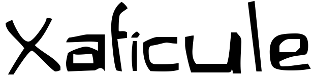
- Xaficule - Unknown license

- Mardi Gross - Unknown license

- dearcycle - Unknown license

- HOLE 3 - Unknown license

- Love Parade - Unknown license

- Square Unique - Unknown license

- Caslon Openface by Bitstream,
$29.99A small x-height typeface, originating with engravers near the start of the twentieth century, appearing in type in the 1923 ATF specimen. - Rodia by Monotype,
$25.00 Rodia is an Oddball Geometric Sans Typeface consisting of nine weights in both roman and oblique. It’s a geometric sans with a twist that’s perfect for branding and identity projects – it will also give your body text a unique voice. Inspiration came from the iconic “RADIO” signage that was once in place at 5041, Pico Boulevard, Los Angeles in 1985 (documented at https://tinyurl.com/y2krt2ox). With its distinctive leg, the /R/ provides a personality trait to define the style of the character set. You can clearly see how this characteristic separates Rodia from other geometric sans families – the /k/v/w/x/y/K/R/V/W/X/Y/ glyphs all display the distinctive ‘feet’ and ‘hands’ as terminals to legs and arms. Then there is the /A/ with its triangular crossbar – this triangular motif has been used to embellish alternates in Stylistic Set 1 for /A/E/F/G/H/Q/S/ glyphs. These will add another layer of versatility for your typographic projects. Rodia features an extensive character set covering all Latin European languages. Key features: 9 weights in Roman and Oblique Full European character set (Latin only) 400+ glyphs per font.
 - Love Parade outline - Unknown license

- Manilla - Unknown license

- Febsta by Vishnu Sathyan,
$12.00 Presenting a font with the tallest x-height in the world. Febsta. Comes only with caps for now. Support me to create small letters.