4,373 search results
(0.012 seconds)
- Beach Loves by Gilar Studio,
$16.00 beach loves is a beautiful and flowing handwritten font with love. It looks beautiful on a variety of designs requiring a personalized style, such as wedding invitations, thank you cards, weddings, greeting cards, logos and so on. This font is PUA encoded which means you can access all of the glyphs and swashes with ease! beach loves a new fresh & modern script with a handmade calligraphy style, decorative characters and a dancing baseline! So beautiful on invitation like greeting cards, branding materials, business cards, quotes, posters, and more!! The alternative characters were divided into several Open Type features such as swash and Stylistic Sets. The Open Type features can be accessed by using Open Type savvy programs such as Adobe Illustrator, Adobe InDesign, Adobe Photoshop Corel Draw X version, And Microsoft Word. And this Font has given PUA unicode (specially coded fonts). so that all the alternate characters can easily be accessed in full by a craftsman or designer. You can mix and match with Opentype feature: More than 419 of glyphs 23 ligatures Alternates Stylistic sets from ss01 to ss02 Multilingual Language Swash Line If you don't have a program that supports OpenType features such as Adobe Illustrator and CorelDraw X Versions, you can access all the alternate glyphs using Font Book (Mac) or Character Map (Windows). To Access Alternate Characters Click The Link Below: Adobe illustrator CS https://www.youtube.com/watch?v=geL0Ye02Ryk Adobe illustrator CC https://www.youtube.com/watch?v=V25yiUh8BcE Ms Word https://www.youtube.com/watch?v=HxkhZiCuwEw Coreldraw X7 https://www.youtube.com/watch?v=UBVsufJjons Adobe Photoshop CC https://www.youtube.com/watch?v=BYKXl58AdNY Indesign CS https://www.youtube.com/watch?v=HgZTCxKG14Q Check my other Font here : https://gilarstudio.com/
 - Cairoli Classic by Italiantype,
$39.00 Cairoli was originally cast by Italian foundry Nebiolo in 1928, as a license of a design by Wagner & Schmidt, known as Neue moderne Grotesk. Its solid grotesque design (later developed as Aurora by Weber and Akzidenz-Grotesk by Haas) was extremely successful: it anticipated the versatility of sans serif superfamilies thanks to its range of weights and widths, while still retaining some eccentricities from end-of the century lead and wood type. In 2020 the Italiantype team directed by Cosimo Lorenzo Pancini and Mario De Libero decided to produce a revival of Cairoli, extending the original weight and width range and developing both a faithful Classic version and a Now variant. The Cairoli Classic family keeps the original low x-height range, very display-oriented, and normalizes the design while emphasizing the original peculiarities like the hook cuts in curved letters, the high-waisted uppercase R and the squared ovals of the letterforms. Cairoli Now is developed with an higher x-height, more suited for text and digital use, and adds to the original design deeper ink-traps and round punctuation, while slightly correcting the curves for a more contemporary look. Born as an exercise in subtlety and love for lost letterforms, Cairoli stands, like its lead ancestor from a century ago, at the crossroads between artsy craftsmanship and industrial needs. Its deviations from the norm are small enough to give it personality without affecting readability, and the expanded weight and width range make it into a workhorse superfamily with open type features (alternates, stylistic sets, positional numbers) and coverage of over two hundred languages using the latin extended alphabet.
 - Night City by Gilar Studio,
$16.00 Night City is a beautiful and flowing handwritten modern font. It looks beautiful on a variety of designs requiring a personalized style, such as wedding invitations, thank you cards, weddings, greeting cards, logos and so on. This font is PUA encoded which means you can access all of the glyphs and swashes with ease! Night City a new fresh & modern script with a handmade calligraphy style, decorative characters and a dancing baseline! So beautiful on invitation like greeting cards, branding materials, business cards, quotes, posters, and more!! The alternative characters were divided into several Open Type features such as Swash, Stylistic Sets. The Open Type features can be accessed by using Open Type savvy programs such as Adobe Illustrator, Adobe InDesign, Adobe Photoshop Corel Draw X version, And Microsoft Word. And this Font has given PUA unicode (specially coded fonts). so that all the alternate characters can easily be accessed in full by a craftsman or designer. You can mix and match with Opentype feature: More than 300 of glyphs Alternates Titl Uppercase Stylistic sets from ss01 to ss03 Multilingual Language Swash If you don't have a program that supports OpenType features such as Adobe Illustrator and CorelDraw X Versions, you can access all the alternate glyphs using Font Book (Mac) or Character Map (Windows). To Access Alternate Characters Click The Link Below: Adobe illustrator CS https://www.youtube.com/watch?v=geL0Ye02Ryk Adobe illustrator CC https://www.youtube.com/watch?v=V25yiUh8BcE Ms Word https://www.youtube.com/watch?v=HxkhZiCuwEw Coreldraw X7 https://www.youtube.com/watch?v=UBVsufJjons Adobe Photoshop CC https://www.youtube.com/watch?v=BYKXl58AdNY Indesign CS https://www.youtube.com/watch?v=HgZTCxKG14Q Check my other Font here : https://gilarstudio.com/
 - Aerle by Hackberry Font Foundry,
$24.95 My first font for 2009 was Aerle. It is a new dark sans serif font in my continuing objective of designing book fonts that I can really use. It made a little ripple in the industry, but more than that I found that I loved it with Aramus and Artimas — my latest book font family with the same proportions. In many ways, Aerle is a very different direction for me built on what I have learned on Aramus and other recent developments in my style. The concept came to me while using Bitstream's Mister Earl on a site online—though there is no direct reference. I wanted a more playful heavy sans with a much smaller x-height than I have been using lately, plus taller ascenders. As I was using Aerle, I constantly needed a light and bold version. The new direction I am taking is a result of a decision that my fonts, though I loved the character shapes, produced an even type color that is too dark or a little dense. Aerle was an attempt to get away from that look even though the letterspacing is quite tight. For Aerle Thin I pushed a little further in that direction and increased the letterspacing. The hand-drawn shapes vary a lot, many pushing the boundaries of the normal character. This gives a little looseness and helps the lightness in feel I am looking for. It will be interesting to see where this all goes. Most new type around the world is far too perfect for my taste. While the shapes are exquisite, the feel is not human but digital mechanical. I find myself wanting to draw fonts that feel human — as if a person crafted them. In most ways this is a normal font for me in that it has caps, lowercase, small caps with the appropriate figures for each case. These small caps were very small (x-height as is proper). So Aerle's small caps are a little oversize because they plugged up too bad at x-height size. The bold is halfway between. These size variations seem important and work well in the text. This font has all the OpenType features in the set for 2009. There are several ligatures for your fun and enjoyment: bb gg sh sp st ch ck ff fi fl ffi ffl ffy fj ft tt ty Wh Th and more. Like all of my fonts, there are: caps, lowercase, & small caps; proportional lining figures, proportional oldstyle figures, & small cap figures; plus numerators, denominators, superiors, inferiors, and a complete set of ordinals 1st through infinity. Enjoy!
 - The Galaxus font is a bold display sans typeface that is strongly themed as futuristic, making it ideal for science fiction and space-related designs. Its characters are heavy and wide, with a unique...
- Levato by Linotype,
$29.99 Levato, the first font designed by Felix Bonge, is an Antiqua that is full of character and is refined but by no means sterile. This typeface provides for a wide range of options for creating individual designs. It was not really Felix Bonge's intention to create a whole font family when, as a second year student, he began several exercises in contrast and proportion as part of the typeface design course of Professor Veljovi? at Hamburg University of Applied Sciences. However, these initial studies developed into a project that Bonge persisted with over the following years while working towards his degree. He continually had new insights and ideas that he was able to exploit for his font. Of particular importance, he claims, was a calligraphy seminar, which prompted him to completely rework his concept. It took him several years before his extensive font Levato™ was ready. Although the forms of Levato are ultimately derived from Renaissance Antiqua, Bonge has slightly increased the relative contrast in his version. This gives the font a graceful appearance that is further emphasized by the reduced x-height and the associated prominence of the ascenders. And, in addition, the relatively fine serifs, which are almost linear at their ends, infuse Levato with a hint of classical Antiqua á la Bodoni. At the same time, Bonge cleverly compensates for the sterilising tendency of this font form. Soft and rounded serif attachments and rounded line apexes offset the severe nature of the font and provide it with an aura of vivacity. This effect is promoted by the calligraphic-like foot of the lowercase h, n and m and the not quite horizontal bars of the uppercase E and F. Overall, Bonge has succeeded in creating a refined and yet very dynamic typeface. Levato is available in five weights; Light, Regular, Medium, Bold and Black, in each case with the corresponding italic versions. Bonge treats Levato Italic as a genuine cursive typeface. Its letters are thus slightly narrower than the analogous upright letters and their forms are considerably more curvilinear. All the versions of Levato boast an enormous range of characters to meet all possible requirements. In addition to four sets of minuscule and majuscule numerals for tabular and proportional typesetting, there are also small caps, numerous ligatures, ornamental characters and even swash variants of letters. With their generous, sweeping curves, the swash variants (available as OpenType versions) can be used for striking titling effects or as initials.
 - Soda Jerk NF by Nick's Fonts,
$10.00Lettering by an uncredited designer on a French travel poster from 1929 provided the inspiration for this ultrabold headline typeface, a curious blend of symmetry and asymmetry. The font’s small descender height allows tight line spacing while maintaining legibility, even in relatively small sizes. Both versions of this font include the complete Latin 1252 and CE 1250 character sets, with localization for Romanian and Moldovan. - Kaybuts by sugargliderz,
$44.00 Kaybuts consists of three styles: sans-serif, serif, and semi-serif, each of which includes italic typefaces. Thinner and thicker weights look best when handled in relatively large font sizes, such as eye catchers and headlines. The middle weight is best suited for smaller text. Incidentally, this typeface was designed under the influence of, or with Mary Shelley's novel Frankenstein: or The Modern Prometheus in mind.
 - Corona LT by Linotype,
$29.99Corona was designed by C.H. Griffith and appeared with Mergenthaler Linotype in 1941. It is a part of Griffith’s Legibility Group’, on which he began working in 1922 and which contains typefaces especially well-suited to newsprint. Corona is based on forms of the Ionic type, perhaps the first style designed specifically for newspapers. The font is relatively small but gives an impression of strength and modernity. - Museo Slab Rounded by exljbris,
$16.50 One of the most friendly Slab Serifs just got even more friendly. Museo Slab Rounded is the latest addition to the Museo font family. It has updated letterforms, spacing and kerning. It can perfectly be combined with Museo Sans Rounded. It comes in six weights with italics, that are not just slanted regulars. Key characters have been changed to give the italics more flow.
 - Ancient History by Kaer,
$20.00 Hey guys! I'm happy to introduce you my new Ancient history based font. Recently I made an adventure to the North and visited a rock art attraction. This font based on pictograms I saw. The font may be used for creating ancient prints, logo design, clothing embroidery, product packaging, historical header, etc. What you will get: * Uppercase and lowercase * Multilingual support * Numbers * Symbols * Punctuation
 - Calendar Blocks JNL by Jeff Levine,
$29.00Calendar Blocks JNL was inspired by old-fashioned wood type used to assemble calendar pages in the days of letterpress printing. The A-Z keystrokes contain the dates 1-26. The lower case a-z keystrokes have the remaining dates 27-31, along with the split dates 23/30 and 24/31 and blank boxes. The days of the week are located on the 1-7 keys. - Chantal by Device,
$29.00 A loose, casual felt-pen script, Chantal comes in three weights plus italics, and a Cyrillic version too. Alternate versions are available in the upper and lower case keys, so settings can be customised according to taste. Chantal communicates a hand-drawn light touch with character. Originally designed to letter the RoboHunter series that Peter Hogan and Rian Hughes produced for the comic 2000AD.
 - Calm Gray by WR Foundry,
$20.00 The Calm Gray typeface is a book font with good readability. It is relatively bright, has a gentle rhythm and neutral expression. Calm Gray is a lightweight font, and thanks to its small caps and oldstyle figures, it allows to create a pleasant, unaccented text grayness. The Thin and ExtraBold weights are suitable for headlines and highlights in text while maintaining the uniform character of the design.
 - P22 Peanut Pro by IHOF,
$39.95 Peanut is a face full of bounce and playfulness but is based on the traditions of the long revered Roman minuscule. The letters are unique in that they imply “youth” without relying on cliché child-like letterforms. Peanut and Peanut Sans come in a ‘Salted’ style which features many alternate letterforms. Both the Salted and regular styles are combined into in the Pro fonts.
 - Round Rock NF by Nick's Fonts,
$10.00Woodtype wizard Rob Roy Kelly identified the inspiration for this typeface in his 100 Wood Type Alphabets simply as "No. 154". Funky, chunky, round and robust, it’s clearly a barrel of fun. Named after a small town in Central Texas, which just happens to be the home of Dell Computer. Both versions of the font include 1252 Latin, 1250 CE (with localization for Romanian and Moldovan). - P22 Sneaky Pro by IHOF,
$39.95 P22 Sneaky is the newest font by award winning type designer Michael Clark. Sneaky is a connecting-script and sibling of his popular Pooper Black type which shares a similar flow and casual elegance. It features shared details and relative size so that with careful design, the two can be mixed and matched. Sneaky Pro features over 500 glyphs with alternates and a Central European character set.
 - Wormwood Gothic by Device,
$39.00 Retaining all the imperfections and irregularities of wood type, Wormwood Gothic is a gothic sans with all the naive and uneven character shapes typical of the period. The ‘capitals’ feature extended characters, while the ‘lower case ’ features capitals of squarer proportions. Freely mix the two in word settings or colour in red and black for a Dada collage, billposter, urban grit or antique Americana atmosphere.
 - Sophisto by MAC Rhino Fonts,
$36.00 A successful collaboration between MRF and Psy/Ops Type Foundry. In search for a Sans Serif with a significant and strong character but still ”low-key” enough to be functional for most areas, Sophisto finally grew into an extensive family of 21 parts. Made carefully to fit both text- and display solutions. The buttons, images and patterns makes it even more complete as a family.
 - Dead Meat by wearecolt,
$8.00 DEAD MEAT - a bold, uppercase display font. Give your titles and logo types a hand made lettering look Features All uppercase font (use lower case key strokes for alternative character). Each glyph is unique from hand drawn originals. – Web font format included. The zip package contains both an opentype (.oft) and web font (.woff), DEAT MEAT has been created with all Western European characters.
 - English 157 by ParaType,
$30.00 The Bitstream version of Englische Schreibschrift by H. Berthold, 1970–72. An unconnected copperplate script of the English nineteenth-century fashion, so-called Spencerian. Based on pressure pointed quill calligraphy. Unlike other copperplate scripts, the letters in this face do not link up. For use in advertising and display typography in relatively small sizes. Cyrillic version was developed at ParaType in 2000 by Vladimir Yefimov.
 - Cuizy by Twinletter,
$13.00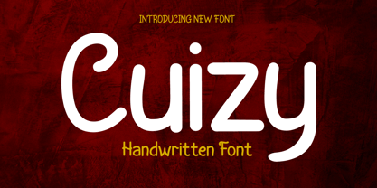 Introducing "Cuizy Font" - Where Handwriting Meets Distinctive Design. Cuizy Font is your key to adding a touch of personal charm and uniqueness to your projects. Crafted with precision, it effortlessly blends the warmth of handwritten text with contemporary style. What’s Included : File font All glyphs Iso Latin 1 Alternate, Ligature Simple installations PUA Encoded Characters – Fully accessible without additional design software. Fonts include Multilingual support
 - Showbiz by Studio K,
$45.00 An all singing, all dancing performer, Showbiz is the perfect font for those who want to sprinkle a little stardust on their typography and give a sense of occasion to their special announcements. It's an in-line version of Studio K's Red Top, Export Drive and Soft Rock, with which it shares the same basic outline and metrics. Mix and match them to stunning effect!
 - Ed McGuinness by Comicraft,
$39.00 Fighting American and all around Superman Ed McGuinness joins our Masters of Comic Book Art with a font inspired by his gamma ray saturated handwriting! Ed is officially a friend of Comicraft and a big smile in Hulk form! Now a small slice of this Jolly Green Giant is available as an alphabet waiting for puny humans to arrange in words of no more than two syllables.
 - FB Titling Gothic by Font Bureau,
$40.00Titling Gothic FB is an immense series of nearly fifty styles inspired by that century-old favorite ATF Railroad Gothic. Led by the Los Angeles Times and Gentleman’s Quarterly, U.S. publications are using David Berlow’s series to unify the structure of headlines from its wide spectrum of options. Titling Gothic FB started as a relative of Berlow’s Rhode family, but took its own direction; FB 2005 - Deco Banner JNL by Jeff Levine,
$29.00 Deco Banner JNL is composed of reverse lettering on a black background with Art Deco end caps. To create a banner, first type the plus sign for the left end cap, then your text. To add a space between words, use the bar on the shift position of the backslash key then continue on. To add the right end cap, type the equal sign.
 - New Boston NF by Nick's Fonts,
$10.00Another addition to the Whiz-Bang Woodtype series, this offering is patterned after a typeface issued by the old Boston firm of Baker & Greele in 1826. Named after a small town in Texas just a hop, skip and a jump from the Red River and Arkansas. Both versions of this font include the complete Latin 1252 and CE 1250 character sets, with localization for Romanian and Moldovan. - LTC Ornamental Initials by Lanston Type Co.,
$24.95 Little is known of the origin of these decorative Initial Caps. Series 448 at 24 point were a different design from the 36 point on which this digital version is based. In addition to the basic 26 characters, there is a negative version contained in the lower case position and a fill character (for two color caps) option in the number and punctuation key positions.
 - Linotype Ergo by Linotype,
$40.99Ergo is a relatively new font oriented on the form philosophy of Univers and Frutiger, namely, that a font which the eye should see as correct cannot be constructed. The eye tends to enlarge horizontals and to perceive verticals as weaker, and the stroke differences of Ergo are therefore designed to accommodate this tendency. Ergo makes a dynamic and modern impression and is extremely legible. - Occulista by VersusTwin,
$39.00 Occulista began as a modern take on a vintage tri-line style of typeface, but quickly evolved into something quite different. This heavyweight optically-stimulating family features nine weights, with alternate uppercase letters in place of lowercase. This typeface works best in eye-catching headlines or short bursts of text, and the variant styles can applied to accent key wordings in many interesting combinations.
 - Chalk Hand Marker by TypoGraphicDesign,
$19.00 The typeface Chalk Hand Marker is designed from 2019 for the font foundry Typo Graphic Design by Manuel Viergutz. The rough sans-serif display typeface with 4 font styles (Reg, Bold, Caps, Invert) is inspired by handwriting. 634 glyphs included plus 150+ decorative extras like icons, arrows, dingbats, emojis, symbols, geometric shapes, catchwords, decorative ligatures (type the word #LOVE for ❤️or #SMILE for
 - HighJinkies by Comicraft,
$19.00 It’s jaunty and flaunty and up to no good! It’s a child born of fairly odd parents and always looking for the good kind of trouble. It'll get you out of the red and into the pink like a panther pawning diamonds! Comicraft’s John Roshell has slipped his hands into the gloves of the Phantom Font Finagler and there’s HighJinks ahead to be sure!
 - VLNL TpLlum by VetteLetters,
$35.00 TpLlum is a typeface designed by TwoPoints for a festival in Barcelona called ‘Montjuïc de Nit’. Llum means light in Catalan. In the Montjuïc de Nit project the font was used in white over a dark grey background, letting the light of a backlit poster shine through. For this purpose the typeface had to be very bright, which was made possible by its heavy cut.
 - Janda Stylish Script by Kimberly Geswein,
$5.00 I love the trends in handwritten calligraphy and wanted to play with playful lettering. I've heard from many of my customers that they don't use Open Type software and feel limited in the cool features of OT scripts because of this, so I've replaced the | (bar key) with a left-sided tail to start the lowercase r and s in words that begin with those letters.
 - Commander by Red Rooster Collection,
$45.00 Commander is a compressed serif font family and is an original creation of Steve Jackaman (ITF). It was designed in 1994 exclusively for the Red Rooster Collection. The family excels at display sizes and in headlines, and its masculine nature lends itself well to projects about sports, science fiction, and academia. Wherever Commander ends up in your project, it is guaranteed to draw attention!
 - Qoronfull Arabic by Boharat Cairo,
$20.00 Qoronfull is an exuberant industrial display typeface, full of curves that create neat alignments. and it's our second collaboration with Hey Porter! Qoronfull means clove, (a dried flower buds spice tree native to Indonesia), Qoronfull's esthetics, curves, and lines are representing the flowers, leaves, and stems of clove, applied on a strong base of Arabic Kufi calligraphy style, with a big group of type compositions and ligatures.
 - Transaction SRF by Stella Roberts Fonts,
$25.00 Leave it to Ray Larabie to come up with an interesting typeface that looks as if it were printed straight out a store's register. Stella Roberts Fonts presents Transaction SRF, the perfect font for emulating cash register receipts and adding machine tapes. The net profits from my font sales help defer medical expenses for my siblings, who both suffer with Cystic Fibrosis and diabetes. Thank you.
 - Titling Gothic FB by Font Bureau,
$40.00 Titling Gothic FB is an immense series of nearly fifty styles inspired by that century-old favorite ATF Railroad Gothic. Led by the Los Angeles Times and Gentleman’s Quarterly, U.S. publications are using David Berlow’s series to unify the structure of headlines from its wide spectrum of options. Titling Gothic FB started as a relative of Berlow’s Rhode family, but took its own direction; FB 2005
 - Halloween Tales by Voysla,
$13.00 Hey Boo! HALLOWEEN TALES FONT - a fun and spooky Halloween font with webs, spiders, ghosts, pumpkins and more. Perfect for Halloween designs, logos, branding, packaging, cards, stickers, posters, quotes, social media posts and much more! You could make me happy if rated my work! Feel free to contact me, if you have any questions. Happy creating and have a Boo day! 💀 👻 🎃
 - Bernhard Blackletter by RMU,
$25.00 Bernhard Blackletter can be compared to a tuba, adding its deep bass sound to the orchestra of blackletter fonts. This font contains a bunch of useful ligatures, and to access all, it is recommended to activate both Standard and Discretionary Ligatures. You find the round s on the # key, and typing the combination N-o-period and activating the OT feature Ordinals gets you the numero sign.