4,373 search results
(0.028 seconds)
- Hybrid by ParaType,
$30.00 Designed for ParaType in 1999-2003 by Manvel Shmavonyan. This is a low-contrast serif typeface with large x-height and small square cove serifs. For use for text and display typography. Due to its open letterforms and big number of styles the face is a good companion to open humanist Sans. Hybrid design was awarded special prize at Kyrillitsa'99 international type design competition.
 - PF Fusion Slab by Parachute,
$40.00 Fusion Slab was developed based on Fusion Sans Pro, as an amalgamation of traditional early nineteenth-century letters. Fusion Slab is a family of 3 weights with very tall x-height which is suitable for long headlines. On the other hand, its ascenders and descenders are extremely short so text lines can be set with a very low leading value. It provides support for Latin and Greek.
 - Oculi Magni by TeGeType,
$25.00 Oculi Magni is a new sans serif type family of 8 weights with italics. This font was specially designed for the composition of texts in small size as captions or footnotes but the thin and black weights can also be used in display sizes. The x-height, as tall as possible, allows the composition of very tight, very dense texts while maintaining a perfect readability.
 - Magica by K-Type,
$20.00 MAGICA is a book and display face that is both distinctive and legible – clear letterforms and a generous x-height make Magica a good choice for text or titles. The typeface has elegantly chamfered serifs and a confident, vivacious character that is equally suited to formal and informal usage. Magica is available in three weights – Regular, Medium and Bold – each supplied with a free italic.
 - Bling by Hackberry Font Foundry,
$24.95 My second font for 2009, Bling is a hoot. This vaguely Deco, sparkly sans is for those heads that need bling. This is the first font released in a long time without my complete feature set. It has lining and oldstyle figures, many wild ligatures, the x-height is too high to make a small caps set worth the effort. It's just for fun. Enjoy!
 - Reverie by District,
$15.00 Reverie is a cheerful band of letters that bounce across the page and get together to create words in three weights. Generous spacing and a modest x-height project an airy typeface that's open but not frail. Quirky without being too whimsical. Use the regular weight for surprisingly readable text or put the light and bold weights to use for decorative headlines and titles.
 - Cafela by Look Minus Today,
$14.00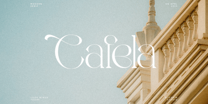 Introducing Cafela - A Elegant Modern Font With A Ligatures & Alternates by Rijesain x Look minus today Cafela - is a modern and elegant serif font that is perfect for adding a touch of sophistication to your designs. Its sleek and stylish look makes it suitable for a variety of applications, including branding, advertising, and editorial design. Features: Uppercase Lowercase Ligatures & Alternates Numerals & Punctuation Multilingual Thanks & Happy Designing!
 - VTC Horoscope by Vintage Type Company,
$18.00 VTC Horoscope is a modern & minimalist rendition of a Victorian-esque style typeface. Much like the typefaces of that time, this font has high stroke contrast, smooth serifs, and a slightly extended x-height, however it ditches the flourishes & fluff for weight & legibility. VTC Horoscope makes the perfect font for packaging design, big bold headlines, vintage inspired projects, or anywhere you want to spark curiosity and attention.
 - FeggoliteMono by Ingrimayne Type,
$6.95 FeggoliteMono is a decorative, monospaced typeface family with a small x-height and long descenders. Two styles (plain and bold but renamed in 2020 as light and regular) were created in 1994 and revised in 2010. In 2020 a bolder bold was added along with italics versions for each of the three weights. The design was an attempt to create a decorative typewriter font.
 - Malebu by Macrotipo,
$39.00 Malebu is a sans serif font that was created based on grotesque and humanist models with certain geometric features. It is clear, simple, gentle and friendly, and can be used in text sizes. It is easy to read in long texts, magazines, books and the like. The rounded shape makes it friendly and fluent. A short x-height is functional and adds economy without losing consistency.
 - Rusulica by Type Fleet,
$12.00 Rusulica pure luxury Rusulica script is designed to express handwriting in a modern and glamorous fashion. Its letter construction is pure and fluid. Because of its ornamental and playful design, it offers plenty of possibilities. Rusulica has a high contrast and there is an alternate for almost every capital letter. The typeface’s x-height is bigger than usual and it is constructed at a 30° angle.
 - Senhan by Studio Principle Type,
$17.00 A timeless serif with a distinctly contemporary attitude. The Senhan font family makes a statement with confidence. Defined by sexy, sharp, angular contours when used in headline and display scenarios, this family of 5 weights and italics is a real eye-catcher. But with a tall’ish x-height for legibility, and a medium contrast, Senhan is a workhorse at small sizes and in lengthy blocks of copy.
 - Soup and Salad JNL by Jeff Levine,
$29.00 Within the 1893 edition of the Barnhart Bros. & Spindler type specimen book is “Bisque”, a text and headline type face with a charmingly eccentric look. Some upper case characters take on more of a squarer look than others, while the lower case has a higher ‘x’ height. This type revival is now available as Soup and Salad JNL in both regular and oblique versions.
 - Decima Mono Cyr by TipografiaRamis,
$39.00 Decima Mono Cyr is an upgraded edition of Decima Mono X fonts (released in 2014). The new version consists of the same (six) styles updated with larger character sets by extending number of Latin and Cyrillics Asian region languages. The typeface is intended for use in display sizes, but is also quite legible in text and is well suited for editorial and brand design.
 - Sanchez Condensed by Latinotype,
$- Sánchez, designed by Daniel Hernández, is a serif typeface belonging to the classification slab serif, or Egyptian, that bears a strong resemblance to the iconic Rockwell, but with rounded edges— offering contrast and balance to the square structure. Sánchez & Sánchez Condensed comprises 12 variants, ranging from extra light to black, each of the same x-height. Regular and Italic variants are available for free.
 - Leibniz Fraktur by RMU,
$25.00 In the middle of 18th century Leibniz Fraktur appeared in German print shops. This blackletter font with its great x-height preserved the then fashioned trunk in many of its uppercase letters. It was a cast font of Genzsch & Heyse, Hamburg. Leibniz Fraktur contains a bunch of useful ligatures, and by typing 'N', 'o' and period plus activating the Ordinals feature you get an oldstyle number-sign.
 - Intrinseca by AVP,
$29.00 With only a suggestion of the serifs remaining, Intrinseca is modelled on traditional serif letterforms but with low-contrast stroke widths and a generous x-height. The family has a clean appearance and excellent readability. Six weights plus italics, small caps and extended language support make Intrinseca ideal for magazines, books and web – wherever distinctive headings and a variety of text options are required.
 - Bantat by Jipatype,
$20.00 ฟอนต์ Bantat เป็นแบบอักษรแซนเซอริฟ ที่มีความเรียบง่ายโดยออกแบบให้หลังคาและฐานตัวอักษรกลุ่มหนึ่งราบเรียบไปกับเส้นบรรทัด ผสมกับหลังคาแบบปกติ เพื่อให้มีไดนามิคแทนที่จะราบเรียบไปทุกตัวอักษร มีให้เลือกใช้ 18 น้ำหนัก และ 5 ความกว้าง ทั้งตัวตรงและตัวเอียงรวมแล้วมี 90 ลักษณะ เหมาะสำหรับงานทั่วไป บนสื่อได้หลากหลายขนาดไม่ว่าจะมีความกว้างหรือแคบ -- The Bantat font is a simple Sans Serif typeface designed to flatter parallel to the baselines and x-height. Available in 18 weights and 5 widths, both upright and italic have 90 Styles in total. Suitable for general work on media in a variety of sizes, whether wide or narrow.
 - Galerie by ArtyType,
$29.00 Incorporating a certain Gallic ‘je ne sais quoi’ Galerie is a chic & stylish sans serif, though you'll notice some short tails with angled terminals acting rather like serifs, lending a sophisticated characteristic to its balanced proportions. Galerie’s large x-height makes it a very legible font family, available in 4 weights: Thin, Light, Medium and Bold. See also the condensed sister family Galerie 2.
 - Malebu by Muykyta,
$10.00 Malebu is a new sans serif font that was created based on grotesque and humanist models with certain geometric features. It’s clear, simple, gentle and friendly, can be used in text sizes. Its easy to read in long texts, magazines, books and the like. The rounded shape makes it friendly and fluent. A short x-height is functional and adds economy without losing consistency.
 - Serifa by Bitstream,
$29.99 Developed by Adrian Frutiger for Bauer in 1966, Serifa is a slabserif based on the principles that led to the success of Frutiger’s 1956 sanserif, Univers. Glypha, designed by Frutiger for Stempel in 1979, is a version of Serifa with a moderately larger x-height; Stempel has paid royalties on Glypha to Neufville since 1984. Serifa® font field guide including best practices, font pairings and alternatives.
 - ITC Mendoza Roman by ITC,
$29.99 ITC Mendoza is a serif typeface with old style characteristics. A generous x-height and a lack of contrast between thick and thin strokes, gives the ITC Mendoza Roman font family good legibility and provides a sturdiness which enables the face to withstand low resolution output and less than ideal printing conditions. It is ideal for continuous text use, particularly in small point sizes.
 - Fidel by Latinotype,
$25.00 Fidel Black Essential is a heavily weighted, condensed, sans-serif typeface with a large x-height. Ideal for short, high-impact headlines, its design is inspired by Russian Constructivism and old Cuban communist posters. Variants include Fidel Black, Fidel Black Italic and Fidel Black Stencil. Fidel Black Essential is an excellent choice for headlines, subheadings, posters and logotypes. Languages: Basic Latin, Euro, Mac OS Roman.
 - Selma by Sea Types,
$25.00 Selma is a family of Sans Serif fonts with 492 Glyphs, 04 weight (Light, regular, medium and bold), with long stems, inspired by bar codes. Extremely condensed vertical emphasis, its bars positioned at the ends of the rods give a strong dose of personality and elegance to the design, has a height of x accented, giving strength and power of attraction for short texts and large sizes.
 - Americana by URW Type Foundry,
$35.99 Americana is a transitional typeface with very rounded, open characters. It was designed in 1967 by Richard Isbell for American Type Founders. Americana is a wide and open face with short, wedge serifs and a rather large x-height. Typical uses for this typeface are advertisements, short pieces of text, such as greeting cards and leaflets. The Americana font family is also ideal for headlines.
 - ZT Mostion by Zelow Type,
$14.00 Introducing "ZT Monstion," a fusion of sans and grotesque styles, both in bold weight, radiating an essence of simplicity and modernism. Crafted meticulously, this typeface embodies the purity of sans-serif aesthetics while embracing the boldness of grotesque forms. Its carefully refined x-height and expertly smoothed angles create a mesmerizing balance, where minimalistic design meets commanding boldness. With each character empowered by the weighty black typography.
 - Ovallique by Vanderfont,
$24.00 Ovallique shares roots with its looser cousin Beachbuoy. But don't mistake Ovallique's casual parentage for hand me down genes. Ovallique is the well-tailored relation, with limousine and driver at the ready. Dom Casual meets Dom Perignon for supper at the revolving restaurant. OK, so the wallpaper is slightly faded. Ovallique's x-height makes it legible even after apéritifs. It's kitschy slumming for the streamlined set!
 - LumineSign - Unknown license

- Larabiefont - Unknown license

- Final Fantasy - Unknown license

- Karma Suture - Unknown license

- Alfredo's Dance - Unknown license

- Abandoned Bitplane - Unknown license

- Chicken Wire Lady - Unknown license

- Mai Tai - Unknown license

- Geographica by Three Islands Press,
$29.00 Thomas Jefferys (ca. 1710–1771) was the best-known map maker in 18th-century England, chiefly because he won (and hyped) the title “Geographer to King George III.” Jefferys was really more an engraver/publisher than a geographer, since he mostly relied on the cartographic materials of others. Still, his maps of the North American colonies were well known. Geographica is a legible, four-style serif family modeled after the neat hand-lettered place names and peripheral text on Jefferys’s maps. With its long serifs, tall x-height, and robust curves, Geographica somehow combines classic elegance with a whiff of coastline and sea. The italic styles have the slant and warmth of the hand-drawn source materials. And the typeface comes with a slew of distinctive map-based ornaments—including compass wheels and sailing ships. This evocative serif works well in both display situations and long blocks of text, whether on paper or screen. OpenType features include small capitals, numerous ligatures, and two stylistic sets of titling caps. Geographica offers full support for Central and Eastern European languages—more than 1,200 glyphs in all.
 - Live Grotesk by Matt Chansky,
$18.00 An exquisite neutral body copy and memorable modern headline font – all under one pixel-perfect font family. Live Grotesk is no ordinary font, in fact it's two fonts in one, seamlessly working together. When big messaging requires a charismatic headline font to activate layout designs, amplify attention, and delight audiences with brand retention – turn on "FM," Live Grotesk's headline font. When you need a body copy font that is space-efficient, a highly refined neutral with a high x-height to help with readability, particularly on screens – Live Grotesk is for you. Stylish simplicity and neutrality are key components of the signature body copy look. This is why Live Grotesk is a uniquely crafted modern font for today's modern creatives. With a variety of weights, from light to bold, you'll also enjoy the robust offering of multilingual glyphs, plus a handful of extras like the estimated symbol, directional arrows, and helpful UX characters. When the creative direction calls for memorable, approachable, and consumable typography, consider Live Grotesk to elevate your marketing tactics. It's a font alive with versatility, that's why it's called Live Grotesk.
 - Sqwared by Monotype,
$25.00 Sqwared is a square sans serif type family... with flares! This typeface has a retro, hand-painted quality – the slight flaring of its verticals evoke the steady brush of a signwriter. Sqwared benefits from large, open counters and a generous x-height that aids clarity and legibility, while a wide footprint gives these fonts a degree of stature and an air of confidence. Each character was drawn while immersed in a late sixties/early seventies vibe, but there’s no reason why Sqwared can’t be used for your contemporary designs. There are 16 fonts altogether, ranging from Thin to Ultra weights in both roman and italic. It has a Latin character set that covers all Latin European languages. Sqwared will dazzle in headlines, add flair and distinction to your logo designs, bring flamboyance to your branding material, and your body text will most definitely be unique! Variable fonts are included in this family, so you can tune the weight of each font to your exact preference. Key features: 8 weights in Roman and Italic Old Style Figures included Full European character set (Latin only) 440 glyphs per font.
 - ITC Schuss Hand by ITC,
$29.99Designed by German graphic designer Jochen Schuss. ITC Schuss Hand and ITC Schuss Hand Bold can probably best be described as excellent all around scripts useful for a broad spectrum of advertising purposes as well as for those applications that benefit from a refined handwritten appearance. The characters themselves have a soft, almost “liquid” appearance which is enhanced by the subtle swelling at most of the stroke terminals. The slightly condensed nature of the characters plus a relatively large x-height ensures that both weights are ideal for the advertising arena. An additional feature on ITC Schuss Hand and ITC Schuss Hand Bold are the capital letters which can actually be used on their own in word settings whereas most script capitals are designed just for initialing purposes. The designer has also invested a good deal of careful thought to the way in which a high percentage of the lowercase letter combinations overlap to create an authentic hand-scripted appearance. This, together with the italicized letter forms, will make Schuss Hand and Schuss Hand Bold ideal candidates for those occasions when paper correspondence requires an informal style. So, as is claimed, an excellent all around script style. - Velo Serif Text by House Industries,
$33.00 Velo leads layouts with a grand tour champion’s panache but is also a hard-working design domestique for text-heavy applications. Superelliptical shapes and sturdy serifs will keep pace with contemporary culture with an aesthetic agility that will never go out of style. Velo Serif includes sixteen fonts: Twelve display styles ranging from thin to black with complementary italics and four text styles designed for longer settings. Velo Serif Display features an increased x-height for more illustrative headlines while Velo Serif Text maintains a readable cadence in high word count environments. Designed by House Industries, Christian Schwartz, Mitja Miklavčič and Ben Kiel. FEATURES Text vs Display: Velo Text maintains the distinctive style of its Display siblings, but is enhanced for optimum legibility in running text settings. Key ligature combinations keep headlines and running text flowing smoothly. Velo Serif Text includes a complete small cap alphabet to add another typographic dimension to your layouts. Select Velo Serif figures include illustrative alternates to display numerical superiority. Like all good subversives, House Industries hides in plain sight while amplifying the look, feel and style of the world’s most interesting brands, products and people. Based in Delaware, visually influencing the world.


