4,373 search results
(0.022 seconds)
- Mufferaw Free - Unknown license

- Bullpen - Unknown license

- Larabiefont Free - Unknown license

- Zekton - Unknown license

- Zekton Dots - Unknown license

- Filmstar by Solotype,
$19.95 - Astron Boy Wonder - Unknown license

- XChessNut by Ingrimayne Type,
$5.00
- Kanji OC by Okaycat,
$29.95
- Shire Script by Bean & Morris,
$35.00
- Vivala Sans by Johannes Hoffmann,
$15.00
- Larque by Furiosum,
$20.00
- Hopeful Giraffe by JBFoundry,
$18.00
- Evening Sans by cm5dzyne,
$12.00 - Pinot Grigio Modern by Alan Meeks,
$45.00
- New Prairie by Aboutype,
$24.99 - FlyHigh by Ingrimayne Type,
$12.95
- Keystoned by TypeArt Foundry,
$45.00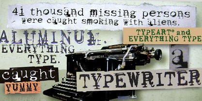
- DS Army Cyr - Unknown license

- Palmer Oxonian NF by Nick's Fonts,
$10.00 - Engebrechtre - Unknown license

- Sui Generis Free - Unknown license

- Zekton - Unknown license

- Bullpen - Unknown license

- Display Uncanny by Gerald Gallo,
$20.00
- Initial Seals JNL by Jeff Levine,
$29.00
- Gristwood JNL by Jeff Levine,
$29.00
- Baby Font - Unknown license

- Aloha - Unknown license

- Activate - Unknown license

- Imprint by Monotype,
$29.99
- Lodewijk Gothic NF by Nick's Fonts,
$10.00
- Kwodsity by Ingrimayne Type,
$12.95
- PL Bernhardt by Monotype,
$29.99 - Mazzard by Pepper Type,
$30.00
- Quixotic Sans by Roland Hüse Design,
$25.00
- Aneba Neue by Borutta Group,
$27.00
- Estandar Rounded by Latinotype,
$-
- Mensa by AVP,
$19.00
- Newlook by QUADRAAT,
$25.00


