10,000 search results
(0.025 seconds)
- Rontage by Letterhend,
$19.00 Rontage Display is a serif display typeface with a touch of vintage look and feel. The stroke with swirls really make it looks nostalgic. This type of font perfectly made to be applied especially in logo, headline, signage and the other various formal forms such as invitations, labels, logos, magazines, books, greeting / wedding cards, packaging, fashion, make up, stationery, novels, labels or any type of advertising purpose. Features : uppercase & lowercase numbers and punctuation multilingual alternates / swashes and ligatures PUA encoded We highly recommend using a program that supports OpenType features and Glyphs panels like many of Adobe apps and Corel Draw, so you can see and access all Glyph variations.
 - Selfakia by Muntab Art,
$16.00 Selfakia is a Hand Brush font, perfect for logo design, branding, clothing design, signage, posters, wedding invitations and so much more! Also many more alternative characters, with 70+ ligature. In order to use the beautiful swashes, you need a program that supports OpenType features such as Adobe Illustrator CS, Adobe Photoshop CC, Adobe Indesign and Corel Draw. To access the swash type _1 _2 _3 _4 _5 Please contact us if you have any question, we are happy to help you! Thank you! Do you want a custom logo design? Contact me at muntabart@gmail.com Or you can also contact me on Instagram @muntab_ar
 - Rivervale by Letterhend,
$19.00 Rivervale font a typeface which is inspired by vintage lettering sign and art. Very suitable for for headline, logotype, apparel, invitation, branding, packaging, advertising etc with old school / vintage as well as modern theme. It comes in uppercase, lowercase, punctuations, symbols & numerals, stylistic set alternate, ligatures, etc also support multilingual and already PUA encoded. Features : uppercase and lowercase numbers and punctuation multilingual alternates and ligatures PUA encoded We highly recommend using a program that supports OpenType features and Glyphs panels like many of Adobe apps and Corel Draw, so you can see and access all Glyph variations. How to access opentype feature : letterhend.com/tutorials/using-opentype-feature-in-any-software/
 - Indigena by Latinotype,
$29.00 Mapuche means ‘man of the land’ and it is also the name of a group of indigenous inhabitants in South America. During the southern Winter solstice, between June 21 and June 24, the We Tripantu, the Mapuche New Year fest, takes place with a magical rite in the middle of the nature. Indigena is a dingbat font that remakes the artistic expression of the Mapuche people in Chile, recovering the handmade stroke they used in textiles and ceramics, but with a fresh look. This dingbat is based on pre-Columbian iconographic drawings shown in the book Dibujos Indígenas de Chile (1929) by chilean art teacher Abel Gutiérrez.
 - Louislemon by Letterhend,
$19.00 Introducing, Louislemon Display - a unique display script with a reverse slant style. The unusual look of the script makes this typeface one of a kind. This type of font perfectly made to be applied especially in logo, and the other various formal forms such as invitations, labels, logos, magazines, books, greeting / wedding cards, packaging, fashion, make up, stationery, novels, labels or any type of advertising purpose. Features : uppercase & lowercase numbers and punctuation multilingual alternates and ligatures PUA encoded We highly recommend using a program that supports OpenType features and Glyphs panels like many of Adobe apps and Corel Draw, so you can see and access all Glyph variations.
 - Eligated by Letterhend,
$17.00 Introducing, Eligated - a display serif typeface with nostalgic look and feel. Inspired from 60s and 70s signages, labels, and ads. This type of font perfectly made to be applied especially in logo, headline, signage and the other various formal forms such as invitations, labels, logos, magazines, books, greeting / wedding cards, packaging, fashion, make up, stationery, novels, labels or any type of advertising purpose. Features : uppercase & lowercase numbers and punctuation multilingual PUA encoded regular & bold version We highly recommend using a program that supports OpenType features and Glyphs panels like many of Adobe apps and Corel Draw, so you can see and access all Glyph variations.
 - Merodine by Letterhend,
$19.00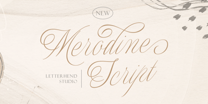 Merodine Script. A Beautiful and classy script that has many swashes that allows you to create beautiful lettering instantly. it has many stylistic set alternates that you can choose from. This font perfectly made to be applied especially in logo, and the other various formal forms such as invitations, labels, logos, magazines, books, greeting / wedding cards, packaging, fashion, make up, stationery, novels, labels or any type of advertising purpose. Features : uppercase & lowercase numbers and punctuation multilingual ligatures alternates swashes PUA encoded We highly recommend using a program that supports OpenType features and Glyphs panels like many of Adobe apps and Corel Draw, so you can see and access all Glyph variations.
 - Mero by Deltatype,
$49.00 Mero inspired by the Roman Capital Proportions which we have seen in Trajan Inscription. With different widths; There are applied each letter to visual proportion. Mero inspired by this measurement method and would like to create the primary typeface in terms of simple form. This sans serif typeface designed to use for any media with a little notice from designer eyes. You won't notice much about style, but something will let you feel extraordinary and trust. Mero has supported over 30 languages and come with nine weights for a complete family. With the standard of CSS font-weight, Mero complete family will map beautifully for your digital layout.
 - Sakura Town by Letterhend,
$19.00 Sakura Town is a display typeface inspired by japanese type brush. This type of font perfectly made to be applied especially in logo, and the other various formal forms such as invitations, labels, logos, magazines, books, greeting / wedding cards, packaging, fashion, make up, stationery, novels, labels or any type of advertising purpose. Features : uppercase & lowercase numbers and punctuation multilingual & swash PUA encoded We highly recommend using a program that supports OpenType features and Glyphs panels like many of Adobe apps and Corel Draw, so you can see and access all Glyph variations. How to access opentype feature : letterhend.com/tutorials/using-opentype-feature-in-any-software/
 - The Blackmore by Letterhend,
$19.00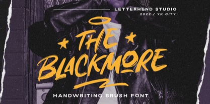 The Blackmore is a bold hand drawn brush script which is purposely made for headline, display or logotype, and signature which need a standout appearing. This font is also suitable to be applied especially in logo, and the other various formal forms such as invitations, labels, logos, magazines, books, greeting / wedding cards, packaging, fashion, make up, stationery, novels, labels or any type of advertising purpose. Features : uppercase & lowercase numbers and punctuation multilingual PUA encoded We highly recommend using a program that supports OpenType features and Glyphs panels like many of Adobe apps and Corel Draw, so you can see and access all Glyph variations.
 - Bastinson by Letterhend,
$19.00 Bastinson is a monoline script with a touch of retro look and feel. Looks great to be paired with bold consendsed sans serif typeface. This type of font perfectly made to be applied especially in logo, headline, signage and the other various formal forms such as invitations, labels, logos, magazines, books, greeting / wedding cards, packaging, fashion, make up, stationery, novels, labels or any type of advertising purpose. Features : uppercase & lowercase numbers and punctuation multilingual alternates / swashes and ligatures PUA encoded We highly recommend using a program that supports OpenType features and Glyphs panels like many of Adobe apps and Corel Draw, so you can see and access all Glyph variations.
 - Alburgone by Letterhend,
$15.00 Alburgone is a hand lettering typeface with nostalgic look and feel! This font perfectly made to be applied especially in logo, and the other various formal forms such as invitations, labels, magazines, books, greeting / wedding cards, packaging, fashion, make up, stationery, novels, labels or any type of advertising purpose. Features: 4 styles (Regular, Slanted, Outline Regular, Outline Slanted) numbers and punctuation multi-lingual support PUA encoded We highly recommend using a program that supports OpenType features and Glyphs panels like many of Adobe apps and Corel Draw, so you can see and access all Glyph variations. Email us to letterhend@gmail.com if you need something! Happy Designing!
 - Huxley Cyrillic by HiH,
$12.00 Huxley Cyrillic is based on our Huxley Amore Bold, retaining all the Western and Central European characters of the latter, while adding upper and lower case Cyrillic characters. Huxley Cyrillic, like Huxley Amore, is visually simple and direct and yet sophisticated and unexpected. Those are the qualities that give it such freshness in so many applications. This font is intended for display use. It is highly condensed and is therefore difficult to read below 18 points. It works well at 36 points, but really works best at 48 points and larger. Huxley Cyrillic has 499 glyphs. I think we should have made at least one more!
 - Averie Brenton by Grezline Studio,
$18.00 Averie Brenton is an elegant serif font family. Perfectly to be applied to various forms such as invitations, labels, logos, magazines, books, greeting / wedding cards, packaging, fashion, make up, stationery, novels, labels or any type of advertising purpose. Feature : Alternates and Ligatures Multilingual Language Works on PC & Mac Simple installations Accessible in the Adobe Illustrator, Adobe Photoshop, Adobe InDesign, even works on Microsoft Word. We highly recommend using a program that supports OpenType features and Glyphs panels like many of Adobe apps and Corel Draw, so you can see and access all Glyph variations. Thank You! Grezline Studio – Akhmad Reza Fauzi Contact : grezline.studio@gmail.com
 - Broadley by Letterhend,
$17.00 Introducing, Broadley, a pair of hand drawn bold serif and script with a touch of vintage look and feel. This type of font perfectly made to be applied especially in logo, headline, signage and the other various formal forms such as invitations, labels, logos, magazines, books, greeting / wedding cards, packaging, fashion, make up, stationery, novels, labels or any type of advertising purpose. Features : uppercase & lowercase numbers and punctuation multilingual alternates / swashes and ligatures PUA encoded We highly recommend using a program that supports OpenType features and Glyphs panels like many of Adobe apps and Corel Draw, so you can see and access all Glyph variations.
 - Morytone by Letterhend,
$18.00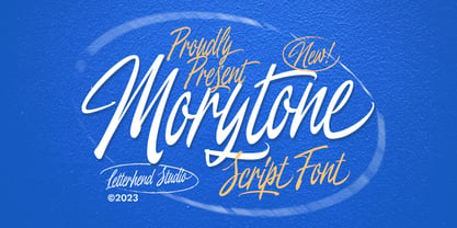 Morytone is a hand drawn brush script which is purposely made for headline, display or logotype, and signature which need a standout appearing. This font is also suitable to be applied especially in logo, and the other various formal forms such as invitations, labels, logos, magazines, books, greeting / wedding cards, packaging, fashion, make up, stationery, novels, labels or any type of advertising purpose. Features : Uppercase & lowercase Numbers and punctuation Swash, ligatures & alternates Multilingual PUA encoded We highly recommend using a program that supports OpenType features and Glyphs panels like many of Adobe apps and Corel Draw, so you can see and access all Glyph variations.
 - Mina Jackstone by Letterhend,
$19.00 Mina Jackstone is a SVG typeface with watercolor texture effect. Available in two types, solid version and transparent version. This type of font perfectly made to be applied such as invitations, labels, logos, magazines, books, greeting / wedding cards, packaging, fashion, make up, stationery, novels, labels or any type of advertising purpose. Features : Solid version and svg version numbers and punctuation multilingual ligatures PUA encoded We highly recommend using a program that supports OpenType features and Glyphs panels like many of Adobe apps and Corel Draw, so you can see and access all Glyph variations. How to access opentype feature : letterhend.com/tutorials/using-opentype-feature-in-any-software/
 - Worthing by Greater Albion Typefounders,
$14.00 Worthing aims to combine Victorian charm with modern-day requirements for legibility and clarity, and we hope, demonstrates that traditional elegance still has its place in the modern world. Meanwhile, for those who are curious about the naming of our fonts, Mr Lloyd our designer was reading Mr Wells (H. G.) War of the Worlds recently. No doubt some of you will remember the part that Worthing in Sussex played in that story. Worthing is offered in three styles: regular, alternate and shaded. It's ideal for Victorian and Edwardian era inspired design work, posters and signage, as well as for book covers, chapter headings and so forth.
 - Vindale by Letterhend,
$19.00 Introducing, The Vindale - a vintage script with reverse contrast and a touch of nostalgic look. The unusual reverse contrast make this typeface one of a kind. This type of font perfectly made to be applied especially in logo, and the other various formal forms such as invitations, labels, logos, magazines, books, greeting / wedding cards, packaging, fashion, make up, stationery, novels, labels or any type of advertising purpose. Features : uppercase & lowercase numbers and punctuation multilingual alternates and ligatures PUA encoded We highly recommend using a program that supports OpenType features and Glyphs panels like many of Adobe apps and Corel Draw, so you can see and access all Glyph variations.
 - Alfabetica by Eurotypo,
$22.00 Alfabetica is a modern and humanist Sans Serif typeface. We were looking for a new grotesque energetic but with some classical features. The result of the design is a grotesque slightly condensed with soft strokes, open counters and terminals; giving it a great readability with an esthetic elegance and sensitive appeal. Alfabetica comes in eight weights from Thin to Black, with a matching italic for every weight. This family of fonts provide advanced typographical support with OpenType features such as CE languages, ligatures, oldstyle numeral, case- sensitive forms, fraction and small capitals. Alfabetica is perfectly suited for texts, signage, magazines, web pages, packaging design, advertising, corporate identity and logotypes.
 - Volupia by DSType,
$19.00I started designing Volupia in 2004 and the main goal was to create a very casual font with some characteristics than we can find in some old commercial advertisements. After designing the basic character set I decided to go OpenType because it would allow me to go deep into the script, correcting the balance of the spaces and the kerning, along with the possibility to create Ligatures and Swashes. The result is a typeface ideal for use in very big sizes. Volupia includes Small Caps, Ligatures, Fractions, CE Characters, Swashes and Alternates. The ligatures and the ending swashes allow the user to make the text more calligraphic and personal. - Astropicks by Letterhend,
$19.00 Astropicks is a modern and playful typeface which is purposely made for headline, display or logotype. This type of font perfectly made to be applied especially in logo, and the other various formal forms such as invitations, labels, logos, magazines, books, greeting / wedding cards, packaging, fashion, make up, stationery, novels, labels or any type of advertising purpose. Features : uppercase & lowercase numbers and punctuation multilingual alternates & ligatures PUA encoded We highly recommend using a program that supports OpenType features and Glyphs panels like many of Adobe apps and Corel Draw, so you can see and access all Glyph variations. How to access opentype feature : letterhend.com/tutorials/using-opentype-feature-in-any-software/
 - Maladroit by Comicraft,
$29.00 Okay, we admit it! Comicraft's latest offering -- wrenched heavy-handedly from the pages of CHARLEY LOVES ROBOTS – is definitely a little awkward, maybe even loose-limbed and goofy. Those (usually) awfully nice chaps in the Comicraft studio are perhaps best known for their dexterity, their lightness of touch and nimbleness of finger rather than the kind of bungling, graceless, clumsy work evident in their latest digital alphabet. So, yes, MALADROIT is probably the most inept, cack-handed, undiplomatic addition to our catalogue ever submitted by freewheelin' John Roshell (formerly GAUCHE-ell) but might just possibly be the perfectly wrong font choice for your more bungling, inept, incompetent and hamfisted characters.
 - Joyful Chase by Letterhend,
$14.00 Joyful Chase is a display font that effortlessly combines playfulness and classic charm. It comes with extrude style, this option adds depth and dimension to your text, creating a visually striking effect that demands attention.This letterforms bring a sense of fun and excitement to your designs, making it ideal for children's books, cheerful branding, and creative projects that seek to inspire happiness and wonder. Features : Uppercase & lowercase Numbers and punctuation Alternates & Ligatures Multilingual PUA encoded We highly recommend using a program that supports OpenType features and Glyphs panels like many of Adobe apps and Corel Draw, so you can see and access all Glyph variations.
 - Garmouth Display by Letterhend,
$19.00 Introducing our latest display typeface named Garmouth Display. A unique serif with classy and classic look with vintage feel, inspired by 60s and 70s signages. This font perfectly made to be applied especially in logo, and the other various formal forms such as invitations, labels, logos, magazines, books, greeting / wedding cards, packaging, fashion, make up, stationery, novels, labels or any type of advertising purpose. Features : uppercase and lowercase numbers and punctuation multilingual PUA encoded We highly recommend using a program that supports OpenType features and Glyphs panels like many of Adobe apps and Corel Draw, so you can see and access all Glyph variations.
 - Fillerglad by Letterhend,
$19.00 Introducing, Fillerglad Script - an authentic hand writing with natural signature style. This type of font perfectly made to be applied especially in logo, and the other various formal forms such as invitations, labels, logos, magazines, books, greeting / wedding cards, packaging, fashion, make up, stationery, novels, labels or any type of advertising purpose. Features : uppercase & lowercase numbers and punctuation multilingual alternates and ligatures swashes PUA encoded We highly recommend using a program that supports OpenType features and Glyphs panels like many of Adobe apps and Corel Draw, so you can see and access all Glyph variations. How to access opentype feature : letterhend.com/tutorials/using-opentype-feature-in-any-software/
 - Black Ground by Letterhend,
$16.00 Black Ground a unique brush typeface with bold and strong feel. This font perfectly made to be applied especially in logo, and the other various formal forms such as invitations, labels, magazines, books, greeting / wedding cards, packaging, fashion, make up, stationery, novels, labels or any type of advertising purpose. Features : uppercase & lowercase (alternates) numbers and punctuation Ligatures and alternates multilingual support PUA encoded We highly recommend using a program that supports OpenType features and Glyphs panels like many of Adobe apps and Corel Draw, so you can see and access all Glyph variations. Email us to letterhend@gmail.com if you need something! Happy Designing!
 - Runestars by Letterhend,
$19.00 About the Product RuneStars is a organic display typeface with unique ligatures. This typeface has unique looks and strong character with natural looks because it was made by manual hand lettering. This font perfectly made to be applied especially in logo, and the other various formal forms such as invitations, labels, magazines, books, greeting / wedding cards, packaging, fashion, make up, stationery, novels, labels or any type of advertising purpose. Features : Numbers and punctuation Stylistic alternates multilingual PUA encoded We highly recommend using a program that supports OpenType features and Glyphs panels like many of Adobe apps and Corel Draw, so you can see and access all Glyph variations.
 - Baille Simpson by Letterhend,
$18.00 Baille Simpson is a dry brush typeface with natural hand writing feel and feminine look. This font is perfectly made to be applied especially in logos, and the other various formal forms such as invitations, labels, magazines, books, greeting / wedding cards, packaging, fashion, make up, stationery, novels, labels or any type of advertising purpose. Features : uppercase & lowercase numbers and punctuation Ligatures and alternates multilingual support PUA encoded We highly recommend using a program that supports OpenType features and Glyphs panels like many of Adobe apps and Corel Draw, so you can see and access all Glyph variations. Email us to letterhend@gmail.com if you need something! Happy Designing!
 - Rogshire by Letterhend,
$14.00 Introducing, Roghsire.A stylish displa font with chic & classic looks. This typeface has been made carefully to make sure its premium quality and luxury feel. It comes with Slant Version. Very suitable for logo, headline, tittle, and the other various formal forms such as invitations, labels, logos, magazines, books, greeting / wedding cards, packaging, fashion, make up, stationery, novels, labels or any type of advertising purpose. Features : Uppercase & lowercase Numbers and punctuation Alternates & Ligatures Multilingual PUA encoded We highly recommend using a program that supports OpenType features and Glyphs panels like many of Adobe apps and Corel Draw, so you can see and access all Glyph variations.
 - Curely Pro by Konstantine Studio,
$15.00 Start from the idea of our free font, Curely, which has hit the milestone - a 70K project views on Behance and a thousand times more download (still going). Now we came up with the Pro version of it. More complex, more features, and absolutely more playful. So, please welcome, Curely Pro. A Versatile casual handmade decorative lettering typeface. Still inspired from the girly things and cuteness overload in every letters. Perfectly fit for your cute, sweet, lovely, and casual branding or logo project. Or any design stuff that need a lovely cute touch on it, let the Curely Pro smooch it all the way baby!
 - Haystack by Letterhend,
$19.00 Haystack is a handwritten script with many . You can use also for headline or signature. This type of font perfectly made to be applied especially in logo, and the other various formal forms such as invitations, labels, logos, magazines, books, greeting / wedding cards, packaging, fashion, make up, stationery, novels, labels or any type of advertising purpose. Features : uppercase & lowercase numbers and punctuation multilingual alternates and ligatures PUA encoded We highly recommend using a program that supports OpenType features and Glyphs panels like many of Adobe apps and Corel Draw, so you can see and access all Glyph variations. How to access opentype feature : letterhend.com/tutorials/using-opentype-feature-in-any-software/
 - Mero Thai by Deltatype,
$59.00 Mero inspired by the Roman Capital Proportions which we have seen in Trajan Inscription. With different widths; There are applied each letter to visual proportion. Mero inspired by this measurement method and would like to create the primary typeface in terms of simple form. This sans serif typeface designed to use for any media with a little notice from designer eyes. You won't notice much about style, but something will let you feel extraordinary and trust. Mero has supported over 30 languages and come with nine weights for a complete family. With the standard of CSS font-weight, Mero complete family will map beautifully for your digital layout.
 - Huyton by Letterhend,
$17.00 Introducing, Huyton- a unique display script with reverse contrast, comes with extrude. The unusual reverse contrast make this typeface one of a kind. This type of font perfectly made to be applied especially in logo, and the other various formal forms such as invitations, labels, logos, magazines, books, greeting / wedding cards, packaging, fashion, make up, stationery, novels, labels or any type of advertising purpose. Features : extrude version uppercase & lowercase numbers and punctuation multilingual alternates and ligatures PUA encoded We highly recommend using a program that supports OpenType features and Glyphs panels like many of Adobe apps and Corel Draw, so you can see and access all Glyph variations.
 - Miau by Cuchi, qué tipo,
$5.95 “Miau” is a display typeface designed by “Cuchi, ¡qué Tipo”! (Hey, what a type!”). Its name comes from the onomatopoeia of "Meow" in Spanish, and it is only to be used for letters or single words. It is built from the basic skeleton of cursive script letters, and its origin and main concept is based on experimenting with shapes that play the limit of readability. Being a variable format typeface, we have from the thinnest and lightest version ("Hiss"), to the thickest, dense and compact ("Purr"), passing through the average ("meow"). The final result of this experimentation is defined into a very contemporary typeface with a geometric, modular and “no-terrestrial” flavour. It aims to be a representation of the times we live about typographic design, a whole explosion of implausible experiments and formals researches.
 - Aanaar by Letterjuice,
$66.00 This typeface comes from a self initiated project called Sápmi, which aims to contribute to keep a group of minority languages alive through solving issues in the education environment. This re-thought edition takes the name of Aanaar and joins our library with a bigger character set and two new weights which complete the typeface providing a big typographic palette as well as adding stylistic two-story a and g for more advanced readers as well as to enable the typeface to be used in other environments. The typeface was originally designed for children’s text books. Analysing kid’s typeface design, we identified some important problems and solved them within the boundaries we had. The main concern in a typeface which will be used by children is letter recognition, as they have not yet fully develop their reading skills. For example, letters like “a” and “g” share a very similar structure in this particular kind of typefaces, where the only distinctive part is the descender of the “g”. It is known that the lower part of the letter is the less important feature when reading, therefore we decided to make a clear distinction between them by having an “a” with a spur on the top right. This also helped distinguishing “a” and “o”. Children typefaces usually have one story “a”, making “a” usually too close to “o”. Additionally we moved the joint in “a” upwards and narrowed very slightly the “a” to make sure they cannot be mistaken. More generally, the x-height is fairly tall and the typeface has a bit of movement which give it a good rhythm helping moving along nicely when reading. Aanaar consists of 5 weights (Light, Regular, Medium, Bold and Black) plus two Italics (Light Italic and Italic).
 - Saugatuck by Alex Jacque,
$20.00 Saugatuck is a cap-height only display typeface inspired by nature. With it’s roots based on a few hand-drawn characters from nearly a century ago by the pen artist W.E. Dennis, Saugatuck now exists as a two-variant typeface. It contains all of the usual characters and accents, most of the math, plus some of the more esoteric characters. Each letter A-Z has a alternate in it’s associated lowercase character to allow you to have even more varied, natural-looking text. Works great for display purposes, seasonal designs, and times when you need to invoke a little bit of a less-structured, environmental feeling.
 - Teimer Std by Suitcase Type Foundry,
$75.00Typographer and graphic designer Pavel Teimer (1935-1970) designed a modern serif roman with italics in 1967. For the drawing of Teimer he found inspiration in the types of Walbaum and Didot, rather than Bodoni. He re-evaluated these archetypes in an individual way, adjusting both height and width proportions and modifying details in the strokes, thus effectively breaking away from the historical models he used as a starting point. Teimer's antiqua has less contrast; the overall construction of the characters is softer and more lively. The proportions of the italics are rather wide, making them stand out by their calm and measured rhythm. This was defined by the purpose of the typeface, as it was to be utilised for two-character matrices. The long serifs are a typical feature noticeable throughout the complete family of fonts. In 1967, a full set of basic glyphs, numerals and diacritics of Teimer's antiqua was submitted to the Czechoslovak Grafotechna type foundry. However, the face was never cast. At the beginning of 2005 we decided to rehabilitate this hidden gem of Czech typography. We used the booklet "Teimer's antiqua - a design of modern type roman and italics", written by Jan Solpera and Kl‡ra Kv’zov‡ in 1992, as a template for digitisation. The specimen contains an elementary set of roman and italics, including numerals and ampersands. After studying the specimen, we decided to make certain adjustments to the construction of the character shapes. We slightly corrected the proportions of the typeface, cut and broadened the serifs, and slightly strengthened the hair strokes. In the upper case we made some significant changes in the end serifs of round strokes in C, G and S, and the J was redrawn from the scratch. The top diagonal arm of the K was made to connect with the vertical stem, while the tail of Q has received a more expressive tail. The stronger hairlines are yet more apparent in the lower case, which is why we needed to further intervene in the construction of the actual character shapes. The drawing of the f is new, with more tension at the top of the character, and the overall shape of the g is better balanced. We also added an ear to the j, and curves in the r have become more fluent. To emphasise the compact character of the family, the lining numerals were thoroughly redrawn, with the finials being replaced by vertical serifs. The original character of the numerals was preserved in the new set of old-style figures. To make the uppercase italics as compact as possible, they were based on the roman cut rather than on the original design. The slope of lowercase italics needed to be harmonised. The actual letter forms are still broader than the characters in the original design, and the changes in construction are more noticeable. The lower case b gained a bottom serif, the f has a more traditional shape as it is no longer constricted by the demands of two-matrice casting, the g was redrawn and is a single storey design now. The serifs on one side of the descenders of the p and q were removed, the r is broader and more open. The construction of s, v, w, x, y, and z is now more compact and better balanced. Because Teimer was designed to make optimal use of the OpenType format, it was deemed necessary to add a significant amount of new glyphs. The present character set of one font comprisess over 780 glyphs, including accented characters for typesetting of common Latin script languages, small caps and a set of ligatures, tabular, proportional, old style and lining, superscript and fraction numerals. It also contains a number of special characters, such as arrows, circles, squares, boxed numerals, and ornaments. Because of its fine and light construction, the original digitised design remained the lightest of the family. Several heavier weights were added, with the family now comprising Light, Light Italic, Medium, Medium Italic, Semibold, Semibold Italic, Bold, and Bold Italic. - Landa by Sudtipos,
$39.00 As good as Nylon is, there’s nothing better than a nice woolly blanket. The smell and coarse, uneven texture are relaxing and feel reassuring. More comfortable. In a world where technology can reach millimetric precision, sometimes it’s good to connect with the imperfect and controlled impurity that is nature. Font design in particular has matured through software that can generate the most perfect letters in the world. But most of them don’t have soul. Landa is a glimpse from the cutting edge into the past. Inspired by Venetian lettering from the 15th century, whilst giving them new meaning, its letters become expressionist and have a modern touch. A rendez-vous between Nicolas Jenson, Oldřich Menhart, and nature itself. In Landa you can feel the texture of trunks and branches, from full fertile splendour to dried-out frailty. It takes the reader for a stroll through the woods on a late autumn evening, or on an adventure through the Amazonian rainforest, depending on the weight chosen. In the lighter and italic options, Landa text is organic and rustic, and very comfortable to read. What’s more, while it’s discreet on smaller screens, when enlarged it reveals brittle and expressive calligraphic shapes. This also makes it ideal for packaging or display elements. Landa provides advanced typographical support in several languages and OpenType features including case-sensitive forms, small caps, contextual alternatives, stylistic alternates, fractions, proportional and tabular figures. In this case it is technology that serves lettering, not the latter being technology dependent. Let’s not forget, as Erik Spiekermann said “we are still analogical beings. Our brains and eyes are analogical.” Perhaps that’s why to disconnect we always need to go back to forests, rivers, nature. Perhaps that’s why we still prefer wood to steel or wool to nylon.
 - Gizmo - Unknown license

