10,000 search results
(0.145 seconds)
- Vokrad by Imoodev,
$20.00 Vokrad is modern vintage font with visual elegance, smooth curves, and beautiful ligatures clear, making your work look true and attractive. A very versatile font that works in both large and small sizes. This font is suitable for a wide variety of projects such as invitations, logos, branding, magazine, photography, card, product packaging, mugs, quotes, poster, labels, signatures, and more. A font that is perfect for all business sectors including personal projects, studio, corporate, creative agency, industrial, company, etc.
 - Riemish by Pandastock,
$12.00 Riemish is blackletter font with visual elegance, smooth curves, and beautiful ligatures clear, making your work look true and attractive. A very versatile font that works in both large and small sizes. This font is suitable for a wide variety of projects such as invitations, logos, branding, magazine, photography, card, product packaging, mugs, quotes, poster, labels, signatures, and more. Font which is perfect for all business sectors including personal projects, studio, corporate, creative agency, industrial, company, etc.
 - TA Bankslab Shadow by Tural Alisoy,
$40.00 TA Bankslab Shadow I created the font in 10 styles. 7 weight from Thin to Extra Black, an Outline, Shadow, and Art Nouveau. The Art Nouveau style was inspired by the texture in the background used for the text on the building. The texture I applied to capital letters adds beauty to the font. If you like the font feel free to use it or simply let me know if your current alphabet doesn't support this font.
 - Sunnycyclops by Maulana Creative,
$12.00 Sunnycyclops is a Handwritten script font it's monoline and clean stroke with fun character. It has Opentype features ligature rich to give you an extra creative work. Sunnycyclops support multilingual more than 100+ language. This font is good for logo design, Social media, Movie Titles, Books Titles, a short text even a long text letter and good for your secondary text font with sans or serif. Make a stunning work with Sunnycyclops Handwritten font. Cheers, MaulanaCreative
 - Highills by Grontype,
$14.00 Highills is awesome bold decorative font. created in rounded corner that give this font a tough and calm feel. this font has s good looking as header and as text both. Highills is fit perfectly for branding projects, movies, logos, social media posts, posters, books, and many more. Features: Basic Latin Glyphs Bold Uppercase and Lowercase Letters Alternates & Ligatures Numeral and Punctuation Multilingual Support Thankyou for picking up this font, hope you enjoy it. Regard. Grontype
 - Arfelick Feather by Ergibi Studio,
$20.00 Proudly Present Arfelick Feather. This Fonts Comes is a bold connected script font with a clear style and dramatic movement. Every single letters have been carefully crafted to make your designs looks better. inspired by urban script fonts with beautiful letters that create fonts that are modern, tendy and elegant. Arfelick Feather came with opentype features such stylistic alternates, stylistic sets & ligatures good for logotype, poster, badge, book cover, tshirt design, packaging and any more. Best Regards Ergibi Studio
 - Happyfin by MNW,
$80.00 Happyfin is a sumptuous font based upon the free nature of a handwritten text, it balances the organic form with the necessary preciseness of a traditional typed font. With a smooth light hearted elegance, this font is perfect for designs involving organic produce and situations where a professional yet fun and friendly typeface is needed. The font has high readability level, and yet conveys a good deal of character and style within the simplest of forms.
 - Hello Hoeask by Imoodev,
$12.00 Hello Hoeask is display fonts with visual elegance, smooth curves and beautiful ligatures clear, making your work look true and attractive. A very versatile font that works in both large and small sizes. This font is suitable for a wide variety of projects such as invitations, logo, branding, magazine, photography, card, product packaging, mugs, quotes, poster, label, signature and more. Font which is perfect for all business sectors including personal projects, studio, corporate, creative agency, industrial, company, etc.
 - NAKED - Personal use only

- Amstrong Script by Lucky Type,
$14.00 Introducing Amstrong Signature Script font. Hi Designers, come again to complete your script font collection! This is a classic thin font with an italic style. This font comes with several modern swirly alternates that can make your work look elegant, sweet and perfect. With this style, this font will be suitable for logos, branding projects, product packaging, mugs, quotes, posters, shopping bags, logos, t-shirts, book covers, business cards, invitation cards, greeting cards, and all your other beautiful projects. Amstrong Signature Script font, includes various language support. You can use this font for your work very easily because it contains many features. Contains a complete set of upper and lowercase letters, punctuation, numbers and multilingual support. This font also includes several ligatures and alternative styles Set Stylistic For those of you who have software that is able to work OpenType (Corel Draw / Photoshop / Illustrator / InDesign). Files include: Amstrong Signature Script.OTF If you don't have a program that supports OpenType features such as Adobe Illustrator and CorelDraw X Version, you can access all alternative glyphs using Font Book (Mac) or Character Map (Windows): How to access all alternative characters using Adobe Illustrator: https://www.youtube.com/watch?v=XzwjMkbB-wQ How to access all alternative characters, using Windows Character Map with Photoshop: https://www.youtube.com/watch?v=Go9vacoYmBw
 - Hello Eiffel by Yumna Type,
$15.00 Being loyal to your same old font will make your designs plain and dull. You need a prominent font to live up your messages without losing the essence of the content itself. Time to welcome Hello Eiffel, a font to help you deliver your desired messages without omitting the whole design. Hello Eiffel is a display font in simple, yet interesting letter shapes with which you can strengthen your desired messages to deliver without distracting attention on the text content itself. Despite its simplicity, Hello Eiffel remains interesting in modern styles to enhance the design’s aesthetic value. Its letters are legible enough to be flexibly applicable for various text sizes, and it gives you a clipart as a bonus. You can enjoy the available features here as well. Features: Multilingual Supports PUA Encoded Numerals and Punctuations Hello Eiffel fits best for various design projects, such as brandings, posters, banners, headings, magazine covers, quotes, printed products, merchandise, social media, etc. Find out more ways to use this font by taking a look at the font preview. Thanks for purchasing our fonts. Hopefully, you have a great time using our font. Feel free to contact us anytime for further information or when you have trouble with the font. Thanks a lot and happy designing.
 - Sedid Pro by Fontuma,
$24.00 Sedid, “solidity; It is an Arabic term meaning “righteousness”. In particular, the correctness and soundness of a word is indicated by this word. The fact that I gave this name to the writing family is to point out its accuracy and robustness. This typeface, which is sans serif, consists of three families: ▪ Sedid: Font family containing Latin letters ▪ Sedid Pro: Font family including Latin, Arabic and Hebrew alphabets ▪ Sedid World: A family of typefaces including Latin, Cyrillic, Greek, Arabic and Hebrew alphabets Those who have versatile works should meet the Sedid Pro writing family to meet a new face of writing and make a difference to their work. This font is serious, elegant and solidly built. The Sedid Pro font family can be used as text and header fonts in publishing, digital media and websites. Sedid Pro also has a nice-looking, flexible, geometric face with smooth lines and transitions. The inner and outer spaces of the font are proportioned so that the text can be read easily. Sedid Pro font family consists of 14 fonts, seven plain and seven italic. The font family includes open type features, as well as a large number of ligatures, small caps, modifiers, and currency symbols of many countries.
 - Staylucky by Nathatype,
$29.00 It can be a tough challenge to find a perfect font for your aesthetic projects to create an everlasting nuance. Handwriting fonts have prominent displays and nuances, but they often rely on old-fashioned script fonts. Therefore, Staylucky is here to give you the best. Staylucky is a script font created to be a visually attractive handwriting which is perfect to express modern, elegant nuances with personalized designs to amaze readers and to protrude your messages. It is made in cursive styles in which the letters are interconnected. Details on each letter show high contrast and curvy wipes on each edge. Its complicated forms made it more suitable to apply for big, short texts. You can also enjoy the available features here as well. Features: Ligatures Stylistic Sets Multilingual Supports PUA Encoded Numerals and Punctuations Staylucky fits best for various design projects, such as brandings, invitations, greeting cards, name cards, quotes, printed products, merchandise, social media, etc. Find out more ways to use this font by taking a look at the font preview. Thanks for purchasing our fonts. Hopefully, you have a great time using our font. Feel free to contact us anytime for further information or when you have trouble with the font. Thanks a lot and happy designing.
 - Wegas by Craft Supply Co,
$20.00 Introduction to Wegas – Bubble Font Wegas – Bubble Font offers a playful and cheerful design, perfect for adding a fun touch to any project. It’s inspired by the lightness of clouds and the joy of bubbles. This font brings a fresh, airy feel to your designs, making them stand out. It’s ideal for creative projects that need a touch of whimsy. Design and Inspiration This font features rounded edges, mimicking the shape of clouds and bubbles. Its design is based on a cheerful and lively aesthetic, perfect for uplifting content. The bubbly appearance gives a sense of joy and playfulness. It’s like capturing the essence of a sunny day in a font. Versatility and Usage Wegas – Bubble Font is incredibly versatile. It works great for children’s books, party invitations, and playful branding. Its readability makes it suitable for both digital and print media. The font is a great choice for anyone looking to inject a sense of fun into their work. Easy to Use and Accessible This font is user-friendly, ensuring accessibility for all skill levels. Its simplicity caters to a wide audience, from professional designers to hobbyists. Downloading and installing Wegas – Bubble Font is straightforward, allowing you to start creating joyful designs immediately.
 - MGN Carleigh by Morgana Studio,
$18.00 MGN Carleigh is a font that combines strength, beauty, and classic style in a unique and captivating way. The font has a bold and solid appearance, with a strong and commanding presence that makes it perfect for creating titles, headlines, and other prominent text. At the same time, the font has a certain elegance and beauty to it that makes it stand out from other more traditional fonts. Its classic elements give the font a timeless quality, making it suitable for designs that require a touch of vintage or retro feel. The shape of the MGN Carleigh font is both strong and refined, with a unique look that is both distinctive and memorable. The font has a certain energy and intensity to it, with a commanding presence that makes it perfect for use in designs where the text needs to be prominent and powerful. At the same time, the font is also beautiful and sophisticated, with a certain classic charm that makes it a great choice for designs that require a more traditional look. The combination of strength, beauty, and classic style in this font makes it a versatile choice for a wide range of design projects, from modern and edgy to classic and timeless.
 - Cadho Toys by Alit Design,
$20.00 Introducing CADHO TOYS, an exciting and playful bubble display font that will add a touch of whimsy to your designs. This font features a unique alternate ligature style that combines bubbles and letters, creating a fun and engaging visual experience. With its lively appearance, CADHO TOYS is perfect for various design projects, especially those aimed at children, toys, games, or anything that requires a cheerful and vibrant aesthetic. This font is carefully crafted with 707 characters, ensuring versatility and multilingual support. Whether you’re designing in English, French, Spanish, German, or any other language, CADHO TOYS has got you covered. The font includes special characters, punctuation marks, numerals, and a wide range of glyphs, allowing you to express your creativity without limitations. One of the standout features of CADHO TOYS is its support for PUA Unicode. This means that you can access the font’s extensive character set through private use area codes, giving you even more freedom to customize and personalize your designs. Let your imagination run wild as you combine different characters and ligatures to create captivating typographic compositions. CADHO TOYS will bring joy and excitement to any project it graces. Whether you’re designing posters, logos, packaging, websites, or any other creative endeavor, this bubble display font is bound to make a lasting impression. Its alternate ligature style adds a touch of uniqueness and flair, setting your designs apart from the crowd. So why wait? Get your hands on CADHO TOYS today and unlock a world of creativity, fun, and boundless possibilities. Let this font take your designs to new heights and bring smiles to the faces of your audience. Language Support : Latin, Basic, Western European, Central European, South European,Vietnamese. In order to use the beautiful swashes, you need a program that supports OpenType features such as Adobe Illustrator CS, Adobe Photoshop CC, Adobe Indesign and Corel Draw. but if your software doesn’t have Glyphs panel, you can install additional swashes font files.
 - Connected Neon by Ditatype,
$29.00 Connected Neon is a mesmerizing display font that encapsulates the vibrant glow of neon lights, fusing it with a unique twist of connected letterforms. With its bold and uppercases design, this typeface commands attention, drawing the viewer into a captivating visual experience. The defining feature of Connected Neon lies in its elegant lines that seamlessly connect each letter, creating a unified and harmonious composition. These delicate lines flow effortlessly from one character to the next, accentuating the connectivity between them. As a result, the letters appear to dance with an electric energy, forming an enchanting tapestry of illuminated artistry. The neon-inspired style of Connected Neon is a nod to the retro-futuristic aesthetics of the 80s, reminiscent of the vibrant signage that adorned the bustling city streets. The font's luminous glow radiates with an otherworldly aura, casting a vivid hue that is both nostalgic and contemporary, evoking a sense of vibrant energy and modernity. Each character in Connected Neon has been meticulously crafted to strike the perfect balance between legibility and decorative flair. The bold letterforms boast a sleek, sans-serif design, ensuring clarity even in the midst of the dynamic interplay of lines. The seamless connections between letters create a sense of continuity and fluidity, enhancing the visual appeal without compromising readability. Enjoy the various features available in this font. Features: Multilingual Supports PUA Encoded Numerals and Punctuations Connected Neon is ideal for a range of creative projects that demand a touch of charismatic flair. From eye-catching headlines on posters and advertisements to striking branding elements, this font adds a touch of electrifying allure to any design. Whether you're designing a captivating logo, crafting an attention-grabbing title, or bringing a digital artwork to life, Connected Neon will effortlessly infuse your creations with a radiant glow and a sense of interconnectedness. Find out more ways to use this font by taking a look at the font preview. Thanks for purchasing our fonts. Hopefully, you have a great time using our font. Feel free to contact us anytime for further information or when you have trouble with the font. Thanks a lot and happy designing.
 - Mon Nicolette by Sudtipos,
$49.00 This is a digital revival by Cristóbal Henestrosa based on an experimental typeface named Charter, designed – yet never fully accomplished – by the prominent William Addison Dwiggins. It is an upright italic, unconnected script typeface, whose main features are a pronounced contrast, condensed forms and exaggerated ascenders. While Dwiggins worked on this project from 1937 to 1955, he only completed the lowercase and a few other characters. However, it was used to set a specimen in 1942 and a short novel in 1946. The sources that Cristóbal used for Mon Nicolette were the original sketches by WAD as well as printing trails kept at the Boston Public Library, and a copy of the 1946 edition of The Song-Story of Aucassin and Nicolette. This gorgeous typeface can be used successfully in headlines, subheads and short passages of text from 12 points onwards, in applications such as fashion magazines, soft news, advertising, poetry, albums, and book covers. This project started ten years ago, while Cristóbal was studying the Type@Cooper Extended Program at New York City. A previous version was selected to be part of the Biennial Tipos Latinos 2018, and now Mon Nicolette is finally ready for commercial distribution with Sudtipos… and we are very proud of it! Festina lente.
 - Artisinal by Stiggy & Sands,
$24.00 Artisinal, not to be confused with the term artisanal, is our revival of the Art Deco typeface known as Cubist Bold, by John W. Zimmerman for Barnhardt Bros. & Spindler in 1929, breathes new life into a classic. The original metal cast typeface was designed without a lowercase, as well as some wedge serif capitals made for not always perfect pairings. We've created a lowercase that blends well with the original design to give the typeface more usability. We've also created a fully sans version of the capitals as the default set, and moved the original wedge serif capital styles to a contextual alternates feature. And we created a few stylistic alternates for lowercase characters like the u and y and their accented styles. See the 5th graphic for a comprehensive character map preview. Opentype features include: - Full set of Inferiors and Superiors for limitless fractions. - A Standard lining figure set. - A collection of basic f Ligatures. - Stylistic Alternates for variations of several characters such as u and y. - Contextual Alternates for the original wedge variations of capitals that will mix in where appropriate. Approx. 450 Character Glyph Set: Artisinal comes with a glyph set that includes standard & punctuation, international language support, and additional features
 - Ongunkan Phrygian by Runic World Tamgacı,
$50.00 Phrygia is the Greek name of an ancient state in western-central Anatolia (modern Turkey), extending from the Eskişehir area east to (perhaps) Boğazköy and Alishar Hüyük within the Halys River bend. The Assyrians, a powerful state in northern Mesopotamia to the south, called the state Mushki; what its own people called it is unknown. We know from their inscriptions that the Phrygians spoke an Indo-European language. Judging from historical records supported by ceramic evidence, settlers migrating from the Balkans in Europe first settled here a hundred or more years following the destruction of the Hittite empire (ca. 1200 B.C.). Most of what is known about Phrygian archaeology and its language derives from excavations at the capital city Gordion, located about 60 miles southwest of the modern Turkish capital of Ankara (also a Phrygian site). Gustav and Alfred Körte first excavated Gordion in 1900. The excavators did not reach Phrygian levels, but they did reveal burials dated to the late eighth century B.C. with Phrygian ceramic, metal, and wooden artifacts. From 1950 to 1973, Rodney S. Young of the University of Pennsylvania led excavations at Gordion. Archaeological work at the site resumed in 1988 and continues to the present.
 - Silvestre Weygel by Intellecta Design,
$20.90 A complete figurative alphabet was published by one Peter Flotner (ca. 1485-1546) in 1534. In Flotner’s alphabet, naked or nearly-naked figures are posed singly or disposed in pairs to form the various letters. Unlike de Grassi’s alphabet, we find only human figures here, no other animals. And unlike Tory’s illustrations, these letters seem an end in themselves, rather than the means of demonstrating a design strategy. Flotner’s alphabet was imitated by other engravers. The letters G and N are reproduced from an alphabet published by one Martin Weygel in Bavaria in 1560. Peter Flötner , c.1485-1546, German medalist and artisan, possibly Swiss by birth. He was active in decorative sculpture, wood carving, and other crafts, making medals and plaques and furnishing designs of classical motifs for silversmiths. He was in Nuremberg by 1522 and did most of his work there, although he made two trips to Italy. Flötner is now regarded as a pioneer of the German Renaissance. His Kunstbuch was published in 1549. In the Metropolitan Museum are five of his bronze plaques illustrating biblical episodes. A stylistical tip : Use this caps with SchneiderBuchDeutsch, as shown in the banners above, to create a perfect historiated layout.
 - Le Monde Sans Std by Typofonderie,
$59.00 Humanist sans in 8 styles Designed by Jean François Porchez, Le Monde Sans is a sanserif based on Le Monde Journal — a practice that become commonplace from early nineties. Designed originally in 1994 for the Le Monde newspapers, it was expended over the years to the large family we know today. Le Monde Sans features a “traditional g” in addition to the usual 1994’s g. Le Monde Sans is offered in numerous weights — in roman, italic to meet all kinds of situations. It will help designers to select the best weights depending their needs, from glossy paper printing to high resolution screen. Superfamily The design of Le Monde Sans continues the basic common structure found in the members of the Le Monde family: its proportions, a relatively narrow width, a fairly oblique axis, etc. The typographer can, at all times, switch between Sans & Journal or Courrier without any disruption in the composition. The verticals metrics and proportions of Le Monde Sans are calibrated to match perfectly others Typofonderie families. This family was designed in 1994 as bespoke typeface family for the French newspaper Le Monde. The family is not used any more by this newspaper from November 2005. Type Directors Club .44 1998 European Design Awards 1998
 - Pobla by Tipo Pèpel,
$22.00 Optimum readability in small bodies with scarce interlining, under poor printing conditions such as in newspapers, where velocity and bad quality’s irregular surface papers, truly distort strokes was the challenge taken. Pobla was designed with this in mind, hence Patau present a hybrid between the conventional strokes of a serif’s classical roman type and markedly “fractured” forms inside, providing a unique personality to this typographic family, where calligraphic’s humanistic axis is visibly broken with the straight axis of the fabricated letters. Subtle details in the serifs, give it a modern look to a classic skeleton. Very pronounced ink traps get the shapes rounded in the printed product to artificially increase the average medium-eye and promote reading in the small sizes it was designed for. An absolutely handwriting look for the italics, where the rupture of the stroke marks a white’s subtle change to only whisper in the printing surface a slight difference, but without fuss and so not to break the rhythm of reading. And as we are used to, a complete set of OpenType features, where you will find small caps, fractions, ligatures, old numerals and tabular, discretionary ligatures and support for 220 languages; and all available in twelve weights to meet the needs of any newspaper printing.
 - Quendel by URW Type Foundry,
$39.99 Quendel has been expanded to become Quendel Happy Family. Apart from the new Bold weight for easy distinction and emphasis, there are now four other very exciting variants, rendering different writing tools and writing materials. The basic form of Quendel was written with a Japanese bamboo tip and therefore embodies a form letter of natural flow. The new versions show other features that provide the feel of written scripts. While the styles Wood and Crayon include some alternate characters, Q Marking Pen and Q Fingertip, due to their apparently more complex enacted forms, do not need additional alternates without looking stiff or boring. The wood relief of Quendel Wood was created by a freehand wood relief drawn with oiled chalk. Quendel Marking Pen seems to be written with a felt-tip pen soon depleted. At the same time it is also reminiscent of the blooming effect, which we know from photography. The name of Quendel Fingertip suggests what can be seen - someone seems to have written with the finger in a grainy material. One would like to try it himself. The effect of broken lines which can be gained by writing with chalk as reflected in Quendel Crayon. Almost like parched sandy soil, the writing material seems to crumble.
 - Ideal Gothic by Storm Type Foundry,
$44.00At the turn of the 20th century monolinear alphabets were often despised for their dullness. Typographers, therefore, took great pains to breathe some kind of individuality into the monotonous sans-serif scheme. They started with subtle differentiation in the thickness of vertical and horizontal strokes and finished by improving details. By this they arrived at a more decorative appearance of the type face which thus became more regardful of the eye of the bourgeoisie. Ideal Gothic is no exception. It is characterized by a correct stiffness which will improve the morals of every idea printed by this type face. The awkward curves of the italics are a little suggestive of openwork iron products or the bent iron of the decorative little railings in a Prague park. The so-called "hidden" and, furthermore, curved serifs complete the inconspicuous "charm" of this type face. All its above-mentioned features, however, suddenly turn into advantages when we need to design a magazine, a brochure or an annual report, in short whenever illustrations dominate. It is not by accident that the basic design of "Ideal Gothic" has such a light tonal value - it competes neither with fine pencil sketches, nor with sentimental landscapes. It is very suitable for business cards and corporate identity graphics. - Myosotis Regular by La Boîte Graphique,
$30.00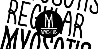 handwriting font
 - Scrapbook by Bedoodle,
$11.00Decorative font. - Nivel by La Boîte Graphique,
$29.00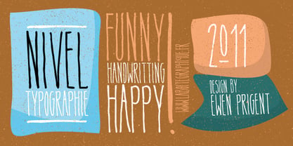 Handwriting font
 - Nouville by Bogusky 2,
$20.00Modern font - Ruthie by TypeSETit,
$24.95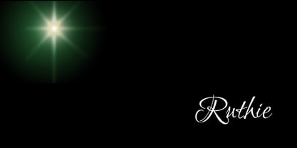 Elegant font.
 - Schneidler Zierbuchstablen by Intellecta Design,
$23.90fancy font - Monogram by Bedoodle,
$10.00Decorative font. - Petemoss by TypeSETit,
$19.95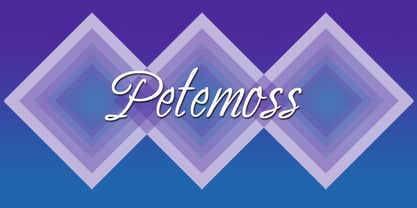 Contemporary font.
 - Angeline by Bedoodle,
$10.00Decorative font. - Angelique by Bedoodle,
$9.00Decorative font. - Garden Gate by Bedoodle,
$11.00Decorative font. - Hellfire Flames by Ferry Ardana Putra,
$99.00 Are you ready to bring some dark and edgy vibes to your designs? Look no further than the Hellfire Flames | death metal font! With its black fire-inspired design and brutal form, this font is perfect for adding a touch of darkness to your work. Hellfire Flames is a death metal font that embodies the essence of infernal power and brutal energy. The font's letters take the shape of black flames, with a raw and aggressive design that will leave a lasting impression. The font includes both uppercase and lowercase letters, as well as a range of symbols, numerals, and foreign language support, making it a versatile tool for any project. Hellfire Flames also offers an array of extraordinary and unique death metal ornaments. These intricate designs are perfect for adding a touch of dark ambiance to your project, and are sure to impress any fans of the genre. Hellfire Flames is perfect for anyone looking to add a touch of darkness and aggression to their design projects. It's especially well-suited for projects related to death metal, black metal, gothic, horror, and other genres of heavy music. This font is also great for creating logos, album covers, merchandise, and other graphics that need a raw and intense look. Its unique death metal ornaments make it a great choice for adding an extra level of detail and flair to your designs. So why settle for boring fonts when you can unleash the power of darkness with the Hellfire Flames? Get ready to create designs that are truly unforgettable and take your work to the next level! ——— Hellfire Flames features: A full set of uppercase and lowercase Numbers and punctuation Multilingual language support PUA Encoded Characters OpenType Features +238 Total Glyphs +50 Death Metal Ornaments and Splatter included! ———
 - TE Mona Tharwat Emara by Tharwat Emara,
$35.00 TE Mona Tharwat Emara," a masterpiece of Arabic calligraphy crafted by the renowned Egyptian calligrapher, Tharwat Emara. This exquisite Ruqaa font seamlessly blends tradition with innovation, offering a timeless elegance that captures the essence of Arabic script. Tharwat Emara, a distinguished figure in the world of calligraphy, has lent his artistic prowess to create a font that is not merely a collection of characters but an embodiment of cultural richness. Each stroke of the pen reflects the heritage of Egyptian calligraphy, echoing the historical echoes of an ancient civilization. "TE Mona Tharwat Emara" stands as a testament to Emara's dedication to perfection. The font's graceful curves and meticulously designed letterforms pay homage to the classical Ruqaa style, while subtle contemporary touches infuse it with a modern flair. It is a harmonious blend of tradition and innovation, making it an ideal choice for projects that demand sophistication and cultural resonance. Designed with precision and passion, this font is not just a typographic tool; it's a work of art that brings the beauty of Arabic calligraphy to the forefront. Each character is a brushstroke of inspiration, contributing to a seamless flow that captures the eye and mesmerizes the reader. Whether you are working on a branding project, publication, or artistic endeavor, "TE Mona Tharwat Emara" adds a touch of timeless class. Embrace the elegance of Arabic script with this font, where every detail reflects the expertise of a master calligrapher. As you embark on your creative journey, let "TE Mona Tharwat Emara" be your muse. Elevate your designs, captivate your audience, and embrace the heritage of Arabic calligraphy with this exceptional font. Embrace the legacy, embrace the art – TE Mona Tharwat Emara awaits, a font that transcends time and tradition
 - Cabrito Inverto by insigne,
$- Life’s always more fun when you reverse the stress. The same goes for the new member of the Cabrito family. Cabrito itself is a recently developed slab serif made for the kid’s book The Clothes Letters Wear. Cabrito proved to be more popular than I thought, and I promised I would create an inverted style for this new addition to the font world--a variant that would pair well with the original or even stand well on its own. And so now, here it is. Cabrito Inverto, which features the reversed stress of the strokes from a font’s “normal” traits. Inverted stress fonts are most often associated with cowboys and the Old West. The inverted stress gives it a happy-go-lucky appearance, not to be taken too seriously. It’s a pleasantly rounded, not-so-strictly geometric typeface with handwriting-inspired forms. Whew, that’s a mouthful! Inverto’s bundle of alternates is accessible in any OpenType-enabled program. It contains a workforce of alternates, swashes, and alternate titling caps to embellish the font. Also bundled are swash alternates, aged design and style figures, and compact caps. Peruse the PDF brochure to examine out these solutions in action. OpenType-enabled purposes such as Adobe suite or Quark will allow ligatures and alternates. This font family also includes the glyphs for 72 different languages. Cabrito Inverto does pair well with Cabrito. There is even an extra font weight, Black, for when you want to punch it up a bit. Jeremy Dooley designed Inverto to be a welcoming, day-to-day font family. Use it to express friendliness on just about anything, from candy to food to children’s toys. Cabrito Inverto’s one-of-a-kind visual appearance brings a bundle of fun to the party. Buy Cabrito Inverto to give a boost to your designs every day of the week.
 - tasapainoaisti - Unknown license


