10,000 search results
(0.025 seconds)
- Pollen by TypeTogether,
$49.00 This typeface finds a perfect balance between technical excellence, careful design of letter forms for extended reading, and a measured dose of charm and personality. Its informal feel allows for successfully typesetting a wide range of applications, from magazines and fiction books to advertising and websites. Calligraphy, be it done with the broad-edge pen, brush, or other tools, has been fundamental in the development of Pollen. Its influence is clearly visible in the construction of the top serifs contrasting the curved bottom serifs and the fluid aspect of terminals and tails, such as on “g” and “r”. The shapes of the diagonal letters are based on a less formal calligraphic model, but still uses the broad edge pen. The letters were then subject to a further process of pencil drawing and digital re-interpretation, which gave them the final shape. The designs of “e” and “c” are derived from drawings made with only one continuous line, with the pencil always touching the paper. The letters “g” and “y” express the intention to bring informal elements to a typeface intended for long text reading, usually characteristic of casual writing. Pollen consists of 3 basic styles with an extended OpenType Pro character set and large language support, perfectly serving the most common typographic needs.
 - Spur Wide JNL by Jeff Levine,
$29.00 Spur Wide JNL was modeled from an example of hand lettering from the antique French alphabet book L'Art du Tracé Rationnel de la Lettre. Heavy Roman style letters with spurs (often referred to as Latin) were most popular with sign painters and show card writers in the early part of the 20th century. Spur Wide JNL is available in both regular and oblique versions.
 - Azest by Pesotsky Victor,
$10.00 "AZEST" FONT — NEW, GROTESQUE This is a simple font, with a small number of accidental elements. The proportions are slightly stretched in width. One regular font. It can be put in interfaces or in communication materials, it will not be too active, but it will not slip into neutrality. Supports Cyrillic and some other scripts. Lowercase and uppercase characters, numbering, punctuation and diacritics, in general: all the necessary signs.
 - Barrington by Letteralle,
$18.00 Say hello to Barrington! A font with relaxed style and carries the impression of luxury. Barrington comes with 64 ligatures to give a natural impression, Uppercase Alternates to give different styles, and also ending swash. To access ending swash you only need to add the number "1" at the and of the word. for example if you want to write "Barrington" with the swash ending, you just have to write "Barrington1", and that's it. Very simple. Barrington is perfect for branding & logo projects, also suitable for Product Packaging, Titles on articles or book covers, Stationary, and much more. Thank You!
 - Sassoon Handwriting Starter by Sassoon-Williams,
$45.99 Sassoon fonts package for handwriting starters The three upright "infant" fonts developed to meet the demand for letters to produce pupil material for handwriting as well as for reading. Letters have extended ascenders and descenders ideal on screen and print. They facilitate word recognition. The exit strokes link words together visually, also crucially, they space the letters for improved legibility. The "joined" font puts the skills gained into practice producing joined-up handwriting. Together these typefaces provide a valuable resource for Teachers to create consistent material across the curriculum. Sassoon Infant Tracker B font: This font with its direction arrows helps pupils to start in the correct place. Motor movements can be refined by keeping inside the line. When starting and direction is no problem, the arrow font can be dropped and the Dotted font used. Sassoon Infant Dotted B font: Writing over the dots of this font refines motor skills. The aim here is to give confidence by reinforcing starting points, exits and to now encourage fluidity. Sassoon Infant font: With some words in this font and a baseline beneath to copy onto, pupils can use their learned starting points and exit strokes to write freely along the baseline - still unjoined. Once learned, this leads to spontaneous joins along the baseline leading logically to a joined-up hand. Sassoon Joined font: Having learned to write letters with correct starts and exits, this is when the joined font for teaching handwriting can be used. With some words in this font and a baseline beneath to copy onto, pupils can use their learned starting points and simply extend their exit strokes to make joined-up writing. The default joins the font provides are recommended, however there are alternative letterforms that are so important for some Teachers which can be accessed. Create ‘pen lifts’ anytime too! NOTE: Fonts display unjoined by default on this website and are delivered that way - joining is controlled by your text editing application such as Word or TextEdit, read more for instructions… Free to download PDF resources: Stylistic Sets and how to access the alternative letters feature in these OpenType fonts. Using the separate letter fonts Using the joined font Teachers copybooks using these fonts: How to teach pre-cursive Copybook How to teach cursive handwriting Copybook
 - Retail Script by ITC,
$29.00Retail Script was designed by Vince Whitlock in 1987. It is a font with strong, dynamic base forms and very small ascenders and descenders, which makes a closed, solid overall image. The fine white lines which are traced within the figures make the font a bit more cheerful and the shading makes the figures look three dimensional. The energetic Retail Script is best used in headlines in larger point sizes in order to preserve the look of its fine details. - Rebnick by Mr Studio,
$29.00 Rebnick is a sans serif typeface where in the early design process, the adjacent stems and bars weren’t weld seamlessly and perfectly. You can actually find glitches which were carefully transformed into a custom language in it’s own and later became the coherent generic rule that keeps everything together. In display sizes, the ink traps give the font’s own character, while in small text sizes they create a good legibility and a well-balanced ratio between the black and white spaces.
 - PB Capitalis Rustica IVc by Paweł Burgiel,
$32.00 PB Capitalis Rustica IVc is a font face designed for imitate latin writing style found in manuscripts from 1st to 9th century. All characters are handwritten by use ink and reed pen (calamus), scanned, digitized and optimized for best quality without lost its handwritten visual appearance. Character set support codepages: 1250 Central (Eastern) European, 1252 Western (ANSI), 1254 Turkish, 1257 Baltic. Include also additional characters for Cornish, Danish, Dutch and Welsh language, spaces (M/1, M/2, M/3, M/4, M/6, thin, hair, zero width space etc.) and historical characters (overlined Roman numerals, I-longa, historical ligatures for "nomina sacra" and "notae communes"). OpenType TrueType TTF (.ttf) font file include installed OpenType features: Access All Alternates, Localized Forms, Fractions, Ordinals, Superscript, Tabular Figures, Proportional Figures, Stylistic Alternates, Stylistic Set 1, Historical Forms, Historical Ligatures. Include also kerning as single 'kern' table for maximum possible backwards compatibility with older software. Historical ligatures for "nomina sacra" and "notae communes" are mapped to Private Use Area codepoints. Use of OpenType features to get historical characters: ïTo get "I-longa" use Stylistic Alternates for: "I"(U+0049), "i"(U+0069), "dotless i"(U+0131). ïTo get "nomina sacra" use Historical Ligatures and write uppercase letters: DS for: "Deus", DMS or DNS for: "Dominus" EPS for: "Episcopus", IHS for: "Iesus", PBR for: "Presbiter", SCS for: "Sanctus", SPS for: "Spiritus", XPS for: "Christus". ïTo get "notae communes" use Historical Ligatures and write: B(U+0042) + "middle dot"(U+00B7) for: "-BUS", Q(U+0051) + "middle dot"(U+00B7) for: "-QUE". ïTo get "scriptio continua" (writing without words separation) use Historical Forms (regular spaces are replaced by zero width spaces between words). ïTo get "middle dot" for separate words use Stylistic Set 1 (regular spaces are replaced by middle dot between words).
 - COS Elfish by Cosmope Type,
$17.00 COS Elfish is a typeface with stroke contrast and has a unique shape. It has a structure that is well suited for display purposes. It has small serifs throughout and features curvilinear elements in some letters. It is suitable for use in various media such as unique and individual graphic design or web design.
 - P22 Kells by P22 Type Foundry,
$24.95 The Book of Kells is a ninth century gospel created in the British Isles and is considered to be the finest existing example of early Celtic art. The book itself is now housed in the Trinity College Library, Dublin. This computer set combines historical accuracy with functional readability and features 72 elements and linking borders.
 - Flyover by Ronnie Boy,
$19.00 When a formation of jets flies over the top of a stadium before a big game, there is an unparalleled sense of excitement in the crowd. Flyover, a display typeface, captures that moment with an italic base, left-facing serifs, hollowed notches and a change in angle representing the instant the jets pass overhead.
 - ALS Agrus by Art. Lebedev Studio,
$63.00 Agrus in Ukrainian means "gooseberry". The letters are rounded like the berries and the sharp end elements remind of the barbs. In fact, the font is an intricate italic type. Optical compensations are purely decorative and rhyme with thin connecting lines. Design of this font is one hundred percent due to “strength of material”
 - Wurstchen by Ingrimayne Type,
$9.00 WurstchenDotted is made up up of sausage segments. It does not have true lower-case letters, but rather variants of the upper-case letters instead. As all extreme display fonts, it is useful in small doses. The three WurstchenOverlay fonts decompose WurstchenOutlined and can be used in layers to create letters with three colors.
 - Pirouette by Linotype,
$40.99Pirouette is based on a logo that Japanese designer Ryuichi Tateno created for a packaging design project in 1999 (a shampoo container!). Tateno's logo experimented with complex, overlapped swash letterforms. He continued to develop these outside of the initial packaging project, until they took on a life of their own. Eventually, Tateno designed a full typeface out of the logo, Pirouette, which was the first place display face in Linotype's 2003 International Type Design Contest. The Pirouette typeface contains six different fonts. The basic font is Pirouette Regular. This is an engraver's italic lowercase paired with elaborate swash capitals. The swash capitals have two visual elements in their forms: thick strokes and thin strokes. Pirouette Text includes the same lowercase as Pirouette Regular, but the uppercase letters are much shorter and simpler. This "text" font can be used to set longer amounts of copy. Pirouette Alternate contains different lowercase glyphs and additional ligatures, which can be used as substitutes for the lowercase forms in the Pirouette Regular and Pirouette Text fonts. Pirouette Ornaments contains swashes and other knick-knacks that can either be added onto the end of a letter, or used as separate decorative elements or swooshes (accolades) on a page. Pirouette Separate 1 and Pirouette Separate 2 are two fonts that can be layered over top of one another in software applications that support layering (e.g., most Adobe and Macromedia applications, as well as QuarkXPress). Pirouette Separate 1 contains the thick stroke elements from Pirouette Regular's uppercase letters, as well as the same lowercase glyphs that can be found in Pirouette Regular and Pirouette Text. Pirouette Separate 2 contains only the thin stroke elements from Pirouette Regular's uppercase letters. By layering Pirouette Separate 1 and Pirouette Separate 2 over one another, you can give the uppercase letter's thick and thin stroke elements different colors and create unique, more calligraphic designs. The Pirouette family, Tanteno's first commercial typeface, was greatly influenced by the calligraphic and typographic work of the master German designer, Prof. Hermann Zapf, especially his Zapfino typeface. - Gr-Memories, is a font that is designed to evoke a sense of nostalgia and personal connection. Its creation is inspired by the handwritten letters and notes we once received or wrote, capturing the w...
- Hinnual by Jipatype,
$27.00 Hinnual เป็นฟอนต์ที่ผสมผสานระหว่างรูปทรงสี่เหลี่ยมและทรงกลมเพื่อสร้างสไตล์ที่ไม่เหมือนใคร ชื่อมาจากคำไทย 2 คำ คือ Hin แปลว่า หิน และ Nual แปลว่า อ่อน ผสมผสานองค์ประกอบที่แข็งและอ่อนนี้สะท้อนให้เห็นในแบบอักษร ซึ่งมีเส้นที่สะอาดตาและเส้นคมซึ่งถูกทำให้อ่อนลงด้วยมุมโค้งมน ฟอนต์มีให้เลือกถึง 18 แบบ มีตัวเลือกหลากหลายให้คุณได้เลือกใช้ Hinnual เหมาะอย่างยิ่งสำหรับใช้ในพาดหัวและพาดหัวย่อย ซึ่งลักษณะที่โดดเด่นสามารถช่วยดึงดูดความสนใจของผู้อ่านได้ เส้นสายที่สะอาดตาและสไตล์ที่เป็นเอกลักษณ์ยังทำให้เป็นตัวเลือกที่ยอดเยี่ยมสำหรับแบรนด์ โลโก้ และงานออกแบบอื่นๆ ที่ต้องการภาพลักษณ์ที่น่าจดจำ โดยรวมแล้ว Hinnual เป็นฟอนต์อเนกประสงค์และสะดุดตาที่ผสมผสานองค์ประกอบทั้งความแข็งแกร่งและความนุ่มนวล การออกแบบที่เป็นเอกลักษณ์ทำให้เป็นตัวเลือกที่ยอดเยี่ยมสำหรับนักออกแบบที่ต้องการสร้างผลงานที่น่าจดจำ Hinnual is a font that combines the square and rounded shapes to create a unique visual style. Its name comes from two Thai words - Hin, which means stone, and Nual, which means soft. This juxtaposition of hard and soft elements is reflected in the font's design, which features clean, sharp lines softened by rounded corners. The font comes in 18 styles, providing a range of options for designers to choose from. Hinnual is particularly well-suited for use in headlines and sub-headlines, where its bold and distinctive appearance can help to grab the reader's attention. Its clean lines and unique style also make it a great choice for branding projects, logos, and other design elements that require a memorable. Overall, Hinnual is a versatile and eye-catching font that combines elements of both strength and softness. Its unique design make it an excellent choice for designers looking to create impactful visual content.
 - Fresno by Parkinson,
$15.00 Fresno is a two-font family. Fresno Inline and Fresno Black. Fresno Black is a recent addition. It can be used alone, and it is carefully tailored to fit behind the Inline font to add color to the inline. There are alternate characters: A, M & N in the caps and lowercase key positions. Fresno is a square gothic style typical of Mid-20th Century Showcard Lettering. A lettering genre known as “Gaspipe.” Signage samples similar to this still exist on buildings in my home town, Oakland, California. I have designed over a half dozen variations of this form over the years. Including Amboy. Golden Gate Initials, Matinee, Motel, and Hotel. Designed in 2001 by Jim Parkinson, Fresno has recently been refreshed, enhanced, and re-released.
 - Algeon by Product Type,
$17.00 Algeon Handdrawn Display Font: An Artistic Touch in Every Letter, where uniqueness and artistic touch meet in every character. This hand-drawn display font brings warmth and intelligence to your projects. Each letter in Algeon is designed with an artistic hand, giving it a unique and authentic feel. Algeon brings elements of hand-drawn beauty into every design, creating a relaxed and memorable look. Algeon is the perfect choice for projects that want a hand feels full of character. Whether you are designing posters, greeting cards, or other creative elements, these fonts add a special touch to any work of art. Do not miss this opportunity! Get the Handrawn Algeon Display Font now and bring artistic uniqueness to every letter.
 - P22 Art Deco by P22 Type Foundry,
$24.95 Art Deco turned mundane objects into graceful, sensual works of art, with a nod towards the opulent and extreme. Art Deco sought to build upon the elements of Modern Art movements by focusing on the principal object and removing the extraneous elements found in the Victorian era and in Art Nouveau. The concept of "form following function" and the technological advances of the early 20th century played a very important role in defining the direction of Art Deco. Popular images included stylized people, svelte animals, tall buildings, sleek vehicles and exotic scenes. Art Deco typographic designers were also inspired by these diverse themes. P22's Art Deco font set shows the influence of a cross section of some of the various European and American Art Deco styles.
 - PR Hearts Take Wing 01 by PR Fonts,
$10.00 Hearts, and wings are both powerful symbols.The heart represents the seat of the emotions, and Wings represent movement upward, even spiritually, in the case of angel wings. These images have been drawn with a brush, some of them on rough paper, and are available as a black or white version.
 - Kano by Device,
$39.00 Kano is inspired by the work of Dutch furniture designer and architect Gerrit Rietveld, one of the principal members of the Dutch artistic movement De Stijl. A modular headline font, constructed from white, black and grey overlapping rectangles, it is seen to best effect in short settings and at larger sizes.
 - Roaring 20s by Thomas Käding,
$5.00 This is a decorative font containing the letters A-Z, numbers 0-9, and enough punctuation to make invitations, playbills, posters, and the like. It is meant to have the feel of the theatre district early last century. "Roaring 20s" comes in three styles: regular/engraved, hollow/white, and black. Enjoy!
 - Gelatique by Forberas Club,
$16.00 Gelatique font create with carefully monoline style. Can be use for wedding party, invitation, memorable moment, love story and many more with special moment.
 - Tomiley by Forberas Club,
$16.00 Tomiley font create with carefully monoline style. Can be use for wedding party, invitation, memorable moment, love story and many more with special moment.
 - Rainee by Forberas Club,
$16.00 Rain is modern handwritten. Recommended to use this font for signature, wedding party, invitation, memorable moment, love story and many more with special moment.
 - Ratumba by Forberas Club,
$16.00 Ratumba font create with carefully. Can be use for wedding party, invitation, cute, tag, memorable moment, love story and many more with special moment.
 - Melody Cinta by Forberas Club,
$16.00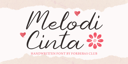 Melody Cinta is modern handwritten. Recommended to use this font for wedding party, invitation, memorable moment, love story and many more with special moment.
 - Sweet Rolling by Forberas Club,
$16.00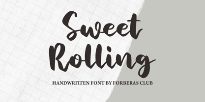 Sweet Rolling is modern handwritten. Recommended to use this font for wedding party, invitation, memorable moment, love story and many more with special moment.
 - Papercut - Unknown license

- Whiffy - Unknown license

- Anhedonia - Unknown license

- Bootleg - Unknown license

- Kogare by Prominent and Affluent,
$30.00 Kogare: Where Elegance Meets Timeless Sophistication Meet Kogare, the meticulously designed serif font that effortlessly captures the essence of elegant design. Inspired by the timeless charm of classic serif writing, this font seamlessly blends tradition and modernity.
 - Mano Danielli by Kate Brankin,
$32.00 Mama, are you doing letters? I want to do letters too! Mano Danielli is based on the writing of a 6 year old child. Great for anything that has to do with children - even the inner ones.
 - Allegedly by Ali Hamidi,
$12.00 Allegedly is a lovely handwritten script font. It has a natural writing style and will add a classy touch to your designs. It’s perfect for branding, photography, invitations, quotes, watermarks, advertisements, product designs, labels, and much more!
 - Ranch Land JNL by Jeff Levine,
$29.00 Ranch Land JNL is based on a classic French Clarendon wood type, many of which were popular in the 1800s and are now associated with either Western motifs or circus events.
 - Geo Deco by Tipo Pèpel,
$28.00 Geodeco font family brings to you the recovery of the typographic forms from the beginning of the 20th century, with a strong ArtDecó flavour but from a new point of view: modernity and geometry. Modernity in the visual contrast between lowercase and capital letters, where rounded shapes are opposed to the breaks and graphic tensions of the strokes of the capital letters. which gives it an enormous originality. Generous doses of internal whites, assure a powerful legibility even with the spite of its short ascending and descending strokes. What we get is a coherent and martial look where fluidity and homogeneity is the main note. Soft and rounded minuscule, with large internal whites for super legibility, bombproof, especially on screens, where Geodeco lives with an astonishing naturalness. The capital letters, used alone as display, or as companions of the minuscule characters, give the family a touch of originality and exotic flavor. Like the spices in the food; a brief but intense note. Breaking the rectangular shapes so that the appearance of the letter comes out benefits from enlarging the internal whites and making them consistent with the white of the lower case. GeoDeco works very well in plain text with the obvious limitation that it is not a type for small bodies, but exceptionality weldon for plain text and signage. Maximum visibility, total beauty on screens. A family of this new century with the flavour of that epoch of experimentation that were the years 20. Extensive multilanguage support and almost all Opentype functionalities. Try it and it will convince you - for sure!
 - Derick Skone by Dumadi,
$20.00 Derick Skone is a brush font created with a brush application. This design font is perfect for meeting the needs of designers in perfecting their projects. Derrick Skone is suitable for magazine design, poster design, event title design, sport event titles, movie poster titles, t-shirt designs, game titles, youtube cover titles, and more. Maximize your business with the right fonts. best regards, Toni Dzulham - Dumadistyle 2020
 - Martie by Canada Type,
$25.00From the heart of the Blue Ridge Mountains, by way of Toronto, comes Martie's handwriting. Martie Byrd is a school teacher in Roanoke, Virginia, and a friend of Canada Type's Rebecca Alaccari. After years of admiring the cheer and clarity of Martie's handwriting, we asked her to write out full alphabets for some cool font treatment. The intent was to do three different versions of her writing in two different pens, then use the auto-magic of OpenType to determine letter sequences and rotate character sets on the fly when the fonts are in use. A successful endeavor it was. Take a look at the images in the MyFonts gallery to see the character rotation in action, along with a visual explanation of why Martie is not just another handwriting font. Unlike other available felt tip and ballpoint handwriting fonts, the regular and bold variations are style-based, not weight-based. They are the handwritten expressions of two different Sharpie pens: The fine point one (Martie Bold), and the ultrafine one (Martie Regular). The style-based variation considerably helps the realism needed in design pieces that take advantage of the contrast of two different handwriting fonts. Weight thickening in handwriting is an obvious mechanical effect that only happens with computers. Weight changing by replacing pens is what happens in the real world. Martie Pro and Martie Pro Bold each contain three different character sets in a single font. Language support includes Western, Central and Eastern European languages for all three sets. This translates into each Pro font containing over 750 characters. Add OpenType code and stir, and you have true handwriting fonts with versatility unavailable out there in anything else of the genre. A software program that supports OpenType features is needed to use the randomization coded in Martie Pro and Martie Pro Bold. Current versions of QuarkXpress and Adobe applications (Photoshop, Illlustrator, InDesign) do contain support for the randomization feature. But if you don't have one of these apps, you can still use the interchangeable Type 1 or True Type fonts and change the characters manually to achieve the appearance of true handwriting. The Martie fonts come in a variety of price packages, from the affordable single fonts to value-laden complete sets. All the proceeds from these fonts received by Canada Type will be donated 50/50 to two primary schools: One in Roanoke (where Martie teaches), and one in Toronto (where the 10-year old, real Canada Type boss goes). So next time a design project needs a handwriting font, do the write thing and use Martie to keep it real. - Jagz - Unknown license


