10,000 search results
(0.235 seconds)
- Beautiful Heart by Garisman Studio,
$20.00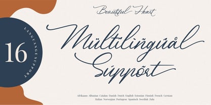 Beautiful Heart is a calligraphy script font and is perfect for logos, invitations, stationery, wedding designs, social media posts, advertisements, product packaging, product designs, labels, photography, watermark, special events or anything. Beautiful Heart comes with full set of uppercase and lowercase letters, multilingual symbols, numerals, punctuation. - Ligature - Stylistic Alternates, Stylistic Sets, and Swashes - Natural brush touch - PUA Encoded open - Support for MAC or PC - Simple installation for Adobe Illustrator, Corel Draw, Photoshop, or Procreate (New Updated)
 - Bone Master by Attype Studio,
$7.00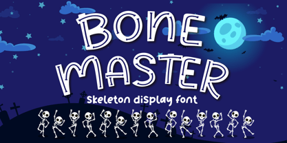 Bone Master is a Halloween display font with bone display on the glyph, perfect for any halloween events and promotions. Bone master is perfect for branding, logo, invitation, stationery, social media post, product packaging, merchandise, blog design, game titles, cute style design, Book/Cover Titles and more. Includes Multilingual Support for Afrikaans, Albanian, Catalan, Danish, Dutch, English, Estonian, Finnish, French, German, Icelandic, Italian, Norwegian, Portugese, Spanisch, Swedish, Zulu. Hope you enjoy with our font! Attype Studio
 - Sun Pride by Attype Studio,
$13.00 Sun Pride is script font with beginning and ending swash of sun flower and is suitable for any summer event. Sun Pride is perfect for branding, logo, invitation, stationery, social media post, product packaging, merchandise, blog design, game titles, cute style design, Book/Cover Title and more. Includes Multilingual Support for Afrikaans, Albanian, Catalan, Danish, Dutch, English, Estonian, Finnish, French, German, Icelandic, Italian, Norwegian, Portuguese, Spanish, Swedish, Zulu. Hope you enjoy with our font! Attype Studio
 - Inhabits by Gassstype,
$23.00 Hello Everyone, introduce our new product Font Inhabits it is Handwritten Brush Font,This is a Textured Natural Style and classy style with a clear style and dramatic movement. This font Inhabits is great for your next creative project such as logos, printed quotes, invitations, cards, product packaging, headers, invitation,advertisements,product designs, stationery, wedding designs,label ,product packaging, special events or anything that need handwritting taste. You can activate 16 Ligatures glyphs and 13 Alternates glyphs OpenType panel.
 - Crossfit Core by TypeThis!Studio,
$50.00 Crossfit is a new headline font for great sizes, such as big movie posters, advertising or editorials. Matching topics might be adventures, sports, strong nature and all kind of challenging life events. Its bold stability transforms your creation into a non questionable design. It is bold, clear and also friendly thanks to its rounded corners. www.typethis.studio Thank you for checking out Crossfit font family. If you have any questions, please send us an email: hello@typethis.studio
 - Santos by Gassstype,
$23.00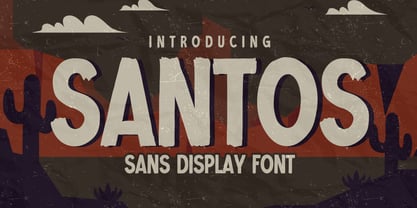 Here comes a New font, Introducing SANTOS It's Sans Display Font is a Textured Natural Style and Authentic Classy Style, this font is great for your creative projects such as watermark on photography, and perfect for logos & branding, invitation,advertisements,product designs, stationery, wedding designs,label ,product packaging, special events or anything that need handwritting taste. SANTOS is a vintage natural Hand Drawn feel. This handmade font will make your design has a beautiful natural touch for each details.
 - Mister Luston by Gian Studio,
$16.00 Mister Luston is a bold, retro display with lots of ligatures and alternatives that will make your presentation or logo stand out! This font will make your project look retro, chic and neat. You can use this font for your posters, events or social media posts. Get your nostalgic feeling with this font character! Features Include: Uppercase & Lowercase Ligature Numbers & Symbols Multy languages Please contact us if you have any questions, we are happy to help you! Enjoy!
 - Heritage Signature by Lunas Type,
$19.00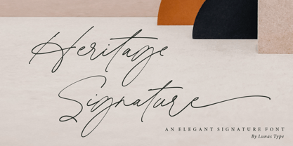 Introducing, Heritage Signature! Heritage Signature is a modern and stylish signature font. This Font have natural flow and unique shape for each letter. Heritage Signature is perfect for many design needs such as merch, T-shirts, signature logo, wedding, book covers, social media posts, websites, events, and many more. What’s you get : – Ending Swashes, beginning swashes, Love connector swashes. – Underline Swashes (just type _1, _2, etc) – Numeral & Punctuation. – ligature. – Multilingual Support. Enjoy Designing! Thanks! Lunas Type
 - Sweet Hearts by Gatype,
$11.00 Sweet Hearts, This font is perfect for branding, invitations, stationery, wedding design, social media posts, advertising, product packaging, product design, labels, photography, watermarks, special events and more. Sweet Hearts is encoded with PUA Unicode, which allows full access to all additional characters without having to design any special software. Mac users can use Font Book, and Windows users can use Character Map to view and copy any additional characters to paste into your favorite text editor/app.
 - My Autumn by Good Java Studio,
$22.00 My Autumn signature font is a natural & modern handwritten font. It's perfect for logos, invitations, stationery, wedding designs, social media posts, advertisements, product packaging, product designs, labels, photography, watermark, special events or anything. This font includes Multilingual support. What's Advantages My Autumn? - Very simple installation - PUA Encoded open - Great for branding, logotype, handlettering, invitations, or fashion branding - Multilingual Support - Support for Adobe Illustrator, Corel Draw, Indesign, Adobe Photoshop and Procreate 4.3 (NEW UPDATE) - Support for Mac or Windows
 - Cassandre by Lunas Type,
$19.00 Introducing, Cassandre! Cassandre is a hairline and modern signature handwritten font. Cassandre comes with ending swashes to add charming feel. Just type "-" at the end of the letters to access swashes. Or you can access it via alternates option. Cassandre is perfect for many design needs such as merch, T-shirts, logo, titles, wedding, book covers, social media posts, websites, events, and many more. What's you get : - Ending Swashes - Numeral & Punctuation. - Ligature. - Multilingual Support. Enjoy Designing! Thanks! Lunas Type
 - Boss Signature by Good Java Studio,
$21.00 Introducing to the new signature font: Boss Signature Boss Signature font is a natural & modern handwritten font. It's perfect for logo, invitation, stationery, wedding designs, social media posts, advertisements, product packaging, product designs, label, photography, watermark, special events or anything. - Very simple installation - PUA Encoded open - Very great for branding, logotype, handlettering, invitations, or fashion branding. - Multilingual Support - Support for Adobe Illustrator, Corel Draw, Indesign, Adobe Photoshop and Procreate 4.3 (NEW UPDATE) - Support for MAC or WINDOWS
 - Ysobel by Monotype,
$29.99 The Ysobel™ typeface family is not only elegant; it is also exceptionally legible and space economical. A collaborative design effort between Robin Nicholas, as lead designer and project director, Delve Withrington and Alice Savoie of Monotype Imaging, the project had the primary design goal of creating a typeface family for setting text in newspapers and periodicals. The result, however, is also ideal for any application that requires quick and easy assimilation of text. According to Nicholas, “The idea for the design started when I was asked to develop a custom version of Century Schoolbook. I wanted to give the design a more contemporary feel, although the client ultimately decided to keep their typeface closer to the original. The project nevertheless gave me ideas for a new design. Since designing Nimrod, some 30 years ago, I had wanted to make a more modern typeface family for newspapers and magazines – this seemed the ideal candidate.” Ysobel (pronounced “Isabel”) has the soft, inviting letter shapes of Century Schoolbook but contrasts these with more incised serifs and terminals. Its capitals are also narrower than those of Century Schoolbook, and care was taken to ensure that they harmonize perfectly with the lowercase. Ysobel’s x-height is full-bodied without disrupting lowercase proportions. In addition, curved terminals, such as those in the “C,” “c” and “e,” were drawn more open as an aid to legibility and readability in text copy. Weight stress is near vertical, and hairlines are robust to ensure character fidelity in small point sizes. Development began with the text version of the family, which has four weights, each with an italic companion. All weights feature lining and old style numerals, fractions, superiors and extended Latin language coverage. Small caps are also available in the Roman Regular design. Ysobel Display is a completely redrawn version of the typeface; it is narrower, and has a slightly smaller x-height, thinner hairlines and subtle design changes to improve its appearance when set at large sizes. The Display Italic received particular attention to make it ideal for setting headlines, subheads and short blocks of copy. Changes include a slightly greater italic angle and more cursive treatment of some letter shapes. Alternative styles of capital “J” and “Q,” to provide variation, are available in all weights.
 - Wilhelm Klingspor Schrift by Alter Littera,
$25.00 A comprehensive and faithful rendition of one of the finest metal typefaces of the 20th century. Rudolf Koch designed Wilhelm Klingspor Schrift (initially conceived as “Missal Schrift”, and later referred to also as “Wilhelm Klingspor Gotisch”) between 1919 and 1925 for the Gebr. Klingspor Type Foundry in Offenbach am Main. It is an impressive textura typeface, being sharp, elegant, spiky, sensitive and noble at the same time. Some of its most notable features have to do with the delicate decorations, the thin but subtly swelling lines that parallel or bridge strokes in the capitals, the hairline endings that terminate each stroke in both the capitals and the lowercase letters, the subtle joining of hairlines to thicker strokes, and the tension of some of the transitional curves. Koch’s original design included two sets of capitals (normal and condensed); alternates for a, d, e, r, s and z, plus long s; short and long flourished finial forms for f and t; thirty-five ligatures; and eighteen decorative pieces (Zierstücke). All of these features, plus several additional ones for modern use (including the usual standard characters for typesetting in modern Western languages, additional alternates and ligatures, plus carefully coded Opentype features), have been thoroughly implemented to the highest and most lively level of detail in the present font, in the hope that the past greatness of Wilhelm Klingspor Schrift will finally step into the modern OpenType realm. The main sources used during the font design process were several pages from a specimen book issued by the Gebr. Klingspor Type Foundry in 1927. Other sources were as follows: Bain, P., and Shaw, P. (Eds.) (1998), Blackletter: Type and National Identity, New York: Princeton Architectural Press (p. 43); Hendlmeier, W. (1994), Kunstwerke der Schrift, Hannover: Bund für Deutsche Schrift und Sprache (pp. 56-7); Kapr, A. (1983), Schriftkunst, Dresden: VEB Verlag der Kunst (p. 453); Kapr, A. (1993), Fraktur - Form und Geschichte der gebrochenen Schriften, Mainz: Verlag Hermann Schmidt (pp. 124-5); and Klingspor, K. (1949), Über Schönheit von Schrift und Druck, Frankfurt am Main: Georg Kurt Schauer (pp. 136-7). Some public and private comments by renowned designer and design historian Paul Shaw have also influenced both the design and the description of the present font. Specimen, detailed character map, OpenType features, and font samples available at Alter Littera’s The Oldtype “Wilhelm Klingspor Schrift” Font Page.
 - Juvenis by Storm Type Foundry,
$32.00Designs of characters that are almost forty years old can be already restored like a historical alphabet – by transferring them exactly into the computer with all their details. But, of course, it would not be Josef Tyfa, if he did not redesign the entire alphabet, and to such an extent that all that has remained from the original was practically the name. Tyfa published a sans-serif alphabet under the title Juvenis already in the second half of the past century. The type face had a large x-height of lower-case letters, a rather economizing design and one-sided serifs which were very daring for their time. In 1979 Tyfa returned to the idea of Juvenis, modified the letter “g” into a one-storey form, narrowed the design of the characters even further and added a bold and an inclined variant. This type face also shows the influence of Jaroslav Benda, evident in the open forms of the crotches of the diagonal strokes. Towards the end of 2001 the author presented a pile of tracing paper with dozens of variants of letter forms, but mainly with a new, more contemporary approach: the design is more open, the details softer, the figures and non-alphabetical characters in the entire set are more integral. The original intention to create a type face for printing children’s books thus became even more emphasized. Nevertheless, Juvenis with its new proportions far exceeds its original purpose. In the summer of 2002 we inserted all of this “into the machine” and designed new italics. The final computer form was completed in November 2002. All the twelve designs are divided into six variants of differing boldness with the corresponding italics. The darkness of the individual sizes does not increase linearly, but follows a curve which rises more steeply towards the boldest extreme. The human eye, on the contrary, perceives the darkening as a more fluent process, and the neighbouring designs are better graded. The x-height of lower-case letters is extraordinarily large, so that the printed type face in the size of nine points is perceived rather as “ten points” and at the same time the line spacing is not too dense. A further ingenious optical trick of Josef Tyfa is the figures, which are designed as moderately non-aligning ones. Thus an imaginary third horizontal is created in the proportional scheme of the entire type face family, which supports legibility and suitably supplements the original intention to create a children’s type face with elements of playfulness. The same applies to the overall soft expression of the alphabet. The serifs are varied; their balancing, however, is well-considered: the ascender of the lower-case “d” has no serif and the letter appears poor, while, for example, the letter “y”, or “x”, looks complicated. The only serif to be found in upper-case letters is in “J”, where it is used exclusively for the purpose of balancing the rounded descender. These anomalies, however, fit perfectly into the structure of any smoothly running text and shift Juvenis towards an original, contemporary expression. Tyfa also offers three alternative lower-case letters *. In the case of the letter “g” the designer follows the one-storey form he had contemplated in the eighties, while in “k” he returns to the Benda inspiration and in “u” adds a lower serif as a reminder of the calligraphic principle. It is above all the italics that are faithful to the tradition of handwritten lettering. The fairly complicated “k” is probably the strongest characteristic feature of Juvenis; all the diagonals in “z”, “v”, “w”, “y” are slightly flamboyant, and this also applies to the upper-case letters A, V, W, Y. Juvenis blends excellently with drawn illustrations, for it itself is modelled in a very creative way. Due to its unmistakable optical effect, however, it will find application not only in children’s literature, but also in orientation systems, on posters, in magazines and long short-stories. - Centennial Script by Canada Type,
$24.95 Centennial Script was designed and cut by Hermann Ihlenburg in 1876 (the centennial of American independence, hence the typeface's name) for the MacKellar, Smiths & Jordan foundry in Philadelphia. Ihlenburg was then only 33 years old, and these beautiful forms put him on his way to become the most prolific and innovative deco, ornamental and script typeface designer and punch cutter of the nineteenth century. In trying to be a true homage to the history of the new world, Centennial Script transcends its then-contemporary deco fashion to embrace script elements historically similar to lettering found on maps or political documents of the 18th century. Letters like the p and s extend themselves high and mighty to accentuate words and lines of text in a fancy hand-drawn manner. The dots on the i and j are those of a careful scribe who acknowledges the importance of the document being lettered. The lowercase letters connect with two slight angular motions of the hand, also very carefully and elegantly. Even the ligatures and ending swashes Ihlenburg made for this face were reminiscent of a mapmaker's patient hand, though Ihlenburg's elegant touch in them cannot be mistaken. Although Centennial Script was one of the few Ihlenburg faces to make it to film type technology, the transition was neither credited nor faultless. The film type version was a bit sloppy in the way the connectors were made, so the lowercase needed a lot of manual work to typeset properly. To alleviate such waste of time for the user of this digital version, the connectors were redrawn according to the original metal ones made by Ihlenburg himself, and tested thoroughly in print to ensure the quality of the typeface's flowing cursive nature. This wasn't an easy task, and very time-consuming, since the changing angles on both ends of the connection made it impossible to escape from having to build every lowercase letter with both left and right connectors that would fit with the rest of the letters. This is one typeface that couldn't be revived in any other manner than the way it was originally made, regardless of more than 130 years of technological advances since the face was designed. Centennial Script comes in all popular font formats, and supports most Latin-based languages. Also included is an Alts fonts that contains alternates, ligatures, snap-on swash endings, some ornaments, as well as a complete set of the lowercase without left side connectors, for a more natural combination when following a majuscule, or just in case the user finds it fit to set the copy in a non-connecting script instead of the face's original connected flow. Centennial Script Pro, the OpenType version, combines the main font with the Alts font in a feature-packed single font. Use the ligature feature to set wordmarks like Mr, Ms, Mrs, Dr, and &Co, the stylistic alternates feature to replace some letters with their alternative forms, the contextual alternates feature for better uppercase-lowercase sequences, and the titling feature to set your text in a disconnected script. Centennial Script is the only script we currently know of that can be set connected or disconnected simultaneously, either using the titling feature in the OpenType Pro version, or manually in the other formats.
 - Mantika Sans Paneuropean by Linotype,
$67.99With its well-defined characters that are readily legible even in the small font sizes, Mantika Sans by Jürgen Weltin is ideal for typesetting. The elaborately designed and highly individual set of italics enhances the attractiveness of the font.Jürgen Weltin developed the Mantika™ Sans sans serif font using older designs for an serif font as his inspiration. Nothing more than the merest suggestion of the original serifs has survived. Bevelled line endings and the slight variation in thickness of verticals, in particular, provide Mantika Sans with a very dynamic character that evokes manuscript. Short ascenders and descenders give the font a compact appearance that is also underscored by its condensed proportions. Weltin has achieved his aim of producing a typeface with excellent legibility even in small sizes not just by means of the x-height, which is tall in comparison with the capital letters, but also by using clearly defined and well differentiated designs for critical letters, such as i", "I" and "l". Lower case "i", for example, has a serif while the "l" has a curved base.In addition to uppercase numerals, Mantika Sans also has lowercase or old style numerals that have been designed so that they can be used in both tabular and proportional settings. The uppercase numerals are slightly shorter than the uppercase letters, ensuring that the latter can be sympathetically incorporated within continuous text.The Mantika Sans italics are very unusual. They are inclined at only 4.5° (the usual angle for italics is 10 - 12°) and so appear to be almost upright. In addition, they also have quite distinctive forms. The overall effect calls attention to their curvilinear, manuscript character, enhances contrasts and further emphasizes the terminals. Weltin explains: "Within the variety of forms of the italics there are many contrasting terminal elements that create dynamism. The result is a diversity of interaction between the rounded and angular forms". Mantika Sans Italic thus has all the features of a display typeface, but can also be happily used on its own to set longer text passages. Mantika Sans is available in two weights; Regular and Bold, both of which have corresponding italics sets. Mantika Sans has been designed so that the widths of the four related cuts are identical, meaning that a change of font within a single layout will have no effect on justification. In addition, the members of the Mantika Informal font family, designed by Jürgen Weltin in 2010, also have the same thickness. Other font families having weights with equal thickness can be found in the "Linotype Office Alliance series".The Mantika Sans character sets are paneuropean. There are characters for setting texts in Eastern European languages, Greek and Cyrillic. There is also a range of special symbols, including right-angled brackets, subscript and superscript lower case letters, together with numerals, arrows and many different bullet points.As a vibrant and highly legible text font, Mantika Sans has a broad spectrum of potential applications. Its unusual italics are not just perfect for use in display text. The fact that it has only four cuts means that Mantika Sans is particularly suitable for office use or for the setting of business reports. Its excellent legibility even in the small font sizes also makes it ideal as a text for electronic reading devices; this also applies to Mantika Informal.At the 3rd International Eastern Type Design Competition Granshan 2010, Mantika Sans was awarded in the category Greek text typefaces." - Mantika Sans by Linotype,
$50.99 With its well-defined characters that are readily legible even in the small font sizes, Mantika Sans by Jürgen Weltin is ideal for typesetting. The elaborately designed and highly individual set of italics enhances the attractiveness of the font.Jürgen Weltin developed the Mantika™ Sans sans serif font using older designs for an serif font as his inspiration. Nothing more than the merest suggestion of the original serifs has survived. Bevelled line endings and the slight variation in thickness of verticals, in particular, provide Mantika Sans with a very dynamic character that evokes manuscript. Short ascenders and descenders give the font a compact appearance that is also underscored by its condensed proportions. Weltin has achieved his aim of producing a typeface with excellent legibility even in small sizes not just by means of the x-height, which is tall in comparison with the capital letters, but also by using clearly defined and well differentiated designs for critical letters, such as i", "I" and "l". Lower case "i", for example, has a serif while the "l" has a curved base.In addition to uppercase numerals, Mantika Sans also has lowercase or old style numerals that have been designed so that they can be used in both tabular and proportional settings. The uppercase numerals are slightly shorter than the uppercase letters, ensuring that the latter can be sympathetically incorporated within continuous text.The Mantika Sans italics are very unusual. They are inclined at only 4.5° (the usual angle for italics is 10 - 12°) and so appear to be almost upright. In addition, they also have quite distinctive forms. The overall effect calls attention to their curvilinear, manuscript character, enhances contrasts and further emphasizes the terminals. Weltin explains: "Within the variety of forms of the italics there are many contrasting terminal elements that create dynamism. The result is a diversity of interaction between the rounded and angular forms". Mantika Sans Italic thus has all the features of a display typeface, but can also be happily used on its own to set longer text passages. Mantika Sans is available in two weights; Regular and Bold, both of which have corresponding italics sets. Mantika Sans has been designed so that the widths of the four related cuts are identical, meaning that a change of font within a single layout will have no effect on justification. In addition, the members of the Mantika Informal font family, designed by Jürgen Weltin in 2010, also have the same thickness. Other font families having weights with equal thickness can be found in the "Linotype Office Alliance series".The Mantika Sans character sets are paneuropean. There are characters for setting texts in Eastern European languages, Greek and Cyrillic. There is also a range of special symbols, including right-angled brackets, subscript and superscript lower case letters, together with numerals, arrows and many different bullet points.As a vibrant and highly legible text font, Mantika Sans has a broad spectrum of potential applications. Its unusual italics are not just perfect for use in display text. The fact that it has only four cuts means that Mantika Sans is particularly suitable for office use or for the setting of business reports. Its excellent legibility even in the small font sizes also makes it ideal as a text for electronic reading devices; this also applies to Mantika Informal.At the 3rd International Eastern Type Design Competition Granshan 2010, Mantika Sans was awarded in the category Greek text typefaces."
 - Maassslicer3D - 100% free

- Alte DIN 1451 Mittelschrift gepraegt - 100% free

- Elbaris - 100% free

- Nomitais - 100% free

- Sabática - Personal use only

- Quirkus Out - 100% free

- Motoride by Epiclinez,
$17.00 Motoride is an authentic handcrafted lettering that transformed into a font. It was inspired by the world of custom motorcycles. It's vintage style is suitable for every design which needs a timeless typeface, such as logotype, apparel, branding, packaging, advertising, Instagram quotes and more! This font features a wealth of OpenType features including alternate glyphs, ligatures, and swashes. This font is multi-language and also PUA encoded which means you can access all of the alternate glyphs with ease. We hope you will enjoy the font, please feel free to comment if you have any thoughts or feedback.
 - Givani by Khoir,
$15.00 Introducing, Givani, a font with a retro look but cute impression making this font unique with a consistent thickness, making memories of the 70s era, this font has an interesting alternative as well as several ligatures to complement it. This font is perfect for creating logos, invitations, novels, books, magazines, labels, greeting / wedding cards. So what are you waiting for! What's included? Uppercase Characters Lowercase Characters Support 75+ Language FEATURES Givani (OTF) So what are you waiting for? immediately purchase this font, feel free to comment, or send me my PM or email at khoirtypework@gmail.com Thank you for seeing
 - Cosmic Sans by Zachary Mazur,
$15.00 Cosmic Sans was my first font ever created for a school project. The class I made this font for was my Advanced Typography and was a semester project. I really couldn't think of a title for this font, until one of my good friends said, "Why don't you name it Cosmic Sans?" I searched the internet for any other fonts with that name, and sure enough there wasn't. Thus the name stuck. This font is more or less a display font, thus every secondary character was not created. I hope you enjoy this font and much as I have while creating it!
 - Rockeby Brush by My Creative Land,
$25.00 Rockeby Brush is a new font family that joins a well known collection - Rockeby Typography Toolbox. It contains 3 brush fonts - Dry, Rough and Clean - and a Brush Extras font that contains different design elements and graphic to complement your design whether it is a logo, website or a more complex design project. The Rough Brush font has a unique feature - the grunge texture that is applied not only to the letters but to the surrounding space as well. You can successfully mix and match all 50 fonts within Rockeby Typography Toolbox to get your design a stylish look. Rockeby SemiSerif Family ; Rockeby .
 - Anthropology by Arendxstudio,
$17.00 Introducing my new font Anthropology, wrapped elegantly and has distinctive characteristics making this font beautiful. Anthropology is perfect for branding projects, logos, wedding designs, media posts, advertisements, product packaging, product designs, labels, photography, watermarks, invitations, stationery, and any project who need a handwritten style. Features: • Character Set A-Z • Numerals & Punctuations (OpenType Standard) • Accents (Multilingual characters) • Ligature • Alternate There it is! I really hope you enjoy it - comments & likes are always welcome and accepted. More importantly, don't hesitate to send a message if you have a problem or question. Now just read this, go there and make it happen :)
 - Aero Wolves by Ironbird Creative,
$15.00 Aero Wolves is a organic blackletter with handdrawn feel. Comes with regular, stamp, oblique and outline styles. This typefaces is perfect for people looking for vintage aesthetic and dark feel. Suitable for any graphic designs such as branding materials, t-shirt, print, logo, poster, t-shirt, quotes .etc ADDITIONAL INFORMATION For upgrading license please contact me. Upgraded licenses are required for apps, books, television, commercial exhibition, film, gaming, print on demand products, etc. We hope you enjoy the font, please feel free to comment if you have any thoughts or feedback. Thanks for purchasing and have fun! Regards, Ironbird Creative
 - Bandung Signature by Arendxstudio,
$19.00 Introducing a new font called Bandung Signature inspired by urban script fonts with sharp and beautiful letters that create fonts that are modern, trendy and elegant. Bandung Signature came with OpenType features such stylistic alternates, stylistic sets & ligatures good for logotype, poster, badge, book cover, tshirt design, packaging and any more. Features : • Character Set A-Z • Numerals & Punctuation (OpenType Standard) • Accents (Multilingual characters) • Ligatures • Alternates There it is! I really hope you enjoy it - comments & likes are always welcome and accepted. More importantly, don't hesitate to send a message if you have a problem or question.
 - Brandan by Andfonts,
$69.00 If you're looking for the perfect font to make your logo stand out, then look no further than Brandan font. This modern and cool font is sure to give your logo, text, or any other design element a unique and eye-catching look. Whether you're looking for a font for a logo, lettering, website, or something else entirely, Brandan font has got you covered. Plus, it looks great on both light and dark backgrounds, so you know your design is going to look nice no matter where it's seen. Check out Brandan font today and give your design a professional edge!
 - Pieches by PintassilgoPrints,
$29.00 This typeface is inspired by the powerful political and social posters by Paul Peter Piech, a tireless artist and printer. Questioned about his endless energy and focus on work, he said "I don't want to sit around and be silent". Pieches is a linocut-looking font heavily loaded with interlocks, including vertical pairs of letters. There are alternates also, and not quite a few: four glyphs for each letter so countless expressive possibilities are open. Graphical elements are also included, for added wilderness. This is a loud-speaking font for those who don't want to be silent. Come on, let’s shout!
 - Gloriant by Letterhend,
$13.00 Introducing Gloriant Signature Script Font with two styles : clean and brush! Both of them looks nice and elegant, naturally made by handwriting. This font is suitable for any design purposes such as logos, headlines, quotes, apparel, wedding invitations, and of course as your digital signature. Gloriant Signature comes with OpenType features like ligatures, stylistic alternates, contextual alternates, swashes, and multi-language support. We hope you enjoy the font, please feel free to comment if you have any thoughts or feedback. Or simply send me a PM or email me at letterhend@gmail.com. Thanks for purchasing and have fun!
 - Squickt by Wiescher Design,
$39.50 Squickt was the first script I designed. The name is an atrocity, I don't remember what was on my mind, when I decided on that name, but after 25 years it is to late to change, so I have to stick with it. I have recently gone over the script and changed a little stroke here, a curve there and I added Small-Caps. The font is very useful for all kinds of signs, that have to look spontaneous. You can even condense or extend it without me going berserk; Squickt is very robust. Your scribe Gert Wiescher
 - Jhon Halend by Typebae,
$19.00 Jhon Halend is the perfect signature font, featuring a natural and stylish flow that showcases elegant tails at the beginning and end of each letter. It provides a binding element, allowing specific letter combinations to flow seamlessly for a more natural and authentic appearance, making it suitable for various projects that require a natural handwriting touch. To use beginning and ending swashes (tail), you don't need to use software that supports opentype, because we have made it separately so it's very easy to use. Files included: Jhon Halend-Regular Jhon Halend-Tail Feature: Ligature, Stylistic Alternate, Multilingual and PUA encoded.
 - New Daily by URW Type Foundry,
$39.99 Marit Otto about New Daily: This typeface design has a modern but yet classic appearance. That is why she listens to the name New Daily. I took some elements from the Art Nouveau and Art Deco (type) styles. And modernized it by cultivating the beautiful curved features of both styles and playing with the stylish fluid lines and open structures. By adding a bit of the no-nonsense office look of a typeface like Nimbus Sans a new but familiar look occurs. This typeface is very readable and useful for many purposes. It has a playful distinguished character.
 - Sing Buneng Bae by Allouse Studio,
$16.00 Proudly Presenting, Sing Buneng Bae a Random Doodle Font. Sing Buneng Bae also come along with Multi-Lingual Support that will fulfill your need. We highly recommend using a program that supports OpenType features and Glyphs panels like many of Adobe apps and Corel Draw, so you can see and access all Glyph variations. Sing Buneng Bae is perfect for any tittle or description, product packaging, branding project, megazine, social media, wedding, or just used to express words above the background. Enjoy the font, feel free to comment or feedback, send me PM or email. Thank You!
 - Bennington Glow by Allouse Studio,
$16.00 Proudly Presenting, Bennington Glow a Brush Lettering Script which will give you natural impression for your needs. Bennington Glow come with Alternates, swash, ligatures and Multi-Lingual Support to fulfill your need. We highly recommend using a program that supports OpenType features and Glyphs panels like many of Adobe apps and Corel Draw, so you can see and access all Glyph variations. Bennington Glow is perfect for any tittle, logo, product packaging, branding project, megazine, social media, wedding, or just used to express words above the background. Enjoy the font, feel free to comment or feedback, send me PM or email. Thank You!
 - My Script by Wiescher Design,
$39.50 MyScript is exactly that: my script; only this one is for everybody’s use! Originally I designed it as a Christmas present for my friends and clients; they liked it. So I thought other people might like it as well. I cleaned it up just enough so that it did not lose its character. And, of course, I made all glyphs so that it is really useful as an everyday, unpretentious script. And I added a small cap version and a swashes version to give you even more reason to use it. It turned out a really readable script. Your scribe, Gert Wiescher


