10,000 search results
(0.048 seconds)
- FS Kitty by Fontsmith,
$50.00 Cute FS Kitty is the type equivalent of Bagpuss: plump, cute, cuddly and not fond of exercise. So don’t go giving it a run-out on body copy; FS Kitty is an all-caps font made for showing off in posters and headlines, and on products, point-of sale and especially sweets. Blubber Kitty had been quietly curled up in Phil Garnham’s sketchbook for a year before he brought it out to be brushed up. “It was in the mix as a basic form when I started thinking about FS Lola. It was a twisted, bubbly beauty – quite squishable and huggable. The working file was called Blubber. “At that time it was a basic construction of strokes. I created the ‘A’ first, purely as a shape to play with, not as type. I flipped it for ‘V’, and copied that for a ‘W’. I flipped the ‘W’ for an ‘M’... I thought, ‘This looks a bit wacky, but I like it,’ and just carried on. The most tricky characters were the ‘B’ ‘P’ and ‘R’. I must have drawn about 20 kinds of B for this, just to get it to fit.” Variety “When the regular weight of Kitty had been designed,” says Jason Smith, “it just felt like a natural progression to go on and explore how far we could go with it: Light, Solid, Headline, Shadow.” Phil Garnham thinks there’s still more to come. “There are some really individual characters in this font that I think have yet to be exploited: the Greek Omega symbol, the strange face in the ampersand. Like Bagpuss, Kitty has kept a low profile so far. “We know people are using Kitty. In fact, it was the first of any of our fonts that we sold on the day it was released. But I still haven’t seen it out there in the wild. It’s going to be a exciting moment.”
 - PF DIN Stencil by Parachute,
$39.00 DIN Stencil on Behance. DIN Stencil: Specimen Manual PDF. Despite the fact that over the years several designers have manually created stencil lettering based on DIN for various projects, there has never been a professional digital stencil version of a DIN-based typeface. After the successful introduction of DIN Monospace a few months earlier, PF DIN Stencil now completes Parachute’s extensive library of DIN superfamilies. It was based on its original counterpart DIN Text Pro and was particularly designed to address contemporary projects, by incorporating elements and weights which are akin to industries such as fashion, music, video, architecture, sports and communications. Traditionally, stencils have been used extensively for military equipment, goods packaging, transportation, shop signs, seed sacks and prison uniforms. In the old days, stencilled markings of ownership were printed on personal possessions, while stencilled signatures on shirts were typical of 19th century stencilling. Two companies dominated the market in the mid-twentieth century: the Marsh Stencil Machine Company in the United States and the Sächsische Metall Schablonen Fabrik in Germany. Ever since the late 1930s, it was the German Sächsische Metall Schablonen Fabrik which used heavily the new DIN 1451 standard font (introduced in 1936), attempting to overthrow the reign of the Didot-style modern roman which was at the time the most common stencil letter in Germany. These letters were manufactured mainly as individual zinc stencils which could be ordered in sizes between 10 and 100mm. The DIN Stencil family manages to preserve several traditional stencil features, but introduces additional modernities which enhance its pleasing characteristics and make it an ideal choice for a large number of contemporary projects. Furthermore, the spacing attributes of the glyphs were redefined and legibility was improved by revising the shape of the letterforms. The DIN Stencil family consists of 8 diverse weights from the elegant Hairline to the muscular Black. Currently, it supports Latin, Eastern European, Turkish and Baltic.
 - Circulo by MMD Fonts,
$6.29 Bound to rules, unbound in the usage. Hyper geometric, and minimal contrast. Circulo V1 is based on a font project I originally started because of a client I had. I wanted to create a display and text font for their product design brand, which is all about reducing the amount of necessary materials and production steps. Before I started the course at tipo-g it was called -“REDUCE“ and was more or less finished. The concept was based on the name. How far can letter shapes be reduced to their core geometric concepts and still be identified as letters? But in a way, it lacked a unique approach and was just a generic geometric Sans Serif with a lack of finesse. There was already a glimpse of characteristics visible which would later define Circulo V1. The high focus on geometric shapes was not of the same severity, and the angle on the stems was less intense. Those, as I call them, fake serifs turned out to be a significant factor in legibility and the characteristic of the font. Besides those changes and improvements, I decided to implicate a new feature to the concept, a condensed style. I quickly realised that it is impossible to keep my perfect circles and half-circles in this style without breaking my rules for the font. This „problem“ turned out to be the most crucial feature of the condensed set. Circular-based Letters will ignore the rules and boundaries of the condensed style and stay as they are. This feature allows the user to create a unique rhythm in their texts, and if you use the variable font, you can decide how intense this rhythm will be. In this situation, the user can choose which letters are allowed to keep their shapes and which will be put in their condensed corset. All, some or none of them, you decide.
 - FS Kitty Variable by Fontsmith,
$199.99Cute FS Kitty is the type equivalent of Bagpuss: plump, cute, cuddly and not fond of exercise. So don’t go giving it a run-out on body copy; FS Kitty is an all-caps font made for showing off in posters and headlines, and on products, point-of sale and especially sweets. Blubber Kitty had been quietly curled up in Phil Garnham’s sketchbook for a year before he brought it out to be brushed up. “It was in the mix as a basic form when I started thinking about FS Lola. It was a twisted, bubbly beauty – quite squishable and huggable. The working file was called Blubber. “At that time it was a basic construction of strokes. I created the ‘A’ first, purely as a shape to play with, not as type. I flipped it for ‘V’, and copied that for a ‘W’. I flipped the ‘W’ for an ‘M’... I thought, ‘This looks a bit wacky, but I like it,’ and just carried on. The most tricky characters were the ‘B’ ‘P’ and ‘R’. I must have drawn about 20 kinds of B for this, just to get it to fit.” Variety “When the regular weight of Kitty had been designed,” says Jason Smith, “it just felt like a natural progression to go on and explore how far we could go with it: Light, Solid, Headline, Shadow.” Phil Garnham thinks there’s still more to come. “There are some really individual characters in this font that I think have yet to be exploited: the Greek Omega symbol, the strange face in the ampersand. Like Bagpuss, Kitty has kept a low profile so far. “We know people are using Kitty. In fact, it was the first of any of our fonts that we sold on the day it was released. But I still haven’t seen it out there in the wild. It’s going to be a exciting moment.” - Decorata by Positype,
$29.00 How many times have you seen lettering on a book cover, poster, or card and wanted to make something similar? Decorata’s eight intertwining weights finally make that possible in an intelligent way. The first major collaboration of its kind, Decorata pairs the talents of supreme lettering artist Martina Flor and masterful type designer Neil Summerour. Lettering was traditionally understood as using words in an artistic way, while type design created written language for easy reading, the one overlapping the other in several ways. For this unique project, Martina created several versions of the alphabet and its decorative layers in her eye-catching style. Neil then took those designs and created an enormous eight-style font family that respects the designer’s need for control and capitalizes on the artist’s expressiveness. Each style can work separately but, on top of the foundational styles, try placing the Lace, then Filigree in contrasting colors. Use any OpenType-capable program to turn headlines from blasé to wowza, make posters with some pow, and design your own cards with that just-right level of detail. Whatever idea you can imagine with the Decorata family, it promises to be a playful and precise wordsmith where the words themselves are the art. Decorata’s glyphs are bifurcated, have medium contrast to showcase their intricate interactions, and include Shadow, Regular, Outline, Filigree, Lace, Fancy, Intricate, and Dingbat styles — eight in all. The Regular style sets the word or phrase to begin the design, Shadow ensures it lifts off the background, and Outline attempts to restrain its ornate flair. Think of those as the foundation and use the rest of the styles for flamboyance. The Intricate and Filigree styles vary only in the thickness of the glyphs, with Filigree being thinner. Lace removes the external curls around each letter but keeps the internal negative space from those decorative lines. The Fancy style is a solid lettershape that includes its attendant elements, and the Dingbats are exactly as expected: borders, manicules, patterns, frames, and many stylized items to bring designs to life.
 - Master Rumble by Alit Design,
$24.00 Introducing "Master Rumble" - an exquisite font that embodies the timeless elegance of the Victorian era. With its ornate details and refined aesthetics, this font exudes a sense of grandeur and sophistication. "Master Rumble" offers two distinct versions: the regular and expanded. The regular version maintains the classic proportions and delicate details, perfect for creating elegant headlines and body text. The expanded version, on the other hand, provides a more dramatic and impactful look, making it ideal for titles and display purposes. These two variants offer versatility and flexibility to suit different design needs. With an impressive collection of 646 glyphs, "Master Rumble" empowers you to craft captivating typographic compositions. The font boasts an extensive range of alternative characters, allowing you to experiment with different letterforms and create unique combinations. This abundance of options gives you the freedom to customize and tailor the font to perfectly match your creative vision. Enhancing the font's allure, "Master Rumble" comes with an additional 146 ornamental elements. These ornaments beautifully complement the Victorian style, enabling you to adorn your designs with decorative flourishes, frames, and borders. These intricate details add a touch of opulence and bring a sense of refinement to your typographic creations. In conclusion, "Master Rumble" is a font that epitomizes the Victorian elegance, offering a perfect balance between classic charm and contemporary design. With its regular and expanded versions, extensive glyph set, alternative characters, ornamental elements, and multilingual support, this font empowers designers to create captivating and sophisticated typographic designs that leave a lasting impression. Elevate your creative projects and embrace the timeless beauty of "Master Rumble".
 - Roller Poster by HiH,
$12.00 Roller Poster is named after Alfred Roller. In 1902, Roller created a poster to advertise the 16th exhibit of Austrian Artists and Sculptures Association, representing the Vienna Secession movement. The exhibit was to take place in Vienna during January & February 1903. The location is not mentioned because everyone in Vienna knew it would be held at the exhibit hall in the Secession Building at Friedrichstraþe 12, a few blocks south of the Opernring, near the Naschmarkt. Designed by Joseph Maria Olbrich in 1897, the buiilding has been restored and stands today as one finest of the many fine examples of Art Nouveau architecture in Vienna (see vienna_secession_bldg.jpg). Because of its dome, it is called “the golden cabbage.” The poster itself is unique. The word “secession” is in one type style and takes up two-thirds of the elongated poster. At the bottom of the poster are the details in a different lettering style. It is this second style at the bottom that is the basis for the font Roller Poster. In keeping with our regular naming conventions, we were going to call it Roller Gezeichnete (hand-drawn), but the wonderful play on both words and the shape of the three S’s in secession was too compelling. In November 1965 there was an exhibit of Jugendstil and Expressionist art at the University of California. Alfred Roller’s Secession Poster was part of that exhibit. Wes Wilson was designing promotional material at Contact Printing in San Francisco. Among their clients was a rock promoter named Bill Graham, staging dance-concerts at Fillmore Auditorium. Wilson saw the catalog from the UC exhibit and Roller’s lettering. Wilson adapted Roller’s letter forms to his own fluid style. The result was the poster for the August 12-13, 1966 Jefferson Airplane/Grateful Dead concert at Fillmore put on by Graham (BG23-1). Wilson continued to use Roller’s letter forms on most of the posters he did for Graham through May 1967, when he stopped working for Graham. The posters were extremely successful and the lettering style along with Roller’s letter forms were picked up by other artists, including Bonnie MacLean, Clifford Charles Seeley, James Gardner, and others. The Secession poster and the Fillmore posters have inspired a number of fonts in addition to ours. Among them are JONAH BLACK (& WHITE) by Rececca Alaccari, LOVE SOLID by Leslie Carbarga and MOJO by Jim Parkinson. Each is different and yet each clearly shows its bloodlines. Our font differs in two ways: 1) the general differences in the interpretation of the letter forms and 2) the modification of the basic letter form to incorporate the diacriticals within the implied frame of the letter, after the manner of the original design by Roller. We borrowed Carbarga’s solution to the slashed O and used it, in a modified form, for other characters as well to accomplish the same purpose. We recommend that you buy ours and at least one of the other three. According to Alaccari, a version called URBAN was released by Franklin Lettering in the 70’s (and is shown on page 51 of The Solotype Catalog). For comparison of our font to original design, see image files roller_poster_2s.jpg of original poster and roller_poster_2sx.jpg showing reconstruction using our font for the lower portion (recontructed area indicated by blue bar). Please note the consistency of character width. In the lower case, 23 of the basic 26 letters are 1/2 EM Square wide. The ‘i’ is an eighth narrower, while the ‘m’& ‘w’ are one quarter wider. All the Upper Case letters are 1/8 EM wider than the lower case. This is to make it easier to fill a geometrical shape like a rectangle, allowing you to capture a little of the flavor of Wes Wilson’s Fillmore West poster using only a word processor. We have also included a number of shapes for use as spacers and endcaps. If you have a drawing program that allows you to edit an ‘envelope’ around the letters to distort their shape, you can really get creative. I used Corel Draw for the gallary images, but there are other programs that can accomplish the same thing. The image file “roller_poster_keys.jpg” shows the complete character set with the keystrokes required for each character (see “HiH_Font_readme.txt” for instruction on inserting the non-keyboard characters). The file “roller_poster_widths.jpg” shows the exact width of each character in EM units (based on 1000 units per EM square). You will notice that the font is set wide for readability. However, most programs will allow you to tighten up on the character spacing after the manner of Roller & Wilson. In MS Word, for example, go to the FORMAT menu > FONT > CHARACTER SPACING. Go to the second Drop-Down Menu, labeled ‘Spacing’ and select "condensed' and then set the amount that you want to condense ‘by’ (key on the little arrows); two points (2.0) is a godd place to start. Let your motto be EXPLORE & EXPERIMENT. Art Nouveau has always been one of my favorite movements in art -- I grew up in a home with a couple of Mucha prints hanging on the living room wall. Perhaps because of that and because I lived through the sixties, I have enjoyed researching and designing this font more than any other I have worked on. Let’s face it (pardon the pun), Roller Poster is a FUN font. You owe it to yourself to have fun using it.
 - Alvarisky by Putracetol,
$24.00 Alvarisky is a stylish script font that inspired by combination of streetwear, bouncy and hand lettering styles. Ideal for logos, badge, label, apparel, club, event, handwritten quotes, product packaging, header, poster, merchandise, social media & greeting cards. Alvarisky come with opentype feature like ligature and a lot of alternates character. Its help you to make beautiful lettering. This font is also support multi language.
 - Creatify by Fikryal,
$18.00 Creatify – Font is a bold script font. It’s perfect for logo, branding, title, social media posts, advertisements, product packaging, product designs, label, photography, watermark, special event, magazine, web design, etc. Features : Creatify ( Uppercase, Lowercase ) Contextual alternates Stylistic alternate Ligatures Multilingual Support If you have any questions please don’t hesitate to contact me. follow my Instagram: fkryall Thank you Fikryal Studio
 - Night Clown by Putracetol,
$20.00 Night Clown - Quirky Clown Font. With its quirky, decorative, and playful design, this font captures the essence of clowns, parties, and April Fools' festivities. Offering a delightful range of seven variations - regular, clown hat, mask, surprise, laughter, decorative, and funny face - Night Clown is a perfect fit for children-oriented projects, kids' events, posters, greeting cards, birthday invitations, and even logos.
 - Beauty One by Attype Studio,
$15.00 Introducing Beauty One, a stylish monoline script style font. This beautiful script font offers your personal touch to your latest art project with fresh, curvy and beautiful look. Beauty One offers is perfect for many different project such as logo, branding, invitation, flyer, posters, social media posts, advertisements, product packaging, product designs, label, photography, special events or anything that need monoline script taste.
 - Paper Sign by Arukidzfl,
$12.00 Paper Sign is a new, modern, and fresh script with a handwritten and style making this font look elegant, natural, stylish and perfect for any awesome project that need a handwritten taste. Paper Sign would perfect for photography, watermark, social media posts, advertisements, logos & branding, invitation, product designs, label, stationery, wedding designs, product packaging, special events or anything that need handwriting taste.
 - Promag Fonts Duo by XdCreative,
$29.00 Promag sans duo is inspired by climora serif by faldykudo, while maintaining a feminine and elegant impression, combined with a beautiful Promag Scripts which is a perfect combination to your various design needs. Promag would look great for logos & branding, invitations, stationery, wedding designs, social media, advertisements, printed quotes, product packaging, labels, photography, watermarks, special events, or even magazine layouts. Thank you.
 - September Twilight by Sronstudio,
$15.00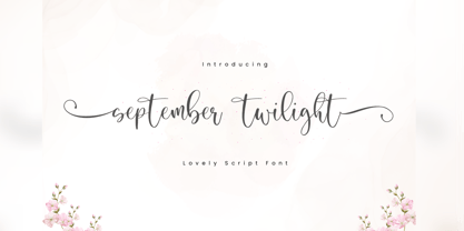 September Twilight is a beautiful calligraphy font perfect for crafting, branding, invitation, stationery, wedding designs, social media posts, advertisements, product packaging, product designs, label, photography, watermark, special events or anything. September Twilight comes with full set of uppercase and lowercase letters, swash alternates, ligatures,multilingual symbols, numerals and punctuation. If you have any questions don't hesitate to drop me a message ;) Happy Creation !!
 - Quiky by Scratch Design,
$10.00 Introducing our Quiky! A playful, hand lettered font. It has smooth lines, a heavy weight, sweet curves and a lot of character that you can name it. Quiky suits for your design such as invitation design, stationery, branding, blog design, advertising design, card, art quote, home decor, book title, special events and more. This font also includes Latin Characters for language support.
 - Neon 80s by Essqué Productions,
$35.00 This font has a great retro-yet-modern feel that is slightly reminiscent of the dawning of the digital awareness age of the 1980s that gave a slight nod to the mid-20th century neon craze. It can be ideal for retro-themed events & promotions, health & cosmetic lines, or wherever you may need a sleek, minimalistic rounded style of lettering.
 - Gift Wrap JNL by Jeff Levine,
$29.00 Gift Wrap JNL takes a classic wood type display font and cuts it into diagonal striped lines to emulate package wrapping paper. An interesting side effect of the lettering is that at first glance you might perceive the style as being an oblique, but the letters are actually vertical. This typeface is perfect for holidays, birthdays and special events featuring a festive theme.
 - Angle & Fairy by Typia Nesia,
$20.00 Angle & Fairy is a vintage / classic fantasy serif. It is perfect for your up coming projects. Such as luxury logo and branding, classic editorial / magazine, cosmetic and fashion promotional, historical of architectural design, logo / branding and stationery design, advertising design, wedding card invitation, art and home decor, fantasy movie or game, novel / book cover title, special events and any more.
 - Origamet Hamida by Gatype,
$14.00 Hi Everyone, we are proud to present our new font. The new natural Hamida origami with a classy and modern style makes this font look elegant, natural, stylish. Origamet Hamida is perfect for invitations, logos & branding, photography, advertising, watermarks, social media posts, product packaging, product designs, labels, wedding designs, stationery, special events or anything else needed to create a theme.
 - Rustling Sound by Sronstudio,
$18.00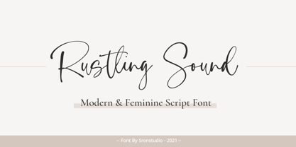 Rustling Sound - Modern & Feminine Script Font perfect for branding, invitation, stationery, wedding designs, social media posts, advertisements, product packaging, product designs, label, photography, watermark, special events, and more. Features: Uppercase and lowercase letters Swash alternates ( Beginning, Ending ) Multilingual symbols, numerals, and punctuation How To Access Alternate Swashes? You can read this article: https://helpx.adobe.com/illustrator/using/special-characters.html Follow Instagram: @sronstudio Thank You!
 - Scary Night by Trim Studio,
$12.00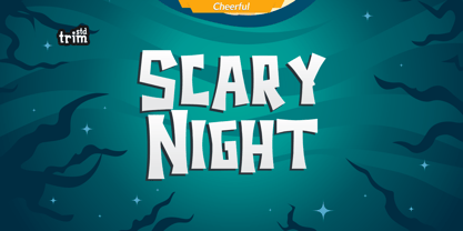 Scary Night is the perfect Halloween font: scary, weird and creepy. It will add a touch of horror to any design project! Its perfectly suited for crafter and graphic artist to complete their design such as invitation, Halloween Event, advertisement, poster, logo, birthday, product sign, and many more! Scary Night Font also Lightweight, even so contains All Standard glyphs and punctuations
 - Funp by Outerend,
$20.00 A fun and playful display font to be explored for your projects! “Funp” (fun & jump) has been created with the themes of manga, anime, and cosplay from Japanese animation culture. It’ll be a great fit not only for all the print materials like party and event invitations, logos, packaging, and more but also for social media ads and your website designs.
 - Gasthony Signature by Sronstudio,
$18.00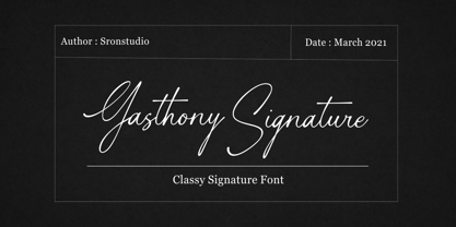 Gasthony - Signature Font - Perfect for branding, invitation, stationery, wedding designs, social media posts, advertisements, product packaging, product designs, label, photography, watermark, special events, and more. Features: Uppercase and lowercase letters Swash alternates ( Beginning, Ending ) Multilingual symbols, numerals, and punctuation How To Access Alternate Swashes? You can read this article: https://helpx.adobe.com/illustrator/using/special-characters.html Follow Instagram: @sronstudio Thank You!
 - Renathalia Signature by Letterena Studios,
$9.00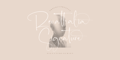 Renathalia Signature is a beautiful signature script font suitable for any projects such as logos, branding projects, homeware designs, product packaging, mugs, quotes, posters, shopping bags, t-shirts, book covers, name cards, invitation cards, and greeting cards. It’s also a perfect fit for labels, photography, watermark, special events, and all your other lovely projects that need a beautiful script taste.
 - Warmesty by Sronstudio,
$18.00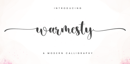 Warmesty is a beautiful calligraphy font perfect for crafting, branding, invitation, stationery, wedding designs, social media posts, advertisements, product packaging, product designs, label, photography, watermark, special events or anything. Warmesty comes with full set of uppercase and lowercase letters, swash alternates, ligatures,multilingual symbols, numerals and punctuation. If you have any questions don't hesitate to drop me a message ;) Happy Creation !!
 - Amadgone by Multype Studio,
$18.00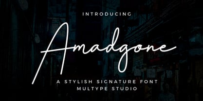 Amadgone is a stylish signature this font looks elegant, natural, stylish and perfect for any awesome projects that need handwriting taste. Features : uppercase, lowercase, symbol, number, ligature, and also support multi language. Amadgone is perfect for photography, watermark, social media posts, advertisements, logos & branding, invitation, product designs, label, stationery, wedding designs, product packaging, special events or anything that need handwriting taste.
 - Hastery Signature by Sronstudio,
$18.00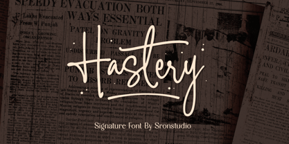 Hastery - Signature Font - Perfect for branding, invitation, stationery, wedding designs, social media posts, advertisements, product packaging, product designs, label, photography, watermark, special events, and more. Features: Uppercase and lowercase letters Swash alternates ( Beginning, Ending ) Multilingual symbols, numerals, and punctuation How To Access Alternate Swashes? You can read this article: https://helpx.adobe.com/illustrator/using/special-characters.html Follow Instagram: @sronstudio Thank You!
 - Besterline by Skinny Type,
$15.00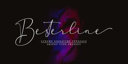 Besterline is a signature Font with a handwritten and script style make this font looks elegant, natural, stylish and perfect for any awesome projects that need signature taste. Besterline would perfect for photography, watermark, social media posts, advertisements, logos & branding, invitation, product designs, label, stationery, wedding designs, product packaging, special events or anything that need signature taste. What’s include : - Besterline OTF Happy Designing
 - Classic Girl Regular by Romie Creative,
$20.00 Classic Girl is a signature Font with a handwritten and script style making this font look elegant, natural, stylish and perfect for any extraordinary project that requires a distinctive taste. Classic Girl would be perfect for photography, watermarks, social media posts, advertising, logos & branding, invitations, product designs, labels, stationery, wedding designs, product packaging, special events, or anything else that needs a distinctive taste.
 - Beagle Sign by Attype Studio,
$14.00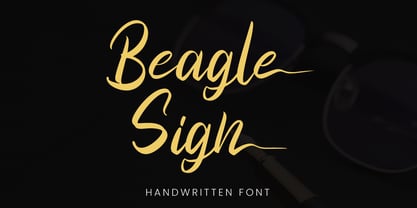 Beagle Sign is a stylish signature font with ending stylistic set that make amazing combination. perfect for any product like branding, invitation, stationery, wedding designs, social media posts, advertisements, product packaging, product designs, label, photography, watermark, special events or anything. Features: - Beagle Sign.otf - Multilingual Support - ligature - Ending stylistic set - Support Opentype features --- Hope you enjoy with our font! Attype Studio
 - Sintyabelinda by Zeenesia Studio,
$16.00 Sintyabelinda - Sintysbelinda is Signature Font, suitable for any projects such as logos, branding projects, homeware designs, product packaging, mugs, quotes, posters, shopping bags, t-shirts, book covers, name card, invitation cards, greeting cards, label, photography, watermark, special events, and more. stylistic set alternate and swash make this font so classy, this is a font worthy of your collection. Thank you.
 - ABSD Elena Verlin by Abesede Studio,
$18.00 It has a lovely, refined appearance. This letter displays an unique and curving style. The gorgeous and elegant Elena Verlin Font is perfect for any project you are working on. This font is ideal for use on invitations for weddings, birthdays, anniversaries, and other special events. Because it can be applied on logos and products, it's also ideal for branding.
 - Hertine by Ef Studio,
$15.00 Hertine is a signature style font, this font is perfect for watermarks, invitations, stationery, wedding designs, social media posts, advertisements, product packaging, product designs, labels, photography, logo, special events and more. Hertine is equipped with many additional features that allow you to customize your text. You will get a complete set of uppercase and lowercase, multilingual, punctuation, ligatures, stylistic alternates a-z.
 - Ambelia Script by Gatype,
$12.00 Ambelia Script is a natural handwritten font, it is perfect for logos, invitations, stationery, wedding designs, social media posts, advertisements, product packaging, product design, labels, photography, watermarks, special events or anything else. Ambelia Script comes with a full set of uppercase and lowercase letters, lowercase strokes, multilingual symbols, numbers, punctuation and liature. If you have any questions, feel free to message me
 - Signature One by Attractype,
$15.00 Signature One is new modern script font with a handwritten monoline style make this font looks elegant, natural, stylish and perfect for any awesome projects that need handwriting taste. Signature One would perfect for photography, watermark, social media posts, advertisements, logos & branding, invitation, product designs, label, stationery, visiting card, wedding designs, product packaging, special events or anything that need handwriting taste.
 - Oceanwide Pro by California Type Foundry,
$47.00 A font perfect for not just one, but many projects! Introducing Oceanwide Pro, a sans that loves to be used in just about any situation! Designed with ultra clean lines and versatility in mind, Oceanwide wants to be your new favorite sans! Oceanwide’s ultra clean letters work anywhere you want to communicate orderliness and competence, and designed to build trust and rapport with your audience. Its wide proportions make it ideal for display and logo use. Oceanwide especially shines for white/bright letters on black/dark backgrounds! That’s because the inside shapes are nearly perfect circles in many weights. Here's a quick video tour of Oceanwide Pro by Dave Lawrence, including all the great things Oceanwide can be used for! We've tested Oceanwide for these industries, with stunning results!: Tech Arts Fashion & Style Business & Branding Corporations Logistics Architecture Food and many more... Oceanwide can be used for: Headers Subheadlines Logos Even body text, if tracked. Print & Screen The styles it can take are also many. It's great for: Modern/minimalist design Flat design Cut out design User Interface (UI) Technical designs In combination with text effects, even for grunge and other situations. And many others... DESIGN FEATURES Simplicity Tall x-height Hand-sloped obliques (italics) Narrow spacing Semi-wide proportions Expert kerning Well proportioned, usable lights & extra lights Large caps Great ALL CAPS MODE Uppercase punctuation Uppercase spacing with California Type Foundry’s Smart Tracking™ Advanced fraction support Proportional lining figures Thick joins Smooth curves Sturdy—great for textures and effects Variable font available Latin Pro character set for Central European languages. That's the writing for over 782 languages and transliterations worldwide! DESIGN STORY—THE FORGOTTEN SANS by Dave Lawrence, Lead Designer, California Type Foundry Adrian Frutiger was the 20th century master of sans, but I didn't realize he had made—not one—but TWO geometric sans! It wasn't until I had purchased the book “Adrian Frutiger: Typefaces”. I had hoped to someday meet Adrian Frutiger, but he passed away that very same year. Here is the story of Frutiger's forgotten sans. Back in 1968, Frutiger was approached by Pentagram to make a design for British Petroleum. They wanted a "new version of Futura". However, they wanted him to make a couple adjustments. First, they felt that Futura was "too fiddly." By this, they meant that it narrowed too much at the joins. (Joins are for example where the round and straight parts of the 'd' meet.) This is something that is necessary for small print text (to prevent ink clogging), but is not necessary at large sizes. Second, they wanted it to be entirely geometric, using the circular shape with minimal optical corrections. Unfortunately this font was not even used very consistently in the BP brand. A haphazard mix of Futura and Frutiger's BP font ensued. It was then replaced by another font design very soon after. My design is different in several ways. First, the commas and quotes are a more modern style. I tried his original commas, but these just didn’t work to 21st century eyes. Second, in his drawings, Frutiger went for a more standard u with a downstroke on the right. However, Oceanwide has a simpler u. Third, I made more optical adjustments. At the direction of his employer, Frutiger reluctantly put no font optical corrections into the letters. So I think my optical adjustments are similar to what Frutiger would have wanted. Fourth, I extended the weight into the light and extra light ranges. Fifth, the rest of the font I created according to the principles of Adrian Frutiger, but with no sources for inspiration. Here is Frutiger’s design philosophy, in his own words: “If you remember the shape of your spoon at lunch, it has to be the wrong shape. The spoon and the letter are tools; one to take food from the bowl, the other to take information off the page... When it is a good design, the reader has to feel comfortable because the letter is both banal and beautiful.” The words about the spoon were the ones I kept in my mind as I tried to make the curves ultra smooth, and the shapes ultra simple. Hopefully this font is a worthy successor to the font that inspired it. Released on the 93rd birthday of Adrian Frutiger, to celebrate the life and achievements of this amazing designer. ——————— Simplicity. Versatility. Oceanwide.
 - FF Pastoral by FontFont,
$50.99 A sturdy workhorse with the grace of a gazelle, the FF Pastoral typeface family marries pure craftsmanship with rapturous excesses of form. With his fifteenth release under the FontFont brand, prolific French designer Xavier Dupré has filled a typographic toolbox with plentiful options ranging from a tender, feathery Thin to a robust, healthy Black. At a glance, FF Pastoral appears deceptively simple, particularly in the middle weights. That surface serenity is intentional and allows for easy reading and quick comprehension of short blocks of copy. Upon closer inspection, FF Pastoral is complex and nuanced, carrying a balanced tension in its forms. This plays particularly well in magazine spreads and corporate logos, where uniqueness is a virtue. In creating his latest design, Dupré drew inspiration from a tasteful mix of references, combining diverse elements with a deft hand. While its letter shapes were informed by humanist-geometric hybrid Gill Sans, FF Pastoral’s proportions have been optimized for contemporary typography. Slightly condensed but generously spaced, FF Pastoral features a tall x-height, open counters, and subtle, sprightly italics slanted at just 5°. Proportional oldstyle figures are the default in the family, with tabular and lining numbers and fractions accessible through OpenType features. Elegant details evocative of calligraphy judiciously pepper the FF Pastoral glyph set. The ‘e’ bears an oblique crossbar, while the right leg of the ‘K’ and the ‘R’ are insouciantly curved in both the upright and italic variants. Further flourishes appear throughout the italics, notably in the ‘T’ and the ‘Z’, the gloriously looped tail of the ‘G’, and an extraordinary ampersand. Sharp-eyed fans of Dupré’s work may feel like they’re in familiar territory, and they would be right. An early version of FF Pastoral sprang to life in 2017 as Malis, a family in four weights on the heavier side of the spectrum. Over time, Dupré refined his original design, expanding it with four lighter styles and including true italics for all. The lightest weights are ethereal, with exquisitely delicate strokes drawing the eye in and across a line of type. The most substantial styles are tremendous in their power, allowing text to make a deep impression in print or on screen. Fully fleshed out, FF Pastoral works sublimely in a vast array of text and display settings. Dupré sees his latest FontFont offering as a ‘cultural’ typeface, perfect for the pages of an oversized coffee-table book or business communications where warmth and informality will win the day. Born in Aubenas, France (1977), Xavier Dupré is a gifted user of type as well as an award-winning type designer and lettering artist. After training in graphic design in Paris, Dupré studied calligraphy and typography at the Scriptorium de Toulouse. Since releasing FF Parango in 2001, Dupré has published such FontFont classics as the FF Absara and FF Sanuk superfamilies, FF Megano, FF Tartine, and FF Yoga. A designer of Khmer fonts as well as Latin typefaces, Dupré splits his time between Europe and Asia.
 - Areplos by Storm Type Foundry,
$53.00To design a text typeface "at the top with, at the bottom without" serifs was an idea which crossed my mind at the end of the sixties. I started from the fact that what one reads in the Latin alphabet is mainly the upper half of the letters, where good distinguishableness of the individual signs, and therefore, also good legibility, is aided by serifs. The first tests of the design, by which I checked up whether the basic principle could be used also for the then current technology of setting - for double-sign matrices -, were carried out in 1970. During the first half of the seventies I created first the basic design, then also the slanted Roman and the medium types. These drawings were not very successful. My greatest concern during this initial phase was the upper case A. I had to design it in such a way that the basic principle should be adhered to and the new alphabet, at the same time, should not look too complicated. The necessary prerequisite for a design of a new alphabet for double-sign matrices, i.e. to draw each letter of all the three fonts to the same width, did not agree with this typeface. What came to the greatest harm were the two styles used for emphasis: the italics even more than the medium type. That is why I fundamentally remodelled the basic design in 1980. In the course of this work I tried to forget about the previous technological limitations and to respect only the requirements then placed on typefaces intended for photosetting. As a matter of fact, this was not very difficult; this typeface was from the very beginning conceived in such a way as to have a large x-height of lower-case letters and upper serifs that could be joined without any problems in condensed setting. I gave much more thought to the proportional relations of the individual letters, the continuity of their outer and inner silhouettes, than to the requirements of their production. The greatest number of problems arose in the colour balancing of the individual signs, as it was necessary to achieve that the upper half of each letter should have a visual counterbalance in its lower, simpler half. Specifically, this meant to find the correct shape and degree of thickening of the lower parts of the letters. These had to counterbalance the upper parts of the letters emphasized by serifs, yet they should not look too romantic or decorative, for otherwise the typeface might lose its sober character. Also the shape, length and thickness of the upper serifs had to be resolved differently than in the previous design. In the seventies and at the beginning of the eighties a typeface conceived in this way, let alone one intended for setting of common texts in magazines and books, was to all intents and purposes an experiment with an uncertain end. At this time, before typographic postmodernism, it was not the custom to abandon in such typefaces the clear-cut formal categories, let alone to attempt to combine the serif and sans serif principles in a single design. I had already designed the basic, starting, alphabets of lower case and upper case letters with the intention to derive further styles from them, differing in colour and proportions. These fonts were not to serve merely for emphasis in the context of the basic design, but were to function, especially the bold versions, also as independent display alphabets. At this stage of my work it was, for a change, the upper case L that presented the greatest problem. Its lower left part had to counterbalance the symmetrical two-sided serif in the upper half of the letter. The ITC Company submitted this design to text tests, which, in their view, were successful. The director of this company Aaron Burns then invited me to add further styles, in order to create an entire, extensive typeface family. At that time, without the possibility to use a computer and given my other considerable workload, this was a task I could not manage. I tried to come back to this, by then already very large project, several times, but every time some other, at the moment very urgent, work diverted me from it. At the beginning of the nineties several alphabets appeared which were based on the same principle. It seemed to me that to continue working on my semi-finished designs was pointless. They were, therefore, abandoned until the spring of 2005, when František Štorm digitalized the basic design. František gave the typeface the working title Areplos and this name stuck. Then he made me add small capitals and the entire bold type, inducing me at the same time to consider what to do with the italics in order that they might be at least a little italic in character, and not merely slanted Roman alphabets, as was my original intention. In the course of the subsequent summer holidays, when the weather was bad, we met in his little cottage in South Bohemia, between two ponds, and resuscitated this more than twenty-five-years-old typeface. It was like this: We were drinking good tea, František worked on the computer, added accents and some remaining signs, inclined and interpolated, while I was looking over his shoulder. There is hardly any typeface that originated in a more harmonious setting. Solpera, summer 2005 I first encountered this typeface at the exhibition of Contemporary Czech Type Design in 1982. It was there, in the Portheim Summer Palace in Prague, that I, at the age of sixteen, decided to become a typographer. Having no knowledge about the technologies, the rules of construction of an alphabet or about cultural connections, I perceived Jan Solpera's typeface as the acme of excellence. Now, many years after, replete with experience of revitalization of typefaces of both living and deceased Czech type designers, I am able to compare their differing approaches. Jan Solpera put up a fight against the digital technology and exerted creative pressure to counteract my rather loose approach. Jan prepared dozens of fresh pencil drawings on thin sketching paper in which he elaborated in detail all the style-creating elements of the alphabet. I can say with full responsibility that I have never worked on anything as meticulous as the design of the Areplos typeface. I did not invent this name; it is the name of Jan Solpera's miniature publishing house, in which he issued for example an enchanting series of memoirs of a certain shopkeeper of Jindrichuv Hradec. The idea that the publishing house and the typeface might have the same name crossed my mind instinctively as a symbol of the original designation of Areplos - to serve for text setting. What you can see here originated in Trebon and in a cottage outside the village of Domanín - I even wanted to rename my firm to The Trebon Type Foundry. When mists enfold the pond and gloom pervades one's soul, the so-called typographic weather sets in - the time to sit, peer at the monitor and click the mouse, as also our students who were present would attest. Areplos is reminiscent of the essential inspirational period of a whole generation of Czech type designers - of the seventies and eighties, which were, however, at the same time the incubation period of my generation. I believe that this typeface will be received favourably, for it represents the better aspect of the eighties. Today, at the time when the infection by ITC typefaces has not been quite cured yet, it does absolutely no harm to remind ourselves of the high quality and timeless typefaces designed then in this country.In technical terms, this family consists of two times four OpenType designs, with five types of figures, ligatures and small capitals as well as an extensive assortment of both eastern and western diacritics. I can see as a basic text typeface of smaller periodicals and informative job-prints, a typeface usable for posters and programmes of various events, but also for corporate identity. Štorm, summer 2005 - BD Gitalona Variable by Balibilly Design,
$139.00 We introduce our Variable Font from the high-complex BD Gitalona font family. Consisting of 3 axes; weight, optical size, and serif, that will give you a different experience extending the family of BD Gitalona. We don't want to mention how many families can be generated from this variable font. During the development process, we got up to more than 50 families and stopped to allow you to continue to play with the slide buttons. And again, BD Gitalona is filled with an explorative and experimental decorative version that we present separately. Figure out the decorative version BD Gitalona Moxa to make the aesthetic appeal of this whole typeface here! Inspiration The world of entertainment moves non-stop. One by one, figures appeared and left. We expect to create something to entertain previous trends with packaging more relevant to the present. More specifically, we admire and are inspired by some of the world's leading and top singers with a segmented nature. We imagine so many figures that can affect every viewer. However, each artist or singer has a segment because almost all of them have characteristics. The Design The basic design of this typeface begins with a transitional serif shape with sharp, shapeless corners. Then in the middle of the invention, there was an opportunity to explore it further from the readability side by adding an optical variable that can adjust the serif thickness when used together between large, medium to paragraph text sizes for editorials. The shift from serif to sans-serif with the contrast initiated by the shift of the serif family form as a different variable also makes this font richer in terms of the features it contains. Parts are expected to add to the user satisfaction with the complexity of this font. The Features BD Gitalona consists of one sub-family intended for body text with nine weights from Thin(100) to Black(900) and four other display sub-families such as Display serif, Flick, Harmony Sans and Contrast Sans. Each consists of four weights Thin(100), Regular Weight(400), Bold(700), and Black(900). And again, there are also retailed separately; the BD Gitalona Variable font, which is designed to accommodate all Subfamily in 1 font file, and BD Gitalona Moxa, an experimental typeface. A total of 700+ glyphs in each style. Advanced OpenType features functionally and aesthetically, such as Case-sensitive forms, small caps, standard and discretionary ligatures, stylistic alternates, ordinals, fractions, numerator, denominator, superscript, subscript, circled number, slashed zero, old-style figure, tabular and lining figure. Supports multi-languages including Western Europe, Central Europe, Southeast Europe, South America, and Oceania.
 - LAMPOH by Afkari Studio,
$13.00 LAMPOH - The Handmade Scratch Display Font LAMPOH is an artistic and captivating handmade display font, meticulously crafted by a talented type designer to bring uniqueness and authenticity to your creative projects. With its scratch-inspired design, LAMPOH stands out as a one-of-a-kind font that exudes a raw and artisanal charm, making it perfect for various artistic endeavors. Every character in LAMPOH has been meticulously hand-drawn with love and passion, ensuring that each glyph carries a distinct and organic feel. The imperfections and irregularities of the scratch strokes add an element of human touch, providing a genuine and authentic character to the font. LAMPOH comes in both regular and bold styles, giving you the flexibility to choose the perfect weight for your design needs. The regular style boasts elegance and subtlety, while the bold style makes a powerful statement, ideal for headlines and emphasis. LAMPOH's versatile design makes it an ideal choice for a wide range of projects. Whether you're creating eye-catching headlines, attention-grabbing posters, logo designs, merchandise branding, or anything that requires a touch of artistic flair, LAMPOH will effortlessly enhance the visual appeal of your work. The uppercase characters of LAMPOH are bold and expressive, demanding attention with their captivating presence. On the other hand, the lowercase letters bring a touch of playfulness, offering quirky alternatives to add delightful variations to your text. LAMPOH comes complete with a set of thoughtfully crafted standard characters and ligatures, allowing you to elevate your designs even further. These unique elements enhance the font's versatility, making it easy to create visually engaging and harmonious compositions. LAMPOH is designed to seamlessly integrate into various design software, making it effortless to use in your preferred creative tools. From Adobe Illustrator to Photoshop, InDesign, and beyond, the font's compatibility ensures a smooth and hassle-free design process. LAMPOH's high-quality design ensures that it looks equally stunning in both print and digital formats. Whether you're producing posters, brochures, social media graphics, websites, or any other project, this font will consistently deliver outstanding results. LAMPOH is not just a font; it's a work of art that adds a touch of human craftsmanship to your creative projects. With its handmade scratch-inspired design, versatile usage, and expressive characters, LAMPOH brings a unique and authentic flair to any design. Unlock your creativity and let LAMPOH illuminate your artistic vision with its captivating charm. Choose between regular and bold styles to create striking and memorable designs that leave a lasting impression on your audience.