10,000 search results
(0.045 seconds)
- Abang Fashion by Nirmana Visual,
$19.00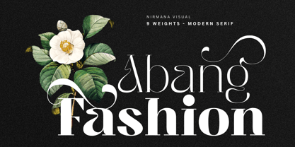 Abang Fashion is a luxury typeface with 9 Weights, full set of lowercase and uppercase letters, numerals and punctuation, multilingual symbols. Very suitable for the title, logo, typography, clothes, magazines, brochures, packaging and much more for your design needs, making your designs more modern and professional.
 - Triorange by Ef Studio,
$10.00 Introducing Triorange, a retro display font with rounded and smooth corner. Comes with 3 weight : Regular, Medium, and Bold. Simple letter form make this font looks nice either in body text or headline. Perfect for logo, branding, surface design, editorial design, and so many design needs.
 - Lakaran by Differentialtype,
$10.00 Lakaran is a serif font family that comes in 9 weights, 9 italics and 2 outlines. Lakaran is perfect for word documents, logo marks, editorial designs, branding projects, packaging, magazine titles, advertisements, and more. Lakaran is equipped with upper & lowercase, numbers, multilingual characters, several ligature and punctuation.
 - King Slayer by OzType.,
$7.50 King Slayer is a strong versatile serif font, the design details have been fine tuned to offer excellent readability on any screen size. King Slayer comes in three weights from regular to bold, with matching true italics, for a full range of editorial and advertising uses.
 - Alt Ayame Long by ALT,
$10.00 A long version of my Ayame font. Ayame is a display font which looks great on posters, logos, and titles. Ayame Long is a 2-weight family with a heavy retro look. Works great with the regular version of Ayame you can check out the original.
 - Loverica by Sarid Ezra,
$15.00 Loverica is a classic yet modern serif with up to 7 alternates for each characters that will make your presentation or logo even more stunning and stand out. With four weights that you can use for several purposes. This fonts support Multi Language and already PUA Encoded.
 - Grota by Latinotype,
$26.00 Grota is a very expressive font, has a gestural character inspired by the hand lettering . Grota is grotesque, unicase and exceptional. It has six weights ranging from thin to black with their italics. It is ideal for logos, brands, magazines, headlines, books. etc. Photography by Matías Troncoso
 - Bethany Elingston by Attract Studio,
$20.00 Bethany Elingston is a serif font with contrasting characters inspired by old-style serifs and condensed serifs. Has dozens of great Alternatives and Binders to combine in creating Labels, signage, titles, logos and many other creative projects. Including: 2 Weights Alternatives & Ligatures OpenType support Multilingual PUA encoded.
 - Panther Black by Device,
$39.00 Developed from Rian Hughes’ Black Panther logo for Marvel, Panther Black is a sharp and stylish three-weight headline sans. Built from sweeping curves and tapered crossbars, its bold, dynamic design is seen to best effect in shorter settings. Available in condensed, normal and extended variants.
 - Ruddy by Inhouse Type,
$33.32 Ruddy is a display sans serif type family. It has a playful and mischievous presence. Exaggerated geometry and varied vertical character stem placement contribute to its animated appearance. Ruddy comes in 4 weights with matching italics. OpenType features include Contextual Alternates, Tabular Figures, Fractions, Numerators and Denominators.
 - Mysteria by Juraj Chrastina,
$29.00 Stick out a mile with the Mysteria typeface and catch everyone's eye. Using a mix of its two weights helps to create stunning messages. Mysteria’s one-of-a-kind eccentric design of a display face can easily be combined with the matching body text family Gerlach Sans.
 - Margate JNL by Jeff Levine,
$29.00 A set of water-applied decals manufactured in 1962 by the American Decalcomania Company for Goodyear serves as the basis for Margate JNL. This block-style letter (with a hint of the Art Deco era) is bold, uniform in weight and commands attention in any titling application.
 - Olystar by NicolassFonts,
$35.00 Unleash the power of modern typography with Olystar, a captivating font family meticulously crafted on the foundation of the beloved Olyford font. Olystar boasts 5 exquisite weights and more than 400 glyphs in each style. This family is perfect for logotypes, advertising, packaging, corporate identities, and more.
 - Egosta by skillyas studio,
$15.00 EGOSTA is a complete sans serif family. The letterform and sharp variations characterize a bold and playful typeface in a graphic layout, making it perfect for modern and futuristic visual needs, EGOSTA complete family contains 10 styles with two axes; Weight and Width, from Thin to Bold.
 - Naname Kun by Julmeme,
$15.00 Naname Kun is a geometric typeface created with oblique lines as a main texture. Its unique particularity is to be filled with diagonal hatching that varies in thickness to create different styles and weights. Applicable for any type of graphic design, especially for posters and logotypes.
 - Mister Giacco Pro by Sudtipos,
$39.00 Mister Giacco Pro, designed by Diego Giaccone, is a simple stroke sans serif font designed with a solid structure that is ideal for corporate use, branding and any design where legibility and personality are required. It is available in 3 weights including small caps and italics.
 - Poppy JT by JAM Type Design,
$15.00 Poppy JT is a brush script typeface that contains three exciting weights which simulate the shapes created by a brush pen. Boasting over 800 glyphs, with its multiple ligature sets and alternatives, this is a wonderful typeface to use in packaging, magazines and on promotional messages!
 - Fonce Sans Pro by Ryan Ford,
$10.95 Fonce Sans Pro is a mono-weight, Swiss-style typeface with influences from great typefaces like Din, Helvetica, Interstate, and Trade Gothic. Its form is unique and sophisticated with an unmistakable Dutch style. It’s subtle and enjoyable, and works beautifully in both display and body copy.
 - Volante by Hindia Studio,
$12.00 Volante is a gorgeous condensed sans serif typeface that comes with various stylistic alternates and discretionary ligatures. It comes with multiple weights, from thin to heavy, with 3 extra outline styles. This is perfect to sweeten up your headlines, branding visual identity, editorial, poster, and etc.
 - Gvardia by ParaType,
$30.00 Type family of two weights was designed in 2000-2001 by Oleg Karpinsky and licensed by ParaType. Similar to Ariergard face in letterforms but differs from it by slab serifs, which always project to the center of an em square. For use in advertising and display typography.
 - Fiore Ebrey by madeDeduk,
$16.00 Fiore Ebrey is a serif display, come with single weight, legible and expressive shapes. A lot of stylish alternates characters and ligature will makes this font suitable for your any project design. Feature Uppercase & Lowercase Number & Symbol International Glyphs Multilingual support Alternative ligature Hope you enjoy it.
 - Geotype by Say Studio,
$10.00 Geotype is typeface inspired by circle shapes simple but significant, and defined by its crisp edges and modern touches. It is designed for optimal legibility. An lowercase is unique with some alternates, Geotyface makes a statement without making a scene. Three weights, four very different personalities.
 - Vallecito by Matteson Typographics,
$19.99 Vallecito or “Little Valley” is an Aldine woodtype design popular in the 19th century for posters and headlines. Vallecito’s multitude of weights and widths allows for impactful typography in signage, posters, menus and logos. Vallecito’s exaggerated, reversed stress shapes may be used in traditional or impressionistic typography.
 - Hypne Pop by Sitintahitam,
$9.00 Hypne Pop is inspiring by retro pop culture, groovy, and funky. Hypne Pop comes with 9 weight unique regular and unique slanted style. Hypne Pop have a different characters in every style. This font also suitable for making headlines, stickers, T-shirt design, logotypes, poster, magazine, etc.
 - Concord by Soneri Type,
$39.00 Yet another typeface with simplicity as its core element. Concord is derived from a successful type family ‘Accord Alternate’ with an added geometric touch. Concord is a geometric sans serif. It has large counters which enhance readability. It is available in seven different weights for emphasis.
 - Belgravia by Scriptorium,
$24.00Belgravia is an Art Nouveau period design based on hand lettering from the 1890s. Like our popular Pantagruel font it has a lot of the elements which would influence later Psychedelic poster lettering in the 1960s. Very nice looking with a good weight for title designs. - RBNo2.1 by René Bieder,
$25.00 RBNo2.1 is a condensed sans serif typeface with a technical and geometric appearance. The family includes 2 versions (RBNo2.1a and RBNo2.1b) and has 7 weights with matching italics. RBNo2.1 feels comfortable in technical surroundings with short text passages, in brochures, catalogs, magazines, posters, websites headlines and logos.
 - Planer by The Northern Block,
$- A modern rounded typeface combining humanist elements with a strong geometric grid. The result is a font that can produce striking visuals at large scale and clean line legibility at text size. Details include seven weights, a complete character set, manually edited kerning and Euro symbol.
 - Troquel by Pau Lamuà,
$28.00 Troquel is a fat font, with feminine curves. Soft edges give this slightly overweight typeface a big and beautiful happy style. Combining fatty with his sister outline version helps to provide a nice contrast between each weights glyphs. Troquel has uppercase characters, numbers, and the basic punctuation.
 - Advertising Script by Zetafonts,
$39.00 Advertising Script is a brush script typeface inspired by a handmade sample drawn by the calligrapher Ross Frederic George and depicted in Speedball 1947 Textbook Manual. Advertising Script has a vintage brush script look, perfect for food packaging, display and logo design and period advertising. The original design has been completely reworked and extended by the Zetafonts Masterclass 2016 Team to provide three lighter weights, a rough and a monoline variant, and to produce an extended character set with open type support for ligatures, alternates, European languages and ending swashes. Advertising Script covers over 40 languages that use the Latin alphabet, with a full range of accents and diacritics. It comes in four weights plus a special monoline weight. Advertising Script makes full use of Open Type ligatures to provide swashes, alternates and a wide array of ligature characters for a more handmade, natural look. Swashes can be accessed through glyph palette or by typing one to six underscores after the letter. Take care: open type features are developed using open type technology, fully compatible with Adobe software and major design softwares and OS, but not supported by every software. Check before buying!
 - Bembo MT by Monotype,
$45.99 The origins of Bembo go back to one of the most famous printers of the Italian Renaissance, Aldus Manutius. In 1496, he used a new roman typeface to print the book de Aetna, a travelogue by the popular writer Pietro Bembo. This type was designed by Francesco Griffo, a prolific punchcutter who was one of the first to depart from the heavier pen-drawn look of humanist calligraphy to develop the more stylized look we associate with roman types today. In 1929, Stanley Morison and the design staff at the Monotype Corporation used Griffo's roman as the model for a revival type design named Bembo. They made a number of changes to the fifteenth-century letters to make the font more adaptable to machine composition. The italic is based on letters cut by the Renaissance scribe Giovanni Tagliente. Because of their quiet presence and graceful stability, the lighter weights of Bembo are popular for book typography. The heavier weights impart a look of conservative dependability to advertising and packaging projects. With 31 weights, including small caps, Old style figures, expert characters, and an alternate cap R, Bembo makes an excellent all-purpose font family.
 - Bembo Infant by Monotype,
$45.99The origins of Bembo go back to one of the most famous printers of the Italian Renaissance, Aldus Manutius. In 1496, he used a new roman typeface to print the book de Aetna, a travelogue by the popular writer Pietro Bembo. This type was designed by Francesco Griffo, a prolific punchcutter who was one of the first to depart from the heavier pen-drawn look of humanist calligraphy to develop the more stylized look we associate with roman types today. In 1929, Stanley Morison and the design staff at the Monotype Corporation used Griffo's roman as the model for a revival type design named Bembo. They made a number of changes to the fifteenth-century letters to make the font more adaptable to machine composition. The italic is based on letters cut by the Renaissance scribe Giovanni Tagliente. Because of their quiet presence and graceful stability, the lighter weights of Bembo are popular for book typography. The heavier weights impart a look of conservative dependability to advertising and packaging projects. With 31 weights, including small caps, Old style figures, expert characters, and an alternate cap R, Bembo makes an excellent all-purpose font family. - Neue Plak Variable by Monotype,
$344.99A little-known design by Futura designer Paul Renner gets a long overdue update by Linda Hintz and Toshi Omagari, in this reliable and impactful industrial sans serif. Neue Plak offers more weights and widths than the original 1928 design, extending its use for branding, editorial, logos and UIs. The pair based their updated and extended version on the original Plak wood type, uncovering lost details and incorporating them as alternates – including the choice between open or strikethrough counters. Neue Plak's outwardly stubborn personality is counteracted by unexpected details, which make for an unusual juxtaposition of severe and playful. “It felt like we should pay Paul Renner more tribute,” says Hintz, who spent time researching the typeface in Hamburg's Museum der Arbeit. “The forms themselves are partly quirky, partly really fun, but with a German stiffness that makes for a strange mix.” Neue Plak offers 60 weights, including a new text version that pairs well with the display weights, and allows the design to function in print and digital environments, and for a wide range of uses. Neue Plak Text Variables are font files which are featuring one axis and have a preset instance from Thin to Black. - Plethora by Sudtipos,
$49.00 A few years ago I've discovered the work of one of the most prolific typeface designers of the Bruce type Foundry in NYC during late nineteenth century. Browsing Julius Herriet's work I found a very unique kind of ligatures in his patented "Old Style Ornamented" type design. Some letters were designed with a little top tail that allowed them to connect to each other. After that, I found that he also designed a single italic weight of the same font 7 years later. Since the beginning of the Opentype days I’ve been deeply obsessed with exploring different ways to build ligatures, so that lead me up to this point where I felt the need to create “Plethora”, this new font inspired by Herriet’s work. Extrapolating weights, adding variable technology and playing with additional interconnected letters and alternates. Definitely, Plethora means a large or excessive amount of something, and this font tries to bring back this abundance of details two centuries later. Available in 9 weights, from roman to italic, and also as variable format, “Plethora” supports plenty of latin languages and is a perfect choice for today’s design tides.
 - Sienna by Monotype,
$40.00 Sienna is a soft serif typeface designed for both text and display purposes. Its soft and sharp structure creates an unusual, yet pleasing appearance. This leads to a comfortable reading experience with enough personality to create impactful titles and headlines, and Sienna will really shine in your branding projects. Variable versions of the fonts are available allowing you to fine tune the weight to your exact liking. Small Caps are included (along with their matching diacritics) – adding another layer of versatility to this typeface. Proportional Lining figures are an option if you prefer them to the default Old Style figures. A number of swash alternates enhance Sienna, giving you the opportunity to add more flair and personality to your title and branding designs. Simply activate Stylistic Sets to start adding flourishes to your typography. There are 14 fonts altogether, with 7 weights in roman and italic from Thin to Black styles. Sienna has an extensive character set (800+ glyphs) that covers every Latin European language. Key features: 7 weights in both roman and italic Variable fonts included with full family 59 Alternates 8 Ligatures Small Caps Full European character set (Latin only) 800+ glyphs per font.
 - Miss Mable by Cory Maylett Design,
$25.00 Miss Mable is a high-quality, well-proportioned contemporary typeface with variations in thick and thin strokes that contains a hint of previous decades. I wanted to create enough weights and widths to make the typeface suitable for a wide range of uses where a soft, stylish, and friendly look is appropriate. The Miss Mable type family consists of 44 fonts. The family encompasses seven weights across three widths in Roman and italics plus variable versions. Each font contains a complete set of characters for Western and Central European languages. In addition, OpenType features include dynamic fractions, alternate glyphs, ligatures, plus proportional, tabular, and old-style numerals. These high-quality fonts are fully compatible with Windows, Macintosh, and Linux. Also for sale are two Miss Mable variable fonts that include all Roman and italic glyphs of every width and weight plus everything in between. For example, if you need something slightly bolder than bold and a little wider than semi-condensed, the variable fonts make that possible without distortion. Variable technology is new, however. All modern web browsers support variable fonts, but support for most desktop software is still spotty.
 - Vito by Dots&Stripes Type,
$70.00 Vito is a strong and elegant sans serif family in 60 styles. A wide range of weights and widths offering tremendous typographic flexibility. Perfect to mix in magazines or packaging, corporate designs or movie titles. Masculine and sporty for adrenaline junkies, reliable and elegant for serious typographers, but with a touch of bling for high snobiety. Vito was selected as one of Typographica’s favorite typefaces of 2015. The Vito Family sets its goal to stay very functional but with a strong and unique look. Neutrality is good, but sometimes you need a bit more edge. The extreme weights and widths work great in title sizes, while the normal weights make longer texts deliciously readable. The classic and elegant outlook in all sizes make the family suitable for everything high quality. While the family looks great on the outside, it is even greater on the inside. Loads of OpenType-Features, a big amount of language support, and the flexibility of alternative letters, make working with Vito easy and exciting. And the big range of widths invite you to mix all together, and find new ways to express your designs. We would love to see, what you come up with!
 - Uniform Italic by Miller Type Foundry,
$25.99 Now Uniform comes in Italics! Uniform is a multi-width geometric type family designed around the circle. The O of the Regular width is based on a circle, the O of the Condensed width is based on 1.5 circles stacked (with straight sides) and the O of the Extra Condensed width is based on two circles stacked with straight sides as well, and all other characters are derived from this initial concept. This unique idea creates a remarkably fresh type family that bridges the gap between circular geometric typefaces and condensed straight-sided typefaces. Uniform also includes many opentype features like Old Style Figures, Tabular Lining Figures, Alternate characters, Ligatures and more. Uniform was first drawn starting with the Black weight. This careful process allows each character to look consistent and balanced through all weights. As a result, the typeface does not ‘break down’ or lose its form in the boldest weights like many typefaces do. The three widths of Uniform Italic make an ideal type family for a host of various uses. From branding to web design, book covers to signage, Uniform is a very versatile solution to complex typographic needs.
 - Uniform by Miller Type Foundry,
$25.99 Uniform is a multi-width geometric type family designed around the circle. The O of the Regular width is based on a circle, the O of the Condensed width is based on 1.5 circles stacked (with straight sides) and the O of the Extra Condensed width is based on two circles stacked with straight sides as well, and all other characters are derived from this initial concept. This unique idea creates a remarkably fresh type family that bridges the gap between circular geometric typefaces and condensed straight-sided typefaces. Uniform also includes many opentype features like Old Style Figures, Tabular Lining Figures, Alternate characters, Ligatures and more. Uniform was first drawn starting with the Black weight. This careful process allows each character to look consistent and balanced through all weights. As a result, the typeface does not ‘break down’ or lose its form in the boldest weights like many typefaces do. The three widths of Uniform make an ideal type family for a host of various uses. From branding to web design, book covers to signage, Uniform is a very versatile solution to complex typographic needs.
 - Alio by R9 Type+Design,
$40.00 Alio™– Let Your Creativity Flow. Inspired by sleek sans serifs and flowing cursives, Alio™ features the best of both worlds. The hybrid modular design of this display type gives you tons of alternates and options to play. Just let your creativity flow and enjoy creating a broad range of styles from minimalistic modern to decorative flourish. *Alio Pro* comes loaded with extensive ligatures and alternates. When combined this display type with Alio Decor, you can let your creativity flow to the max. Together, you can create stunning flourish designs and unique type treatment to your projects. The Pro also supports most Latin-based languages. Heck, it even covers Chinese PinYin. Perfect for the logo, branding, poster, book cover, store sign, and packaging. [6 weights/12 font styles. 750+ glyphs each] *Alio Decor* is more than just an Alio Pro’s sidekick. You can enjoy creating flourish designs exclusively with Alio Decor. [6 weights/12 font styles, 300+ glyphs each] *Alio Std* features selected glyphs from Alio Pro (fewer ligatures and alternates). Perfect for web headlines and subheads, and minimalistic, modern print designs. [6 weights/12 font style, 400+ glyphs each]