1,804 search results
(0.026 seconds)
- Arachnids - Personal use only

- Walk Da Walk One - Personal use only

- Paduka Script by Siwox Studios,
$15.00 Introducing Paduka Script, Modern Smooth Calligraphy. 471+ glyphs included, with swashes alternative characters, suitable for any design needs, modern design, branding, stationery design, blog design, modern advertising design, invitation, wedding, special events, any lettering needs and more, for commercial use or personal use. Paduka Script is available for any printing needs, desktop, print on demand, video design, blog header image, or designing a commercial product for reselling. For Adobe Photoshop / Illustrator CC user, Swashes / Stylistic Alternates can be used directly. If you are a non-glyph panel software user, You can use the alternative letters by Install OTF font files. To activate the alternates click on Swash, and Stylistic Alternates in any OpenType savvy program or manually select the characters from Glyph Palette. Then Change the font to Paduka Script.
 - Plinc Italiano by House Industries,
$33.00 Dave West’s Italiano is a smooth and sensuous typographic dish with a few extra savory dashes. The silky semi-serif combines ingredients from eighteenth-century engraved italics and nineteenth-century Italian Modern, softened by fine stroke endings and plump dolloped terminals. Preserve Italiano’s subtle flavors by maximizing its size in headlines, advertising captions, and identity campaigns, or capitalize on its swash characters to sweeten package and poster designs. However you use it, Plinc Italiano is a tasty typographic treat—non ci piove! Drawn in the late 1960s for Photo-Lettering, Inc., Italiano was digitized by Steve Ross with Ken Barber in 2015. Like all good subversives, House Industries hides in plain sight while amplifying the look, feel and style of the world’s most interesting brands, products and people. Based in Delaware, visually influencing the world.
 - Monserga FFP - Personal use only

- Gill Sans Nova by Monotype,
$61.99 The Gill Sans® Nova typeface, by Monotype Studio designer George Ryan, expands the much-loved Gill Sans family from 18 to 43 fonts and features a coordinated range of roman and condensed designs. Several new display fonts are available, including a suite of six inline weights, shadowed outline fonts that were never digitized and Gill Sans Nova Deco that was previously withdrawn from the Monotype library. A variety of OpenType® features are supported that make it possible to include experimental characters from different points in Gill Sans’s long history, including pointed diagonals on ‘A’, ‘V’ and ‘W’ and alternatives for ‘b’, ‘d’, ‘p’ and ‘q.’ Proportional figures are also available as an alternative to the tabular designs. The Gill Sans Nova family has a large character set that supports Latin, Greek and Cyrillic languages. The display weights support Latin only. “Gill Sans was fast to strike a chord with people after its initial 1928 release and quickly became popular,” explains Ryan. “It’s been adapted for every publishing technology, from mechanical typesetting to digital imaging – always receiving the best treatment from Monotype in each iteration. This is especially true with all that we’ve added to the new series, while still retaining the familiarity of Gill Sans. My goal was to ensure clarity across digital environments, add missing weights, and bring more personality to the family with new display fonts, as well as Gill-inspired alternate characters.” The Gill Sans Nova typeface family is part of the new Eric Gill Series, drawing on Monotype's heritage to remaster and expand and revitalize Eric Gill’s body of work, with more weights, more characters and more languages to meet a wide range of design requirements. The Series also brings to life new elements inspired by some of Gill’s unreleased work, recently discovered in Monotype’s archive of original typeface drawings, designer correspondence and documents from the last century.
 - Adelle Mono by TypeTogether,
$36.00 The Adelle family continues its stylistic expansion with the release of Adelle Mono and Adelle Mono Flex by Veronika Burian and José Scaglione. Monospaced typefaces are the default choice for developers and programmers and are also an aesthetic choice for many designers and communicators. The Adelle Mono font family has two widths to serve both breeds and a variable font for the flexible spectrum in between. Monospaced typefaces are born of necessity rather than purely aesthetic values. Each glyph is constrained to a strict box, making the naturally smaller ones the same width as the naturally wider ones. While this serves the functional purpose of keeping text aligned in vertical and horizontal rows, it is completely unnatural in terms of readability. A monospaced ‘l, i’ are overblown compromises while ‘m, w’ become compressed mutations. The Adelle Mono family was therefore designed with both the developer and the aesthete in mind. Adelle Mono respects its necessary constraints while still being visually appealing and easily read. Activate it for use in Sublime, Swift, Terminal, or your IDE of choice and see how well it performs. Clarity will lead to less developer mistakes, and its aesthetic appeal will make your work enjoyable. Adelle Mono Flex is the proportional width version that works for any kind of normal text reading or a design intended to invoke “system or information aesthetics”. Opposite the demands of the monospace family, Flex is reader friendly and intended for branding, annual reports, paragraphs, UI, logos, posters, screens, tables, captions, and more. Employ the Mono version where monospace is needed and the Flex version where reading or coherence is priority. Adelle Mono’s experimental 20-style design explores the space between proportional and monospaced types. It boosts creativity and coherence by providing flexible options in the same family, including italics and the variable font format with an axis of weight and a spectrum axis between multi-width and monospaced characters. Combining Adelle Mono with either Adelle or Adelle Sans adds more layers and adaptability to your work.
 - Acarau Display by Tipogra Fio,
$30.00 Acarau is a 6 fonts display typeface with high reverse contrast—since from Roman capitals and calligraphy, usually Latin alphabet letters have thiner horizontal steams and thicker verticals, these features being optical or visual—quite adequate for logos, headlines and posters. Moreover, the style of the typeface is inspired by Italics form factor: lowercase letters having less strokes to make their shapes; A has one story; E has one stroke shape, such as K, G, Y and Z; F has a descent. To give it more calligraphic feeling, there is contrast for uppercases as well, this is very perceived by the diagonal letters like A, K, M, N, V, W, X, Y and Z. J also has a descent. Q and R have natural swashes, but they have alternates in case the costumer want to go for more usual forms—including accent marked letters. Acarau is a 12 months project, the contrast for uppercases were increasing as the process was made. In the middle it is found suitable blend the letter shapes with the history of Brazilian music from the 70’s and 80’s, since the font has a tropical, warm, spicy and nostalgic feeling. Songs from bands and singers that emerged on Rio de Janeiro like Paralamas do Sucesso, Cazuza, Lulu Santos and Kid Abelha bring the beach accent and rhythm that this font has. OpenType features complement the set, which has Multi-Lingual support for a comprehensive Latin set, including Vietnamese—meaning more than 640 glyphs: Case-Sensitive forms, so symbols can properly align to uppercase letters; Ligatures, to better reading for z_y and L_I, and style for s_s, w_w_w; also for ease arrows and punctuation typing; Stylistic Set 1: two story a—including accent marked letters; Stylistic Set 2: two story g—including accent marked letters; Stylistic Set 3: diagonal (usual) z—including accent marked letters; Stylistic Set 4: flower i and j dots; Contextual alternates; Terminal forms, for R and Q; Ordinals.
 - Smallstep Pro by Evolutionfonts,
$- Smallstep - One geometric sans serif with a free spirit. If we presume that geometric typefaces play with the idea of what typography would look like in the future when all unnecessary elements would disappear, than most of their designers seem to envision the future in a rather metropolisque kind of way. We love geometric faces, but the cold and heartless feelings that most of them leave is just not our cup of tea. That is why we are happy to bring some optimism in that genre with our new typeface. We called it Smallstep. Smallstep is a typeface that follows the traditions of classic geometric sans serifs like “Futura”, but is at the same time friendly and whimsical. We took the liberty to deviate from the standard sans serif glyphs while drawing some characters (such as ”a” and ”r” ), others (“w” “k”) are completely redesigned. Probably the biggest trademark of this typeface is the way vertical lines in most lower case characters are “cut” so they end in a 60 degree angle. Smallstep is over all a expressive face, which means it brings some emotions to your design and feelings in itself, and should be used accordingly. Other than that, it is suitable for both headline and body text, print and web. So what kind of name is “Smallstep”? We view the type design process as a form of evolution: There can be no typeface that differs drastically from the current standards, since its characters would be unrecognizable and thus unreadable. But at the same time there are hundreds of faces that differ a little, and still manage to make a difference by moving with small steps towards better and more refined looks. Smallstep consist of 4 weights, that cover all the features, that are expected of a modern Opentype face: kerning pairs, ligatures, true italics and alternative characters, plus a set of symbols, that will help you start off your designs more easily.
 - ITC Founder's Caslon by ITC,
$40.99The Englishman William Caslon punchcut many roman, italic, and non-Latin typefaces from 1720 until his death in 1766. At that time most types were being imported to England from Dutch sources, so Caslon was influenced by the characteristics of Dutch types. He did, however, achieve a level of craft that enabled his recognition as the first great English punchcutter. Caslon's roman became so popular that it was known as the script of kings, although on the other side of the political spectrum (and the ocean), the Americans used it for their Declaration of Independence in 1776. The original Caslon specimen sheets and punches have long provided a fertile source for the range of types bearing his name. Identifying characteristics of most Caslons include a cap A with a scooped-out apex; a cap C with two full serifs; and in the italic, a swashed lowercase v and w. Caslon's types have achieved legendary status among printers and typographers, and are considered safe, solid, and dependable. ITC Founder's Caslon® was created in 1998 by Justin Howes, an English designer who used the resources of the St. Bride Printing Library in London to thoroughly research William Caslon and his types. As was common in the eighteenth century, Caslon had punchcut several different sizes of his types, and each size had a slightly different design. Howes digitized every size of type that Caslon cast, keeping their peculiarities and irregularities and reproducing them as they appeared on the printed page. This family has the 12 point, 30 point, 42 point, and Poster styles, as well as a full set of bona fide ornaments. In keeping with the original Caslon types, none of the sizes have bold weights, the numerals are all old style figures, and a full set of ligatures (some with quaint forms) are included. ITC Founder's Caslon® is a remarkable revival in the true sense of the word, and works beautifully in graphic designs or texts that require an authentic English or historical flavor. - ITC Stone Humanist by ITC,
$40.99 Type designers have been integrating the design of sans serifs with serifed forms since the 1920s. Early examples are Edward Johnston's design for the London Underground, and Eric Gill's Gill Sans. These were followed by Jan van Krimpen's Romulus Sans, Frederic Goudy's ITC Goudy Sans, Hermann Zapf's Optima, Hans Meier's Syntax and Adrian Frutiger's Frutiger. Now, ITC Stone Humanist joins this tradition. It is a careful blend of traditional sans serif shapes and classical serifed letterforms. ITC Stone Humanist grew out an experiment with the medium weight of ITC Stone Sans, a design that already showed a relationship to these sans serif-serif hybrids. ITC Stone Sans has proportions based on those of ITC Stone Serif, and its thick-and-thin stroke contrast suggests the bloodline of humanistic sans serif typefaces. But other aspects of ITC Stone Sans are more closely aligned to the gothics and grotesques, a tradition that accounts for the largest portion of sans serif designs. Enter ITC Stone Humanist. During his experiments with the earlier design, Sumner Stone recalls, I was actually quite surprised at how seemingly subtle changes transformed the face," moving the design firmly into the humanist tradition. "The form of the 'g,' 'l,' 'M,' 'W,' and more subtly the 'a' and 'e' are part of the restructuring of the family," he explains. The top endings of vertical lower case strokes have been cropped on an angle, as have the ascender and descender stroke endings. ITC Stone Humanist is a full-fledged member of the ITC Stone family. It has been produced with the same complement of weights, and the x-heights, proportions, and underlying character shapes are completely compatible with the three original designs. The original ITC Stone Sans is a popular typeface, in part because of its notable versatility. ITC Stone Humanist shares this virtue, and can be used successfully at very small sizes, in long passages of text copy, and even as billboard-sized display type."
 - FS Sinclair by Fontsmith,
$80.00 ZX Spectrum In 1982, a home computer came on the market that would launch the UK IT industry. The ZX Spectrum sold five million units and spawned thousands of software titles. It was the must-have gadget for every teen. FS Sinclair is inspired by the memory of Sir Clive Sinclair’s greatest creation: the experience of entering its clunky command codes and reading its simple, grid-placed type. Smart, switched-on, great in text and display, FS Sinclair is a modern grid-based font, drawn with the Spectrum in mind and brought to life by well thought-out design. Formula Having completed the font for Channel 4’s brand update, the Fontsmith team defined the formula for its next font: the creative essence of the C4 work but with more structural discipline, more rigid form and a little more seriousness. The new font wouldn’t look self-consciously retro but it would reference the past and, it was hoped, influence the future. Readability Like the ZX Spectrum, it took a while for the new font to do exactly what it was meant to do. Many of the early concepts by Phil Garnham and Jason Smith were too jagged – the result of an awareness of getting too close to existing fonts of the same ilk, such as Wim Crouwel’s Gridnik. Eventually, FS Sinclair evolved into a more readable, functional grid-based type design that answered Phil and Jason’s original, self-set brief. Idiosyncratic There’s a technological, systems feel to FS Sinclair but ultimately, humans are in charge. The lowercase “a”, “n”, “m” and “r” have clean-cut “ears”, and the square-ish design is softened by round joins on the inside of the letterforms. The idiosyncratic design of letters such as “g”, “j”, “k”, “v”, “w” and “y” bring the design up to date. This is a modular font with character, and a range of weights that allow varied application.
 - Felbridge by Monotype,
$29.00 The impetus behind Felbridge was both ambitious and highly practical: to develop an ideal online" typeface for use in web pages and electronic media. Robin Nicholas, the family's designer, explains, "I wanted a straightforward sans serif with strong, clear letterforms which would not degrade when viewed in low resolution environments." Not surprisingly, the design also performs exceptionally well in traditional print applications. In 2001, to achieve his goal, Nicholas adjusted the interior strokes of complex characters like the M and W to prevent on-screen pixel build-up and improve legibility. Characters with round strokes were drawn with squared proportions to take full advantage of screen real estate. In addition, small serifs were added to characters like the I, j and l to improve both legibility and readability. "The result," according to Nicholas, "is a typeface with a slightly humanist feel, economical in use and outstanding legibility - even at relatively small point sizes. Most sans serif typefaces have italics based on the simple "sloped Roman" principle, but italic forms for Felbridge have been drawn in the tradition of being visually lighter than their related Roman fonts, providing a strong contrast when the italic is used for emphasis in Roman text. The italic letter shapes also have a slightly calligraphic flavor and distinctive "hooked" strokes that improve fluency. Felbridge is available in four weights of Roman - Light, Regular, Bold and Extra Bold - with complementary italics for the Regular and Bold designs. The result is a remarkably versatile typeface family, equally comfortable in magazine text copy or in display work for advertising and product branding. As a branding typeface, Felbridge works in all environments from traditional hardcopy materials to web design, and is even suitable for general office use. As part of a corporate identity, this no-nonsense typeface family will be a distinctive and effective communications tool." Felbridge™ font field guide including best practices, font pairings and alternatives.
 - Biome by Monotype,
$29.99 In the sketches that formed the basis for his typeface Biome, Crossgrove experimented with inner and outer shapes in different styles, adapted letters to the form of the super-ellipse, and added curves only to remove these again. His challenge was to find a harmonious and coherent approach that provided sufficient contrast with existing fonts. Biome is essentially in the sans serif tradition and the letters exhibit only minor variations in terms of line thickness. There is still a suggestion of the super-ellipse at many points, but this never becomes the predominant design factor. While most of the terminals of the vertical strokes are only slightly rounded, the horizontals and diagonals have pronounced arches and it is these that basically determine the round and soft character of the typeface. The more unconventionally shaped letters, such as the lowercase 'g' with its two semi-open counters and the 'k' and 'x' with their crossbars, provide Biome with an individual personality. And this effect is emphasized by the generously rounded links in the 'v' and 'w' and the uppercase 'M' and 'N'. Biome has been designed as a typeface super-family. From the near hairline Extra Light to the amply proportioned Ultra, there are seven clearly differentiated weights and three tracking widths. There are oblique italic versions of all variants. The range includes small caps and numeral sets containing lowercase and uppercase digits. With its available range of characters, Biome can be used to set texts in all Eastern European languages. Although the remarkable individuality of Biome is most clearly apparent in the larger point sizes, this typeface is not just suitable for producing headlines and logos. Biome's elegant visual effects mean that it is equally comfortable in short texts while its large x-height and generous counters make it readily legible even in the small font sizes. Biome is a contemporary typeface that employs mid-20th century futurist elements which ironically give it a retro feel.
 - Caslon Graphique by ITC,
$29.99 The Englishman William Caslon punchcut many roman, italic, and non-Latin typefaces from 1720 until his death in 1766. At that time most types were being imported to England from Dutch sources, so Caslon was influenced by the characteristics of Dutch types. He did, however, achieve a level of craft that enabled his recognition as the first great English punchcutter. Caslon's roman became so popular that it was known as the script of kings, although on the other side of the political spectrum (and the ocean), the Americans used it for their Declaration of Independence in 1776. The original Caslon specimen sheets and punches have long provided a fertile source for the range of types bearing his name. Identifying characteristics of most Caslons include a cap A with a scooped-out apex; a cap C with two full serifs; and in the italic, a swashed lowercase v and w. Caslon's types have achieved legendary status among printers and typographers, and are considered safe, solid, and dependable. Caslon Antique was designed by Berne Nadall and brought out by the American type foundry Barnhart Bros & Spindler in 1896 to 1898. It doesn't bear any resemblance to Caslon, but has the quaint crudeness of what people imagine type looked like in the eighteenth century. Use Caslon Antique for that old-timey" effect in graphic designs. It looks best in large sizes for titles or initials. Caslon Black was designed by David Farey in the 1990s, and consists of one relatively narrow and very black weight. It is intended exclusively for titles or headlines. Caslon Black has a hint of the original Caslon lurking in the shadows of its shapes, but has taken on its own robust expression. Caslon Graphique was designed by Leslie Usherwood in the 1980s. The basic forms are close to the original Caslon, but this version has wide heavy forms with very high contrast between the hairline thin strokes and the fat main strokes. This precisely drawn and stylized Caslon has verve; it's ideal for headlines or initials in large sizes."
 - Paralucent by Device,
$39.00 Paralucent is versatile all-purpose modern sans. Available in seven weights, from Thin to Heavy, and in two widths each with corresponding italics, it avoids some of the more eccentric calligraphic quirks of Akzidenz or Helvetica or the cool precision of Univers for an elegant, functional, yet warm design. There are two additions to the core 28-weight family: a three-weight stencil set, and a four weight text family. The text weights have been adjusted for use at small point sizes, and feature more open character shapes, looser inter-letter spacing for improved readability, and lining numerals for use in listings and tables. Several core ideas inform Paralucent’s design. Prime attention has given to the negative space between characters, giving a more even “colour”, especially in text. For example, the J, L and T have shorter arms than comparable sans typefaces, while the M and W are wider. The A has a lower bar, opening up the interior counter. An unusually high lower-case x-height again helps to give a more even colour and improve legibility. Care has been taken to rationalise repeated elements like the tails on lower-case letters, or the Q and the “ear” of the g. Typographic design solutions that are consistent across all these features add more stylistic cohesion. ‘Ink traps’ are exaggerated incisions used to open up a letter's narrower internal angles, which can become clogged with ink, especially in small point sizes. Now largely redundant due to the high quality of modern print, they are still sometimes used as a stylistic quirk or design feature. Now that digital fonts are often reversed or outlined, or enlarged to enormous sizes, these can also lead to unexpected or obtrusive results. Paralucent takes these inevitable digital manipulations into account, and adds optical corrections without resort to ink traps. The family has been picked up by many UK and US publishers, featuring heavily in magazines like Loaded, Heat and TV Quick, as well as high-end coffee-table photography books and gallery websites. A perennial Device bestseller.
 - Hamlet by Canada Type,
$24.95Based on a specimen of an obscure and uncredited old face called Kitterland, Hamlet is one of those curiosities hardly ever noticed in the world of modern fonts, the kind that infuses a variety of historic Blackletter and calligraphy traits in an otherwise Roman alphabet. Such typefaces, what few of them exist, are almost always classified by typophiles as traditional decorative Roman alphabets. We beg to differ. We think such hybrids are fascinating enough to deserve a classification of their own. And we think today's aspiring letterers and type designers would benefit from paying special attention to this kind of hybrid alphabet, not only because it has much more hand than machine in it, but also because it is a prime example of how to succeed in mixing different lettering techniques into one self-contained and distinctly functional alphabet. As in any efficient mixture of lettering methods, Hamlet ended up with characters that are uniquely its own, such as the cupped A, M, V, W and Y, the very luscious and inviting curves on the arms of E, F, L and T, both single- and double-story forms of the a, and the humblest, friendliest g and y ever. A dozen alternate characters are sprinkled throughout the character set, so check out the map for a few pleasant surprises. We also made the Handtooled and Headstone styles because we thought these friendly forms were just crying out for such treatments. The Handtooled version turned out quite lovely, if we may say so ourselves, perhaps even better than the main font. The Headstone version is available as a free bonus to those who purchase the complete Hamlet package. All Hamlet styles come with lining figures as well as old style ones. Hamlet comes in all popular font formats. The OpenType fonts contain push-button swapping alternates and figures, which come in handy in software programs that support this kind of thing. - Ardina by Sensatype Studio,
$15.00 Ardina typeface is an old-style, retro, unique, and versatile vintage typeface with Special character, ready for branding and stand out. It is a display typeface with a unique curve that perfect for branding projects, logo, wedding designs, social media posts, advertisements, product packaging, product designs, label, photography, watermark, invitation, stationery, and any projects, it makes with a high level of legibility. What's Included: Character set A-Z Uppercase & Lowercase Numerals & Punctuation Accented Characters (West Europe) Ligature & Character alternate Works on PC & Mac Recommended using Adobe Illustrator or Adobe Photoshop and wish you enjoy our font. :)
 - Night Sign JNL by Jeff Levine,
$29.00 For decades, the soft glow of a neon sign beckoned weary travelers to roadside rest courts, told the hungry individual where to eat; let enthusiastic revelers know where the night life was happening. There is something special about a neon sign, yet changing times, city ordinances and even technology itself is turning this staple of urban life for over a hundred years into a museum piece. Night Sign JNL emulates the craft of hand-formed neon signage and it (along with a few added special effects) can really add some good-old-fashioned pizzazz to a print or web project.
 - Durango Western by Sharkshock,
$100.00 This all caps display font is defined by its close spacing and thick serifs for a distinct appearance. Inspiration came from old movies set in the Wild West. The characters are tall in stature so works well in spots with limited space. Use Durango Western for a wanted poster, social media, or team logo. Basic/Extended Latin, European accents, punctuation, diacritics, kerning, and Cyrillic characters are included. The eroded version features varying levels of distress between the uppercase/lowercase and contains a few alternates. NOTE: Due to the level of detail in the eroded version temporary computer slowdown may occur.
 - Tekton by Adobe,
$35.00Tekton font is based on the hand lettering of West Coast architect Frank Ching, who wrote out the text for his books. It is an Adobe Originals typeface designed by David Siegel in 1989. Tekton is ideal for architectural drawing/design software, to match the feel of the type with the designer�s plans, or to give the page an architectural or informal handwritten flavor. Tekton multiple master, released in 1993, has increased the usefulness of the design by adding weight and width axes and making the font more usable for signage and display work, as well as informal correspondence. - ITC Holistics by ITC,
$29.99Some words from the designer... Like a tree rooted in ancient philosophy with branches reaching into the new age, ITC Holistics encompasses 82 pictographs of astrology, healing, magic, nature and spirituality. In an illustration style that originates from hand-carved rubber stamps, west coast designer Teri Kahan shines new light on these timeless symbols. ITC Holistics is functional collectively and individually for graphics and logos. As with Teri's companion font ITC Connectivities, ITC Holistics can also be used as a divining tool. Just type your name in caps and lower case and see what the images tell you! - Troika by ArtyType,
$24.00 Naming this typeface Troika, the Russian word meaning "group of three", seemed apt because the starting point in this design process was a three sided letter 'O'. This triangular type styling became a template guide for the rest of the character set. Troika is a highly distinctive, ultra modern typeface with idiosyncratic letterforms that make for striking headlines, particularly at large display sizes. Challenging, futuristic and experimental, always unique, and with caps as characterful as the lower case. Troika being derived from the French 'Triangle' and the Latin 'Triangulus' it seemed only fitting to design three weights: Light, Medium & Bold.
 - Lucky Duke by Keristyper Studio,
$14.00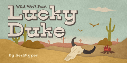 Introducing Lucky Duke font a western display typeface, inspired by cowboy wild west styles. This font is good for logo design, Social media, Movie Titles, Books Titles, short text even long text letters, and good for your secondary text font with sans or serif. **Featured:** * Standard Uppercase & Lowercase * Numeral & Punctuation * Multilingual : ä ö ü Ä Ö Ü ß ¿ ¡ * Alternate & Ligature * PUA encoded We recommend programs that support the OpenType feature and the Glyphs panel such as Adobe applications or Corel Draw. so you can use all the variations of the glyphs. Hope you enjoy our fonts!
 - Saltbush by Estudio Calderon,
$39.00 Saltbush is a collection of 3 hand made fonts following Pistacho's design line. Through an intelligent ligatures system we could design a typeface that imitates the strokes of a round brush pen and generates a flowing and organized writing. Saltbush contains 3 variables: 2 scripts, regular and bold, each one has 776 glyphs and; a beautiful display font. This typefamily has an extended characters set to support the languages in central and east Europe, as well as the ones used in west Europe. Keeping in mind the particularity of Saltbush design, it is possible to create beautiful graphics with a "hand made" look.
 - Hand Cursive by Okaycat,
$25.50 Hand Cursive design is a cute cursive font, written by hand—careful writing with a steady pen! The applications of this full-out cursive font are many. It is designed to be creative & free-flowing, but I also wanted it to be at least somewhat proper. Use Hand Cursive any time you want fancy, legible, and luxurious text. Works great for logo design and beautiful for titles. Go ahead and have fun with it. Hand Cursive is extended, containing the full West European diacritics & a full set of ligatures, making it suitable for multilingual environments & publications.
 - Jeeves by Red Rooster Collection,
$79.00 The inspiration for Jeeves came from Leslie Carbarga's wonderful book LETTERHEADS, One Hundred Years of Great Design, 1850-1950. It was based on a secondary type usage for the letterhead for Sutherland in New York. The rest of the letterhead had features that were more typical of the Art Deco period, but this script added a touch of timeless elegance. And since at the time I was reading every scrap of P.G. Wodehouse I could get my hands on, the name Jeeves seemed like a perfect fit. The font is loaded with a plethora of extra glyphs, ligature characters and OpenType features.
 - Big Chuck by Proportional Lime,
$1.99 Charlemagne, one of the great rulers of the Middle Ages, was instrumental in the reestablishment of formal education in the West. This font was inspired by the notion that he felt the need to protect his communications from people with the ability to read; a rare skill then. Did he really command such a script to exist? He did instigate the development Carolingian minuscule script. Here are two different systems that are both attributed to him. Does it provide any real security? No, but it is fun to think about how such a system might have been used.
 - Buxom by ITC,
$29.00Robert Trogman originally designed Buxom for Fotostar in 1975 with lettering from Herman Spinadel. Trogman’s design is an old-fashioned headline face, whose style feels at home in a number a different periods: the Wild West, the 1960s–70s, and once again today! Buxom is an all caps typeface with a three-dimensional effect: each character looks like it sits atop a trapezoidal shape, whose right side is always shaded. An inline around each letterform enhances this shadowy image. Buxom is best used in large display sizes as a single word, or single line of text. - TA Father 60 by Tural Alisoy,
$15.00 Since 2017, I have been improving my font creating skills. In the same year, I went through my father's notes and decided to make a font with his handwriting style. I completed the initial version with a lower number of glyphs in 2018. It supported only basic Latin, Turkish, and Azerbaijani alphabets. On the 15th of January 2021, my dad will turn 60. I am planning to finalize the updated version of the Father font by then. 584 glyph, 100+ Languages Set. Multilingual support: Latin basic, Latin Extended, Cyrillic, Central Europe, Turkish, Romanian, Euro, West European diacritics
 - Magnificent SS by Sensatype Studio,
$15.00 Magnificent is A Modern Feminine Vintage Font Magnificent font is a feminine retro modern vintage font with a fancy, playful, unique, and versatile vintage sans serif that you can combine to get a beautiful typography. It is a Sans Serif font with moderate contrast that perfect for branding projects, logo, wedding designs, social media posts, advertisements, product packaging, product designs, label, photography, watermark, invitation, stationery, and any projects, it makes with a high level of legibility. What's Included: Character set A-Z Uppercase & Lowercase Numerals & Punctuation Accented Characters (West Europe) Works on PC & Mac Wish you enjoy our font. :)
 - Herlanda by Sensatype Studio,
$15.00 Herlanda is Modern Vintage Logo Font is a well-balanced contemporary font with a fancy, unique, and versatile vintage serif, font that you can combine to get any variations and unique shapes easily just in seconds with choose alternates of them. It is a serif display font with moderate contrast that perfect for branding projects, l social media posts, advertisements, product packaging,and any projects, it makes with a high level of legibility. What's Included: Character set A-Z Numerals & Punctuation Accented Characters (West Europe) Stylistic alternates Works on PC & Mac Recommended using Adobe Illustrator or Adobe Photoshop. Wish you enjoy our font. :)
 - Natural Heap by Gleb Guralnyk,
$14.00 Hi, introducing a decorative font – Natural Heap! It's a handcrafted typeface that consists of hundreds of leaves that are seamlesly combined in a flowing pattern. Natural Heap font will perfectly fit for various label and logo designs. It's working better with short big words, when all the details are visible. To create an organic begining and ending of the word, type underscore characters on both sides (contextual alternates feature must be turned on). Natural Heap font has a west european multilingual support, check out the screenshots with available characters. Thank you and have a nice day!
 - Caught by Sensatype Studio,
$15.00 Caught is Unique Vintage Serif font with a fancy, unique, and vintage serif, font that you can combine to get any variations and unique shapes easily just in seconds with choose alternates of them. It is a serif display font with moderate contrast that perfect for branding projects, logo, wedding designs, social media posts, advertisements, product packaging, product designs, label, photography, watermark, invitation, stationery, and any projects, it makes with a high level of legibility. What's Included: Character set A-Z Numerals & Punctuation Accented Characters (West Europe) Works on PC & Mac Recommended using Adobe Illustrator or Adobe Photoshop. Wish you enjoy our font. :)
 - ITC Kumquat by ITC,
$29.99ITC Kumquat is the work of American designer Eric Stevens. He started with the logo for his company, Tower of Babel Design, and expanded upon the Mesopotamian look to create a typeface to match. Stevens imagined drawing figures in the sand with a stick and how this method would change the way one usually draws characters, usually with lines replacing curves. Most characters are slim but a few, like the uppercase A and L, were made to contrast with the rest. ITC Kumquat is a great display typeface for anything which should have an antiquated feel."" - Authority by RetroSupply Co.,
$19.00 Inspired by public fonts in New York in the 1970s. Authority pays tribute to the almost unnoticed but powerful effect type have on our lives. From waiting on a cold morning to catch the 307 to Morton West High School, to the rain and snow worn stencil on a postal box. Public typography is a part of the little spaces in your lives where life actually happens. Government designed fonts were chosen to communicate authority and help grease the gears of the day-to-day grind. Authority beckons back to these days with it's mildly condensed feel, squared corners and weight presence.
 - Karsten by Nasir Udin,
$25.00 The first development of Karsten typeface was inspired by signs on some old Dutch-buildings in Java. Then in the making, it blends with modern style. It's a synthesis between two cultures, the East & the West. The typeface was named after the Dutch architect who gave major contributions to architecture and town planning in Indonesia, Herman Thomas Karsten. It comes in nine weights from thin to black with matching italics. Its mixture of weights provide a wide range of styles that will help you find the best vibe for your projects, for headlines or a short paragraph. See the full presentation on Behance
 - Aulas by Eurotypo,
$48.00 Aulas's design is inspired by an ancient Roman lettering. This font is characterised by the strength and weight of its glyphs, in addition to its predominant height of "x", as well as the ascending and descending, with particularly short strokes. Aulas includes more than 200 alternative glyphs (swashes, stylistics sets, stylistics alternates), more than 70 ligatures, and a set of more than 30 ornaments, very easy to combine with the rest of the letters. This font offers good readability for use in editorial design, magazines, newsletters, and print. The strong personality of its glyphs is well suited to headlines.
 - Work Crew Stencil JNL by Jeff Levine,
$29.00 In the 1949 Paramount comedy "My Friend Irma" (a film based on the popular radio series that introduced America to Dean Martin and Jerry Lewis), an opening gag set-up involving excavation work utilizes street barricades which inspired Work Crew Stencil JNL. Placed along the site, different advisories are stenciled upon barricades warning of the work in progress. The scatterbrained Irma (Marie Wilson) walks straight through the construction, oblivious as to what's going on around her and steps right into the open hole dug into the sidewalk (a scene she reprises in 1950's "My Friend Irma Goes West").
 - Lark by Shana Hu,
$20.00 Lark is a modern calligraphic sans inspired by a rich history of broad-edge and translation contrast calligraphy. By combining its sharp geometry with flared curves, Lark exhibits a nice warmth as a display face. Lark was initially conceived as a final project as part of the Type@Cooper West Extended Program's post-graduate certificate program in typeface design, so its journey has benefitted from routine feedback from experienced typeface designers. Comes in Bold, Medium, Regular, and Light weights for both roman and italic, and supports multiple languages including Danish, Dutch, English, French, German, Italian, Portuguese, Spanish, Swedish, and more.


