10,000 search results
(0.032 seconds)
- Berlewi FA by Fontarte,
$39.00 FA Berlewi is inspired by stencil lettering of a vanguard creator, Henryk Berlewi, who was a precursor of contemporary typography, a painter and a creator of the mechano-facture (Mechano-Faktura) theory. In 1924 he designed a poster for his mechano-facture one-man show in Warsaw Austro-Daimler car salon. An attention-grabbing composition with stencil lettering was doubtless a real innovation and according to Berlewi - the first typographic poster to be made in Poland.
 - Bock by Latinotype,
$35.00 Is a recreational typography. Created from experimentation of the Slab Serif style with asymmetric lines. Bock is compact and stable, although having the quality of breaking the typographic rhythm, to benefit its use in short words as logotypes and lowering of text in editorials and publicity. The Fat variable was devised as an extension of the Bock concept, deleting the inner and outer space that surrounds a letter, creating a font with much weight and attitude.
 - Novecento Slab by Synthview,
$22.00 Novecento Slab is the “slab serif” companion of Novecento Sans , a font family inspired on european typographic tendencies between the second half of 19th century and first half of the 20th. This font face is designed to be used mostly for headlines, visual identities or short sentences, both in big and small sizes. Novecento Slab family comes in 32 styles, speaks 76 latin based languages, has 590 glyphs and 16 stylistic opentype features for advanced typography.
 - Neospace Expanded by deFharo,
$21.00 Neospace Expanded is an avant-garde typeface designed for technology and science fiction lovers. With its elegant geometric minimalism, Neospace redefines typographic aesthetics with a perfect fusion between modern and futuristic. Geometric Inspiration Designed with an expanded proportion and thin thickness, it exudes its own high-tech, futuristic and space style. Each Neospace character has been sculpted from the letter “O”, using the mathematical proportions of the Fibonacci sequence in curves, metrics and kerning, adding a golden ratio to each character. This meticulous approach ensures exceptional readability and a unique aesthetic that evokes a sense of order and precision. Three styles: Regular, which provides a modern and clean look; the Dot Layer, which adds a touch of color and creativity to typographic titles; and the Bold version, which evokes the feeling of futuristic and sophisticated electronic circuits, bringing a sense of avant-garde and advanced technology to your projects. Neospace allows you to create typographic titles in various colors, imitating the sophistication of futuristic electronic circuits. Limitless Versatility Neospace goes further by offering alternative letters and signs, multiple sets of numbers and capital letters, as well as monetary and cryptocurrency symbols. In addition, it incorporates complex OpenType functions that further enrich the design possibilities, allowing even greater customization in your typographic designs.
 - Script Art by Dedsign,
$10.00 ScriptArt is a modern hand-made font that combines calligraphy, typography and graffiti. This project is inspired by calligraphy and its modern interpretation. Simply put, it is a conscious effort to turn symbols or words into a visual composition. Scriptart comes with a set of capital letters and punctuation marks. This font can be used for many design projects, including printed materials, logos, fashion design, and so on. Supported languages: English, Russian, Ukrainian.
 - La Sonnambula by deFharo,
$18.00 The Sonnambula is a handwritten and expanded font with terminal ornaments, designed to write very elegant titles or calligraphic texts. The name of this typography is dedicated to the opera La Sonnambula by Vincenzo Bellini. - Use the following characters for terminal ornaments: () [] - 380 glyphs. Latin Extended-A • OTF & TTF - OpenType Functions: Discretionary Ligatures, Kerning, All Alternates, Additional languages, Standard Ligatures, Slashed Zero, Capital Spacing, Ornaments, Ordinals, Mathematical Greek, Fractions, Localized Forms. - Bitcoin symbol: b# (ligatures)
 - Asterlight by NREY,
$19.00 Hi, friends! Introducing new typeface - Asterlight. It is a new display font with 2 styles and cool characters. Asterlight has multilingual support includes cyrillic. Many ligatures make your typography most variable. It works well with normal size text and for large displays or short words. You may combine uppercase and smallcase in the text body, as alternates symbols. The Asterlight typeface is suitable for : product packaging, labeling, logo, classic shop, ethnic shop, titles, etc
 - Fempowering by Franziska Herrmann Sustainable graphic design,
$14.00 GENDER DIVERSITY Introducing 'Fempowering' – designed to champion gender diversity in typography, created by a sustainable graphic designer who recognized the need for balance in a predominantly male field. SPACE-SAVING In the world of typography, space is often a precious commodity. 'Fempowering' is designed with this in mind. Its space-saving characteristics make it an ideal choice for print materials, editorial layouts, and any project where readability within confined space is paramount. GLYPH COLLECTION At the core of Fempowering lies an extensive glyph collection. It goes beyond the standard characters and numbers, embracing specialized symbols, mathematical notations, and even phonetic transcription. This comprehensive assortment opens new creative avenues, enabling you to craft unique and captivating designs. Franziska Herrmann
 - SK Quadratica by Shriftovik,
$32.00 SK Quadratica™ is a monumental accidental typeface inspired by the coexistence of nature and human industrialization. Font characters are similar to blocks. The block structure of the typeface allows you to create various typographic compositions with striking simplicity. Besides, typeface symbols are easy to modify because of which it is a pleasure to work with it. SK Quadratica also contains many alternative character variations. In addition to the basic Latin alphabet, the font supports various languages, including the expanded Latin alphabet, Cyrillic, etc.
 - Megalito Slab ExtCond - Personal use only

- Decoral by Totem,
$30.00 Decoral has developed its character from the Art Deco period typography and is reinterpreting it with a modern approach. This typeface is a friendly and flexible family that is fun to use. It’s consisted of 3 weights with over 650 glyphs each. Decoral also comes with special stylistic sets and swash characters that allows the user to be even more creative and playful with the type. These open up many different possibilities that certainly will spice up your design. Decoral will satisfy all your typographic needs, from book jackets to monograms, from packaging to logos, and even wedding invitations—timelessly elegant, with a distinctive flair that exudes Art Deco typography in a fresh, modern way. The wide selection of titling alternates and ligatures make copyfitting a delight.
 - Publica Slab by FaceType,
$- ‘Publica Slab’ is the serifed sister of Publica Sans and Publica Play – packed with subtle open type features, tabular options, rare currencies signs and symbols and arrows, ‘Publica Slab’ provides everything you need for big design tasks like signage, corporate design and magazine design. Take a close look at our gallery (especially ‘OpenType Features 1–6’) to discover the versatility of Publica Slab. Alternates Give your typography a certain spin with the variety of alternate letters provided. Currency You need to set prices in exotic countries? No problem: Publica Slab gives you loads of rare currency symbols. Case Sensitive Forms Sometimes you write in all caps and there are some symbols (e.g. brackets) that need some extra treatment to make it look perfect – that’s what case sensitive forms are for. Figures Publica Slab provides 6 sets of figures, like lining, tabular, oldstyle, numerators ... Discretionary Ligatures Ligatures can make your logo or headline look spicy. So there are plenty of them.
 - Publica Play by FaceType,
$- Publica Play is Publica Sans’ and Publica Slab’s playful sister. It comes with loads of subtle open type features, tabular options, rare currencies signs and symbols and arrows – ‘Publica Play’ has everything you need for playful design tasks. Take a close look at our gallery (especially ‘OpenType Features 1–7’) to discover the versatility of Publica Play. Alternates and Stylistic Sets Give your typography a certain spin with the variety of alternate letters provided. Explore the Stylistic Sets provided. Currency You need to set prices in exotic countries? No problem: Publica Play gives you loads of rare currency symbols. Case Sensitive Forms Sometimes you write in all caps and there are some symbols (e.g. brackets) that need some extra treatment to make it look perfect – that’s what case sensitive forms are for. Figures Publica Play provides 6 sets of figures, like lining, tabular, oldstyle, numerators ... Discretionary Ligatures Ligatures can make your logo or headline look spicy. So there are plenty of them.
 - Esfand by Naghi Naghachian,
$98.00 Esfand is a modern Sans Serif font family in three weights, Light, Medium and Bold.The Esfand innovation is a contribution to the modernisation of Arabic typography; gives the Arabic font letters real typographic arrangement and provides for more typographic flexibility. Esfand supports Arabic, Persian, and Urdu and includes proportional and tabular numerals for the supported languages. The Esfand Font family is available in Three weights; Light, Medium and Bold. Its intuitive design arrangement fulfills the following needs: - It is precisely crafted for use in electronic and print media. Esfand is not based on any pre-digital typefaces and it is not a revival. Rather, its forms were created with today’s ever-changing technology in mind. - Esfand is suitable for multiple applications, and gives the widest potential for acceptability. - It is extremely legible not only in its small sizes, but also when the type is filtered or skewed, e.g., in Photoshop or Illustrator. Esfand's simplified forms may be artificially oblique with InDesign or Illustrator, without any degradation of its quality for the effected text. - Esfand is an eye-catching and classy typographic image that was developed for multiple languages use and writing conventions. - Esfand uses the very highest degree of geometric clarity along with the necessary amount of calligraphic references. The Esfand typeface is of a high vibration that is finely balance between calligraphic tradition and the contemporary sans serif aesthetic commonly seen in Latin typography.
 - Jasna by Naghi Naghachian,
$95.00 Jasna is designed by Naghi Naghashian. This Font is developed on the basis of specific research and analysis on Arabic characters and definition of their structure. This innovation is a contribution to modernisation of Arabic typography, gives the font design of Arabic letters real typographic arrangement and provides more typographic flexibility. This step was necessary after more than two hundred years of relative stagnation in Arabic font design. Jasna supports Arabic, Persian, and Urdu. It also includes proportional and tabular numerals for the supported languages. Jasna Font is available in two weights, Jasna Regular and Jasna Bold. Jasna design fulfills the following needs: A Explicitly crafted for use in electronic media fulfills the demands of electronic communication. Jasna is not based on any pre-digital typefaces. It is not a revival. Rather, its forms were created with today's technology in mind. B Suitability for multiple applications. Gives the widest potential acceptability. C Extreme legibility not only in small sizes, but also when the type is filtered or skewed, e.g., in Photoshop or Illustrator. Jasna's simplified forms may be artificial obliqued in InDesign or Illustrator, without any loss in quality for the effected text. D An attractive typographic image. Jasna was developed for multiple languages and writing conventions. E The highest degree of geometric clarity and the necessary amount of calligraphic references. This typeface offers a fine balance between calligraphic tradition and the contemporary sans serif aesthetic now common in Latin typography.
 - Bauhaus Arabic by Naghi Naghachian,
$112.00 Bauhaus is celebrating its centenary in this year. For the Bauhaus's 100th anniversary year, art and design museums and galleries around the world are hosting exhibitions and events. The publication of „Bauhaus Arabic“ font family is my contribution to celebrate this event. Bauhaus Arabic is a sans-serif font family designed by Naghi Naghashian in tree weights. Bauhaus Arabic Light, Bauhaus Arabic Medium and Bauhaus Arabic Bold. It is extremely legible even in very small size. This font family is a contribution to modernisation of Arabic typography, gives the font design of Arabic letters real typographic arrangement und provides more typographic flexibility. Bauhaus Arabic supports Arabic, Persian ( Farsi ) and Urdu. It also includes proportional and tabular numerals for the supported languages. Bauhaus Arabic design fulfills the following needs: A Explicitly crafted for use in electronic media fulfills the demands of electronic communication. B Suitability for multiple applications. Gives the widest potential acceptability. C Extreme legibility not only in small sizes, but also when the type is filtered or skewed, e.g., in Photoshop or Illustrator. Bauhaus Arabic’s simplified forms may be artificial obliqued in InDesign or Illustrator, without any loss in quality for the effected text. D An attractive typographic image. Bauhaus Arabic was developed for multiple languages and writing conventions. Bauhaus Arabic supports Arabic, Persian and Urdu. It also includes proportional and tabular numerals for the supported languages. E The highest degree of calligraphic grace and the clarity of geometric typography.
 - Parsi by Naghi Naghachian,
$105.00 Parsi Font family is designed by Naghi Naghashian. This Font is developed on the basis of specific research and analysis on Arabic characters and definition of their structure. This innovation is a contribution to modernization of Arabic typography, gives the font design of Arabic letters real typographic arrangement and provides more typographic flexibility. This step was necessary after more than two hundred years of relative stagnation in Arabic font design. Parsi supports Arabic, Persian, and Urdu. It also includes proportional and tabular numerals for the supported languages. Parsi Font is available in Light, Regular and Bold. Parsi design fulfills the following needs: A Explicitly crafted for use in electronic media fulfills the demands of electronic communication. Parsi is not based on any pre-digital typefaces. It is not a revival. Rather, its forms were created with today’s technology in mind. B Suitability for multiple applications. Gives the widest potential acceptability. C Extreme legibility not only in small sizes, but also when the type is filtered or skewed, e.g., in Photoshop or Illustrator. Parsi's simplified forms may be artificial obliqued in InDesign or Illustrator, without any loss in quality for the effected text. D An attractive typographic image. Parsi was developed for multiple languages and writing conventions. E The highest degree of geometric clarity and the necessary amount of calligraphic references. This typeface offers a fine balance between calligraphic tradition and the contemporary sans serif aesthetic now common in Latin typography.
 - Abelina by Sudtipos,
$69.00 «Abelina» is a typeface that can be used in display sizes for titles where part of the central premise is to emulate certain features of gestural handwriting. Concepts like spontaneity, speed and fluidity, associated with the use of certain calligraphic tools – in this case the pointed brush – led to a typographic result based on the pattern-like structure coming from the chancery and italic calligraphic models. «Abelina» - initially designed by Yanina Arabena (Calligrapher, Graphic Designer and Typographer) - is reborn to make way for “Abelina Pro” through the solid work of Guillermo Vizzari working together with Ale Paul from Sudtipos. Throughout its use, “Abelina Pro” maintains the structure of a firm style, integrating a dynamic rhythm in the composition of short texts and offering personality to each of the words it builds. It has over a thousand glyphs, including several alternates, ligatures combination, initials and miscellaneous to reinforce the idea of the author of merging a calligraphic project in the typographic world; allowing new ways to capture this great universe of italic faces. «Abelina» project was initially born as a typographic project developed by Yanina Arabena – tutored by Ale Paul and Ana Sanfelippo – under completion of the Specialization in Typography Design at University of Buenos Aires, Argentina, during the years 2011 and 2012.
 - Gentona by René Bieder,
$25.00 Designed for a wide range of applications, Gentona was intended to support the goals of contemporary design paired with a mostly swiss oriented demand on typography – neutrality. The result is a nine-weight neo-grotesque family ranging from sharp and fine thin cuts to muscle-bound and strong heavy weights. Gentona’s confident and open shapes support legibility especially in small sizes while its alternative shapes and letterforms create flexibility. A wide range of typographic features round up the whole family.
 - Heidth Variable by Arkitype,
$40.00 Heidth Variable has 2 styles, regular and slanted with varying extremes in width and height. It is designed as a display font for fun typographic use. Heidth is perfect for use in branding, posters, print campaigns packaging or what ever you need to have fun expressive typography. Wide or high, Heidth Variable is extremely versatile and works for any artwork layout and orientation. Please note: Being a Variable font, you will need software that supports variable fonts.i.e Adobe Illustrator, Photoshop etc.
 - Magpie by Elster Fonts,
$24.00 Magpie is a font family consisting of three sub-families with both regular and italic styles. Originally designed on squared paper, over time it has moved further and further away from this rigid grid, although its appearance is still based on it, so it can easily be used for logotypes or headlines with strict grid-based layouts. While Magpie Text is suitable for headlines and short texts, Magpie Display is ideal for logotypes or more playful headlines. Finally, Magpie Mix is a combination of both families. Magpie Text Regular represents stability, Magpie Display Italic is ideal for dynamic logos or headlines. To cover more languages, cyrillic and greek letters were added and Magpie can be used for nearly a hundred languages. In addition to the four common numeral variants, special numerals, punctuations and symbols for all-caps (c2sc) are included. Furthermore case-sensitive punctuations and symbols are available. To expand the typographic possibilities, four stylistic sets, different symbols, forms and standard- and discretionary ligatures have been added. Each Magpie-font contains more than 880 glyphs.
 - Novin Shadow by Naghi Naghachian,
$105.00 Novin-Shadow is an outline Font with Shadow. It is based on Novin font family but as a separate headline font with Arabic and Latin characters. It is a typeface that gives the typographer and other graphic artists the possibility to use modern headline. It enables, moreover, the use of this typeface for decorative headlines and is suitable for manipulations in both vector-based and pixel-based graphic programs. Typographies in countries worldwide, whose alphabets derive from the Roman and Arabic, are dependent on such innovations in order to meet the increasing demands of modern communication. This typeface implies at the same time an enrichment of the possibilities for typographical design, which in turn increases the delight in such design. It gives me great pleasure to present this new typeface to my creative colleagues worldwide.
 - DIN Next Stencil by Monotype,
$56.99 The DIN Next™ Stencil suite of designs is DIN with an attitude. It’s even more industrial strength than the original. DIN Next Stencil’s seven roman weights are perfect for projects that require a mechanized, military, or commercial vibe. If you’re looking to create commanding display typography, be it in advertising, apparel, packaging, posters, signage, wayfinding – or crash dummy name tags, DIN Next Stencil can be the perfect typographic enhancement. Based on Akira Kobayshi’s DIN Next with stenciling by Sabina Chipară, the wide range of weights and large complement of diacritical and international characters – including those for Cyrillic and Greek – further expand the design’s capabilities. The DIN Next Stencil fonts are powerful tools in their own right – and provide a distinctive supplement to the DIN Next typographic palette.
 - Mangan by Hoftype,
$49.00 Mangan is a new text face which combines classical rationality with contemporary design. Mangan appears dynamic, elegant, vivid and provides a high standard of functionality. The Mangan family comprises 14 styles and is well suited for ambitious typography. It comes in OpenType format with extended language support. All weights contain small caps, ordinals, ligatures, proportional lining figures, tabular lining figures, proportional old style figures, lining old style figures, matching currency symbols, fraction- and scientific numerals, and arrows.
 - Howl Castel by Inumocca,
$20.00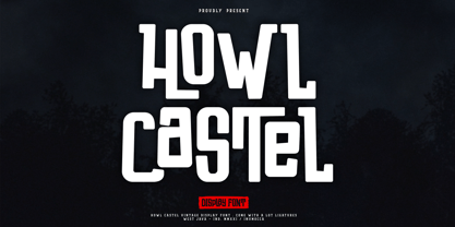 Howl Castel is Vintage and Modern Display Font, Handlettering Bold Font, Powerfull and has a very Strong Character, Great for expressing a summer,The Typeface comes with Stylistic Alternates and Ligature Combinations Exellent typeface to use for covering your Project, like Branding, Headline Letter, Flyer, Signage, Quotes, Poster Typography, Bookcover, Magazine cover, Poster, Quotes Lettering, Logos, and more your project design. - Unique glyphs - Multilingual Characters Support - UPPERCASE - Lowercase - Numeric - Symbol - Punctuation Character - Ligature - Stylistic Alternates inumocca type Studio
 - Orgon Plan by Hoftype,
$49.00 Orgon Plan is the square-cut sister of the Orgon. It represents the crispy counterpart to the sucsessfull Orgon family and was published in 2020. Orgon Plan consists of 20 styles and is well equipped for advanced typography. It comes in OpenType format with extended language support. All weights contain small caps, ligatures, superior characters, proportional lining figures, tabular lining figures, proportional old style figures, lining old style figures, matching currency symbols, fraction- and scientific numerals and matching arrows.
 - Mister Crack by Olivetype,
$18.00 Say goodbye to boring typography and hello to an impactful visual experience! Mister Crack's rough texture adds depth and dimension to your designs, making them stand out from the crowd. Whether you're designing a vintage-inspired poster or crafting a powerful logo, this typeface injects charisma and attitude into every word. Mister Crack features : Standard Latin Numbers, symbols, and punctuations Multilingual Support. Fully accessible without additional design software Simple Installations Works on PC & Mac Thank You.
 - Cisse by Epiclinez,
$18.00 Cisse is a signature script font that has a classy & elegant feel that gives you so many ways to create beautiful typography in your design projects. It's made up of smooth curves, which are also perfect for logos & wedding invitations. Use Cisse script font to make your design stand out! So what’s included : Basic Latin Uppercase and Lowercase Numbers, symbols, and punctuations Ligatures Multilingual Support. Fully accessible without additional design software Simple Installations works on PC & Mac Thank You!
 - Monarky by YXType,
$22.00 Monark family is designed with legibility and wide language support in mind. Rooted in Fyodor Dostoevsky's Crime and Punishment, it captures the anguish & distortion atmosphere and suppresses them into ruthless letterforms. Top-heavy stems, heavy serifs, and low-contrast forms are all extractions of Dostoevsky's dilemma. Rest assure this typeface would bring you all the needs for advanced typography with true small caps with symbols, 4 styles of figures, support for inferior/superiors, and more than 200 Latin languages. Features: • Support for 200+ Latin languages • Low contrast with unique details • Unique Italic letterforms • Small caps with symbols • Arbitrary and pre-defined fractions • Support for superscript & subscript in normal & scientific alignments • Proportional lining, proportional old-style, tabular lining, tabular old-style
 - Antiquary by DimitriAna,
$22.00 The Antiquary font collection was designed and illustrated, to reanimate the art of vintage advertising design. The fonts are inspired by the old ad posters and product labels, as well as the art of sign-making. The 4 typographic styles are combined with shapes and ornaments to create a variety of designs. They are ideal for logos, packaging, branding and all kinds of advertisements. Typographic styles: Antiquary: Old fashioned, serif, with 2 styles (Regular and Outline), stylistic alternates and ligatures. Antiquary Wide: All caps, bold, serif, vintage, with 3 styles: Regular, Inline and Outline. Antiquary Script: Modern brush calligraphy with terminal forms, contextual alternates, stylistic alternates and ligatures. Antiquary Thin: All caps, minimal, old fashioned. Antiquary Elements: 52 symbols, ribbons, frames and ornaments. The font collection supports Western, Central, Eastern, European, Baltic, Turkish and Greek languages.
 - PIXymbolsFabricCare by Page Studio Graphics,
$39.00 Standard fabric (or textile) care symbols used for creating clothing labels. This font has temperature setting symbols for washing, drying and ironing. It also includes bleach and dry cleaning symbols. This font uses a method that allows combinations of the washing, drying and dry cleaning symbols to create more symbols. Therefore, this font actually has a total of 73 unique fabric care symbols that can be created.
 - Mogand by Soerat Company,
$19.99 Mogand is a contemporary serif typeface that combines a humanist writing style. Mogand family is very suitable for various design needs such as a display font for editorial design, packaging, branding, broadcasting purposes and for any project that requires a clean, modern font with a strong character. This 9-weight family includes oblique and support around 200+ languages as well as several sets of figures. This font provides advanced typographic support with features such as ligatures, alternate characters, old-style figures, fractions, numerator/denominator, superior/inferior, and various symbols.
 - Silva Display by Blackletra,
$50.00 Designed primarily for editorial use, Silva is a superfamily ideal to typographically complex environments requiring a highly versatile typeface. With slightly condensed proportions, generous x-height, moderated ascenders and descenders and robust serifs, it is an extremely readable and economic type. Subdivided in two optical sizes, the family has a total of 26 fonts including italics. Silva has an extensive character set — with extensive language support — that provides both old style and lining figures as well as their respective tabular versions, fractions, various ligatures, small capitals, arrows and a number of different symbols.
 - Okaeri by Struvictory.art,
$14.00 Okaeri is a linear display font inspired by Japanese aesthetics, uppercase is decorated with oriental patterns. Okaeri is suitable for typographic posters in oriental style. The font is also suitable for menu and restaurant design, tourist products, magazine and book covers, thematic events design. The font works great both for printing clothes and craft products branding and packaging. Also use individual letters to create logos and monograms. Okaeri includes stylistic alternates for symbols: a, i, o, u. There are also ligatures: aa, ca, ea, ee, ff, ka, ki, la, li, ra, ri, oo, tt, za.
 - Typold by The Northern Block,
$29.55Typold originated out of the desire to improve geometric forms and push beyond previous achievements through collaborative working methods and knowledge sharing. The result is a finely balanced modern sans serif constructed from mathematical inputs, typographers needs, and the natural hand and eye of an artisan. Details include nine weights and matching italics, three separate widths, 1000 characters with an alternative lowercase a and y, small caps, 12 variations of numerals, Opentype features inferiors, superiors, fractions, case sensitive punctuation, extended symbols including emoji's and language support covering Western, South and Central Europe. - Precolombina by Juan I. Siwak,
$20.00 "Precolombina" consists on a series of graphic symbols native to South America, decorative trims, and a minimal set of typographic characters. The signs were taken from ceramic pottery, clothing, and petroglyphs from the southern cone of South America. We try to select a varied range of signs representing shamans, jaguars, rheas, monkeys, birds, and mythological beings. The decorative trims are taken from the same places and occupy the set of numbers. Finally, it contains the minimum characters of a font to achieve a brand or a title. They take place in the OpenType resources.
 - Nuber Next by The Northern Block,
$39.95 Nuber Next is a modern geometric sans influenced by the popular neo-grotesques of the 1950s including Helvetica and Univers. Carefully remastered from the original Nuber type family to improve letter shape, overall uniformity and introduce a flexible width system capable of handling a wider variety of typographic applications. Details include 750 characters per font, nine weights and five widths with matching italics. Opentype features include seven variations of numerals, fractions, case-sensitive forms, stylistic alternates, ligatures, extended monetary symbols and language support covering Cyrillic, Western, South and Central Europe.
 - Meduza Collection FJ by Frncojonastype,
$30.00 fj Meduza is a new typographical system designed by Franco Jonas Hernández, born as an exploring process from the classic model from —modern or didones style— typhography from XIX century. fj Meduza also explores the posibilities of Optical Adjustments —from 8 or 10 to 72 pts— offering a version to compose preferent reduced sizes —newspapers— and another version to titles with long-standing. Ideally for Branding, Headlines and especially complex editiorial contexts.
 - Quador Display by Fontador,
$24.99 Quador Display is a serif, especially designed for contemporary typography on print and screen. The superellipse-based forms and high x-height allow large and open letterforms, perfectly adapted to the pixel grid on screen. The font contains 6 weights from light to ultrabold plus true italics. 1.049 glyphs include 282 ligatures, tabular, old style, fractions …, and a wide range of flexibility for latin language support for every typographical needs. Quador Display is a contemporary serif typeface, special for logotypes, brands, magazines and editorial.
 - Glis by BXS Type,
$10.00 The Glis font is a unique expression of authenticity, meticulously hand-drawn to bring a touch of charming personality to your designs. With rounded and slightly irregular strokes, Glis is more than just typography; It's a visual experience that adds artisanal charm and a sense of warmth to your creations. Each character is carefully designed to convey a relaxed and welcoming aesthetic, providing a visually captivating approach to your typographic compositions. Try Glis to infuse a dose of originality and softness into your designs. **Uppercase
