8,127 search results
(0.187 seconds)
- ITC Jiggery Pokery by ITC,
$29.99ITC Jiggery Pokery is the work of British freelance designer Carol Kemp. ITC Jiggery Pokery evolved from lettering for a project which needed to be quirky, wacky and fun," says Kemp. "The name came to me as the letters appear to jig along - it just seemed to fit. 'Jiggery Pokery' is London Cockney slang which has a variety of meanings. It's used to describe behavior such as 'ducking and diving', trickery, juggling (especially of financial matters!), or 'hanky panky'. My grandparents were Cockneys, and my uncle would use colourful rhyming slang which I loved to hear as a child."" - Vista Nordic by VistaType,
$9.00 Vista Nordic is a minimal and Modern font family. Made for text display purposes, Nordic brings a contemporary and Robust appearance to your design projects with a bold style, making this font suitable as the Prior heading and common text on a website or layout design. The Nordic family includes 18 fonts in a variety of weights and types. 18 fonts 2 font styles Upper / lowercase glyphs Multilingual Webfonts included Free updates and feature additions If you have any questions about licensing, need help with a typeface, or would like to request a new feature, contact us at hello@vistatype.com. Thank you!
 - Blueberry Jam by Hanoded,
$15.00 I love blueberries. When my brother and I were young, we used to pick them in the forest by the bucket. Afterwards, we’d always look like victims of a serial killer, but it was all worth it, as nothing quite tastes likes homemade blueberry jam. I don’t know why I named this cute little font Blueberry Jam. Maybe I was craving some… Blueberry Jam is a highly legible, extremely cute and very handmade font. It would look good on just anything, but book covers, product packaging and homemade jam labels come to mind. Blueberry Jam comes with a bucketload of diacritics.
 - Ballasticus by Shapovalov Fonts,
$15.00 Ballasticus is a controversial bold grotesque for logos, big headlines, posters, signage, gyms, and bodybuilders. The outer contour of the beech is rounded, while the inner space is square. The font contains two barbell icons that can be immediately inserted into your company logo. The character of Ballasticus is honest, stable, open, grounded like a weight. Ballasticus contains extended Latin, Cyrillic, ligatures, barbell and peace sign, as well as alternatives for some letters, the total number of glyphs is more than 700. It contains OpenType functions: liga, numr, dnom, calt, ss01. The font is also case sensitive, has fractions, currency signs, and arrows.
 - Elizabeth Script by Kimmy Design,
$25.00 Elizabeth a script that carries the imperfections of a hand written brush script. It includes regular and discretionary ligatures, as well as stylistic alternatives and swashes. If you are working in a program that supports Open Type, I would suggest purchasing the Pro version as it includes all the features Elizabeth has to offer. If you are not working with Open Type but want to have the option of the swashes are stylistic alternatives, then you can buy both the regular Elizabeth and the swashes version. It will allow you to have most of the functions of Open Type.
 - Flanela by Gatype,
$12.00 Flanela is my new elegant serif font that will give your projects a touch of luxury and style. It's perfect for logotypes, branding, monograms and wedding invitations, blog headlines, and more. Browse through all the previews and get as inspired as I was when creating this font. What do you get? - Flanella (OTF,) -Uppercase Letters, Numbers, Punctuation & Symbols. Multilingual Support Important information: To access the alternatives, you must have access to an older version of Photoshop to copy/paste the glyphs from the included PSD, OR the Glyphs Panel, which can be found in Photoshop CC or any Version of Adobe Illustrator.
 - The Jakarta by XdCreative,
$29.00 Say hi to "The Jakarta" a stylish display sans typeface is the latest collection from @faldykudo "The Jakarta" basic technical and anatomy comes from the genetics of the "Magnify" family (Geometric classification of typefaces) with several stroke modifications and a combination smooth curves for a minimalist, elegant and modern sans serif. The Jakarta is perfect for the logo, product, headline or any of display design. The Jakarta has a complete characters A-Z, a-z (including stylistic Alternates), Numeral, Punctuations, and standard ligature. thanks, hope you would like and accept "The Jakarta" as part of your family. thank you in advance
 - Ivoor by Cloveron Media,
$18.00 Meet Ivoor, a new sans serif typeface of the 21st century. It has distinct letter accents and comes with beautiful ligatures. It's a very versatile font that works as standalone or paired with other fonts. It is a great design choice for branding, logo, labels, packaging, magazine headers & so much more. Features: Weights - Regular & Bold Lowercase & Uppercase Classy Ligatures Numerals & Punctuation Multilingual Characters In .otf file Language Support: Western Europe Follow my shop for upcoming updates and new products that you might be interested in next time. Please message me for any suggestions and support. I would like to hear it. Thank you!
 - East Variable by Tarallo Design,
$73.99 East Variable is a condensed sans serif typeface. It is timeless, but with a subtle nostalgia of vintage jazz albums, film titles, newspapers, and signage. The light weight has excellent legibility at small sizes. The Extra Bold weight will capture attention. East is versatile, but would be a good choice for film titles, labels, publications, or any context where space is limited. It has variable axes of weight and slant. The OpenType features include stylistic sets, a one-story 'a', hooked letters, seriffed uppercase 'I' and '1', a slashed zero, raised colon and punctuation (Spanish), German eszett, ligatures, and vertical fractions.
 - Floorwalker JNL by Jeff Levine,
$29.00 On February 15, 1926, the Display Material Company of St. Paul Minnesota patented a sign making outfit consisting of a series of stencils in various sizes and styles, paints, brushes, instructions for use and all stored inside a convenient wooden case. Sold to any business in need of making many signs at low cost, this versatile stencil set enabled many a merchant to produce posters, show cards and price tags for pennies over what a commercial sign shop would charge. Floorwalker JNL is the digital version of one of these stencil fonts, solidified into a pre-Art Deco-era typeface.
 - Nostalgia Peach Creme by PeachCreme,
$23.00 The "Nostalgia" font is a dark, vintage style that includes all the basic characters (letters, numbers, and punctuation) and is very simple to read. "Nostalgia" was inspired by inky handwriting with a natural flow and has fantastic starting and ending lowercase swashes. It works well for a wide range of projects, from wedding stationery to Instagram quotes to contemporary logos to packaging to websites. Consequently, these top-notch, traditionally-styled hand-drawn characters would be an excellent and priceless resource for those who want to write by hand. The headlines and titles you create will look fantastic with this font.
 - Hello Script by Zetafonts,
$39.00 Hello Script is a high contrast calligraphic script designed by Cosimo Lorenzo Pancini, featuring monoline swashes and terminals and strong, round body shapes designed with a parallel nib. It covers over 40 languages that use the Latin alphabet, with full range of accents and diacritics, and comes with over ten different swashes and two decorative fill typefaces (Hello Script Fill and Hello Script Striped Fill) to use as multilayer color fonts. The Hello family features a sans serif companion (Hello Sans) as well as a christmas-themed version ( Hello Christmas ) with a set of Icons (Hello Christmas Icons), both featuring multilayer color fill.
 - Jalliestha by Zeenesia Studio,
$16.00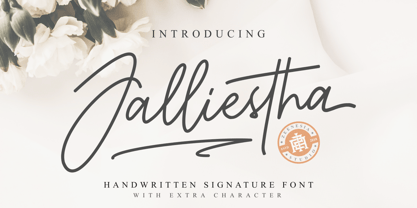 Jalliestha Signature is a monoline script font with handwritten signature Style. Jalliestha Signature font was created with original handwritting pen. This collection of scripts is perfect for personal branding. this works well for many applications. Jalliestha Signature would perfect for photography, watermark, social media posts, advertisements, logos & branding, invitation, product designs, label, stationery, photography, wedding designs, product packaging, special events, fashion, website or anything that need handwriting taste. Jalliestha Signature is equipped with many additional features that allow you to customize your text. You will get a complete set of uppercase and lowercase, multilingual, punctuation, ligatures, stylistic alternates a-z and more.
 - M Hei PRC by Monotype HK,
$523.99 Although traditional Heiti typefaces may not be as lively as Songti, the modesty of M Hei makes is enduring and stand out from other similar typefaces. M Hei’s design is based on the hallmarks of traditional Heiti typefaces: it has little to no thick-thin contrast in strokes and has square cut terminals. Its dots (點), ticks (剔) and downstrokes (撇、捺) are subtly curved and longer than usual; all stems (豎) and crossbars (橫) remain simple and clear; and hooks (勾) appear rounded. Together they make a harmonious form which is clean but pure, classy but contemporary.
 - Gorda by Zeptonn,
$10.00 Oh yeah! Gorda is a huge, bold and all-caps typeface. It's rounded style makes sure it's nice and friendly, even though it can be used in (very) large sizes. With Gorda you can produce a powerful and contemporary style. The smaller stroke width of the symbols and punctuation marks makes sure legibility is not an issue, as is often the case with fat type. Gorda is suitable for all sorts of uses, especially posters, headlines, artwork and logos. Use it to draw attention, in a quirky and distinctive way. Gorda has been designed and developed by Zeptonn.
 - Purveyor by Hustle Supply Co,
$18.00 Purveyor Purveyor is a bold modern sans serif with a lot of character. This will be your "Work Horse" for a lot of projects. It works nicely for projects that require a more refined yet vintage aesthetic. Purveyor is a simple yet refined All-Caps sans serif. I had a ton of fun making the specimens for this font, which is usually a good sign that I'll use it regularly. Purveyor includes 8 versions: Regular, Rounded, Rough, Textured (+ 4 Oblique Versions). Purveyor comes with Western European Characters. By the way, I included 2 R's - Just uppercase and lowercase to access
 - English Script by Linotype,
$40.99English Script Regular is a typeface made in the manner of English Copperplate, a kind of writing that was very popular in England during the 18th Century. Also referred to as English Round Hand, the style was promulgated by various writing masters, who published copybooks of their handwriting for students to use as guides. The style has remained popular to this day, and almost no sort of font is more readily identifiable with the ideas of formal," "old fashioned," "traditional," or "high society." English Script Regular is the perfect choice for use on wedding invitations and other announcements." - Karamelia by PizzaDude.dk,
$20.00 Karamelia is my grungy hand drawn brush script. Uppercase is pretty steady, while the lowercase dances and bounces in an unpredictable way. The font has got at lot of of OpenType features such as swashes, ligatures and stylistic alternates - which easily makes your text look more like authentic handwriting. I can think of loads of great opportunities in which this font would look absolutely great ... invitations, weddings, café menus, birthdays, various greeting cards ... or maybe even a loveletter?! I could mention more, but I think I got your fantasies started! Go crazy with Karamelia, and the world will love you for it!
 - Eurobia by Greater Albion Typefounders,
$24.00 Eurobia is a family of two typefaces - Regular and Plain. They are display faces with a strongly European feel and a strong flavour of the 1920s. My suggestion would be to use them for poster or banner work, or packaging or cover design, with the heading text set in Eurasia Regular and subsidiary text set in Eurobia plain. Why not give that European flavour to your next project? We see Eurobia as a fun typeface, for advertising products like confectionery or concerts. We had a lot of fun designing it and hope you'll like it too!
 - Bitterbrush by Hanoded,
$17.00I needed a name with ‘brush’ in it and most have already been taken, so I did a little digging and found out that Purshia tridentata, a flowering plant native to the mountainous areas of western North America is called bitterbrush. It is also known as antelope brush, quinine brush and buckbrush - but I settled on Bitterbrush. There’s nothing bitter about Bitterbrush. It is actually a very sweet hand brushed font. It comes with ligatures for double letter combinations and a truck load of diacritics. And (something I am very proud of): it supports the Vietnamese language! - Kinder Stone by Letterhend,
$17.00 Let Kinder Stone add a pop of personality to your designs! This fun and whimsical font is like a playful friend. Its rounded, bubbly letters give it a friendly and approachable feel, while its cartoon-like appearance adds a touch of humor and playfulness. Use Kinder Stone to create logos, posters, and other designs that need a dash of personality and fun. Features : Uppercase & lowercase Numbers and punctuation Alternates & Ligatures Multilingual PUA encoded We highly recommend using a program that supports OpenType features and Glyphs panels like many of Adobe apps and Corel Draw, so you can see and access all Glyph variations.
 - Conglomerate by Typetanic Fonts,
$39.00 Sans or serif? Square or rounded? Calligraphic or geometric? Conglomerate is both all and none of these things — a subtle yet unorthodox blend of typographic traits resulting in a clean, unique, and versatile font family with large, open counters for legibility in text yet crisp, sharp details that sparkle at display sizes. Conglomerate is sturdy but never stiff, crisp but never stark — perfect for projects that require a more contemporary feel than either a traditional serif or geometric sans might bring. Conglomerate received a PRINT Magazine Best in Class award, and was one of Typographica’s Favorite Typefaces of 2016.
 - Habano ST by Sudtipos,
$39.00 Habano is an eleganty flowing bold script with some very surprising traits. Taking its roots in both the art deco style and the kind of lettering used for pop culture, its minuscules are classy yet obedient, and its majuscules and figures are playfully round and memorable. This contrast in character between cases makes for an appealing display face that can turn simple words into images that are hard to forget. Once again, the unique lettering talent of Angel Koziupa makes itself evident through an alphabet that leaves the memory of its soft touch for long after it is initially perceived.
 - Softie by Tail Spin Studio,
$20.00This typeface was designed to be used as the page heading font for MyFonts. Originally only the letters needed to make up the required phrases were drawn. Then amazingly enough, people started asking where they could get the font, so I decided to complete the character set, and named it Softie. This name was chosen because the round and rather bulbous shapes that make up the letters reminded me of marshmallows. Softie, almost good enough to eat. The Bold version, called Softie Bloated, was added in late 2003. Rumor has it that the name came to Steve after Thanksgiving dinner. - Fling by ITC,
$29.00 Michael Gills, formerly a resident designer at Letraset, created the Fling typeface in 1995. Fling's letterforms are based on the Ronde --or round--script style from France. The design includes intricate and generous capital letters, which are contrasted with a more reserved lowercase letters. This allows for a sophisticated and elegant appearance in text. Fling's letterforms are highly legible for those of a script face, and it is a typeface with many uses. Aside from short amounts of running text, Fling's capital letters serve well as initials. In the Opentype font are extra ligatures and alternative letterforms thatoffer expanded typesetting possibilities.
 - Hagemann JNL by Jeff Levine,
$29.00 One of the most enduring type styles of the Art Deco era is Huxley Vertical. Its clean lines and stylish appeal have transcended changing times and tastes. Many typefaces have been inspired by the original, including the model used to create this font. The design was found in the book "Lettering and Alphabets", first published in 1946 by J. Albert Cavanagh. By re-drawing it from scratch, the missing numerals, punctuation, special characters and accents were added. Hagemann JNL and its oblique version are named in honor of one of Jeff Levine's friends within the type design community -- Michael Hagemann of Font Mesa.
 - Channel B by Just My Type,
$25.00 Channel B was derived from the logo for Channel B, a British entertainment internet channel, anchored by former Soccer AM presenter Tim Lovejoy at www.dailymotion.com/channelbee. I’m not sure what it was in 2008 when I first ran across the logo, but that elegant capital B seemed to cry out for a font to support it. Many of the capitals, numbers and other glyphs of Channel B are split into a top and bottom, but not all. The tall, condensed capitals are contrasted to the rounded lowercase (derived from the bottom half of the B, rotated 180°).
 - Glancias by ScovType,
$45.00 Glancias Display is a contemporary typeface for article headings. In order to create a style that merges serif and sans serif and to attemp a minimalistic final appearance, Glancias Displas removed the serifs while remaining the high-contrast strokes which are usually found in a serif font. By removing serifs and cutting stroke ends vertically and horizontally, the font has been built in a modern, sleek, neutral and also concise look. Over 400 glyphs in total including upper and lowercase characters, figures, ligatures and signs are available. Glancias Display covers Latin based languages of North and South America and most of Western Europe.
 - Biscuits And Spam by Kitchen Table Type Foundry,
$10.00 I remember that my auntie once made a dish called ‘Macaroni and Smac’. It consisted of little ‘elbow’ macaroni, Spam (which in Holland was called Smac), cheese and ketchup. I am sure it didn’t contain on of your five a day, but it was delicious. As far as I know, I have eaten it only once, but it did make a lasting impression! Biscuits & Spam is a handmade ‘Western’ style font, which I found in my ‘unfinished fonts’ folder. It comes with multilingual support, a full set of alternates for the lower case letters and a really happy vibe.
 - Lorna by FontaZY,
$30.00 Lorna by Fontazy is a rounded connected script of narrow proportion in both vertical and slanted styles. Lorna consist of six fonts (Light, Regular and Bold and matching italics). All fonts in the family have Latin (West, Central and Baltic) and Cyrillic encoding for multilingual support. Lorna has Contextual Alternates to keep a true connected handwriting look and plenty of Swashes Alternates and a bunch of Ligatures for striking appearance. Ampersand and copyright symbols have Stylistic variants (available from Glyph panel), figures made in Standard and Oldstyle variants. Lorna is perfect for all variety of print design, advertising, packaging, logo making, branding etc.
 - Alpas by VP Creative Shop,
$12.00 ntroducing Alpas - soft serif typeface Alpas is rounded and soft font with multilingual support. It's a very versatile font that works great in large and small sizes. This font is perfect for branding projects, home-ware designs, product packaging, magazine headers - or simply as a stylish text overlay to any background image. FEATURES Uppercase, lowercase, numeral, punctuation & Symbol regular and italic versions Multilingual support No special software is required to type out the standard characters of the Typeface. Canva friendly Feel free to contact me if you have any questions! Mock ups and backgrounds used are not included. Thank you! Enjoy!
 - Banuk by Grontype,
$16.00 Banuk is a brand new techno font designed with slanted line accent, the fonts is rounded edges and little imminent space between fonts. This font is a regular bold font and all caps with different style between uppercase and lowercase. Banuk is perfectly used font in any project such as logo font, flyer header, name card, invitational header, movie poster, poster, website header and much more. Features: Uppercase and lowercase Numeral and punctuation More Alternates and Ligatures Multilingual Support What inside Main Files Banuk .ttf Banuk .otf webfont Thankyou for choosing this font, i hope you enjoy it. Regard, Grontype
 - Narin by Ahmet Altun,
$19.00 Narin Font Family is a geometric sans design with rounded corners which seems much softer and eye-pleasing even though it still has geometric and straight borders. The family comes in six weights with regular and italic forms. Narin Font Family is legible from very small size to very large ones. It is suitable for letterpress and also long texts. With the small caps, all fonts can be used to create great and gorgeous works like logos, texts, presentations, t-shirts etc. and can be used to create the pressworks such as posters, magazines and books. The word "Narin" means "graceful" in Turkish.
 - Roadway by K-Type,
$20.00 Roadway is based on U.S. highway lettering observed on New York street signs. Two weights of capitals would often be used on the same sign, condensed for the main name, and a half-size regular superscript for ‘road’ or ’street’. Roadway is a Small Caps font. The upper case consists of condensed capitals, the lower case consists of regular width small caps, sized at 50% and superscript. A small superscript comma and period, aligned with the lowercase, are at keystrokes < and > respectively. A small hyphen lining with the superscript lowercase is at the en dash position (Mac: option hyphen, Windows: alt-0150).
 - CA Segundo by Cape Arcona Type Foundry,
$29.00 The inspiration for this font came from a wall-writing in Cuba. At first glance we thought: "There is something wrong with the wall-writing." But a closer look revealed, that it just mixed up different stroke-styles. That "feature" became the designing principle behind CA Segundo: Round characters like O, U or C are available either with a fat or a thin stroke, whereas other characters with orthogonal lines come in two different styles – uppercase characters emphasize the vertical strokes, while lower cases emphasize the horizontal strokes. This gives you the opportunity to design just while you type.
 - Montix by Linotype,
$49.00Montix is a narrow, constructed type family that developed by the German designer Diana Fischer in 2003. With five weights (light, light italic, regular, regular italic, and bold), Montix is a particularly effective small family, especially when used for headline or display purposes. Montix's letterforms have relatively long ascenders and descenders, which compared with its horizontally compact body gives it its unique style. Words or lines of text set in Montix would look best when some amount of white space is left around them. Because of this, the faces are well suited for logos and corporate identity uses. - Umberland Slab by Sharkshock,
$115.00 Umberland Slab is an attractive family available in 3 different weights with italics. There’s a particular emphasis on simple geometric shapes and the way they interact with tall vertical strokes. Smooth curves and sharp angles blend together in a pleasing symmetry. Stroke widths are given variable degrees of contrast but serifs are consistent and heavy handed. Spacing is on the tight side with some lowercase pairs quite snug against each other. Umberland Slab would work well in small blocks of text, corporate logos, menus, or signage. This family is equipped with European accents/diacritics for international support, fractions, alternates, and ligatures.
 - ArchiType by Archiness,
$10.00 With the famous and much used Eurostile and Bank Gothic in my mind I wanted to design a mono-line font as simple and legible as possible. A square with rounded corners, i.e., the letter ‘o’ as its basis. From there on back to basics, so straights remained simple straights with 90° endings, whatever the angle. Numbers are monospaced. The result seems to be a pleasantly balanced and neutral font. Excellent for display purposes and surprisingly legible in even small sizes. This perhaps typical approach by an architect led to the name of the font: ArchiType.
 - PGF Dinos by PeGGO Fonts,
$29.00 “PGF Dinos” is a low contrast round typeface that resembles handmade American ‘Sign Painting’ in such the upper portion of the characters is bigger than the lower one, what gives the font a more playful and friendly personality. Another remarkable feature is its hooked terminals in characters such as C, G or S, heightening the differences between similar characters. “PGF Dinos” Family is composed of 10 different weights ranging from Hairline to Extra Black plus Italics and a full set of Dingbats. Early version was originallly called as “Globa” and was developed under the supervision of the Latinotype Team. Designer: Pedro González.
 - OTC Eugen by Ograda Type Company SRL,
$29.00 OTC Eugen is a geometric grotesque with industrial socialist aspect. It is a somewhat brute interpretation of the graphic environment and old era typography found around cities or in the country side in Romania. It works best as a display typeface used in big titles, in branding projects for clear wordmarks, or around the house where you can just go wild and make your own mark with the stencil version. Two styles: Display & Stencil. Various stylistic and contextual alternates, and a considerable amount of ligatures, arrows and more. Language support for: Basic Latin, Western, Central & Eastern European languages.