10,000 search results
(0.034 seconds)
- Helvetica Thai by Linotype,
$149.00Helvetica is one of the most famous and popular typefaces in the world. It lends an air of lucid efficiency to any typographic message with its clean, no-nonsense shapes. The original typeface was called Neue Haas Grotesk, and was designed in 1957 by Max Miedinger for the Haas'sche Schriftgiesserei (Haas Type Foundry) in Switzerland. In 1960 the name was changed to Helvetica (an adaptation of Helvetia", the Latin name for Switzerland). Over the years, the Helvetica family was expanded to include many different weights, but these were not as well coordinated with each other as they might have been. In 1983, D. Stempel AG and Linotype re-designed and digitized Neue Helvetica and updated it into a cohesive font family. At the beginning of the 21st Century, Linotype again released an updated design of Helvetica, the Helvetica World typeface family. This family is much smaller in terms of its number of fonts, but each font makes up for this in terms of language support. Helvetica World supports a number of languages and writing systems from all over the globe. Today, the original Helvetica family consists of 34 different font weights. 20 weights are available in Central European versions, supporting the languages of Central and Eastern Europe. 20 weights are also available in Cyrillic versions, and four are available in Greek versions. Many customers ask us what good non-Latin typefaces can be mixed with Helvetica. Fortunately, Helvetica already has Greek and Cyrillic versions, and Helvetica World includes a specially-designed Hebrew Helvetica in its OpenType character set. Helvetica has also been extende to Georgian and a special "eText" version has been designed with larger xheight and opened counters for the use in small point sizes and on E-reader devices. But Linotype also offers a number of CJK fonts that can be matched with Helvetica. Chinese fonts that pair well with Helvetica: DF Hei (Simplified Chinese) DF Hei (Traditional Chinese) DF Li Hei (Traditional Chinese) DFP Hei (Simplified Chinese) Japanese fonts that pair well with Helvetica: DF Gothic DF Gothic P DFHS Gothic Korean fonts that pair well with Helvetica: DFK Gothic" - Helvetica Monospaced Paneuropean by Linotype,
$89.00Helvetica is one of the most famous and popular typefaces in the world. It lends an air of lucid efficiency to any typographic message with its clean, no-nonsense shapes. The original typeface was called Neue Haas Grotesk, and was designed in 1957 by Max Miedinger for the Haas'sche Schriftgiesserei (Haas Type Foundry) in Switzerland. In 1960 the name was changed to Helvetica (an adaptation of Helvetia", the Latin name for Switzerland). Over the years, the Helvetica family was expanded to include many different weights, but these were not as well coordinated with each other as they might have been. In 1983, D. Stempel AG and Linotype re-designed and digitized Neue Helvetica and updated it into a cohesive font family. At the beginning of the 21st Century, Linotype again released an updated design of Helvetica, the Helvetica World typeface family. This family is much smaller in terms of its number of fonts, but each font makes up for this in terms of language support. Helvetica World supports a number of languages and writing systems from all over the globe. Today, the original Helvetica family consists of 34 different font weights. 20 weights are available in Central European versions, supporting the languages of Central and Eastern Europe. 20 weights are also available in Cyrillic versions, and four are available in Greek versions. Many customers ask us what good non-Latin typefaces can be mixed with Helvetica. Fortunately, Helvetica already has Greek and Cyrillic versions, and Helvetica World includes a specially-designed Hebrew Helvetica in its OpenType character set. Helvetica has also been extende to Georgian and a special "eText" version has been designed with larger xheight and opened counters for the use in small point sizes and on E-reader devices. But Linotype also offers a number of CJK fonts that can be matched with Helvetica. Chinese fonts that pair well with Helvetica: DF Hei (Simplified Chinese) DF Hei (Traditional Chinese) DF Li Hei (Traditional Chinese) DFP Hei (Simplified Chinese) Japanese fonts that pair well with Helvetica: DF Gothic DF Gothic P DFHS Gothic Korean fonts that pair well with Helvetica: DFK Gothic" - Mostera by Mega Type,
$17.00 INTRODUCING Mostera is a fun unique display serif font. This font looks sturdy and fun with a retro touch and curves giving it a playful personality. Mostera is a versatile display serif that works in both large and small sizes. This font is suitable for a wide variety of projects such as: headlines, logos, labels, branding projects, weddings, magazines, product packaging, mugs, quotes, posters, and more. Have fun using Mostera!!! I really hope you enjoy it! Feel free to follow, like and share. Thank you so much for checking out my shop!
 - KG Party On The Rooftop by Kimberly Geswein,
$5.00 In both chunky and tilted/3D versions, this font gives a dose of fun!
 - Q Typ by Funk King,
$5.00 Q Typ is a quirky little fun font inspired by those lovely cotton sticks.
 - Boochie by Zang-O-Fonts,
$25.00Boochie is a fun font, created as a homage to 1960's movie posters. - LDJ Tickled Tourist by Illustration Ink,
$3.00This font is a lot of fun and will definitely tickle your funny bone! - Kontext H by Elster Fonts,
$20.00 Imagine a font that is easier to read the smaller it is – or the further away the text is. There are already many line screen fonts, I wanted to take it to the extreme and use as few lines as possible, while keeping the grid of the fonts metrics. The result is a typeface that lives up to its name. Each individual line makes no sense on its own; individual letters are only recognisable in the context of all associated lines, individual letters are most likely to be recognised in the context of whole words. Attached to a building wall, text would be readable from a great distance and become increasingly difficult to decipher the closer you get to the building. Placed on the ground or on a large flat roof, text would only be readable from an aeroplane or - depending on the size - in Google Earth. Kontext has old style figures, superscript numerals, case-sensitive questiondown and exclamdown and an alternative ampersand, 390 glyphs at all. Use the same value for font size and line spacing to keep the lines in the grid, or change the line spacing in 10% steps. Change the spacing in 100-unit or 25-percent increments increments to keep the grid. The »H« in the font name stands for horizontal (lines). The numbers in the font name refer to the brightness of the background and letters themselves, with the first number describing the background and the second the letters. Starting with »00« (white) to »200« (dark) See also my Family Kontext Dot
 - Kontext V by Elster Fonts,
$20.00 Imagine a font that is easier to read the smaller it is – or the further away the text is. There are already many line screen fonts, I wanted to take it to the extreme and use as few lines as possible, while keeping the grid of the fonts metrics. The result is a typeface that lives up to its name. Each individual line makes no sense on its own; individual letters are only recognisable in the context of all associated lines, individual letters are most likely to be recognised in the context of whole words. Attached to a building wall, text would be readable from a great distance and become increasingly difficult to decipher the closer you get to the building. Placed on the ground or on a large flat roof, text would only be readable from an aeroplane or - depending on the size - in Google Earth. Kontext has old style figures, superscript numerals, case-sensitive questiondown and exclamdown and an alternative ampersand, 390 glyphs at all. Use the same value for font size and line spacing to keep the lines in the grid, or change the line spacing in 10% steps. Change the spacing in 50-unit or 25-percent increments to keep the grid. The »V« in the font name stands for vertical (lines). The numbers in the font name refer to the brightness of the background and letters themselves, with the first number describing the background and the second the letters. Starting with »00« (white) to »200« (dark) See also my family Kontext Dot
 - Yule Like This NF by Nick's Fonts,
$-Just in time for the Holiday Season, here's a FREE font with word art, clip art and border elements to dress up your next project. Enjoy! - PIXymbols Backstitch by Page Studio Graphics,
$40.00A tool for cross-stitch creators. A highly readable backstitch alphabet font to be used in a word processor, especially useful for long, or centered text. - IRONGATE - Unknown license

- ND Raster Neon by NeueDeutsche,
$10.00 A captivating and futuristic font inspired by the iconic worlds of The Matrix, Terminator, and Blade Runner. Embrace the enigmatic allure of the future as each character pulsates with neon energy, unleashing possibilities for cybernetic titles, gaming interfaces, logos, and more. Step into the neon-laden realms of ND Raster Neon and ignite your designs with a touch of cybernetic mystique.
 - Round Nib Deco JNL by Jeff Levine,
$29.00 Great type font inspirations can come from any time period and any location in the world. A Febuary, 1932 issue of an Estonian woman’s magazine called “Eesti Naine” had its name hand lettered using a round nib lettering pen. This extra-wide Art Deco design is now available as Round Nib Deco JNL, and is available in both regular and oblique versions.
 - Jingle Balons GT by Gartype Studio,
$10.00 Inspired by a cute, gum, and balloons character, we present to you Jingle Balons, a handwritten font with bold and cute characters that was comes with alternates and multilingual glyphs to help people around world with that unique accent. Jingle Balons is very suitable for T-Shirt Designs, Birthday invitation, Product packaging, YouTube Thumbnail, Posters, Advertising Projects, Logos and more.
 - Vtg Stencil Marsh by astype,
$36.00 The Vtg Stencil fonts from astype are based on real world stencils from several countries. The Vtg Stencil Marsh design was derived from 1 inch stencils, cut by a Marsh R machine. Marsh produced stencil machines since 1922 and was one of the most important manufacturers for such marking machines. The design is part of the American industrial heritage. PDF Specimen
 - Aloha Obelic GT by Gartype Studio,
$10.00 Inspired by a bold, script, chill, and handwritten style character, we present to you Aloha Obelic, a Display font with bold and Script characters that was comes with alternates and multilingual glyphs to help people around world with that unique accent. Aloha Obelic is very suitable for T-Shirt Designs, Birthday invitation, Product packaging, YouTube Thumbnail, Posters, Advertising Projects, Logos and more.
 - Galagar by Jadatype,
$12.00 Galagar is a font with a strong look. The font is suitable for your branding name, poster title, event, or group name, supported by the font that gives a strong effect to the reader. has its own market and fans. can be used in adobe illustrator, photoshop, or microsoft word. By purchasing this font, you will get: - Uppercase and Lowercase letters - Alternates Characters - Ligatures - Numbering and Punctuations - Multilingual Support - Works on PC or Mac - Simple Installation - Support Adobe Illustrator, Adobe Photoshop, Adobe InDesign, also works on Microsoft Word. Thank you
 - Zebramatic by Harald Geisler,
$14.99 Zebramatic - A Lettering Safari Zebramatic is a font for editorial design use, to create headlines and titles in eye-catching stripes. Constructed to offer flexible and a variety of graphical possibilities, Zebramatic type is easy to use. The font is offered in three styles: POW, SLAM and WHAM. These styles work both as ready-made fonts and as patterns to create unique, individualized type. The font design’s full potential is unleashed by layering glyphs from two or all three styles in different colors or shades. Working with the different styles I was reminded of the late Jackson Pollock poured paintings—in particular the documentation of his painting process by Hanz Namuth and Paul Falkernburg in the film Jackson Pollock 51. In Pollock’s pictures the complex allure arises from how he layered the poured and dripped paint onto the canvas. Similar joyful experience and exciting results emerge by layering the different styles of Zebramatic type. Texture In the heart of the Design is Zebramatics unique texture. It is based on an analog distorted stripe pattern. The distortion is applied to a grade that makes the pattern complex but still consistent and legible. You can view some of the initial stripe patterns in the background of examples in the Gallery. Zebramatic POW, SLAM and WHAM each offer a distinct pallet of stripes—a unique zebra hide. POW and WHAM use different distortions of the same line width. SLAM is cut from a wider pattern with thicker stripes. The letter cut and kerning is consistent throughout styles. Design Concept Attention-grabbing textured or weathered fonts are ideal for headlines, ads, magazines and posters. In these situations rugged individuality, letter flow, and outline features are magnified and exposed. Textured fonts also immediately raise the design questions of how to create alignment across a word and deal with repeated letters. Zebramatic was conceived as an especially flexible font, one that could be used conveniently in a single style or by superimposing, interchanging and layering styles to create a unique type. The different styles are completely interchangeable (identical metrics and kerning). This architecture gives the typographer the freedom to decide which form or forms fit best to the specific project. Alignment and repetition were special concerns in the design process. The striped patterns in Zebramatic are carefully conceived to align horizontally but not to match. Matching patterns would create strong letter-pairs that would “stick out” of the word. For example, take the problematic word “stuff”. If Zebramatic aligned alphabetically, the texture of S T and U would align perfectly. The repeated F is also a problem. Imagine a headline that says »LOOK HERE«. If the letters OO and EE have copied »unique« glyphs - the headline suggests mass production, perhaps even that the designer does not care. Some OpenType features can work automatically around such disenchanting situations by accessing different glyphs from the extended glyph-table. However these automations are also repeated; the generated solutions become patterns themselves. Flip and stack To master the situation described above, Zebramatic offers a different programmatic practice. To eliminate alphabetic alignment, the letters in Zebramatic are developed individually. To avoid repetition, the designer can flip between the three styles (POW, SLAM, WHAM) providing three choices per glyph. Stacking layers in different sequences provides theoretical 27 (3*3*3) unique letterforms. A last variable to play with is color (i.e. red, blue, black). Images illustrating the layering potential of Zebramatic are provided in the Gallery. The design is robust and convenient. The font is easily operated through the main font panel (vs. the hidden sub-sub-menu for OpenType related features). The process of accessing different glyphs is also applicable in programs that do not support OpenType extensively (i.e. Word or older Versions of Illustrator). International Specs Zebramatic is ready for your international typographic safari. The font contains an international character set and additional symbols – useful in editorial and graphic design. The font comes in OpenType PostScript flavored and TrueType Format.
 - Folklore by Ahmad Jamaludin,
$15.00 Just in time for your Halloween projects hopefully :) Say hello to Folklore! A font that's all about spooky, ghoulish fun! With its charming all caps style and built-in speckly texture, Folklore brings a touch of whimsy to your creative projects. Plus, we've included an Outline version of the font as a little bonus. What's Included? Folklore Main File Regular and Outline version Instructions (Access special characters, even in Cricut Design) Unique Letterforms Works on PC & Mac Simple Installations Accessible in Adobe Illustrator, Adobe Photoshop, Microsoft Word even Canva! PUA Encoded Characters. Fully accessible without additional design software. Multilingual Supports: (Afrikaans, Albanian, Catalan, Croatian, Czech, Danish, Dutch, English, Estonian, Finnish, French, German, Hungarian, Icelandic, Italian, Lithuanian, Maltese, Norwegian, Polish, Portuguese, Slovenian, Spanish, Swedish, Turkish, Zulu) Thank you, Dharmas Studio
 - Cherrypie by Andinistas,
$39.00 @andinistas presents Cherrypie, a font family inspired by 1957 Speedball lettering, Ross F. George. Cherrypie will bring unusual typographic fun to your designs with 3 fonts with a fresh and creative brush lettering look. Use Cherrypie Script, Caps & CapsB mixed or independently in logos or headlines for coffee, music, juice, beer or sports. With Cherrypie you will get flashy and spontaneous short messages on packaging and craft and sweet designs. Take a look at the examples in our gallery and you'll get inspiration to get the most out of the Cherrypie OpenType potential with alternate uppercase and lowercase letters and numbers, ligatures and flourishes ideal for beginning, middle and end of words. Cherrypie has a total of 1583 glyphs distributed in Cherrypie Script (707 glyphs), Cherrypie Caps (438 glyphs), Cherrypie CapsB (438 glyphs).
 - Kynthia Script by Akifatype,
$14.00 Kynthia Script is highly legible Script typeface, get touch of a bold, classic and fun Vintage Script font, With glyphs and opentype features with stylistic alternates. Can be used for various purposes. such as posters, t-shirt, signage, logos, news, badges etc. To enable the OpenType Stylistic alternates, you need a program that supports OpenType features such as Adobe Illustrator CS, Adobe Indesign & CorelDraw X6-X7, Microsoft Word 2010 or later versions. Kynthia Monogram Is Guided by a very perfect monogram mandala and specially designed by Khairul Syuhada. This font will looks awesome and amazing in many way to your latest project. Mandalas Monogram is perfect for many different project such as logos & branding, invitation, stationery, wedding designs, social media posts, advertisements, product packaging, product designs, label, photography, watermark, special events or anything.
 - Shareholder JNL by Jeff Levine,
$29.00 Shareholder JNL could possibly be found on a stock certificate, but in truth, it's based on hand-lettering found on some old sheet music entitled "Sharing".
 - Incy Wincy Spider by Comicraft,
$19.00 Spun with webs in mind for the letters pages of the SPIDER-MAN books, INCYWINCYSPIDER is probably one of the World's CREEPIEST Comic Book Fonts! Handle with care - some letters may stick together!
 - Happy Laundry by PizzaDude.dk,
$17.00 Happy Laundry is my laid back happy kids font. Smooth and yet rough here and there. I'd say that Happy Laundry would suit your birthday invitations, posters, packaging and other products perfectly! Enjoy! :)
 - Silk Display by Luhop Creative,
$18.00 Silk Display is a serif retro and bold display font. This font is PUA encoded which means you can access all of the glyphs and alternates with ease! It would look great on headlines, magazines, logos, branding and so much more!
 - The Reyden by onlyfontyouandme,
$15.00 The Reyden is a retro and bold display font. This font is PUA encoded which means you can access all of the glyphs and alternates with ease! It would look great on headlines, magazines, logos, branding and so much more!
 - Melon Kundang by Zamjump,
$13.00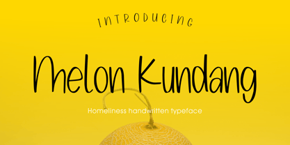 Melon Kundang its homeliness font, very simple and very easy to remember with distinctive hand strokes! This font would be perfect for party invitations, quotes, t-shirts, birthday cards, product packaging and more. • lowercase and uppercase • Includes numbers and punctuation
 - Miss Seshat by Eurotypo,
$48.00 In Egyptian mythology, Seshat was the Ancient Egyptian goddess of wisdom, knowledge, and writing. She was seen as a scribe and record keeper, and her name means she who scrivens, and is credited with inventing writing. Miss Seshat font is a fun, charming and expressive handwritten font with 900 glyphs. They have many advantages of the OpenType futures to choose from: stylistic alternates, contextual alternates, and a full set of standard and discretionary ligatures, Swatches, Beginnings and endings, as a rich set of 120 ornaments, connectors and catch words. Miss Seshat Pro version supports all diacritics for CE languages. They've been specially thought to obtain endless possibilities of composition and to help to make each creation unique and interesting. Miss Seshat font can be used in packaging design, children books, advertising, logotypes, greeting cards, web sites and much more.
 - Adorn Story by PeachCreme,
$19.00 Meet our new ah-mazing font duo-Adorn Story. You would fell in love, if you are looking for beautiful, refined serif paired with the voguish script. Serif font is rich with 60 ligatures, script font has beginning uppercase, beginning and ending lowercase swashes.
 - Ecatherina by BlessedPrint,
$23.00 Hi! It took me almost a year to design Ecatherina script. Finally it is available to purchase! Ecatherina script is an opentype font-family (15 fonts: 5 styles for 3 line thickness) with a bonus (editable wedding invitations, menu, quotes, letters, and more) HOW TO GET ACCESS TO ALTERNATES? Absolutely easy, just type a number after any letter: a1, a2, a3 etc Capital letters have 3-4 options and more. So just type E1, E2, E3 etc and find your favourite one! I found this method the most useful when you need to experiment with design very fast. All characters are available through Glyph panel as well, even more each of the alternate letter has it’s own unicode (PUA) so you can copy/paste from Apple Font Book or Windows Character Map. Total amount of glyphs 1436. Compatible with SILHOUETTE & CRICUT DESIGN SPACE WHAT IS INCLUDED BP-Ecatherina OTF & TTF It goes with 5 weights: Thin, Medium, Regular, Bold, UltraBold BP-Ecatherina-Ex1 The only difference between previous font is that thin line is a bit thicker. BP-Ecatherina-Ex2 Even more thicker line. Help.pdf Help file with most common questions. Bonus - Ecatherina.fig with editable wedding invitations (10+ designs 5x7 inches), menu, quotes, letters. Important! You need to install Figma application (it is free) to access files. With Figma application you can import bonus files and edit the text, export as png, pdf, svg and print it. Bonus - help.pdf file with general information how to work with Figma if you are new. It is very easy application and I recommend it to you! It works with MS Word, I included example.docx file so you can understand how to work.
 - Shaky Kane by Comicraft,
$39.00 He sees you! He can see everything YOU do! He wears X-Ray Spex! He glows in the dark! Top Pop Cult Comic Artist Shaky Kane pushes at the limits of taste, dragging a scalpel down the veil of your illusions to make you see the world as it really is, as HE sees it. You've wondered at his work in the pages of ELEPHANTMEN! THE BULLETPROOF COFFIN! CAP'N DINOSAUR! THAT'S BECAUSE YOU'RE A ROBOT! MONSTER TRUCK and DEADLINE! You've worn the HATEFUL DEAD t-shirt and drawn blood with the SHAKY KANE FAN CLUB pins. Now Shaky Kane isn't just a disaffected punk rock way of looking at the world, it's a font too. A little Shaky, a little Stirred, best served with a purple eyeball spiked on a cocktail stick.
 - Hokuba Grabs by Afkari Studio,
$15.00 Hokuba Grabs - New Fun Display Font Hokuba Grabs is a New display font that creates with a very good concept and adjusted well to keep the legibility. Hokuba Grabs Display Font Comes with upper and lowercase Standard Characters, Punctuation, Numerals, And other Glyphs variation of the OpenType features/ Ligatures. Hokuba Grabs Display Font is suitable for logos, posters, school flyers, university banners, modern advertising design, product labels, cartoons, comics, kid books, custom mugs, pillows, t-shirts, youtube thumbnails/covers, subtitles, poster quotes, editorial design, book/cover Title, website/blog, social media post, packaging designs, and other designs. Features; - 2 Styles; Regular and Outline - Special Alternates - Uppercase, Lowercase, Number, and Punctuation - Works on PC & Mac - Simple installations - Accessible in Adobe Illustrator, Adobe Photoshop, Adobe InDesign, even work on Microsoft Word - Fully accessible without additional design software. - Mültîlíñgúãl Sùppört for; ä ö ü Ä Ö Ü ß ¿ ¡ Hope you enjoy our font and this font is useful font for your projects!
 - Oceania by Hipfonts,
$17.00 Prepare to be swept away by the mesmerizing allure of Oceania, the font that will transport your designs to a world of elegance and beauty. Say goodbye to dull and uninspiring typography because Oceania is here to revolutionize your creative endeavors. With its graceful curves and enchanting letterforms, this gorgeous curvy typeface exudes sophistication and charm. Each letter is meticulously crafted to perfection, forming a harmonious dance of curves that will captivate the eyes of your audience. Whether you're designing wedding invitations, crafting stunning logos, or adding a touch of class to your branding materials, Oceania is the secret weapon that will make your designs shine. Dive into the depths of this exquisite font and let its timeless elegance elevate your creations to a whole new level of visual splendor. Get ready to make waves in the design world with the irresistible allure of Oceania!
 - Painters Display by limitype,
$20.00 Painters Display is a font with a brutal style but still modern and fun, inspired by paint splashes and scratches, suitable for your fun, free and cool designs, This font can be applied at large sizes for optimal results such as headlines, posters, banners, etc. Painters display available with Allcaps, Symbol & Number
 - Cookie Crumble by Hanoded,
$10.00 I like cookies. Especially butter cookies and ginger nuts. The word cookie comes from the Dutch word ‘koekje’ - which means exactly the same. Cookie Crumble is a cute little font that I made on a rainy day. I just needed something that looked and sounded happy and I guess it applies to this font. Cookie Crumble comes with a bunch of alternates, a full set of diacritics and a bit of sunshine to chase away your rainy day.
 - Devil Inside by Ditatype,
$29.00 Devil Inside is a spine-chilling display font that will send shivers down your spine. Designed in a large, bold font, this typeface demands attention and exudes an aura of darkness. Each letter is meticulously crafted with a square shape, high contrast, and haunting brush details, adding an eerie and sinister touch to the font. The large size of the letters enhances the font's ominous presence, making it impossible to ignore. The square shape of each letter adds a sense of rigidity and sharpness, while the high contrast brings an element of drama and intensity. These design choices contribute to the font's unsettling and sinister look, immersing the viewer into a world of darkness and fear. The brush details in Devil Inside give the font an organic and handcrafted appearance, as if it were inscribed with ancient symbols by a malevolent force. These haunting details add a sense of craftsmanship and enigma, creating an atmosphere of mystery and foreboding. For the best legibility you can use this font in the bigger text sizes. Enjoy the available features here. Features: Alternates Multilingual Supports PUA Encoded Numerals and Punctuations Devil Inside fits in headlines, logos, movie posters, flyers, invitations, branding materials, print media, editorial layouts, headers, and any horror-themed project. Find out more ways to use this font by taking a look at the font preview. Thanks for purchasing our fonts. Hopefully, you have a great time using our font. Feel free to contact us anytime for further information or when you have trouble with the font. Thanks a lot and happy designing.
 - Fiesta De Los Muertos by Mvmet,
$10.00 Fiesta De Los Muertos is a fun and festive display font! Not only can be used for Halloween theme needs, you can use it too for other things for daily needs. Use it on t-shirts and clothing, book designs, greeting cards, stickers, posters, banners, or anything that needs a fun touch. Try it to create fabulous designs and feel the fun and cool vibes with it!
 - VVDS Organum by Vintage Voyage Design Supply,
$10.00 Elegant and easy to use serif font family with contrast in vertical and horizontal strokes. Its variety of weights provides a range of choices that will help you to find the best typographic look. Use all caps to get the classic serif look, like Didones, or use it normally for a playful serif look. Normal and Medium widths are good for text blocks and Thin and Light, or Bold and Black are perfect for Headliners. Every letter in a word looks like as if written specially next to each other, as in hand lettering. You can use it in gentle and minimal projects, and also in projects with bold and heavy typographic base. Also, for more individuality, Organum comes with discretionary ligatures and few stylistic alternates for every caps and some lowercase letters.
 - Satellite PT by Puckertype,
$19.00Satellite PT started out as an experiment. Wanting to explore the geometry of using angles instead of curves, I started sketching out the face using grid paper. I had seen similar fonts that tended to be completely symmetrical. My exploration tended to include what I humorously call 'faux humanist' elements, such as asymmetrical bowls, tapers and 'flare-serifs' (for lack of a better word) for select terminals. The result was a quirky and interesting face at display sizes. However, at small sizes, as ink bleed starts to take over, the angles disappear in favor of the overall forms (rounded bowls, etc.) and the 'faux-humanist' effects start to mimic modulation found in more traditional, modulated text faces. While it is hardly a true text face, the result is surprising legibility at text sizes.
