10,000 search results
(0.038 seconds)
- Rozza by Serebryakov,
$49.00 Rozza is a single weight stencil cursive fat face font for extremal display use. Looking at this font the story of beauty and the beast comes to mind. That is how I would describe it. On the one hand prickly and dangerous, and on the other - pulsating beauty and passion. Try to combine Rozza together with Displace — great pair!
 - Tentangku by SimpleType Studios,
$15.00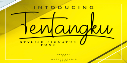 Tentangku Font is a new modern & fresh script with a handwritten and script style make this font looks elegant, natural, stylish and perfect for any awesome projects that need handwriting taste . would perfect for photography, watermark, social media posts, advertisements, logos & branding, invitation, product designs, label, stationery, wedding designs, product packaging, special events or anything that need handwriting taste.
 - Thistails Font Duo by Panatype Studio,
$9.00 Thistails is font duo with modern vintage look design style, available as a script and Display Sans serif typeface. These two lovely fonts would be perfect to combine in your design. Suitable for digital lettering, logo, t-shirt, print, business cards, branding materials, quotes, nature photography, etc, made with hand painted and carefully crafted. OpenType Features: Ligatures, Stylistic Set
 - Urbanhive by Jaetwo Type,
$45.00 Urban Hive : reinterpreting three-dimension to the typeface A blueprint consists of two-dimensional elements changes into a three-dimensional structure. What works would be created by reversing the process? The building components were divided into three parts : Facade, Inside space and Construction materials to apply all the features to the typeface. This is Facade version.
 - Kamaboko by Fype Co,
$14.00 Hey guys! Today I want to present to you with Kamaboko decorative display font, this fun font is a perfect choice if you want to give your design a playful and childish look. This is a cute font that would be perfect for the cutest cards, posters, flyers, calendar, packaging, T-shirts, invitations and so much more!
 - SpeedSketch by Greater Albion Typefounders,
$16.00 It’s surprising - it can take more time and effort to make something deliberately and artfully imperfect than it does to make a more conventional design. We certainly found this to be the case when designing ‘SpeedSketch’. Perhaps a more accurate name would have been ‘SlowDraw’ but that wouldn’t really capture the essence of the finished design.
 - Art Magazine JNL by Jeff Levine,
$29.00 A 1920 art magazine from Great Britain entitled “Pan” had its three letter name hand lettered on the cover in a style that had elements of Art Nouveau, Art Deco and what would eventually be called Techno in the 1980s. This inspired the typeface Art Magazine JNL, which is available in both regular and oblique versions.
 - Air Factory Rounded by Khaito Gengo,
$22.00 Air Factory Rounded was made for soft looking version of the original font Air Factory. Air Factory Rounded is a very simple and modern sans-serif and consisting of four weights. This contemporary typefaces would be good for restaurants, in retail, books, posters, etc. Air Factory Rounded also features various ligatures, stylistic alternates, fractions, and languages as well.
 - Plastic Display JNL by Jeff Levine,
$29.00Plastic Display JNL was sketched from photo examples in an old sales promotion sheet for the Movitex Do-It-Yourself Plastic Sign Kit. The set was manufactured by Pryor Marking Products of Chicago, and featured a board with pre-spaced holes in a grid to which the letters and numbers would be inserted to form the sign. - Alma Serif by Alma Type,
$19.00 Alma Serif is a typeface that tries to combine the modern shape of serif magazines such as Times New Roman with the atmosphere of classic typefaces such as Baskerville. I was working on the universality of the typeface, so that it would be suitable for both long papers and books, but also for formatting narrow columns in magazines.
 - Tequileria by Hanoded,
$15.00 Tequila… I have to admit that I am not a drinker. I do like Tequila, though, even though I can’t remember when I last had a shot. Tequileria is a very recognisable inline display style font. It would look great on posters and book covers, packaging and even bottles (with or without tequila). Comes with an abundance of diacritics.
 - Parkson by Rook Supply,
$18.00 Inspired by the grotesque fonts of the 19th century, Parkson is a tall sans serif typeface of 7 weights along with italic and several outline versions. The contemporary typeface aims to be one of the world's best condensed collection of fonts. Designed for optimum legibility, its clean, geometric look is perfect for logotypes, headers, titles and brochures.
 - Smoothes Inline by Lucky Type,
$18.00 Smoothes Inline is a new handwritten script font featuring a playful style and will suit all kinds of design goals. This font would be perfect especially for print design projects or website needs. Smoothes Inline has multiple language support and has more than 50 ligatures that will enhance your writing. thank you very much for looking.
 - Charmantine by Prestige Artsy Studio,
$29.99 Charmantine is a revolutionary, classy and delicate ligature sans-serif that has been designed uniquely for modern projects. An excellent arsenal for branding, mark logos, monograms, packaging, invitations, magazines and more. The delicacy of Charmantine with its perfect curves makes it a great choice for anyone who would like to add a touch of modernity to their projects.
 - Vinyle by Lián Types,
$37.00 Bold, rounded and super cool. Those are the attributes of my latest font “Vinyle”, french for vinyl. In this epoque where all fields of Design are giving a lot of importance and attention to Typography and Lettering, I felt it was my duty to contribute with something that could really stand alone and ‘say something else’ that just words to be read. I've found that lately in the world, regarding a finished piece of design, the role of Typography (and of letters in general) went from being secondary, (like a minor player or a supporting actor) to the most important one. People are starting to understand the beauty of a well-done letter: they want their storefronts with unique scripts, they want to drink coffee surrounded by lettered blackboards, they want to buy books with astonishing covers with swashes ‘por doquier’. I'm more than happy to be alive in a present where even the most unimaginable friends of mine, (who couldn't spot differences between comic sans and helvetica before) are now conscious of the importance of a letter, or let’s say: Of the ‘voice’ of Typography. With Vinyle I tried to make a font with power. Following the nowadays trend of, let me say, “the vintage sans renaissance”. This time I put my brushes and nibs aside and experimented with something new. It wasn't easy, if you will pardon, for me to see swashes all over the place withouth the classic calligraphic ‘thick and thins’, but with after some weeks of work I started to love them. Like I already showed you in other creations (1) let me finish with the phrase: GEOMETRY IS SEXY! TIPS Vinyle has a lot of attitude, it shouts “here I am!” it really can ‘design an entire piece’ for you with just a word or two: It was designed with a 10 degree slant on purpose so the user may rotate it (like on the posters) that amount of degrees in order to see better results. Use Vinyle with the ‘fi’ standard ligatures activates for better kerning and ligatures! NOTES (1) See my font Selfie , the ‘little sister’ of Vinyle.
 - Mailuna Pro AOE by Astigmatic,
$24.00 Mailuna Pro is a family of gothic typefaces of weight and oblique stature, finding themselves on a line between modern and historical gothic styles. Originating as a revival and elaboration of a limited lettering specimen from a series of old loose spanish specimen book pages, it finds itself in the visual company of vintage transportation roll signs, wood type gig posters, financial publications, etc. What began as just Capitals, Lowercase and Numerals was expanded to a rich pro glyphset including small caps, unlimited fractionals, superiors & inferiors, ordinals, tabular & proportional figures, a Caps to small caps feature and an expanded language glyph set. From modern letterpress back to historical adverts, book covers, headlines, or anything else you want to give a dash of vintage authenticity to, the Mailuna Pro Family is here to fill your needs. Be sure to download and take Mailuna Pro AOE - Book weight for a spin for free.
 - Troubled PB by Pink Broccoli,
$16.00 Loaded with various auto-ligatures (primarily for ALL-CAPS typesettings), Troubled has all of the rebellious custom lettered attitude of a vintage pulp paperback. Troubled PB began as a digitization of a film typeface known as Toronado by LetterGraphics, perfect for typesetting early children books, candy packaging, toy packaging, birthday invitations, or any other playful design need. It's lowercase typesetting is straightforward and casual, with a light animated feel, while the all-caps typesetting goes wild with auto-ligatures galore to create wonderful and interesting interwoven letterform combinations. This typestyle has such an offbeat appeal to it that it just draws your attention. Great for headlines (especially in all caps settings), but also great for small bodies of text in mixed case setting. So whether child-friendly design pursuits, or reminiscing of vintage pulp paperbacks novels, Troubled PB has a little something for everyone.
 - Salty by Fenotype,
$40.00 Salty - not fat just big boned. Salty is a hearty brush family that’s great for any kind of display use from packaging to poster & logos to headlines. Salty has bold and clear basic letterforms and lots of alternates for more customised look. Salty family consists of Script, Caps and Extras and two weights of each. Salty script is equipped with plenty of OpenType features: Keep Automatic Ligatures on to keep the flow and click Swash, Stylistic or Titling Alternates for extra goodies or manually select from even more alternates from Glyph Palette. Salty Caps is a vivid set of casual caps that play well with the script but can also be used on their own. Salty Extras is a set of ornaments and swashes designed to support the script. Some of the Extras are designed so that they can be used to customise the letters - to create your own Alternates.
 - Ergonomique by Monotype,
$31.99 Ergonomique is a humanist sans serif typeface that has been designed to be efficient and comfortable to use across all applications. Ergonomique’s personality is defined by its spurless lowercase glyphs – the stems are truncated and blend into their adjoining arcs, as can be seen in the a/b/d/m/n/p/q/r/u characters. Ergonomique is ideal for branding and display purposes, but also performs well as body copy if you’re seeking a unique style for your text. With its nine weights and complementing italics, Ergonomique is highly versatile, especially when you consider that there are small caps and old style figures included, along with a Latin Extended character set. Key Features: • 18 font family – 9 weights in Roman and Italic • Small Caps, Ligatures, with Proportional, Old Style, and Small Cap figures, plus Fractions, Numerators, Denominators, Superiors, and Inferiors • Full European character set (Latin Extended) • 800+ glyphs per font.
 - Breeder by Scratch Design,
$9.00 Introducing Breeder Font Duo it's a handwritten script. Enjoy this playful font in your designs with Breeder Script & Breeder Small Caps! This playful font consists of a natural handwritten and signature style, so this font is perfect for logos, menu design, social media posts, packaging, poster, name card, birthday card, etc. Breeder Script has a natural flow handwritten signature containing upper & lowercase characters, numerals, and punctuation. This font also has a ligature, stylistic alternate, swashes, multi-languages support, and doodles art for the bonus of this font. Breeder Small Caps comes with a natural & simple handwritten all-caps font. Complete with a-z letters, very charming handwritten font, and perfect for combining with Breeder Script. This font also includes multi-language support. Thank you for checking and visiting our store, and feel free to drop me a message if you had any questions! Visit our Instagram :) www.instagram.com/scratchdesignbali
 - The Acres by Set Sail Studios,
$20.00 Introducing The Acres Font Duo - A luxury Sans & Serif all-caps font duo. Take away the painstaking search for the perfect font pair, as these typographic partners were made for each other. The Acres Serif is a wide, high contrast serif font, designed with high-end looking branding in mind. The Acres Sans is a simple, elegant sans font, designed to compliment the serif font as secondary text. Accessing Ligatures & Extras • The Acres Serif Also contains 33 specially designed ligatures (double and triple letter combinations), to give you extra customisability. These Standard Ligatures should switch automatically when using OpenType capable software. The font is all-caps, however the ligatures will only switch when typing in capitals (i.e. turning off caps-lock gives you a quick way of turning off ligatures). There are also raised small-caps for A,E,I,O,U, these can be accessed by turning on 'Stylistic Alternates', and simply typing each letter in capitals. All special characters can also be manually inputted via a Glyphs panel. Language Support • Both fonts the following languages; English, French, Italian, Spanish, Portuguese, German, Swedish, Norwegian, Danish, Dutch, Finnish, Indonesian, Malay, Hungarian, Polish, Croatian, Turkish, Romanian, Czech, Latvian, Lithuanian, Slovak, Slovenian
 - Dog Days by Fenotype,
$45.00 Dog Days is an American hand lettering style brush script family. Dog Days is swift, strong and full of bursting energy. Due to its clean features it’s legible even in small sizes. Dog Days is great for any display use -from poster to packaging and logo to t-shirt. Dog Days is also great for lettering works. Dog Days Brush boasts with more than 700 glyphs and plenty of OpenType features: Keep Standard Ligatures on - it adds variety in hand lettering style and keeps the flow steady. If you need more action try turning on Swash, Stylistic or Titling Alternates in any OpenType savvy software. Dog Days Brush is also equipped with Old Style Numerals if you need your numbers to fit more into text. Dog Days Brush uppercase letters are designed to work as initials so if you need to write all caps you might want to use Dog Days Caps or Dog Days Small Caps. Dog Days Caps can also be used as uppercase letters for the script. Dog Days Extras is a set of badges, swashes and swirls designed to play with the font. Dog Days is inspired by a hand lettering sample in a vintage American swimsuit advertisement.
 - FS Lucas by Fontsmith,
$80.00 Pure and not-so-simple Maybe it’s the air of purity, openness and transparency that they transmit, but geometric typefaces are more popular than ever among leading brands. Based on near-perfect circles, triangles and squares, geometric letterforms look uncomplicated, even though making them readable is anything but – something the designers of the first wave of geometric fonts discovered nearly a century ago. Many of the world’s most recognisable brands in technology, retail, travel, food, manufacturing and other industries continue to be drawn to the straightforward, honest character that geometric fonts convey. Fontsmith set out in 2015 to develop a typeface in the same tradition, but optimised for the demands of modern brands – online and offline usage, readability and accessibility. And, of course, with the all-important Fontsmith x-factor built in. FS Lucas is the bold and deceptively simple result. Handle with care The letterforms of FS Lucas are round and generous, along the lines of Trajan Column lettering stripped of its serifs. But beware their thorns. Their designer, Stuart de Rozario, who also crafted the award-winning FS Millbank, wanted a contrast between spiky and soft, giving sharp apexes to the more angular letterforms, such as A, M, N, v, w and z. Among his inspirations were the colourful, geometric compositions of Frank Stella, the 1920s art deco poster designs of AM Cassandre, and the triangular cosmic element symbol, which led him to tackle the capital A first, instead of the usual H. The proportions and angles of the triangular form would set the template for many of the other characters. It was this form, and the light-scattering effects of triangular prisms, that lit the path to a name for the typeface: Lucas is derived from lux, the Latin word for light. Recommended reading Early geometric typefaces were accused of putting mathematical integrity before readability. FS Lucas achieves the trick of appearing geometric, while taking the edge off elements that make reading difficult. Perfectly circlular shapes don’t read well. The way around that is to slightly thicken the vertical strokes, and pull out the curves at the corners to compensate; the O and o of FS Lucas are optical illusions. Pointed apexes aren’t as sharp as they look; the flattened tips are an essential design feature. And distinctive details such as the open terminals of the c, e, f, g, j, r and s, and the x-height bar on the i and j, aid legibility, especially on-screen. These and many other features, the product of sketching the letterforms in the first instance by hand rather than mapping them out mechanically by computer, give FS Lucas the built-in humanity and character that make it a better, easier read all-round. Marks of distinction Unlike some of its more buttoned-up geometric bedfellows, FS Lucas can’t contain its natural personality and quirks: the flick of the foot of the l, for example, and the flattish tail on the g and j. The unusual bar on the J improves character recognition, and the G is circular, without a straight stem. There’s a touch of Fontsmith about the t, too, with the curve across the left cross section in the lighter weights, and the ampersand is one of a kind. There’s a lot to like about Lucas. With its 9 weights, perfect proportions and soft but spiky take on the classic geometric font, it’s a typeface that could light up any brand.
 - FS Lucas Paneureopean by Fontsmith,
$90.00Pure and not-so-simple Maybe it’s the air of purity, openness and transparency that they transmit, but geometric typefaces are more popular than ever among leading brands. Based on near-perfect circles, triangles and squares, geometric letterforms look uncomplicated, even though making them readable is anything but – something the designers of the first wave of geometric fonts discovered nearly a century ago. Many of the world’s most recognisable brands in technology, retail, travel, food, manufacturing and other industries continue to be drawn to the straightforward, honest character that geometric fonts convey. Fontsmith set out in 2015 to develop a typeface in the same tradition, but optimised for the demands of modern brands – online and offline usage, readability and accessibility. And, of course, with the all-important Fontsmith x-factor built in. FS Lucas is the bold and deceptively simple result. Handle with care The letterforms of FS Lucas are round and generous, along the lines of Trajan Column lettering stripped of its serifs. But beware their thorns. Their designer, Stuart de Rozario, who also crafted the award-winning FS Millbank, wanted a contrast between spiky and soft, giving sharp apexes to the more angular letterforms, such as A, M, N, v, w and z. Among his inspirations were the colourful, geometric compositions of Frank Stella, the 1920s art deco poster designs of AM Cassandre, and the triangular cosmic element symbol, which led him to tackle the capital A first, instead of the usual H. The proportions and angles of the triangular form would set the template for many of the other characters. It was this form, and the light-scattering effects of triangular prisms, that lit the path to a name for the typeface: Lucas is derived from lux, the Latin word for light. Recommended reading Early geometric typefaces were accused of putting mathematical integrity before readability. FS Lucas achieves the trick of appearing geometric, while taking the edge off elements that make reading difficult. Perfectly circlular shapes don’t read well. The way around that is to slightly thicken the vertical strokes, and pull out the curves at the corners to compensate; the O and o of FS Lucas are optical illusions. Pointed apexes aren’t as sharp as they look; the flattened tips are an essential design feature. And distinctive details such as the open terminals of the c, e, f, g, j, r and s, and the x-height bar on the i and j, aid legibility, especially on-screen. These and many other features, the product of sketching the letterforms in the first instance by hand rather than mapping them out mechanically by computer, give FS Lucas the built-in humanity and character that make it a better, easier read all-round. Marks of distinction Unlike some of its more buttoned-up geometric bedfellows, FS Lucas can’t contain its natural personality and quirks: the flick of the foot of the l, for example, and the flattish tail on the g and j. The unusual bar on the J improves character recognition, and the G is circular, without a straight stem. There’s a touch of Fontsmith about the t, too, with the curve across the left cross section in the lighter weights, and the ampersand is one of a kind. There’s a lot to like about Lucas. With its 9 weights, perfect proportions and soft but spiky take on the classic geometric font, it’s a typeface that could light up any brand. - Gendouki by Typodermic,
$11.95 Introducing Gendouki, the ultimate futuristic typeface that will transport your designs to the cutting-edge of technology. With its striking filament stencil lines, reminiscent of spacecraft access panels, Gendouki is the perfect choice for projects that demand a bold and hyper-futuristic look. Imagine using Gendouki as a large, low-contrast backdrop element, setting the stage for your content to shine. The sleek and modern lines of the font will add depth and dimension to your design, creating a dynamic visual experience that’s sure to capture your audience’s attention. But that’s not all. Gendouki is also perfect for producing movement in your paragraphs when applied as a techno drop-cap. Watch as your text springs to life, animating your words and drawing your reader in with its captivating energy. So if you’re looking for a font that combines the sleek, hyper-futuristic look of a spacecraft with the sharp, clean lines of modern design, look no further than Gendouki. Try it today and take your designs to a whole new level of cool. Most Latin-based European writing systems are supported, including the following languages. Afaan Oromo, Afar, Afrikaans, Albanian, Alsatian, Aromanian, Aymara, Bashkir (Latin), Basque, Belarusian (Latin), Bemba, Bikol, Bosnian, Breton, Cape Verdean, Creole, Catalan, Cebuano, Chamorro, Chavacano, Chichewa, Crimean Tatar (Latin), Croatian, Czech, Danish, Dawan, Dholuo, Dutch, English, Estonian, Faroese, Fijian, Filipino, Finnish, French, Frisian, Friulian, Gagauz (Latin), Galician, Ganda, Genoese, German, Greenlandic, Guadeloupean Creole, Haitian Creole, Hawaiian, Hiligaynon, Hungarian, Icelandic, Ilocano, Indonesian, Irish, Italian, Jamaican, Kaqchikel, Karakalpak (Latin), Kashubian, Kikongo, Kinyarwanda, Kirundi, Kurdish (Latin), Latvian, Lithuanian, Lombard, Low Saxon, Luxembourgish, Maasai, Makhuwa, Malay, Maltese, Māori, Moldovan, Montenegrin, Ndebele, Neapolitan, Norwegian, Novial, Occitan, Ossetian (Latin), Papiamento, Piedmontese, Polish, Portuguese, Quechua, Rarotongan, Romanian, Romansh, Sami, Sango, Saramaccan, Sardinian, Scottish Gaelic, Serbian (Latin), Shona, Sicilian, Silesian, Slovak, Slovenian, Somali, Sorbian, Sotho, Spanish, Swahili, Swazi, Swedish, Tagalog, Tahitian, Tetum, Tongan, Tshiluba, Tsonga, Tswana, Tumbuka, Turkish, Turkmen (Latin), Tuvaluan, Uzbek (Latin), Venetian, Vepsian, Võro, Walloon, Waray-Waray, Wayuu, Welsh, Wolof, Xhosa, Yapese, Zapotec Zulu and Zuni.
 - Postillon by RMU,
$30.00 Herbert Post’s (1903-1978) blackletter fonts redesigned for nowadays’ use. Both font styles contain adorning swash caps. Typing N, o, and period, and activating the OT feature Ordinals produces an oldstyle number sign.
 - Sublimina by Deniart Systems,
$15.00 Give your documents a whimsical look! For kids of all ages, the Sublimina package features 26 modern drop-caps that are sure to add a little fun and flair to all your presentations.
 - Koch Original LP by LetterPerfect,
$39.00 Koch Original is a revival of the original cut of Rudolf Koch's classic sans serif, Kabel , retaining its tall ascenders and art deco flavor. It is suitable for both text and display setting.
 - Winnetka JNL by Jeff Levine,
$29.00Winnetka JNL was inspired by Cooley Antique Tuscan Condensed - a printer's wood type manufactured in 1859 by J.G. Cooley. Given an additional hand-made treatment, the lettering resembles characters made from cut paper. - Big Display Sans JNL by Jeff Levine,
$29.00 Big Display Sans JNL is an all-caps version of Ludlow’s metal type “Samson”, originally designed by Robert Hunter Middleton in 1940. This digital version is available in both regular and oblique versions.
 - P.T. Barnum by Bitstream,
$29.99 One of the original nineteenth century designs, cut at Barnhart Brothers & Spindler in Chicago about 1880, passed on to us through ATF. Unlike most Circus types, the serifs of P.T. Barnum are bracketed.
 - Mindwalk by TOMO Fonts,
$15.00 TOMO Minkwalk is a casual but legible hand-made font. A tall, single weight, all-caps typeface with lots of language support. Ideal for book covers, or large pieces of text. Have fun!
 - Cubissimo by Hanoded,
$15.00 Cubissimo is a geometric font inspired by a 1929 poster advertising a museum exhibition. It is an all-caps cubist typeface designed to look good on posters. It comes with extensive language support.
 - Rococo Titling by Three Islands Press,
$15.00Rococo Titling is a set of ornate titling caps based on work done by Jacques-Francois Rosart (1714-1777) and Pierre Simon Fournier (1712-1768) during the middle decades of the 18th century. - Display Inline JNL by Jeff Levine,
$29.00Display Inline JNL is a companion design to Jeff Levine's Signboard JNL font - both derived from die-cut display letters and numbers popular during the 1950s and 1960s for signs and show cards. - Chen Xing by Pelavin Fonts,
$25.00 Chen Xing, literally “morning star”, a font both futuristic yet mystifyingly ancient is cast in contemporary forms on the cutting edge of the present moment, but harkens back centuries to endless cultural heritage.
 - Metaluna by Device,
$39.00 Metaluna is an extended sans serif family of five weights derived from Rian Hughes’ classic Forbidden Planet logo. Sleek and modern, it suggests cutting-edge tech, supercar marques or high-precision engineering multinationals.
 - Bibiana by Otto Maurer,
$19.00 Swashy Newstyle Tattoo-Font Gangsterstyle. Bibiana is the Sisterfont to Tinka Babe Tattoofont. Bibiana is best for Tattoart like Tattooflash.Bibiana Tattoofont comes with many OpenType Features. Alternate Ends Alternate Caps Ligatures Extra swashes
 - Scholarly Ambition by Ali Hamidi,
$10.00 Scholarly Ambition is a cute and fun display font perfect for adding a playful element to your next craft or design project. It is compatible with cutting machines such as Cricut and Silhouette.
 - Acton by Device,
$29.00 Acton is a deceptively simple, grid-based design. Though derived from a 2 by 3 arrangement of blocks, it uses white spaces to allow for more complex shapes – for example as the R – where the underlying 3 by 5 arrangement is apparent. It also departs from this strict grid-based logic for characters such as the the T, L, f and r, whose cross-bars are shorter than they would otherwise be in order to promote optical evenness. No elegant solution could be found for the V, which in geometric fonts can appear very similar to the U, lacking as it does the cross-bar that can differentiate a square A from the capital form of the n. However, the resultant diagonal retroactively proved useful on the lower-case e and a, characters that otherwise would have more uninteresting design solutions.