10,000 search results
(0.019 seconds)
- Rocher by Harbor Type,
$29.00 🏆 Selected for Tipos Latinos 8. 🏆 Hiii Typography 2018 Merit Award. Rocher was designed while looking for an answer to a simple question: what would a typeface look like if it was made of stone? It certainly would look solid, but did we have to add cracks and rubble so it would resemble rocks? We didn’t think so. We decided to tackle the problem a different way. We added corners where there usually aren’t any and threw some unusual letterforms into the mix. The result is a typeface that feels like stone, but if you look closely there is nothing inherently stony about it. Unexpected corners provide just the right amount of roughness, while unusual letterforms give the text an informal aesthetic, traces of something naive and handmade. A family was born when the sturdy letterforms were turned into a series of playful layers. With 9 fonts in total, Rocher can be mixed and matched to create unique layered compositions that add depth to the layout. We designed Rocher to be used in logotypes, packaging, mobile apps and headlines. We are confident you will find another handful of scenarios where it can shine.
 - Mochita Display by Sign Studio,
$15.00 Mochita Display is indeed a font made to give a fun, funny and cute impression. Even so, it still maintains good detail and balances the negative space. This font would be perfect for logo designs, titles, product names, labeling, or anything with a fun design theme.
 - AC Texto by Antoine Crama,
$- Texto is a synonym of SMS (Short Message Service) in french. As a SMS that you would send or receive from a friend, this typeface is friendly, warm and informal. It is a humanist sans-serif typeface that comes in 9 weights to meet all needs.
 - Sweet Titling No. 22 by Sweet,
$39.00 Sweet Titling No. 22 is part of the Sweet Collection of engraved lettering styles from the 20th Century, published by MVB Fonts. This obscure, art deco design would have been used for engraved letterhead, business cards, etc., and likely first appeared in the 1920s or ’30s.
 - Holt Sans by A New Machine,
$14.00 Holt is a sans serif font that works best at larger sizes and display. The substantial contrast between the thick and thin stokes lends it an air of elegance that would make it suitable for fashion design, magazine headers as well as a large range of advertising.
 - Georgina Pro by FoxType,
$9.00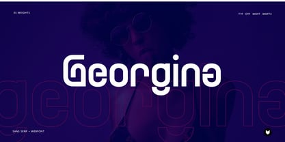 Georgina pro is a Unique Modern Elegant Typeface with Web-fonts. It’s a very versatile font that works great in large and small sizes. Georgina would perfect for branding, logos, headlines, Captions. or simply as a stylish text overlay to any background image. 5 Weights Included.
 - Superbrush by Hanoded,
$20.00 Superbrush is, well, a super brush font! Made with Chinese ink, a flat brush and a lot of patience. Superbrush would look great on book covers, product packaging, old school rock albums and T-shirts. Comes with a super amount of diacritics and double letter ligatures.
 - Stars And Type by Tim Kirkman,
$22.00 Stars & Type is a display font inspired by a road trip around the USA. It is bold, abstract and experimental and is meant for attention grabbing large headlines. Utilising stars to give a sense of Americana, it would be suited to editorial, advertising and display typography.
 - Argiss by Hanzel Space,
$25.00 Argiss Handwritten Font - A cute and simple hand-lettered font! This font would be perfect for party invitations, baby showers, birthday cards and more. • Uppercase & Lowercase • Includes Numbers and Punctuation Currently supports English characters only. I'm more than happy to add additional characters and glyphs at request!
 - Callephane by Viswell,
$9.00 Callephane is our newest font. Its retro style is inspired by a unique design in the 60s. This fonts is perfect for any project, posters, clothing, labels, logos, badges, and many more, that would benefit from a retro look. Callephane has 3 styles: Light, Regular and Rough.
 - Abstract Style by Putracetol,
$24.00 Abstract Style is a abstract display font. This font has abstract and irregular shapes, sharp corners and messy shapes that characterize it. Abstract Style would be perfect for Logo, title, logotype, cover, headline, apparel, comic, cover books, cards, posters, or anything that requires a abstract creativity!
 - Belgravia by Scriptorium,
$24.00Belgravia is an Art Nouveau period design based on hand lettering from the 1890s. Like our popular Pantagruel font it has a lot of the elements which would influence later Psychedelic poster lettering in the 1960s. Very nice looking with a good weight for title designs. - Earhtroline by Qwrtype Foundry,
$14.00 Earhtroline is a Handwritten Monoline Script Font Earhtroline is perfect for product packaging, branding project, megazine, social media, wedding, or just used to express words above the background. Earhtroline also multilingual support. Enjoy the font. Thank you!
 - Boffin by Evolutionfonts,
$- A simple little typeface for all things technical. A faux monospaced, semi-serif with rounded corners that you will never forget. The name comes from a British slang word that means "tech-savy person". Or simply "nerd".
 - Paksa by Jipatype,
$17.00 Paksa is a decorative sans-serif typeface. The name of this typeface is derived from the Thai word that means “bird.” It is suitable for use in text headlines, sub-headlines, packaging, posters, and other print media.
 - Rahere Roman Display by ULGA Type,
$30.00 Rahere Roman Display is an elegant design with flared stems and subtle old style features, influenced by Berthold Wolpe’s wonderful Albertus font and (to a lesser extent) fonts based on Roman square capitals. It’s a classic design for the modern age, appealing to serious typographers, graphic designers and anyone looking for a beautiful, multipurpose font that also offers value for money. Originally conceived as a display companion for the Rahere Sans typeface family, Rahere Roman harmonizes perfectly with its sans counterpart: use it for headings, sub-headings or pull-out quotes. Want an eye-catching introduction? The small caps have been sized to optically align with the x-height of Rahere Sans or start a paragraph with a swash drop cap. There are also ornaments and devices on hand to spice things up. Of course, Rahere Roman Display works beautifully as a standalone font too. Although predominantly a display font, with a quick flick of its lowercase switch, Rahere Roman transforms effortlessly into a readable text font. Like a Swiss Army Knife, this is a hugely versatile font, capable of conveying different messages from classic and romantic to historical and modern. It’s suitable for a wide range of applications including: branding, posters, advertising, packaging, labels, signage, wedding stationery, museums, art galleries and book covers. Weighing in at well over 2,000 glyphs, Rahere Roman contains a myriad of alternative characters (mostly capitals) including two sets of small caps that allow certain letter combinations - such as RO, LA, LI, TY, etc. - to mimic ligatures. The advantage of this is that if letter spacing is increased or decreased, the letter combinations aren’t fixed and can move too, which helps the space between letters to remain even. However, for lovers of ligatures there is still a bucketload of goodies to play with, including the obligatory ‘OO’ ligature. If that’s not enough, the font also contains start & end swashes, alternative numerals, seven ampersands, ornaments and devices. .ss01 - Initial swash capitals .ss06 - Superior small capitals (aligned to the cap height) .ss07 - Small capitals (sitting on the baseline)
 - Cristal by Corradine Fonts,
$24.95 Cristal is a modern typeface inspired in the cuts of a bevel effect. Its lines build each letter as a cutted gem giving an unique elegant aspect. It comes in two weights to be used at different sizes and has positive and negative versions. Also has a solid version that allows compose more legible texts. Cristal Dingbats and Cristal Frames are two essential complements to obtain a great typographic system of 15 fonts.
 - Nevaeh Scratch by Kufic Studio,
$15.00 Nevaeh Scratch is a stylized version of the font Nevaeh. The design has been inspired by the paper cut effect. Nevaeh Scratch has a unique design with rough and irregular linings yet, a perfect font. The font has a simple and minimalist factor with all main characters, the font is specially made for those who are in the printing and branding fields. Carefully engraved and stenciled to deliver clean cuts and design.
 - Aestero by Craft Supply Co,
$20.00 Aestero Futuristic Typeface Cutting-Edge Inspiration Aestero Futuristic Typeface, drawing from Gundam and sci-fi aesthetics, embodies a cutting-edge design for a bold display impact. Sleek Sci-Fi Elegance Named Aestero, this font seamlessly blends Gundam inspiration with sci-fi elegance, presenting sleek characters with a futuristic charm. Dynamic and Bold Presence Aestero commands attention with dynamic and bold letterforms, making it an ideal choice for projects seeking a strong visual presence.
 - Athisthan by Jipatype,
$27.00 อธิษฐาน เป็นอักษรแบบคอนทราสต์แซนส์เซอริฟ มาพร้อมกับอักษรแบบมีหัวสำหรับภาษาไทย ดูทางการ เรียบหรู มีเสน่ห์ เหมาะสำหรับการใช้ผาดหัว หรือรองผาดหัว มีทั้งหมด 9 น้ำหนักและตัวเอียงของแต่ละน้ำหนักรวมทั้งหมดมี 18 สไตล์ และมีฟีเจอร์อื่น ๆ อาทิเช่น Small Caps และฟีเจอร์อื่น ๆ พร้อมให้คุณได้เลือกใช้งาน รองรับหลากหลายภาษา Athisthan is a contrast sans serif typeface with loop head style for Thai character. Formal, elegant, charming look. Suitable for headline and sub-headline. Comes with 9 weights and italics of each weight total 18 styles, and there are features such as Small Caps and many features available for you. Support multi-languages.
 - Hemispheres by Runsell Type,
$9.00 Hemispheres perfectly represents clean and classy design in four weights: Script 1, Script 2, Caps 1, and Caps 2. The project was inspired by unique labels, badges, and packaging and works well for additional cases such as logotype, branding, packaging, quotes, business cards and more. Hemispheres feature uppercase, lowercase, numeral, punctuation & symbol, ligatures, stylistic alternates, multilingual support, PUA encoded. How to get access alternate glyphs from open type fonts check this link : http://adobe.ly/1m1fn4Y
 - Bergsland Fashion by Hackberry Font Foundry,
$24.95 This is a stylized sans serif font family that is very high-waisted and sleek. The stroke is only slightly modulated. The letterforms are higher, with a more open aperture, and sprinkled with breaks to add light and sparkle. This an attempt at a readable sans serif for text. It has many OpenType features and 465 characters per font: Caps, lower case, small caps, old style figures, numerators, denominators, accents characters and so on.
 - Perio by Aah Yes,
$12.00Perio is a small family, offering a distressed rendering of a conventional serif typeface in 4 varieties. There's Ordinary, All Caps, Small Caps, Clean and Jumbled. Many of the letters contain little bits of extra print around the body of the character, in imitation of imperfect printing, in all except the Clean version. It's especially useful for display, poster and headlines, but easily legible enough to be used in a paragraph of text. - Phatthana by Jipatype,
$27.00 สมัย ออกแนว ไซ-ไฟ ในโลกเทคโนโลยี เหมาะสำหรับการใช้พาดหัว รองพาดหัว มีทั้งหมด 9 น้ำหนักและตัวเอียงของแต่ละน้ำหนักรวมทั้งหมดมี 18 สไตล์ และมีฟีเจอร์อื่น ๆ อาทิเช่น Small Caps และฟีเจอร์อื่น ๆ พร้อมให้คุณได้เลือกใช้งาน รองรับหลากหลายภาษา Phatthana is a sans serif display typeface with square shape style Look strong, modern, sci-fi and technology movie. Suitable for headline, sub-headline Comes with 9 weights and italics of each weight total 18 styles, and there are features such as Small Caps and many features available for you. Support multi-languages.
 - Norden by Heinzel Std,
$17.00 Norden is an elegant and modern all caps serif font. Fall for its ravishing style and use it to create gorgeous logos, headline, title, branding, wedding invitations, beautiful stationary art, eye-catching social media posts, and much more! This font is PUA encoded which means you can access all of the amazing glyphs with ease! Features : Norden Regular version, serif font All Caps, Numerals and more punctuations. Multilingual support for various languages
 - Dalek Pinpoint by K-Type,
$20.00 DALEK PINPOINT is a clean and precise version of K-Type’s distressed DALEK typeface, a small caps face with overtones of Greek, Phoenician and Runic alphabets, based on Dalek comic book lettering from the 1960s. The package includes Regular and Bold weights, plus an Italic and Bold Italic which are optically corrected obliques. The fonts contain a full complement of Latin Extended-A characters, and now include Greek capitals and small caps.
 - Emjay by A New Machine,
$19.00 Emjay is a whimsical hand drawn all caps serif font. It has 4 glyphs per letter - upper and lowercase as well as 2 more sets of glyphs - that make for a more unnatural handmade feel. Any user can interchange letters using caps and lowercase. With contextual alternates on, opentype programs will place different glyphs automatically. Also includes a number of ligatures for even more unique type setting. Great for use in posters, headlines, invitations, etc.
 - The Last Shuriken by Arterfak Project,
$26.00 Konichiwa! Introducing our brand new font "The Last Shuriken" a Japanese-style typeface. Inspired by modern Japanese food branding and anime title. Designed in a bold stroke, this font is an all-caps font that has the same cap height and different shapes. The Last Shuriken is perfect for display, especially for Japanese food, title, logo, poster, short quote, movie, games, apparel. Complete with stylistic alternates and PUA Encoded with multilingual support! Thank you. Ramz.
 - Akwe Pro by ROHH,
$40.00 Akwe Pro™ is a professional, ultra versatile sans serif typeface characterized by excellent legibility and modern design perfect for all design purposes. It is designed for use in long and short paragraphs of text, headlines and user interfaces. Its distinctive character and carefully crafted proportions make it a great option for brand identification and logo design. Akwe Pro™ mega family consists of 164 fonts - each weight in uprights, italics and small caps versions. It has extended language support and true italics, as well as broad number of OpenType features, such as small caps, case sensitive forms, standard and discretionary ligatures, stylistic sets, contextual alternates, lining, old style, tabular and small cap figures, slashed zero, fractions, superscript and subscript, ordinals, currencies and symbols.
 - Amico by Hackberry Font Foundry,
$24.95 This is a new barely modulated, slightly narrow, sans serif font family. It has eight styles: thin, thin italic, regular, italic, bold, bold italic, black, & black italic grouped into two 4-font families: Amico Thin with the Bold; and Amico with the Black. Amico has the standard feature set developed at the end of 2007. It has many OpenType features and 654 character/glyphs: Caps, lower case, small caps, ligatures, discretionary ligatures, swashes, small cap figures, old style figures, numerators, denominators, accent characters, ordinal numbers (1st-infinity): lining and oldstyle), and so on. It is designed for text use in body copy. However, Amico really shines as the choice for heads & subheads when using Amitale or Brinar for the text family.
 - Progeny by Type Associates,
$35.00 Progeny is a single-stroke freehand informal script that began life as a logo for a fast food company. That logo was rejected but when I added a suite of swash caps and a few extra ligatures and my trademark underlines it all started to come together as a font. Then I used it successfully for another logo and I proceeded to complete the weight variations that emerged during the first logo design, rounding the lighter weights to give a more friendly, softer look. That treatment didn't suit the bold weight but sharp corners did not detract from the robust, legible headliner that emerged. All weights work in all-lowercase, all-capitals, lowers with swash or regular initial caps and surprisingly – in all-caps with swash initials.
 - Araldo by Hackberry Font Foundry,
$14.95 My latest book production group is quite conservative. I discovered my need for a pair of headline fonts with the same vertical metrics which are looser and more lively. Since the serif family is Biblia Serif, and the Sans family is Draetha [which is Welch for preach], Araldo [which is Italian for herald] makes sense to me. Narrow has my normal set of Opentype features with small caps, small cap figures, and the rest of the figure sets. Bold is too heavy for small caps, without messing with the metrics. So, it has the normal figure sets, plus a decent set of discretionary ligatures. They both work well, and are meeting my need for a headline family to add to the book production group.
 - ITC Portago by ITC,
$29.99 ITC Portago was designed by Luis Siquot, who admits to a tendency toward unusual typefaces that can be read in text yet also work well in display settings. ITC Portago is a robust alphabet of caps and slightly smaller caps. It is a stencil face, based on the lettering on crates and luggage. Siquot says that his intention drawing Portago was to obtain a neutral, classical, very condensed grotesque stencil shape that is readable in text sizes, showing at the same time the 'movement' produced by the nicked edges. And of course the more obvious rough effect in headline sizes." At small sizes, Portago is best set with slightly looser letterspacing, as capital combinations usually do. Portago includes numerals in both full and small caps proportions.
 - Diagram Display by Makes Type,
$50.00 The distinctive design of the "Diagram Display" comes from the Venn diagram. It is a common statement and it is a spatial illusion. The delicately differentiated curves balance the technical, geometrically constructed shaping. The graceful character comes with All caps or Small caps typesetting in lighter weights when the font takes on a classicist character due to its proportions. It appears best in headlines and larger sizes, in all applications and themes where its elemental design resonates. Each of the six weights contains an extensive character set, including small caps, uppercase, lowercase and tabular numbers, mathematical symbols, standard and discretionary ligatures, or arrows and other special characters. The stylistic set SS01 contains alternations (a, g, t, u, y) that support its geometrically constructed appearance.
 - Breakers by Kostic,
$40.00 Breakers is a sans serif originally conceived to be a display typeface. Works great in text also, but the diversity in weights is its strong point. It is easy to achieve that high contrast using thin against the ultra weight, but setting tall and lean capitals against the compact and heavy small caps can make really diverse compositions for all kinds of display design. With small caps included, and over 600 glyphs in each weight, it should prove itself useful in finding the right combination for any typographic setting. Breakers has a character set to support Western and Central European languages, and an extended set for monetary symbols. Each weight includes small caps, ligatures, proportional lining and oldstyle numbers, tabular figures, fractions and scientific superior/inferior figures.
 - Today - Unknown license

- Weg by Huerta Tipográfica,
$18.00 WEG* font is an experimental type system where legibility isn’t the focus. This project studies how glyphs are constructed and how their ductus can be modified. I explored how far I can move the limits if I don’t worry about the legibility. In Weg, letters are built by a single line that connects them, along with words and paragraphs. When weight decreases, the legibility of the signs increases. This is the first stage. It’s a project in expansion. The set contains uppercase, lining figures and basic punctuation in three weights: Regular, Light and Thin. The current supported languages are Spanish, Guaraní and English. If you need any other language, please let me know. I would like to expand the character set. Second stage project WEG is an experimental in-expansion font family. Here I present to you the second stage. I’m planning the first upgrade for middle 2021. I’m preparing a pattern set for July 2021. Here you can see the first four patterns. If you buy the font before July 2021, you’ll get this upgrade! • Second stage April - July 2021: pattern set (first four ready). • This upgrade will be available on August 2021.
 - Niemeyer by Latinotype,
$36.00 Oscar Niemeyer is one of the greatest architects of our time—his unique way of mixing straight lines and abstract curves gives rise to an unmistakable and characteristic style. This typeface is my own tribute to Brazilian architect Oscar Niemeyer. The design process started when my wife and I visited Brazil while she was running a series of workshops on calligraphy. In my spare time, I would walk through the streets of beautiful cities like Rio de Janeiro or São Paulo, enjoying the local architecture and urban life. I had also the opportunity to attend to some of the workshops during which I was able to observe the organic of calligraphy and people. Then, I started to draw some shapes that reflected everything about this beautiful place: Niemeyer’s architecture and work and, in his own words ‘the curves on the body of the beloved woman’. This versatile typeface comes in 8 weights with matching italics, alternative characters, oldstyle figures and much more! Niemeyer is well-suited for logotypes, advertising, publishing, branding and corporate use. Special thanks to everyone in the Latinotype Team (especially to César Araya) for their support, help with corrections and digital editing.
 - Primot by Plau,
$49.00 Primot is an upright script heavily influenced by italian gelaterias . After releasing 3 sans serifs , we were looking for an opportunity to design a display type with less constraints for legibility and expression. We started playing with brush lettering and looking into vintage scripts from different eras. Some cool things that made it into Primot were some unusual vertical connections and the sweet brush flairs in the letter endings. From that point on, we set out to create a beautiful looking vertical script – something we don’t see that often – in which each word set could would make a nice piece of graphic design (think logos, video game titles, shop windows etc.). We also made it smart by including hand-lettering inspired features such as initial and final forms for letters, contextual alternates and swashes. The result is a versatile 900+ glyphs display typeface, suitable for a wide range of applications. We hope you have as much fun with it as we had designing it! And while we’re here, you may like that it also pairs beautifully with our sturdy sans-serif family Motiva Sans .
 - Electric Cable by Harald Geisler,
$39.00 ''Sometimes, you fall in love with someone, and, sometimes, you fall in love with something. I fell in love with the work of Harald Geisler. Harald and I met through our work on a couple of Kickstarter projects (Typographic Wall Calendar and The Montserrat Typeface). We sympathised immediately with each other, and that lead us to start a new project. The electricity we felt was captured in Electric Cable (that’s what we named it), a typeface designed in our own image and likeness. Electric cable is connected, and that power leads it to write unexpected things. It’s a letter for the flâneur: it carries within itself a high voltage that makes it lively. It has energy and spark. That’s exactly what we would like in a person. It is a display typeface, current and contemporary. It is based on the connection of two friends who felt the need to create a common language even without speaking the same language. In editorials use, your words will become strikingly beautiful. Electric Cable features geometric, humanistic qualities,and also some script, but ,above all, it has a sense of humor.’’ Julieta Ulanovsky (Usage tip: Use the “
