10,000 search results
(0.021 seconds)
- Priori Sans by Emigre,
$59.00 After the popular successes of Exocet and Mason, Emigre has once again teamed up with Jonathan Barnbrook to bring you his latest venture into type land. Priori is a logical progression from Mason, a typeface he designed around ten years ago. Where Mason was designed purely for display purposes and featured only caps, Priori includes lower case, companion serif and sans serif versions, alternates and, according to its creator, is shooting for text face status - a bold claim from a designer who loves to wear his influences on his sleeve and who has little use for typography that aspires to be "neutral" or "transparent." Like many of Barnbrook's typeface designs, Priori is based on his interest in British typography of the early 20th century. It is inspired by the work of famous British typographers, such as Eric Gill and Edward Johnston. But it also embraces all of the signage and lettering that Barnbrook observes in the streets, cathedrals, and public buildings of his London neighborhood. This mixing of native influences with a contemporary pop culture intent is what gives Barnbrook's types a distinct and unique flavor. Like its creator, Priori is a one of a kind.
 - King Tut by Canada Type,
$24.95 King Tut is a restoration and expansion of the original Egyptian Expanded, a single bold face cut in 1850 by Miller & Richard, the famous Edinburgh founders. This aesthetic, though originally issued to help drive simple print advertising of those days, is perhaps the longest lasting genre of typeface. This aesthetic flourished in the later part of the 19th century, helped by the surge of similar faces from England (such as Figgins' Antique 6 and Expanded Antique), and became the defining index of the old American wild west that continues to this very day. King Tut serves up its impact through a balance between the wide, compact letterforms and elegant curvature that manages to come through even in confined areas. The family's weight variety allows for more options in counterspace use as well as precision in the amount of curve definition and contrast needed by the typographer. The lighter weights completely oppose that 19th century boldness and expose the alphabet's skeleton in a strive for simplicity that fits modern applications. With generous language support to boot, King Tut's diverse offerings make it an essential addition to today's designer repertoire.
 - El Greco by Berthold,
$39.99 Günter Gerhard Lange designed El Greco for Berthold in 1964. This script dresses up informal documents and adds lightness to formal documents.
 - Tea Bag JNL by Jeff Levine,
$29.00 Inspired by a grocery store chain logo used up until 1975, this unusual Victorian-style typeface has a unique and interesting charm.
 - Lydstyrke by Bogstav,
$16.00 Lydstyrke is Sound volume in danish. Always play your favourite music loud...really loud. Turn up the volume - skru op for lydstyrken! :)
 - Scratchnessism by Jesse Tilley,
$19.95Scratchnessism is a grunge font, perfect for dirtying up anything. For best use of this font I recommend turning anti-aliasing on. - Sure, diving into the essence of a font named "Oneworldonefuture" designed by Dieter Schumacher is like embarking on a journey through artistry and vision. This is not just a mere collection of lette...
- Botanika by Suitcase Type Foundry,
$75.00The motivation behind the Botanika family was the desire to create a text version of the Magion font. Although the glyphs were originally drawn using the same proportions, they were subsequently adjusted in order to improve legibility. The font retains certain characteristics of the original, such as the top serif on the “i” and the similar bottom serif on the “l”. Lowering the x-height lent the family a new and original character. The italics are slightly more condensed than the regular weight, without losing the austere grace of the regular weight. They are distinct enough to stand out in the text. Alternative characters can be selected to spice up the setting, or conversely to subdue headlines by using more traditional letter shapes. Small caps are available as well. The monospace version is a 10 pitch font: at 10 pt type size 10 characters fit exactly into the width of one inch, meaning that individual letters Take up 60 % of an em in width. The family is provided with matching italics. The modifications made during the OpenType transition included the addition of missing glyphs to cover the Suitcase Standard set and adding relevant kerning pairs, plus redrawing the bold weight and the accents. Despite its lower x-height, the font is often used for setting medium to long texts. Its slightly archaic feel lends text set in Botanika an air of novelty, which may be the reason why it is so popular in extensive corporate identity systems. If you are looking for an alternative to the cold, neutral sans serifs which are so popular these days, Botanika is the perfect choice. - The Atlas of the Magi is a font that conjures an aura of ancient mysticism and arcane knowledge, as if it's a collection of symbols and glyphs directly sourced from the secret scrolls of sorcerers or...
- Mr Palker by Letterhead Studio-YG,
$35.00 A slab serif Mr Palker and grotesque Mr Palkerson build one superfamily together. These are blank types. In a way even the display ones. Typefaces for newspapers, announcements, cheap advertising and police posters. Mr Palker and Mr Palkerson will turn every language into a fence. And due to six types of faces one can choose what material should the fence be made from — from Thin steel rods to the Black stone blocks. In their simplest appearance Mrs P&P are intended for the solid blank composition in victorian or industrial style. They are quite decent, a bit old-fashioned slab serif and grotesque with closed aperture. All my types have layers. Walker and Palkerson also do. Besides the standard set of symbols, they have 4 add-ons. 1. Alternate glyphs, including unicase ones. 2. Ligatures with A letter. 3. Extra tall small caps. 4. Two-storey ligatures. All this options are intended for the complex composition. The additional letters are rather eccentric as their main function here is to imitate the victorian oddities. Imitate, parody, just not repeat. There are lower-case As and Es in the set in height of small caps and uppercases. They can turn every writing into the unicase. The lower-case A (as well as uppercase and small caps version of it) has deliberately by my taste grown a ludicrous tail. To compensate it I’ve built all the possible ligatures - ад, ал, ая. There are 35 of this ligatures all together. Take a closer look at the Russian letters D, L, K, Ya from the main set as well as their alternates. The additional glyphs are one more comic than the other — on purpose to imitate (not to repeat!) the victorian set. This sets have lowercase numbers. And small caps numbers as well. What a modern typeface without them. They also have an У-letter with a generously curvy tail. As if before the WWI. The Latin of course has alternates as well. It has letters to make the perfect French sound more like the russian provincial version of it. The tails of Js and Ts can be made a little bit more open — or a little bit closed. My favorite feature here, an invention of a kind - extra tall small caps. It allows to compose logos with the small caped uppercases directly from the keyboard. The small caps of this typefaces are usually much taller than the customary ones. This is the kind of small caps that Palker and Palkerson have. More to that, the strokes’ weight and the letters width are corresponded to the uppercases. Just a ready set for making a logo a la 1913 style. With a unicase, one has to mind! One more trick with the tall small caps is a possibility to make them work like lower uppercases. Their height is just in between of lower- and uppercases. Isn’t it great to have an additional set of uppercase working ponies in stock for the case of emergency. And finally — the trademark of Palkers family, two-storey ligatures. They are made in the height of uppercases and turn every writing into an ornament or a puzzle of a kind, while at the same time making them much shorter. Each face has 90 of them. Mainly those are twins: CC, BB, DD and so on. ll this things are for the unhasty compositing, even for lettering. Which means that for the things which are not there you always should have Command+Option+O and some patience. Also — among the two storey ligatures one also can find some belvedere villas. All my types are glasses from the one kaleidoscope. The P&Ps family was preliminary part of the victorian set, which already has 1 Cents and Clarendorf - optionally one can add Costro, Gordoni, Handy, Guardy, Surplus, Red Ring, Red Square, Babaev to the list. And also Sklad, Odessa, Dreamland, Romb, Platinum - here, at Letterhead’s, every second one is victorian. All together our typefaces can allow one to set advertisement of any kind, even the trickiest one, and compose everything, from the coffee place’s menu to the antiquarian magazine.
 - Mr Palkerson by Letterhead Studio-YG,
$35.00 A grotesque Mr Palkerson and slab serif Mr Palker build one superfamily together. These are blank types. In a way even the display ones. Typefaces for newspapers, announcements, cheap advertising and police posters. Mr Palker and Mr Palkerson will turn every language into a fence. And due to six types of faces one can choose what material should the fence be made from — from Thin steel rods to the Black stone blocks. In their simplest appearance Mrs P&P are intended for the solid blank composition in victorian or industrial style. They are quite decent, a bit old-fashioned slab serif and grotesque with closed aperture. All my types have layers. Walker and Palkerson also do. Besides the standard set of symbols, they have 4 add-ons. 1. Alternate glyphs, including unicase ones. 2. Ligatures with A letter. 3. Extra tall small caps. 4. Two-storey ligatures. All this options are intended for the complex composition. The additional letters are rather eccentric as their main function here is to imitate the victorian oddities. Imitate, parody, just not repeat. There are lower-case As and Es in the set in height of small caps and uppercases. They can turn every writing into the unicase. The lower-case A (as well as uppercase and small caps version of it) has deliberately by my taste grown a ludicrous tail. To compensate it I’ve built all the possible ligatures - ад, ал, ая. There are 35 of this ligatures all together. Take a closer look at the Russian letters D, L, K, Ya from the main set as well as their alternates. The additional glyphs are one more comic than the other — on purpose to imitate (not to repeat!) the victorian set. This sets have lowercase numbers. And small caps numbers as well. What a modern typeface without them. They also have an У-letter with a generously curvy tail. As if before the WWI. The Latin of course has alternates as well. It has letters to make the perfect French sound more like the russian provincial version of it. The tails of Js and Ts can be made a little bit more open — or a little bit closed. My favorite feature here, an invention of a kind - extra tall small caps. It allows to compose logos with the small caped uppercases directly from the keyboard. The small caps of this typefaces are usually much taller than the customary ones. This is the kind of small caps that Palker and Palkerson have. More to that, the strokes’ weight and the letters width are corresponded to the uppercases. Just a ready set for making a logo a la 1913 style. With a unicase, one has to mind! One more trick with the tall small caps is a possibility to make them work like lower uppercases. Their height is just in between of lower- and uppercases. Isn’t it great to have an additional set of uppercase working ponies in stock for the case of emergency. And finally — the trademark of Palkerson family, two-storey ligatures. They are made in the height of uppercases and turn every writing into an ornament or a puzzle of a kind, while at the same time making them much shorter. Each face has 90 of them. Mainly those are twins: CC, BB, DD and so on. ll this things are for the unhasty compositing, even for lettering. Which means that for the things which are not there you always should have Command+Option+O and some patience. Also — among the two storey ligatures one also can find some belvedere villas. All my types are glasses from the one kaleidoscope. The P&Ps family was preliminary part of the victorian set, which already has 21 Cents and Clarendorf - optionally one can add Costro, Gordoni, Handy, Guardy, Surplus, Red Ring, Red Square, Babaev to the list. And also Sklad, Odessa, Dreamland, Romb, Platinum - here, at Letterhead’s, every second one is victorian. All together our typefaces can allow one to set advertisement of any kind, even the trickiest one, and compose everything, from the coffee place’s menu to the antiquarian magazine.
 - Rotis II Sans by Monotype,
$50.99 Developed over several years by the late Otl Aicher and first released in the late 1980s, the Rotis® typeface has become a timeless classic. ROTIS II SANS HISTORY Aicher was a renowned German designer and corporate image consultant. He created the four basic designs of Rotis – sans serif, semi sans, semi seif and serif – within an extended typeface family concept, wherein all designs share a common cap height, lowercase x-height, basic stem weight and general proportions. While each version is part of the large, integrated family, each was also designed to function on its own as a distinctive typestyle. The result is that all members of the Rotis family combine smoothly with each other. Aicher, however, did not design the Rotis family with the weights and proportions normal for more contemporary releases. Rotis Sans Serif, for example, was drawn with just six weights and only two italics. Starting in 2010, Robin Nicholas, senior designer for Monotype Imaging in the UK, and freelance designer Alice Savoie collaborated to bring Rotis Sans Serif up to current standards. The result is Rotis II Sans, a completely new addition to the Rotis family. “We devised our approach together,” recalls Savoie, “deciding which weights to start with, what kind of alterations to make to the original Rotis, etc. I went to work on the typefaces, regularly submitting proofs to Robin. We would then decide in tandem on the next steps to take.” Nicholas elaborates, “We revisited the range of weights and added matching italics so that the new additions to the family offer increased versatility. We optimized the outlines, corrected the weight of several letters and re-examined overall spacing and kerning. In addition to a new set of numerals, with a height similar to the capitals, we also drew case-sensitive punctuation.” ROTIS II SANS USAGE The new Rotis II Sans suite comprises 14 typefaces: seven weights, ranging from extra light to black, each with a companion italic. The designs are available as OpenType® Pro fonts, allowing for automatic insertion of ligatures and fractions. Pro fonts also offer an extended character set supporting most Central European and many Eastern European languages. Aicher’s original Rotis designs were widely used for branding and advertising. With the addition of Rotis II Sans, the family is again poised to become a powerful communicator.
 - Saturday Script by Nicky Laatz,
$16.00 Say hello to Saturday Script! A a care-free, casual, handwritten script with authentic tell-tale dry brush imperfections. Saturday Script has the added bonus of having 'multiple personalities'! Saturday Script has 2 sets of lowercase stylistic sets, allowing you to make each word look completely unique to the next. Whether you need "flaunty & loud" or "soft & romantic" Saturday Script has the look for you. There are 2 variants of Saturday Script, to add even more flexibility to your designs: Regular, and Oblique
 - Maryland JNL by Jeff Levine,
$29.00 The 1913 sheet music for "There's A Girl in the Heart of Maryland (with a Heart That Belongs to Me)" may have had no shortage of words in the title - fifteen to be exact, but it also offered some nice hand lettering in the Art Nouveau style. Maryland JNL is a condensed typeface with an unusual twist. The "S" and "G" both have spurs on them, which is reminiscent of the preceding Victorian period and the popular spurred Tuscan alphabets of the time.
 - Bogesta by Mantype Studio,
$14.00 Bogesta Typeface - Stylish OpenType rich serifs with letters that seem to dance and swirl harmoniously together - to form unique & elegant typographic designs. The wide selection of interwoven binders and Opentype alternatives means lots of choice and variety in your final look. To access these OpenType features, you need Opentype-enabled software such as: Word, Textedit, Photoshop, Sketch, Pages, Keynote, Numbers, iBooks Author, QuarkXPress, Indesign and Illustrator. A wide variety of useful glyphs are included - see preview images of all glyphs.
 - Halla by Wilton Foundry,
$19.00 Creating Halla was a bit unusual for me since I started out creating the italic version first and that inspired the name Halla, meaning to tilt in Icelandic. It is also a fairly common female name in Iceland. “Halla” is derived from old Norse word “hallr” = 'flat stone, rock' or 'sloping, leaning to one side' Halla is a true italic inspired by handwriting and mechanical type. The combination of Light and Italic makes Halla ideal for advertising, branding, signage, packaging and editorial design.
 - Heart love by Amarlettering,
$25.00 Heart Love come with 320+ glyphs. The alternative characters were divided into several OpenType features such as Swash, Stylistic Sets, Stylistic Alternates, Contextual Alternates. The OpenType features can be accessed by using Open Type savvy programs such as Adobe Illustrator, Adobe InDesign, Adobe Photoshop Corel Draw X version, And Microsoft Word. And this Font has given PUA unicode (specially coded fonts), so that all the alternate characters can easily be accessed in full by a craftsman or designer. Happy Designing
 - Wirophant by Youngtype,
$18.00 Wirophant are modern font sets featuring an organic, dynamic and energetic style. They can be used for a variety of purposes, such as titles, signatures, logos, correspondence, wedding invitations, letterheads, nameplates, labels, newsletters, posters, badges and much more. To enable the OpenType Stylistic alternative, you need a program that supports OpenType features such as Adobe Illustrator CS, Adobe Indesign & CorelDraw X6-X7, Microsoft Word 2010 or a later version. Contains full set: Uppercase Lowercase Ligatures Punctuation number multilingual support. Thank You
 - Alifut MF by Masterfont,
$59.00 A practical font family with 4 weights for all your day to day design needs: headlines, body text, signage etc. High legibility at small sizes. An extended sans serif typeface with rounded endings that provides a unique softness appearance without losing legibility. The Pro version is an excellent support for Niqqud (Vowels). All marks are programmed to fit each glyph's shape and width. Best used with apps that support right to left Hebrew text, like Adobe InDesign CC or MS Word.
 - Beckman Demons by Aldedesign,
$18.00Beckman Demons is a stylish signature font that is inspired by modern photography. It’s easy to use, to create a stunning watermark for your photos, invitations, branding. It also works great as a business signature or on other branding materials. - PUA encoded = Accessible in the Adobe Illustrator, Adobe Photoshop, Adobe InDesign, even work on Microsoft Word. - PUA Encoded Characters - Fully accessible without additional design software. How to access alternate glyphs? you can see it on this link: http://goo.gl/1vy2fv - Slik by Trine Rask,
$40.00 Slik is a type family developed with packaging in mind. It started as one word in the boldest weight while working on an update of the Swedish liquorice brand »Läkerol« , a rejected proposal with the logotype in all upper case letters. It has very characteristic elements and is still simple and consistent in a way that is suitable in packaging design. The family consists of seven weights from Ultralight to Extrabold. It contains some alternative characters more suitable for text & numbers for pricing.
 - Tallove by Attype Studio,
$16.00 Tallove is lovely script font with swash on beginning & ending word. This font perfect for valentine & wedding theme design. Combine it with Tallove beginning, ending swash & ligatures to make perfect design for yor projects. Tallove perfect for valentine promotion, wedding invitation, branding, logo, invitation, stationery, social media post, product packaging, merchandise, blog design, game titles, cute style design, Book/Cover Title and more. What's Included : - Tallove Font - Beginning Swash - Ending Swash - Ligature - Multilingual Support --- Hope you enjoy with our font! Attype Studio
 - MM Agrafa by MM Fonts,
$19.00 A paper-clip-inspired typeface with character. Agrafa is a technical but versatile display face that works well in both large and small sizes. Most of the glyphs are made from one continuous line and shows the constraints of bending a paperclip/wire. The family consist of four weights, Hairline, Thin, Light and Book, last three also comes with an oblique companion. While Hairline works best for setting large headlines/words, the Book weight can be used even for small size texts.
 - Willona by Nk Studio,
$19.00 Willona is a subtle and elegant font. This font has a lovely touch of character, perfect for a variety of designs. The Willona features varied baselines, unique smooth lines, and stunning alternatives. Add to your most creative ideas and see how to make art! Alternative Glyph Styles (including Uppercase, Lowercase, Numbers & Punctuation) Works on PC & Mac Simple installation. Accessible in Adobe Illustrator, Adobe Photoshop, Adobe InDesign, even works in Microsoft Word. Multilingual Support Thank you ! Hope you enjoy our fonts!
 - SF Saggar by Sultan Fonts,
$19.99 SF Saggar is an Arabic typeface for Print and screen. Inspired by an alphabet written by the calligrapher and artist Mohamed Said Al-Saggar 40 years ago to simplify Arabic printing. Saggar is from Naskh style and contains 3 weights: Regular, bold and black. SF Saggar is a simple and little detailed font and its three weights are fully harmonized, one letter with one length on the line, and words with a uniform length on the line, gives a comfortable reading look.
 - Owbeirak by Allouse Studio,
$16.00 Owbeirak is a Font Duo Serif & Script that will bring you an luxury and stylish impression. Owbeirak Script also come with many stylistic alternates, ligatures, and Multi-Lingual Support. We highly recommend using a program that supports OpenType features and Glyphs panels like many of Adobe apps and Corel Draw, so you can see and access all Glyph variations. Owbeirak is perfect for any tittles, logo, product packaging, branding project, magazine, social media, wedding, or just used to express words above the background.
 - Mount Loneli by Letterday Studio,
$20.00 Mount Loneli is a subtle and lovely font. This font has a lovely touch of character, perfect for a variety of designs. Mount Loneli features varied baselines, unique smooth lines, and stunning alternatives. Add to your most creative ideas and see how to make art! fastener, Alternative Glyph style (including Uppercase, Lowercase, Numbers & Punctuation) Works on PC & Mac Simple installation. Accessible in Adobe Illustrator, Adobe Photoshop, Adobe InDesign, even works in Microsoft Word. Multilingual Support Thank you ! Hope you enjoy our fonts!
 - Sierra Danielle by Grezline Studio,
$19.00 Sierra Danielle is a modern sans serif font with feminine characteristic. Its charm can speak to your audience, telling your story in a way that is both beautiful and meaningful. Very suitable for headlines, titles, advertising, vintage mood board, branding, logotypes, packaging, editorial design, blog/websites, social media quotes, wedding branding, vintage designs and much more. Feature : - Alternates and Ligatures - Multilingual Language - Works on PC & Mac - Simple installations - Accessible in the Adobe Illustrator, Adobe Photoshop, Adobe InDesign, even works on Microsoft Word.
 - Apparel JNL by Jeff Levine,
$29.00 An image spotted online showed a rendering of a ladies’ fashions storefront that had appeared in the Libbey-Owens-Ford Glass Company’s 1939 brochure. The signage consisted of the hand lettered word ‘Apparel’, and was done in a variant of the Art Deco stencil style of lettering that’s most recognizable in Futura Black. From these few sign letters came the inspiration for a digital font of the same name, Apparel JNL – which is available in both regular and oblique versions.
 - Kitchen Stink by Bogstav,
$15.00 Just like a nice breakfast, Kitchen Stink is a great way to start the day! :) You may already have guessed that the fontname is the result of a wordplay. Sometimes it's funny how a single letter can completely change the meaning of a word. In this case! With this font, you are dealing with a gentle mixture of a basic handwritten font, a comic font and oldschool grafitti! The result is this steady, sometimes a bit off, but legible crunchy handwritten font!
 - Rasendrya by Amarlettering,
$15.00 Rasendrya script come with 310+ glyphs. The alternative characters were divided into several OpenType features such as Swash, Stylistic Sets, Stylistic Alternates, Contextual Alternates. The OpenType features can be accessed by using OpenType savvy programs such as Adobe Illustrator, Adobe InDesign, Adobe Photoshop Corel Draw X version, and Microsoft Word. This font has given PUA unicode (specially coded fonts) so that all the alternate characters can easily be accessed in full by a craftsman or designer. Thanks and happy designing :-)
 - Bombtrack by Epiclinez,
$19.00 Bombtrack is a reference to hip hop terminology where the word 'bomb' means 'the greatest'. With splatter of inks looks alike in every glyph, produces moments of pure awesomeness. This kind of typeface proves its usefulness from time to time. You can use it for headlines, apparel, branding, and many more. Bombtrack contains 215 glyphs. Supporting more than 67 languages, from English to Zulu. Bombtrack is raw, casual, carefree, and authentic. Handcrafted with passion and love for your awesome projects.
 - Andreash by Rometheme,
$25.00 Andreash – Sans Serif Font. It has a elegant, classy look and beauty. It’s a great font for fashion, apparel projects, signature, album cover, logo, branding, magazine, social media, & advertisements, but also works great for other projects. Highlight: - Easy instalation - Work on PC or Mac - PUA Encoded Support - Basic Latin A-Z and a-z - Numbers - Symbols - No special software is required, The fonts can be opened and used in Adobe Illustrator, Adobe Photoshop, Adobe InDesign, even work on Microsoft Word.
 - Kalisha script by Akrtype Studio,
$19.00 Kalisha Script was built 570+ glyphs, with OpenType features and includes many beginning and ending swashes, numbers, punctuation, and it also supports other languages. You can toggle between both the regular and swashes font to get a handwritten, professional look. To enable the OpenType Stylistic alternates, you need a program that supports OpenType features such as Adobe Illustrator CC, Adobe Indesign & CorelDraw , Microsoft Word 2010 or later versions. Don't hesitate to drop me a message if you have any issues or queries
 - Misteria by Amarlettering,
$30.00 Misteria come with 250+ glyphs. The alternative characters were divided into several Open Type features such as Swash, Stylistic Sets, Stylistic Alternates, Contextual Alternates. The Open Type features can be accessed by using Open Type savvy programs such as Adobe Illustrator, Adobe InDesign, Adobe Photoshop Corel Draw X version, And Microsoft Word. And this font has given PUA unicode so that all the alternate characters can easily be accessed in full by a craftsman or designer. Email : amarlettering@gmail.com Happy Designing! Thanks
 - When Suddenly by Comicraft,
$49.00 From completely OUT OF THE BLUE, here’s a font you'll need when, unexpectedly -- with a sense of immediate urgency -- your characters abruptly call out without warning and on the spur of the moment! When Suddenly ’s prompt! It’s abrupt! It responds in a flash! Now you can put all the words you need in your comic book in such a way that they'll come as a complete surprise to all your readers! When Suddenly is BOLD! It’s ITALIC! It’s anything but REGULAR!
 - Breathine by MJB Letters,
$19.00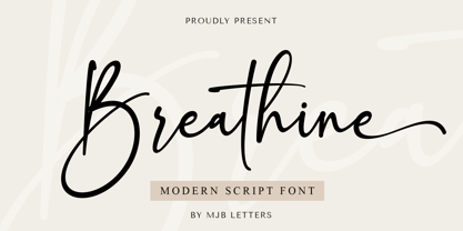 Breathine is a modern script font, with stylish looks that will add a chic elegance to design, perfect for websites, wedding stationery, modern logos, personal branding, social media quotes, and more. Files Included: Works on PC & Mac Simple installations Accessible in Adobe Illustrator, Adobe Photoshop, Adobe InDesign, and even work on Microsoft Word. PUA Encoded Characters – Fully accessible without additional design software. Thank you so much for checking out my shop, and please get in touch if you have any questions!
 - Art School by AVP,
$25.00 Faithfully reproduced from my father’s design drawings made at The Municipal School of Arts and Crafts, Wolverhampton in 1939. Strong nostalgic influences of Art Nouveau and Art Deco. What caught my eye was the consistency with which each particular character was formed: every ‘R’ like every other, every ‘S’ the same. Tight letter spacing and loose word spacing characterised his titling but he didn’t trust himself to print without first ruling guidelines, a hint of which remain in this font.
 - Mini Moniker by AnkaDrozd,
$27.00 Mini Moniker Simple Font Elevate your design simplicity with Mini Moniker, a digital font that embodies the essence of minimalism. Perfectly curated for short phrases and print design, this font brings a clean and understated style to your creative projects. Each letter is a testament to the beauty found in simplicity, making Mini Moniker the ideal choice for those seeking a sleek and modern aesthetic. Enhance your visual language with this versatile font and let your words speak with clarity and elegance.
 - Andes Condensed by Latinotype,
$29.00 Andes, designed by Daniel Hernández, is a display typeface that has neo-humanist characteristics. Its different terminals, among other elements, give it a look of mixed typography. Andes is a typeface with 10 Upright weights ,10 Italics & Condensed version, ranging from Ultra Light to Black, each of the same x-height. This typeface contains additional italic glyphs (a, y, z, g) that help to emphasise text or words. Andes is based on the design of Merced and both of them share several features.