10,000 search results
(0.023 seconds)
- Mowera by Tebaltipis Studio,
$15.00 Mowera a new fresh & modern serif with a strong style, a dancing baseline! So beautiful on invitation like greeting cards, branding materials, business cards, quotes, posters, and more! Mowera Display Typeface is the part of a strong and modern Bold display. This typeface both impressive at display sizes and easily readable in text size, while the sharp shapes of the triangular serif and the distinctive letter shapes show their strength in logo design and impressive editorial use. WHAT'S YOU GET ? Unique Letterforms Works on PC & Mac Simple Installations Accessible in the Adobe Illustrator, Adobe Photoshop, Microsoft Word Fully accessible without additional design software. I really hope you'll get pleasure using Pagers font and it will be perfect addition to your font collection! Contact me with an inbox message If you have any question. Thank you! Happy Creating.
 - Alternoon by Putracetol,
$22.00 Alternoon - Ligature Display Font. Alternoon inspired by the ligature style and well balanced curves. Alternoon font makes for more fun, trendy and more lively. Alternoon has a surprise from alternate that will make your work display even more beautiful. Alternoon perfect for a professional touch which makes it even more unique ligature and classic display font. But Alternoon is also suitable for logos, branding, greeting cards, invitation cards, advertisements, titles, headlines, book titles, stickers, packaging, quotes, posters, t-shirts/apparel, billboards and others. The alternative characters were divided into several Open Type features such as Swash, Stylistic Sets, Stylistic Alternates, Contextual Alternates, and Ligature. The Open Type features can be accessed by using Open Type savvy programs such as Adobe Illustrator, Adobe InDesign, Adobe Photoshop Corel Draw X version, And Microsoft Word. This font is also support multi language.
 - Ragwort by Putracetol,
$28.00 Ragwort - Display Sans Serif Font. Ragwort font makes for more fun, trendy and more lively. This font is inspired by the extra bold font style and well balanced curves.This font has a surprise from alternate that will make your work even more beautiful. This font is perfect for a professional touch which makes it even more unique and classic. But this font is also suitable for logos, branding, greeting cards, invitation cards, advertisements, titles, healines, book titles, stickers, packaging, quotes, posters, t-shirts/apparel, billboards and others. The alternative characters were divided into several Open Type features such as Swash, Stylistic Sets, Stylistic Alternates, Contextual Alternates, and Ligature. The Open Type features can be accessed by using Open Type savvy programs such as Adobe Illustrator, Adobe InDesign, Adobe Photoshop Corel Draw X version, And Microsoft Word. This font is also support multi language.
 - Going Clap by Ahmad Jamaludin,
$17.00 Introducing Going Clap, the font that's all about bold and nostalgic vibes! This chunky slab serif typeface is your secret weapon for making text pop with artistic and vintage flair. With 8 unique font families, including Condensed, Normal, Semi Expanded, Expanded, and their cool shadow versions, you'll find the perfect style for any project. But that's not all! When you choose Going Clap, you'll also get a fantastic bonus—56 retro mascot illustrations for that extra touch of character and nostalgia. What's included? Going Clap Main File Has 8 fonts: Condensed, Normal, Semi Expanded, Expanded, Condensed Shadow, Normal Shadow, Semi Expanded Shadow, Expanded Shadow Instructions (Access special characters, even in Cricut Design) Unique Letterforms Works on PC & Mac Simple Installations Accessible in Adobe Illustrator, Adobe Photoshop, Microsoft Word even Canva! PUA Encoded Characters. Fully accessible without additional design software. Thank you, Dharmas Studio
 - Bessemer by Sivioco,
$10.00 Bessemer is an all-caps sans-serif display font inspired by industrial lettering from the 20th century. On its own, it has a predominantly factory-made feel, but is versatile enough to work well in a variety of settings. In other words, it feels just at home on a series of technical guides as it does on a range of hair styling products. Bessemer comes in 5 weights ranging from Light to Bold and has been designed with chamfered edges. This makes it really easy to customize and create your own custom type. It also includes the following OpenType features: • Proportional Lining Figures • Tabular Lining Figures • Superior & Inferior Figures • Numerators & Denominators • Ordinals • Fractions Perfect for logos, posters, t-shirts, packaging and use in video. Delivered in TTF and OTF format. Supports all Western, Central and South Eastern European languages.
 - Mr Anteater by Hipopotam Studio,
$20.00 Hand drawn serif typeface designed for one of our books. You can use just the regular style or set the fill style over the stroke style to get a more colorful version. It has upper and lowercase characters with up to three alternate glyphs. Build in OpenType Contextual Alternates feature will automatically set alternate glyphs depending on frequency of appearance of the same character (even in web font but only in HTML5 browsers). The script doesn’t throw random glyphs (so it won't break the layered, two colored version). For example in the word “HIPPOPOTAMUS” you will automatically get three different “P” glyphs and two “O” glyphs. It really works great but of course you can always fine tune it by hand. Mr Anteater has younger sister. Mrs Ant was designed for side notes in the same book.
 - Monieta by Almarkha Type,
$35.00 Monieta -is a Adorable Script Calligraphy font with a natural handwritten feel. It has lovely ligatures and alternates that are perfect for any creative design. This handmade font will make your design has a beautiful natural touch for each details. It is perfect for any design project as Invitation,logo, book cover, craft or any design purposes. This font is PUA encoded which means you can access all of the magical glyphs and swashes with ease! It also features a wealth of special features including alternate glyphs and ligatures. Simple installationsAccessible in the Adobe Illustrator, Adobe Photoshop, Adobe InDesign, even work on Microsoft Word. PUA Encoded Characters – Fully accessible without additional design software. Fonts include multilingual support Image used : All photographs/pictures/vector used in the preview are not included, they are intended for illustration purpose only. Cheers! Thank You
 - Duero by Eurotypo,
$34.00 The Duero is one of the major rivers of the Iberian Peninsula, flowing from its source across northern-central Spain and Portugal to its outlet at Porto. The "Duero viñatero", is an area of the Duero Valley where its famous wines are produced. "Duero", a new script font designed by Olcar Alcaide. Its slight bounce and intentional irregularity gives your words a wonderful flow. The thick and thin strokes in this typeface combine balance and harmony. "Duero" has OpenType features such as Stylistics and Contextual alternates, Swashes, Ligatures, that allow you to mix and match pairs of letters and a Central European language support to fit your design. This will help your creativity and make it easier to make the impressive and elegant typographic work. "Duero" looks good on food packaging, logo design, business-cards, fashion, magazines, menus, book covers and much more!
 - Catsy by Fenotype,
$30.00 Catsy is a cute and curly upright script family. Catsy is great for any kind of display use from packaging to poster to headlines. Catsy makes clear word images but if you want more curly action try Swash, Stylist or Titling Alternates on any OpenType savvy software. If that isn’t enough you can manually select from even more alternates from Glyph Palette: Each version of Catsy contains more than 700 glyphs. Keep Standard Ligatures on for smooth flow. Catsy Printed is a texturised version of Catsy. Catsy Printed also has softer features than Catsy. Catsy Ornaments is a pack of 86 extra swashes, badges, ornaments and swirls designed to play with the font, though they work nice on their own as well. For the best price purchase Catsy Family, Catsy Printed Family or Catsy Complete Family.
 - Allogist by Dora Typefoundry,
$17.00 Introducing Elegant Serif Font Allogist is a new elegant serif font that will add a touch of luxury and sharp diamond dots add a slick yet legible Persian style. This versatile font is Perfect for editorial projects, magazine headers, Logo designs, Clothing Branding, product packaging, and showcases masculine and feminine qualities. Allogist is equipped with uppercase, lowercase, numbers and full punctuation + Multi language support and PUA-encode. To activate the OpenType Stylistic alternative, you need a program that supports OpenType features such as Adobe Illustrator CS, Adobe Indesign & CorelDraw X6-X7, Microsoft Word 2010 or a later version. Features: • 3 Font weight • Uppercase & Lowercase letters • Alternative & Ligature Styles • Numbers & Punctuation • Characters with accents • Supports Multiple Languages This type of family has become a work of true love, making it as easy and enjoyable as possible. I really hope you enjoy it!
 - Palmstar by Fauzistudio,
$40.00 Introducing vintage and classy display serif with a little touch of 3D to make your work more real so that readers are hypnotized by your work.
 - Marie Jeanne by A New Machine,
$19.00 Marie Jeanne is a handmade font created with a casual feel that works well at larger sizes in headers or titles. Also works great in branding applications.
 - HWT Van Lanen by Hamilton Wood Type Collection,
$24.95 In 2002 Matthew Carter was commissioned to create a new design to be cut in wood by the then nascent Hamilton Wood Type Museum. This was significant in that this was the one format for which Carter had not yet designed type. The new design emerged as a two-part chromatic type to be cut specifically in wood. Originally called Carter Latin, the font was renamed Van Lanen after one of the Museum's founders. The first cutting and printing of the type took place in late 2009 and although it has been available through the Museum, contemporary wood-type production is expensive and few have acquired this font in wood. The digital version of the pair of Van Lanen fonts is now available. The design recalls Antique Latin wood type, but with a refined sensibility and intentional quirks (like the sideways ampersand). It is a wonderful addition to Carter's oeuvre, and to the ongoing history of wood type.
 - Birthday Doodles by Outside the Line,
$19.00 Birthday Doodles.... cakes, hats, banners, flags, confetti, streamers, balloons, noise makers, and some written and printed words. Plus a full set of numbers. Everything you need to make cards, invitations, and to scrapbook all your parties.
 - Autumn Stories by Tlatous Type,
$19.00 Introducing Autumn Stories by Tlatous Type. Autumn Stories is a Modern Script Handwritten Font. This font is perfect for product packaging, branding project, megazine, social media, wedding, or just used to express words above the background.
 - FM Birthday 1.0 by The Fontmaker,
$20.00 FM Birthday 1.0 consists of 26 birthday related words and phrases -- all custom made and handwritten. Add a personal touch to your greeting cards or party invitation designs with the help of these hand lettered captions.
 - Gemstone JNL by Jeff Levine,
$29.00 A late-19th Century song book entitled "Gems of Scotland - A Beautiful Collection of Scottish Songs" had the words "Gems of Scotland" hand lettered in an ornate, condensed type style now reproduced digitally as Gemstone JNL.
 - Drawing Tablet JNL by Jeff Levine,
$29.00 Drawing Tablet JNL was created based on those two words hand-lettered on the cover of a sketch pad from the late 40s - early 50s. It is reminiscent of the popular Deco typefaces of the time.
 - Souplesse by Hanoded,
$15.00 Souplesse (flexibility in French) is a nice, uncomplicated typeface; happy beyond words, yet with a bit of a bite. The glyphs have a rough edge, yet remain very legible. Souplesse comes with a bagful of diacritics.
 - Pantomime by Alan Meeks,
$45.00 Pantomime is an original and unusual casual Roman Script. Designed for using at larger sizes and headlines I have spaced the fortnight, as I believe this is the most effective way for producing interesting word patterns.
 - Joyline Notes by Essentials Studio,
$16.00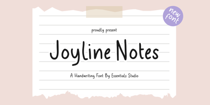 introducing by Essentials Studio Proudly Present, Joyline Notes Delmonte Is a A Cute Handwritten Font Delmonte is perfect for product packaging, branding project, megazine, social media, wedding, or just used to express words above the background.
 - Arizona Futur by Fonts of Chaos,
$10.00 Hello. Arizona Futur is a pixel font with little pixel guys. Easy to use to make cool artworks. The little guys have the same size than the alphabet. So you can mix the words with illustration.
 - Babydance by Aestherica Studio,
$12.00 Introducing the new Handwritten Script Font by Aestherica Studio. Babydance is perfect for product packaging, branding project, megazine, social media, wedding, or just used to express words above the background. Babydance also multilingual support. Thank You
 - Syahilla by Essentials Studio,
$16.00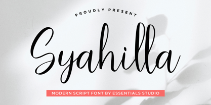 Introducing by Essentials Studio Proudly Present, Syahilla Syahilla Is a A Modern Handwritten Script Font Syahilla is perfect for product packaging, branding project, megazine, social media, wedding, or just used to express words above the background.
 - Frinch Cobeans by Essentials Studio,
$16.00 Introducing by Essentials Studio Frinch cobeans Is a Modern monoline Font Include 50+ stylish Alternate minadine is perfect for product packaging, branding project, megazine, social media, wedding, or just used to express words above the background.
 - Geographica Hand by Three Islands Press,
$39.00 Geographica Hand replicates the neat hand-lettering typical of engraved British maps of the 18th century, including the work of cartographers Emanuel Bowen (circa 1694–1767), Geographer to King George II, and Thomas Jefferys (circa 1719–1771) Geographica ro King George III. A kindred font to our Geographica serif family, Geographica Hand exhibits long serifs, irregular edges, and a genuinely hand-made character. Use to simulate historical materials, vintage documents, or other time-worn text. The OpenType release of Geographica Hand comes with true small capitals, contextual and historical ligatures, a series of sketchy map ornaments (e.g., trees, churches, windmills, boats), and full Latin support.
 - Mortice by ArtyType,
$24.00 I set out to create a solid, bold, strong, rugged font, one that would lend itself to any industrial type of use, and by that I mean industry in general, but probably sectors that would still be considered male preserves such as carpentry or metalwork. I thought specifically of mortice & tenon joints, whilst toying with shape and form for this self imposed challenge. I was also visualizing a router tool used for producing most wood joints nowadays. I think the general premise worked out well; in the end I settled on the name Mortice, referring to the slots or negative spaces that the matching part, or tenon would fit into.
 - Sattler by astype,
$25.00 Joseph Kaspar Sattler, one of the great German art nouveau artists created these nice initials in 1897 for the famous royal monumental book project Die Nibelunge for the Reichsdruckerei Berlin. Only 200 exclusive signed masterpieces were printed in four years from 1900 till 1904. Joseph Sattler was the art director, typographer and designer in one person. The Reichsdruckerei showed samples of the unfinished work in 1900 at the world exhibition in Paris to advertise the high craftsmanship of the German presses. Style Initials A uses the OpenType features Superscript and Scientific Inferiors to change the fill layer. You can combine up to three different color inks.
 - Serath by Letterara,
$24.00 Step into a world of bold sophistication with Serath, a remarkable blackletter font that exudes power and elegance. Its distinct and imposing design showcases uniquely shaped letters, making it the perfect choice for creations that demand a touch of distinction. Whether you're working on product packaging, branding, or any project that requires bold and daring typography, Serath will effortlessly make a statement. Unlock its full potential with its PUA encoding, granting you easy access to a wide array of glyphs and swashes. Embrace the confidence that comes with incorporating Serath into your projects, and prepare to be amazed by the remarkable results it delivers.
 - CA Moskow has a plan by Cape Arcona Type Foundry,
$20.00 Inspired by an old Russian book about Moscow’s plan to take over the world, this font was designed to give digital prints the taste of hand lettering. It’s vivid outlines and slight differences in boldness between characters give it an accurate and realistic imperfect letterpress look. It works amazingly well as a text font in small sizes and shows it’s crippled outlines only at larger sizes. »CA Moskow has a plan« has got an extensive character-set including Russian Cyrillic, the Russian Rubel and the Turkish Lira sign. Although it includes kerning, for a full simulation of letterpress print and cold-war feeling we recommend to turn it off.
 - Pinkhoff Caps by TypeFaith Fonts,
$10.00 This fantastic beautiful Amsterdam School fonts brings alive the roaring twenties and crashing thirties. An art deco typeface from the Netherlands that summons a thirties vibe for a nostalgic twist on chic lines. It's the work of designer Leon Hulst, and you can see from the layout examples here that nostalgia means ruin, and it has become super cool to use a ruin vibe in retro aesthetics. Yep, there's a touch of class to that worn out look and feel, and the beautiful lines of the typography and numerals show how the barely restrained charisma of art deco can be coupled with the new obsession with all things vintage.
 - Askey by Craft Supply Co,
$20.00 Askey - The Funky Serif Font is a bold and expressive typeface that channels the spirit of funk and creativity. With its unique and unconventional serifs, Askey exudes a sense of artistic flair and individuality. This font is perfect for projects that seek to make a statement and stand out from the crowd. Whether you're working on posters, album covers, or any design that demands a touch of funkiness, Askey adds a distinctive and charismatic charm. Askey is like a burst of creativity in the world of typography, making it an ideal choice for projects that want to embrace a bold and unconventional style, exuding confidence and originality.
 - Astro by Just My Type,
$20.00 When Sputnik launched in 1957, the world was launched into the Space Age, baby! It was rockets and soda shops, souped-up jalopies and Fairlane convertibles with radios blaring. Rock and Roll. American Bandstand and the Race to Space. Astro aims to call back those exciting days with a look that might have graced the sign of your local drive-in or donut shop. The uppercase characters look like they could fly, suggesting spacecraft, UFOs. Use it for Retro future events or business branding. It also seems to work exceptionally well, strangely, with French, Icelandic, Japanese and African names and anything to do with fish.
 - Brush Type Standard by Brush Art Design Office,
$39.50I created the brush font named "BrushType Standard" in my unique brush style. I made it for ad designers. I believe this is the only one brush font in the world, so using it will enable them to get easily satisfied on their work. Brush handwriting in Japan has a long and proud Tradition and History. I tried to interject this feeling of Tradition into my font designs for you to comprehend its true meaning. I trust I have succeeded to convey my feelings to you. In addition, I can say each letter of the "BrushType Standard" is truly art. I am a pioneer of Brush Art. - Rama Slab by Dharma Type,
$19.99 Rama Slab is an antique slab serif designed inspired by 1800s-style wood type. All glyphs have been designed carefully to be retro-looking to fill the viewer with nostalgia. This condensed font family with 18 styles is a great solution for posters, titles and anywhere you need impact. To complete your work perfectly, Gothic Extras family is ready for free. They include borders, ornaments and frames designed using vintage catalog of Hamilton in 1800s as a model. Incidentally, -r- has its alternative glyph that can be used with OpenType salt feature. Be sure to check out the sans serif style of this Rama series named Rama Gothic.
 - Erotica by Lián Types,
$49.00 “A picture is worth a thousand words” and here, that’s more than true. Take a look at Erotica’s Booklet; Erotica’s Poster Design and Erotica’s User’s Guide before reading below. THE STYLES The difference between Pro and Std styles is the quantity of glyphs. Therefore, Pro styles include all the decorative alternates and ligatures while Std styles are a reduced version of Pro ones. Big and Small styles were thought for better printing results. While Big is recommended to be printed in big sizes, Small may be printed in tiny sizes and will still show its hairlines well. INTRODUCTION I have always wondered if the circle could ever be considered as an imperfect shape. Thousands of years have passed and we still consider circles as synonyms of infinite beauty. Some believe that there is something intrinsically “divine” that could be found in them. Sensuality is many times related to perfectly shaped strong curves, exuberant forms and a big contrasts. Erotica is a font created with this in mind. THE PROCESS This story begins one fine day of March in 2012. I was looking for something new. Something which would express the deep love I feel regarding calligraphy in a new way. At that time, I was practicing a lot of roundhand, testing and feeling different kinds of nibs; hearing the sometimes sharp, sometimes soft, sound of them sliding on the paper. This kind of calligraphy has some really strict rules: An even pattern of repetition is required, so you have to be absolutely aware of the pressure of the flexible pen; and of the distance between characters. Also, learning copperplate can be really useful to understand about proportion in letters and how a minimum change of it can drastically affect the look of the word and text. Many times I would forget about type-design and I would let myself go(1): Nothing like making the pen dance when adding some accolades above and below the written word. Once something is mastered, you are able to break some rules. At least, that’s my philosophy. (2) After some research, I found that the world was in need of a really sexy yet formal copperplate. (3) I started Erotica with the idea of taking some rules of this style to the extreme. Some characters were drawn with a pencil first because what I had in mind was impossible to be made with a pen. (4) Finding a graceful way to combine really thick thicks with really thin hairlines with satisfactory results demanded months of tough work: The embryo of Erotica was a lot more bolder than now and had a shorter x-height. Changing proportions of Erotica was crucial for its final look. The taller it became the sexier it looked. Like women again? The result is a font filled with tons of alternates which can make the user think he/she is the actual designer of the word/phrase due to the huge amount of possibilities when choosing glyphs. To make Erotica work well in small sizes too, I designed Erotica Small which can be printed in tiny sizes without any problems. For a more elegant purpose, I designed Erotica Inline, with exactly the same features you can find in the other styles. After finishing these styles, I needed a partner for Erotica. Inspired again in some old calligraphic books I found that Bickham used to accompany his wonderful scripts with some ornated roman caps. Erotica Capitals follows the essentials of those capitals and can be used with or without its alternates to accompany Erotica. In 2013, Erotica received a Certificate of Excellence in Type Design in the 59th TDC Type Directors Club Typeface Design Competition. Meet Erotica, beauty and elegance guaranteed. Notes (1) It is supossed that I'm a typographer rather than a calligrapher, but the truth is that I'm in the middle. Being a graphic designer makes me a little stubborn sometimes. But, I found that the more you don't think of type rules, the more graceful and lively pieces of calligraphy can be done. (2) “Know the forms well before you attempt to make them” used to say E. A. Lupfer, a master of this kind of script a century ago. And I would add “And once you know them, it’s time to fly...” (3) Some script fonts by my compatriots Sabrina Lopez, Ramiro Espinoza and Alejandro Paul deserve a mention here because of their undeniable beauty. The fact that many great copperplate fonts come from Argentina makes me feel really proud. Take a look at: Parfumerie, Medusa, Burgues, Poem and Bellisima. (4) Some calligraphers, graphic and type designer experimented in this field in the mid-to-late 20th century and made a really playful style out of it: Letters show a lot of personality and sometimes they seem drawn rather than written. I want to express my sincere admiration to the fantastic Herb Lubalin, and his friends Tony DiSpigna, Tom Carnase, and of course my fellow countryman Ricardo Rousselot. All of them, amazing.
 - Prillwitz Pro by preussTYPE,
$49.00 Johann Carl Ludwig Prillwitz, the German punch cutter and type founder, cut the first classic Didot letters even earlier than Walbaum. The earliest proof of so-called Prillwitz letters is dated 12 April 1790. Inspired by the big discoveries of archaeology and through the translations of classical authors, the bourgeoisie was enthused about the Greek and Roman ideal of aesthetics. The enthusiasm for the Greek and Roman experienced a revival and was also shared by Goethe and contemporaries. »Seeking the country of Greece with one’s soul«. All Literates who are considered nowadays as German Classics of that time kept coming back to the Greek topics, thinking of Schiller and Wieland. The works of Wieland were published in Leipzig by Göschen. Göschen used typefaces which had been produced by until then unknown punch cutter. This punch cutter from Jena created with these typefaces master works of classicist German typography. They can stand without any exaggeration on the same level as that of Didot and Bodoni. This unknown gentleman was known as Johann Carl Ludwig Prillwitz. Prillwitz published his typefaces on 12th April 1790 for the first time. This date is significant because this happened ten years before Walbaum. Prillwitz was an owner of a very successful foundry. When the last of his 7 children died shortly before reaching adulthood his hope of his works was destroyed, Prillwitz lost his will to live. He died six months later. His wife followed him shortly after. The typeface Prillwitz as a digital font was created in three optical styles (Normal, Book and Display). The typeface Prillwitz Press was created especially for a printing in small sizes for newspapers. »Prillwitz Press« combines aesthetic and functional attributes which make written text highly readable. It was originally designed for a newspaper with medium contrast to withstand harsh printing conditions. Its structure is quite narrow which makes this typeface ideal for body text and headlines where space is at premium. For the Normal – even more for the Book – a soft and reader-friendly outline was created through a so-called »Schmitz« and optimized in numerous test prints. The arris character and the common maximal stroke width contrast of the known classicist typefaces (Didot/Bodoni) were edited by the study of the original prints. This was also done in order to reach a very good readability in small type sizes. This typeface is perfectly suited to scientific and belletristic works. Accordingly it has three styles: Regular, Bold and Italic as Highlighting (1). The typeface Prillwitz is a complete new interpretation and continuing development of the conservated originals from 1790. They have been kept in the German Library in Leipzig. It was always given the priority to keep the strong roughness and at the same time optimizing the readability of this striking font. The type family has all important characters for an efficient and typographic high quality work. ----------- (1) Accentuation of particular words or word orders (e.g. proper names, terms etc.). Typographic means for Highlighting could be Italic, SmallCaps or semi-bold.
 - Moliere by Eurotypo,
$44.00 The life of Molière is a story of struggle, hard work, domestic unhappiness, death and burial in obscurity and almost in shame. Molière left behind a body of work that not only changed the face of French classical comedy, but has also come to influence the work of other dramatists from around the world. Despite his own preference for tragedy, which he had tried to further with the Illustre Théâtre, Molière became famous for his farces, which were generally in one act and performed after the tragedy. Both the comic and the serious drama were powerfully affected by the work of Molière, not only in his own age and country but everywhere and up to the present time. Didot is a name given to a group of typefaces named after the famous French printing and type producing family. The classification is known as modern, or Didone. The typeface we know today was based on a collection of related types developed in the period 1784–1811. Firmin Didot cut the letters, and cast them as type in Paris. Along with Giambattista Bodoni of Italy, Firmin Didot is credited with establishing the use of the "Modern" classification of typefaces. The types that Didot used are characterized by extreme contrast in thick strokes and thin strokes, by the use of hairline serifs and by the vertical stress of the letters. As in the extreme contrasts of the literature of Molière, in Didione's typefaces, thick and thin strokes, straight and curved, are the most relevant characteristic for an era marked by the changes.
 - Tough Talk by Comicraft,
$29.00 What's that, bub? Looking for a whole train full of whupass? A six pack of adamantium shred? Listen, are you talking to me or chewing a brick? Either way you're gonna get all your teeth broken. And if you think that's all just Tough Talk, make your move, bub. (Our new font, ToughTalk, put the words in Wolverine's mouth in the pages of Steve Skroce's WOLVERINE: BLOOD DEBT, but don't tell the short Canadian over there, he's likely to get upset at the mere suggestion that people put words in his --) What? No, I didn't, uh, say you were -- ulp -- short...
 - Admire Gustavo by Balpirick,
$15.00 Admire Gustavo is a Handbrushed Font. Our handwritten font takes inspiration from the fluidity and uniqueness of human handwriting, ensuring that each letter carries a sense of character and charm. With its graceful curves and delicate strokes, this font adds an intimate and personal feel to your written words. Perfect for creating notes, memos, journal entries, or beautiful quote designs, our handwritten font elevates your messages with a sense of authenticity and warmth. It transforms your ordinary words into a beautiful composition, breathing life into your writing. - also multilingual support Enjoy the font! Feel free to comment or feedback! Thank you!