10,000 search results
(0.043 seconds)
- Golden Estella by Timurtype,
$14.00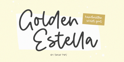 Introducing by Timur type Proudly Present, Golden Estella Golden Estella A Handwritten Script Font Golden Estella is perfect for product packaging, branding project, megazine, social media, wedding, or just used to express words above the background. Golden Estella multilingual support. Embelish your designs with our original fonts.Enjoy the font,Thank you!
 - Codswallop by Hanoded,
$20.00 The origin of the word Codswallop is uncertain, but it might have something to do with a 19th century English soft drink brewer named Hiram Codd. Codswallop is a beautiful hand drawn font. A little weird, a tad grotesque and a wee bit over the top, but fun and useful nonetheless.
 - Paramount by Aestherica Studio,
$12.00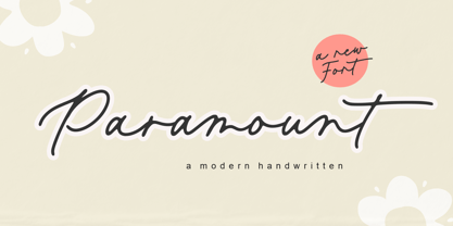 Introducing the new Fun Handwritten Font by Aestherica Studio. Proudly Present, Paramount Paramount is perfect for product packaging, branding project, megazine, social media, wedding, or just used to express words above the background. Paramount also multilingual support. Enjoy the font, feel free to comment or feedback, send me PM or email.
 - Label Machine JNL by Jeff Levine,
$29.00 Label Machine JNL is Jeff Levine's take on the embossed labels popularly used for years as a marking and identifying method. This font has a limited character set. On the left bracket is a wide blank for label ends, and the right bracket has a narrower space for use between words.
 - YT basic Latin by Yangtype,
$9.00 The reason you should buy this font is simple and clear. This is because we have accumulated experience in realistic typography. This typeface exists as a unity with diversity. The intuitive form of letters and the subtlety of letter spacing create artistic value in the combination of words and sentences.
 - Slagless by Almarkha Type,
$29.00 Hello Introducing, Slagless - Urban Display Serif is unique font that uses 19 ligatures to smoothly link letters. inspired by the famous urban logo, perfect for the purposes of designing templates, brochures, videos, advertising branding, logos and more. Perfect for adding a unique twist to word-mark logos, monograms or pull quotes.
 - Grounds Crew Stencil JNL by Jeff Levine,
$29.00 The opening title from the 1943 Abbott and Costello comedy ”It Ain't Hay” shows a park bench with the words “Universal Presents” stenciled on it in a chamfered sans serif style. This served as the design model for Grounds Crew Stencil JNL, which is available in both regular and oblique versions.
 - Midspicy by Allouse Studio,
$16.00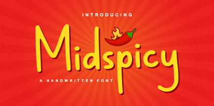 Midspicy A Handwritten Font. It is perfect for any titles, logo, product packaging, branding project, magazine, social media, wedding, or just used to express words above the background. Midspicy also come with Multi-Lingual Support. Enjoy the font, feel free to comment or feedback, send me PM or email. Thank You!
 - Mystica by Aestherica Studio,
$12.00 Introducing the new Fun Handwritten Font by Aestherica Studio. Proudly Present, Mystica Mystica is perfect for product packaging, branding project, megazine, social media, wedding, or just used to express words above the background. Mystica also multilingual support. Enjoy the font, feel free to comment or feedback, send me PM or email.
 - Jingle Binder by Balpirick,
$15.00 Jingle Binder is a Modern Handwritten Bold Font. Jingle Binder is perfect for product packaging, branding project, magazine, social media, wedding, or just used to express words above the background. Jingle Binder also multilingual support. Enjoy the font, feel free to comment or feedback, send me PM or email. Thank you!
 - Uncle Hours by Adante Creative,
$23.00 Introducing by Adante.Creative Proudly Present, Uncle Hours Uncle Hours is A Bold Display Typeface Font Uncle Hours is perfect for product packaging, branding project, megazine, social media, wedding, or just used to express words above the background. Enjoy the font, feel free to comment or feedback, send me PM or email.
 - Lexikos by ITC,
$29.00Lexikos was designed by Vince Whitlock and based on the design of the typeface Corinthian. It is a condensed sans serif typestyle with heavier horizontal weights as vertical. Lexikos is best used with close letter and word spacing and is an excellent choice for applications requiring a clean, contemporary look. - Oyscake by Allouse Studio,
$16.00 Proudly Present, Oyscake a Handwritten Font. Oyscake is perfect for any titles, logo, product packaging, branding project, megazine, social media, wedding, or just used to express words above the background. Oyscake also come with Multi-Lingual Support. Enjoy the font, feel free to comment or feedback, send me PM or email.
 - Black Delights by Mokatype Studio,
$19.00 Hello Introducing, Black Delights - Elegant Ligatures Connected Serif is an elegant and unique font that uses ligatures to smoothly link letters. Perfect for adding a unique twist to word-mark logos Black Delights has 16 ligatures as well making it super fantastic.Ligature can be turned off if required standard writing needs.
 - Forsty Candy by Balpirick,
$15.00 Forsty Candy is a Fun Display Hand-brushed Font. Forsty Candy is perfect for product packaging, branding project, megazine, social media, wedding, or just used to express words above the background. Forsty Candy support multilingual. Enjoy the font, feel free to comment or feedback, send me PM or email. Thank you!
 - Epicgant by Viaction Type.Co,
$25.00 Epicgant is a sans serif font with elegant characters. Epicgant is perfect for your elegant-themed work, suitable also for elegant vintage. This font is available in two font style variants, making it easy to do work on various design themes. Epicgant is equipped with multilingual accents. Check out the latest Viaction Type.Co font products : Matrole : https://www.myfonts.com/fonts/viaction-type/matrole/ Baskar : https://www.myfonts.com/fonts/viaction-type/baskar-stc/ Get it now Epicgant Family fonts, to add to your collection and work solutions. Thanks.
 - CyberNippon by MXMV Design,
$20.00 CyberNippon is a unique latin script font that references Japanese and Cyberpunk motifs. Literal translation of the name "Cyber Japan" This typeface took many months to complete and was inspired by the style and mood of cyberpunk, for whom Japanese culture is very close. Since the Japanese are inherent in perfectionism, while working on this font, I brought everything to perfection. The result of all the work was, in my opinion, a font that was perfectly verified and worked out for many hours. The main motives that are visible in this work are the modern interpretation of the classic Japanese hieroglyphic systems - hiragana and katakana. Originally, the font was completely handwritten using a calligraphic pen, and then converted to digital format.
 - Yiggivoo Unicode - 100% free

- Madison Antiqua by Linotype,
$29.99Madison Antiqua was original released as a metal typeface for hand-setting in 1965. The letters were produced by D. Stempel AG in Frankfurt, Germany. Their design was based heavily on an earlier German typeface named Amts-Antiqua, which had also been produced by Stempel. Amts-Antiqua is credited to Henrich Hoffmeister, and he developed it between 1909 and 1919. Madison Antiqua is an excellent selection for body text in magazines and newspapers. The typeface features a characteristic x-height, and attention-grabbing serifs. For a time, Madison Antiqua was associated with advertising design, because of its namesake: Madison Avenue in New York. Madison Avenue is a global center of advertising excellence. - Electro by Thinkdust,
$10.00 Electro’s neon light inspiration gives it an interesting way to draw letters. Every part of this font could be part of a circuit board, with no lines doubling over or tracing the same path. The font stands out by occasionally taking shortcuts, such as in the E and S characters, which make up for many characters having to choose a longer route. Altogether, this constant state of quick then slow creates an unpredictability as of a surge of electricity or lightning bolt. Electro supports a number of languages with glyphs that keep up the electronic theme, and is perfect for party culture or futuristic science fiction. Like electric, this is the perfect font for shocking your audience.
 - Vtg Stencil DIN by astype,
$35.00 The Vtg Stencil DIN fonts were developed to made the most common stencil type of Germany available in digital type. Of course there are several, slightly different stencil designs from different manufactures in circulation, but all share the typical design of DIN type. » pdf specimen « Vtg Stencil DIN comes in many styles – Regular, Alt, Fabric, Halftone and Rough. The Alt style features older designs of letter “a” and figures “6” and “9”. Fabric, Halftone and Rough styles have an eroded, weathered look using up to four glyph variations of each letter. For an random effect an glyph rotator is programmed into the fonts opentype-code and applied by typing in opentype-savvy application.
 - Naylah by Arendxstudio,
$12.00 Naylah is a casual handwritten font with personal charm. With a quick sweep and a very different style, Naylah is perfect for branding projects, household design, product packaging - or as an overlay. Nalyah Alt and Alt 2 contain alternative characters, with lowercase and uppercase characters that are completely new. If you want to avoid the letters that are visible all the time to recreate custom styles, or try different tenses, just switch to this font for additional layout options. Naylah includes ligatures for several lowercase letters (double letters that are more natural). This can only be accessed through software with different devices or flying machine panels, eg Photoshop / Illustrator. Come and say hello on Instagram! https://www.instagram.com/aseprendii.otf/
 - Kristall Now Pro by Elsner+Flake,
$49.00 The design of Kristall Grotesk Now is based on a cut by Wagner & Schmidt, Leipzig, from the 30s of the last century as well as the digital version Kristall Grotesk MdK, created for the Stiftung Werkstattmuseum für Druckkunst. The implementation of the Kristall Grotesk MdK, a headline font, was deliberately created as a replica to create a faithful reproduction of the original. The design of the complete family Kristall Grotesk Now is based on the one cut Kristall Grotesk Buchschrift by Johannes Wagner GmbH, 1937, with its function as a text family. Designer: in parts Johannes Wagner GmbH, Redesign Elsner+Flake, Hamburg Designdate: 1937, 2009 Publisher: Elsner+Flake Design Owner: Elsner+Flake Original Foundry: in parts Johannes Wagner GmbH
 - Material by Rocket Type,
$20.00 Who made this mess! Material is quintessential paint brush font fun. A little bit grunge, little bit 80s chic. Material is rated R for adult content and violence, violence to the american alphabet. This font soars just like KITT in Knight Rider. Part virtuoso part New Kid On The Block. Feels like you’re painting those letters on yr’ own self! Anytime you need to make a little mess and really express yourself choose Material. This font will really give your designs some distressed authenticity. Material is great for billboards, t shirts or video productions. It’s full of smudgy love, it’s loud and is likely to offend but what better way to give your designs that highly sought after ‘edge’.
 - Rufina by TipoType,
$16.00 Rufina was as tall and thin as a reed. Elegant but with that distance that well-defined forms seem to impose. Her voice, however, was sweeter, closer, and when she spoke her name, like a slow whisper, one felt like what she had come to say could be read in her image. Rufina’s story can only be told through a detour because her origin does not coincide with her birth. Rufina was born on a Sunday afternoon while her father was drawing black letters on a white background, and her mother was trying to join those same letters to form words that could tell a story. But her origin goes much further back, and that is why she is pierced by a story that precedes her, even though it is not her own. Maybe her origin can be traced back to that autumn night in which that tall man with that distant demeanor ran into that woman with that sweet smile and elegant aspect. He looked at her in such a way that he was trapped by that gaze, even though they found no words to say to each other, and they stayed in silence. Somehow, some words leaked into that gaze because since that moment they were never apart again. Later, after they started talking, projects started coming up and then coexistence and arguments, routines and mismatches. But in that chaos of crossed words in their life together, something was stable through the silence of the gazes. In those gazes, the silent words sustained that indescribable love that they didn’t even try to understand. And in one of those silences, Rufina appeared, when that man told that woman that he needed a text to try out his new font, and she saw him look at her with that same fascination of the first time, and she started to write something with those forms that he was giving her as a gift. Rufina was as tall and thin as a reed, wrote her mother when Rufina was born. Photo (Fragilité): Karin Topolanski / Post: Raw (www.raw.com.uy) - María Pérez Gutiérrez
 - Grand Canyon by Red Rooster Collection,
$45.00 Based on an early wood type design. An original creation, that kept growing...!
 - Granny Smith by BA Graphics,
$45.00Angular serifs give this font a unique look. Works well in all applications. - Geo by BA Graphics,
$45.00A Bold Powerful Geometric design. Great headline face; works well in many applications. - Eingraviert by Intellecta Design,
$29.90 Eingraviert is based on old books capitals, with a wood type engraving style
 - Topanga JNL by Jeff Levine,
$29.00Topanga JNL is based on an ultra-condensed sans serif wood type design. - Brute Aldine by Intellecta Design,
$12.90a revival of a classic wood type font, in many family variations provided - Banished GRP by Grype,
$16.00 Banished was inspired by posters for the 1968 Cult Cinema Classic, “Astro Zombies”, but it exudes the rough and tumble, chewed up and spit out Old West era. Banished dives head first into all of the nostalgic clichés of the old west, as well as the cult classic that inspired it. Here's what's included with Banished: 388 glyphs - including Capitals, Lowercase (Alt. Capitals), Numerals, Alt. Numerals, Punctuation and an extensive character set that covers multilingual support of latin based languages. (see the 6th graphic for a preview of the characters included) Contextual Alternates that auto-switches between Capitals & Lowercase (Alt Capitals) glyphs, as well as Numerals and Alt Numerals for visual randomness. To access the Contextual Alternates feature, you will need to be using software with Opentype compatibility otherwise you can access the alternate glyphs via a Glyphs panel. Stylistic Alternates feature that swaps all default Numerals with their Alternates Numerals Font is provided in TTF & OTF formats. The TTF format is the standard go to for most users, although the OTF and TTF function exactly the same. Here's why Banished is for you: You're in need of a good rustic slab serif typestyle with a narrow width and gritty feel You're planning a Western themed party and need a unique western typeface You're a fan of the 1968 Cult Classic "Astro Zombies" as just have to have the font to match You've got one of those Old West photography studios and need a great Wanted poster font You just like to collect quality fonts to add to your design arsenal
 - Wedding by HiH,
$10.00 Wedding Regular was originally designed by Morris Fuller Benton for ATF and released as Wedding Text in 1901. It is a lighter version of his ENGRAVER'S OLD ENGLISH of the same period. Wedding Regular is based on the Textura style of blackletter that continued in popularity in England into the 16th century, long after the Dutch, French and Italians had moved to a Roman model that expressed the Renaissance humanism of the period. Wedding Headline is a still lighter version of the regular text face, suitable for setting larger sizes while still preserving the delicacy of the decorative hairlines. Textura continues in use in England and the United States for newspaper mastheads, gift shop signs, wedding invitations and programs and other applications where a feeling of tradition is desired. I recently saw an 1980ish photo of a “Tubby Isaac” sign in London using textura. I believe Benton’s design captures that feeling without being heavy-handed and still remaining quite readable for eyes accustomed to Roman lettering. Both Wedding Regular and Wedding Headline convey a comfortable familiarity. These two fonts may be purchased together at an attractive discount or they may be purchased separately. The full character set may be found in the pdf file that you can download from the gallery section. The two monks (alt-0172 and alt-0177) are from a set of sixteenth century decorative initial letters by Gering and Renbolt. Please note that there are two different eszetts, the blackletter style at alt-0126 and the antiqua style at the alt-0223.
 - Grayfel by insigne,
$- As designers, we seek perfection and originality. The more we step back and look at our work, the more changes we tend to find necessary. Drastic modifications are inevitable. The same is true of Grayfel. Grayfel began as an exercise at insigne to explore the crowded space of neutral sans. While the world of sans serifs is admittedly crowded, I still managed to find something new and different. The final Grayfel consists of 42 full-featured OpenType fonts containing three widths: Regular, Condensed, and Extended. Every width consists of 14 fonts--seven weights with matching italics, making it a good companion for setting clear text and headlines for print and screen. OpenType features are also available. There’s figure choices, such as proportional and old style figures. Additionally, Greyfel includes sophisticated typographic attributes: ligatures, fractions, alternate characters, small caps, superscripts and subscripts. Its extended character set supports Central, Western and Eastern European languages. Optical compensations also mean the outcome of this family is a hybrid of humanistic proportions. It’s a well-finished design with optimized kerning gives it a friendly look. If you like sans serifs within the tradition of Futura, Helvetica, Avant Garde and Avenir, then you’ll love Greyfel, too. Grayfel works well in a variety of applications. Subtly neutral yet fun, it’s suitable for headlines of all sizes as well as for text. Put it to the task for marketing, packaging, editorial work, branding and even on-screen projects. Try it out: it’s not just fun and playful; it’s Grayfel.
 - America Line by Kustomtype,
$30.00 Since its foundation in 1901, the iconic building in the Rotterdam neighborhood Kop van Zuid, is shining. Where previously the Holland America Line was housed, you will now find Hotel New York. A building with a tremendous history. We’re glad to take you back in time with captivating memories. In 1991, catering entrepreneurs Daan van der Have, Hans Loos and Dorine de Vos refurbished the at the time vacant property into a hotel/restaurant. To honor its 25 years existence, we celebrate this happening with a brand-new font, ‘America Line’. A tribute to Wim ten Broek, the multi-talented Dutch Graphic Designer. As early as the 1930’s before the Second World War, Wim ten Broek made the famous posters for the Holland-America Line. The influence of A.M. Cassandre here in, is clearly recognizable. Wim ten Broek also worked for HAL with large surfaces and fixed lines in which primary colors dominate, accentuated with shadows acquired by spraying technique. He also made graphic works for, among others, the World Exhibition in New York, the Dutch railway company ‘Werkspoor’ and the royal Dutch steel factory ‘Hoogovens’. His drawings and lettering gave me a love for the trade and naturally gave me a completely different view on fonts. That’s how I slowly but surely made my way to the trade. Based on the letters I had at my disposal from the Holland – America Line poster, I started to complete the alphabet in the same style as the original text. I digitized everything in order to acquire a usable and modern font. The Holland America Line Font comes with uppercase and lowercase with all the needs of modern times to create a good digital font and to be able to use it for all graphic purposes. The font is ideal for headtext, posters, logos, etc... Don't hesitate and use this unique historical font! It will give your work that glamour that you will find in few fonts. Enjoy the Holland America Line. The Holland America Line Font comes with uppercase, lowercase, numerals, punctuations so you can use the Holland America Line font to customize all your designs. The Holland America Line font is designed by Coert De Decker in 2018 and published by Kustomtype Font Foundry. The Holland America Line Font can be used for all graphic purposes. It is ideal for headtext, posters, logos, logos, letterhead, apparel design, package design, label design etc... Don't hesitate any longer and enjoy this unique historical font! It will give your work the glamour that you will only find in a few fonts. Enjoy your journey with the Holland America Line!
 - Iwan Stencil by Linotype,
$40.99 Iwan Stencil is a new revival of an old display typeface. Based on type originally designed by Jan Tschichold in 1929, the style was revived by Klaus Sutter in 2008. The letterforms in this peculiar design are very high contrast; all of the thin bits are much thinner than the thick parts. They have a modern, upright axis. All in all, the creation has a bit of a Bodoni-gone-crazy touch. The thin elements are the unique part of the design that binds this face together. They almost naturally fade away in the stencil gaps (or pylons), making you wonder if you are really looking at a stencil face at all. These thins contribute greatly to the typeface's overall serif-style, making the design at least a semi serif typeface, if not a full serif one. The lowercase n, for instance, has no serifs of its own, but many of the other letters have clear ones, or serif-like terminals. A serif stencil face is a peculiar variety, especially in this day and age, but in the past they were much more common, if not the norm, The Iwan Stencil typeface has only one weight. Naturally, this is just for display. Use Iwan Stencil to cut real stencils, or only to create the effect of stenciled type in your design work. Ivan Stencil includes all of the characters that you have come to expect in a font. Just because this design was originally made in 1929 does not mean that is has a 1929 character set. Instead, it includes a 21st century, with extended European language support Jan Tschichold, who we have to thank for today's Iwan Stencil inspiration, was a man of many faces. A trained calligrapher who went on to codify the New Typography, would go on to become a teacher, a classical book designer, and the creator of the Sabon typeface. Like all young designers, he was occasionally in need of money. Before his emigration from Germany in 1933, he took on many kinds of commissions. In the late 1920s, a time full of waves of economic turmoil within Germany and across the world, he began designing a typefaces for different European companies, mostly display things like this. For a time during the mid-1920s, Jan Tschichold went by the name Iwan" "
 - Zennor by ITC,
$29.99Zennor is the work of British designer Phill Grimshaw, a bold italic brush script with slick, dashing letterforms with an almost globular quality. Its uppercase can be used alone or as initials with a strong, authoritative lowercase. Zennor is an ideal choice for work requiring a casual yet confident look. - Hollyweird by ITC,
$29.00Hollyweird is another original, funky work of California designer Jill Bell, a bold display script with intentionally shaky strokes and tightly curled flourishes. The capitals are ideal as initials and the lowercase is best used tightly set. Hollyweird is a good choice for any work requiring a casual chic appearance. - Michiamelly by Nandatype Studio,
$10.00 Michiamelly is a fancy, bold font with multilingual support. This is a very versatile font that works well in both large and small sizes. Michiamelly is perfect for branding projects, logos, wedding designs, social media posts, advertising, product packaging, product design, labels, photography, watermarks, invitations or any project you're working on.
 - Destroyer by Comicraft,
$19.00 You wanted the best and you got the best - the hottest fonts in the world jumping off the pages of the hottest comic in the world -- KISS: PSYCHO CIRCUS. Now you can all journey into the void with the KissAndTell and Destroyer fonts handcrafted by headbangin' John Roshell. Lick it up!
