10,000 search results
(0.011 seconds)
- Gobsmacked by Hanoded,
$15.00 Gobsmacked is a rather new English word. It has been around since 1959 and was used mostly around Liverpool at that time. The word means: ’astounded’, ‘flabbergasted’ (another nice word!) or ‘speechless’. Gob could be of French or Scottish Gaelic origin and means ‘mouth’. Gobsmacked font was created using a brush and black gouache. The result is a very eroded, very legible and quite unique brush font. I have created alternates for the lower case letters, plus two double letter ligatures (oo and ss). Use it for any design that needs a little brushwork; I am sure the result will leave you gobsmacked!
 - The Real Font - Unknown license

- Ginan by Goodigital13,
$20.00 This font is very suitable for photography needs, decorating food designs, products, sports, weddings to poster designs.
 - KG Flavor And Frames Three by Kimberly Geswein,
$5.00 Frames and borders of various types. Also includes a series of words perfect for accenting Instagram photos.
 - Hebrew Sara by Samtype,
$26.00 This is calligraphic font. Good for posters and invitations. Best to use this font from 24pt size.
 - Butt Smuggler by Buttfaces,
$18.00Buttsmuggler is a light-hearted puffy font, good for a cartoon-like or casual hand-drawn look. - Flavour by Hubert Jocham Type,
$29.90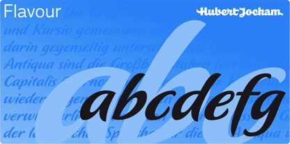 Flavour is an elegant brush script headline typeface. It is ideal for food packaging and product branding.
 - Golden Love by Autographis,
$39.50 Golden Love is a modern, compact script with short ascenders and descenders but nevertheless very good readability.
 - DB Circles - Christmas by Illustration Ink,
$3.00DoodleBat Circles - Christmas is a collection of Christmas themed words and clipart thrown together in classic circles. - Jeeks by Oleg Stepanov,
$12.00 Jeeks is a simple hand made font, good for children and comic books, cartoons, posters and games.
 - KvadratZ by ParaType,
$25.00 An original type family designed for ParaType in 2001 by Zakhar Yaschin. The fonts were created within 'One Touch' project. The aim of the experiment was searching for a grapheme through primitive forms and intentional avoiding 'adjusted' characters. The family includes Wood style imitating woodcut letters, and a set of pictograms. For use in advertising and display typography.
 - Dime Museum by Solotype,
$19.95This idea of "wrong way weights" was originally called French Clarendon by the Americans, Italienne by the French, and American by the Italians. Sounds like nobody wanted to own up to it. When it was revived by ATF in 1933, it was given the name P. T. Barnum. Many variations have appeared. Dime Museum is an old wood type. - Mule Train JNL by Jeff Levine,
$29.00 Instead of being directly based on classic wood or metal type examples, Mule Train JNL takes a roundabout route in its development. Images of a set of letters and numbers cut from plywood (which in turn were based on a vintage type design) served as the work models. Mule Train JNL is available in both regular and oblique versions.
 - Rachelle JNL by Jeff Levine,
$29.00One of Jeff Levine's friends kept requesting that he name a font after her, and he finally obliged with Rachelle JNL. The font gets its inspiration from the antique wood type version of the popular font most often known as a Latin typeface - complete with spur serifs and all of the usual quirks of wooden type. - ITC Golden Cockerel by ITC,
$40.99ITC Golden Cockerel font is based on designs created by Eric Gill in 1929 for the Gold Cockerel Press in England. These elegant and meticulously crafted typefaces were inspired by and modeled on Gill's skills of stone carving, calligraphy and wood engraving. The typeface family includes ITC Golden Cockerel Roman, Italic, Titling, and Initials and Ornaments. - Farringdon by Solotype,
$19.95An old wood type we picked up in London from the Fredrick Ullmer Company. It's not marked, and we've never seen it in a catalog, so we don't know who made it. We like it for antique-looking western posters and playbills. We added the lowercase. We have seen it used on British music hall bills. - Mercurius Script by Monotype,
$29.99 Mercurius Script font was designed by the Hungarian wood engraver and type designer Imre Reiner in 1957 for the Monotype Corporation. The expressiveness of this bold script typeface is the result of Reiner's use of a bamboo pen for Mercurius Script's elemental shapes. Used sparingly, Mercurius Script font gives even the dullest headlines genuine spirit and excitement.
 - Gullywasher NF by Nick's Fonts,
$10.00One in the series of fonts called Whiz-Bang Wood Type, intended to be set large and tight. Gullywasher is distinguished by its unusual letterforms and “pineapple” serifs. The font takes its name from a Texas term for a heavy rain. Both versions of this font include the complete Unicode Latin 1252 and Central European 1250 character sets. - Shelton Slab by HVD Fonts,
$19.00 Shelton Slab is a Typeface with an eroded, printed look. The letters seem to be from different alphabets to support the wood type feeling. Every letter has an alternate character. Shelton Slab has an extended character set to support Central and Eastern European languages and also contains arrows and other special glyphs available through the OpenType contextual alternates feature.
 - Sorvettero by Just in Type,
$30.00 Sorvettero is a sans, layered and unicase typeface inspired by some wood signs at Descansópolis, a neighborhood on Campos do Jordão, a city of Brazil. A fun and cute display project with different use purposes, like packaging, logos, signs, and whatever your creativity brings on. Designed by Diego Maldonado, with contribution of Tony de Marco on the Diamond style.
 - Goudy Titling by Matteson Typographics,
$19.95 Goudy Titling was designed by Steve Matteson. It is based on the 2" wood engravings Frederic Goudy made for his book ‘The Trajan Capitals’ - a seminal book about the history of the Roman letter. These letterforms predate the work of Father Catich’s exhaustive study of the Trajan Column and, while remarkably faithful to the inscription, have Goudy’s interpretive fingerprints.
 - Drakkar by Jorgensen-fonts,
$30.00Drakkar is a Latin typeface based on runes, the medieval script of the Vikings and Northern Europe. It imitates letters carved in wood with flared strokes. Just as the actual runes, it is a single-case font; instead of lower case letters, Drakkar has a set of slightly changed caps to enable the user to express handmade lettering. - Arts District JNL by Jeff Levine,
$29.00 Although the model for Arts District JNL was a set of wood type, the design influence is clearly from the Art Nouveau era. Note the combination of unusual flat and curved sides on many letters. Decorative, yet legible; Arts District JNL works well with any period piece or as a pleasant alternative to traditional headline fonts.
 - Axelby JNL by Jeff Levine,
$29.00 Axelby JNL was modeled from a set of die-cut, self-adhesive cardboard letters from the 1960s. The design is reminiscent of some early wood type in the way it has letters of varying widths that do not conform to any set standard. The font is perfect for plain, easy-to-read and attention-getting headlines.
 - Laguna Madre NF by Nick's Fonts,
$10.00Another addition to the Whiz-Bang Wood Type series is this ultra-condensed font, well suited for very large headlines. Named for the body of water which separates Padre Island from the mainland of Texas. Both versions of this font contain the Unicode 1252 (Latin) and Unicode 1250 (Central European) character sets, with localization for Romanian and Moldovan. - WOODTYPE Collection by Borutta Group,
$19.00 WOOD TYPE COLLECTION from Mateusz Machalski is a set of wonderful, warm, and weathered hand made typefaces designed by Mateusz Machalski. The Inspiration for this collection comes from a wooden letter blocks and other old technologies used for printing. WTC supports 40 different languages and contains over 300 glyphs per style. The Family consists of 20 typefaces. ENJOY!
 - HWT Antique Tuscan 9 by Hamilton Wood Type Collection,
$24.95 A very condensed 19th century Tuscan style wood type design with a full character set with ligatures. This design was first shown by Wm H Page Co in 1859 and this is the first digital version of this font to include a lowercase and extended European character set. This is a font best used at large sizes.
 - Wolverhampton by Greater Albion Typefounders,
$12.50 Wolverhampton is a new Neo-Victorian face from Greater Albion Typefounders. It's something of an example of starting with a small idea and running with it. This family of three typefaces (Regular, Small Capitals and Capitals) was inspired by a line of lettering seen on a late 19th Century enamel advertisement made by Chromo of Wolverhampton (hence the family name). The family grew, topsy-like, from a recreation of these initial fifteen capital letterforms to the three complete typefaces offered here. The three typefaces are ideal for advertising and poster work with a Victorian, Edwardian, or 'Steam-punk' theme. They would also be eminently suitable for signage inspired by the same eras or (as we've seen a number of our other typeface families prove very popular) for book covers of period related novels and historical works. Finally, these slender elegant display faces are just plain fun!
 - Red Border Labels JNL by Jeff Levine,
$29.00 In the pre-computer, pre self-adhesive label era of office supplies a number of companies (including Dennison, Maco and Denny-Reyburn) manufactured a wide variety of gummed labels for just about any use or purpose. Blank labels, specialty labels and decorative holiday seals were just a part of this line. One popular style was that of labels with parallel thick-and-thin borders of red lines and corners chamfered, rounded or straight cut. Occasionally, one could find similar labels with blue, green or gold borders but red was the mainstay, hence naming this typeface Red Border Labels JNL. Presented in this font is a collection of twenty-six standard and specialty shape label borders on the capital (A-Z keys) and twenty-six solid panel versions on the lower case (a-z) keys which can be used as backfills for the borders or as stand-alone labels.
 - Capo by Alias,
$60.00 The intention with Capo was to make a typeface with a pinched, angled connection between curves and verticals. We have explored this incised, cut motif previously on typefaces, most notably Noah, Sabre and Harbour. These have focussed more specifically on stone-cut forms. For Capo we wanted to mix the expressive quality of its ‘pinch’ idea with an overall aesthetic that could be applied to text rather than headline. So Capo has something of the function and warm, organic quality of Grotesque style typefaces. In Capo’s Bold and Black weights the sharpness of the letter shapes is more dramatic and emphasised, making for great effect for large-sized text. Why Capo? A capo is a device used on the neck of a stringed (typically fretted) instrument to shorten the playable length of the strings by pinching or clamping them in place, hence raising the pitch.
 - Hunkster by Heypentype,
$20.00 HUNKSTER is heypentype journey to simplified a stencil fonts. Simplified means it must easy and fast to cut when creating stencil art. Hence, this typeface inspired a lot from stencil arts and fonts right from the beginning of its creations. When a lot of stencil fonts out there used to create political message and self-expression, Hunkster take it beyond that. This typefaces can be applied to anything, from motorsports, branding, logo or logotype, industrial design, products packaging, software, games, website headlines,etc. Whatever it will be used, the spirit of the stencil and street art remains. Include in this typeface family is plenty of ligatures because the nature of stencil and our design aims, easy-to-cut but still beautiful. Most importantly its thrown away an image of stencil fonts bound on military themes. This ligatures will be developed in the future release along with updates on Hunkster variable fonts.
 - Dealers by Gumpita Rahayu,
$20.00 Back to the past when the old building and the beauty of a old store decorated by distinctive signage. With a clear feels of authentic historical value and the today's needs must be balanced in order to create the nostalgic feels. Introducing an authentic touch based on old fashioned signage developed into the wood type feels, and it's called Dealers. Dealers is a development of the classic taste wood type to form a solid blocked shapes, modern serifs, and with all caps based characters and slightly condensed. With specific characteristics, dealers font is intended for coffee shops, stores, restaurant menu that you want to create the impression of a classic and harmonious. With the addition of catchwords in the OpenType features, allowing you to be more creative to meet the requirements on the design you create.
 - FT Mammoth by Fenotype,
$19.95 FT Mammoth is a heavy and tough all-caps font. Mammoth is an ideal font for big words!
 - Putty Peeps by m u r,
$15.00Little people that appear to be made with putty stretching themselves in fun configurations to spell out words. - Hand Of Joy by Open Window,
$19.95 Fantastic, elegant, informal handwriting. It's Hand of Joy! Comes with alternate (end of word) characters with extra swooshes.
 - Hulbert by Typotheticals,
$10.00A rough hand drawn playful serif that would be good at larger than normal text use, or headlines. - Feris Script by Pedro Teixeira,
$14.00 Feris Script is a cool typeface, unexpected and informal, good for logos or to add personality to designs.
 - Hyperspit by PizzaDude.dk,
$20.00Hyperspit is really the CAPS of my other font Family Cat. They are just messed up pretty good! - Scrup by Typotheticals,
$5.00 Scrup A basic font with a science fiction influence, good for headlines and where strong text is required.
 - Oron Koteret MF by Masterfont,
$59.00 This unique font preserves the DNA of old Biblical manuscript, maintaining clear forms and shapes for good readability.
