10,000 search results
(0.019 seconds)
- Grafita by Slava Antipov,
$29.00 Grafita is a typeface pair where one font is a strict geometric grotesque and the other is more playful and display. The first typeface is good for typing large amounts of text. The second is for headlines, logos, posters, covers, spectacular presentations, and more. The combination of these two fonts would be great for branding, websites and other tasks. Each of the fonts has extensive language support, OpenType features such as ligatures, alternate characters, fractional numbers and more.
 - Manufactory JNL by Jeff Levine,
$29.00 Manufactory JNL and its oblique counterpart were re-drawn from examples of a now-antique typeface used within many advertisements found throughout the pages of The American Stationer magazine, circa 1879. The term ‘manufactory’ was popular during this era; the word being a more archaic form of ‘factory’. There is a bit of Western flavor to this type design, as the spurred serifs and the top and bottom strokes are heavier than the vertical and mid-point stroke weights.
 - Brushstrike by Zetafonts,
$39.00 The Brush Strike Family is an exercise in dynamic, gestural brush type design by Francesco Canovaro. The typeface contains no lowercase set, but it doubles the uppercase with a strikethrough alternate set to be used for dynamic logo design and unusual word highlighting. Two weights are available with consistent design: the light weight (Brushstrike Light aka Lightstrike) can work together with the heavier regular weight but can also be used in white on dark background for light effects.
 - Cindie 2 by Lewis McGuffie Type,
$49.00 Cindie 2 is an update of the optical type Cindie Mono. It retains the monospace-stacking system of the original, but some letters have been redrawn. It also now includes a lowercase and Cindie 2 has a script accompaniment (which isn’t mono and should be used with Contextual Alternates turned on!). Good for posters, branding and headlines, Cindie 2 has 26 monospaced widths which will fit any job. Cindie 2 also comes as a Variable Font.
 - Saythis Script by stiplinestudios,
$17.00 Saythis Script Upright is our latest product that need so much effort to create it. We research and do the best to make this font good for you. This is very suitable for beautiful logo, poster, magazine, photography and any other design project. Saythis Script Upright goes with Romantic and Elegant Upright Calligraphy, ready to give your design project with Fresh and Feminine Style. This font have an 264 Standard Glyph + 503 Glyph Alternate in Open Type Standard Format.
 - Misses Twiggs by Type Innovations,
$39.00 Misses Twiggs is a contemporary modern serif created by the American type designer Alex Kaczun. It compliments its partner Mister Twiggs and is a perfect marriage of two fonts. Mister Twiggs brings his tall good looks and Misses Twiggs bring her cute little serifs to the relationship. There are absolutely no curves in these elegant typefaces. Both fonts have sharp corners with extra tall capitals and narrow waistlines. Misses Twiggs also comes in 3 flavors: regular, thin and heavy.
 - Draw by Andinistas,
$37.00 Draw is a type family designed by Carlos Fabian Camargo G. Draw emphasizes the abundance of useful features to design messages with artistic purposes, spontaneous and vernacular, usually dressed in imaginative ideals to compose words, apparently drawn freehand. Draw is intended to be used in the context of graphic design as vogue, restaurants, weddings, art, clothing or imaginative supports where crafts and romance predominates. Draw contains professional typographic OpenType strategies to grant special character content: ligatures, swash and more.
 - VLNL Dream Meal by VetteLetters,
$6.00 Nowadays, everything is ‘In The Cloud’. So why not put information in clouds directly? Here it is: a happy dreamy cloudy font. It’s called Dream Meal. Don’t read, just dream away; about nice food and typographic sensations. You can set whole texts 'in the cloud'. Every character makes up a part of a cloud. The clouds can float to the left or to the right. It’s an Open Type font. Actually: This font is a dream!
 - Vintage Stencil Borders JNL by Jeff Levine,
$29.00 Vintage Stencil Borders JNL collects twenty-six decorative vintage and antique stencil border motifs for embellishing word copy set in stencil type or for any other decorative purpose. Please note: Commercial reproduction of these designs as stencils, stickers, decals, transfers, ink stamps or other decorative stand-alone products for resale requires a separate license. Contact Jeff Levine through the email address located in the PDF file provided with the font or from the online EULA text.
 - Happyfin by MNW,
$80.00 Happyfin is a sumptuous font based upon the free nature of a handwritten text, it balances the organic form with the necessary preciseness of a traditional typed font. With a smooth light hearted elegance, this font is perfect for designs involving organic produce and situations where a professional yet fun and friendly typeface is needed. The font has high readability level, and yet conveys a good deal of character and style within the simplest of forms.
 - Wooden Alphabet by Yumna Type,
$25.00 Wooden Alphabet is a peculiar wood texture and shape-inspiring display font having unique, attractive letter designs in prominent uppercases along with wood textures to express natural nuances. All of the font letters are very carefully, smoothly designed in detail as if they were made of real wood. In fact, wood textures on the letters leave the impressions of warmth and nature on the designs. Wooden Alphabet excels at the ability to create natural impressions and warm nuances in order to make your designs look interestingly different for increasing the product’s attractiveness. Such a wood-themed font is a perfect match for any nature, environment, or organic related products. To be greatly legible, you can use it for big text sizes. Wooden Alphabet provides a clipart in accordance with the font theme as a bonus and features you can enjoy. Features: Multilingual Supports PUA Encoded Numerals and Punctuations Wooden Alphabet fits best for various design projects, such as brandings, headings, magazine covers, quotes, printed products, merchandise, social media, etc. Find out more ways to use this font by taking a look at the font preview. Thanks for purchasing our fonts. Hopefully, you have a great time using our font. Feel free to contact us anytime for further information or when you have trouble with the font. Thanks a lot and happy designing.
 - Adhesive Nr. Seven by phospho,
$25.00 This sticky blackletter font owes its street credibility to the texture of torn adhesive tape. Designed to support rehabilitation of the historically tainted Fraktur, its pragmatically shaped majuscules guarantee legibility to a 21st-century readership. They even forgive all-caps usage - a thing you better not try with most blackletter types around. It contains a range of diacritics and ligatures, as well as open type features that substitute alternate glyphs for often repeating characters. With its fine tape strip details you may best use it at poster and headline sizes; at small sizes you interestingly get a nice woodcut appearance. Connoisseurs use it with style, while true blackmetal grimlords curse it for its fashionability!
 - Blackduck by Eurotypo,
$60.00 “Blackduck” font is a typical Gothic, usually named “Blackletter” . This typeface was born with the name of “Textur” and developed from Carolingian cursive. It was used in the middle age as sacred script, became increasingly narrower, his vertical lines were emphasized and his strokes very compacted to save space. Along the time the early German print typefaces derived in others styles that were more readable such as Schwabacher and Fraktur, very popular in Germany and sometimes associated to the identity of the country. The font "Blackduck" was inspired mixing carefully the last two “Blackletters”. We try to joine some characteristics of both to reach good legibility without loosing the strong impact and powerfulness of the shapes. Some minuscules like the “o” “c” “e” “d” are rounded on both sides, while both strokes join in an angle at the top and at the bottom. Some other lower cases are formed by an angular and rounded stroke. This font contains a full set of OpenType features; swashes, stylistics alternates, old style figures (Arabic numeral were carefully shape integrated), ligatures and some extras ornaments were added to help in your design. "Blackduck" includes diacritic signs for Central European languages.
 - Shape Variable Script by Roland Hüse Design,
$32.00 A shape-shaky script font that reacts to audio! Thanks to the variable font technology, fonts today can be variable be it weight, width or any other parameters that are defined by values such as shape! Even better: in html, with a bit of css (and in this case, javascript as well) it is possible to animate them between these values. This gave me the idea to create something really fun which is a quirky, informal handwritten font that can react to sound. The html file along with css and javascript is taken from codepen.io and I was using and tweaking it to this specific project. Please read more details in this pdf where you can also find link to a demo and download the txt files: https://drive.google.com/file/d/15J_6g3NgmZKJYO6SrnOHj4Rk7qltkfwE/view?usp=sharing The character set of this font contains Western, Eastern and South-Eastern Latin accented characters, special characters, basic symbols, punctuation and signs. Best use is with large size and a few words rather than large sentences. I hope you guys like it and it will add up to your next creative project! Have fun and happy creating!
 - French Script by Monotype,
$40.99French Script font is based on script handwriting and engraving used in formal announcements and invitations in general, and specifically on a 1905 ATF face named Typo Upright," by Morris Fuller Benton. French Script lends itself to typesetting in which an elegant mood is desired. French Script is an upright script font with an engraved appearance and decorative capitals. " - HWT Unit Gothic by Hamilton Wood Type Collection,
$39.95 The Unit Gothic series was released by Hamilton Manufacturing Co. in 1907. This sans serif family features one of the first multi width/weight type 'systems' anticipating the Univers font system by 50 years. This set of 7 fonts was designed to aid in press room efficiency and with its incremental variation in widths gave poster printers unprecedented flexibility in fitting copy while using consistently harmonious fonts. This HWT release is the first ever digital version of these fonts. Each font contains 600 glyphs including Greek and Cyrillic character sets as well as alternate characters which are based on the actual special character production patterns from the Hamilton Wood Type Museum collection. HWT Unit Gothic system features: •HWT Unit Gothic 716 - 50% wider •HWT Unit Gothic 717 - 25% wider •HWT Unit Gothic 718 - (Standard width which others are based on) •HWT Unit Gothic 719 - 25% narrower •HWT Unit Gothic 720 - 50% narrower •HWT Unit Gothic 721 - 62.5% narrower •HWT Unit Gothic 722 - 75% narrower
 - Glarestha by Mevstory Studio,
$25.00 Glarestha is a modern high-contrast display font with bright positive character. Clean forms and a bit curly letter ends creates a friendly mood in any designs. It comes with Regular version, Opentype features (stylistic alternates and standard ligatures). The easiest way to get alternate is to add number after character (for example A2, A3) or add Underscore after end character (for example a r). The full set of alternates you can find in font presentation. Faery Dream font is perfect for headlines, magazines, logotypes, food package, advertising and many others. Multilingual Support
 - Sortland by Tour De Force,
$30.00 Sortland is single weight font inspired with vintage serif typography. By it’s design, Sortland is condensed, contrasted and typeface with tall x-height. It radiates with distinctive charm and warmness as soft lines and rounded corners make friendly impression on words made with Sortland. Sortland recommends itself for package design, posters, outdoor and indoor graphics, logo and websites either for headlines or paragraphs. In terms of markets, it’s ideal for beverage, food and cosmetics, but also for movies, magazines and books. Comes with Small Caps and standard Ligatures.
 - Selebor by takoliko,
$10.00 Selebor is a slab serif font. Selebor inspired by the 80s and 90s vibe font. The font is perfect for you that want to create a project that have a retro feeling but not to old. it perfect for designing stickers, t-shirt, a food logo and design that used a smiley themed or vintage cartoon on it. Selebor can be used as a fun or a formal kind of project. It support multilingual language. It can easily be matched to your projects, and good for communicating your brands.
 - Mafuta by Scholtz Fonts,
$19.00Mafuta is a round, happy font, named for the Zulu word for "fat". In tribal societies in Africa, where food was often scarce and almost never easily come by, it was considered desirable to appear "well fed". Roundness was a symbol of high status in the tribe, and a sign of wealth. The up-beat, bold outline of the font celebrates the confidence of people who feel comfortable being who they are. The font manages to be both contemporary and African. It is best used for posters and for headings. - Mesh Stitch by Siren Fonts,
$10.00 Mesh Stitch has a hand-stitched look, with the capital letters/numbers being nine cross-stitches tall (+ about 3 stitches for accents). To make the font look authentic, I stitched some characters using wool and took photographs which were turned into glyphs. As a result, none of the cross-stitches are symetrical and some are at a slightly at an angle, because I didn't want the font to feel mechanical. As a result, the font has a cute, homely character to it. It is particularly good for large displays/headlines.
 - Petugas by Twinletter,
$14.00 Petugas is our newest font. This font is written in deep and dramatic handwriting. Each letter has a unique and beautiful character to be used as a title, word or sentence, which looks good and beautiful in every display design you make. Not limited to that, the bold calligraphy font is designed to keep paying attention to the beauty of each letter, there are alternate options for the letters which are certainly easy for you to access, so you can automatically customize the letters you want to enhance the visual appearance of your design project.
 - Paneuropa Inline by ROHH,
$19.00 Paneuropa Inline is a retro display typeface inspired by a classic modernist design from Poland. It has a retro mood, but is reworked from the original to achieve a better consistency in letterforms and spacing. The set includes 3 versions of the font, each one featuring different worn/grunge effects to fit various sizes and design scenarios. Paneuropa Inline is designed for all kinds of retro, vintage, grunge, eco, bio, organic projects in mind and nicely fits to industries and purposes such as food & beverage, gardening, travel & hospitality, vintage-styled apparel, restaurants and pubs.
 - Cologics by Allouse Studio,
$16.00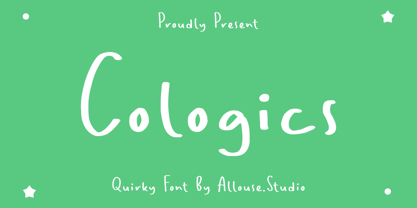 Cologics a Quirky Font which will give you mood impression.. Cologics wome along with Multi-Lingual Support to fulfill your need. We highly recommend using a program that supports OpenType features and Glyphs panels like many of Adobe apps and Corel Draw, so you can see and access all Glyph variations. Cologics is perfect for any tittle, lyrical video music, logo, product packaging, branding project, megazine, social media, wedding, or just used to express words above the background. Enjoy the font, feel free to comment or feedback, send me PM or email. Thank You!
 - Mybela by Scratch Design,
$9.00 Mybela is a beautiful brush script font with a super-sexy-casual vibe! This font is incredibly versatile in use cases ranging from street urban, to styled fashionista, to hearty food branding - whatever the weather, and also for invitation wedding or quote text! Mybela comes with a set of upper and lower case letters, and ligatures so you can write one word in a different ways - and keep things natural looking. Also this font has support for multiple languages. Do your magic with Mybela font, be creative and keep beautiful. Enjoy it!
 - Meikayla script by Alandya TypeFoundry,
$19.00 Meikayla Script is a classic decorative font with a modern twist. Meikayla is a handwritten font meant for vintage logos, fashion labels, custom cards headers, badges, food packaging designs, as there are a lot of fancy letter connections. Meikayla offers a decent amount of stylistic alternatives for many letters. To enable OpenType Stylistic alternates, you need a program that supports OpenType features like Adobe Illustrator CS, Adobe Indesign & CorelDraw X6-X7, Microsoft Word 2010 or later. (Windows), Font Book (Mac) or software programs such as PopChar (for Windows and Mac).
 - Marazion by Studio K,
$45.00 Marazion takes its name from a Cornish seaside resort in the UK's West Country. It was inspired by some hand lettering I came across at a local inn on the seafront where I was enjoying a lunchtime pint (always a good place to seek inspiration in my experience!) Being based on a hand drawn script Marazion is a smooth, fluid and rounded font that is both fresh and distinctive. Personally, I think it is well suited to applications in food and fashion, but in practice its uses are more or less universal.
 - Retrouvailles by Hanoded,
$15.00 Retrouvailles is a French word, which means ‘the feeling one gets after reuniting after a long time’. This script font was based on a couple of handwritten letters and postcards and my own imagination. I used a drawing tablet for the ligatures and the connecting strokes. Retrouvailles comes in 3 distinct styles: the slightly slanted regular style, an Italic style and a back slanted style. Retrouvailles has an abundance of goodies under the hood: it comes with a lot of ligatures and all the diacritics you could poke a stick at.
 - Vendetta by Emigre,
$69.00 The famous roman type cut in Venice by Nicolas Jenson, and used in 1470 for his printing of the tract, De Evangelica Praeparatione, Eusebius, has usually been declared the seminal and definitive representative of a class of types known as Venetian Old Style. The Jenson type is thought to have been the primary model for types that immediately followed. Subsequent 15th-century Venetian Old Style types, cut by other punchcutters in Venice and elsewhere in Italy, are also worthy of study, but have been largely neglected by 20th-century type designers. There were many versions of Venetian Old Style types produced in the final quarter of the quattrocento. The exact number is unknown, but numerous printed examples survive, though the actual types, matrices, and punches are long gone. All these types are not, however, conspicuously Jensonian in character. Each shows a liberal amount of individuality, inconsistency, and eccentricity. My fascination with these historical types began in the 1970s and eventually led to the production of my first text typeface, Iowan Old Style (Bitstream, 1991). Sometime in the early 1990s, I started doodling letters for another Venetian typeface. The letters were pieced together from sections of circles and squares. The n, a standard lowercase control character in a text typeface, came first. Its most unusual feature was its head serif, a bisected quadrant of a circle. My aim was to see if its sharp beak would work with blunt, rectangular, foot serifs. Next, I wanted to see if I could construct a set of capital letters by following a similar design system. Rectangular serifs, or what we today call "slab serifs," were common in early roman printing types, particularly text types cut in Italy before 1500. Slab serifs are evident on both lowercase and uppercase characters in roman types of the Incunabula period, but they are seen mainly at the feet of the lowercase letters. The head serifs on lowercase letters of early roman types were usually angled. They were not arched, like mine. Oddly, there seems to be no actual historical precedent for my approach. Another characteristic of my arched serif is that the side opposite the arch is flat, not concave. Arched, concave serifs were used extensively in early italic types, a genre which first appeared more than a quarter century after roman types. Their forms followed humanistic cursive writing, common in Italy since before movable type was used there. Initially, italic characters were all lowercase, set with upright capitals (a practice I much admire and would like to see revived). Sloped italic capitals were not introduced until the middle of the sixteenth century, and they have very little to do with the evolution of humanist scripts. In contrast to the cursive writing on which italic types were based, formal book hands used by humanist scholars to transcribe classical texts served as a source of inspiration for the lowercase letters of the first roman types cut in Italy. While book hands were not as informal as cursive scripts, they still had features which could be said to be more calligraphic than geometric in detail. Over time, though, the copied vestiges of calligraphy virtually disappeared from roman fonts, and type became more rational. This profound change in the way type developed was also due in part to popular interest in the classical inscriptions of Roman antiquity. Imperial Roman letters, or majuscules, became models for the capital letters in nearly all early roman printing types. So it was, that the first letters in my typeface arose from pondering how shapes of lowercase letters and capital letters relate to one another in terms of classical ideals and geometric proportions, two pinnacles in a range of artistic notions which emerged during the Italian Renaissance. Indeed, such ideas are interesting to explore, but in the field of type design they often lead to dead ends. It is generally acknowledged, for instance, that pure geometry, as a strict approach to type design, has limitations. No roman alphabet, based solely on the circle and square, has ever been ideal for continuous reading. This much, I knew from the start. In the course of developing my typeface for text, innumerable compromises were made. Even though the finished letterforms retain a measure of geometric structure, they were modified again and again to improve their performance en masse. Each modification caused further deviation from my original scheme, and gave every font a slightly different direction. In the lower case letters especially, I made countless variations, and diverged significantly from my original plan. For example, not all the arcs remained radial, and they were designed to vary from font to font. Such variety added to the individuality of each style. The counters of many letters are described by intersecting arcs or angled facets, and the bowls are not round. In the capitals, angular bracketing was used practically everywhere stems and serifs meet, accentuating the terseness of the characters. As a result of all my tinkering, the entire family took on a kind of rich, familiar, coarseness - akin to roman types of the late 1400s. In his book, Printing Types D. B. Updike wrote: "Almost all Italian roman fonts in the last half of the fifteenth century had an air of "security" and generous ease extremely agreeable to the eye. Indeed, there is nothing better than fine Italian roman type in the whole history of typography." It does seem a shame that only in the 20th century have revivals of these beautiful types found acceptance in the English language. For four centuries (circa 1500 - circa 1900) Venetian Old Style faces were definitely not in favor in any living language. Recently, though, reinterpretations of early Italian printing types have been returning with a vengeance. The name Vendetta, which as an Italian sound I like, struck me as being a word that could be taken to signifiy a comeback of types designed in the Venetian style. In closing, I should add that a large measure of Vendetta's overall character comes from a synthesis of ideas, old and new. Hallmarks of roman type design from the Incunabula period are blended with contemporary concerns for the optimal display of letterforms on computer screens. Vendetta is thus not a historical revival. It is instead an indirect but personal digital homage to the roman types of punchcutters whose work was influenced by the example Jenson set in 1470. John Downer.
 - Mikal by Eurotypo,
$88.00 David was promised Saul’s daughter in marriage after he defeated Goliath. However, while Saul procrastinated in delivering his elder daughter for marriage, David fell in love with the younger daughter Mikal (1 Samuel 18:20,28). Mikal was the only wife who was reported to have loved David. Her name, Mikal, meant brook, or stream, a symbol of the water of the word. Mikal is a versatile and elegant script font; well suited in the area of magazines, web pages, packaging, logotypes and advertising, etc. This font can be used as body text for its good legibility and accurate kerning. Mikal font has all the advantages of OpenType technology that allows a variety of combinations: Swash, old style numerals, standard and discretionary ligatures, contextual alternates, word ending and tails. Mikal supports all Central European character set as well as basic Western languages.
 - Daylosta by Authentype,
$20.00 Daylosta Authentic Handwritten Font created by AuthenType. This font features a classic and elegant style, perfect for: The concept of font design for the food, drink and cake industry leads to an energetic and creative youth market processing the taste and color of food. Features Standard glyphs uppercase and lowercase letters Numerals, a large range of punctuation and ligatures. Lowercase letters include ending swashes. Works on PC & Mac. Simple installations, accessible in the Adobe Illustrator, Adobe Photoshop, Adobe InDesign, even work on Microsoft Word. PUA Encoded Characters – Fully accessible without additional design software. Fonts include multilingual support for; ä ö ü Ä Ö Ü ß ¿ ¡ ________________________________________________________________________________________________________________________________________________ Image used : All photographs/pictures/logo/vector used in the preview are not included, they are intended for illustration purpose only. Thank you for your purchase! Hope you enjoy with our font! Designers: Ekayasa.
 - Plinc Bubble Gum by House Industries,
$33.00 Bubble Gum is a juicy multi-dimensional gob of goodness that’s bursting at the seams with loads of alphabetic appeal. Its well-padded figure transforms the ample letterforms found in classic comic strip word balloons into a warm and casual display font with a little extra kick. Cooked up by Dave West for Photo-Lettering, Inc. between the late 1960s and early 70s, Bubble Gum was finally digitized by Jess Collins in 2011. Please note that the shaded version of the typeface is composed by layering the Regular font and a separate Drop Shadow font. Some assembly required. Like all good subversives, House Industries hides in plain sight while amplifying the look, feel and style of the world’s most interesting brands, products and people. Based in Delaware, visually influencing the world. Featured in: Best Fonts for Logos
 - Vega VW SH by Scangraphic Digital Type Collection,
$26.00 Since the release of these fonts most typefaces in the Scangraphic Type Collection appear in two versions. One is designed specifically for headline typesetting (SH: Scangraphic Headline Types) and one specifically for text typesetting (SB Scangraphic Bodytypes). The most obvious differentiation can be found in the spacing. That of the Bodytypes is adjusted for readability. That of the Headline Types is decidedly more narrow in order to do justice to the requirements of headline typesetting. The kerning tables, as well, have been individualized for each of these type varieties. In addition to the adjustment of spacing, there are also adjustments in the design. For the Bodytypes, fine spaces were created which prevented the smear effect on acute angles in small typesizes. For a number of Bodytypes, hairlines and serifs were thickened or the whole typeface was adjusted to meet the optical requirements for setting type in small sizes. For the German lower-case diacritical marks, all Headline Types complements contain alternative integrated accents which allow the compact setting of lower-case headlines.
 - Goudy Heavyface SB by Scangraphic Digital Type Collection,
$26.00Since the release of these fonts most typefaces in the Scangraphic Type Collection appear in two versions. One is designed specifically for headline typesetting (SH: Scangraphic Headline Types) and one specifically for text typesetting (SB Scangraphic Bodytypes). The most obvious differentiation can be found in the spacing. That of the Bodytypes is adjusted for readability. That of the Headline Types is decidedly more narrow in order to do justice to the requirements of headline typesetting. The kerning tables, as well, have been individualized for each of these type varieties. In addition to the adjustment of spacing, there are also adjustments in the design. For the Bodytypes, fine spaces were created which prevented the smear effect on acute angles in small typesizes. For a number of Bodytypes, hairlines and serifs were thickened or the whole typeface was adjusted to meet the optical requirements for setting type in small sizes. For the German lower-case diacritical marks, all Headline Types complements contain alternative integrated accents which allow the compact setting of lower-case headlines. - Cooper Black SH by Scangraphic Digital Type Collection,
$26.00Since the release of these fonts most typefaces in the Scangraphic Type Collection appear in two versions. One is designed specifically for headline typesetting (SH: Scangraphic Headline Types) and one specifically for text typesetting (SB Scangraphic Bodytypes). The most obvious differentiation can be found in the spacing. That of the Bodytypes is adjusted for readability. That of the Headline Types is decidedly more narrow in order to do justice to the requirements of headline typesetting. The kerning tables, as well, have been individualized for each of these type varieties. In addition to the adjustment of spacing, there are also adjustments in the design. For the Bodytypes, fine spaces were created which prevented the smear effect on acute angles in small typesizes. For a number of Bodytypes, hairlines and serifs were thickened or the whole typeface was adjusted to meet the optical requirements for setting type in small sizes. For the German lower-case diacritical marks, all Headline Types complements contain alternative integrated accents which allow the compact setting of lower-case headlines. - Bernhard Antique SB by Scangraphic Digital Type Collection,
$26.00Since the release of these fonts most typefaces in the Scangraphic Type Collection appear in two versions. One is designed specifically for headline typesetting (SH: Scangraphic Headline Types) and one specifically for text typesetting (SB Scangraphic Bodytypes). The most obvious differentiation can be found in the spacing. That of the Bodytypes is adjusted for readability. That of the Headline Types is decidedly more narrow in order to do justice to the requirements of headline typesetting. The kerning tables, as well, have been individualized for each of these type varieties. In addition to the adjustment of spacing, there are also adjustments in the design. For the Bodytypes, fine spaces were created which prevented the smear effect on acute angles in small typesizes. For a number of Bodytypes, hairlines and serifs were thickened or the whole typeface was adjusted to meet the optical requirements for setting type in small sizes. For the German lower-case diacritical marks, all Headline Types complements contain alternative integrated accents which allow the compact setting of lower-case headlines. - Walbaum SB by Scangraphic Digital Type Collection,
$26.00 Since the release of these fonts most typefaces in the Scangraphic Type Collection appear in two versions. One is designed specifically for headline typesetting (SH: Scangraphic Headline Types) and one specifically for text typesetting (SB Scangraphic Bodytypes). The most obvious differentiation can be found in the spacing. That of the Bodytypes is adjusted for readability. That of the Headline Types is decidedly more narrow in order to do justice to the requirements of headline typesetting. The kerning tables, as well, have been individualized for each of these type varieties. In addition to the adjustment of spacing, there are also adjustments in the design. For the Bodytypes, fine spaces were created which prevented the smear effect on acute angles in small typesizes. For a number of Bodytypes, hairlines and serifs were thickened or the whole typeface was adjusted to meet the optical requirements for setting type in small sizes. For the German lower-case diacritical marks, all Headline Types complements contain alternative integrated accents which allow the compact setting of lower-case headlines.
 - Garamont Amsterdam SB by Scangraphic Digital Type Collection,
$26.00Since the release of these fonts most typefaces in the Scangraphic Type Collection appear in two versions. One is designed specifically for headline typesetting (SH: Scangraphic Headline Types) and one specifically for text typesetting (SB Scangraphic Bodytypes). The most obvious differentiation can be found in the spacing. That of the Bodytypes is adjusted for readability. That of the Headline Types is decidedly more narrow in order to do justice to the requirements of headline typesetting. The kerning tables, as well, have been individualized for each of these type varieties. In addition to the adjustment of spacing, there are also adjustments in the design. For the Bodytypes, fine spaces were created which prevented the smear effect on acute angles in small typesizes. For a number of Bodytypes, hairlines and serifs were thickened or the whole typeface was adjusted to meet the optical requirements for setting type in small sizes. For the German lower-case diacritical marks, all Headline Types complements contain alternative integrated accents which allow the compact setting of lower-case headlines. - Vendome SB by Scangraphic Digital Type Collection,
$26.00Since the release of these fonts most typefaces in the Scangraphic Type Collection appear in two versions. One is designed specifically for headline typesetting (SH: Scangraphic Headline Types) and one specifically for text typesetting (SB Scangraphic Bodytypes). The most obvious differentiation can be found in the spacing. That of the Bodytypes is adjusted for readability. That of the Headline Types is decidedly more narrow in order to do justice to the requirements of headline typesetting. The kerning tables, as well, have been individualized for each of these type varieties. In addition to the adjustment of spacing, there are also adjustments in the design. For the Bodytypes, fine spaces were created which prevented the smear effect on acute angles in small typesizes. For a number of Bodytypes, hairlines and serifs were thickened or the whole typeface was adjusted to meet the optical requirements for setting type in small sizes. For the German lower-case diacritical marks, all Headline Types complements contain alternative integrated accents which allow the compact setting of lower-case headlines. - Grotesque No. 9 SB by Scangraphic Digital Type Collection,
$26.00Since the release of these fonts most typefaces in the Scangraphic Type Collection appear in two versions. One is designed specifically for headline typesetting (SH: Scangraphic Headline Types) and one specifically for text typesetting (SB Scangraphic Bodytypes). The most obvious differentiation can be found in the spacing. That of the Bodytypes is adjusted for readability. That of the Headline Types is decidedly more narrow in order to do justice to the requirements of headline typesetting. The kerning tables, as well, have been individualized for each of these type varieties. In addition to the adjustment of spacing, there are also adjustments in the design. For the Bodytypes, fine spaces were created which prevented the smear effect on acute angles in small typesizes. For a number of Bodytypes, hairlines and serifs were thickened or the whole typeface was adjusted to meet the optical requirements for setting type in small sizes. For the German lower-case diacritical marks, all Headline Types complements contain alternative integrated accents which allow the compact setting of lower-case headlines.