2,257 search results
(0.027 seconds)
- Misket by Altay,
$9.00 Misket is a display typeface designed by Altay Dagistan. The glyphs were drawn one by one by hand, using traditional calligraphy methods. The font features a modulation called “reversed contrast”. Instead of the stems being thicker than the horizontals like in most typefaces, the contrast is reversed so, the stems are much thinner than the horizontals.
 - Sticker by DonyaDesign,
$14.00 Special creative products for you, our products will give you an extraordinary experience that will not be forgotten. A popular and professional script font. Modern and elegant, this typeface is made of beautiful creative strokes. This font is perfect for your creative ideas, both formal and informal. It has a modern style with a touch of creative ideas that is very suitable to be applied anywhere that requires creative ideas such as invitation cards, letterheads, website logos, social media, banners, advertisements, brochures, packaging products, leather products, and any product that requires writing. By using this font, all of your products will look luxurious, elegant, and attractive, please try and see the results. This font includes a complete set of beautiful upper and lowercase letters, numbers, a wide variety of punctuation marks, and ligatures. All lowercase letters include a start and end, providing a realistic style. everything you get.
 - Thicker by Zetafonts,
$39.00 Thicker is a type-family designed for Zetafonts by Francesco Canovaro with Andrea Tartarelli. A geometric sans typeface on steroids, it was first designed in the muscular Extrablack weight with the aesthetics of high-power dynamic typefaces used in sports communication, and then developed in the lighter weights where the shapes show some vintage-inspired proportions and the slightly squared look that nods to Novarese famous Eurostile, eponymous with retro-futurism. With these diverse influences the typeface allows for both impressive display use and effective logo design as well as more fine-tuned editorial use in body text - with a natural inclination for effective and powerful advertising. Sports typography usually uses italics to add dynamism and impact, and Thicker complies with this by offering a choice of three alternate italic forms with different slant, made even more customizable by the inclusion of variable font technology that allows fine tuning of the weight range as well as precise choice of typeface slant. In each of the 44 weights of the typeface family (as well as in the all-in-one variable type solution) Thicker offers a extended charset of over 900 latin, Cyrillic and Greek glyphs, covering over two hundred languages and including useful Open Type features (Alternate forms, Positional Numerals, Small Caps and Case Sensitive Forms) for flawless typesetting.
 - Ticker Tape - Unknown license

- Subway Ticker - Unknown license

- Jules Thicket by Rachel White Art,
$14.00 Jules Thicket is a wonky caps font, with kicky angles. Mix and match caps and lowercase letters to create a unique hand-lettered look in your designs.
 - Subway Ticker by K-Type,
$20.00 Subway Ticker is based on a 5×7 grid, electronic display observed on a New York subway train in February 2005. Also included is a ‘Grid’ variation of the font that is slightly more spaced out and based upon a more precise grid structure.
 - Theater Tickets JNL by Jeff Levine,
$29.00 Theater Tickets JNL was inspired by a photo of the marquee signage for Detroit’s Majestic Theater (built in1934), and is available in both regular and oblique versions. The theater was renovated and restored in 1987 and its marquee replicated the original one. What’s interesting is that the signage actually resembles squared pen lettering with rounded corners.
 - Ticket Booth JNL by Jeff Levine,
$29.00 The opening title card for 1940's "Two Girls on Broadway" was the basis for Ticket Booth JNL. A typical Art Deco typeface, its features include a squared letter shape with rounded corners and a thin character weight.
 - Meal Ticket JNL by Jeff Levine,
$29.00Meal Ticket JNL follows the same basic letter shapes as Jeff Levine's Flatbush Beanery JNL, but with a much lighter look and feel. This is another perfect typeface for recreating the sign lettering and menus of old-time diners, drive-ins and restaurants. - Gordon - Unknown license

- Garden - Unknown license

- Boldern by HansCo,
$15.00 Boldern is a Vintage typeface font, it will add an old-time charm to any design project. Our vintage font is the perfect companion for your creative journey. Features : Uppercase & Lowercase Numbers & Punctuation Multilingual Alternate character & ornament How to access alternate / ornament ? : https://hanscostudio.com/tutorial/ Enjoy!
 - Moldyen by MJType,
$19.00 Moldyen is a Elegant typeface that combines classic elegance with modern functionality. With its clean lines, sophisticated curves, and beautiful letterforms, Moldyen adds a touch of refinement and sophistication to any design project. What sets Moldyen apart is its unique variable design, which allows you to adjust the font’s weight to perfectly match the tone and style of your content.
 - Salden by Canada Type,
$40.00 The Salden fonts are our tribute to the man who was dubbed the face of the Dutch book, and whose work is considered essential in 20th century Dutch design history. Helmut Salden’s exquisite book cover designs were the gold standard in the Netherlands for more than four decades. His influence over Dutch lettering artists and book designers ranges far and wide, and his work continues to be used commercially and exhibited to this very day. At the root of Salden’s design work was a unique eye for counter space and incredible lettering skills that never failed to awe, regardless of category or genre. This made our attention to his lettering all the more focused within our appreciation to his overall aesthetic. Though Salden never designed alphabets to be turned into typefaces (he drew sets of letters which he sometimes recycled and modified to fit various projects), we thought there was enough there to deduce what a few different typefaces by Salden would have looked like. The man was prolific, so there were certainly enough forms to guide us, and enough variation in style to push our excitement even further. And so we contacted the right people, obtained access to the relevant material, and had a lot of fun from there. This set covers the gamut of Salden’s lettering talents. Included are his famous caps, his untamed, chunky flare sans serif in two widths, his unique Roman letters and an italic companion and, most recognizable of all, his one-of-a-kind scripty upright italic lowercase shapes, which he used alongside Roman caps drawn specifically for that kind of combination titling. All the fonts in this set include Pan-European glyph sets. They’re also loaded with extras. Salden Roman (908 glyphs) and Salden Italic (976 glyphs) each come with built-in small caps (and caps-to-small-caps), quite a few ligatures, and two different sets of alternates. Salden Black and Salden Black Condensed (636 glyphs each) come with a set of alternates, and both lining and oldstyle figures. Salden Caps (597 glyphs) comes with a set of alternates, and Salden Titling (886 glyphs) comes with a quite a lot of swashed forms and alternates (including as many six variants for some forms), a few discretionary ligatures, and two sets of figures. There are also some form alternates for the Cyrillic and Greek sets included in all six fonts. These alphabets were enjoyably studied and meticulously developed over the past ten years or so. We consider ourselves very fortunate to be the ones bringing them to the world as our contribution to maintaining the legacy of a legendary talent and a great designer. The majority of the work was based on Salden’s original drawings, access to which was graciously provided by Museum Meermanno in The Hague. The Salden fonts were done in agreement with Stichting 1940-1945, and their sale will in part benefit Museum Meermanno.
 - Soliden by Eko Bimantara,
$29.00 Soliden is a neo grotesk san serif font family with solid letterforms. Designed and published by Eko Bimantara in 2022, Soliden became a suitable choice for large display and functional purposes. The letterforms are built in large x-height with spacious counters. It consists of 8 weight from Thin to Black and 3 width; Condensed, Normal and Expanded, which make it a large font family with 48 styles. Soliden has 394 glyphs which cover broad latin languages.
 - Golften by Craft Supply Co,
$20.00 In the world of typography, Golften – Art Nouveau Serif Font stands as an epitome of elegance. It gracefully channels the beautiful and harmonious flow, drawing inspiration from the Art Nouveau style. Let’s delve into why Golften is an exceptional choice for those seeking refined and graceful design. Elegance at Its Core First and foremost, Golften exudes elegance through its graceful serifs and harmonious lines. It encapsulates the very essence of Art Nouveau. Moreover, its flowing curves and intricate details create a captivating visual experience, making it the ideal choice for designers aiming to create visually stunning projects. Versatile Beauty What sets Golften apart is its versatility, which knows no bounds. It seamlessly adapts to various design projects. Whether you’re crafting wedding invitations, establishing elegant branding, or designing artistic posters, Golften adds an exquisite touch that elevates your work. Furthermore, this font’s adaptability makes it suitable for a wide range of creative endeavors. Inspired by Art Nouveau Golften draws inspiration from the Art Nouveau movement, celebrated for its organic forms and ornate aesthetics. This font mirrors those principles, making it a perfect choice for projects aiming to capture the timeless allure of this influential style. With Golften, you can effortlessly infuse your designs with the spirit of Art Nouveau.
 - Gildeon by Sronstudio,
$25.00 "Gildeon" is a bold serif display typeface that commands attention with its powerful letterforms. Designed for impactful statements and strong visual presence, this font strikes the perfect balance between boldness and sophistication. Whether used for headlines, posters, or branding, "Gildeon" stands out with its commanding strokes and confident design, making it the ideal choice for projects that demand a bold and assertive typographic style. Features: - Uppercase & Lowercase - Numeral & Punctuation - PUA Encoded - Multilingual support - Simple Installation - Work both on Mac and Windows Thank you very much :)
 - Bolgen by Blankids,
$25.00 Introducing of our new product the name is Bolgen Handlettering Serif font. Bolgen inspired by Sketch Style Lettering this font is a fun theme very good for display, tshirt design, craft, quote sign, logotype and etc
 - Booden by Lithographe,
$36.00 Booden is a name not to boo but to use in display type situations. but as texts funtion s to be read its functionality ges beyond a Cyber-tech font single weight single time use. it can be used for branding purposes or any type of editorial text because of its readability. Be it a logo, or a Title headliner, web or print booden typeface can certainly entertain your need for simple variation.
 - Malden by Muksal Creatives,
$15.00 Malden Elegant serif Font typeface with beautiful alternate, special glyphs, ornament and multilingual support. It's a very versatile font that works great in large and small sizes. Perfect for editorial projects, Logo design, Clothing Branding, product packaging, magazine headers, or simply as a stylish text overlay to any background image.
 - Galdien by Craft Supply Co,
$20.00 Introducing Galdien – Modern Sans Serif Font A Contemporary Typeface Galdien – Modern Sans Serif Font is, without a doubt, a testament to contemporary design simplicity and elegance. It seamlessly blends modernity with readability. Clean and Versatile Furthermore, Galdien’s clean lines and uncluttered appearance make it an extraordinarily versatile choice for a wide range of design applications. Its simplicity ensures it doesn’t overpower your message, making it a font suitable for various projects. Readability at its Core At its core, Galdien prioritizes readability. Each character is thoughtfully crafted to ensure clarity in both print and digital formats. This font’s legibility is especially essential for conveying your message effectively and effortlessly. Ideal for Modern Branding Additionally, Galdien is perfectly suited for modern branding initiatives. Its clean and sleek aesthetic aligns seamlessly with contemporary brand identities, offering a cohesive and professional look that resonates with today’s audience. In Conclusion Galdien – Modern Sans Serif Font is your unwavering companion for modern design endeavors. Its simplicity, versatility, and readability, combined with its adaptability to various media, make it an excellent choice for diverse projects. With Galdien, your message is not only communicated with clarity and style but also imbued with a contemporary touch that captivates your audience and leaves a lasting impression.
 - Pollen by TypeTogether,
$49.00 This typeface finds a perfect balance between technical excellence, careful design of letter forms for extended reading, and a measured dose of charm and personality. Its informal feel allows for successfully typesetting a wide range of applications, from magazines and fiction books to advertising and websites. Calligraphy, be it done with the broad-edge pen, brush, or other tools, has been fundamental in the development of Pollen. Its influence is clearly visible in the construction of the top serifs contrasting the curved bottom serifs and the fluid aspect of terminals and tails, such as on “g” and “r”. The shapes of the diagonal letters are based on a less formal calligraphic model, but still uses the broad edge pen. The letters were then subject to a further process of pencil drawing and digital re-interpretation, which gave them the final shape. The designs of “e” and “c” are derived from drawings made with only one continuous line, with the pencil always touching the paper. The letters “g” and “y” express the intention to bring informal elements to a typeface intended for long text reading, usually characteristic of casual writing. Pollen consists of 3 basic styles with an extended OpenType Pro character set and large language support, perfectly serving the most common typographic needs.
 - Molgen by Sealoung,
$17.00 Introducing Molgen Modern Display Serif Font Molgen Modern Display Serif Font is a distinctive and versatile typeface designed to make a statement. With a unique blend of classic serifs and contemporary display elements, it is a font that encapsulates the perfect balance between tradition and innovation. In the world of typography, Molgen is your gateway to elegance and modernity. Key Features: Serif Meets Display: Molgen is the epitome of a harmonious coexistence between the timeless serif font and the contemporary display style. Its serifs are pronounced yet not overwhelming, making it an ideal choice for a wide range of applications. Versatility: Whether you're designing a striking logo, crafting eye-catching headlines, or preparing an elegant invitation, Molgen can handle it all with grace and sophistication. Distinctive Characters: Each character in Molgen is meticulously crafted, ensuring that every letter oozes character and charm. From A to Z, you will find unique touches that set Molgen apart. Multilingual Support: Whether your audience speaks English, French, Spanish, or any other language, Molgen has comprehensive multilingual support, ensuring that your message is clear and effective worldwide.
 - Borden by La Boîte Graphique,
$25.00 Borden is a rounded hand-printed caps font ideal for your graphic project. Usage recommendations : Title, short text, children’s book, poster, book cover, brochure, label, magazine. "The friendly hand-drawn charms of the Borden family […] Designed by Ewen Prigent, the Borden family is a hand rendered, all-caps design ideal for all sorts of playful settings. With its narrow condensed letterforms and rough rendering, this family is a good fit when space is limited in your design but you don’t want to compromise its friendly tone." www.fonts.com - newsletter - march 2014
 - Mollen by Eko Bimantara,
$19.00 Mollen is sans serif font family that designed to be functional. Each glyphs are shaped by geometrical form with specific visual structure: Simple and clean form with low contrast stroke, rounded 'o' in the normal width, mix diagonal and straight cuts on terminals and finials. Low capitals, with flat top and low descenders. With this personality, Mollen meant be fit for modern, contemporary and technological nuance. Mollen consist of 48 font with 8 weight: From Thin to ExtraBold and 3 width: Condensed, Narrow and Normal. With each matching Italics. It also contain 425 glyphs and several opentype features.
 - Moldern by Arterfak Project,
$18.00 Moldern is a modern-style serif with stylish ligature explorations. Moldern combines decorative, vintage, and minimalist style with a bold weight that is suitable for display. This font has a classy impression, feminine and expensive. You can apply this font for branding, fashion, logo, magazine, books, labels, invitations, cards, and more! Here's what you'll get : Uppercase Lowercase Stylistic set Stylistic alternates Ligatures Number & symbols Multilingual support Thank you for watching. Happy designing!
 - Gardens by The Rivertown Inkery,
$20.00 Gardens is a nostalgic arena font. Inspired by a soon-to-be demolished arena, this font was created to capture the memories and good times this building once contained. Upon hearing the news of the demolition, our team was struck with sadness and nostalgia. As youngsters we can recall attending a wide variety of events, such as hockey games, pro wresting and the circus. Our hope is that others can share in our nostalgic love of this once prominent arena. With curvy retro styling Gardens is unique and will fit in with many retro and vintage logos and design. Wether its t-shirts, posters or digital, Gardens will surely make your work stand out!
 - Gildan by Sign Studio,
$15.00 Gildan fonts come in 7 measured thicknesses. Inspired by a charming classic style. Equipped with several OpenType features (plain version); Discretionary Ligatures, Small Caps, Stylistic Sets, Oldstyle Figures. We made the italic version simpler but with controlled thickness on each side. Everything is made with the aim of complementing each other and supporting the design well. Regards
 - Boldine by Fateh.Lab,
$8.00 Boldine is a strong and elegant typeface display. Inspired by the style of design that is currently popular, and this is the answer to all the needs of every idea that you will pour in this modern era, with a thick and solid style in each letter as if this font has a soul in it. Its weight is superior in posters, social media, headlines, titles, large format print - and wherever you want to be noticed.
 - Dolmen by ITC,
$29.99Dolmen font from Max Salzmann revives the look of the 1920s and suggests all the glamour and culture of the jazz age. Dolmen can be used in all capital or upper and lower case settings and gives any work an Art Deco look. - Goldney by Set Sail Studios,
$16.00 There are a lot of script fonts out there - but Goldney isn't your average one, it's designed to be your go-to modern handwriting font. Goldney produces incredibly realistic letterforms and free-flowing sentences - this was achieved by writing out hundreds of individual words, then hand-picking the most natural looking letters. Also hand-picked was a whopping 90 Ligatures - these unique letter combinations give even more authenticity to each word layout. It's the perfect choice for genuine handwritten logos & branding, advertisement text, quotes, headers and product packaging. Goldney consists of 4 fonts files; Goldney • A handwritten script font containing upper & lowercase characters, numerals, and a large range of punctuation. Goldney Alt • This is a second version of Goldney, with a completely new set of both upper and lowercase characters. If you wanted to avoid letters looking the same each time to recreate a custom-made style, or try a different word shape, simply switch to this font for an additional layout option. Slanted Versions • Are included for both regular and alternate fonts. These can be used for a more italicised, fast-hand flow to your text.
 - Milden by Youthlabs,
$21.00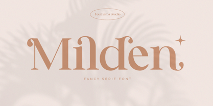 Introducing MILDEN fancy serif font. MILDEN is a serif font that gives fancy touch on your design. It looks so good for fashion brand logo. With many alternative fonts, MILDEN will make it easier for you to use various design functions, be it for logos, typography, magazine, fashion, branding, advertising, and more. What's the Feature ? Uppercase and Lowercase Alternate Ligatures Multilinguals Support Up to 450 Glyphs
 - Folder by Typodermic,
$11.95 Introducing Folder—the technical sans-serif typeface that’s so boring, it’s exciting. Designed with a single-minded focus on legibility, this font is perfect for those who want to communicate their ideas without any frills or distractions. Commissioned by the BBC for an educational broadcast, Folder is a font that means business. Its clean lines and crisp edges make it perfect for technical documents, reports, and presentations. And with its four alternate characters, the “I”, “J”, “Q”, and “9”, you can be sure that every letter is legible, no matter what app you’re using. With Folder, you won’t have to worry about your message getting lost in translation. This font is designed to be clear, concise, and to the point. And with its support for OpenType “stylistic alternates”, you can customize your text to suit your needs. So if you want a font that’s as serious about your message as you are, choose Folder. It’s the perfect font for anyone who wants to get their point across without any distractions or unnecessary flourishes. Get Folder now and start communicating with clarity and precision. Most Latin-based European writing systems are supported, including the following languages. Afaan Oromo, Afar, Afrikaans, Albanian, Alsatian, Aromanian, Aymara, Bashkir (Latin), Basque, Belarusian (Latin), Bemba, Bikol, Bosnian, Breton, Cape Verdean, Creole, Catalan, Cebuano, Chamorro, Chavacano, Chichewa, Crimean Tatar (Latin), Croatian, Czech, Danish, Dawan, Dholuo, Dutch, English, Estonian, Faroese, Fijian, Filipino, Finnish, French, Frisian, Friulian, Gagauz (Latin), Galician, Ganda, Genoese, German, Greenlandic, Guadeloupean Creole, Haitian Creole, Hawaiian, Hiligaynon, Hungarian, Icelandic, Ilocano, Indonesian, Irish, Italian, Jamaican, Kaqchikel, Karakalpak (Latin), Kashubian, Kikongo, Kinyarwanda, Kirundi, Kurdish (Latin), Latvian, Lithuanian, Lombard, Low Saxon, Luxembourgish, Maasai, Makhuwa, Malay, Maltese, Māori, Moldovan, Montenegrin, Ndebele, Neapolitan, Norwegian, Novial, Occitan, Ossetian (Latin), Papiamento, Piedmontese, Polish, Portuguese, Quechua, Rarotongan, Romanian, Romansh, Sami, Sango, Saramaccan, Sardinian, Scottish Gaelic, Serbian (Latin), Shona, Sicilian, Silesian, Slovak, Slovenian, Somali, Sorbian, Sotho, Spanish, Swahili, Swazi, Swedish, Tagalog, Tahitian, Tetum, Tongan, Tshiluba, Tsonga, Tswana, Tumbuka, Turkish, Turkmen (Latin), Tuvaluan, Uzbek (Latin), Venetian, Vepsian, Võro, Walloon, Waray-Waray, Wayuu, Welsh, Wolof, Xhosa, Yapese, Zapotec Zulu and Zuni.
 - Monden by Tour De Force,
$29.00 If you'd like to scream, but you have no self esteem, or you'd love to start a fight, but you're scared of the night, I made this font for you all, whether you're short or tall. Monden is wide, gentle and fun, but it wasn't born under the Sun, it was my intention to make it unique, I surely hope I didn't make some freak, it looks a bit classical, in moments maybe here and there radical, but it surely is really graphical with a dose of something magical. Want a logo, poster or any other design, but you'd rather cry and then run, even this description sounds lousy, at least it isn't so drowsy, so meet Monden family from our hood and keep your spirit in good mood, and do the things on any way you think they should.
 - Garden by Los Andes,
$18.00 Last year, we visited Brazil and we were totally captivated by its cheerful and warm people. Its wild nature is absolutely amazing and very noticeable in textile printing as well as in floral design. That was precisely what inspired us to create some ornaments and dingbats, which we then turned into a single typographic work. The resulting typeface was called Garden , a serif display handmade font with a playful and spontaneous feel. The Garden family offers a font with a set of original “catchwords” (‘Garden Catchwords’, based on brush calligraphy), floral dingbats and botanical ornaments. Please be aware, “Garden Catchwords” is a ‘Catchwords’ font, and does not offer standard AlphaNumeric characters. The OpenType version provides a wide range of creative options. Garden is well-suited for text composition, posters, headlines, label design and handmade-style items. Garden is inspiration, nature and joy!
 - Gotten by Stringlabs Creative Studio,
$25.00 Gotten combines authenticity and elegance into one truly stunning script. Use it to turn any design project into a true piece of art! The Gotten font is a great choice to increase the prominence in your project. Although the typography is traditional, the basic elements are great.
 - Gordon by Letterbox,
$50.00 Although appearing at first as a no-nonsense bold titling face, Gordon actually offers a much greater complexity through the addition of a wide range of special superscript ornaments. This adds an element of spice and depth to the face, creating a wide variation of creative typographic possibilities.
 - Gordon by URW Type Foundry,
$35.00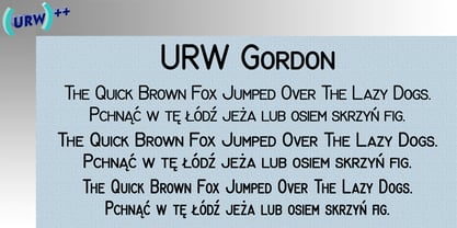
- Ghaden by Muksal Creatives,
$15.00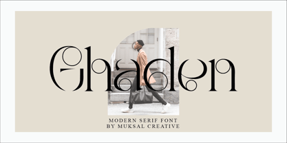 Ghaden Modern serif typeface with beautiful alternete, special glyphs, ornament and multilingual support. It's a very versatile font that works great in large and small sizes. Perfect for editorial projects, Logo design, Clothing Branding, product packaging, magazine headers, or simply as a stylish text overlay to any background image.


